Defining Custom Views
Android UI elements are all based on View (single element on screen) and ViewGroup (collection of elements on screen). There are many «widgets» and «layouts» built-in that can be used to build the UI such as views like Button and TextView, and layouts like RelativeLayout
In some apps though we need to be able to customize views to suit our own needs. This might mean extending an existing view, creating your own View subclass or doing more complicated drawing with a SurfaceView.
Customizing your own views involves extending View or an existing subclass, overriding the view behavior by writing methods such as onDraw or onTouchEvent and then using your new view in an activity.
Creating custom views is centered around five primary aspects that we may need to control or modify:
- Drawing — Control the rendering of the view on screen visually by overriding the onDraw method.
- Interaction — Control the ways the user can interact with the view with the onTouchEvent and gestures.
- Measurement — Control the content dimensions of the view on screen by overriding the onMeasure method.
- Attributes — Defining custom XML attributes for your view and using them to control behavior with TypedArray
- Persistence — Storing and restoring state on configuration changes to avoid losing the state with onSaveInstanceState and onRestoreInstanceState
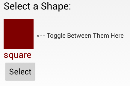
To take a closer look, suppose we want to create our own view control that allows the user to select between different shapes. The view will display a single shape (square, circle or triangle) and clicking on the view will toggle the shape selected between the different options.
To create our own custom toggle-able shape selector from scratch, we start by defining a ShapeSelectorView which extends from View and implements the required constructor:
Next, let’s add this view to our activity layout along with a caption and a button for selecting the shape after choosing:
Note how we define a custom namespace app . This namespace allows you to allow Android to auto-resolve the namespace, avoiding the necessity for specifying the package name in this file. See this blog post for more information.
Well-written custom views can be configured and styled via XML attributes. You need to ask yourself which aspects of your view should be customizable. For example, we might want to let the user select the color of the shape as well as give the user the option to display the name of the shape in the view as well. We might want the view to be configurable in XML as follows:
In order to be able to define shapeColor and displayShapeName , we need to define these as attributes within res/values/attrs.xml :
Notice we define the attr node along with the name and format for each custom attribute we’d like to be able to define. The format is the expected type of value for that property and valid options include string, color, dimension, boolean, integer, float, enum, and several others.
Once you define the custom attributes, you can use them in layout XML files just like built-in attributes. The only difference is that your custom attributes belong to a different namespace. You can define the namespace within the root view of the layout and configure the properties for the view. Normally you would need to specify a namespace such as http://schemas.android.com/apk/res/
(i.e. com.codepath.example.customviewdemo) but the namespace http://schemas.android.com/apk/res-auto will auto-resolve for you.
Now that we have set custom properties such as shapeColor and displayShapeName , we need to extract those properties to be used within our custom View within the constructor. To extract the custom attributes, we can use a TypedArray and the obtainStyledAttributes on the AttributeSet :
Let’s expose property methods to allow us to get and set the important properties after a view has been created:
Notice that when the view properties are changed and might require a redraw, be sure to call invalidate() and requestLayout() to update the appearance.
Next, let’s actually draw a square taking into account the properties defined above for shape color and shape name. All view drawing happens within the onDraw method using the Canvas object to paint onto the view. Let’s draw a square shape:
This will paint the square based on the shapeColor specified in the XML and will paint the shape name if specified within the displayShapeName property. Result looks like:

You can read more about drawing onto a canvas on the official Custom 2D Drawing Tutorial.
In order to understand the width and height of a view that is being custom drawn, we need to define the onMeasure method which determines the width and height of the view based on it’s contents. In this case, the height and width are determined by the shape and text drawn within the view. Let’s define the onMeasure as follows:
Note that the calculations take into account the view’s padding and calculate the content size. Also note that the onMeasure method must call the setMeasuredDimension. Widths and heights are discussed using the MeasureSpec which encapsulates all the different types of constraints imposed by the parent layout for a view. The helper method resolveSizeAndState() returns an appropriate value by comparing the view’s desired size to the spec passed into the method.
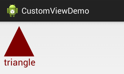
We have the square drawing, but we want the shape to toggle each time the view is clicked. Let’s setup a touch handler to ensure the shape changes as specified using the onTouchEvent method:
Now whenever the shape is clicked, the selected shape index will change and a different shape should be drawn after postInvalidate is called. Let’s update the onDraw method to paint the correct shape according to the selected index:
Now every time that we click the view, a different shape appears rotating between the three available options. Result looks like:
For more advanced view user interaction, check out the Making the View Interactive official docs.
The final touch might be to add a property to allow the activity to access the selected shape from within the view. First, let’s add the method to expose the selected shape:
and then now within the activity, we might be able to display the selected shape with a toast when a button is pressed:
The result of this is the following:

There are many events which can be customized for a view, check out the Custom Components guide for a more details.
Views are responsible for maintaining their own state when configuration changes (i.e phone is rotated) occur. You can do this by implementing View#onSaveInstanceState and View#onRestoreInstanceState in order to save and then restore the view state. For example, to maintain the selected shape index for our shape selector:
Once you’ve defined these saving and restoring methods, your view will be capable of automatically persisting state when configuration changes occur.
There is an even easier option for creating a custom View which is useful in certain circumstances. If there is a component that is already very similar to what you want, you can simply extend that component and just override the behavior that you want to change and get the rest of the behavior for free.
Incomplete: Fill this in with a relevant example
Read more about this in the Extending View Types guide for more details.
If you don’t want to create a completely customized component, but instead are looking to put together a reusable component that consists of a group of existing controls, then you may want to simply create a compound control. You might also want to create your own ViewGroup to act as a container for views or create a custom layout.
Incomplete: Fill this in with a relevant example
Check out this tutorial on Medium for a detailed overview of developing a compound view. Read more about this in the Custom Compound Components guide for more details.
There are many libraries for Android that contain custom views such as:
- Caldroid — A better calendar widget
- PullToRefresh-ListView — Pull to refresh enabled ListView
- RoundedImageView — ImageView extension that rounds the image with a border
Источник
Creating Dynamic Layouts in Android
What are Dynamic Layouts?

Generally, we develop the layout for an Android application by creating the XML file. These are called static layouts.
Static you ask? Yes, because you can not add/delete any View Type in XML on runtime.
Dynamic layouts are developed using Java and can be used to create layouts that you would normally create using an XML file.
Why do we need them?
Let’s say we are fetching some data from our server and we want to create n number of fields/buttons/options in our layout. How do we do that using the only XML? That’s right!
But we can use Java to replicate the exact layout that we would normally create using XML.
It can be used to create LinearLayout, ScrollView, etc.which can further add TextView, EditText, RadioButtons, Checkbox inside it.
Where do Dynamic Layouts excel?
Let’s say we want to show some items in our layout that were frequently bought together(all items are of the same View Type).
There are quite a few ways to show them in our layout:
1. Adding static views in our XML(if we know the exact amount of items).
2. Using Recycler View to inflate the items in our layout.
3. Creating Dynamic Views using Java.
What if we do not know the exact number of items to be displayed and our
layout require different View Types( like 3 TextViews, 2 CheckBoxes, etc.)?
Possible solutions to tackle this problem:
1. Adding static views in our XML won’t work this time because we do not . know the exact number of views we need.
2. Using Recycler View could work but the same View Types should be grouped together in a list. There is not much flexibility in this case.
3. However, this is where Dynamic Layouts take the lead! They are flexible and can add multiple View Types to our layout in any order.
Источник
Basics of Android layouts and views

What is a ViewGroup?
A viewgroup is a parent class of all the views. It holds all the children views (and viewgroups) within, as depicted by the structure above.
Types of ViewGroups
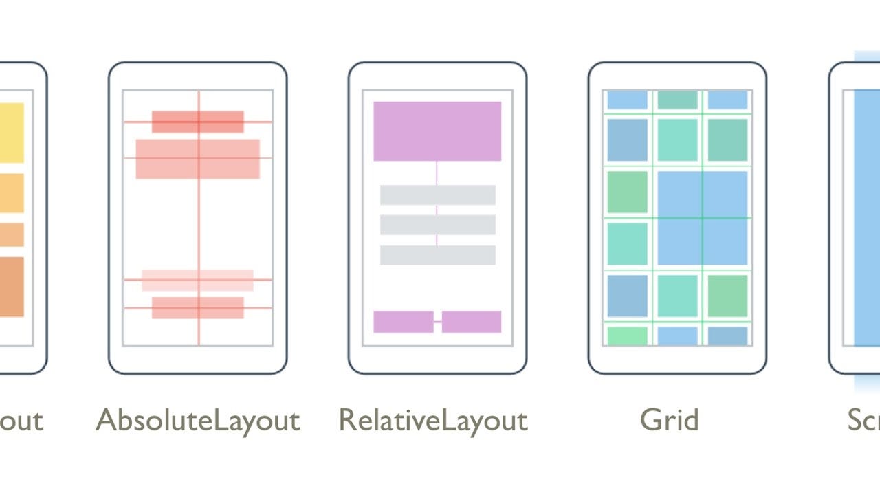
- Absolute Layout
- By using an Absolute Layout, you can specify the exact locations (x/y coordinates) of its children.
- They are less flexible and harder to maintain, rarely used nowadays.
- One needs to remember too many coordinate values for placing a view at a position, it would rather be much easier to remember a view with respect to which one needs to place a view on screen.
- It is usually used to block out an area on the screen and display only a single child on screen.
- If multiple children are used within it then all the children are placed on top of each other.
- Position of children can only be controlled by assigning gravity to them.
- Usually used to display single fragments on screen.
- Aligns the children views either horizontally or vertically.
- The attribute android:orientation specifies wheher to horizontally or vertically align children views.
- We usually use the attribute android:weight in the children views/viewgroups to decide what percentage of the available space they should occupy.
- An attribute android:weightSum defines the maximum weight sum, and is calculated as the sum of the layout_weight of all the children if not specified explicitly.
TRIVIA : What would happen if the weightSum is less than the sum of weights given to children explicitly?
- Relative Layout enables you to specify how child views are positioned relative to each other.
- The position of each view can be specified as relative to sibling elements or relative to the parent.
Some common attribute usages in relative layout:
Difference between android:layout_alignRight and android:layout_toRightOf : android:layout_alignRight is used to align a view’s rightmost edge to the rightmost edge of the specified view, whereas android:layout_toRightOf is used to place a view to the right of the specified view ie the left edge of a view is postioned to the right of the specified view.
Why to prefer android:layout_toEndOf instead of android:layout_toRightOf :
The views have LTR(left-to-right) orientation by default ie they start from left and end towards their righ, butthis orientation can be changed to RTL(right-to-left) where views start from right and end towards left. In suchcses,the views with the attribute android:layout_toEndOf will correctly align to the end w.r.t the view specifiedwhereas android:layout_toRightOf will still align it towards the right.
- Read more about Relative Layout here and here.
TRIVIA: Relative Layout measures a view twice, whereas Linear Layout measures only once (if weights are not used)!
Sources: Stack Overflow and Medium
- Instead of specifying the width and height of a child, we can provide a percentage of screen width or height to use.
- It is very useful in scaling layouts to various screen sizes.
- The PercentSupportLayout supports two pre-built layout — PercentRelativeLayout and PercentFrameLayout .
- Find an example for this here.
- ScrollView
- It is a subclass of FrameLayout, as the name says it is used when your contents do not fit the screen and tend to overflow.
- ScrollView can hold only one direct child. This means that you need to wrap all your views into a single viewgroup in order to use it within a ScrollView.
- ScrollView only supports vertical scrolling. Use HorizontalScrollView if you want to have horizontal scrolling.
- It is advised not to use ScrollView with ListView , GridView and Recycler View as they take care of their own vertical scrolling.
Источник


