Скачать бесплатно Adobe Ideas для Apple iPhone OS — iPad в категории Управление задачами и временем
Поиск по устройству
Мое устройство
Поиск по категориям
Базы данных
Бизнес & Профессия
Здоровье & Медицина
Игры
Интернет & Коммуникации
Мультимедиа & Графика
Наука & Образование
Программирование & Разработка
Словари & Переводчики
Темы & Обои & Скины
Туризм & Навигация
Управление задачами и временем
Записи & Дневники
Календари
Контакты
Напоминания
Планирование задач и встреч
Учет времени & Таймеры
Часы & Будильники
Другие
Утилиты
Финансы
Хобби & Развлечения
Чтение
Поиск по платформе
Android
Apple iPhone OS
iPad
iPhone
iPod Touch
BlackBerry
Java
Linux
Maemo Nokia Internet Tablet
MeeGO
Sharp Zaurus
Mobile Gaming
Nintendo DS
Playstation 3
Playstation Portable
Wii
Xbox 360
Palm OS
Symbian OS
Series 60
Series 80
Series 90
UIQ
Tablet PC
Windows CE.NET
Windows Mobile Pocket PC
Windows Mobile Smartphone
Платформы: iPhone, iPad, iPod Touch, Apple iPhone OS
Категории: Управление задачами и временем
Дата загрузки: 3 Мар 11
Разработчик: Adobe Systems Incorporated
Тип распространения: бесплатная
Рейтинг: 3.0/5 (Всего голосов: 10)
Adobe Ideas — цифровая записная книжка, в которую владельцы мобильных устройств от Apple могут записывать новые идеи и возвращаться к старым в любой момент.
Из новых, но платных, функций в версии 1.2 — это возможность добавлять слои — до 10-ти слоёв для зарисовок и один фото-слой в каждом скетче. Пользователю подконтрольны порядок слоёв и их прозрачность, вдобавок новый инструмент Layer Move позволяет передвигать, масштабировать и вращать каждый из слоёв.
Заметен прирост производительности обновленного приложения при изменении масштаба и панорамировании. Появившаяся поддержка VGA-вывода сняла с пользователей ограничение маленького экрана — скетчи можно выводить на внешний дисплей или проектор для демонстрации в режиме реального времени (для этого необходим адаптер Apple VGA).
Стоит отдельно упомянуть об улучшеном сглаживании контуров в приложении Adobe Ideas 1.2, которое позиционируется как идеальное дополнение к приложениям профессионального дизайна от Adobe — Illustrator и Photoshop.
Источник
Adobe Ideas — идеи в векторе
Так в чем же симбиоз вектора с растром? Не все так просто. Вы рисуете как в обычном растровом редакторе, но если захотите приблизить, увидите, что только что нарисованное изображение не потеряло в качестве.
Знакомьтесь, это вектор. Фактически, растром рисуется вектор. Многие при виде слова «вектор» вспомнят кривые Безье и различные операции с ними. Здесь такого нет, оплошали — стирайте и рисуйте заново. Никакого точечного редактирования, а что вы хотели, это же редактор для набросков.
Естественно есть возможность выбирать толщину ручки, прозрачность и цвет. Изначально доступно 7 цветов, которые можно расширить, выбирая из двух цветовых моделей — RGB и HSB. Так что пусть Вас не смущает изначально маленькая палитра. Присутствуют слои.
И тут начинаются претензии. Изначально Adobe Ideas была бесплатна. Монетизация была построена на докупке слоев, хочешь один слой — плати $0,99. Вполне нормальная модель для бесплатного приложения. В один прекрасный момент, Adobe обновила свое детище, при этом закрыв обновление пользователям уже приобретшим бесплатную версию, и назначив странный ценник — $9,99, при этом оставив in-app purchase в виде докупки слоев. Просто наплевательское отношение к пользователям со стороны Adobe. Но ладно, пусть это останется на их совести.
На счет экспорта, то я ожидал увидеть классические варианты — jpg, png, send e-mail. На деле все хуже — сохранить в альбом и отправить по почте в PDF формате. Для графического редактора, даже такого, это мало. Опять проявляется сущность Adobe, нас тут явно завлекают в Adobe Creative Cloud.
Что имеем в итоге? Интересный, минималистичный графический редактор, который погубила жадность Adobe. Свою цену, напомню, Adobe Ideas — $9,99, определенно не стоит. Если Adobe одумается и сделает опять бесплатную версию, то советую посмотреть, уж больно заманчиво орудовать векторными изображениями растровым способом. Кто хочет узнать о более функциональных растровых и векторных графических редакторах — следите за моими следующими обзорами.
Источник
Adobe ideas iphone tutorial
Если Вы выложили новую версию программы, пожалуйста, сообщите об этом модератору нажав на вашем сообщении кнопку «Жалоба».
Adobe Ideas версия: 2.6
Последнее обновление программы в шапке: 8.05.2012
Краткое описание: цифровой блокнот для создания векторных рисунков в любом месте.
Описание: Как известно, великая идея может настигнуть вас где угодно, и теперь вы сможете ее реализовать, если при вас находится планшет с установленным приложением Adobe Ideas. Используйте векторы, слои и цветовые схемы для воплощения вашей идеи. Приложение позволяет создавать полноценные рабочие проекты, готовые к реализации. К полученным результатам и возможности доработки проекта можно получить доступ из Adobe Illustrator ® или Photoshop ®.
Adobe Ideas создает векторные изображения, а это означает, что его можно масштабировать в безграничное количество раз без потери качества. Для просмотра полной картины вы можете уменьшать размеры изображения, и когда вы его видите полностью, то можете увидеть, что необходимо еще добавить или убрать. Adobe Ideas позволяет работать с каждым рисунком отдельно и контролировать прозрачность каждого независимо от других. Также приложение запоминает 50 последних действий, для возможности отката и исправления ошибок. Через Adobe Ideas также доступен облачный доступ к файлам с помощью Adobe Creative, откуда вы можете взять незаконченную работу и продолжить ее доработку, либо сохранить уже сделанный проект.
Adobe Ideas предлагает такие инструменты, как кисти, с регулируемым размером, с использованием сенсорного управления и векторный ластик. Вы можете легко просмотреть все ваши идеи при помощи галереи. Размер виртуального холста практически не ограничен.
Сообщение отредактировал mfilonen2 — 10.07.15, 09:06
Что нового в версии 2.6 * Extract & save color themes right from your Ideas artwork * Sync color themes between Ideas and Kuler * Customize the toolbar with your favorite brushes * Draw with increased accuracy * Share your Ideas on Facebook and Twitter * Purchase additional Creative Cloud storage from within the app
Вот как это сделать, я что-то не разобрался..
И еще, может кто-нибудь знает, в Appstore указано что это приложение со встроенными покупками, однако в самом приложении я так и не нашел что можно купить.
Сообщение отредактировал Defconhe — 11.05.13, 12:21
Источник
Adobe Ideas for iPhone
Digital notebook for sketching and capturing ideas
This program can no longer be downloaded
Adobe Ideas is the perfect companion for artists on the go. If you like drawing quick sketches while commuting to work or sitting at a cafe, this iPad app is for you.
With Adobe Ideas you can quickly capture concepts and draw sketches of anything around you thanks to a set of drawing tools and color themes you can capture directly from photos stored on your iPad.
The drawing tools included in Adobe Ideas are pretty basic – namely brush, eraser and color palette – but combined with a powerful color selection and the excellent response of the iPad screen, you can easily create quite impressive drawings. We especially liked the ability to set a picture as the background layer, so you can use Adobe Ideas to draw over it. On the downside, configuring the brush in terms of size, opacity and color can be a bit confusing — it took us a while to figure out how to change color.
Adobe Ideas saves and organizes your sketches – ideas – automatically and also lets you share them by email as PDF, so you can import them into Illustrator or Photoshop for further editing later on.
Adobe Ideas is a powerful digital sketchbook you can take anywhere with you on your iPad.
Create up to 10 drawing layers plus a photo layer for each sketch; control order and opacity for each layer New Layers Move tool offers move, scale and rotate for each layer Huge performance improvement to zooming and panning VGA Out – connect to an external display or projector to show sketch content real-time (requires Apple VGA adapter) Left/Right toolbar setting- customize the location of your toolbar Improved stroke smoothing. Some smoothing occurs while drawing
Changes
Create up to 10 drawing layers plus a photo layer for each sketch; control order and opacity for each layer New Layers Move tool offers move, scale and rotate for each layer Huge performance improvement to zooming and panning VGA Out – connect to an external display or projector to show sketch content real-time (requires Apple VGA adapter) Left/Right toolbar setting- customize the location of your toolbar Improved stroke smoothing. Some smoothing occurs while drawing
Источник
iOS App Design Guidelines & Inspiration
Most designers dream of creating products that rise to the top of the App Store charts. But to do so, it’s vital to design them to meet high expectations for quality and functionality. Human Interface Guidelines (HIG) is a must-read resource for anyone who wants to master an ios app design. By reading HIG, you will gain in-depth information about this OS.
In this article, I want to provide a summary of the essential design principles and specific design recommendations from HIG for iOS designers.
Design principles
In HIG, Apple defines the following five basic principles of ios app design:
Consistency
A consistent app uses consistent visual and functional language. In general, elements with similar functions should look similar. Consistency creates a sense of familiarity and simplifies the process of interaction with an app for first-time users.
Feedback
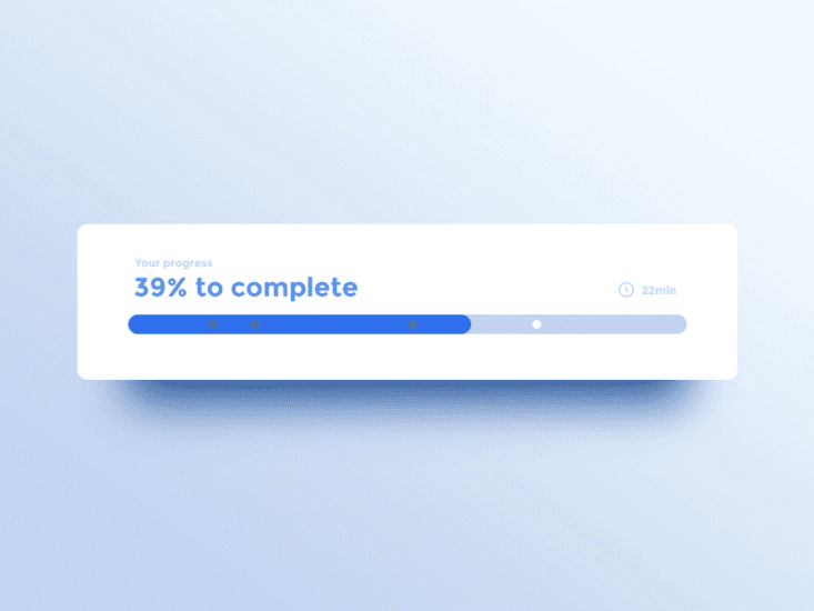
Feedback acknowledges actions and shows the results of any operations. Feedback is what keeps people informed. iOS designers have multiple ways of providing feedback— visual feedback on tapping, progress indication for activities that take some time, and audio feedback for notifying users about certain operations.
Progress indicator shows current progress and remaining time. Image by Adrien Gervaix.
Metaphors
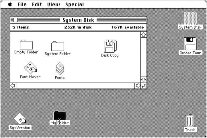
An interface metaphor is a UI visual that leverages knowledge users already have from real life. Metaphors allow users to learn more quickly because they can use the knowledge gained from the real-world when interacting with digital products. The most famous metaphor in human-computer interaction and UX design is Alan Kay’s “desktop metaphor”. The desktop metaphor moved us from typing command to direct manipulation with digitally rendered objects.
The original 1984 Mac OS desktop that popularized the new graphical user interface.
Direct manipulation
Users experience direct manipulation when they use gestures to interact with on screen content. Direct manipulation helps users see immediate results of their actions.
Scrolling interaction on mobile. Image by artrayd
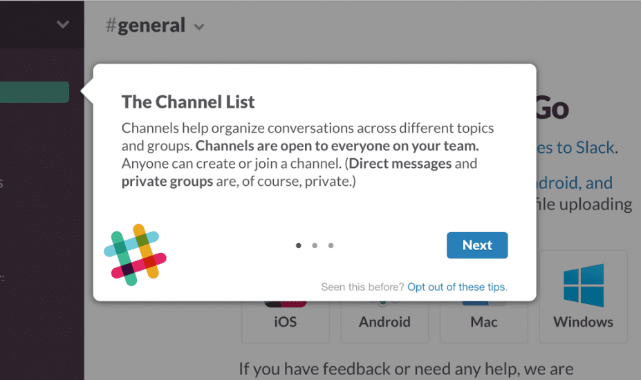
User control
iOS puts people, not the system, in control. Good iOS design prevents users from making mistakes by suggesting a course of action, but it should never push users in making certain decisions.
Contextual tips in Slack
Interface essentials
iOS app design guidelines define three key elements of app experience:
Bars tell people where they are in the app (status bar), provide navigation (tab bar), allow them to search for information (search bar), or take some actions (toolbar).
Views
Views contain the primary content people see in the app. Text, visuals, animations, interactive objects – all those elements are located in views.
Controls
Controls initiate actions (buttons) and convey status/information (progress indicators).
Design recommendations
iOS is a large platform, and it’s impossible to provide all possible design recommendations in a format of a single article, but still, it’s possible to provide a few of the most important recommendations that mobile designers should remember:
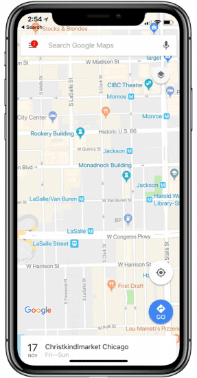
Don’t hide the notch
The notch, sensor housing, is an element that prevents iOS screen from being edge-to-edge. It might be tempting to hide the notch area with a black bar to create a complete square screen, but it’s better not to do it. Why? There are a couple of reasons for that:
You make the screen look smaller than it really is. The area of the notch provides the sense of space for the content to be displayed. For example, if you use a Google map in your app, it won’t suffer by being clipped by the notch.
Google Map on iPhone XS
By hiding notch, you make your app look inconsistent with other iOS apps.
Design using points not pixels
Pixels are the smallest physical element that we can control on a digital display. The more pixels can be fitted into a specific screen size, the higher the PPI (pixels-per-inch), and the clearer the rendered content becomes. Points, on the other hand, are a resolution-independent measurement. When the original iPhone was introduced, both points and pixels were the same (320×480 pixels = 320×480 points), but the situation changed with the release of the first iPhone with a retina screen. Depending on the screen pixel density, a point can contain multiple pixels (e.g., 1 pt contains 2 x 2 pixels on a regular retina display).
When you are designing for modern iOS devices, you should think in points, but design in pixels. To make your app look good on every screen, you should prepare design assets in 3 different resolutions (1x, 2x, and 3x). Be sure to choose an app design software that includes the latest iOS templates to choose from. That will ensure this process goes much faster.
If possible, use single, system typeface
Typography plays a vital role in any digital product, and iOS app design is not an exception. When it comes to selecting a typeface for your app, it’s recommended to use a system typeface of iOS. The system font of iOS is called San Francisco. The fonts of San Francisco are optimized to give your text unmatched legibility, clarity, and consistency.
It’s important to know that when using a system font, you will have access to dynamic type, which lets the font adjust based on the user’s preference.
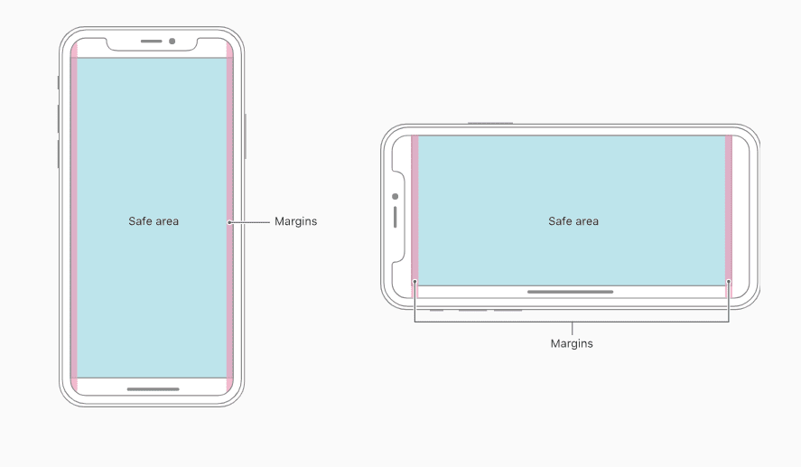
Avoid clipping content by corners
All recently released iPhones have one thing in common – they feature a display with round corners and notch. Round corners and notch can clip the content. When designing screen layouts, always use a safe area layout guide to push the content to the point where it won’t be clipped. Generally, 16 points are enough to make the proper margin. Also, the system includes predefined layout guides that make it easy to apply standard margins around content, but you can always define custom layout guides.
Illustration of the safe area for iPhone X. Image by Apple.
Include status bar in as many places as you can
Mobile design should be glanceable. Ideally, it shouldn’t take more than just a glance to get all important information. Users rely on the status bar for important information such as current time, signal, battery.
Use vibrant colors to bring out interactive elements
Vibrant colors are a simple yet powerful way to direct the user’s attention to a particular UI element. Vibrant color works equally well on the white and dark background. But don’t go too overboard with vibrant colors in your UI. Ideally, only 10% of your design should have vibrant colors.
Using vibrant blue to highlight an active option.
Optimize for thumb
Tiny touch targets located too close to each other can make the interaction really painful for users. What can make things even worse, is when users have to stretch their fingers in order to interact with them.
To create really comfortable user interactions, both the size and location of interactive elements should be in a thumb-friendly zone. When working on your iOS app design, aim to have a minimum tappable area of 44pt x 44pt for all controls. It will guarantee comfortable interactions for your users.
Make your navigation visible
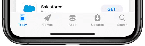
The latest iPhone models feature a relatively large screen, and it means that you can use it to create a better navigation experience. Avoid using hidden navigation patterns such as a hamburger menu and вЂuse tab bar instead’ option. Tab bar is always visible and won’t cause users to ask, “Where am I?” This pattern is also located in the thumb-friendly zone, which makes the interaction more comfortable for users.
Here are a few tips for tab bar design:
Add labels for icons. Clear labels will simplify the process of navigation for first-time users. Adding labels is especially important for less known icons.
Use color to convey the status of the navigation option. The color will help users understand what option is active right now.
The active option in tab bar is colored in contrasting color.
Use motion to convey hierarchy and facilitate understanding
Clarity is an essential characteristic of a well-designed iOS app. Modern iOS apps can be really complex and contain a dozen different screens. And when users navigate from one screen to another, they need to understand how the screens are related. Good motion language can help to create a connection between screens and will help users understand the spatial transitions.
One important thing to remember when working on animation in your app is that you need to make it look consistent with system built-in animations. A consistent animation will look familiar for users and will keep them engaged.
Minimize interruptions
Users don’t like to be interrupted, especially when they are in the middle of something important. That’s why it’s recommended to keep in-app alert dialogs to a minimum and create a clear exit for every dialog.
Support Dark Mode in your app
In iOS 13.0 and later, people can use a dark system-wide appearance called Dark Mode. Dark Mode enhances visual ergonomics by reducing eye strain when device is used at night or in dark environments. In Dark Mode, iOS uses a darker color palette for all screens, views, menus, and controls.
If you want to support Dark Mode in your app, you should test your design in both light and dark appearances. See how your interface looks in both appearances and adjust your design as needed to accommodate each one.
Always preview your design in an Emulator
Before sending your design to a real device, you should always preview it in an emulator. You can see and interact with your design using the XCode iPhone emulator.
Conclusion
The first iPhone was released more than a decade ago. If you compare the first iPhone with the iPhone 11, you will see the progress Apple made along the way. The same progress we have in the process of design & development for the iOS platform. Human Interface Guidelines and provide essential information about the requirements for the modern iOS app. And large iOS designers & developers communities on Stackowerflow will help you find an answer to specific questions.


 Scrolling interaction on mobile. Image by artrayd