- Адаптивные значки
- Дополнительное чтение
- Designing Adaptive Icons
- Understanding Android Adaptive Icons
- Android O introduces a new format for app icons called adaptive icons. To better understand the motivation and…
- Fundamentals
- Size and shape
- Keylines
- Layers
- Design Considerations
- Clipping
- Background Anchoring
- Masked masks
- Light & shadows
- Leave behinds
- Resources and tools
- Adaptive Icon Playground
- Android Adaptive Icons
- Deliver an eye-catching first impression by making your Android icon pop
- Legacy Icons
- Normalizing icon shapes and sizes
- So… Adaptive Icons
- How to create an Adaptive Icon?
- For designers
- More Adaptive Icon stuff.
- Wrapping up
Адаптивные значки
В Android 8.0 Oreo появилась поддержка адаптивных значков.
Для работы с адаптивными значками следует использовать API 26 и выше. Адаптивные значки состоят из двух слоёв: фон и основная часть.
В манифесте по-прежнему остаётся старая запись о значке.
Далее следует создать файл res/mipmap-anydpi-v26/ic_launcher.xml. Android Studio 3.0 генерирует подобный файл, можете изучать его.
Слои содержат векторные изображения VectorDrawable. К слову сказать, в качестве фона можно использовать просто цвет.
Для передней части значка можно использовать PNG-файл (используйте ресурсы mipmap).
Для совместимости с Android 7 вы должны также создать ещё один файл ic_launcher_round.xml с таким же содержанием.
Если изучить ресурс для фона, то можно заметить, что для значка используются размеры 108dp*108dp. Основной слой значка имеет те же размеры, но нужно учитывать одно обстоятельство — фоновый слой работает как маска, накладываемая на передний значок. Поэтому вы должны проследить, чтобы маска случайно не закрыла важные детали значка.
Гарантировано будет виден центр значка 66dp, а 77dp применимо к общему размеру значка.


Адаптивные значки можно применить к App Shortcut.
На эмуляторе следует выбрать устройство Pixel и включить у него режим разработчика. Далее в настройках домашнего экрана появится пункт Change icons shape.
Дополнительное чтение
Implementing Adaptive Icons – Google Developers – Medium — в статье приводится пример применения линейного градиента для тени.
Releases · nickbutcher/AdaptiveIconPlayground — приложение с открытым исходным кодом для удобного просмотра эффектов значков с настройками.
Источник
Designing Adaptive Icons

Android O introduces a new app icon format: adaptive icons. Adaptive icons can make devices more coherent by unifying the shape of all app icons and opening the door to interesting visual effects. This post explains how they work and explores some techniques for designing them.
For a look back at where this feature has come from, see:
Understanding Android Adaptive Icons
Android O introduces a new format for app icons called adaptive icons. To better understand the motivation and…
Fundamentals
Size and shape
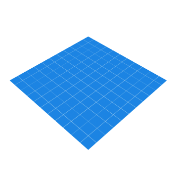
Adaptive icons are 108dp*108dp in size but are masked to a maximum of 72dp*72dp. Different devices can supply different masks which must be convex in shape and may reach a minimum of 33dp from the center in places.

Because of the minimum reach of the mask, you can consider a centered 66dp diameter circle as a safe zone, guaranteed not to be clipped.

Keylines

Keyline shapes are the foundation of the icon grid helping your icon’s visual proportions be consistent with other apps’ icons . The keyline shapes are:
- Circles: 52dp & 36dp diameter
- Square: 44dp*44dp, 4dp corner radius
- Rectangles: 52dp*36dp & 36dp*52dp, 4dp corner radius
See the templates included at the end of this article.
Layers
Adaptive icons are actually made up of two layers; a foreground and a background. Both layers are 108dp*108dp; the background must be fully opaque while the foreground may include transparency. These layers are stacked on top of each other.
Providing elements in two separate layers which are larger than the displayed (i.e. masked) size creates the opportunity for interesting visual treatments and animations. Exactly what effects may be applied and when is still something of an open question; it is up to device and launcher makers to decide. Here are some simple examples you could imagine: parallax or pulsing by independently translating or scaling each layer before applying the mask.
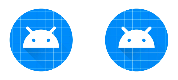
As the 108dp*108dp icons are masked up to 72dp*72dp, the outer 18dp on each side can be considered the “extra” content, only revealed during motion.
Design Considerations
The material design guidelines for creating product icons still very much apply. Specifically the icon anatomy, shadows and finish remain, but you can now place elements in either the foreground or background layers yielding different effects.
Now I’m sure that many icons will be well served by placing their brand mark in the foreground on a solid colored background and calling it a day. This will ensure that your icon fits in well on the device. What excites me is how we as a community will explore these new constraints and find interesting, playful and innovative ways to make delightful icons. Here are a few things to keep in mind and a few ideas to potentially explore.
Clipping
Due to the dynamic nature of adaptive icons, you cannot know the exact mask shape that will be applied. For that reason it’s best to place any critical elements like your brand mark inside the safe-zone and to stay away from the mask edges.
Background Anchoring
Placing some elements which might appear to be foreground, actually in the background means that they will move independently. For example the calculator app places most elements in the foreground, but the equals button on the accent color block in the background:
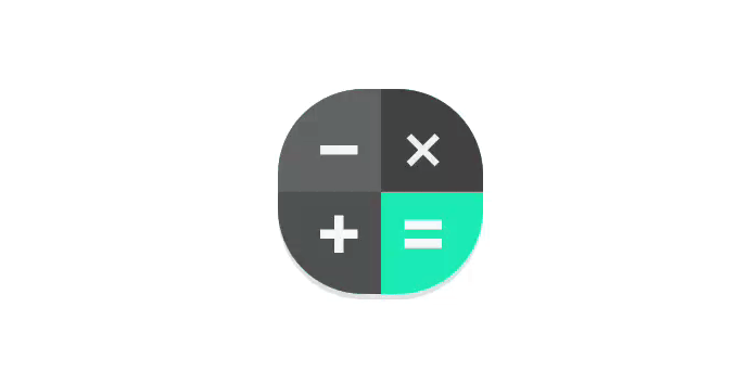
This creates interesting opportunities for motion where you visually anchor on the bright color block, but it moves less than the foreground elements, creating a sensation of depth.
Masked masks
I think that there may be interesting opportunities for placing masking elements in the foreground — that is solid elements with areas cut out. Consider a possible icon for the Google Play Store, this might be constructed in an ‘obvious’ manner, that is placing the colored triangle in the foreground atop a white background.

Instead of doing this, we might use a colorful background and a white foreground with the triangle subtracted to produce the same static output:

This setup would allow the colors ‘peeking through’ to move independently of the mask revealing different parts of the background when translated or scaled.

Light & shadows
The interaction of lighting effects and shadows placed in separate layers can have interesting results. For example using the long-shadow technique on the foreground element can have a playful interaction as it moves within the masked area. Similarly lighting effects can be placed in the foreground layer rather than being baked into the background. For example, a ‘finish’ layer can be placed in the foreground to emulate a light source. Placing this in the foreground means that it will play over the background layer when under motion, moving at a different rate to it.

Be careful not to create an effect that doesn’t make sense e.g. a shadow detaching from a foreground element or moving behind a background element. Also remember that many icons are likely to be seen together so be conservative with bespoke lighting effects and stick close to the material guidelines.
Leave behinds
You could place elements in the background layer which are completely obscured by the foreground layer and only revealed under motion.

Resources and tools
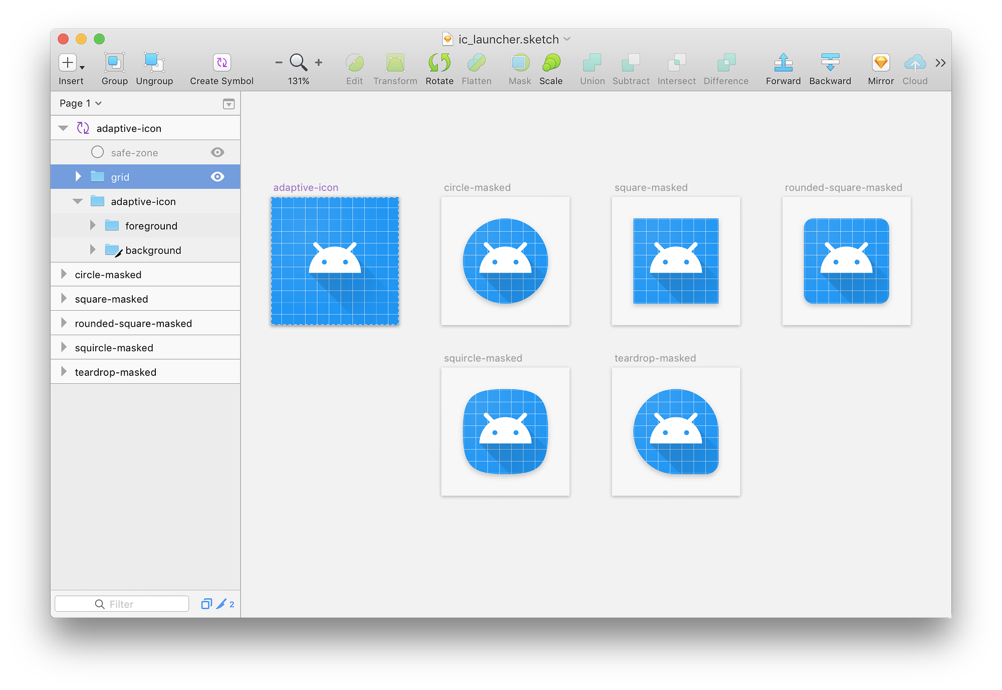
Here is my sketch file which you can use as a template whilst creating adaptive icons. It includes the icon grid, keyline shapes and safe area. It’s implemented as a symbol so changing the master element will update the copies giving you a preview with different masks applied.
I’ve also uploaded an Adobe Illustrator template if that’s more your thing.
Additionally check out these other resources i’ve come across:
Adaptive Icon Playground
In developing adaptive icons, I’ve come to appreciate that many of the subtleties come from the interaction of the foreground and background elements when motion effects are applied. This is still something of an open question as we are yet to see how device and launcher makers will implement this. To help investigate this space, I’ve created a small test app to help you evaluate it whilst creating your icon:

The app displays all applications installed on your device with adaptive icons. Scrolling the grid applies parallax effects to the icons and touching an icon applies a scale effect. You can configure the strength of the effects and change the mask applied to all icons. Hopefully this tool helps you to envisage how your icon will appear and may move on different devices.
You can download an APK or checkout the source on github:
Источник
Android Adaptive Icons
Deliver an eye-catching first impression by making your Android icon pop
- Jimmy Morales, Senior Developer, Guatemala
Adaptive icons are definitely not a new thing in the Android world. They were introduced in Android 8.0 (Oreo), around four years ago. Not so many things have changed since then, but I think it will be good if we do a quick review on the topic.
Legacy Icons
Let’s talk about how icons were implemented in versions prior to Oreo, which we will call legacy icons from now on. Legacy icons are easy to implement. You need to have at least one PNG for each different density from mdpi to xxhdpi (four in total), but ideally you should also add one for the xxxhdpi. The icon’s size needs to be 48×48 dp and it can have any transparency. This opens the opportunity to have icons with different types of shapes. It means your icon can be a circle, square, or any shape really.
Initially having a unique shape was a good practice because it meant your app icon was more likely going to stand out compared to other apps. But this resulted in a Launcher full of icons with different shapes and sizes and a lot of inconsistency.
Normalizing icon shapes and sizes
This started a new movement on trying to normalize the icons shapes and sizes in the Android Platform. Samsung was the first OEM that introduced a background behind the icons that make them look more consistent.
Left: Standard icon look. Right: Icons with backgrounds. Source: cnet.com
The second attempt at trying to introduce a more consistent icon experience was in Android 7.1 (Nougat) with the introduction of the roundIcon . This new feature had some restrictions, especially with OEMs looking to differentiate their devices by having different icon shapes (ie: Pixel devices use circular icons, Samsung a rounded square shape, other OEMs might use a rectangular shape). This was solved in Android 8.0 with the introduction of Adaptive Icons.
So… Adaptive Icons
An Adaptive Icon is made up of two layers, a foreground and background, both of 108×108 dp. Ideally these two layers should be vector assets, but they can also be PNGs. The downside of using PNGs is that you will need to provide at least 4 different PNGs per each density (mdpi to xxhdpi) for each layer (8 PNGs in total). With vector assets you will only need two files which will save you a lot of space.
Basically, Android will apply a mask to both layers and clip an area around your icon. Different OEMs will apply different shapes of masks. You need to have in mind that because of the applied mask you will need to put your icon in a safe area that is around 33dp from the center of the icon.
How to create an Adaptive Icon?
If you are a developer (with no design skills like myself) the short answer is to use the Asset Studio from Android Studio. Using Asset Studio is very easy, you can import both of your layers and the Asset Studio will generate the files for you.
The Asset Studio will show you the safe zone and a really nice preview on how different masks will be applied to your icon. You can resize both of the layers if needed. The background layer can be just a color drawable, but as I mentioned before you can also provide a vector asset, that means the background can be really anything, for example, you can have a gradient as the background layer.
When creating the Adaptive Icon, Asset Studio will generate for you several files. It will add the two layers as drawables, for example, if you used vector assets for your layers it will generate a drawable/ic_launcher_foreground.xml for your foreground layer and a drawable/ic_launcher_background.xml for your background layer.
The Adaptive Icon file by default will be called ic_launcher.xml . If your app’s minimum SDK is 26 or higher this file can live in the mipmap resource directory, but if not (most of the apps), it will be stored in the mipmap-anydpi-v26 resource directory. This is because Adaptive Icons are only supported on API level 26 or higher, and on versions below 26 you will need to have the legacy icon saved in the mipmap-mdpi , mipmap-hdpi , etc.
For example, if your minimum SDK is 23 you could end up with this file tree in your res directory:
If the ic_launcher_round adaptive icon is the same one as the normal ic_launcher , instead of duplicating the file you can provide a resource alias in your values-anydpi-v26 folder.
Now you only need to specify the icon file in your app’s AndroidManifest.xml like you would normally do.
And this is how the Adaptive Icon looks internally. It is pretty simple, you only need to use the adaptive-icon tag and inside add both layers using the background and foreground tags (Asset Studio does this for you).
For designers
If you are a designer and like to use fancy design tools, you can also use these tools to design Adaptive Icons.
More Adaptive Icon stuff.
The real reason for having two layers is because it allows OEMs to do really cool animations when an user interacts with your icon, like moving the foreground layer on top of the background layer.
But, how can we test the animated visual effects of our Adaptive Icons in a real device? Well, thanks to Nick Butcher again, we can use his Adaptive Icon Playground app to see how the animated visual effects perform in the icon. You can download the APK from the repo, run the app and you will be able to see the Adaptive Icons of all of your installed apps in your device.
Wrapping up
Implementing Adaptive Icons is a great way to make your app follow the best practices and is in tune with the other apps on the devices of our users. Remember that App Icons are a great investment because they usually are the first thing the user sees, and that also involves seeing the animated visual effects in the latest Android versions or supporting different Icon shapes in different OEMs.
At the time of writing this article, Android 12 is in beta, but hopefully when it gets stable in the next month I’ll update the article if we get something new.
Special thanks to Chris Weathers, Camilo and Mauricio for reviewing this.
Источник


