- Адаптивные значки
- Дополнительное чтение
- Understanding Android Adaptive Icons
- VectorDrawable Adaptive Icons
- The basics of adaptive icons
- Round icons
- Building a VectorDrawable Background
- Building a VectorDrawable Foreground
- All the benefits, none of the APK bloat
- 47 Best Icon packs: Round, Square, Minimal, Transparent, Light, Dark, White, and more types
- Round icon packs
- Rondo
- Redox
- RETRORIKA
- Revolution
- Naxos flat round
- Easy circle
- Fluxo
- Square icon packs
- Goolors Square
- Rifon
- PIXEL SQUARE
- Long Shadow
- Easy Square
- Voxel
- Rounded square icon packs
- BELUK
- Rugos – Free
- Transparent icon packs
- Glass Pack
- TwoPixel Light
- Color Lines
- Lines Free
- Color Gloss
- Zeon Black
- Glasklart
- Dark icons/Black theme
- Moonrise
- Pixel Pie DARK
- Glim Dark
- Black Light
- Luxury X
- Silhouette
- Zwart – Black
- Dark Void Free – Circle Icons
- Light icons/ White theme
- Light Void
- Linebit Light
- Flat White
- Whicons – White
- Flight Lite – Minimalist Icons
- Pasty Free – White
- Flat White
- Minimal icon packs
- Minimalist
- Materialistik
- Belle UI
- Polycon
- Candycons
- Pineapple
- O3 Free Icon Pack
Адаптивные значки
В Android 8.0 Oreo появилась поддержка адаптивных значков.
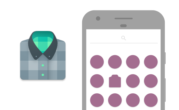
Для работы с адаптивными значками следует использовать API 26 и выше. Адаптивные значки состоят из двух слоёв: фон и основная часть.
В манифесте по-прежнему остаётся старая запись о значке.
Далее следует создать файл res/mipmap-anydpi-v26/ic_launcher.xml. Android Studio 3.0 генерирует подобный файл, можете изучать его.
Слои содержат векторные изображения VectorDrawable. К слову сказать, в качестве фона можно использовать просто цвет.
Для передней части значка можно использовать PNG-файл (используйте ресурсы mipmap).
Для совместимости с Android 7 вы должны также создать ещё один файл ic_launcher_round.xml с таким же содержанием.
Если изучить ресурс для фона, то можно заметить, что для значка используются размеры 108dp*108dp. Основной слой значка имеет те же размеры, но нужно учитывать одно обстоятельство — фоновый слой работает как маска, накладываемая на передний значок. Поэтому вы должны проследить, чтобы маска случайно не закрыла важные детали значка.
Гарантировано будет виден центр значка 66dp, а 77dp применимо к общему размеру значка.


Адаптивные значки можно применить к App Shortcut.
На эмуляторе следует выбрать устройство Pixel и включить у него режим разработчика. Далее в настройках домашнего экрана появится пункт Change icons shape.
Дополнительное чтение
Implementing Adaptive Icons – Google Developers – Medium — в статье приводится пример применения линейного градиента для тени.
Releases · nickbutcher/AdaptiveIconPlayground — приложение с открытым исходным кодом для удобного просмотра эффектов значков с настройками.
Источник
Understanding Android Adaptive Icons

Android O introduces a new format for app icons called adaptive icons. To better understand the motivation and potential of this feature it’s useful to take a look at what it’s replacing.
While Android’s icon guidelines have evolved over time, they have always promoted using unique shapes. I was a huge fan of this! I held that it really helped users to locate the app they wanted to launch. If you want to get nostalgic you can listen to Roman Nurik and I talk about this to 6 whole minutes in an old video we made.
Here’s the ‘traditional’ icon (created by Roman) from Plaid, an app I work on. I believed that the distinct shape helped it to stand out, making it easier to find:
But it’s not all sunshine and rainbows in distinct-shape-icon-land. The flipside of this near-complete creative freedom is lack of consistency. When each individual app is responsible for shape, size and drop-shadow (which is baked into the icon) then the inevitable consequence is that they vary widely. Here’s an example of icons just from Google showing how they at one time varied:

Now admittedly the above image is from 2012 and things have improved a lot in the meantime; especially with the extra guidance in the material guidelines. Nonetheless, I’ve come to believe that the current system places too much responsibility on app developers; giving us too much scope to detract from the overall experience..
When we’re working on an app, we can become laser-focused on it. We rightly spend huge amounts of time pouring over the details that make it unique. We think about it in isolation. But that’s not how users see it; no app is an island and we need to recognize that it exists alongside many other apps on a device. As such it needs to get along. This is true for your entire app but it’s all the more important with elements like app icons which appear side by side. With this framing we can see how instead of our idealized situation, the reality often ends up being more like this:

In response to this problem, a whole cottage industry has sprung up: custom launchers offering icon packs to replace app’s icons or normalize their size. Devices also started shipping with launchers adding backgrounds to app icons to enforce consistency & brand their platform.

Indeed Google’s launcher will start placing icons of apps which target Android-O but do not supply an adaptive icon onto a background (scaling down their non-adaptive icon).

While normalizing icon shapes or sizes is understandable, altering an icon without input from the app developer can’t lead to the best outcome.
Android 7.1 introduced roundIcon as an attempt to bring some consistency here but this was pretty restrictive to OEMs looking to differentiate their devices (i.e. only supporting circular icons) and lacked any kind of validation (developers could supply any shaped icon and pinky-swear that it was round!).
I’d characterize the situation as lacking a well defined contract between the app icons and launchers which will display them. Balancing the complete freedom of icon design against a desire for consistent display currently places responsibilities in the wrong camps. Launchers try to resize icons but don’t understand the content, like which elements are critical and shouldn’t be touched. App icons need to keep up with any guideline changes to ensure they bake in correct sizing/padding or shadow information. I see adaptive icons as making this contract clearer; becoming more explicit about what an app must supply and how a launcher will consume and display it.
For icon makers, it’s easy to see this as losing some freedom. I think this is actually more of a shift rather than a reduction. Adaptive icons introduce new and interesting constraints that open up new creative possibilities. Join me in part 2: designing adaptive icons to explore these.
Источник
VectorDrawable Adaptive Icons

So the Android O APIs are final — API 26 is here! That means you can start compiling with API 26 right now (and you should really always compile with the latest SDK) as well as work towards targeting API 26.
One of the first things you should consider working on is providing an adaptive icon — an icon made of a separate background and foreground layer. This new format provides a consistent shape across all icons on a device and will also allow launchers to add visual effects by animating the background and foreground separately. This is really how you make a good first impression for users with Android O devices.
With the system handling the outer edge shape and its shadow, adaptive icons give you a chance to re-evaluate how you build your app icon. If you’re able to build your app icon as an SVG/vector image, consider avoiding bloating your app with more PNGs for the background and foreground and take advantage of VectorDrawables for your adaptive icon.
Note: there are valid cases where PNGs are the correct choice for your app. Talk to your designer before trying to force everything into vector drawables.
I’ll walk you through what it took to convert Muzei’s current icon into an adaptive icon.
Note: you do not need to target API 26 to provide an adaptive icon — only compile against it. Users will benefit from your work even as you work through other behavior changes.
The basics of adaptive icons
By placing it in the mipmap-anydpi-v26 folder, the resource system will use it in preference over any files in the other dpi folders (exactly what you want, since this file is replacing all of them) and that it should only be used in API 26+ devices.
You’ll notice that the drawables are in the drawable directory. This is because I’m using vector drawables. If you are using PNGs, this should most definitely be in mipmap . Another option is use a color resource for your background:
Round icons
For those of you with an android:roundIcon , you must keep that attribute to continue to support API 25 devices. Devices with round masks will use your custom roundIcon if available, but it is strongly suggested to use a single adaptive icon for those devices as well (this ensures you get the standard shadow, support for visual effects, etc).
I find this easiest by creating an alias resource. You’d keep your ic_launcher_round images in the res/mipmap directories for API 25 devices, but add a file in your values-anydpi-v26 folder:
Building a VectorDrawable Background
The background is a great place to start. Being a full bleed 108 x 108 dp image, there’s not much special about this one:
Just keep in mind that due to the masking of the image, users will usually only see the middle 72 x 72 dp.
Building a VectorDrawable Foreground
The foreground image, on the other hand, offers a unique challenge.
First, you have to handle creating the foreground shape itself. It is still on the same 108 x 108 dp artboard, but the ‘safe zone’ of what you know will be shown is only a middle circle of radius 33 dp — don’t put anything critical outside of that part!
Where I initially got stuck was when it comes to the traditional 45º material cast shadow that the foreground also needs to include. Normally, this would be where you’d have to break out the PNGs to get that perfect gradient. But gradient support was added to VectorDrawables back to API 24!
Getting gradients working, however, required a bit of research. The VectorDrawable docs point out the ability to use a GradientColor , but where to find a good example? On StackOverflow of course.
Now, Roman Nurik, the maker of the original Muzei icon, had made a fantastic SVG version of the launcher icon including the shadow as a
element in the SVG. I won’t pretend that I know how he came up with the correct values — talk to your local designers or read the material design guidelines for product icons a couple hundred times.
But what it became was a res/color/ic_launcher_shadow.xml file that looks like this:
You’ll note all of the attributes from the GradientColor documentation available to customize this to be just right.
Note: As of Android Studio 3.0 Canary 3, Android Studio flags gradient as an error (‘Element gradient must be declared’). It still works.
Now, we can refer to our gradient color the same way you’d refer to a color: with @color/ic_launcher_shadow in the VectorDrawable . In Muzei’s case, this means that the foreground background consists of two paths: the shadow and then the shape below it:
Note: this is also how you’d add a finish layer to your icon — a separate gradient above your shape as explained in the material design guidelines.
All the benefits, none of the APK bloat
By taking advantage of API 24’s addition of gradients to VectorDrawables, we can build well designed VectorDrawable adaptive icons that have the correct material shadows on foreground elements without resorting to adding even more PNGs into the app.
If you want to see it in action, join Muzei’s open beta, then download Muzei on an Android O Dev Preview 3 device and check out the commit that added the adaptive icon. (Although unless you have the superhuman ability to visualize VectorDrawables like Nick Butcher, you might find the full commit doesn’t add much over the code we already covered.)
For further information, you might want to check out Nick Butcher’s excellent series of articles on adaptive icons.
Источник
47 Best Icon packs: Round, Square, Minimal, Transparent, Light, Dark, White, and more types
You already know how awesome Android is at customizing your device. Be it changing the wallpaper, ringtone, theme, buttons, LED notification light or icons, everything is possible on Android.
Talking about icons, in case you didn’t know, you can change the icons on your device with the icon packs. Icon packs are cool and give a new look to your device. Icon packs are apps, like any other app on the Google Play Store but instead of adding any new functionality, they replace the default boring icons on your device with the customized icons based on your liking.
However, you cannot use the icon packs directly on default launchers as most of them do not support the icon packs, you have to install a 3rd party launcher first. Here is our detailed guide on how to use and apply icon packs using 3rd party launchers.
Anyway, back to the awesomeness of icon packs. Google Play store is loaded with lavish icon packs and it becomes quite difficult to choose between them. So, we have made it easier for you by hand-picking the best icon packs available on the Play store in different categories.
Related:
Round icon packs
Rondo
A product of the famous icon packs developer, Benas Dzimidas, Rondo Icon Pack features circular icons. There are more than 3000+ icons in this pack, all available in the high definition resolution of 192×192.
Redox
With over 2000+ icons under its hood, Redox Icon Pack features 256px icons supported on 2K screens as well. The icons are circular and bright in color. Moreover, there are many cool app drawer icons as well.
RETRORIKA
Fan of vintage effect? Well then, you must try this Icon Pack. Based on the vintage palette, the Icon Pack has more than 3500 icons under its banner.
Revolution
The icons in this pack are round like a Pixel launcher and consist of 1500 icons. Moreover, the Icon Pack is compatible with Android Nougat 7.1 and also supports tablets.
Naxos flat round
Cute, simple and stylish are the three words that define Naxos flat round Icon Pack. With over more than 2000 icons in its basket, the Icon Pack also features 92 QHD wallpapers.
Easy circle
This is a fantastic Icon Pack and the use of different colors as the background for different apps makes the icons look extremely good. With nearly 5000 icons and 330 wallpapers, the developers continue to accept your request for new icons.
Fluxo
With a translucent circular background overlaid with the colored icon, Fluxo Icon Pack is a fantastic choice if you like round icons. The Icon Pack currently includes more than 2000 icons, 20 wallpapers, and an analog clock widget.
Square icon packs
As the name suggests, the icons in this category are square shaped.
Goolors Square
If you were looking for a perfect square in the background filled with plain color, here you go. The Goolors Square icon is reminiscent of the Windows 7 tiles UI that amazed the whole world and was the talk of the time for quite some time. its flat style icons are quite good if you have a thing for square, flat colorful icons.
Pitching in as many as 4600+ icons and 330 Flat wallpapers in great resolution, the Icon Pack supports all the major Android custom launchers. Thus, applying the Icon Pack is quite easy, too.
Rifon
Rifon Icon Pack is similar to the Goolors one right above in that it also features flat and square icons with colorful backgrounds. But the Rifon is quite simply in its styling, as it retains the app’s original icon for the most part in the middle of its icon which means it’s easy to identify the app.
Yes, the icon lacks out a bit on the dose of creative design, but this may be actually preferable to many who struggle in finding their app because of the changed icon. Plus, it’s cheaper.
PIXEL SQUARE
![]()
Pixel square Icon Pack stands out on pretty much any wallpaper you apply as per its distinctive look. Icons are colorful with a black outline all around as if someone drew on them.
It has a collection of more than 3000 high-quality icons with 50 2k wallpapers to compliment each of them. This Icon Pack is compatible with most of the third party launchers on google play store.
Long Shadow
With a square background and a long shadow, the icons give enough information to know what the app represents. The Icon Pack comprises of 1500+ icons for over 3000
Easy Square
Most of the icons in this pack have a colored square background with a white outlined icon. It has plenty of icons that amount to more than 4500 and that too in Full HD 144×144 resolution. Also, the Icon Pack features 330 flat wallpapers.
Voxel
Voxel Icon Pack also features a square shaped icon that takes the color of the original icon as its background and then overlays it with the white outline icon. This pack also comes with a plenty of icons, with the numbers as large as 3000+. Also, all the icons come in full HD resolution of 192×192.
Rounded square icon packs
Square and round icons fell in love, they had a baby named rounded square icon. That sums up the rounded square icons.
From the developer of Voxel Icon Pack, comes another masterpiece, the Elta Icon Pack. Similar to the voxel pack, Elta also features an icon that takes the original icon color as its background and then overlays it with the white outline icon. The only difference between the two is that Voxel Icon Pack has square shaped icons whereas Elta has rounded corners.
BELUK
Full of beautiful icons, Beluk Icon Pack comprises of more than 3500 icons. Vibrant colors teamed up with vivid icons and an added bonus of search feature makes the Beluk Icon Pack stand out.
A new entry in the world of icon packs, Clix definitely amazes you. Regularly updated after every 4-7 days, Clix is a beautiful Icon Pack that has a bunch of wallpapers in addition to appealing rounded square icons.
Rugos – Free
With a creased look and rounded corners, the app is slightly different from the rest. The Icon Pack has a wide range of choices and colors to choose from more than 1000 icons.
Transparent icon packs
Most of the icon packs in this category are either transparent or translucent overlaid with the icon outlines, making the device background more prominent.
Glass Pack

Glass Pack Icon Pack consists of icons which are shiny and glossy and fully transparent. Now you need not worry about the icons covering your beautiful wallpaper as these will surely complement each and every wallpaper you apply.
Icons have high quality and are compatible with all Android devices including tablets too. Included here are 200 wallpapers in the app which go hand in hand with these icons.
TwoPixel Light

TwoPixel Light Icon Pack costs $0.99 and consists of 2500+ icons which are simple outlines of a particular app. Its nothing top-notch but these pinkish outlines do look clean.
Having only the outlines makes the icons fully transparent with an elegant app drawer. The app provides 30+ high-quality wallpapers which do compliment the beautifully-lined theme of the icons.
Color Lines

Color Lines Icon Pack is kinda the same as TwoPixel Light but much more appealing. These are outlines of app icons but in colored lines and with a unique style.
Outlines include colors like yellow, blue, violet, green, red and many more which look stunning on a dark background and also are transparent, thus they don’t cover much of your wallpaper.
Lines Free
Take the icon, remove the central colored part, keep the white outline, that’s what this Icon Pack is all about. With no background color for the icons, the entire focus lies on your background. The Icon Pack boasts of having more than 2500+ icons and 200+ wallpapers and includes a matching analog clock widget as well.
Color Gloss
Multicolored lights paired with beautiful glass effect is the reason that sets this Icon Pack apart. With more than 1200 icons and cloud wallpapers, the Icon Pack is regularly updated.
Zeon Black
Similar to the Lines free Icon Pack, Zeon black also focuses entirely on the outline of the icons. The only difference being, Lines Free Icon Pack outline was white in color, while Zeon black, as the name suggests has a black outline. The Zeon black Icon Pack comes with an app dashboard and 1600+ icons.
However, it is available in other colors as well, such as blue, white, red, green and pink.
Glasklart
The icons in this pack come with a monotone outline kept in a square translucent box. As the description in the Play store says, Glasklart icons allow you to showcase your wallpaper due to the translucent nature of the icons. It has over 1400 + icons and also includes HD wallpapers.
Dark icons/Black theme
There are two kinds of people; one who like dark (black) themes and the other who like light (white themes). No matter which category you belong to, we have got you covered.
Moonrise
Designed to portray the mix between the moon and night, Moonrise Icon Pack is a great choice if you like dark themes. With more than 900 icons, the Icon Pack also has 60 premium wallpapers.
Pixel Pie DARK
![]()
As the name suggests, the Pixel Pie DARK Icon Pack includes pixel icons but with a little bit of twist. These are dark-themed icons with flat material colors designed in a circular shape.
Almost every icon can be seen with a dark grey and black blending in with colors like blue, yellow, red, orange, etc. It contains about 5000 icons and has a ton of variety to choose from. The app also provides a collection of wallpapers which look great with the dark-colored icons.
Glim Dark

Glim Dark Icon Pack has icons with long shadows and with many vibrant colors. Icons surely give out much detail and look amazing on any home screen and app drawer.
This one provides 2500+ icons which are of the highest quality and can be searched within the app. High-quality wallpapers have also been included so as to complement the icons.
Black Light

This pack gives out a neon feel as per the fluorescent colors used in it. All the icons are beautifully built and give 3D effects with different colors of the neon palette.
It comes with more than 200 high-quality wallpapers matching the incredible look of the icons and is compatible with almost every launcher.
Luxury X
Luxury Icon Pack has a combination of gold and black color that gives a premium and stylish look to your icons. Simple and elegant, luxury Icon Pack has more than 1000 icons.
Silhouette
Similar to Luxury X Icon Pack that adds a golden tinge to the black icons, Silhouette adds a slight colored effect to the black icons, which also gives a floating look to the Icon Pack.
Zwart – Black
With no additional color tinge, Zwart –black Icon Pack consists of pure black icons. Boasting of more than 4000 icons, icons look great, especially on a light colored background.
Dark Void Free – Circle Icons
The Icon Pack features flat circular black icons with a transparent background. With more than 200 wallpapers and an analog clock widget, the Icon Pack comprises of 2,500+ hand crafted simple black flat HD Icons.
Light icons/ White theme
Light Void

The Light Void Icon Pack is a simple, clean and with a flat collection of pure white icons which look amazing on a dark background. Icons are transparent and blend in with the wallpaper very easily.
All of these are of HD quality and have a collection of about 3700 icons with more than 200 wallpapers included to complement these flat white circular icons.
Linebit Light

These beautiful linear icons give a decent feel to your home screens as well as the app drawer. Even better, the Linebit Light Icon Pack has a collection of about 2180+ icons with 22 high-quality wallpapers included which do enhance the look of these icons. Icons when applied with a darker wallpaper surely look stunning as these white outlines tend to glow.
Flat White

Flat White Icon Pack has a collection of pure white icons which provide a minimalist look to your app drawer and home screen. The app does have about 1200 icons which might not be as many as the others in this post, but you still get matching wallpapers for the icons.
Whicons – White
Fan of pure white? Say hi to Whicons – White Icon Pack. The Icon Pack boasts of more than 4500 icons and is super stylish. Also, the developer regularly makes new icons as per the requests.
Flight Lite – Minimalist Icons
Another beautiful white Icon Pack that also blends in with your backgrounds is the Flight Lite Icon Pack. With matching wallpapers and a matching analog clock widget, the Icon Pack features 2,500+ handcrafted flat white flat HD Icons.
Pasty Free – White
Pasty free Icon Pack consists of white icons with round borders. All the icons are HD with a transparent center. It works great with every launcher and features 2,500+ simple white icons.
Flat White
Clean and minimalistic to the core, Flat white Icon Pack has a gorgeous collection of white icons. With a built-in icon request feature, the Icon Pack supports over 1200 icons.
Minimal icon packs
The icon packs in this category retain the default colors of the icon but slightly change the design, giving it a new look.
Minimalist
This one includes a collection of more than 6000 minimal icons which are really a masterpiece. Icons are mostly with a flat design and have been designed with creativity which really enhances your app drawer look.
It has a collection of more than 70 unique wallpapers which go hand in hand with the icons provided and you can even make a request of any personal icon you want them to make from the app itself.
Materialistik
Materialistik brings in a collection of more than 4200 icons inspired by material design. Icons are a combination of dark and light colors used in an effective way and give out a 3D feel. There are over 4200 icons in the pack and 130 cloud-based wallpapers to compliment these minimal icons.
Belle UI
With more than 1440+ custom icons to its credit, all the icons are polished and well designed. Again, compatible with all the major launchers, the Icon Pack is phenomenal.
Polycon
Taking a cue from material design, the polycon Icon Pack consists of 800+ Vector icons. Also, the Icon Pack includes firebase integration and supports custom folder icons and custom app drawer icons.
Candycons
Based on material design color palette, the Icon Pack consists of more than 1000 icons. Plus you will get color variants for some icons as well.
Pineapple
Although, still in beta, the Icon Pack has a great range of icons. With over 1000 icons, all in high definition, the Icon Pack also supports Android Nougat.
O3 Free Icon Pack
The O3 offers you a range of colorful and stylish handmade icons that result in a dynamic and vibrant look for your device. This one supports multiple launchers and provides clean and beautiful icons to offer a new feel to your phone screen.
The icons are innovative yet recognizable to avoid confusion. The app works perfectly with Nova launcher or any other launcher you want it to work with. And overall gives a fresh feel to your device for free.
Did you like the list curated by us?
Was there anything, in particular, you picked up from this post? Any Icon Pack you’d like to share? Let us know in the comments below.
Источник


