- Icon Design Guidelines
- Quickview
- In this document
- Topics
- Downloads
- See also
- Using the Android Icon Templates Pack
- Providing Density-Specific Icon Sets
- Tips for Designers
- Use common naming conventions for icon assets
- Set up a working space that organizes files for multiple densities
- Use vector shapes where possible
- Start with large artboards
- When scaling, redraw bitmap layers as needed
- When saving image assets, remove unnecessary metadata
- Make sure that corresponding assets for different densities use the same filenames
- Designing Adaptive Icons
- Understanding Android Adaptive Icons
- Android O introduces a new format for app icons called adaptive icons. To better understand the motivation and…
- Fundamentals
- Size and shape
- Keylines
- Layers
- Design Considerations
- Clipping
- Background Anchoring
- Masked masks
- Light & shadows
- Leave behinds
- Resources and tools
- Adaptive Icon Playground
Icon Design Guidelines
Quickview
- You can use several types of icons in an Android application.
- Your icons should follow the general specification in this document.
- You should create separate icon sets for high-, medium-, and low-density screens.
In this document
Topics
Downloads
See also
New Guides for App Designers!
Check out the new documents for designers at Android Design, including more guidelines for Iconography.
Creating a unified look and feel throughout a user interface adds value to your product. Streamlining the graphic style will also make the UI seem more professional to users.
This document provides information to help you create icons for various parts of your application’s user interface that match the general styles used by the Android 2.x framework. Following these guidelines will help you to create a polished and unified experience for the user.
The following documents discuss detailed guidelines for the common types of icons used throughout Android applications:
Launcher Icons A Launcher icon is a graphic that represents your application on the device’s Home screen and in the Launcher window. Menu Icons Menu icons are graphical elements placed in the options menu shown to users when they press the Menu button. Action Bar Icons new! Action Bar icons are graphical elements representing action items in the Action Bar. Status Bar Icons Status bar icons are used to represent notifications from your application in the status bar. Tab Icons Tab icons are graphical elements used to represent individual tabs in a multi-tab interface. Dialog Icons Dialog icons are shown in pop-up dialog boxes that prompt the user for interaction. List View Icons List view icons are used with ListView to graphically represent list items. An example is the Settings application.
To get started creating your icons more quickly, you can download the Android Icon Templates Pack.
Using the Android Icon Templates Pack
The Android Icon Templates Pack is a collection of template designs, textures, and layer styles that make it easier for you to create icons that conform to the guidelines given in this document. We recommend downloading the template pack archive before you start designing your icons.
The icon templates are provided in the Adobe Photoshop file format (.psd), which preserves the layers and design treatments we used when creating the standard icons for the Android platform. You can load the template files into any compatible image-editing program, although your ability to work directly with the layers and treatments may vary based on the program you are using.
You can obtain the latest Icon Templates Pack archive using the link below:
For previous versions of the Icon Templates Pack, see the Downloads section in the box at the top-right corner of this page.
Providing Density-Specific Icon Sets
Android is designed to run on a variety of devices that offer a range of screen sizes and resolutions. When you design the icons for your application, it’s important keep in mind that your application may be installed on any of those devices. As described in the Supporting Multiple Screens document, the Android platform makes it straightforward for you to provide icons in such a way that they will be displayed properly on any device, regardless of the device’s screen size or resolution.
In general, the recommended approach is to create a separate set of icons for each generalized screen density. Then, store them in density-specific resource directories in your application. When your application runs, the Android platform will check the characteristics of the device screen and load icons from the appropriate density-specific resources. For more information about how to store density-specific resources in your application, see Resource directory qualifiers for screen size and density.
For tips on how to create and manage icon sets for multiple densities, see Tips for Designers.
Tips for Designers
Here are some tips that you might find useful as you develop icons or other drawable assets for your application. The tips assume that you are using Adobe Photoshop or a similar raster and vector image-editing program.
Use common naming conventions for icon assets
Try to name files so that related assets will group together inside a directory when they are sorted alphabetically. In particular, it helps to use a common prefix for each icon type. For example:
| Asset Type | Prefix | Example |
|---|---|---|
| Icons | ic_ | ic_star.png |
| Launcher icons | ic_launcher | ic_launcher_calendar.png |
| Menu icons and Action Bar icons | ic_menu | ic_menu_archive.png |
| Status bar icons | ic_stat_notify | ic_stat_notify_msg.png |
| Tab icons | ic_tab | ic_tab_recent.png |
| Dialog icons | ic_dialog | ic_dialog_info.png |
Note that you are not required to use a shared prefix of any type — doing so is for your convenience only.
Set up a working space that organizes files for multiple densities
Supporting multiple screen densities means you must create multiple versions of the same icon. To help keep the multiple copies of files safe and easier to find, we recommend creating a directory structure in your working space that organizes asset files per resolution. For example:
This structure parallels the density-specific structure in which you will ultimately store the finished assets in your application’s resources. Because the structure in your working space is similar to that of the application, you can quickly determine which assets should be copied to each application resources directory. Separating assets by density also helps you detect any variances in filenames across densities, which is important because corresponding assets for different densities must share the same filename.
For comparison, here’s the resources directory structure of a typical application:
Use vector shapes where possible
Many image-editing programs such as Adobe Photoshop allow you to use a combination of vector shapes and raster layers and effects. When possible, use vector shapes so that if the need arises, assets can be scaled up without loss of detail and edge crispness.
Using vectors also makes it easy to align edges and corners to pixel boundaries at smaller resolutions.
Start with large artboards
Because you will need to create assets for different screen densities, it is best to start your icon designs on large artboards with dimensions that are multiples of the target icon sizes. For example, launcher icons are 96, 72, 48, or 36 pixels wide, depending on screen density. If you initially draw launcher icons on an 864×864 artboard, it will be easier and cleaner to tweak the icons when you scale the artboard down to the target sizes for final asset creation.
When scaling, redraw bitmap layers as needed
If you scaled an image up from a bitmap layer, rather than from a vector layer, those layers will need to be redrawn manually to appear crisp at higher densities. For example if a 60×60 circle was painted as a bitmap for mdpi it will need to be repainted as a 90×90 circle for hdpi .
When saving image assets, remove unnecessary metadata
Although the Android SDK tools will automatically compress PNGs when packaging application resources into the application binary, a good practice is to remove unnecessary headers and metadata from your PNG assets. Tools such as OptiPNG or Pngcrush can ensure that this metadata is removed and that your image asset file sizes are optimized.
Make sure that corresponding assets for different densities use the same filenames
Corresponding icon asset files for each density must use the same filename, but be stored in density-specific resource directories. This allows the system to look up and load the proper resource according to the screen characteristics of the device. For this reason, make sure that the set of assets in each directory is consistent and that the files do not use density-specific suffixes.
For more information about density-specific resources and how the system uses them to meet the needs of different devices, see Supporting Multiple Screens.
Источник
Designing Adaptive Icons
Android O introduces a new app icon format: adaptive icons. Adaptive icons can make devices more coherent by unifying the shape of all app icons and opening the door to interesting visual effects. This post explains how they work and explores some techniques for designing them.
For a look back at where this feature has come from, see:
Understanding Android Adaptive Icons
Android O introduces a new format for app icons called adaptive icons. To better understand the motivation and…
Fundamentals
Size and shape
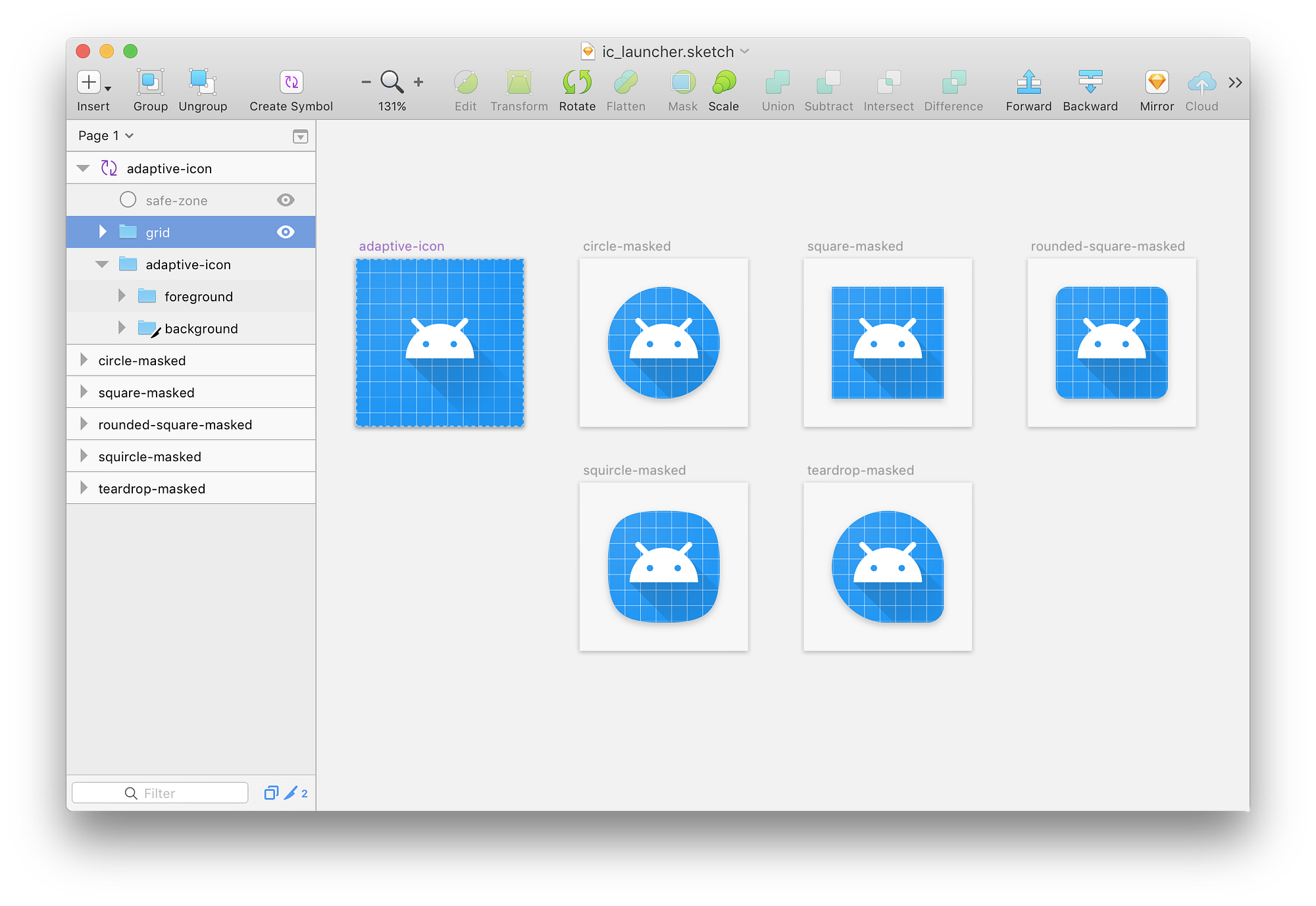
Adaptive icons are 108dp*108dp in size but are masked to a maximum of 72dp*72dp. Different devices can supply different masks which must be convex in shape and may reach a minimum of 33dp from the center in places.
Because of the minimum reach of the mask, you can consider a centered 66dp diameter circle as a safe zone, guaranteed not to be clipped.
Keylines
Keyline shapes are the foundation of the icon grid helping your icon’s visual proportions be consistent with other apps’ icons . The keyline shapes are:
- Circles: 52dp & 36dp diameter
- Square: 44dp*44dp, 4dp corner radius
- Rectangles: 52dp*36dp & 36dp*52dp, 4dp corner radius
See the templates included at the end of this article.
Layers
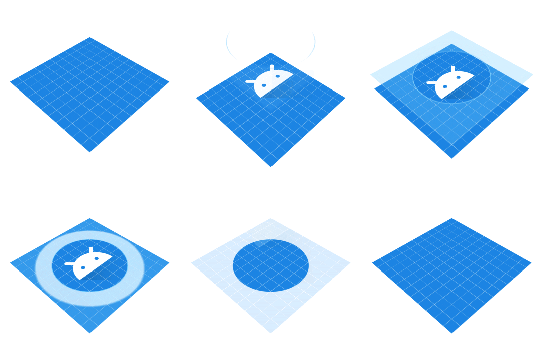
Adaptive icons are actually made up of two layers; a foreground and a background. Both layers are 108dp*108dp; the background must be fully opaque while the foreground may include transparency. These layers are stacked on top of each other.
Providing elements in two separate layers which are larger than the displayed (i.e. masked) size creates the opportunity for interesting visual treatments and animations. Exactly what effects may be applied and when is still something of an open question; it is up to device and launcher makers to decide. Here are some simple examples you could imagine: parallax or pulsing by independently translating or scaling each layer before applying the mask.
As the 108dp*108dp icons are masked up to 72dp*72dp, the outer 18dp on each side can be considered the “extra” content, only revealed during motion.
Design Considerations
The material design guidelines for creating product icons still very much apply. Specifically the icon anatomy, shadows and finish remain, but you can now place elements in either the foreground or background layers yielding different effects.
Now I’m sure that many icons will be well served by placing their brand mark in the foreground on a solid colored background and calling it a day. This will ensure that your icon fits in well on the device. What excites me is how we as a community will explore these new constraints and find interesting, playful and innovative ways to make delightful icons. Here are a few things to keep in mind and a few ideas to potentially explore.
Clipping
Due to the dynamic nature of adaptive icons, you cannot know the exact mask shape that will be applied. For that reason it’s best to place any critical elements like your brand mark inside the safe-zone and to stay away from the mask edges.
Background Anchoring
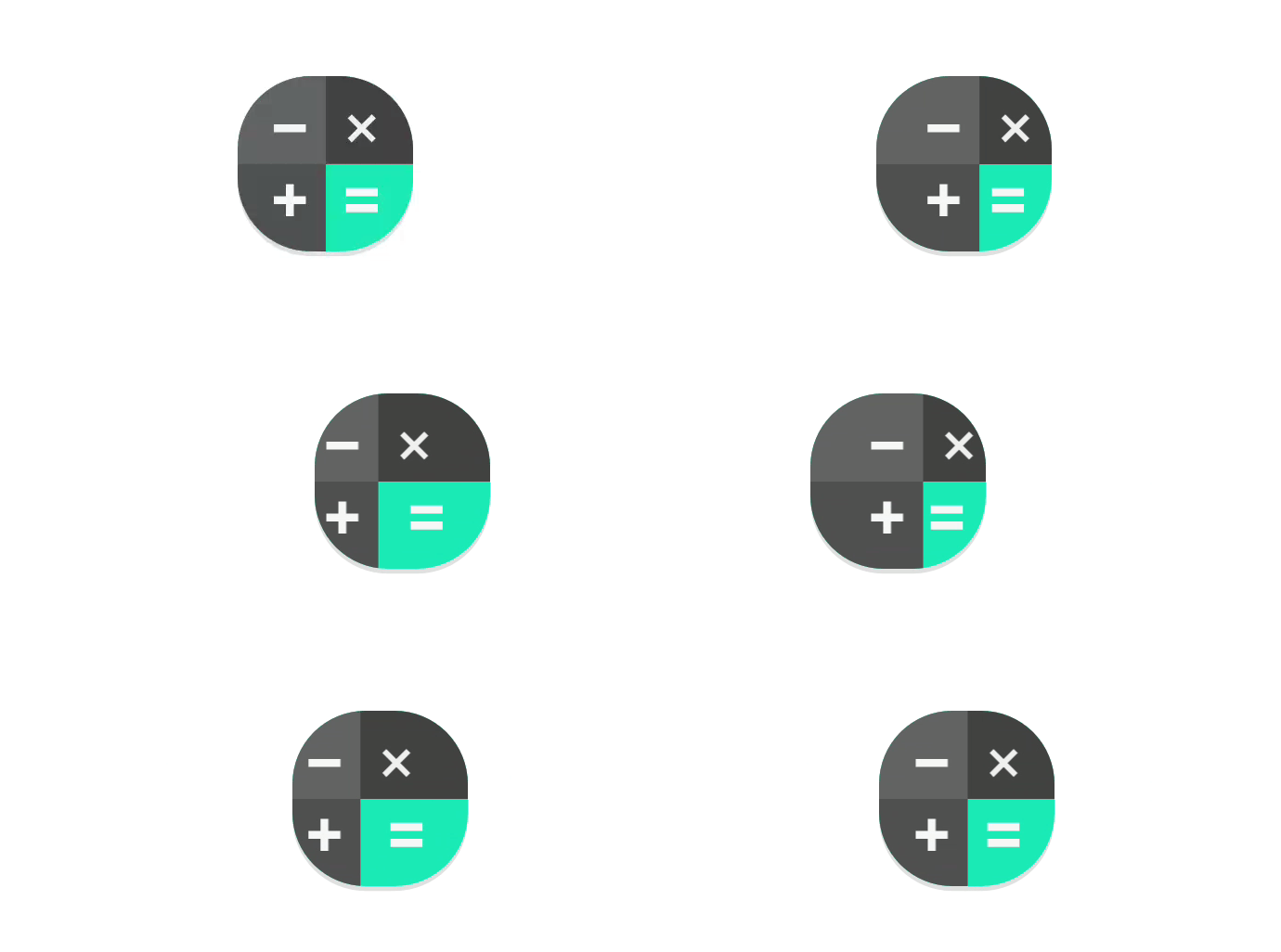
Placing some elements which might appear to be foreground, actually in the background means that they will move independently. For example the calculator app places most elements in the foreground, but the equals button on the accent color block in the background:
This creates interesting opportunities for motion where you visually anchor on the bright color block, but it moves less than the foreground elements, creating a sensation of depth.
Masked masks
I think that there may be interesting opportunities for placing masking elements in the foreground — that is solid elements with areas cut out. Consider a possible icon for the Google Play Store, this might be constructed in an ‘obvious’ manner, that is placing the colored triangle in the foreground atop a white background.
Instead of doing this, we might use a colorful background and a white foreground with the triangle subtracted to produce the same static output:
This setup would allow the colors ‘peeking through’ to move independently of the mask revealing different parts of the background when translated or scaled.
Light & shadows
The interaction of lighting effects and shadows placed in separate layers can have interesting results. For example using the long-shadow technique on the foreground element can have a playful interaction as it moves within the masked area. Similarly lighting effects can be placed in the foreground layer rather than being baked into the background. For example, a ‘finish’ layer can be placed in the foreground to emulate a light source. Placing this in the foreground means that it will play over the background layer when under motion, moving at a different rate to it.
Be careful not to create an effect that doesn’t make sense e.g. a shadow detaching from a foreground element or moving behind a background element. Also remember that many icons are likely to be seen together so be conservative with bespoke lighting effects and stick close to the material guidelines.
Leave behinds
You could place elements in the background layer which are completely obscured by the foreground layer and only revealed under motion.
Resources and tools
Here is my sketch file which you can use as a template whilst creating adaptive icons. It includes the icon grid, keyline shapes and safe area. It’s implemented as a symbol so changing the master element will update the copies giving you a preview with different masks applied.
I’ve also uploaded an Adobe Illustrator template if that’s more your thing.
Additionally check out these other resources i’ve come across:
Adaptive Icon Playground
In developing adaptive icons, I’ve come to appreciate that many of the subtleties come from the interaction of the foreground and background elements when motion effects are applied. This is still something of an open question as we are yet to see how device and launcher makers will implement this. To help investigate this space, I’ve created a small test app to help you evaluate it whilst creating your icon:
The app displays all applications installed on your device with adaptive icons. Scrolling the grid applies parallax effects to the icons and touching an icon applies a scale effect. You can configure the strength of the effects and change the mask applied to all icons. Hopefully this tool helps you to envisage how your icon will appear and may move on different devices.
You can download an APK or checkout the source on github:
Источник


