- Что нового в ConstraintLayout 1.1
- Android Gradle
- Новый функционал в 1.1
- Проценты
- Цепочки
- Барьеры
- Группы
- Круговые зависимости
- Анимация с ConstraintSet
- Новые оптимизации
- Percentage Width/Height using Constraint Layout
- 📚Learning ConstraintLayout — 🚀Live Templates for Rescue 🚒
- wajahatkarim.com
- Difference between Build Type, Flavour, and Build Variant in Android
- April 25, 2018
- Defining Constants in Gradle
- April 24, 2018
- ConstraintLayout
- Mark Allison
- PercentLayout
- Percent width/height in the editor
- Percent width/height in XML
- Percent margin in the editor
- Percent margin in XML
- Aspect ratio in the editor
- Aspect ratio in XML
Что нового в ConstraintLayout 1.1

ConstraintLayout упрощает создание сложных макетов в Android, позволяя создавать большую часть вашего пользовательского интерфейса с помощью визуального редактора в Android Studio. Его часто называют более мощным RelativeLayout. С помощью ConstraintLayout вы можете избегать множества уровней вложенности при вёрстке сложных экранов.
Недавно была выпущена стабильная версия ConstraintLayout 1.1, и теперь он выглядит очень зрело. Полная его оптимизация ещё больше увеличивает его быстродействие, а новые элементы, такие как барьеры и группы, превращают создание по-настоящему крутого дизайна в достаточно тривиальную задачу.
Android Gradle
Чтобы использовать новые функции в проекте, необходимо добавить ConstraintLayout 1.1 в проект в качестве зависимости:
Новый функционал в 1.1
Проценты
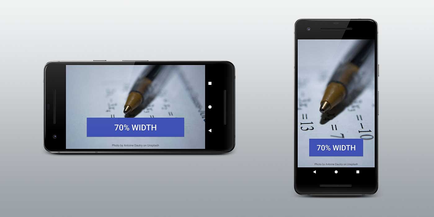
Для того, чтобы View занимала определённый процент экрана, в ConstraintLayout 1.0 было необходимо наличие как минимум двух зависимостей. В ConstraintLayout 1.1 решение этой задачи было упрощено до простого указания процента ширины или высоты.
Ширина кнопки задана в процентах, и она занимает всё свободное пространство и сохраняет свой внешний вид:

Все View-компоненты поддерживают атрибуты layout_constraintWidth_percent и layout_constraintHeight_percent. Они позволяют ограничить View-компонент процентным значением в рамках всего доступного пространства. Таким образом, чтобы кнопка растянулась на 70% в рамках свободного для неё места, необходимо всего несколько строк:
Цепочки
При позиционировании нескольких компонентов с помощью цепочки есть возможность управления пространством между ними. В 1.1 было исправлено несколько ошибок с цепочками и теперь они могут работать с большим количеством View-компонентов. Чтобы создать цепочку, необходимо добавить зависимости в обе стороны от View-компонента:
У главного (head) View-компонента из цепочки доступно свойство app:layout_constraintVertical_chainStyle, которое можно установить в spread, spread_inside или packed.
- spread равномерно распределяет все View-компоненты в цепочке
- spread_inside располагает первый и последний компоненты по краям и равномерно распределяет остальные
- packed группирует все компоненты в центре цепочки
Барьеры
Когда у вас есть несколько View-компонентов, которые могут динамически изменять размер, можно использовать барьер для их ограничения. Барьер можно расположить в начале, в конце, сверху или снизу нескольких компонентов. Это очень похоже на создание виртуальной группы компонентов. Виртуальной, потому что этой группы не существует физически, и, следовательно, она не усложняет иерархию компонентов.
Барьеры действительно полезны, когда вы создаете локализированные строки или отображаете контент, созданный пользователем, размер которого вы не можете предсказать.
Барьеры позволяют создать зависимости от нескольких View-компонентов:
Барьер всегда находится непосредственно за пределами виртуальной группы, и его можно использовать для построения зависимостей с другими View-компонентами. В этом примере View-компонент справа всегда находится в конце самого длинного компонента из виртуальной группы.
Группы
Иногда вам необходимо показывать или скрывать сразу несколько компонентов. Именно для этого в ConstraintLayout были добавлены группы.
Группа не добавляет дополнительного уровня вложенности в иерархию View-компонентов. Группа — это просто способ виртуального объединения. В примере ниже мы объединяем profile_name и profile_image под одним id — profile.
Это полезно, когда у вас есть несколько компонентов, которые отображаются или скрываются вместе.
После того как вы создали группу profile, вы можете менять видимость целой группе, и она будет применяться как к profile_name, так и к profile_image.
Круговые зависимости
В ConstraintLayout большинство зависимостей и ограничений задаются размерами экрана – горизонтальными и вертикальными. В Constraint Layout 1.1 появился новый тип зависимости – constraintCircle, который позволяет указывать зависимости по кругу. Вместо горизонтальных и вертикальных отступов можно указать угол и радиус круга. Это удобно для View-компонентов, смещённых под углом, таких как радиальное меню!
При создании круговых зависимостей углы начинаются сверху и изменяются по часовой стрелке. Например, таким образом нужно описать среднюю кнопку в примере выше:
Анимация с ConstraintSet
ConstraintLayout можно использовать вместе с ConstraintSet для одновременного анимирования нескольких элементов. ConstraintSet работает только с зависимостями из ConstraintLayout. ConstraintSet можно создать в коде или добавить прямо в xml-файл.
Для начала анимации используйте TransitionManager.beginDelayedTransition()` из support library. Эта функция запустит все анимации определённые в ConstraintSet**.
В этом видео можно узнать немного больше по этой теме:
Новые оптимизации
ConstraintLayout 1.1 добавляет несколько новых оптимизаций, которые повышают его быстродействие. Оптимизации выполняются для того, чтобы уменьшить количество зависимостей, необходимых для расположения View-компонентов на экране.
Суть оптимизаций заключается в избавлении от избыточных констант в макетах.
Появился новый атрибут — layout_optimizationLevel, который настраивает уровень оптимизации. Ему можно задать следующие значения:
- barriers определяет местоположение барьеров и заменяет их более простыми зависимостями
- direct оптимизирует компоненты, непосредственно подключенные к другим фиксированным компонентам, например сторонам экрана, и продолжает оптимизировать любые компоненты, непосредственно связанные с ними
- standard — это оптимизация по умолчанию, которая включает в себя barriers и direct
- dimensions в настоящее время является экспериментальной оптимизацией и может приводить к некоторым проблемам. Оптимизирует макет путем вычисления размеров
- chains в настоящее время также на экспериментальной стадии. Оптимизирует построение цепочек компонентов с фиксированными размерами
Если вы хотите опробовать экспериментальные оптимизации dimensions и chains, вам необходимо включить их в ConstraintLayout с помощью
Источник
Percentage Width/Height using Constraint Layout
UPDATE: I’ve started a new articlw series on ConstraintLayout to discuss tips and tricks regularly. Here’s the first article about it.
📚Learning ConstraintLayout — 🚀Live Templates for Rescue 🚒
Save time and improve productivity by using Live Templates for ConstraintLayout
wajahatkarim.com
Constraint Layout 1.1 was recently released as stable and there’s a lot to love. A complete overhaul of optimization makes most layouts run even faster than before and new features like barriers and groups make real-world designs simple! You can add it using this line in your android projects:
There has been lots of new features in version 1.1, but we will talk about the percentage feature here. In Constraint Layout 1.0 making a view take up a percentage of the screen required making two guidelines. In Constraint Layout 1.1 it’s been made simpler by allowing you to easily constrain any view to a percentage width or height.
Isn’t this fantastic? All views support layout_constraintWidth_percent and layout_constraintHeight_percent attributes. These will cause the constraint to be fixed at a percentage of the available space. So making a Button or a TextView expand to fill a percent of the screen can be done with a few lines of XML.
For example, if you want to set the width of the button to 70% of screen, you can do it like this:
Please note that you will have to put the dimension should be used as percentage to 0dp as we have specified android:layout_width to 0dp above.
Similarly, if you want to set the height of the button to 20% of screen, you can do it like this:
See! we have specified android:layout_height to 0dp this time as we want button to use height as percentage.
If you liked this article, you can read my new articles below:
Difference between Build Type, Flavour, and Build Variant in Android
Build Type Build Type refers to build and packaging settings like signing configuration for a project. For example, debug and release build types. The debug will use android debug certificate for packaging the APK file.
April 25, 2018
Defining Constants in Gradle
Every android app has some global constants values such as Base URL, API keys etc. Usually, developers define these constants in any AppConstants.java file as static final variables, or they define these in strings.
April 24, 2018


7 years experience. 💻 Creator of various Open Source libraries on Android . 📝 Author of two technical books and 100+ articles on Android. 🎤 A passionate Public Speaker giving talks all over the world.
Источник
ConstraintLayout
Mark Allison
 v2.4 alpha 7 All of the examples in this article have been created using Android Studio v2.4 alpha 7.
You may see differences if you are using a different version.
 v1.1+ All of the examples in this article have been created using ConstraintLayout v1.1+.
You may see differences if you are using a different version.
PercentLayout
PercentLayout is generally used in responsive designs to size child views to a percentage of the parent layout’s size.
Percent width/height in the editor
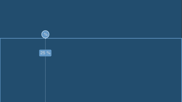
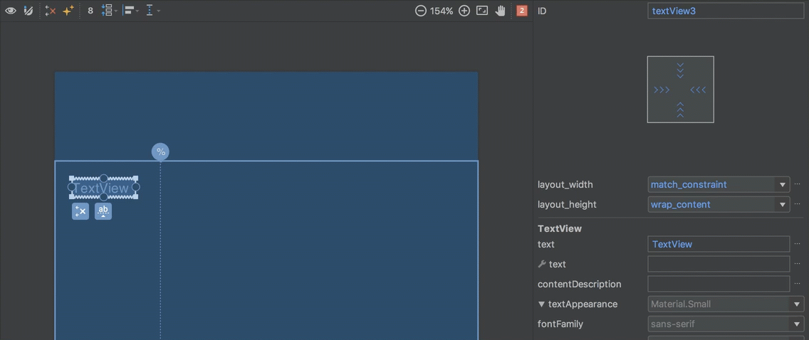
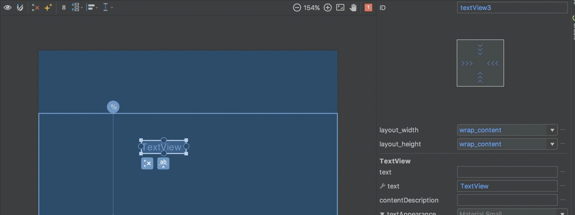
The first use-case of PercentLayout that we’ll cover is specifying the width or height of a child view as a percentage of the parent. This is done using the app:layout_widthPercent and app:layout_heightPercent attributes (note the use of the app namespace here because PercentLayout is provided in a support library). To achive this we create a guideline which corresponds to the percentage of the parent. For example, to achieve app:layout_widthPercent=»25%» we first create a guideline at 25% of the width of the parent:
Now we just need to constrain a view to the start edge of the parent, and the guideline. I am using start in favour of left to ensure that we behave nicely for RTL languages.
We need to make sure that the android:layout_width is set to either match_constraint or 0dp (they are, in fact, the same thing), and remove any margins. Then the view will always be sized to 25% of the parent:
Percent width/height in XML
The XML for this is as follows:
All of the actual work is done by the guideline, it’s just a case of constraining the view to it, and we get the desired width.
Percent margin in the editor
PercentLayout also allows us to create a margin as a percentage of the parent. Once again we need to create a guideline to represent the margin that we’re after, but instead of using it to set the width of a view, we create the constraint slightly differently to create the equivalent of a percentage margin. For example to achieve app:layout_marginStartPercent=»25%» , we would create a guideline at 25% of the parent width and then align the start edge of a view to it:
In this case we’ve left android:layout_width=»wrap_content» and, once again, we remove any margin and the view will be positioned with a start margin at 25% of the parent width.
Percent margin in XML
In XML the guideline is identical to the previous example:
The difference is in how we constrain the view to it. In this case we specify app:layout_constraintStart_toStartOf=»@+id/guideline» and set the android:layout_width and android:layout_marginStart as described for the editor.
Aspect ratio in the editor
The final use-case of PercentLayout that we’ll cover is how to make the height of a view a function of its width, or vice versa. There is a much fuller explanation of how this works in ConstraintLayout here. We specify a ratio of the view and ensure that both the android:layout_width and android:layout_height are set to match_constraint or 0dp :
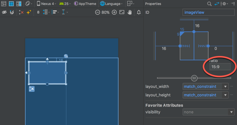
Then if we constrain both horizontal edges, but leave at least one of the vertical edges unconstrained, then we make the height dependent on the width, and changing the width will also change the height while maintaining the aspect ratio:
Aspect ratio in XML
In XML, we must follow the same rules for the constraints as with the editor, and it is the app:layout_constraintDimensionRatio attribute that is doing the magic here:
Once again a fuller explanation of this can be found in the article on dimensions.
Источник


