- Android: выдвигающийся экран снизу
- Зависимости
- Создание макетов
- Container view
- Динамическое управление
- Прикрепление элементов к нижнему экрану
- Скрытие плавающей кнопки при скроле
- Hands-on with Material Components for Android: Bottom Sheets
- Part 3 of a series covering practical usage of Material Components for Android
- Setting up a Material Components theme for Android
- Attribute by attribute
- Basic usage 🏁
- Standard Bottom Sheet
- Modal Bottom Sheet
- Adjusting behavior ⚙️
- Applying attributes
- The attributes
- A word on modal dismiss animations
- Setting (and saving) state 💾
- Setting state
- Retaining attribute state on configuration change
- Listening for state change and slide callbacks 👂
- Theming 🎨
- Color
- Typography
- Shape
- More resources 📚
- Bottom Sheets – Material Components for Android
- Types of Bottom Sheets
- Persistent bottom sheets
- Modal Bottom Sheets
- Persistent bottom sheets with example
- attributes
- Setting bottom sheets attributes programmatically
- Bottom sheets states:
- Handling bottom sheets callbacks
- Modal Bottom Sheets with example
- Showing a modal bottom sheets
- Conclusion
Android: выдвигающийся экран снизу
Данная статья является переводом статьи Emrullah Luleci, а также её продолжения.
Нижний экран (Здесь и далее под «нижним экраном/слоем» будет подразумеваться элемент bottom sheet — прим. пер.) — компонент, выезжающий снизу экрана, который используется для отображения дополнительного контента. Подробнее об этом элементе можно узнать на официальной сайте посвященном материальному дизайну.

Зависимости
Для использования этого элемента, добавьте последние версии библиотек поддержки в свой проект:
Создайте класс наследник от AppCompatActivity:
Создание макетов
Содержимое нижнего экрана
Для удобства воспользуемся макетами. Назовем файл с нижним слоем bottom_sheet.xml.
behavior_peekHeight: Определяет высоту видимой части.
behavior_hideable: Определяет, может ли нижний экран скрываться свайпом вниз.
Container view
Создайте CoordinatorLayout в качестве корневого вью. Добавьте в него прямым наследником bottom_sheet.xml. Элементы app_bar и activity_bottom_sheet_content не имеют прямого отношения к нижнему экрану, поэтому их можно заменить или удалить.
На данном этапе нижний экран должен работать примерно так:
Динамическое управление
Поведением и свойствами нижнего экрана можно также управлять динамически с помощью Java.
Прикрепление элементов к нижнему экрану
Также можно прикрепить вью к нижнему экрану, чтобы прикрепленный элемент перемещался одновременно с нижним слоем.
Добавим Floating Action Button в макет созданный выше. Новый компонент должен являться непосредственным наследником CoordinatorLayout также как и bottom_sheet. Для прикрепления элемента к нижнему экрану необходимо добавить app:layout_anchor с id вью нижнего экрана, а также app:layout_anchorGravity со значением top|end.
Теперь плавающая кнопка закреплена в верхнем углу нашего нижнего экрана и перемещается вместе с ним.
Скрытие плавающей кнопки при скроле
Для скрытия кнопки при скроле необходимо добавить слушатель к нижнему экрану и отображать/скрывать кнопку. Для начала найдем необходимые вью:
Для скрытия кнопки в момент начала скрола и отображения после полного сворачивания нижнего экрана, используйте следующее:
Результат обоих вариантов можно увидеть ниже:
Источник
Hands-on with Material Components for Android: Bottom Sheets
Part 3 of a series covering practical usage of Material Components for Android

This post will be covering the features and API of Bottom Sheet components. To find out how to handle initial setup of Material Components for Android (including the Gradle dependency and creating an app theme), please see my original post:
Setting up a Material Components theme for Android
Attribute by attribute
Bottom Sheets are surface components that hold supplementary screen content. They are anchored to the bottom of a screen (making them ergonomic on mobile/tablet devices) and, similar to Dialogs, are elevated over main screen content. In most cases, they can be expanded/dismissed via a drag up/down gesture.
From a design perspective, there are two types of Bottom Sheets:
- Standard Bottom Sheet: They operate independently to (and allow for simultaneous interaction with) primary screen content. They can be in an expanded, collapsed or hidden state.
- Modal Bottom Sheet: They block primary screen content and must be interacted with or dismissed. A semi-transparent scrim, which can be tapped to dismiss, is displayed behind them to indicate the underlying UI is temporarily inaccessible.

Note: A third type exists: Expanding Bottom Sheet . At the time of writing, the latest release of Material Components for Android is 1.2.0-alpha06 and there is no standard component or class to handle this. A custom implementation could be achieved with something like MotionLayout , but that is outside the scope of this article and won’t be covered.
Basic usage 🏁
Implementing Bottom Sheets is not as simple as using a single component. There exists different classes within Material Components for Android for each type of sheet.
Standard Bottom Sheet
A child View of a CoordinatorLayout can have Standard Bottom Sheet characteristics enabled by using BottomSheetBehavior . In doing so, the bottom anchoring, drag up/down gesture support and animated state transitions and more are handled for us.
This can be done in your screen layout like so:
In the above example, our Bottom Sheet is in fact the FrameLayout . The most important part is that the layout_behavior attribute is set to com.google.android.material.bottomsheet.BottomSheetBehavior . We have also applied some default styling (background shape/tint, elevation, etc.) with the bottomSheetStyle attribute, which will be discussed in more detail below in the “Theming” section.
Modal Bottom Sheet
For Modal Bottom Sheets, the implementation is different. The BottomSheetDialogFragment class (which extends AppCompatDialogFragment ) provides the desired modal behavior in addition to existing DialogFragment functionality.
First of all, a subclass of BottomSheetDialogFragment needs to be created and the onViewCreated callback must be overridden to provide a layout for the contents of the sheet:
Then, inside an AppCompatActivity , the class can be used to show the sheet like so:
It is worth noting that, under the hood, BottomSheetDialogFragment also makes use of BottomSheetBehavior in a BottomSheetDialog class to convert a standard AppCompatDialogFragment to one that has Bottom Sheet characteristics. BottomSheetDialog can be used independently if you don’t want to use a Fragment .
Adjusting behavior ⚙️
There exists a variety of attributes that can be used to adjust the behavior of both Standard and Modal Bottom Sheets. This includes things like “peek” (collapsed) height, hidability, content fitting and more.
Applying attributes
For Standard Bottom Sheets, applying these attributes can be done in XML by applying the attributes to the same child View that has the layout_behavior attribute set to BottomSheetBehavior . In our example above in the “Basic usage” section, this is the FrameLayout .
Alternatively, it can be done programmatically:
For Modal Bottom Sheets there is no XML layout definition for the sheet itself, but we can make use of app-level theme attributes and styles:
Alternatively, it can be done programmatically:
The attributes
Now that we know how to apply attributes, let’s dive into what attributes are available to us.
- behavior_hideable : Determines whether or not the sheet can be hidden when using a drag down gesture (bearing in mind that it can always be hidden programmatically). The default value is false for Standard Bottom Sheets and true for Modal Bottom Sheets.
- behavior_draggable : Determines whether or not the sheet can be collapsed/expanded when using a drag gesture (bearing in mind that a custom way to expand/collapse the sheet will need to be implemented). The default value is true.
- behavior_skipCollapsed : Determines whether or not the collapsed state should be ignored when hiding the sheet. This has no effect if behavior_hideable is not set to true. The default value is false.
- behavior_fitToContents : Determines whether or not the height of the expanded sheet wraps its contents. Alternatively, it expands in two stages: half the height of the parent container, full height of the parent container. The default value is true.
- behavior_halfExpandedRatio : Determines the height of the sheet (as a ratio of the parent container height) when in half-expanded state. This has no effect if behavior_fitToContents is not set to false and should be greater than the peek height. The default value is 0.5 (the recommended ratio in the Material Guidelines).
- behavior_expandedOffset : Determines the offset of the sheet from the top of the parent container when in expanded state. This has no effect if behavior_fitToContents is not set to false and should be greater than the offset when in half-expanded state. The default value is 0dp (the top of the sheet matches the top of the parent container).
- behavior_peekHeight : The initial “peek” (collapsed state) height of the sheet. The default value is auto , which sets the peek height at the 16:9 ratio keyline of the parent container. A dimension (or pixel value, programmatically) can otherwise be used.

A word on modal dismiss animations
You might notice that, for modal bottom sheets (i.e. BottomSheetDialog or BottomSheetDialogFragment ), the animation used when calling dismiss() does not match the normal drag-to-dismiss animation. As of Material Components for Android 1.1.0-alpha10 , there exists an opt-in flag to align these animations:
Setting (and saving) state 💾
The state of a Bottom Sheet can be changed via user interaction, but we can also do so programmatically. By default, these state changes are animated.
Setting state
The following states can be set on a BottomSheetBehavior :
- STATE_EXPANDED : The sheet is fully expanded.
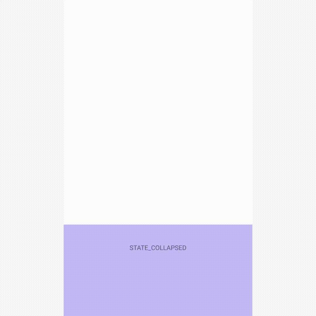
- STATE_COLLAPSED : The sheet is collapsed (“peeking”).
- STATE_HIDDEN : The sheet is hidden and can only be re-shown programmatically.
- STATE_HALF_EXPANDED : The sheet is half-expanded (only applicable if behavior_fitToContents has been set to false).
This can be done like so:
While these should not be set programmatically, a BottomSheetBehavior can also be in one of the following states:
- STATE_DRAGGING : The sheet is being dragged up/down via a gesture.
- STATE_SETTLING : The sheet is animating up/down as a result of programmatically setting its state.
Retaining attribute state on configuration change
We can choose which aspects of state we wish to preserve when the host Activity experiences a configuration change (i.e. the View representing our Bottom Sheet is destroyed and recreated). In this case, “state” refers to the attributes discussed in the “Adjusting behavior” section above.
The following flags can be set (or combined with bitwise OR operations) on a BottomSheetBehavior :
- SAVE_PEEK_HEIGHT : The behavior_peekHeight attribute will be preserved.
- SAVE_FIT_TO_CONTENTS : The behavior_fitToContents attribute will be preserved.
- SAVE_HIDEABLE : The behavior_hideable attribute will be preserved.
- SAVE_SKIP_COLLAPSED : The behavior_skipCollapsed attribute will be preserved.
- SAVE_ALL : All aforementioned attributes will be preserved.
- SAVE_NONE : No attributes will be preserved. This is the default value.
This can be done like so:
There is also a corresponding behavior_saveFlags XML attribute which can be used in layouts and styles.
Listening for state change and slide callbacks 👂
We can listen for changes to Bottom Sheet state as well as the current slide offset. This can be used to coordinate other UI changes, such as fading in/out other View s, adjusting system bar color, etc.
A BottomSheetCallback can be added to a BottomSheetBehavior like so:
In the onStateChanged callback, the newState parameter will be one of the state constants discussed above in the “Setting (and saving) state” section.
In the onSlide callback, the slideOffset parameter is a Float value in the [-1.0, 1.0] range. Hidden state is -1.0, collapsed state is 0.0 and expanded state is 1.0. The value interpolates linearly and increases as the sheet moves upwards.
Note: Multiple callbacks can be added (and removed via BottomSheetBehavior#removeBottomSheetCallback ).
Theming 🎨
Bottom Sheets can be themed in terms of the three Material Theming subsystems: color, typography and shape. For Standard Bottom Sheets, there are no existing style variants but we can create our own. When implementing a global Standard Bottom Sheet style, reference it in your app theme with the bottomSheetStyle attribute. For Modal Bottom Sheets, we have already shown which styles/attributes to use in the “Adjusting behavior” section above. Theming attributes are applicable to both sheet types.
Color
The color of a Bottom Sheet background can be customized with the backgroundTint attribute. This defaults to colorSurface .

Typography
There is no primary text as part of Bottom Sheet components. Text included in the contents of a Bottom Sheet will be styled according to the class/component used as well as the fontFamily app theme attribute.

Shape
The shape of a Bottom Sheet background can be customized with the shapeAppearance attribute. This defaults to shapeAppearanceLargeComponent .

More resources 📚
- The source code for the Playground app used in this article can be found on GitHub.
- Bottom Sheets Design Documentation
- Bottom Sheet API Documentation
- Modal Bottom Sheet API Documentation
I hope this post has provided some insight into Bottom Sheets and how they can be used in your Android app(s). If you have any questions, thoughts or suggestions then I’d love to hear from you!
Источник
Bottom Sheets – Material Components for Android
Android Bottom Sheet is the Android Materiel Design Components which slides up from the bottom of the screen. Also, part of the material design components. Bottom sheets are displayed as a result of the user-triggered action, and also it can reveal additional content by swiping up.
Already, I have explained some of the material components in detail. check below,
Table of Contents
Types of Bottom Sheets
There are two types of Bottom Sheets available in android:
Persistent bottom sheets
BottomSheetBehavior is applied to a child of CoordinatorLayout to make that child a persistent bottom sheet.
The Persistent bottom sheets display in-app content. It will be displayed at the bottom of the screen making some portion of the content visible.
Modal Bottom Sheets
slides up from the bottom of the screen to reveal more content. It’s a dialog which are alternatives to content choosers, simple menus, or dialog. Used to present deep-linked content from other apps.
Lets see both bottom sheets in details.
This is my example demo using bottom sheets in android.
Persistent bottom sheets with example
As mentioned above, the bottom sheets part of the android material design library. Make sure you have included the library in your project.
BottomSheetBehavioris a type of layout_behavior used for persistent bottom sheets. It requires setting CoordinatorLayout as the root element of that layout.
Adding the xml attribute app:layout_behavior:android.support.design.widget.BottomSheetBehavior to the child view.
attributes
behavior_peekHeight — The initial “peek” (collapsed state) height of the sheet. The default value is auto, which sets the peek height at the 16:9 ratio keyline of the parent container.
behavior_hideable — Determines whether or not the sheet can be hidden when using a drag-down gesture. The default value is false for Standard Bottom Sheets and true for Modal Bottom Sheets.
behavior_draggable — Determines whether or not the sheet can be collapsed/expanded when using a drag gesture. The default value is true.
behavior_skipCollapsed — Determines whether or not the collapsed state should be ignored when hiding the sheet. This has no effect if behavior_hideable is not set to true. The default value is false.
Setting bottom sheets attributes programmatically
Bottom sheets states:
Bottom sheets have 5 states,
STATE_COLLAPSED — The bottom sheet is visible but only showing its peek height.

STATE_EXPANDED — The bottom sheet is visible and its maximum height and it is neither dragging nor settling (see below).

STATE_DRAGGING — Sheet can be collapsed/expanded when using a drag gesture.
STATE_SETTLING — The bottom sheet is settling to a specific height after a drag/swipe gesture. This will be the peek height, expanded height, or 0, in case the user action caused the bottom sheet to hide.
STATE_HIDDEN — The bottom sheet is no longer visible.

STATE_HALF_EXPANDED — The sheet is half-expanded (only applicable if behavior_fitToContents has been set to false).
changing the bottom sheets state programatically,
Handling bottom sheets callbacks
In the onStateChanged callback, the newState parameter will be the current state of the bottom sheets.
In the onSlide callback, the slideOffset parameter is a Float value in the [-1.0, 1.0] range. The hidden state is -1.0, the collapsed state is 0.0 and the expanded state is 1.0. The value interpolates linearly and increases as the sheet moves upwards.
Modal Bottom Sheets with example
Modal Bottom Sheets are not part of the view layout like Persistent sheets. Instead, they will be shown dynamically using BottomSheetDialog or BottomSheetDialogFragment.
Before creating our BottomSheetDialogFragment however, let’s create the layout for the dialog.
layout_modal_bottomsheet.xml
design for this xml:
I am using recyclerview to display all the items in the bottom sheets dialog fragment.
I have explained recyclerview in details in my another post.
We need to create a class that inherits from BottomSheetDialogFragment.
Lets create MyBottomSheetDialogFragment with recyclerview.
Showing a modal bottom sheets
To show a modal bottom sheet, create MyBottomSheetDialogFragment instance and call the show() method on that class.
Note that we did not set the behavior for the modal sheet to be hideable, nor did we set the peek height. The modal bottom sheet automatically computes appropriate values for both peek height and expanded height.
You can download this example on GITHUB.
Conclusion
Thanks for reading.
Please share if you like it. Also, don’t forget to share your feedback on comments.
Источник


