Drawable Resources
See also
A drawable resource is a general concept for a graphic that can be drawn to the screen and which you can retrieve with APIs such as getDrawable(int) or apply to another XML resource with attributes such as android:drawable and android:icon . There are several different types of drawables:
Bitmap File A bitmap graphic file ( .png , .jpg , or .gif ). Creates a BitmapDrawable . Nine-Patch File A PNG file with stretchable regions to allow image resizing based on content ( .9.png ). Creates a NinePatchDrawable . Layer List A Drawable that manages an array of other Drawables. These are drawn in array order, so the element with the largest index is be drawn on top. Creates a LayerDrawable . State List An XML file that references different bitmap graphics for different states (for example, to use a different image when a button is pressed). Creates a StateListDrawable . Level List An XML file that defines a drawable that manages a number of alternate Drawables, each assigned a maximum numerical value. Creates a LevelListDrawable . Transition Drawable An XML file that defines a drawable that can cross-fade between two drawable resources. Creates a TransitionDrawable . Inset Drawable An XML file that defines a drawable that insets another drawable by a specified distance. This is useful when a View needs a background drawble that is smaller than the View’s actual bounds. Clip Drawable An XML file that defines a drawable that clips another Drawable based on this Drawable’s current level value. Creates a ClipDrawable . Scale Drawable An XML file that defines a drawable that changes the size of another Drawable based on its current level value. Creates a ScaleDrawable Shape Drawable An XML file that defines a geometric shape, including colors and gradients. Creates a ShapeDrawable .
Also see the Animation Resource document for how to create an AnimationDrawable .
Note: A color resource can also be used as a drawable in XML. For example, when creating a state list drawable, you can reference a color resource for the android:drawable attribute ( android:drawable=»@color/green» ).
Bitmap
A bitmap image. Android supports bitmap files in three formats: .png (preferred), .jpg (acceptable), .gif (discouraged).
You can reference a bitmap file directly, using the filename as the resource ID, or create an alias resource ID in XML.
Note: Bitmap files may be automatically optimized with lossless image compression by the aapt tool during the build process. For example, a true-color PNG that does not require more than 256 colors may be converted to an 8-bit PNG with a color palette. This will result in an image of equal quality but which requires less memory. So be aware that the image binaries placed in this directory can change during the build. If you plan on reading an image as a bit stream in order to convert it to a bitmap, put your images in the res/raw/ folder instead, where they will not be optimized.
Bitmap File
A bitmap file is a .png , .jpg , or .gif file. Android creates a Drawable resource for any of these files when you save them in the res/drawable/ directory.
file location: res/drawable/filename.png ( .png , .jpg , or .gif )
The filename is used as the resource ID. compiled resource datatype: Resource pointer to a BitmapDrawable . resource reference: In Java: R.drawable.filename
In XML: @[package:]drawable/filename example: With an image saved at res/drawable/myimage.png , this layout XML applies the image to a View:
The following application code retrieves the image as a Drawable :
XML Bitmap
An XML bitmap is a resource defined in XML that points to a bitmap file. The effect is an alias for a raw bitmap file. The XML can specify additional properties for the bitmap such as dithering and tiling.
Note: You can use a element as a child of an element. For example, when creating a state list or layer list, you can exclude the android:drawable attribute from an element and nest a inside it that defines the drawable item.
file location: res/drawable/filename.xml
The filename is used as the resource ID. compiled resource datatype: Resource pointer to a BitmapDrawable . resource reference: In Java: R.drawable.filename
In XML: @[package:]drawable/filename syntax: elements: Defines the bitmap source and its properties.
xmlns:android String. Defines the XML namespace, which must be «http://schemas.android.com/apk/res/android» . This is required only if the is the root element—it is not needed when the is nested inside an . android:src Drawable resource. Required. Reference to a drawable resource. android:antialias Boolean. Enables or disables antialiasing. android:dither Boolean. Enables or disables dithering of the bitmap if the bitmap does not have the same pixel configuration as the screen (for instance: a ARGB 8888 bitmap with an RGB 565 screen). android:filter Boolean. Enables or disables bitmap filtering. Filtering is used when the bitmap is shrunk or stretched to smooth its apperance. android:gravity Keyword. Defines the gravity for the bitmap. The gravity indicates where to position the drawable in its container if the bitmap is smaller than the container.
Must be one or more (separated by ‘|’) of the following constant values:
| Value | Description |
|---|---|
| top | Put the object at the top of its container, not changing its size. |
| bottom | Put the object at the bottom of its container, not changing its size. |
| left | Put the object at the left edge of its container, not changing its size. |
| right | Put the object at the right edge of its container, not changing its size. |
| center_vertical | Place object in the vertical center of its container, not changing its size. |
| fill_vertical | Grow the vertical size of the object if needed so it completely fills its container. |
| center_horizontal | Place object in the horizontal center of its container, not changing its size. |
| fill_horizontal | Grow the horizontal size of the object if needed so it completely fills its container. |
| center | Place the object in the center of its container in both the vertical and horizontal axis, not changing its size. |
| fill | Grow the horizontal and vertical size of the object if needed so it completely fills its container. This is the default. |
| clip_vertical | Additional option that can be set to have the top and/or bottom edges of the child clipped to its container’s bounds. The clip is based on the vertical gravity: a top gravity clips the bottom edge, a bottom gravity clips the top edge, and neither clips both edges. |
| clip_horizontal | Additional option that can be set to have the left and/or right edges of the child clipped to its container’s bounds. The clip is based on the horizontal gravity: a left gravity clips the right edge, a right gravity clips the left edge, and neither clips both edges. |
android:mipMap Boolean. Enables or disables the mipmap hint. See setHasMipMap() for more information. Default value is false. android:tileMode Keyword. Defines the tile mode. When the tile mode is enabled, the bitmap is repeated. Gravity is ignored when the tile mode is enabled.
Must be one of the following constant values:
| Value | Description |
|---|---|
| disabled | Do not tile the bitmap. This is the default value. |
| clamp | Replicates the edge color if the shader draws outside of its original bounds |
| repeat | Repeats the shader’s image horizontally and vertically. |
| mirror | Repeats the shader’s image horizontally and vertically, alternating mirror images so that adjacent images always seam. |
example: see also:
- BitmapDrawable
- Creating alias resources
Nine-Patch
A NinePatch is a PNG image in which you can define stretchable regions that Android scales when content within the View exceeds the normal image bounds. You typically assign this type of image as the background of a View that has at least one dimension set to «wrap_content» , and when the View grows to accomodate the content, the Nine-Patch image is also scaled to match the size of the View. An example use of a Nine-Patch image is the background used by Android’s standard Button widget, which must stretch to accommodate the text (or image) inside the button.
Same as with a normal bitmap, you can reference a Nine-Patch file directly or from a resource defined by XML.
For a complete discussion about how to create a Nine-Patch file with stretchable regions, see the 2D Graphics document.
Nine-Patch File
XML Nine-Patch
An XML Nine-Patch is a resource defined in XML that points to a Nine-Patch file. The XML can specify dithering for the image.
file location: res/drawable/filename.xml
The filename is used as the resource ID. compiled resource datatype: Resource pointer to a NinePatchDrawable . resource reference: In Java: R.drawable.filename
In XML: @[package:]drawable/filename syntax: elements: Defines the Nine-Patch source and its properties.
xmlns:android String. Required. Defines the XML namespace, which must be «http://schemas.android.com/apk/res/android» . android:src Drawable resource. Required. Reference to a Nine-Patch file. android:dither Boolean. Enables or disables dithering of the bitmap if the bitmap does not have the same pixel configuration as the screen (for instance: a ARGB 8888 bitmap with an RGB 565 screen). example:
Layer List
A LayerDrawable is a drawable object that manages an array of other drawables. Each drawable in the list is drawn in the order of the list—the last drawable in the list is drawn on top.
Each drawable is represented by an element inside a single element.
Источник
Использование XML Drawables в приложениях
Если вы хотите использовать PNG- или JPEG-изображения в своём приложении, вы должны будете предоставить несколько копий этих изображений для разных плотностей экрана. При большом количестве таких изображений это может сделать ваше приложение весьма громоздким. Решение здесь — использовать вместо картинок изображения, описанные с помощью XML.
Фактически, XML Drawable это серия команд, которая описывает, как нарисовать изображение на экране. Поэтому они могут изменяться под любую плотность экрана без какой-либо потери качества. Мы можем манипулировать ими даже когда приложение работает.
Недостатком такого подхода может являться то, что такие изображения можно использовать только там, где используются обычные Drawable. Другой проблемой может являться то, что их рисование иногда занимает больше времени, чем рисование растрового изображения. Однако эти минусы не так существенны перед возможностями модифицировать изображения и уменьшить размер APK приложения. В этой статье мы разберём несколько примеров реализации XML Drawable в приложении.
Основные элементы
При рисовании изображения в XML главным тегом является — корневой элемент для геометрической фигуры. Он имеет следующие атрибуты:
- android:shape — тип фигуры. Может принимать значения oval, rectangle, ring, line. Если атрибут не задан, то по умолчанию берётся rectangle.
- android:innerRadius — радиус внутренней части кольца. Используется для ring.
- android:innerRadiusRatio — радиус внутренней части кольца, выраженный как отношение ширины кольца. Используется для ring.
- android:thickness — толщина кольца. Используется для ring.
- android:thicknessRatio — толщина кольца, выраженная как отношение ширины кольца. Используется для ring.
- android:useLevel — true если используется как LevelListDrawable. Обычно должен быть false, иначе ваша фигура может не отобразиться.
Затем внутри тега используются следующие теги:
- — создаёт закруглённые углы для фигуры. Применяется только тогда, когда в атрибуте android:shape задано значение rectangle. Атрибуты:
- android:radius — радиус закругления углов. В данном случае все углы будут иметь одинаковый радиус, однако вы можете переопределить радиус отдельно для каждого угла с помощью атрибутов ниже.
- android:topLeftRadius — верхний левый угол.
- android:topRightRadius — верхний правый угол.
- android:bottomLeftRadius — нижний левый угол.
- android:bottomRightRadius — нижний правый угол.
- — задаёт параметры градиента для фигуры. Атрибуты:
- android:angle — угол для градиента, в градусах. Должен быть кратным 45.
- android:centerX — смещение X-координаты относительно центра градиента.
- android:centerY — смещение Y-координаты относительно центра градиента.
- android:startColor — начальный цвет градиента.
- android:centerColor — дополнительный цвет, который находится между начальным и конечным цветами.
- android:endColor — конечный цвет градиента.
- android:gradientRadius — радиус градиента. Применяется только при типе градиента radial,
- android:useLevel — true, если используется как LevelListDrawable.
- android:type — тип градиента. Может иметь следующие значения: linear — линейный градиент (по умолчанию); radial — радиальный, начальный цвет находится в центре; sweep — развёрточный градиент, который идёт по кругу вокруг центра.
- — заполняет фигуру сплошным цветом. Атрибуты:
- android:color — цвет заливки.
- — рисует линию для фигуры. Можно рассматривать как границу фигуры. Атрибуты:
- android:width — толщина линии.
- android:color — цвет линии.
- android:dashWidth — толщина каждого штриха. Работает только в случае, если задан атрибут android:dashGap.
- android:dashGap — расстояние между штрихами. Работает только в случае, если задан атрибут android:dashWidth.
- — задаёт размер фигуры. Атрибуты:
- android:width — ширина фигуры.
- android:height — высота фигуры.
-
— отступы, применяемые к содержимому элемента View. Меняет отступы только View, не самой фигуры. Атрибуты:
- android:left — отступ слева.
- android:right — отступ справа.
- android:top — отступ сверху.
- android:bottom — отступ снизу.
Теперь, когда мы знаем, из каких элементов составляются изображения, посмотрим несколько примеров того, как можно.
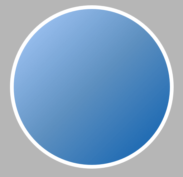
Круг с градиентом
Вы можете использовать XML Drawables для создания элементов дизайна или функциональных элементов интерфейса. Например, можно нарисовать вот такой круг и залить его градиентом.
В результате получим вот такое изображение.
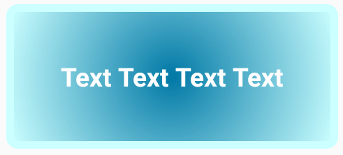
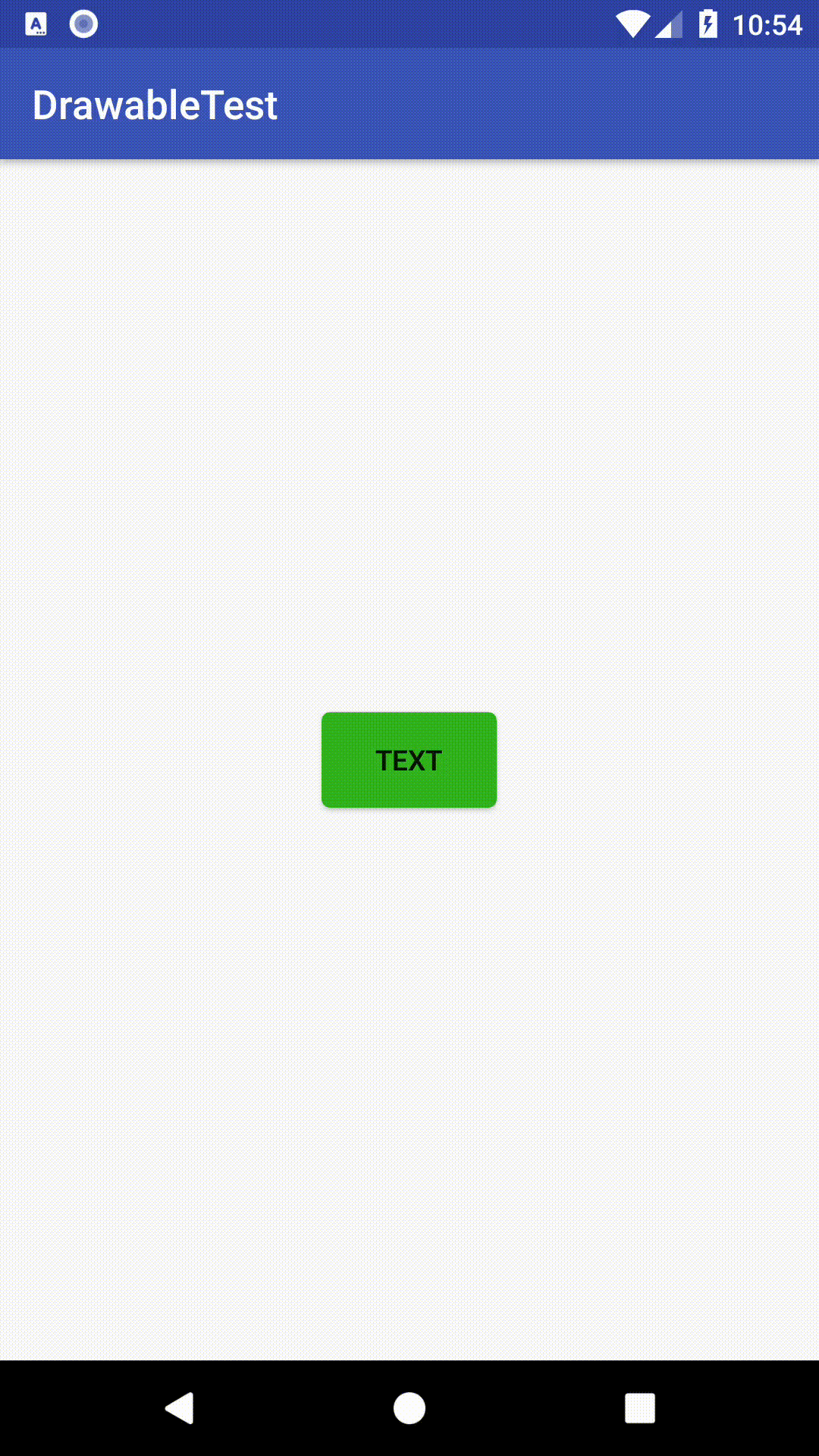
Фон для кнопки
Кнопкам в Android можно задавать различный фон, в том числе и собственноручно нарисованный. Это довольно просто и не требует особо большого количества элементов. Например, кнопку ниже можно использовать для навигации в приложении.

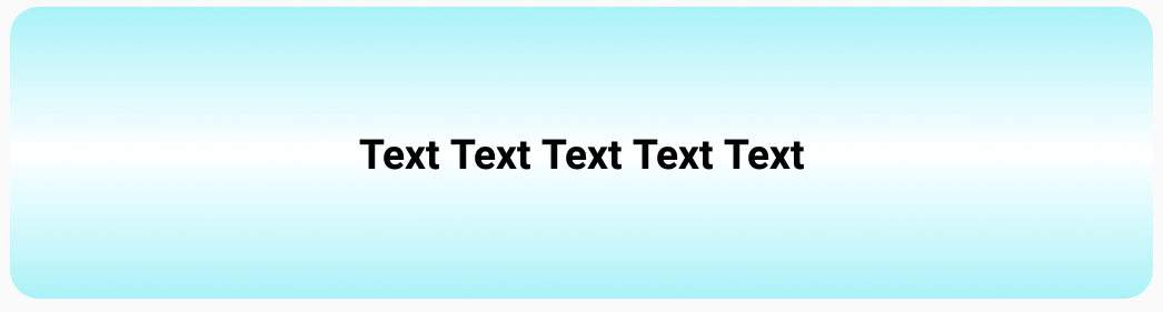
Фон для текста
Аналогично кнопка, TextView также можно задать любой фон. Например, вот так:
Использование Layer List
Бывают ситуации, когда нужно составить изображение из разных фигур. Это возможно с помощью тега , который позволяет комбинировать элементы . Каждый элемент внутри рисуется в порядке списка — последний в списке рисуется поверх остальных слоёв. Каждая фигура помещает в тег , который представляет собой элемент списка.
Например, можно создать вот такую комбинацию из двух эллипсов, которую можно использовать как метку для маркированного списка.

А с помощью кода ниже можно создать подобие почтовой марки:

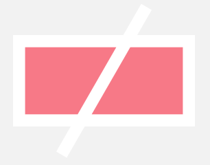
Использовать фигуры одного типа необязательно, можно использовать разные типы. Нарисуем иконку, комбинирующую прямоугольник и линию, перечёркивающую его.
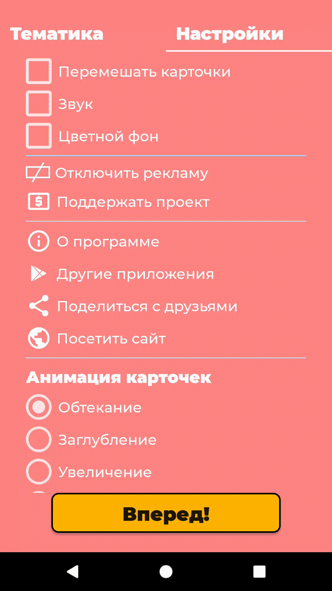
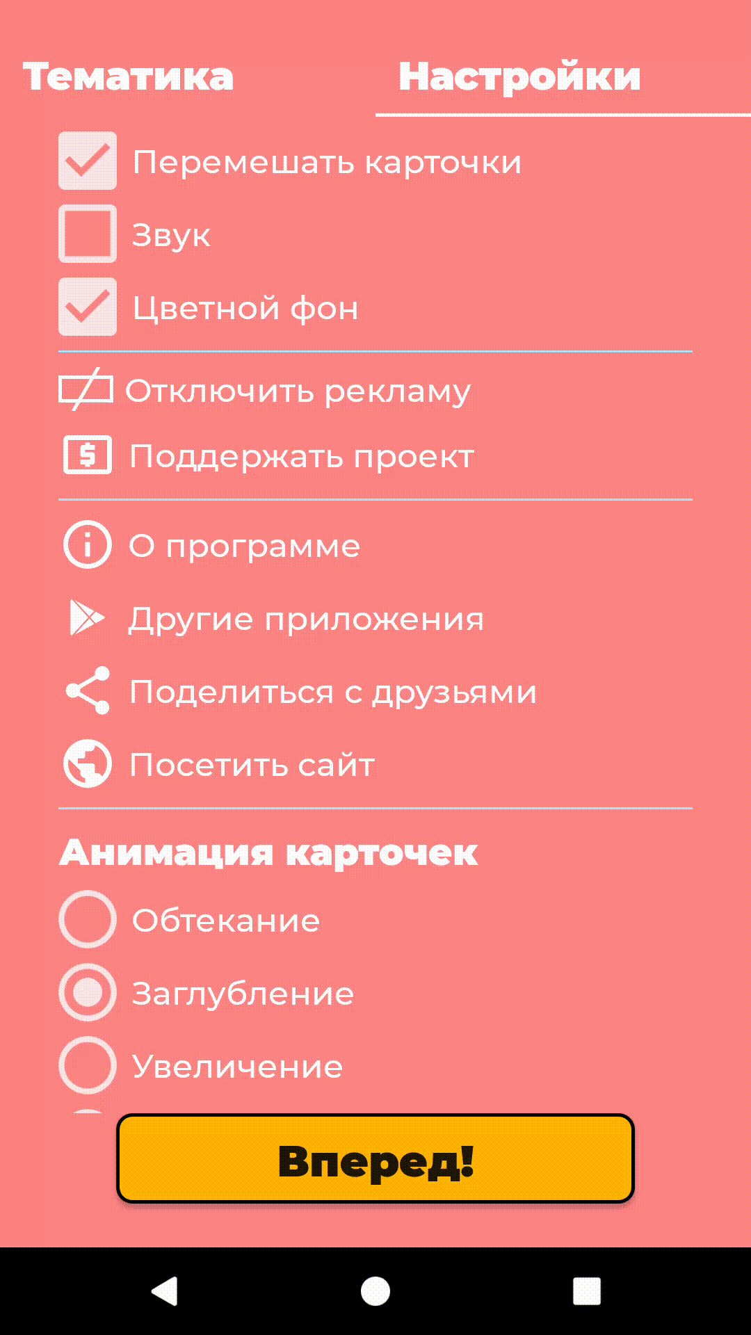
StateDrawable
У некоторых элементов интерфейса существуют различные состояния, с которыми можно работать. Например, у Button можно отслеживать состояние pressed (нажат) и менять при этом фон кнопки. Для этого создадим селектор, который будет отслеживать состояния кнопки и ставить нужный фон.
У селектора есть следующие атрибуты, определяющие состояние элемента:
- android:state_pressed — когда пользователь нажимает на элемент.
- android:state_focused — когда на элементе установлен фокус ввода.
- android:state_enabled — когда элемент доступен.
- android:state_checked — когда элемент в списке был отмечен.
С помощью значений true\false определяем, какое состояние нужно отследить и в атрибут android:drawable добавляем нужный фон.
button_pressed.xml:
button_focused.xml:
button_enabled.xml:
В результате получим следующую кнопку, которая будет менять свой цвет в зависимости от состояния.
Кнопки это не единственные элементы, у которых можно отслеживать состояния. Например, это можно делать также для элементов RadioButton и CheckBox с помощью атрибута android:state_checked. Например, с помощью кода ниже можно добавить в приложение свою картинку, которой будет отмечаться выбранный элемент CheckBox.
Аналогичным образом отслеживается состояние у RadioButton.
В качестве drawable здесь может быть любое изображение, в нашем приложении «Карточки для детей» с помощью селекторов используются белые галочки и фон.
Также в селекторе вместо изображений можно рисовать свои собственные фигуры, как это показано ниже.
Здесь мы при нажатии на кнопку делаем её чуть темнее.
Как можно увидеть, у XML Drawables есть множество применений, которое ограничивается лишь фантазией разработчика. Рисование своих изображений поможет сделать ваше приложение уникальнее и заметнее среди других.
Использование XML Drawables в приложениях : 1 комментарий
Спасибо за познавательную статью!
А есть ли способ добавить тень контролу в api V17 — 19 ?
Спасибо.
Источник


