Анимация Floating Action Button в Android
С момента возникновения концепции Material design одним из самых простых в реализации элементов стала плавающая кнопка действия — FAB, Floating Action Button. Этот элемент быстро обрёл широчайшую популярность среди разработчиков и дизайнеров. В этой публикации мы рассмотрим, как можно анимировать FAB и сделать её интерактивной. Но сначала разберём, как вообще добавить этот элемент в ваш проект.
FAB выглядит как цветной круг в правом нижнем углу экрана. Если в Android Studio создать новый проект Blank Activity, то в нём автоматически будет сгенерирована плавающая кнопка действия.

Floating Action Button
FAB может быть одного из двух размеров: 56 dp (по умолчанию) или 40 dp. Если вы хотите подробнее изучить принципы использования FAB в дизайне приложения, то обратите внимание на официальные гайдлайны Google.
В самых свежих Android-приложениях FAB реагирует на прокручивание списка элементов. Было бы логичнее скрывать её во время прокручивания. Вот что имеется в виду:
Для отображения этой анимации создадим recyclerView , благодаря которому FAB реагирует на прокручивание. Сегодня доступно немало библиотек, позволяющих добиться этого с помощью пары строк кода. Например:
Здесь использован класс FloatingActionButton.Behavior() , чья основная задача, согласно официальной документации, заключается в перемещении видов FloatingActionButton , чтобы ни один из Snackbar их не перекрывал. Но в нашем случае этот класс является расширенным, так что мы можем его использовать для реализации нужного поведения кнопки.
Что же делает данный класс? При каждой инициализации прокрутки вниз метод onStartNestedScroll() возвращает значение true. После этого метод onNestedScroll() отображает или прячет кнопку, в зависимости от её текущей видимости. Конструктор класса FloatingActionButton.Behavior() является важной частью описанного поведения вида (view) и извлекается из XML-файла.
Добавим в FAB атрибут layout_behavior , содержащий название пакета, а в конце — имя класса. Иначе говоря, в атрибуте должно быть указано точное размещение класса в проекте. Например:
Анимация выглядит хорошо, но можно сделать ещё лучше. Например, чтобы кнопка уходила за пределы экрана во время прокрутки — это более реалистичное поведение:
Здесь используется та же логика, что и в предыдущем варианте, за исключением способа исчезновения FAB. Анимация довольно проста. Кнопка уходит вниз с помощью LinearInterpolator. Расстояние, которое ей нужно пройти, равно высоте кнопки плюс ширина нижнего поля.
Обратите внимание, что в выражениях if отсутствуют проверки View.VISIBLE и View.GONE , поскольку в данном случае вид не скрывается, а лишь уплывает за пределы экрана.
Меню из FAB’ов
Существует немало приложений, авторы которых создали красивые и хорошо работающие меню, состоящие из плавающих кнопок действия.
Давайте сделаем нечто подобное. Для начала создадим макет, содержащий три маленькие кнопки. Они невидимы и расположены в самом низу макета, под главной FAB. Содержимое fab_layout.xml:
Этот макет нужно включить в макет activity под главной FAB.
Теперь нужно добавить анимацию исчезновения и появления каждой из малых кнопок.
Примечание: здесь вы можете столкнуться с проблемой, связанной с отработкой нажатия на малые кнопки. Когда анимация завершается, реальное положение кнопки не меняется, перемещается только вид. Поэтому вы не сможете правильно обработать касание кнопки. Для решения этой проблемы можно настроить параметры макетов каждой кнопки с учётом их нового положения, и только потом выполнять анимацию перемещения вида.
Саму анимацию вы можете посмотреть в конце этой публикации. Порядок действий для всех кнопок один и тот же, различаются лишь координаты перемещения.
fab1 перемещается с помощью добавления в layoutParams полей справа и снизу, после чего инициируется анимация.
FrameLayout.LayoutParams layoutParams = (FrameLayout.LayoutParams) fab1.getLayoutParams();
layoutParams.rightMargin -= (int) (fab1.getWidth() * 1.7);
layoutParams.bottomMargin -= (int) (fab1.getHeight() * 0.25);
fab1.setLayoutParams(layoutParams);
fab1.startAnimation(hide_fab_1);
fab1.setClickable(false);
Процесс скрывания представляет собой обратное воспроизведение предыдущей анимации.
//Анимации одной из малых кнопок
Animation show_fab_1 = AnimationUtils.loadAnimation(getApplication(), R.anim.fab1_show);
Animation hide_fab_1 = AnimationUtils.loadAnimation(getApplication(), R.anim.fab1_hide);
Теперь создадим в папке res/anim/ файлы для каждой из анимаций. Делается это просто, но если у вас возникнут затруднения, то можете обратиться к документации.
Если вы посмотрите на тэг перевода (translate tag), отвечающий за движение вида, то увидите, что коэффициент перемещения (170% и 25%) соответствует коэффициентам, использованным при добавлении полей и извлечённым в Java-код.
Все вышеописанные шаги мы повторяем и для остальных малых кнопок. Различаются только коэффициенты перемещения: fab2 — 150% и 150%, fab3 — 25% и 170%.
Источник
How to add Extended Floating Action Button in Android | Android Studio | Java

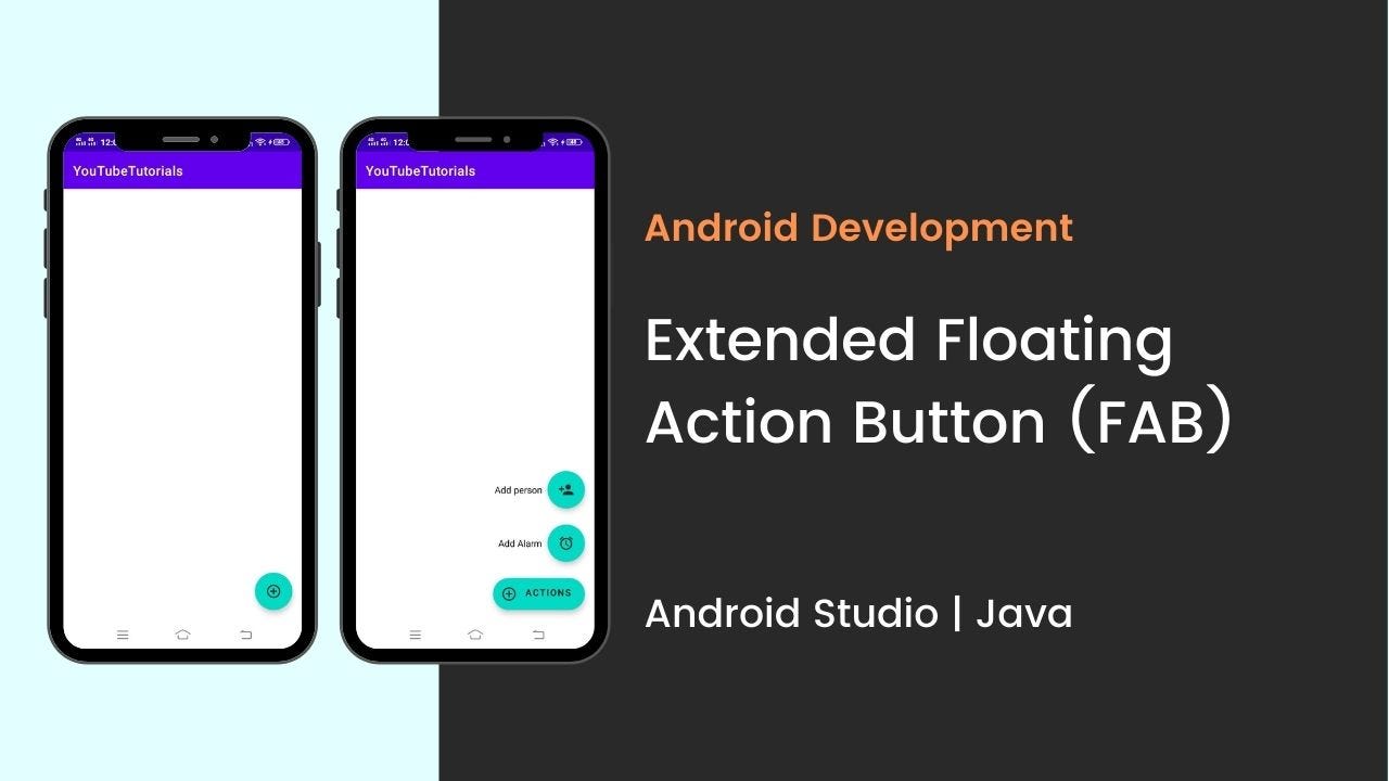
How to add Extended Floating Action Button in Android | Android Studio | Java.
In this tutorial, we are going to create an extended floating action button in android. A floating action button (FAB) performs the primary, or most common, action on a screen. It appears in front of all screen content, typically as a circular shape with an icon in its center.
Extended Floating Action Button is the newly introduced class with Material Components library in Android.
Material Components is introduced with SDK 28 or Android P. It’s a superset of Support Design Library with lots of new additions and improvements. And, in this tutorial, we are going to create an extended floating action button.
So, let’s start creating the extended FAB.
Before going to create let’s see what you’re going to see.
Step 1: add the dependency
make sure to add the material design dependency in your build.gradle app file.
Step 2: add the drawable files
before going to design the main XML file, first, import the drawable files. Below drawable files that I used in my project.

Step 3: design the XML file
now, design the main XML file, add the Extended Floating Action Button that is set as the parent FAB and also add the child FAB. Here as a child FAB, I used two FABs.
parent FAB: Action
child FAB 1: Alarm
child FAB 2: Person
Step 4: add the functionality
now in the main JAVA file add the functionality for the extended FAB and add the click listener in the child FAB.
Источник
Android fab with text
Floating action buttons
A floating action button (FAB) represents the primary action of a screen.

Contents
A FAB performs the primary, or most common, action on a screen. It appears in front of all screen content, typically as a boxy shape with an icon in its center.
Before you can use Material FABs, you need to add a dependency to the Material Components for Android library. For more information, go to the Getting started page.
Note: If the FloatingActionButton is a child of a CoordinatorLayout , you get certain behaviors for free. It will automatically shift so that any displayed Snackbar s do not cover it, and will automatically hide when covered by an AppBarLayout or BottomSheetBehavior .
Making FABs accessible
You should set a content description on a FAB via the android:contentDescription attribute or setContentDescription method so that screen readers like TalkBack are able to announce their purpose or action. Text rendered in Extended FABs is automatically provided to accessibility services, so additional content labels are usually unnecessary.
Use the show and hide methods to animate the visibility of a FloatingActionButton or an ExtendedFloatingActionButton . The show animation grows the widget and fades it in, while the hide animation shrinks the widget and fades it out.
Extending and Shrinking
Use the extend and shrink methods to animate showing and hiding the text of an ExtendedFloatingActionButton . The extend animation extends the FAB to show the text and the icon. The shrink animation shrinks the FAB to show just the icon.
The FloatingActionButton can be sized either by using the discrete sizing modes, a custom size, or for the large FAB by applying the desired style.
There are three app:fabSize modes:
- normal — the normal sized button, 56dp.
- mini — the small sized button, 40dp.
- auto (default) — the button size will change based on the window size. For small sized windows (largest screen dimension app:fabCustomSize attribute. If set, app:fabSize will be ignored, unless the custom size is cleared via the clearCustomSize method.
If you’d like to use the large FAB, apply one of these style attributes:
- ?attr/floatingActionButtonLargeStyle
- ?attr/floatingActionButtonLargePrimaryStyle
- ?attr/floatingActionButtonLargeSecondaryStyle
- ?attr/floatingActionButtonLargeTertiaryStyle
- ?attr/floatingActionButtonLargeSurfaceStyle
There are four types of FABS: 1. FABs, 2. Small FABs, 3. Large FABs


FABs are the default size and style for a primary action button.
API and source code:
The following example shows a regular FAB with a plus icon.


A regular FAB has a container and an icon.
A small FAB should be used on smaller screens.
Small FABs can also be used to create visual continuity with other screen elements.
API and source code:
Small FAB example
The following example shows a small FAB with a plus icon.


A small FAB has a container and an icon.
A large FAB is useful when the layout calls for a clear and primary action that the user is most likely to take, and where a larger footprint would help them to engage. For example, when appearing on taller and larger device screens.
API and source code:
Large FAB example
The following example shows a large FAB with a plus icon.


A large FAB has a container and an icon.
Regular, small, and large FAB key properties
| Element | Attribute | Related method(s) | Default value |
|---|---|---|---|
| Color | app:backgroundTint | setBackgroundTintList getBackgroundTintList | ?attr/colorPrimaryContainer (see all states) |
| Stroke | app:borderWidth | N/A | 0dp |
| Size | app:fabSize app:fabCustomSize | setSize setCustomSize clearCustomSize getSize getCustomSize | auto |
| Shape | shapeAppearance shapeAppearanceOverlay | setShapeAppearanceModel getShapeAppearanceModel | ShapeAppearanceOverlay.Material3.FloatingActionButton |
| Elevation | app:elevation | setElevation getCompatElevation | 6dp |
| Hovered/Focused elevation | app:hoveredFocusedTranslationZ | setCompatHoveredFocusedTranslationZ getCompatHoveredFocusedTranslationZ | 2dp |
| Pressed elevation | app:pressedTranslationZ | setCompatPressedTranslationZ getCompatPressedTranslationZ | 6dp |
| Ripple | app:rippleColor | setRippleColor getRippleColor getRippleColorStateList | variations of ?attr/colorOnPrimaryContainer , see all states |
| Motion | app:showMotionSpec app:hideMotionSpec | set*MotionSpec set*MotionSpecResource get*MotionSpec | @null |
| Element | Attribute | Related method(s) | Default value |
|---|---|---|---|
| Icon | app:srcCompat | setImageDrawable setImageResource getDrawable | null |
| Color | app:tint | setImageTintList getImageTintList | ?attr/colorOnPrimaryContainer (see all states) |
| Element | Style |
|---|---|
| Default style | Widget.Material3.FloatingActionButton.Primary |
Default style theme attribute: ?attr/floatingActionButtonStyle
See the full list of styles and attrs.
The extended FAB is wider, and it includes a text label.
Note: ExtendedFloatingActionButton is a child class of MaterialButton , rather than FloatingActionButton . This means that several attributes which are applicable to FloatingActionButton have different naming in ExtendedFloatingActionButton . For example, FloatingActionButton uses app:srcCompat to set the icon drawable, whereas ExtendedFloatingActionButton uses app:icon . See the attributes tables below for more details.
API and source code:
Extended FAB example
The following example shows an extended FAB with a plus icon.

Anatomy and key properties

An extended FAB has a text label, a transparent container and an optional icon.
| Element | Attribute | Related method(s) | Default value |
|---|---|---|---|
| Color | app:backgroundTint | setBackgroundTintList getBackgroundTintList | ?attr/colorPrimaryContainer (see all states) |
| Stroke color | app:strokeColor | setStrokeColor getStrokeColor | null |
| Stroke width | app:strokeWidth | setStrokeWidth getStrokeWidth | 0dp |
| Size | app:collapsedSize | N/A | |
| Shape | app:shapeAppearance app:shapeAppearanceOverlay | setShapeAppearanceModel getShapeAppearanceModel | ShapeAppearanceOverlay.Material3.FloatingActionButton |
| Elevation | app:elevation | setElevation getElevation | 6dp |
| Hovered/Focused elevation | app:hoveredFocusedTranslationZ | N/A | 2dp |
| Pressed elevation | app:pressedTranslationZ | N/A | 6dp |
| Ripple | app:rippleColor | variations of ?attr/colorOnPrimaryContainer , see all states | |
| Motion | app:showMotionSpec app:hideMotionSpec extendMotionSpec shrinkMotionSpec | set*MotionSpec set*MotionSpecResource get*MotionSpec | see animators |
| Element | Attribute | Related method(s) | Default value |
|---|---|---|---|
| Icon | app:icon | setIcon setIconResource getIcon | null |
| Color | app:iconTint | setIconTint setIconTintResource getIconTint | ?attr/colorOnPrimaryContainer (see all states) |
| Size | app:iconSize | setIconSize getIconSize | 24dp |
| Padding between icon and text | app:iconPadding | setIconPadding getIconPadding | 12dp |
| Element | Attribute | Related method(s) | Default value |
|---|---|---|---|
| Text label | android:text | setText getText | null |
| Color | android:textColor | setTextColor getTextColor | ?attr/colorPrimaryContainer (see all states) |
| Typography | android:textAppearance | setTextAppearance | ?attr/textAppearanceLabelLarge |
| Element | Style |
|---|---|
| Default style | Widget.Material3.ExtendedFloatingActionButton.Icon.Primary |
| Text-only when extended style | Widget.Material3.ExtendedFloatingActionButton.Primary |
Default style theme attribute: ?attr/extendedFloatingActionButtonStyle
See the full list of styles and attrs.
FAB theming example
API and source code:
The following example shows a regular, small, and extended FAB with Material Theming.

Implementing FAB theming
Use theme attributes and styles in res/values/styles.xml to add themes to all FABs. This affects other components:
Use a default style theme attribute, styles and a theme overlay. This themes all FABs in your app but does not affect other components:
Use one of the styles in the layout. That affects only this FAB:
Источник


