- Evolution of Finding Views by ID in Android
- The findViewById() vs Butterknife vs Kotlin Synthetics vs DataBinding vs ViewBindings
- The findViewById() method
- Analysis
- Butterknife
- Analysis
- Kotlin Synthetics
- Analysis
- Data Binding
- Analysis
- View Binding
- Analysis
- Time to Make a Decision
- Defending Your In-Background App When Android OS Kills It
- March 19, 2020
- How to Display Dependency Tree of Your Android Project with Gradle?
- March 9, 2020
- Hands-on with Material Components for Android: Buttons
- Part 4 of a series covering practical usage of Material Components for Android
- Setting up a Material Components theme for Android
- Attribute by attribute
- Basic usage 🏁
- Choosing a style 🤔
- Adding an icon 🔷
- Grouping Buttons to create a Toggle Button 👨👩👧👦
- Grouping
- Adjusting selected behavior
- Listening for selection state
- Orientation
- Theming 🎨
- Color
- Typography
- Shape
- More resources 📚
Evolution of Finding Views by ID in Android
The findViewById() vs Butterknife vs Kotlin Synthetics vs DataBinding vs ViewBindings
For more than a decade, Android developers have struggled with a simple but annoying issue. Getting the view reference from XML layouts to their view classes such as Activity or Fragments in entirely separate language — Java or Kotlin.
As a beginner in Android, I used to get confused a lot. The Android SDK provided a method: findViewById() . Functionality-wise, this method performs a singular task — it will give you the reference to the view in XML layouts by searching its ID. And if nothing is found, it will give you the good old NULL , which is said to be the 1-billion dollar mistake by its creator.
In this article, I am going to discuss on how the findViewById() evolved over time and what’s the best approach in “modern Android development” to get the view reference from XML layouts.
The findViewById() method
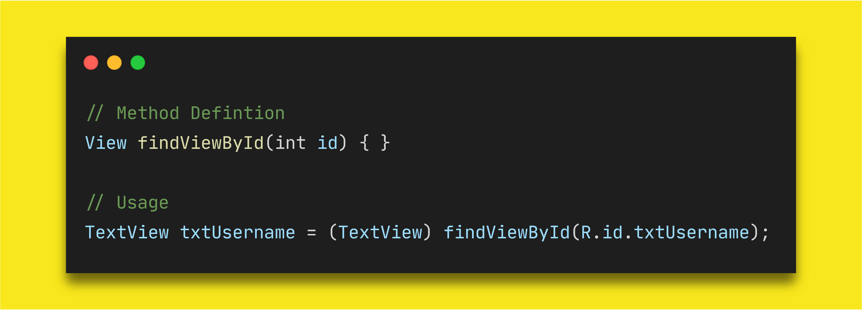
Obviously, the first one is the findViewById() method. Introduced in the API level 1, this requires an ID and returns a View object.
There are some problems with this approach.
If there is view with this ID in this layout, you won’t get any compile time errors. Rather you will get NullPointerException at runtime when Android fails to locate the view in Activity , Fragment or ViewGroup .
If the view is TextView in XML layout and you are type-casting it as Button , you won’t get any compile time errors. Instead you will get ClassCastException as a TextView cannot be converted to Button .
This method was used extensively and is being used as well throughout whole evolution of Android SDK. In the API level 26 of compileSdk , the definition of this method was slightly changed to remove the casting issue.
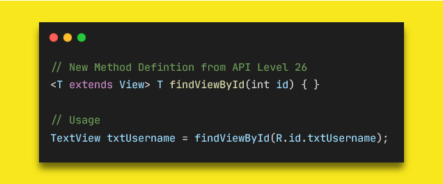
Now, developers don’t need to cast their views manually in the code. If you are referencing a Button with a TextView ID, then Android SDK will try to find the Button with the provided ID and it will return NULL because it won’t be able to find it.
But in Kotlin, you would still need to provide the type like findViewById
(R.id.txtUsername) . This may give you NullPointerException if you are not checking your views for null-safety, but this method will not throw ClassCastException like it used to.
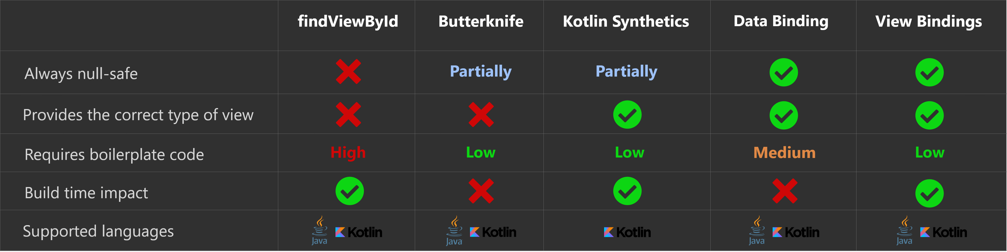
Analysis
Type-safe: Before API 26, there was no type-safety.
Null-safe: No null-safety. You will have to check views before accessing for null values.
Boilerplate Code: A lot. You have to declare a separate variable for all the views you need from XML layouts.
Build-time: No difference in build time.
Languages: Supports both Java and Kotlin.
Butterknife
Many different libraries have tried to simplify the findViewById() usage with different methods. Particularly, the Butterknife library created by Jake Wharton has become super famous and has got huge interest by developers around the world. It has become to sort-of standard way to avoid the findViewById usage.
The library uses annotation-processing and fetches the views from XML layouts using the findViewById method under the hood through code generation. It’s very easy to use, and helps in reducing the boilerplate code for developers.
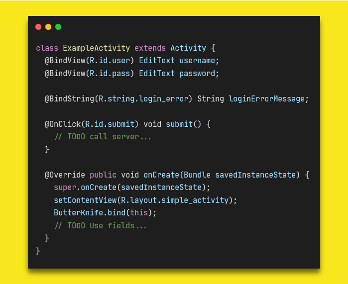
It has almost similar issues as findViewById . However, it adds a null-safety check at runtime to avoid the NullPointerException .
Attention: This tool is now deprecated. Please switch to view binding. Existing versions will continue to work, obviously, but only critical bug fixes for integration with AGP will be considered. Feature development and general bug fixes have stopped. —** Source: Butterknife Github repository**
Analysis
Type-safe: No type-safety as it uses findViewById .
Null-safe: The library checks the views for null-ability at runtime before accessing.
Boilerplate Code: Reduces the boilerplate as annotation processors auto generate code for you.
Build-time: Build time is affected because of annotation processing.
Languages: Supports both Java and Kotlin.
Kotlin Synthetics
Android SDK is now the Kotlin-first officially. That means that Android SDK will implement APIs from the Kotlin language perspective first and later these will be added for Java.
One of the biggest features Kotlin introduced is Kotlin Extension Methods. And with the help of it, Kotlin Synthetics came into existence. Kotlin Synthetics provides developers direct access to their views from XML layout through the auto-generated Kotlin extension methods.
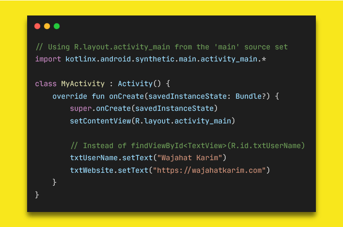
Kotlin Synthetics calls findViewById method once and then caches the view instances in a HashMap by default. This cache configuration can be changed to SparseArray or no cache via the Gradle settings.
Overall, Kotlin Synthetics is a good option as it is type-safe and requires null check through Kotlin’s ? operator if the view is present only in some layout configurations. It requires no extra code from the developers. But this is only supported for Kotlin projects.
But there’s a slight problem which lots of developers have faced with using Kotlin Synthetics. For example, if you set your content view to a layout, then type an ID that only exists in a different layout, the IDE lets you autocomplete and add the new import statement. Unless the developer specifically checks to make sure their import statements only import the correct views, there is no safe way to verify that this won’t cause a runtime issue.
Analysis
Type-safe: Absolutely
Null-safe: Normally its null safe. But if view ID is also present / missing in other layouts, then it requires developer to explicitly either use safe call operator ? or check the variable before use. Developers can use view from other layout leading to NullPointerException .
Boilerplate Code: No boilerplate code as extension methods are generated. It only requires to apply android-kotlin-extension plugin in the build.gradle one time.
Build-time: No difference.
Languages: Supports only Kotlin.
Data Binding
Data Binding Library is a support library that enables you to bind UI elements in your layouts to data sources in your app using a declarative style rather than programmatically.
The Data Binding is much superior in terms of functionality from other approaches as it not only gives you the type-safe AND null-safe view references but also allows you to map your data with views directly inside the XML layouts.
You will have to manually convert layouts to support data binding by nesting in tag.
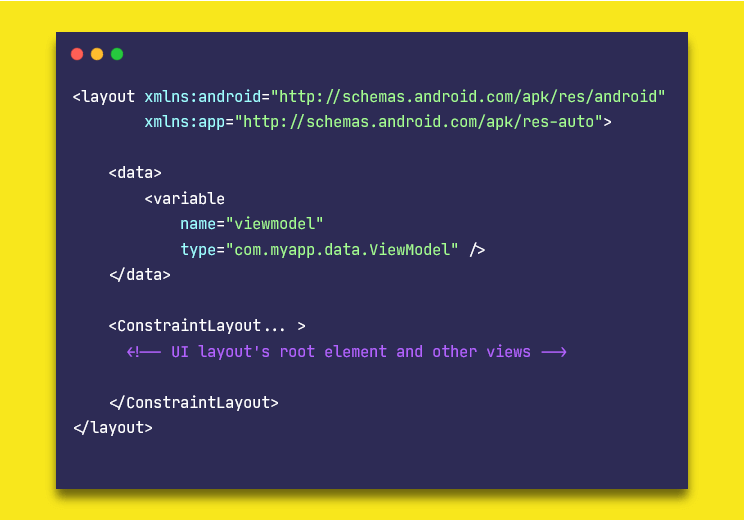
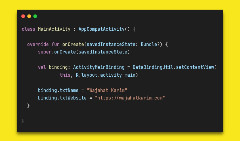
Now, Android Studio will generate classes for your layouts. For example, if your layout file name is activity_main.xml , then Android will generate a class ActivityMainBinding either in Java or Kotlin as per your preferences. You can use that to access the views without any NullPointerException or ClassCastException .
The best advantage of using Data Binding is that it allows developers to map data with the views in XML without even accessing those in the Java/Kotlin files. You can also use two-way binding to update your XML or data value without any listeners or callbacks.
Analysis
Type-safe: Absolutely
Null-safe: Absolutely
Boilerplate Code: Requires each layout file to be nested inside tag. And also you will have to create instance of auto generated binding class and inflate it to your Activity or Fragment .
Build-time: Increases build time as it generates class files of layouts. Often time, it’s slow because you will have to manually press “Make” button to update / generate new classes for your layouts.
Languages: Supports both Java and Kotlin.
View Binding
The ViewBinding introduced in Android Studio 3.6 recently is sort-of subset of the Data Binding library. It improves build times because no annotation processing is required. It doesn’t require any extra attention to layout files by nesting those in tags. It simply works on all layout files by default.
The only difference with data binding of this is that this is only used for view references. It doesn’t do any data mapping or two-way data binding.
You can use ViewBinding in place of other options if you are simply looking for a good approach to get views from layout files.
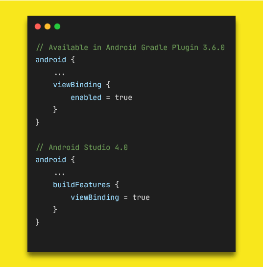
This only works on Android Studio 3.6 or later versions. You can enable it by adding this in your app’s build.gradle file.
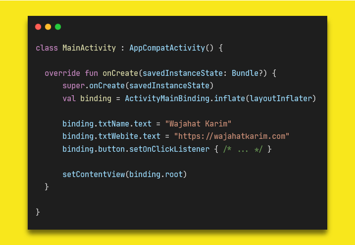
Then Android Studio will generate View Binding classes for all your layout files. You can use those classes to inflate in the Activity or Fragments just like you would do in Data Binding.
If you want some layout file to be skipped for view binding class, you can do so by adding tools:viewBindingIgnore=»true» in your layout files.
Analysis
Type-safe: Absolutely
Null-safe: Absolutely
Boilerplate Code: No boilerplate code as View Binding classes are generated automatically. It only requires enable the View Binding in the build.gradle one time.
Build-time: No impact on build speed. View Binding* is designed to solve the performance issue connected to using Data Binding *so it doesn’t have a negative impact on the build speed.
Languages: Supports both Java and Kotlin.
Time to Make a Decision
Looking at all the options and their analysis, View Binding is the best option at this time to use.
At the end, please Subscribe to my newsletter DroidUp to get more tutorials and tips on Android development directly in your inbox.
If you liked this article, you can read my new articles below:
Defending Your In-Background App When Android OS Kills It
Android OS will kill your app in background to reclaim the resources and memory. Learn how to handle it as a developer. It all started from a crash reported in Firebase Crashlytics console.
March 19, 2020
How to Display Dependency Tree of Your Android Project with Gradle?
For Starters, simply run the command “gradlew :app:dependencies” in your terminal Gradle Dependency Tree Printed in Console Recently, in one of my projects, we were stuck at a very annoying exception IllegalStateException: WorkManager is already initialized .
March 9, 2020


7 years experience. 💻 Creator of various Open Source libraries on Android . 📝 Author of two technical books and 100+ articles on Android. 🎤 A passionate Public Speaker giving talks all over the world.
Источник
Hands-on with Material Components for Android: Buttons
Part 4 of a series covering practical usage of Material Components for Android

This post will be covering the features and API of Button components. To find out how to handle initial setup of Material Components for Android (including the Gradle dependency and creating an app theme), please see my original post:
Setting up a Material Components theme for Android
Attribute by attribute
Buttons are arguably the most widely-used components in any app. This is largely due to their versatility, allowing users to perform actions and make choices that ultimately guide the flow of an experience. A single line of contained text and/or an icon indicate the action a button can perform.

Material Buttons are slightly different to traditional Android buttons in that they do not include additional insets (4dp on the left/right) and have more letter-spacing, different default colors and other attributes that improve legibility and affordance amongst other components.

From a design perspective, there are three main types of buttons which are intended to offer hierarchical levels of emphasis:
- Text button (low emphasis): No container. Best used for less important actions, especially when other main content needs to be emphasised.


In addition to this, buttons can be grouped together into a fourth type: Toggle button. This allows related button actions to be horizontally arranged in a common container. The buttons themselves can be selected/deselected to indicate an active/inactive choice.

Basic usage 🏁
A MaterialButton can be included in your layout like so:
Choosing a style 🤔
As discussed in the intro section above, a variety of button types exist. These types map to styles that you can apply to a MaterialButton . There also exists a variety of sub-styles for specific use cases, such as to adjust padding for an icon. The full list of styles and their attributes can be found on GitHub. These style variants inherit from Widget.MaterialComponents.Button , each with an optional style suffix:
- Text button: *.TextButton (main), *.TextButton.Icon , *.TextButton.Snackbar , *.TextButton.Dialog , *.TextButton.Dialog.Icon , *.TextButton.Dialog.Flush
- Outlined button: *.OutlinedButton (main), *.OutlinedButton.Icon
- Contained button (unelevated): *.UnelevatedButton (main), *.UnelevatedButton.Icon
- Contained button (raised): No suffix (default, main), *.Icon
Adding an icon 🔷
An icon can be added to a button. It is displayed at the start, before the text label. In order to get the correct icon padding, it is recommended that you use a *.Icon style variant (shown above in the “Choosing a style” section).

The icon can be added in XML:
Alternatively, it can be done programmatically:
A few additional attributes exist for adjusting the icon size and position:
- iconSize : The width/height of the icon. The default value is the supplied Drawable ’s intrinsic width.

- iconGravity : The gravity of the icon. This can be set to start ( ICON_GRAVITY_START , default, at start of button), end ( ICON_GRAVITY_END , at end of button), textStart ( ICON_GRAVITY_TEXT_START , at start of centered text label) or textEnd ( ICON_GRAVITY_TEXT_END , at end of centered text label).


- iconPadding : The spacing between the icon and the text label. Typically you would not want to change this. The default value is 4dp for text buttons and 8dp for all other types.
Attributes related to icon tinting are discussed in the “Theming” section below.
Grouping Buttons to create a Toggle Button 👨👩👧👦
In order to create a toggle button, we need to add MaterialButton s as child View s to a MaterialButtonToggleGroup (a custom ViewGroup ).
Note: MaterialButtonToggleGroup was added in the 1.1.0-alpha05 release of Material Components for Android.
Grouping
This can be done in XML:
Alternatively, it can be done programmatically:
The MaterialButtonToggleGroup handles layout and adjusting of only the relevant shape corners in the row of MaterialButton s. The appearance of the MaterialButton s is determined by whichever style they each use. It is advised to use a consistent style for all children and also recommended to use the outlined button type.
Adjusting selected behavior
When added to a MaterialButtonToggleGroup , child MaterialButton s automatically become “selectable” (i.e. The android:checkable attribute is set to true).
Thus, there exists a couple of attributes for adjusting how MaterialButtonToggleGroup manages this:
- singleSelection : Determines whether or not only a single button in the group can be checked at a time. The default value is false, meaning multiple buttons can be checked/unchecked independently.
Listening for selection state
We are able to query for and adjust the current checked button(s) in a variety of ways:
We are also able to listen for checked changes by adding an OnButtonCheckedListener to a MaterialButtonToggleGroup :
Listeners can also be removed with the MaterialButtonToggleGroup#removeListener and MaterialButtonToggleGroup#clearListeners functions.
Orientation
The default arrangement of buttons within a toggle group is horizontal. However, seeing as MaterialButtonToggleGroup extends LinearLayout , it also supports vertical arrangement. This can be set programmatically or in XML:

The interesting thing to note here is the extra attributes on the child MaterialButton (s). It is recommended to set the width to match_parent and to remove the top/bottom insets from the child buttons so as to have them sit flush against each other vertically. This also, however, requires adjusting the minHeight to make up for the lack of insets.
Theming 🎨
Buttons can be themed in terms of the three Material Theming subsystems: color, typography and shape. We have already shown which styles to use in the “Choosing a style” section above. When implementing a global custom MaterialButton and MaterialButtonToggleGroup styles, reference them in your app theme with the materialButtonStyle / materialButtonOutlinedStyle and materialButtonToggleGroupStyle attributes respectively.
Color
The color of the MaterialButton background can be customized with the backgroundTint attribute. This requires a ColorStateList , meaning a for checked/enabled/disabled states is required. It defaults to colorPrimary (enabled)/ colorOnSurface (disabled) for contained buttons and transparent(unchecked)/ colorPrimary (checked) for all other types, with different opacities per state. There is also a backgroundTintMode attribute to change the tint PorterDuff.Mode , although typically you would want to keep this the same.
The color of the text label can be customized with the android:textColor attribute. This too requires a ColorStateList . It defaults to colorOnPrimary (enabled)/ colorOnSurface (disabled) for contained buttons and colorPrimary (enabled or checked)/ colorOnSurface (disabled or unchecked) for all other types, with different opacities per state.
The color of the optional icon can be customized with the iconTint attribute. This too requires a ColorStateList and the defaults are the same as those of android:textColor . As before, there is also an iconTintMode attribute.
Lastly, the color of the button touch ripple can be customized with the rippleColor attribute. It too accepts a ColorStateList and defaults to colorOnPrimary for contained buttons and colorPrimary for all other types, with different opacities per state.

Typography
The button text label will adopt the fontFamily attribute defined in your app theme.
While you would typically want to keep most aspects of the button text appearance as is, the Material Guidelines suggest we can use sentence case over the standard all caps for the text label, if desired. To achieve this, we would create a new style:
We could apply this directly to a button or in an individual button style by referencing it with the android:textAppearance attribute. Alternatively, it can be applied globally by referencing it in your app theme with the textAppearanceButton attribute.

Shape
The shape of a button background can be customized with the shapeAppearance attribute. This defaults to shapeAppearanceSmallComponent .
While not strictly shape theming, it is worth mentioning that the width of an outlined button stroke can be adjusted with the strokeWidth attribute. This defaults to 1dp.

More resources 📚
- The source code for the Playground app used in this article can be found on GitHub.
- Buttons Design Documentation
- Buttons API Documentation
- Toggle Buttons API Documentation
I hope this post has provided some insight into Material Buttons and how they can be used in your Android app(s). If you have any questions, thoughts or suggestions then I’d love to hear from you!
Источник


