Adding ActionBar Items From Within Your Fragments
This tutorial shows you how to add action items to the ActionBar from within your Fragments and how to disable or enable action items depending on the state of your fragment. All code works with the stock Android ActionBar object as well as with ActionBarSherlock.
Why do you want to add action items?
In a previous post you have seen that Android makes it easy to provide responsive interfaces. And given the vast distribution of devices sizes that is something you should do.
This post continues with the app, you have developed in the first posts of this series. The user has a list of items, a detail screen and an edit screen.
On a phone the startscreen simply shows a list of items. Here you have an action item to add a new item to the list:
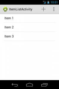 Screen showing the ListFragment only
The detail screen shows all the relevant details of this item and offers you to edit the item:
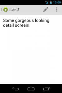 Screen showing the DetailFragment only
Now here’s what the tablet version looks like:
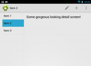 Top part of the tablet version containing both fragments
As you can see, it now sports both icons since it also presents both fragments. Now this app is pretty dull so far, and the detail screen even more so, so let me show you a real app. I take Timetable, an app that does this nicely.
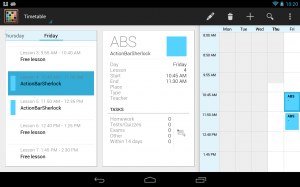 Timetable app showing action items of multiple fragments
In this screen the edit and trash icon are from the selected element and are only added when a lecture has been selected. The plus and the search icon though are from the ListFragment .
Adding action items programatically
As the post title implies the additional action items are inserted by the fragment. In fact not much different from how you add the items within your Activities. You use the onCreateOptionsMenu() method for it:
As you can see the signature of this method is different from the one of the Activity class. With fragments your method takes a MenuInflater as second parameter. And the fragment’s onCreateOptionsMenu() method also doesn’t return a boolean value.
Even with this method in place Android still doesn’t display any additional menu items unless you explicitly tell it to call this method. To do so, you first have to call setHasOptionsMenu() within the fragment’s onCreate() method:
Now your fragments menu items will be displayed in the ActionBar.
Of course, if you do so, you have to stop using the same entries in your Activity. Otherwise it would look fine on any screen that makes use of your multi-pane layouts but you would end up with doubled icons on single-pane screens.
For the sample screen I have used a menu xml file containing only the about entry in the activity. And I use an xml file containing only the edit entry in the fragment. The about entry is not needed in the fragment, because it is added by the activity, no matter whether you are in single-pane or double-pane mode.
Changing the order of action items
By default Android displays the action items of your fragment behind those of the activity. If you use multiple fragments Android displays them in the order the fragments are created.
This default order is not necessarily what you want. For example it is very likely that you want to display an about item as the very last entry within your overflow-menu — no matter if fragments later on add more overflow-menu entries. Also some actions are more often used than others. You want to put them more to the left, so that, depending on the screen size, those are always visible. And which items are more important depends on which fragments are in use.
Tio help you achieve this you can make use of the android:orderInCategory attribute of the item elements.
The fragment_itemdetail.xml menu file:
The activity_itemdetail.xml menu file:
And finally the activity_itemlist.xml menu xml file:
The higher the number the later your action item is displayed. So use an absurdly high value for the about item. And order all other elements by importance.
Since all elements have an order value of zero by default, you have to use numbers for all action items as soon as you want to move one to the front.
Handling events
As usual you can handle menu item clicks in the onOptionsItemSelected() method:
But bear in mind that the Activity’s onOptionsItemSelected() method is called first. Your fragment’s method is called only, when the Activity didn’t consume the event!
Adding and removing action items
So far I have only mentioned how to use action items, that are defined within an xml file. But that often is not sufficient.
See this screenshot of a German TV program app. Please ignore, that it’s in German, I explain what is relevant to you.
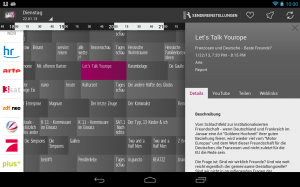 The Prime Guide app showing icons only when relevant
In this app you can select a program to get more information about it. If you select a program that hasn’t started yet, you can bookmark it and set an alarm for it. If on the other hand the program either has already started or ended those actions are not displayed. It simply makes no sense to add an alarm for some program that has already started. But all other icons are visible in both cases.
So how to do that? You could either use different menu xml files for a static set of action items. Or you could add or remove menu actions programatically. Since the second approach is more flexible I deal with it in the next paragraphs.
First you need to get hold of a Menu object. You can do so in the onCreateOptionsMenu() method shown above.
Now you can use this Menu object to either change the visibility of action items or to remove them from the menu entirely.
You can change the visibility like this:
The null check in the code is necessary, because of the order in which the methods of your fragment are called. Of course Android executes the lifecycle methods before finally calling onCreateOptionsMenu() . Thus your Menu object is null in the onCreateView() method, which you probably use to create event handlers.
If you want to entirely remove the action item, you can do so easily as well:
As you will see in the next few paragraphs, adding a menu item is slightly more cumbersome than just making it visible again. Thus if you want to toggle action items depending on the state of your fragment, I suggest to change the visibility instead of removing and re-adding the items.
So far I have only shown you how to get rid of action items. Of course you also can add new items. You can use one of the several add() methods of the Menu class. For example the following code fragment would add the item in the same way, as with the xml code for inflating it:
The first parameter sets the group. If you have no groups, use Menu.NONE. The second parameter sets the id you want to use. It’s the same one you later use in the onOptionsItemSelected() method to react to menu item clicks. The third parameter is the order value and the last one the title text you want to use. Remember, that Android uses the title text to display usage hints or to read out this value with a screenreader app. So never use null for this value.
As the code sample shows, you have to add the icon and the showAsAction attribute value with separate method calls later on.
I don’t know why there is no way to add a complete MenuItem object directly. To me that would be better readable. But that’s just a tiny detail 🙂
Wrapping up
In this post I have shown that you can use the onCreateOptionsMenu() method to add action items related to your fragment to the existing icons of the ActionBar.
Since the default order in which Android adds these items is often not the preferred one, you can change this easily by adding the android:orderInCategory attribute to your menu items in the xml files.
Finally you have seen how to change the visibility of menu items, how to remove them completely or how to add new menu items.
Please let me know in the comments, if any questions are left open and which way you prefer to remove action items from the ActionBar. And don’t forget to plus one and share this post if you found it useful!
Wolfram Rittmeyer lives in Germany and has been developing with Java for many years.
He has been interested in Android for quite a while and has been blogging about all kind of topics around Android.
Источник
ActionBar Tabs with Fragments
There are several ways to setup tabs with fragments. The easiest is using ActionBar tabs. Note: Standard ActionBar tabs are not supported in Gingerbread, so many people use ActionBarSherlock when Gingerbread must be supported. Google has also released a support AppCompatActivity class which can be used for compatible tabs. Thankfully, both the support approaches are more or less identical in code with a few class name tweaks.
Note: As of Android 5.0, ActionBar Tabs is now officially deprecated. Tabs should now be built using the TabLayout.
To setup tabs using ActionBar and fragments that are not gingerbread compatible, you need to add a TabListener implementation to your application which defines the behavior of a tab when activated. A good default implementation is just adding this to FragmentTabListener.java
Once you have created the FragmentTabListener from this snippet within your app, setup the ActionBar and define which tabs you would like to display and attach listeners for each tab:
Now you have fragments that work for any Android version above 3.0. If you need gingerbread support, check out the approaches below.
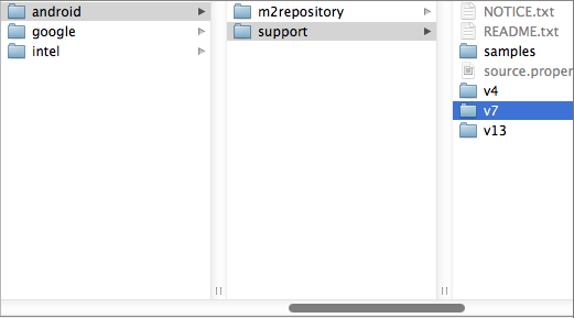
Google has released an updated support library «android-support-v7-appcompat» which includes official support for the ActionBar with Gingerbread compatibility. To use this, first, we need to upgrade to latest support library by opening the Android SDK Manager and verifying we have the latest «Android Support Library».
Now, we need to import the support library as a library project following the usual steps. File => Import => Existing Android Code. and then go to your sdk folder and select sdk => extras => android => support => v7 => appcompat .
Now, for your app, right-click and select «Properties. » and then add «android-support-v7-appcompat» as a library.

Make sure to setup your app to use the correct support theme within the AndroidManifest.xml :
For these compatibility items, you also need to be careful to change the menu items to use a custom prefix in res/menu/example.xml for the showAsAction instead of android:showAsAction :
To setup tabs using ActionBar and fragments, you need to add a TabListener implementation to your application which defines the behavior of a tab when activated. A good default implementation is just adding this to SupportFragmentTabListener.java .
Once you have created the SupportFragmentTabListener from this snippet within your app, setup the ActionBar and define which tabs you would like to display and attach listeners for each tab:
Using ActionBarSherlock, the code looks almost exactly the same but automatically supports gingerbread and below. First you must download ActionBarSherlock.zip. Import the code into Eclipse and mark the project as a library. Next, add the library to your application. Watch the video on the FAQ page for a detailed guide.
With ActionBarSherlock installed and added to your app, add the gist code as the SherlockTabListener within your application.
Once you have created the SherlockTabListener from this snippet within your app, setup the ActionBar and define which tabs you would like to display and attaches listeners for each tab:
With this approach you can have easy tab navigation switching quickly between fragments.
If you need to reference a fragment instance from within the activity, you can refer to the fragment by it’s «tag». For example, if you created the following tab:
You have assigned the tag FIRST_TAB_TAG to that fragment during construction and you can access the fragment for this tab later using findFragmentByTag :
This will return the fragment instance embedded for that tab.
In certain cases we need to be able to pass arguments into the tab fragments during their construction. Fortunately, the FragmentTabListener can accept an optional Bundle argument which will be passed into the fragment automatically during creation:
Then within the FirstFragment we can access these arguments with getArguments :
Once the ActionBar has been set to ActionBar.NAVIGATION_MODE_TABS navigation mode, we can look at the currently selected tab index with getSelectedNavigationIndex():
We can set the currently selected tab by index with setSelectedNavigationItem:
We can also access arbitrary tabs, check the number of tabs or remove them:
Using these methods described above, we can modify the tabs and their selected states at runtime.
Note: Occasionally, you might attempt to switch the current tab and load a fragment in the wrong event (for example onActivityResult ) and encounter an error such as IllegalStateException: cannot perform this action after onSaveInstanceState . This is typically tied to replacing fragments onto the content pane at a time where state loss could occur. Read this article for a detailed description of the issue. See this solution for one common approach to solving this.
There are several different ways of styling the tabs within the ActionBar. The easiest way to style the ActionBar tabs is using the nifty Android ActionBar Style Generator. This utility will allow you to easily drop-in a new skin for the ActionBar.
Doing custom styling of the ActionBar requires using the Styles system for declaring the look of the ActionBar and tabs more manually by setting various tab related styles and themes. There are actually a few related styles for different sections of the ActionBar Tabs:
- actionBarTabBarStyle – This determines the style of the overall tab bar which contains the tabs.
- actionBarTabStyle – This determines the style of the individual tabs themselves including the indicator.
- actionBarTabTextStyle — This determines the style of the tab text.
We can tweak the styles of these by building a custom theme in the res/values-v14/styles.xml :
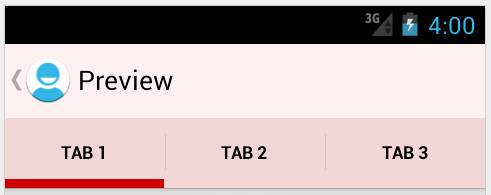
The result of these styles is this with the actionBarTabBarStyle set orange, the actionBarTabStyle set green and the actionBarTabTextStyle set purple (selected) or white:

To customize the tabs including bottom indicators, we will be overriding actionBarTabStyle which determines the style of the tabs themselves. The tab is the area that includes the text, its background, and the little indicator colored bar under the text. If you want to customize the indicator, you need to alter this style.
First, we need to create the tab_bar_background drawable which defines the tab drawables for each state. This will be a selector drawable, which has different layer-lists applied depending on whether the tab is selected or not. In res/drawable/tab_bar_background.xml we can add:
Each state applies a different layer-list representing the different tab states. The indicator under the active tab comes from the background drawable. To draw the indicator, we created a layer-list for a rectangle shape with a 2dp stroke around the exterior, then offset the rectangle so that the top, left and right sides are outside the bounds of the view, so we will only see the bottom line.
Finally, we need to set the background for the tabs to the tab_bar_background drawable in res/values-v14/styles.xml :
With these steps in place, we now have fully customized tabs with this result:
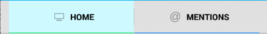
We may also want to customize the tab text color based on the selected state of the tab. This allows the tab to be one color when selected and another color when unselected. To do this, we need to define a color selector in res/color/selector_tab_text.xml :
and then we can apply this color selector to the tab text color within res/values/styles.xml :
The result of these styles is that the text color is purple when tab is selected and white otherwise.

Browse the Styling the ActionBar official guide for a basic overview. If you are serious about wrestling tabs styles into submission though, check out these resources as well:
- Check out this article for a detailed look at styling tabs in the action bar
- This second article details how to style tabs as well with several examples.
- You can supply a custom view for each tab in truly custom cases that radically changes the look and feel of the tab.
- Consider replacing tabs with the ViewPager and using a third-party tab indicator which more easily achieves the desired effect.
Note that fully customizing tabs requires an understanding of Drawables as well.
If you are using ActionBarSherlock, you will need to do the following to custom style your tabs:
You will need to customize android:actionBarTabBarStyle in order to achieve this. actionBarTabBarStyle determines the style of the overall tab bar. It includes the whole container that includes all of the tabs.
- Create style for «Widget.Sherlock.Light.ActionBar.TabView» in res/values-v14/styles.xml .
- Reference this style for «actionBarTabBarStyle».
Customize «android:actionBarTabBarStyle» in res/values-v14/styles.xml as follows:
To define a selector to choose different text color based on tab state, create res/color/actionbar_color_selector.xml :
Sometimes its required to change the text typeface depending on the tab state. e.g. You might want to change the text typeface to bold for the selected tab. We can achieve this in the ‘onTabSelected’ and ‘onTabUnselected’ methods in ‘SherlockTabListener.java’ class.
Override ‘actionBarTabStyle’ — it determines the style of the tabs themselves. The tab is the area that includes the text, its background, and the little indicator bar under the text. If you want to customize the indicator, you need to alter this one.
- Create the tab_bar_background drawable. This will be a state list drawable, which has different visual appearance depending on whether the tab is selected and/or pressed. In the state list, we’ll reference two other drawables for when the button is selected, and we’ll just use a plain color for the unselected states.
- We’ll also need to create a colors.xml file to define the two colors we used in the state list drawable:.
- Now, we need to create the drawables for the different backgrounds. The indicator under the active tab comes from the background drawable, so in our custom version, we’ll include an indicator in the proper color. To do this, I used a hack where I create a layer list with a rectangle shape with a 2dp stroke around the exterior, then offset the rectangle so that the top, left and right sides are outside the bounds of the view, so you only see the bottom line. In the case of the “pressed” version, the fill color is set on the rectangle to indicate that it is pressed.
- Finally, we need to set the background for the tabs to the “tab_bar_background” drawable in res/values-v14/styles.xml :
With those steps, you now have fully customized tabs!
Источник


