- Полный список
- Кольцо
- GradientDrawable
- GradientDrawable
- Class Overview
- Summary
- XML Attributes
- android:angle
- android:bottom
- android:centerColor
- android:centerX
- android:centerY
- android:color
- android:color
- android:dashGap
- android:dashWidth
- android:endColor
- android:gradientRadius
- android:height
- android:innerRadius
- android:innerRadiusRatio
- android:left
- android:right
- android:shape
- android:startColor
- android:thickness
- android:thicknessRatio
- android:top
- android:type
- android:useLevel
- android:useLevel
- android:visible
- android:width
- android:width
- Constants
- public static final int LINE
- public static final int LINEAR_GRADIENT
- public static final int OVAL
- public static final int RADIAL_GRADIENT
- public static final int RECTANGLE
- public static final int RING
- public static final int SWEEP_GRADIENT
- Public Constructors
- public GradientDrawable ()
- public GradientDrawable (GradientDrawable.Orientation orientation, int[] colors)
- Public Methods
- public void applyTheme (Resources.Theme t)
- public boolean canApplyTheme ()
- public void draw (Canvas canvas)
- public int getAlpha ()
- public int getChangingConfigurations ()
- public ColorFilter getColorFilter ()
- public Drawable.ConstantState getConstantState ()
- public float getGradientRadius ()
- public int getIntrinsicHeight ()
- public int getIntrinsicWidth ()
- public int getOpacity ()
- public GradientDrawable.Orientation getOrientation ()
- public void getOutline (Outline outline)
- public boolean getPadding (Rect padding)
- public void inflate (Resources r, XmlPullParser parser, AttributeSet attrs, Resources.Theme theme)
Полный список
— изучаем drawable-тег shape
Подробно ознакомившись с Bitmap, переходим к другому ключевому объекту графики – Drawable.
Drawable – это абстрактный контейнер для графического объекта. Его главное абстрактное умение – он может нарисовать свое содержимое на предоставленной ему канве. А вот что конкретно он нарисует, зависит уже от реализации. Это может быть, например, тот же Bitmap, если мы используем BitmapDrawable объект. Или это может быть простая геометрическая фигура, если мы используем ShapeDrawable.
Drawable-объекты мы можем создавать сами напрямую в коде. Но для некоторых из них мы можем создать описание в xml-файлах, в папке res/drawable. И когда он нам понадобится, мы укажем id файла, система сама распарсит его и создаст нам нужный объект.
Самое распространенное использование Drawable – это свойство background, которое есть у каждого View. В качестве значения вы можете указать там RGB-цвет или id ресурса из папки res/drawable. Далее система сама по этому значению определит тип и далее:
— если это цвет, то создаст ColorDrawable,
— если это id картинки в res/drawable, то создаст BitmapDrawable
— если это id xml-файла в res/drawable, то распарсит его и вернет соответствующего ему наследника Drawable: StateListDrawable, AnimationDrawable или какой-то другой.
В итоге View получит свой Drawable-объект и сможет его нарисовать.
В общем, как вы поняли, у абстрактного Drawable есть несколько наследников-реализаций и в ближайших уроках мы их рассмотрим. Начнем с тех, которые можно описать в xml. По ним есть отдельная статья в хелпе. Там, правда, есть пара ошибок копипаста, но в остальном все верно.
В этом уроке рассмотрим тег
Project name: P1621_DrawableShape
Build Target: Android 4.4
Application name: DrawableShape
Package name: ru.startandroid.develop.p1621drawableshape
Create Activity: MainActivity
Корневой тег shape и у него же есть одноименный атрибут shape, в котором мы указываем тип фигуры. Мы указали rectangle – это прямоугольник.
Далее, внутри тега shape, идет тег stroke, который позволяет задать нам характеристики линии контура (периметра) фигуры. Мы задаем толщину (width) в 1dp и черный цвет (color).
В ImageView пока ничего не отображаем.
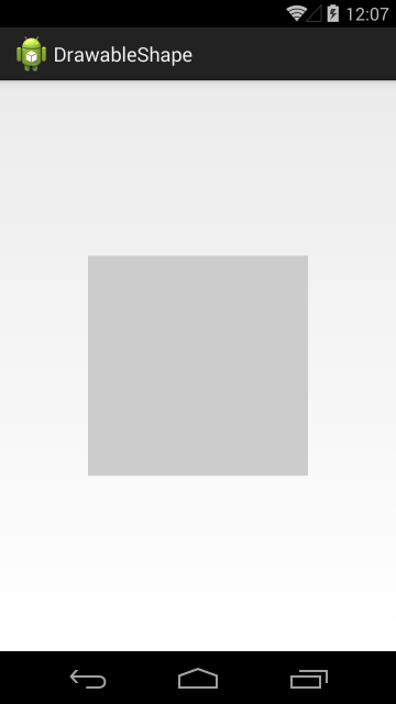
Видим ImageView с серым фоном
Перепишем метод setDrawable:
В качестве drawable будем передавать наш файл shape
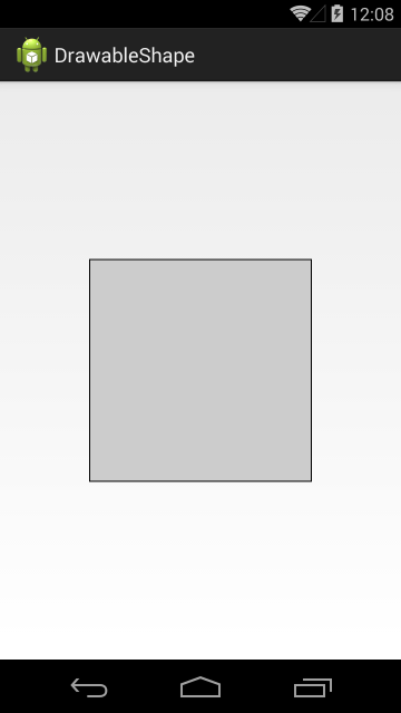
ImageView теперь отображает прямоугольник с черным контуром.
Посмотрим, какие еще фигуры нам доступны.
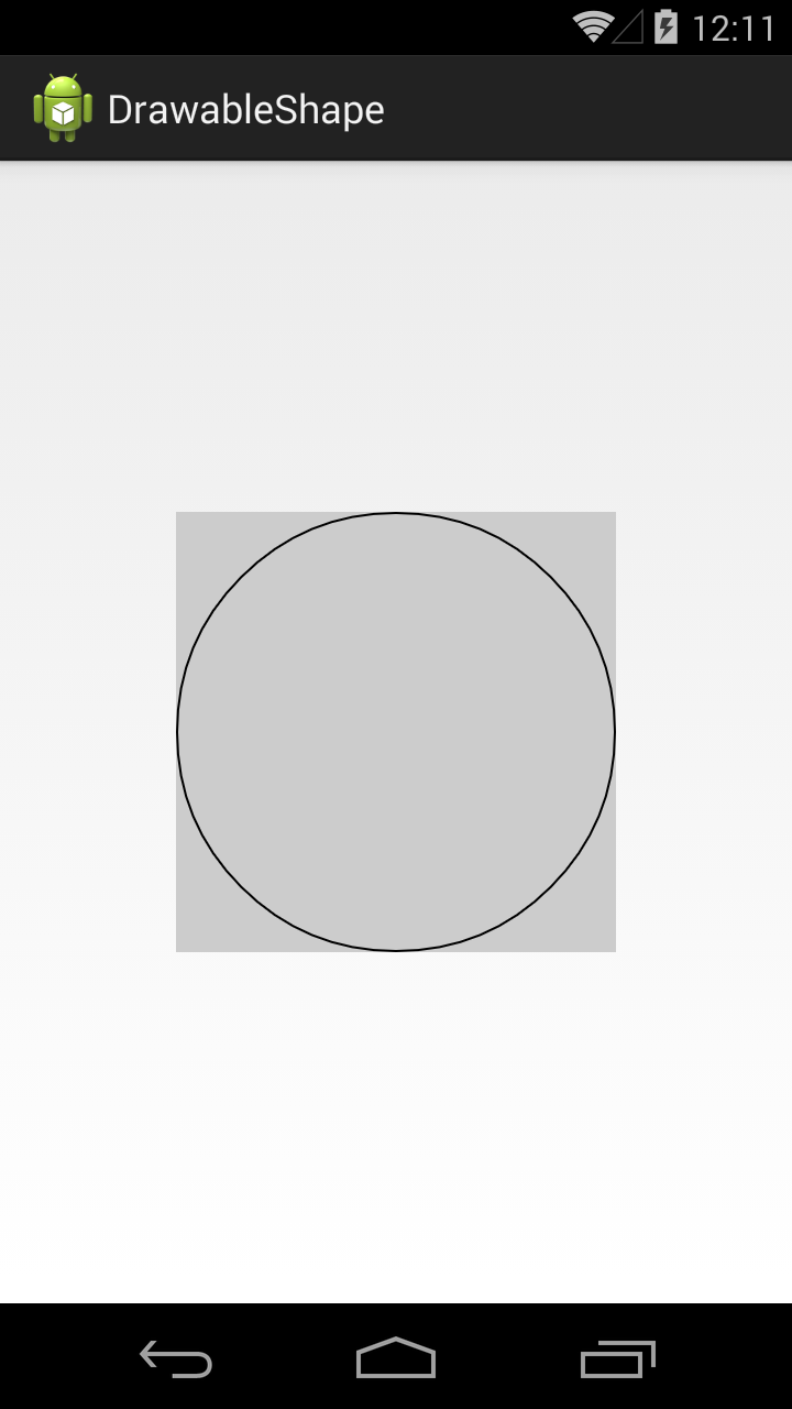
Значение атрибута shape = oval, это эллипс
В нашем случае получился круг, т.к. ImageView квадратный.
Значение line даст нам горизонтальную линию

Есть еще фигура кольцо (ring), но о нем чуть позже.
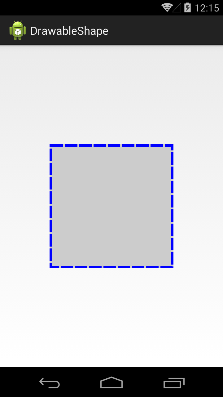
Вернемся к тегу stroke. Добавим в него параметров.
Ширина – 4dp, цвет – синий. Параметры dashWidth и dashGap сделают линию контура пунктирной. dashWidth задает длину пунктирной черточки, а dashGap – расстояние между черточками
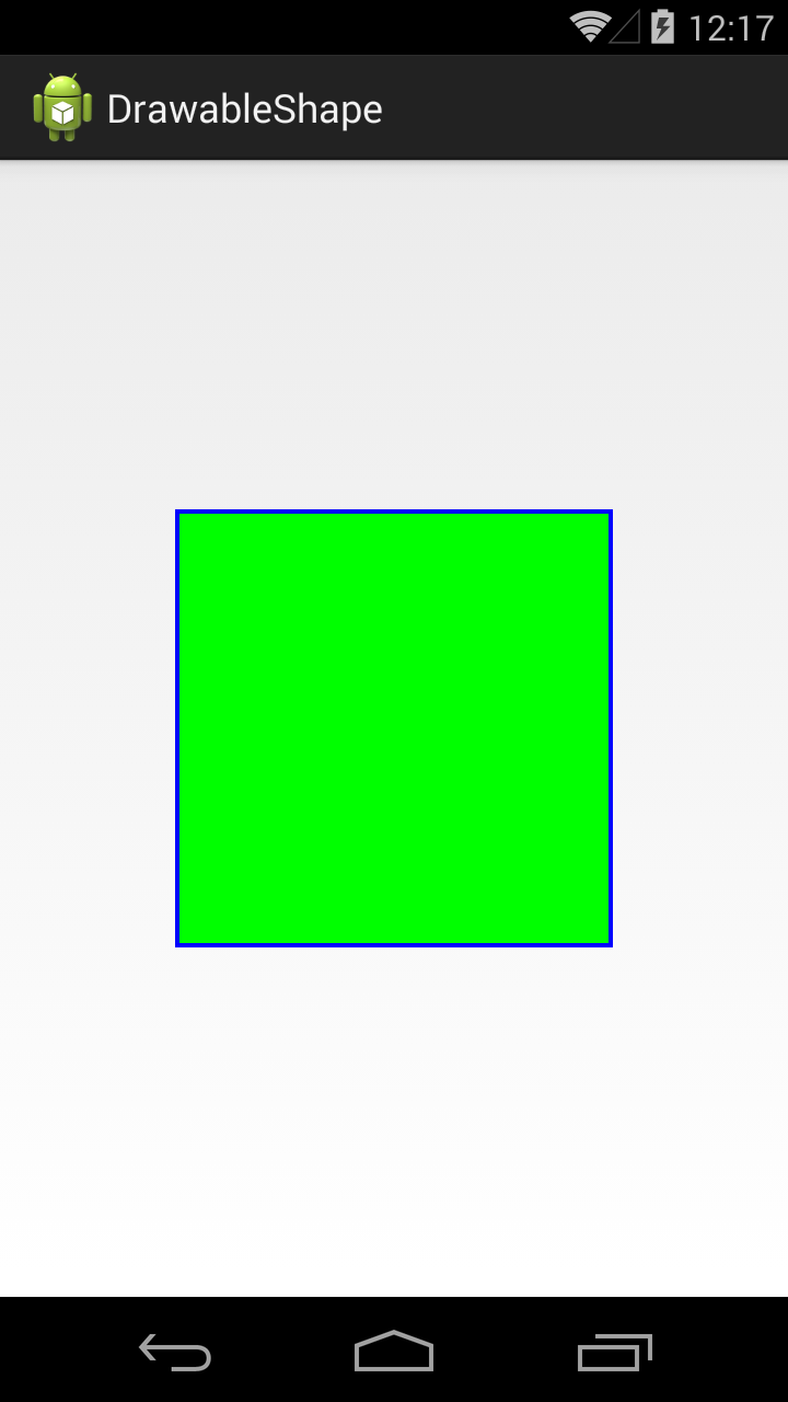
Добавим заливку, для этого используется тег solid
Тег solid имеет атрибут color, который позволяет указать цвет заливки фигуры. Мы указали в нем зеленый цвет.
По умолчанию фигура занимает все доступное ей пространство, но мы можем явно указать ее размер с помощью тега size.
Используем тег size с атрибутами width и height
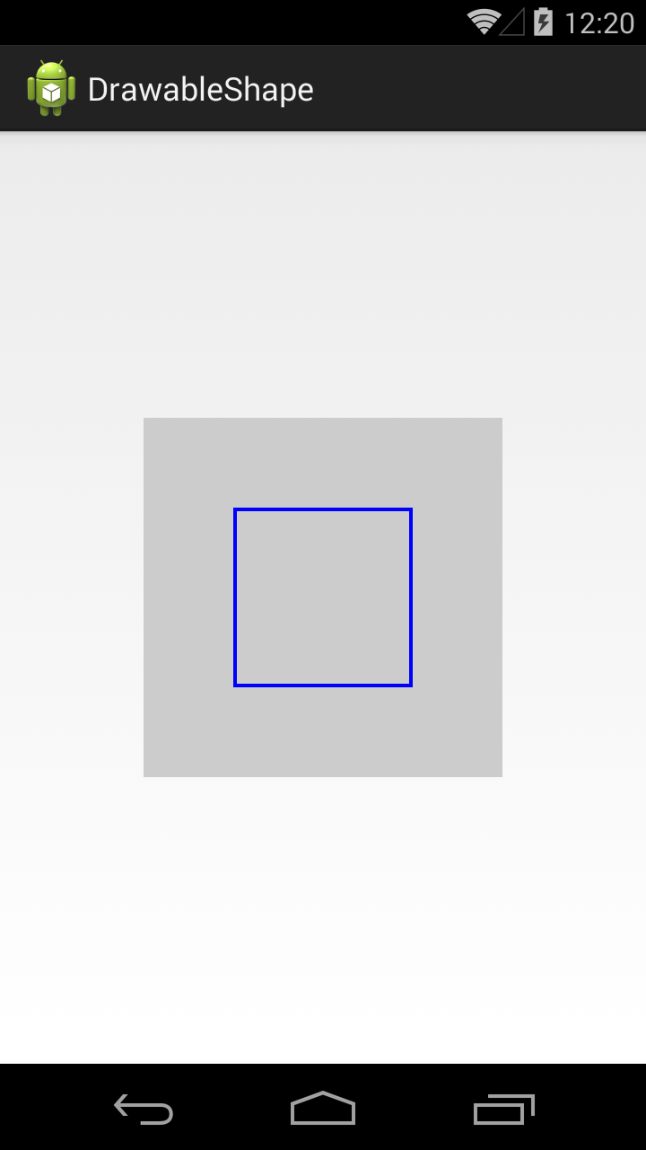
Фигура теперь размером 100х100 и уже не занимает всю доступную ей площадь.
Учтите, что режим отображения зависит от scaleType y ImageView.
Тег padding позволяет нам задать величину отступа внутри фигуры. Это актуально, например, для TextView. Отступ будет учтен при размещении текста.
Мы указали различные отступы со всех 4 сторон.
Если мы теперь повесим эту фигуру в качестве background для TextView, результат будет таким

В качестве заливки мы можем использовать не один цвет, а градиент из двух или трех. Для этого используется тег gradient.
В теге gradient указываем два атрибута-цвета: startColor и endColor.
В результате получится градиент, переходящий из первого цвета во второй.

Градиент вовсе необязательно должен идти слева-направо. Мы можем указать угол направления. Для этого у тега gradient есть атрибут angle
В angle указываем угол 225. Угол 0 означает направление слева-направо, 90 – снизу вверх и т.д. Угол должен быть кратным 45.
В результате видим угол справа-сверху налево-вниз.

Тег gradient позволяет указать третий цвет, который вклинится между start- и end- цветами.
В атрибуте centerColor укажем синий цвет, и он в градиенте будет между красным и зеленым.

Градиент может быть разных типов. Мы рассмотрели тип linear, который используется по умолчанию. Есть еще два типа: radial и sweep.
Тип radial даст нам круговой градиент, а в параметре gradientRadius мы должны указать радиус круга.

Мы можем указать точку центра кругового градиента атрибутами centerX и centerY. Значения этих атрибутов должны быть от 0 до 1.
Центра градиента будет в точке (0.2, 0.2), если принять размеры фигуры за единицу.

Теперь посмотрим, как выглядит градиент sweep.

Для этого типа градиента также можно использовать атрибуты centerColor, centerX и centerY.
Для фигуры прямоугольника мы можем сгладить углы. За это отвечает тег corners.
Атрибут radius позволяет задать радиус закругления сразу для всех углов.

Есть возможность задать свой радиус для каждого угла отдельно.

Кольцо
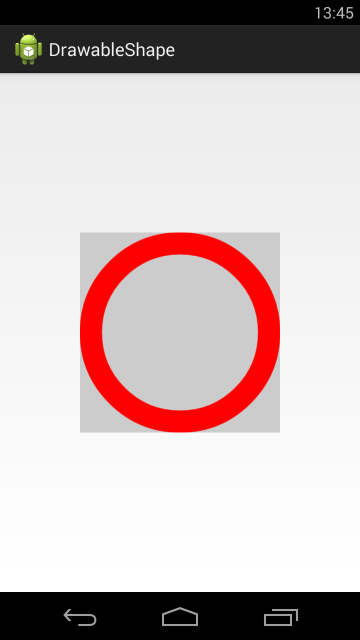
Нам осталось рассмотреть четвертую фигуру — кольцо. Чтобы его получить, надо в атрибуте shape указать значение ring. Для кольца мы можем настроить два параметра: размер внутреннего радиуса и толщина кольца. Причем, эти два параметра мы можем указывать в абсолютном и относительном выражении.
innerRadius – позволяет указать внутренний радиус, а thickness – толщину кольца. Атрибут useLevel, который нам пока неизвестен, должен быть false, иначе эта фигура у меня не отображалась.

Отобразился круг с внутренним радиусом = 50dp и толщиной = 40dp.
Попробуем указать толщину кольца в относительном значении. Для этого вместо thickness используем thicknessRatio. В этом атрибуте мы указываем во сколько раз толщина кольца будет меньше его ширины.
Ширина кольца = 200 dp, это указано в теге size. thicknessRatio =10, значит толщина кольца = 200 dp / 10 = 20dp.

Теперь укажем внутренний радиус в относительном выражении. Для этого вместо innerRadius используем innerRadiusRatio. В атрибуте innerRadiusRatio указываем во сколько раз внутренний радиус меньше ширины кольца.
Ширина кольца = 200 dp. innerRadiusRatio = 3, значит внутренний радиус кольца = 200 dp / 3 = 67dp.

Как видите, кольцо может занимать не весь свой размер. Это зависит от значений, которые мы задаем для внутреннего радиуса и толщины.
У атрибутов относительного размера есть значения по умолчанию. Т.е. если мы явно не укажем значение для innerRadiusRatio, то по умолчанию он будет равен 3, а thicknessRatio по умолчанию равен 9. Посмотрим, как это выглядит
Мы указали только внутренний радиус. А размер толщины будет вычислен исходя из значения thicknessRatio по умолчанию, т.е. 9.
Теперь не будем указывать инфу о внутреннем радиусе.
Мы указали только толщину кольца, а внутренний радиус будет вычислен исходя из значения innerRadiusRatio по умолчанию = 3.

Давайте теперь попробуем вообще не указывать размеры внутреннего радиуса и толщины, и посмотрим, что получится.

Видим, что кольцо заняло не все 200 dp по высоте, которые мы ему задали в теге size. Почему? Давайте считать исходя из значения по умолчанию.
Внутренний радиус = 200 / 3 = 67. Толщина = 200 / 9 = 22. Т.е. диаметр кольца получается = 22 + 67 * 2 + 22 = 178.
Попробуем подогнать размер кольца под все выделенное ему пространство.
Теперь радиус будет равен 200 / 2.5 = 80, а толщина = 200 / 10 = 20. Диаметр кольца = 20 + 80 * 2 + 20 = 200.
Это видно и на скрине. Кольцо теперь по размеру равно ImageView, т.е. = 200.

Атрибуты абсолютных значений (innerRadius и thickness) имеют приоритет перед относительными (innerRadiusRatio и thicknessRatio).
GradientDrawable
Хоть корневой тег и называется shape, но когда система его распарсит, она создает не ShapeDrawable, а GradientDrawable.
Также, этот объект мы можем сами создать программно.
Перепишем метод setDrawable:
Методы set* позволяют нам установить почти все те же параметры, что и в xml-файле.

Но есть и отличия. Например, я не нашел как для GradientDrawable установить значения размеров для кольца. С другой стороны, мы в GradientDrawable можем указать больше трех цветов для градиента.
Т.е. в основном — xml- и java-создание равноценны, но есть некоторые нюансы.
На следующем уроке:
— изучаем drawable теги: , ,
Присоединяйтесь к нам в Telegram:
— в канале StartAndroid публикуются ссылки на новые статьи с сайта startandroid.ru и интересные материалы с хабра, medium.com и т.п.
— в чатах решаем возникающие вопросы и проблемы по различным темам: Android, Kotlin, RxJava, Dagger, Тестирование
— ну и если просто хочется поговорить с коллегами по разработке, то есть чат Флудильня
— новый чат Performance для обсуждения проблем производительности и для ваших пожеланий по содержанию курса по этой теме
Источник
GradientDrawable
| java.lang.Object | ||
| ↳ | android.graphics.drawable.Drawable | |
| ↳ | android.graphics.drawable.GradientDrawable | |
Class Overview
A Drawable with a color gradient for buttons, backgrounds, etc.
It can be defined in an XML file with the element. For more information, see the guide to Drawable Resources.
Summary
| Nested Classes | |||||||||||||||||||||||||||||
|---|---|---|---|---|---|---|---|---|---|---|---|---|---|---|---|---|---|---|---|---|---|---|---|---|---|---|---|---|---|
| GradientDrawable.Orientation | Controls how the gradient is oriented relative to the drawable’s bounds | ||||||||||||||||||||||||||||
| XML Attributes | |||||||||||||||||||||||||||||
|---|---|---|---|---|---|---|---|---|---|---|---|---|---|---|---|---|---|---|---|---|---|---|---|---|---|---|---|---|---|
| android:angle | Angle of the gradient. | ||||||||||||||||||||||||||||
| android:bottom | Amount of bottom padding inside the gradient shape. | ||||||||||||||||||||||||||||
| android:centerColor | Optional center color. | ||||||||||||||||||||||||||||
| android:centerX | X coordinate of the origin of the gradient within the shape. | ||||||||||||||||||||||||||||
| android:centerY | Y coordinate of the origin of the gradient within the shape. | ||||||||||||||||||||||||||||
| android:color | Solid color for the gradient shape. | ||||||||||||||||||||||||||||
| android:color | Color of the gradient shape’s stroke. | ||||||||||||||||||||||||||||
| android:dashGap | Gap between dashes in the stroke. | ||||||||||||||||||||||||||||
| android:dashWidth | Length of a dash in the stroke. | ||||||||||||||||||||||||||||
| android:endColor | End color of the gradient. | ||||||||||||||||||||||||||||
| android:gradientRadius | Radius of the gradient, used only with radial gradient. | ||||||||||||||||||||||||||||
| android:height | Height of the gradient shape. | ||||||||||||||||||||||||||||
| android:innerRadius | Inner radius of the ring. | ||||||||||||||||||||||||||||
| android:innerRadiusRatio | Inner radius of the ring expressed as a ratio of the ring’s width. | ||||||||||||||||||||||||||||
| android:left | Amount of left padding inside the gradient shape. | ||||||||||||||||||||||||||||
| android:right | Amount of right padding inside the gradient shape. | ||||||||||||||||||||||||||||
| android:shape | Indicates what shape to fill with a gradient. | ||||||||||||||||||||||||||||
| android:startColor | Start color of the gradient. | ||||||||||||||||||||||||||||
| android:thickness | Thickness of the ring. | ||||||||||||||||||||||||||||
| android:thicknessRatio | Thickness of the ring expressed as a ratio of the ring’s width. | ||||||||||||||||||||||||||||
| android:top | Amount of top padding inside the gradient shape. | ||||||||||||||||||||||||||||
| android:type | Type of gradient. | ||||||||||||||||||||||||||||
| android:useLevel | |||||||||||||||||||||||||||||
| android:useLevel | Indicates whether the drawable’s level affects the way the gradient is drawn. | ||||||||||||||||||||||||||||
| android:visible | Indicates whether the drawable should intially be visible. | ||||||||||||||||||||||||||||
| android:width | Width of the gradient shape. | ||||||||||||||||||||||||||||
| android:width | Width of the gradient shape’s stroke. | ||||||||||||||||||||||||||||
| Constants | |||||||||||
|---|---|---|---|---|---|---|---|---|---|---|---|
| int | LINE | Shape is a line | |||||||||
| int | LINEAR_GRADIENT | Gradient is linear (default.) | |||||||||
| int | OVAL | Shape is an ellipse | |||||||||
| int | RADIAL_GRADIENT | Gradient is circular. | |||||||||
| int | RECTANGLE | Shape is a rectangle, possibly with rounded corners | |||||||||
| int | RING | Shape is a ring. | |||||||||
| int | SWEEP_GRADIENT | Gradient is a sweep. | |||||||||
| Public Constructors | |||||||||||||||||||||||||||||
|---|---|---|---|---|---|---|---|---|---|---|---|---|---|---|---|---|---|---|---|---|---|---|---|---|---|---|---|---|---|
| Changes this drawable to use a single color instead of a gradient. Specify radii for each of the 4 corners. Specify radius for the corners of the gradient. Sets the center location of the gradient. Sets the radius of the gradient. Sets the type of gradient used by this drawable.. Changes the orientation of the gradient defined in this drawable. Sets the type of shape used to draw the gradient. Sets the size of the shape drawn by this drawable. Set the stroke width and color state list for the drawable. Set the stroke width and color for the drawable. Set the stroke width and color state list for the drawable. Set the stroke width and color for the drawable. Sets whether or not this drawable will honor its level property. XML Attributesandroid:angleAngle of the gradient. Must be a floating point value, such as » 1.2 «. This may also be a reference to a resource (in the form » @[package:]type:name «) or theme attribute (in the form » ?[package:][type:]name «) containing a value of this type. This corresponds to the global attribute resource symbol angle . Related Methodsandroid:bottomAmount of bottom padding inside the gradient shape. Must be a dimension value, which is a floating point number appended with a unit such as » 14.5sp «. Available units are: px (pixels), dp (density-independent pixels), sp (scaled pixels based on preferred font size), in (inches), mm (millimeters). This may also be a reference to a resource (in the form » @[package:]type:name «) or theme attribute (in the form » ?[package:][type:]name «) containing a value of this type. This corresponds to the global attribute resource symbol bottom . Related Methodsandroid:centerColorOptional center color. For linear gradients, use centerX or centerY to place the center color. Must be a color value, in the form of » #rgb «, » #argb «, » #rrggbb «, or » #aarrggbb «. This may also be a reference to a resource (in the form » @[package:]type:name «) or theme attribute (in the form » ?[package:][type:]name «) containing a value of this type. This corresponds to the global attribute resource symbol centerColor . Related Methodsandroid:centerXX coordinate of the origin of the gradient within the shape. May be a floating point value, such as » 1.2 «. May be a fractional value, which is a floating point number appended with either % or %p, such as » 14.5% «. The % suffix always means a percentage of the base size; the optional %p suffix provides a size relative to some parent container. This may also be a reference to a resource (in the form » @[package:]type:name «) or theme attribute (in the form » ?[package:][type:]name «) containing a value of this type. This corresponds to the global attribute resource symbol centerX . Related Methodsandroid:centerYY coordinate of the origin of the gradient within the shape. May be a floating point value, such as » 1.2 «. May be a fractional value, which is a floating point number appended with either % or %p, such as » 14.5% «. The % suffix always means a percentage of the base size; the optional %p suffix provides a size relative to some parent container. This may also be a reference to a resource (in the form » @[package:]type:name «) or theme attribute (in the form » ?[package:][type:]name «) containing a value of this type. This corresponds to the global attribute resource symbol centerY . Related Methodsandroid:colorSolid color for the gradient shape. Must be a color value, in the form of » #rgb «, » #argb «, » #rrggbb «, or » #aarrggbb «. This may also be a reference to a resource (in the form » @[package:]type:name «) or theme attribute (in the form » ?[package:][type:]name «) containing a value of this type. This corresponds to the global attribute resource symbol color . Related Methodsandroid:colorColor of the gradient shape’s stroke. Must be a color value, in the form of » #rgb «, » #argb «, » #rrggbb «, or » #aarrggbb «. This may also be a reference to a resource (in the form » @[package:]type:name «) or theme attribute (in the form » ?[package:][type:]name «) containing a value of this type. This corresponds to the global attribute resource symbol color . Related Methodsandroid:dashGapGap between dashes in the stroke. Must be a dimension value, which is a floating point number appended with a unit such as » 14.5sp «. Available units are: px (pixels), dp (density-independent pixels), sp (scaled pixels based on preferred font size), in (inches), mm (millimeters). This may also be a reference to a resource (in the form » @[package:]type:name «) or theme attribute (in the form » ?[package:][type:]name «) containing a value of this type. This corresponds to the global attribute resource symbol dashGap . Related Methodsandroid:dashWidthLength of a dash in the stroke. Must be a dimension value, which is a floating point number appended with a unit such as » 14.5sp «. Available units are: px (pixels), dp (density-independent pixels), sp (scaled pixels based on preferred font size), in (inches), mm (millimeters). This may also be a reference to a resource (in the form » @[package:]type:name «) or theme attribute (in the form » ?[package:][type:]name «) containing a value of this type. This corresponds to the global attribute resource symbol dashWidth . Related Methodsandroid:endColorEnd color of the gradient. Must be a color value, in the form of » #rgb «, » #argb «, » #rrggbb «, or » #aarrggbb «. This may also be a reference to a resource (in the form » @[package:]type:name «) or theme attribute (in the form » ?[package:][type:]name «) containing a value of this type. This corresponds to the global attribute resource symbol endColor . Related Methodsandroid:gradientRadiusRadius of the gradient, used only with radial gradient. May be a floating point value, such as » 1.2 «. May be a dimension value, which is a floating point number appended with a unit such as » 14.5sp «. Available units are: px (pixels), dp (density-independent pixels), sp (scaled pixels based on preferred font size), in (inches), mm (millimeters). May be a fractional value, which is a floating point number appended with either % or %p, such as » 14.5% «. The % suffix always means a percentage of the base size; the optional %p suffix provides a size relative to some parent container. This may also be a reference to a resource (in the form » @[package:]type:name «) or theme attribute (in the form » ?[package:][type:]name «) containing a value of this type. This corresponds to the global attribute resource symbol gradientRadius . Related Methodsandroid:heightHeight of the gradient shape. Must be a dimension value, which is a floating point number appended with a unit such as » 14.5sp «. Available units are: px (pixels), dp (density-independent pixels), sp (scaled pixels based on preferred font size), in (inches), mm (millimeters). This may also be a reference to a resource (in the form » @[package:]type:name «) or theme attribute (in the form » ?[package:][type:]name «) containing a value of this type. This corresponds to the global attribute resource symbol height . Related Methodsandroid:innerRadiusInner radius of the ring. When defined, innerRadiusRatio is ignored. Must be a dimension value, which is a floating point number appended with a unit such as » 14.5sp «. Available units are: px (pixels), dp (density-independent pixels), sp (scaled pixels based on preferred font size), in (inches), mm (millimeters). This may also be a reference to a resource (in the form » @[package:]type:name «) or theme attribute (in the form » ?[package:][type:]name «) containing a value of this type. This corresponds to the global attribute resource symbol innerRadius . Related Methodsandroid:innerRadiusRatioInner radius of the ring expressed as a ratio of the ring’s width. For instance, if innerRadiusRatio=9, then the inner radius equals the ring’s width divided by 9. This value is ignored if innerRadius is defined. Default value is 9. Must be a floating point value, such as » 1.2 «. This may also be a reference to a resource (in the form » @[package:]type:name «) or theme attribute (in the form » ?[package:][type:]name «) containing a value of this type. This corresponds to the global attribute resource symbol innerRadiusRatio . Related Methodsandroid:leftAmount of left padding inside the gradient shape. Must be a dimension value, which is a floating point number appended with a unit such as » 14.5sp «. Available units are: px (pixels), dp (density-independent pixels), sp (scaled pixels based on preferred font size), in (inches), mm (millimeters). This may also be a reference to a resource (in the form » @[package:]type:name «) or theme attribute (in the form » ?[package:][type:]name «) containing a value of this type. This corresponds to the global attribute resource symbol left . Related Methodsandroid:rightAmount of right padding inside the gradient shape. Must be a dimension value, which is a floating point number appended with a unit such as » 14.5sp «. Available units are: px (pixels), dp (density-independent pixels), sp (scaled pixels based on preferred font size), in (inches), mm (millimeters). This may also be a reference to a resource (in the form » @[package:]type:name «) or theme attribute (in the form » ?[package:][type:]name «) containing a value of this type. This corresponds to the global attribute resource symbol right . Related Methodsandroid:shapeIndicates what shape to fill with a gradient. Must be one of the following constant values.
This corresponds to the global attribute resource symbol shape . Related Methodsandroid:startColorStart color of the gradient. Must be a color value, in the form of » #rgb «, » #argb «, » #rrggbb «, or » #aarrggbb «. This may also be a reference to a resource (in the form » @[package:]type:name «) or theme attribute (in the form » ?[package:][type:]name «) containing a value of this type. This corresponds to the global attribute resource symbol startColor . Related Methodsandroid:thicknessThickness of the ring. When defined, thicknessRatio is ignored. Must be a dimension value, which is a floating point number appended with a unit such as » 14.5sp «. Available units are: px (pixels), dp (density-independent pixels), sp (scaled pixels based on preferred font size), in (inches), mm (millimeters). This may also be a reference to a resource (in the form » @[package:]type:name «) or theme attribute (in the form » ?[package:][type:]name «) containing a value of this type. This corresponds to the global attribute resource symbol thickness . Related Methodsandroid:thicknessRatioThickness of the ring expressed as a ratio of the ring’s width. For instance, if thicknessRatio=3, then the thickness equals the ring’s width divided by 3. This value is ignored if innerRadius is defined. Default value is 3. Must be a floating point value, such as » 1.2 «. This may also be a reference to a resource (in the form » @[package:]type:name «) or theme attribute (in the form » ?[package:][type:]name «) containing a value of this type. This corresponds to the global attribute resource symbol thicknessRatio . Related Methodsandroid:topAmount of top padding inside the gradient shape. Must be a dimension value, which is a floating point number appended with a unit such as » 14.5sp «. Available units are: px (pixels), dp (density-independent pixels), sp (scaled pixels based on preferred font size), in (inches), mm (millimeters). This may also be a reference to a resource (in the form » @[package:]type:name «) or theme attribute (in the form » ?[package:][type:]name «) containing a value of this type. This corresponds to the global attribute resource symbol top . Related Methodsandroid:typeType of gradient. The default type is linear. Must be one of the following constant values.
This corresponds to the global attribute resource symbol type . Related Methodsandroid:useLevelRelated Methodsandroid:useLevelIndicates whether the drawable’s level affects the way the gradient is drawn. Must be a boolean value, either » true » or » false «. This may also be a reference to a resource (in the form » @[package:]type:name «) or theme attribute (in the form » ?[package:][type:]name «) containing a value of this type. This corresponds to the global attribute resource symbol useLevel . Related Methodsandroid:visibleIndicates whether the drawable should intially be visible. Must be a boolean value, either » true » or » false «. This may also be a reference to a resource (in the form » @[package:]type:name «) or theme attribute (in the form » ?[package:][type:]name «) containing a value of this type. This corresponds to the global attribute resource symbol visible . Related Methodsandroid:widthWidth of the gradient shape. Must be a dimension value, which is a floating point number appended with a unit such as » 14.5sp «. Available units are: px (pixels), dp (density-independent pixels), sp (scaled pixels based on preferred font size), in (inches), mm (millimeters). This may also be a reference to a resource (in the form » @[package:]type:name «) or theme attribute (in the form » ?[package:][type:]name «) containing a value of this type. This corresponds to the global attribute resource symbol width . Related Methodsandroid:widthWidth of the gradient shape’s stroke. Must be a dimension value, which is a floating point number appended with a unit such as » 14.5sp «. Available units are: px (pixels), dp (density-independent pixels), sp (scaled pixels based on preferred font size), in (inches), mm (millimeters). This may also be a reference to a resource (in the form » @[package:]type:name «) or theme attribute (in the form » ?[package:][type:]name «) containing a value of this type. This corresponds to the global attribute resource symbol width . Related MethodsConstantspublic static final int LINEShape is a line public static final int LINEAR_GRADIENTGradient is linear (default.) public static final int OVALShape is an ellipse public static final int RADIAL_GRADIENTGradient is circular. public static final int RECTANGLEShape is a rectangle, possibly with rounded corners public static final int RINGShape is a ring. public static final int SWEEP_GRADIENTGradient is a sweep. Public Constructorspublic GradientDrawable ()public GradientDrawable (GradientDrawable.Orientation orientation, int[] colors)Create a new gradient drawable given an orientation and an array of colors for the gradient. Public Methodspublic void applyTheme (Resources.Theme t)Applies the specified theme to this Drawable and its children. public boolean canApplyTheme ()public void draw (Canvas canvas)Draw in its bounds (set via setBounds) respecting optional effects such as alpha (set via setAlpha) and color filter (set via setColorFilter). Parameters
public int getAlpha ()Gets the current alpha value for the drawable. 0 means fully transparent, 255 means fully opaque. This method is implemented by Drawable subclasses and the value returned is specific to how that class treats alpha. The default return value is 255 if the class does not override this method to return a value specific to its use of alpha. public int getChangingConfigurations ()Return a mask of the configuration parameters for which this drawable may change, requiring that it be re-created. The default implementation returns whatever was provided through setChangingConfigurations(int) or 0 by default. Subclasses may extend this to or in the changing configurations of any other drawables they hold. Returns
public ColorFilter getColorFilter ()Returns the current color filter, or null if none set. Returns
public Drawable.ConstantState getConstantState ()Return a Drawable.ConstantState instance that holds the shared state of this Drawable. Returns
public float getGradientRadius ()Returns the radius of the gradient in pixels. The radius is valid only when the gradient type is set to RADIAL_GRADIENT . Returnspublic int getIntrinsicHeight ()Return the intrinsic height of the underlying drawable object. Returns -1 if it has no intrinsic height, such as with a solid color. public int getIntrinsicWidth ()Return the intrinsic width of the underlying drawable object. Returns -1 if it has no intrinsic width, such as with a solid color. public int getOpacity ()Return the opacity/transparency of this Drawable. The returned value is one of the abstract format constants in PixelFormat : UNKNOWN , TRANSLUCENT , TRANSPARENT , or OPAQUE . An OPAQUE drawable is one that draws all all content within its bounds, completely covering anything behind the drawable. A TRANSPARENT drawable is one that draws nothing within its bounds, allowing everything behind it to show through. A TRANSLUCENT drawable is a drawable in any other state, where the drawable will draw some, but not all, of the content within its bounds and at least some content behind the drawable will be visible. If the visibility of the drawable’s contents cannot be determined, the safest/best return value is TRANSLUCENT. Generally a Drawable should be as conservative as possible with the value it returns. For example, if it contains multiple child drawables and only shows one of them at a time, if only one of the children is TRANSLUCENT and the others are OPAQUE then TRANSLUCENT should be returned. You can use the method resolveOpacity(int, int) to perform a standard reduction of two opacities to the appropriate single output. Note that the returned value does not necessarily take into account a custom alpha or color filter that has been applied by the client through the setAlpha(int) or setColorFilter(ColorFilter) methods. Some subclasses, such as BitmapDrawable , ColorDrawable , and GradientDrawable , do account for the value of setAlpha(int) , but the general behavior is dependent upon the implementation of the subclass. Returns
public GradientDrawable.Orientation getOrientation ()Returns the orientation of the gradient defined in this drawable. public void getOutline (Outline outline)Called to get the drawable to populate the Outline that defines its drawing area. This method is called by the default ViewOutlineProvider to define the outline of the View. The default behavior defines the outline to be the bounding rectangle of 0 alpha. Subclasses that wish to convey a different shape or alpha value must override this method. public boolean getPadding (Rect padding)Return in padding the insets suggested by this Drawable for placing content inside the drawable’s bounds. Positive values move toward the center of the Drawable (set Rect.inset). Returns
public void inflate (Resources r, XmlPullParser parser, AttributeSet attrs, Resources.Theme theme)Inflate this Drawable from an XML resource optionally styled by a theme. Источник  Когда к мобильному устройству присоединены наушники  ОС Google Android развивается, и по всему видимому | |||||||||||||||||||||||||||||

