- Manipulating images and Drawables with Android’s ColorFilter
- Tinting, custom effects and reusability for visual Android app resources
- Where can this be used? 🤔
- Canvas
- Drawable
- ImageView
- Introducing our sample image 🖼️
- PorterDuffColorFilter 1️⃣
- LightingColorFilter 2️⃣
- ColorMatrixColorFilter 3️⃣
- Limitations and other options 🛠️
- Working with the ImageView
Manipulating images and Drawables with Android’s ColorFilter
Tinting, custom effects and reusability for visual Android app resources

Image and Drawable resources are an integral part of any Android app. Since day (i.e. API level) 1, the Android framework has provided a means of manipulating the colors of these assets on a per-pixel level, as they are drawn to screen, with the ColorFilter class.
The documentation for the base abstract class stipulates that “a color filter can be used with a Paint to modify the color of each pixel drawn with that paint”. This is a powerful tool that can be used for:
- Applying effects and adjustments to images
- Tinting of icons and logos
Ultimately this encourages the good practice of reusing resources for scenarios that require different color variations, resulting in reduced app size.
Note: ColorFilter is an abstract class that should never be used directly, and the constructor was deprecated in API level 26. Only the subclasses should be used, which we will discuss further down.
Where can this be used? 🤔
Before we explore the existing subclasses and their capabilities, we need to discuss where we can actually use ColorFilter .
Canvas
As hinted at in the documentation description, we can use ColorFilter when drawing to Canvas in a custom View . Specifically, a ColorFilter is set on a Paint which then affects everything that is drawn with it:
Drawable
A ColorFilter can be applied to a Drawable , which will affect how it is rendered in View s and layouts:
In addition to this, there exists a Drawable convenience function to apply a PorterDuffColorFilter (more on that later):
Lastly, it is important to note that a tint can be applied to a Drawable . This is separate and will be overridden if a ColorFilter is set via either one of the above functions.
ImageView
A ColorFilter can be applied to an ImageView , which will affect how its current image will be rendered:
As with Drawable , convenience functions exist for applying a PorterDuffColorFilter :
Introducing our sample image 🖼️
We are now going to dive into the three subclasses of ColorFilter ( PorterDuffColorFilter , LightingColorFilter and ColorMatrixColorFilter ). In order to demonstrate this, we will make use of a visual aid in the form of a sample image:

It has photographic detail while also having “shape” as a result of the transparent areas. This will allow all of the subclasses to be demonstrated.
PorterDuffColorFilter 1️⃣
We have already touched on this briefly. This is a color filter that accepts a single color that is applied to all source pixels along with a Porter-Duff composite mode. There are many modes that are suitable to different scenarios. Typically, this is used to apply a “blanket” color (eg. To tint an icon).

LightingColorFilter 2️⃣
This color filter can be used to simulate lighting effects on an image. The constructor accepts two parameters, the first to multiply the source color ( colorMultiply ) and the second to add to the source color ( colorAdd ).
While the source color alpha channel is not affected, the R, G and B channels are computed like so:
Note: The above is using Android KTX Color extension functions for accessing the red, blue and green channels (alpha is also available).

ColorMatrixColorFilter 3️⃣
This is arguably the most flexible (but also the most complex) color filter.
It is quite similar to LightingColorFilter , in that we can tweak each pixel’s color channels using values that are multiplicative and additive. However, a ColorMatrixColorFilter is constructed with a ColorMatrix , which is essentially a wrapper class for a 4×5 matrix. This gives us 20 values, used in a certain way, that allow us to transform colors using all of the existing channels, including alpha.
Before we dive into using matrices, let’s first take a look at some of the convenience functions offered by ColorMatrix :

Fear not if some of these color concepts do not make sense! The point here is that ColorMatrix offers a lot of flexibility, and these convenience functions are simply matrix operations under the hood.
We know that ColorMatrix wraps a 4×5 matrix. Given this matrix, how do we arrive at our resultant color channels? They are computed like so:
The 4 rows in fact represent the resultant R, G, B and A channels. For each channel, the 5 columns allow you to combine the existing R, G, B, and A channels and a wildcard value in a plethora of ways.
This provides us with a lot of possibilities. We can adjust the brightness/contrast of images, ignore some channels, invert an image or even create basic filters and effects.

Limitations and other options 🛠️
While ColorFilter is powerful and flexible, image manipulation is a vast field and it simply cannot cover everything.
For example, the current pixel value that is being passed through the filter would be handy to know, but is not available. Additionally, you are limited to the three subclasses that ColorFilter currently provides. It appears as if you cannot create a custom subclass, due to native code restrictions.
In instances like this, what other options do we have?
The graphics framework has other useful classes such as Shader and MaskFilter . We could turn to RenderScript , which offers Bitmap utilities that still keep us mostly within traditional Android graphics territory. There is also OpenGL, which is perhaps the most extreme power vs. complexity tradeoff, but opens up all of the possibilities of custom GLSL shaders.
Overall, ColorFilter is still a fantastic tool for working with app resources.
I hope this post has provided some insight into ColorFilter and the flexibility it provides when working with images and Drawable s. If you have any questions, thoughts or suggestions then I’d love to hear from you!
Источник
Working with the ImageView
Typically, images are displayed using the built-in image view. This view takes care of the loading and optimizing of the image, freeing you to focus on app-specific details like the layout and content.
In this guide, we will take a look at how to use an ImageView, how to manipulate bitmaps, learn about the different density folders and more.
At the simplest level, an ImageView is simply a view you embed within an XML layout that is used to display an image (or any drawable) on the screen. The ImageView looks like this in res/layout/activity_main.xml :
The ImageView handles all the loading and scaling of the image for you. Note the scaleType attribute which defines how the images will be scaled to fit in your layout. In the example, using scaleType «center», the image will be displayed at its native resolution and centered in the view, regardless of how much space the view consumes.
By default, contents of an ImageView control are of a certain size — usually the size of the image dimensions. They can also be bounded by their layout_width and layout_height attributes:
The scaleType above has been set to fitXY which sets the height and the width up or down to fit the maximum dimensions specified.
Fixing the width and height however means that the proportions of the width and height of the original image, known as the aspect ratio, will be altered. We can take advantage of the adjustViewBounds parameter to preserve this aspect ratio. However, we must either allow the height and/or width to be adjustable (i.e. by using maxWidth and using wrap_content for the dimension). Otherwise, the dimensions cannot be readjusted to meet the required aspect ratio.
By combining these properties together we can control the rough size of the image and still adjust the image according to the proper aspect ratio.
We can also size an ImageView at runtime within our Java source code by modifying the width or height inside getLayoutParams() for the view:
In certain cases, the image needs to be scaled to fit the parent view’s width and the height should be adjusted proportionally. We can achieve this using an extended ResizableImageView class as described in the post.
An ImageView can display an image differently based on the scaleType provided. Above we discussed the fitXY type along with adjustViewBounds to match the aspect ratio of the drawable. The following is a list of all the most common types:
| Scale Type | Description |
|---|---|
| center | Displays the image centered in the view with no scaling. |
| centerCrop | Scales the image such that both the x and y dimensions are greater than or equal to the view, while maintaining the image aspect ratio; centers the image in the view. |
| centerInside | Scales the image to fit inside the view, while maintaining the image aspect ratio. If the image is already smaller than the view, then this is the same as center. |
| fitCenter | Scales the image to fit inside the view, while maintaining the image aspect ratio. At least one axis will exactly match the view, and the result is centered inside the view. |
| fitStart | Same as fitCenter but aligned to the top left of the view. |
| fitEnd | Same as fitCenter but aligned to the bottom right of the view. |
| fitXY | Scales the x and y dimensions to exactly match the view size; does not maintain the image aspect ratio. |
| matrix | Scales the image using a supplied Matrix class. The matrix can be supplied using the setImageMatrix method. A Matrix class can be used to apply transformations such as rotations to an image. |
Note: The fitXY scale type allows you to set the exact size of the image in your layout. However, be mindful of potential distortions of the image due to scaling. If you’re creating a photo-viewing application, you will probably want to use the center or fitCenter scale types.
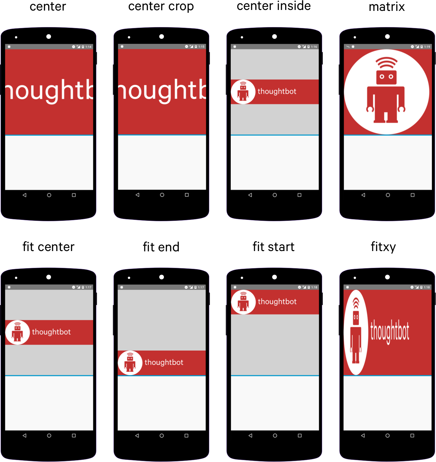
Refer to this ImageView ScaleType visual guide for additional reference. Remember that if you wish to match the aspect ratio of the actual drawable, adjustViewBounds=true must be declared along with not defining an explicit width and/or height.
Since Android has so many different screen sizes, resolutions and densities, there is a powerful system for selecting the correct image asset for the correct device. There are specific drawable folders for each device density category including: ldpi (low), mdpi (medium), hdpi (high), and xhdpi (extra high). Notice that every app has folders for image drawables such as drawable-mdpi which is for «medium dots per inch».
To create alternative bitmap drawables for different densities, you should follow the 3:4:6:8 scaling ratio between the four generalized densities. Refer to the chart below:
| Density | DPI | Example Device | Scale | Pixels |
|---|---|---|---|---|
| ldpi | 120 | Galaxy Y | 0.75x | 1dp = 0.75px |
| mdpi | 160 | Galaxy Tab | 1.0x | 1dp = 1px |
| hdpi | 240 | Galaxy S II | 1.5x | 1dp = 1.5px |
| xhdpi | 320 | Nexus 4 | 2.0x | 1dp = 2px |
| xxhdpi | 480 | Nexus 5 | 3.0x | 1dp = 3px |
| xxxhdpi | 640 | Nexus 6 | 4.0x | 1dp = 4px |
This means that if you generate a 100×100 for mdpi (1x baseline), then you should generate the same resource in 150×150 for hdpi (1.5x), 200×200 image for xhdpi devices (2.0x), 300×300 image for xxhdpi (3.0x) and a 75×75 image for ldpi devices (0.75x). See these density guidelines for additional details.

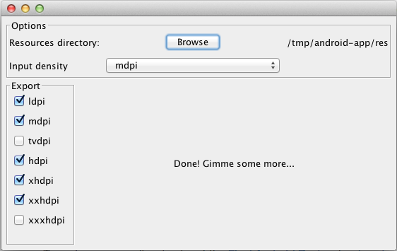
This handy utility allows us to select a resources directory, choose an extra high density image and the tool will automatically generate the corresponding lower size images for us and place the subfolders inside the generated res-drawable directory within the actual res folder in your project as the example shows below in «Project» view (left) and the default «Android» view (right):


Refer to the screens support reference for a more detailed look at supporting a wide range of devices. Also check out the iconography guide for more details.
Starting with Android 4.3, there is now an option to use the res/mipmap folder to store «mipmap» images. Mipmaps are most commonly used for application icons such as the launcher icon. To learn more about the benefits of mipmaps be sure to check out the mipmapping for drawables post.
Mipmap image resources can then be accessed using the @mipmap/ic_launcher notation in place of @drawable . Placing icons in mipmap folders (rather than drawable) is considered a best practice because they can often be used at resolutions different from the device’s current density. For example, an xxxhdpi app icon might be used on the launcher for an xxhdpi device. Review this post about preparing for the Nexus 6 which explains in more detail.
We can change the bitmap displayed in an ImageView to a drawable resource with:
or to any arbitrary bitmap with:
If we need to resize a Bitmap, we can call the createScaledBitmap method to resize any bitmap to our desired width and height:
You often want to resize a bitmap but preserve the aspect ratio using a BitmapScaler utility class with code like this:
In other cases, you may want to determine the device height or width in order to resize the image accordingly. Copy this DeviceDimensionsHelper.java utility class to DeviceDimensionsHelper.java in your project and use anywhere that you have a context to determine the screen dimensions:
Check out this source for more information on how to scale a bitmap based instead on relative device width and height.
Note: Doing any type of scaling of images results in the loss of EXIF metadata that includes info such as camera, rotation, date/time of the photo taken. While there are workarounds to transfer this data after the image has been copied, there are current limitations. If you need this info or wish to upload it to some site, you should send the original file and not the downsampled version.
Android now has vector drawables support, which allows SVG files to be imported to a specific format. SVG files can be automatically converted using Android Studio by going to File -> New -> Vector Asset . Make sure to click Local file (SVG, PSD) to import the file.
Android can print images using the PrintHelper class. The following method sends a command to the printer to print a bitmap image.
Источник


