- Урок 4. Android Material Design. Установка теней и обрезка View
- Настройте тени и контуры
- Обрежьте view
- Cardview with Recyclerview Android Example [beginners]
- Cardview XML attribute
- Cardview android example with Recyclerview
- Step 1 — Adding dependencies
- Using the CardView
- Android java cardview shadow
- About
- Android java cardview shadow
- About
Урок 4. Android Material Design. Установка теней и обрезка View
Перевод документации официального сайта developer.android.com
 Рисунок 1. Тени для различных высот view.
Чтобы установить высоту view в макете используйте атрибут android:elevation. Чтобы установить высоту в коде activity, используйте метод View.setElevation().
Чтобы установить смещение, используйте метод View.setTranslationZ().
Новые методы ViewPropertyAnimator.z() и ViewPropertyAnimator.translationZ() позволяют легко анимировать высоту view. Для получения дополнительной информации, смотрите справку по ViewPropertyAnimator и руководство разработчика о свойствах анимации.
Вы так же можете использовать StateListAnimator чтобы установить анимации декларативно. Это особенно полезно в тех случаях, когда изменяется состояние триггера анимации, например, когда пользователь нажимает на кнопку. Для получения дополнительной информации, смотрите Изменение состояния анимации view.
Значение Z измеряется в dp (density-independent pixels).
Настройте тени и контуры
Границы фона drawable view определяют форму его тени. Контуры представляют собой внешнюю форму графического объекта и определяют область для сенсорного отклика.
Рассмотрим view, определенное с помощью фона dravable:
Фон drawable определен как прямоугольник с закругленными углами:
View отбрасывает тень с закругленными углами, после того как фон drawable установил границы view. Создание пользовательского контура переопределяет форму тени view по умолчанию.
Чтобы установить пользовательский контур для view в коде:
1. Унаследуйтесь от класса ViewOutlineProvider.
2. Переопределите метод getOutline().
3. Назначьте нового поставщика контура для вашего view с помощью метода View.setOutlineProvider() .
Вы можете создать овальные и прямоугольные очертания с закругленными углами используя методы класса Outlines. Поставщик контура для view по умолчанию получает контур из фона view. Чтобы view не отбрасывала тень, установите значение поставщика контура в null.
Обрежьте view
Обрезание позволяет вам легко изменить форму view. Вы можете обрезать view для совместимости с другими элементами дизайна или изменить форму view в ответ на действия пользователя. Вы можете обрезать view к его области контура с помощью метода View.setClipToOutline() или используя атрибут android:clipToOutline. Только прямоугольник, круг и скругленный прямоугольник поддерживают обрезание, как определено в методе Outline.canClip().
Чтобы обрезать view в форме drawable, установите drawable в качестве фона view (как показано выше), и вызовите метод View.setClipToOutline().
Обрезание view это дорогостоящая операция, поэтому не анимируйте форму, которую вы используете чтобы обрезать view. Для достижения этого эффекта используйте Reveal эффект анимации.
Источник
Cardview with Recyclerview Android Example [beginners]


Cardview Android is a new widget for Android, which can be used to display a card sort of a layout in android. Cardview was introduced in Material Design in API level 21 (Android 5.0 i.e Lollipop).
Since, Cardview is part of material design.It’s such a view which has all material design properties, most importantly showing shadows according to the elevation.
The best part about this view is that it extends FrameLayout and it can be displayed on all the platforms of Android since it’s available through the Support v7 library.
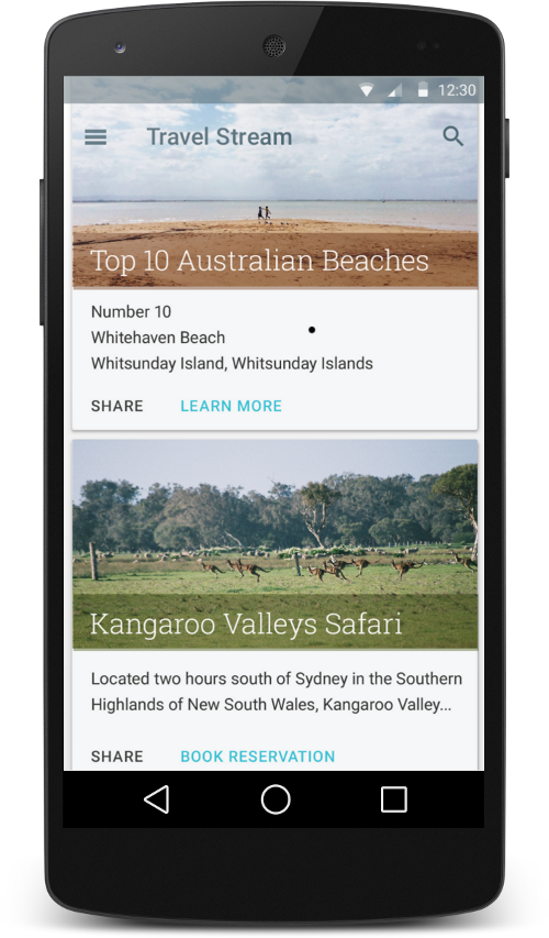
The design of the cardview will be looks like,

In the above picture, every boxes made with cardview in android.
Before jumping into the coding part, Let’s see the Cardview XML attribute, that makes the cardview looks beautiful.
Cardview XML attribute
CardView_cardBackgroundColor : ColorStateList: The new ColorStateList to set for the card background
CardView_cardCornerRadius : float: The radius in pixels of the corners of the rectangle shape
CardView_cardElevation : float: The backward compatible elevation in pixels.
CardView_cardMaxElevation : float: The backward compatible maximum elevation in pixels.
CardView_cardPreventCornerOverlap : boolean: Whether CardView should add extra padding to content to avoid overlaps with the CardView corners.
CardView_cardUseCompatPadding : boolean: true> if CardView should add padding for the shadows on platforms Lollipop and above.
CardView_contentPadding : Sets the padding between the Card’s edges and the children of CardView.
CardView_contentPaddingBottom : int: The bottom padding in pixels
CardView_contentPaddingLeft : int: The left padding in pixels
CardView_contentPaddingRight : int: The right padding in pixels
Done with explanation about the android cardview. Let get into the coding part.
Cardview android example with Recyclerview
In this post, I am going to create cardview with recyclerview in android to list the movies with the image and the movie title.
example application demo,
Step 1 — Adding dependencies
In this example, I am using recyclerview with cardview. But I am not going deeper into recyclerview. I am already have a post on recyclerview in android.
Источник
Using the CardView
Android 7.0 introduces a new widget called CardView which essentially can be thought of as a FrameLayout with rounded corners and shadow based on its elevation. Note that a CardView wraps a layout and will often be the container used in a layout for each item within a ListView or RecyclerView.
CardView should be used when displaying heterogeneous content (where different cards show different types of information). Using a list or a grid of tiles (non-cards) for homogeneous content is preferred since the boundaries in a card can distract the user from quickly scanning a list.
Lets assume your layout looks something like this:
To create a card using this layout, first you need to import the CardView from AndroidX library in your build.gradle file.
Now replace the FrameLayout with CardView .
CardView provides a default elevation and corner radius so that cards have a consistent appearance across the platforms. However, you may choose to customize these values if you desire to do so. We can also set the background color of the card.
Note that the card_view:cardElevation is used to determine the size and softness of the shadow so as to realistically depict the depth. These properties can be set programmatically as well:
See the CardView docs for additional properties.
By default, a CardView is not tappable and it doesn’t show any touch feedback. Touch feedback animations provide users with visual feedback when a CardView is touched. To enable this behavior, add the following attributes to your CardView .
Using the android:foreground=»?android:attr/selectableItemBackground» property on a CardView enables the ripple effect to originate from the touch origin.
On platforms before Android L, CardView adds padding to support corner radius, since rounded corner clipping can be an expensive operation. Similarly, for shadows, before L, CardView adds content padding and draws shadows to that area. This content padding is based on the elevation, and as per the docs:
This padding amount is equal to maxCardElevation + (1 — cos45) * cornerRadius on the sides and maxCardElevation * 1.5 + (1 — cos45) * cornerRadius on top and bottom.
Thus, if you would like to specify custom padding on the content, you need to use a new attribute card_view:contentPadding .
Similarly, to change the background color of a CardView, you need to use a new attribute card_view:cardBackgroundColor .
Источник
Android java cardview shadow
This library draw android view shadow by ShadowLayer. You may don’t like the CardView’s black shadow which we can’t change it’s color. Same to CardView wrap content and set shadow radius. You can change shadow color, foreground color and corner radius everywhere. Because the shadow is draw in the view. So you must add space to draw the shadow. The ShadowView add one param shadowMargin which must be set before you add shadow radius to the view.
Caveat: Margin In UI
= layout_margin + shadow_margin(Add by ShadowView)
| H | H | H |
|---|---|---|
| Change Radius | Change foreground | Change Corners |
 |  |  |
| Change shadow color | Change shadow margin | Demo |
 |  |  |

About
Deprecated because of the performance not fine. Android custom shadow view, can replace your CardView
Источник


