- Animations in Navigation Compose
- Compose 💚 Animations
- Experimental APIs and Semantic Versioning
- Getting Navigation 2.4 to stable
- Introducing: Accompanist Navigation Animation!
- The future of Navigation Compose and Animations
- Go forth and animate
- Jetpack Compose Animations I
- State-Driven Animations
- AnimatedVisibility
- animateContentSize()
- animateFooAsState
- Transitions
- Conclusion
Animations in Navigation Compose

Jetpack Compose moves the bar on animations from ‘polish, if we have the time’ to ‘so easy there’s no reason to not do it’ and a big part of that are screen level transitions. That’s why Navigation Compose has been working towards a set of solutions that solve three specific cases:
- Using only the stable Animation APIs in Compose 1.0.0
- Enabling support for Experimental Animation APIs present in Compose 1.0.0
- Building towards the future Animation APIs (shared element transitions. ) in Compose 1.1.0 and beyond
Each of these requires a slightly different approach, which we’ll cover here.
Compose 💚 Animations
Jetpack Compose has come a long, long way since the first 0.1.0-dev01 release through to the new Compose 1.0.1 release. One of the areas that has been a huge improvement over the View world has been that of animations and transitions. In the quest for the perfect animation APIs, a lot of changes were made as Compose marched towards 1.0.0.
While a number of lower level Animation APIs like the incredibly powerful animateTo() and animate*AsState() are stable, foundational parts of Compose at this point, there’s a whole class of APIs on top of those building blocks marked with @ExperimentalAnimationApi .
Experimental APIs and Semantic Versioning
An Experimental API (any API using @RequiresOptIn API in Kotlin land) means that these APIs are subject to change at any point. This means that those APIs might be changed, improved, or replaced in any future release — maybe it is Compose 1.1.0-alpha04 or 1.2.0-alpha08. As such, any library that is built on those Experimental APIs would immediately crash and fail if you were to update the version of Compose you were using and not also update that library at the same time. (If you were along for the ride for early Compose releases, you know this pain.)
All AndroidX libraries, Navigation and Compose included, follow strict semantic versioning as explained on the AndroidX releases page. This means that any API that isn’t experimental is set in stone once a library goes to its Release Candidate (RC) phase. It would take a major version bump (i.e., a ‘2.0’) to make breaking API changes to these stable APIs.
This is great when it comes to forward and backward compatibility — for instance, you can upgrade your Fragment version to try out a new alpha while keeping your other dependencies on their stable releases and everything just works.
However, it also means that experimental APIs, being APIs that can shift out from underneath you, are strictly forbidden across different artifact groups — again, upgrading your version of androidx.fragment shouldn’t break androidx.appcompat . This also applies to androidx.navigation and androidx.compose.animation .
Getting Navigation 2.4 to stable
Navigation 2.4 is a big release as both the first release of Navigation Compose as well as the first release with multiple back stack support for both Navigation Compose and Navigation with Fragments. This means we’re wrapping up the remaining related API requests in preparation for moving through beta, RC, and to stable.
For Navigation Compose, this means that we’re building on top of Compose 1.0.1 with the goal of being forward compatible for those of you who want to (or have already!) moved to start depending on Compose 1.1.0-alpha01 and beyond.
That forward compatibility requirement means that any code in Navigation Compose 2.4.0 can only rely on stable Compose Animation APIs. This is how we were able to add crossfade support in Navigation 2.4.0-alpha05 — in the world of Compose, jump cuts should be the first thing on your list to banish completely.
This limitation on only using stable Compose Animation APIs means that APIs such as AnimatedContent aren’t something Navigation 2.4 can use directly to offer the kind of rich animation control you’d want directly as part of Navigation 2.4. However, the extensible nature of Navigation means that the underlying framework is already built and available.
Introducing: Accompanist Navigation Animation!
That underlying support for animating between destinations is why we’re able to release Accompanist Navigation Animation, built off of today’s release of Navigation 2.4.0-alpha06. The Navigation Animation artifact provides its own set of animation enabled versions of the Navigation Compose APIs you’ve been using:
- Replace rememberNavController() with rememberAnimatedNavController()
- Replace NavHost with AnimatedNavHost
- Replace import androidx.navigation.compose.navigation with import com.google.accompanist.navigation.animation.navigation
- Replace import androidx.navigation.compose.composable with import com.google.accompanist.navigation.animation.composable
At first glance, the appearance of your app hasn’t changed: the default animations are still the same type of fadeIn and fadeOut that the crossfade found in Navigation 2.4 does for you. However, you’ll gain one crucial new feature: the ability to configure those animations and substitute in your own transitions between screens.
This control comes in the form of four new parameters found on every composable destination:
- enterTransition : specifies the animation that runs when you navigate() to this destination.
- exitTransition : specifies the animation that runs when you leave this destination by navigating to another destination.
- popEnterTransition : specifies the animation that runs when this destination re-enters the screen after going through a popBackStack() . This defaults to the enterTransition .
- popExitTransition : specifies the animation that runs when this destination leaves the screen after you pop it off the back stack. This defaults to the exitTransition .
In each case, these parameters have the same format:
Each takes a lambda. That lambda is given the NavBackStackEntry of where you are coming from (the initial ) and where you are going to (the target ). For example, for the enterTransition , the entering destination is the target — the one you are applying the enterTransition to. The opposite applies to the exitTransition : the initial screen is the one you are applying the exit transition to.
This allows you to write your destination such as:
Or, control your animation based on where you’re coming from / going to:
Here, the friends list screen controls its exit transition to the profile screen and the profile screen controls its enter transition from the friends list, allowing for a custom slide over animation between these two destinations. We also see the usage of null to mean “use the defaults”. Those defaults come from the parent navigation graph and then the parent’s parent’s navigation graph, all the way up the hierarchy to the root AnimatedNavHost . This means that setting default animations (say, the timing on crossfades) is possible just by changing the global enterTransition and exitTransition on your AnimatedNavHost .
If you instead want to change the default for only one subgraph (say, your login flow always uses a horizontal slide in animation), you can set that animation on the nested graph level as well:
Note how we use the hierarchy extension method to determine if the destination is actually part of the login graph — that way our transition to the login graph and from the login graph just use the default transition (or whatever transition you’ve set at the higher level).
Whenever you have a directional transition such as sliding in horizontally, this is where the difference between enterTransition and popEnterTransition becomes incredibly handy — you’ll be able to avoid cases where one screen is sliding to the right while the other slides to the left.
Accompanist serves as the booster rockets for Jetpack libraries and let us deliver experimental features right now as the work on Compose 1.1 progresses.
The future of Navigation Compose and Animations
With Navigation 2.4 based on Compose 1.0.1 and Accompanist Navigation Animation stretching the limits of Compose 1.0 via experimental APIs, there’s something else on the horizon: Compose 1.1. Looking at the Compose Roadmap, there’s one really important upcoming feature to get excited about:
Support shared element transitions
Our goal for Navigation 2.5 is to bring all the goodness of Compose 1.1 to Navigation Compose. That means as animation APIs lose their experimental status, we can fold them directly into Navigation Compose. It also means that we can build the API that we know will support shared element transitions as they become available.
It also means that Accompanist Navigation Animation should be considered as a temporary measure: once Navigation Compose itself offers the same level of animation APIs (tailored based on your feedback!), you’ll be able to depend on it directly and remove Accompanist Navigation Animation entirely.
Go forth and animate
Balancing stability and the forward and backward compatibility requirements we put on ourselves as a Jetpack library with the ability to ship features quickly means this isn’t as straightforward as we’d like. Accompanist has been a huge boon as Jetpack Compose gains momentum and accelerates beyond the need for those booster rockets. I’d like to thank Chris Banes and all the developers who put time into Accompanist, the entire team behind Compose, and all of you for helping shape the future of Android development.
PS: if you’re looking for even more Navigation+Accompanist goodies, check out the also brand new Accompanist Navigation Material!
Источник
Jetpack Compose Animations I

Apr 5 · 5 min read
Jetpack Compose has been promoted from alpha to beta some time ago, which means the API’s last breaking changes are up. One of the greatest changes we can find is in its animations interface, which, in general, makes animations easier to understand, to read, and to build.
In this article, I will make a general overview of this animation API, making a special emphasis on Transition s object, which will help us create beautiful declarative animations in any composable we write by having a good control on what’s being displayed.
State-Driven Animations
If you’ve b e en into Jetpack Compose for a while, you’ll know that you can have some state in your composables by using the remember and (if the state is mutable) mutableStateOf duple. In case your state is immutable, the remember function will keep that very value in every recomposition; in case it is mutable, it will trigger the recomposition anytime that value changes, because when you use mutableStateOf you’ll receive a MutableState object, which is an observable type.
That recomposition is the key to create state-driven animations. They will be triggered in any change of state of our composable, taking advantage of the recomposition. Let’s see the simplest composable of this type: AnimatedVisibility .
AnimatedVisibility
You just need two things:
- Set a variable that will hold the state defining the visibility of the composable:
2. Wrap any composable you want inside the `AnimatedVisibility` composable:
So, anytime the value visible changes, the AnimatedVisibility composable will catch that change and manage the whole animation for you! Let’s say that you change the state via a Button composable:

IMPORTANT: right now, the AnimatedVisibility composable is an experimental feature, and such code must include the @ExperimentalAnimationApi annotation or it won’t compile.
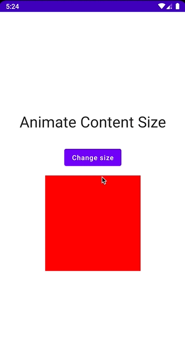
animateContentSize()
This is exactly the same principle of the Modifier.animateContentSize() function.
- Set a state with a Size value:
2. Add the animateContentSize to our composable:
3. Change the size variable in a Button :
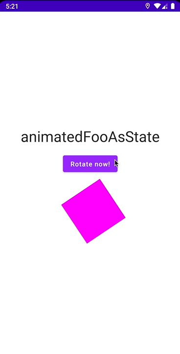
animateFooAsState
Finally, let me introduce the animateFooAsState , which follows the same principle of the state-driven animations and will animate the respective property when the state of the composable changes.
First of all, Jetpack Compose offers a lot of built-in functions that can animate different types of data. For example, you have: animateColorAsState , animateDpAsState , animateOffsetAsState , etc.
As in the previous examples, you need:
1. A piece of state that will change and trigger our animation:
2. Based on this rotate variable, set the targetValue that our animation is going to have:
3. Change our state by using a Button :
Transitions
Although AnimatedVisibility , animateContentSize and animateFooAsState can be very helpful and easy to use, they are pretty limited and they animate just one property at a time, letting us with a little monotone animations. We can apply the same principle of changing the state to create animations by using the Transition object, which is way more flexible. They allow us to do something like this:

Let’s take a look at the code.
For this example, you create a custom enum class that will be part of the state of our composable:
This boxPosition will be in charge of controlling the position of the box in our composable. However, if you just add the logic to move the box with no animations, the UI would look pretty awkward and lifeless. You can use the updateTransition function to create some animations!
The updateTransition animation will receive a targetState parameter, that will be listened by the transition to trigger the animation in your composable:
Now, the transition value is a Transition object, and it includes a method called animateFoo (very similar to animateFooAsState ). Its main argument is a lambda that will receive an object of the type of our targetState (in this case, a BoxPosition ), and you need to return the value you want it to take in a certain point. For this example I used animateOffset , and, in the case of BoxPosition.TopLeft , you need the box to be in the top-left corner of our container, so you need to return an Offset with both x and y equals to 0. You need to cover all of the cases in our BoxPosition class:
If you pay attention to the boxOffset variable, it is of the type State , which means it can be used as a normal value anywhere!
And once again, it’s a Button that will help you to change the state of your composable:
The getNextPosition seems a little bit like a state machine, and you can change the order of our animation with it.
Conclusion
Jetpack Compose has simplified animations to the point of creating declarative code in our composables: you just write how you want the UI to animate and the rest is managed by Compose. At the end, this was the main goal of Jetpack Compose: create a declarative UI toolkit to accelerate the app development and improve the code readability and logic.
There is more content about animations such as target based animations, keyframes, tweens, springs and more. But they’ll be explored in the next one.
You can find all the examples above in this repo.
Источник


