- Hands-on with Material Components for Android: Dialogs
- Part 7 of a series covering practical usage of Material Components for Android
- Setting up a Material Components theme for Android
- Attribute by attribute
- Basic usage 🏁
- Customization using the builder 🧰
- Title and supporting text
- Action buttons
- Simple items
- Single- and multi-choice items
- Custom layout/view
- Choosing a theme overlay 🤔
- Theming 🎨
- Color
- Typography
- Shape
- More resources 📚
- Showing Material Design Dialogs in an Android App
- 1. Alert Dialog
- Creating an Alert Dialog
- Styling an Alert Dialog
- 2. Confirmation Dialogs
- Multiple Choice Dialog
- Single Choice Dialog
- Date Picker Dialog
- Setting a Custom Theme
- Time Picker Dialog
- 3. Bottom Sheet Dialog
- 4. Full-Screen Dialog
- 5. Surviving Device Orientation
- Progress Dialog (deprecated)
- Conclusion
Hands-on with Material Components for Android: Dialogs
Part 7 of a series covering practical usage of Material Components for Android

This post will be covering the features and API of Dialog components. To find out how to handle initial setup of Material Components for Android (including the Gradle dependency and creating an app theme), please see my original post:
Setting up a Material Components theme for Android
Attribute by attribute
Dialogs are components, typically with modal windows, that are displayed in front of app content. They are used to inform users about a task that may contain critical information and/or require a decision. They purposefully interrupt the current flow and remain on screen until dismissed or action has been taken, so they should be used sparingly.
From a design perspective, there are three main types of dialogs which can be used in different scenarios:
- Alert dialog: The simplest of dialogs, despite the name. Used to interrupt a user with urgent information that typically requires user action/confirmation. Characterized by a title, optional supporting text and action buttons.

- Simple dialog: Used to present the user with a list of actions that, when tapped, take immediate effect. Should not contain action buttons.

- Confirmation dialog: Used to present a list of single- or multi-select choices to a user. Action buttons serve to confirm the choice(s).

All of the above share common characteristics: a background scrim that obscures app content (which can be optionally tapped to dismiss the dialog) and a surface container.
Note: A fourth type exists: Full screen dialog . To implement this, the official documentation recommends using a DialogFragment along with resource qualifiers to determine how it is presented. This is outside the scope of this article and won’t be covered.
Basic usage 🏁
All of the aforementioned dialog types can be implemented using MaterialAlertDialogBuilder . This builder class configures and instantiates an AlertDialog with Material Design specifications and theming.
The basic method of showing a dialog is like so:
The above approach will not retain the dialog after a configuration change (such as device rotation). To achieve this we need to use a DialogFragment while still using MaterialAlertDialogBuilder to provide the Dialog :
The DialogFragment can be shown using the Navigation Architecture Component or manually from a Fragment or Activity in the following way:
Customization using the builder 🧰
All of the characteristics listed in the three types of dialogs above (and more) can be achieved by passing parameters to MaterialAlertDialogBuilder . Some of these are listed below.
Note: In most cases below, hardcoded values are used. The builder provides overloads for resource IDs as well.
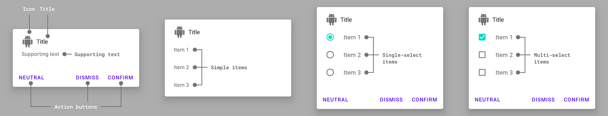
Title and supporting text
Action buttons
Simple items
Single- and multi-choice items
Custom layout/view
Note: The middle area of the dialog can be occupied by either supporting text or a set of items of a particular type. These cannot be combined.
Choosing a theme overlay 🤔
A couple of theme overlays exist for changing the general layout of a dialog. These theme overlay variants inherit from ThemeOverlay.MaterialComponents.MaterialAlertDialog , each with an optional suffix:
- Default: No suffix
- Centered: *.Centered , center-aligned title and icon
When implementing a global custom Material AlertDialog theme overlay, reference it in your app theme with the materialAlertDialogTheme attribute.
Alternatively, there exists a secondary MaterialAlertDialogBuilder constructor which accepts an overriding theme resource ID:
Theming 🎨
Material Alert Dialogs can be themed in terms of the three Material Theming subsystems: color, typography and shape. We have already shown which theme overlays to use in the “Choosing a theme overlay” section above. In addition to this, a custom AlertDialog style can be referenced within a theme overlay by extending the MaterialAlertDialog.MaterialComponents style and using the alertDialogStyle attribute.
Color
There are no specific attributes to customize the colors used in a dialog but the colorPrimary , colorSecondary , colorSurface and respective “on” colors used in your app theme will automatically adjust the dialog colors when changed.

Typography
The dialog text elements will adopt the fontFamily attribute defined in your app theme. The action buttons will be styled according to the textAppearanceButton style set in your app theme.
In your theme overlay, you can also use the materialAlertDialogBodyTextStyle attribute to specifically style the body text.

Shape
The shape of a dialog background can be customized with the shapeAppearance attribute. This defaults to shapeAppearanceMediumComponent .

More resources 📚
- The source code for the Playground app used in this article can be found on GitHub.
- Dialogs Design Documentation
- Dialogs API Documentation
I hope this post has provided some insight into dialogs and how they can be used in your Android app(s). If you have any questions, thoughts or suggestions then I’d love to hear from you!
Источник
Showing Material Design Dialogs in an Android App
The material design team at Google defines the functionality of dialogs in Android as follows:
Dialogs inform users about a specific task and may contain critical information, require decisions, or involve multiple tasks.
Now you have understood what dialogs are used for, it’s now time to learn how to display them. In this tutorial, I’ll take you through the process of showing different kinds of material design dialogs in Android. We’ll cover the following dialogs:
- alert
- single and multiple choice
- time and date picker
- bottom sheet dialog
- full-screen dialog
A sample project for this tutorial can be found on our GitHub repo for you to easily follow along.
1. Alert Dialog
According to the official Google material design documentation:
Alerts are urgent interruptions, requiring acknowledgement, that inform the user about a situation.
Creating an Alert Dialog
Make sure you include the latest appcompat artifact in your build.gradle file (app module). The minimum supported API level is Android 4.0 (API level 14).
The next thing is to create an instance of AlertDialog.Builder .
Here we created an instance of AlertDialog.Builder and began configuring the instance by calling some setter methods on it. Note that we are using the AlertDialog from the Android support artifact.
Here are the details of the setter methods we called on the AlertDialog.Builder instance.
- setTitle() : set the text to show in the title bar of the dialog.
- setMessage() : set the message to display in the dialog.
- setPositiveButton() : the first argument supplied is the text to show in the positive button, while the second argument is the listener called when the positive button is clicked.
- setNegativeButton() : the first argument supplied is the text to show in the negative button, while the second argument is the listener called when the negative button is clicked.
Note that AlertDialog.Builder has a setView() to set your custom layout view to it.
To show our dialog on the screen, we just invoke show() .


There is another setter method called setNeutralButton() . Calling this method will add another button on the far left side of the dialog. To call this method, we have to pass a String that will serve as the button text, and also a listener that is called when the button is tapped.


Note that touching outside the dialog will automatically dismiss it. To prevent that from happening, you will have to call the setCanceledOnTouchOutside() on the AlertDialog instance and pass false as an argument.
To further prevent dismissing the dialog by pressing the BACK button, you then have to call setCancelable() on the AlertDialog instance and pass false to it as an argument.
Styling an Alert Dialog
It’s quite easy to style our dialog. We just create a custom style in the styles.xml resource. Observe that this style parent is Theme.AppCompat.Light.Dialog.Alert . In other words, this style inherits some style attributes from its parent.
We begin customising the dialog style by setting the values of the attributes to be applied on the dialog—for example, we can change the dialog button colour to be @android: color /holo_orange_dark and also set the dialog background to a custom drawable in our drawable resource folder ( android:windowBackground set to @drawable/background_dialog ).
Here is my background_dialog.xml resource file.
Here we created a custom InsetDrawable which allows us to add insets on any side of the ShapeDrawable . We created a rectangle shape using the tag. We set the android:shape attribute of the tag to a rectangle (other possible values are line , oval , ring ). We have a child tag that sets the radius of the rectangle corners. For a solid fill, we added the tag with an android:color attribute which indicates what color to use. Finally, we gave our drawable a border by using the tag on the .
To apply this style to the dialog, we just pass the custom style to the second parameter in the AlertDialog.Builder constructor.


2. Confirmation Dialogs
Confirmation dialogs require users to explicitly confirm their choice before an option is committed. For example, users can listen to multiple ringtones but only make a final selection upon touching “OK.”
The following different kinds of confirmation dialog are available:
- multiple choice dialog
- single choice dialog
- date picker
- time picker
Multiple Choice Dialog
We utilize a multiple choice dialog when we want the user to select more than one item in a dialog. In a multiple choice dialog, a choice list is displayed for the user to choose from.
To create a multiple choice dialog, we simply call the setMultiChoiceItems() setter method on the AlertDialog.Builder instance. Inside this method, we pass an Array of type String as the first parameter. Here’s my array, located in the arrays resource file /values/arrays.xml.
The second parameter to the method setMultiChoiceItems() accepts an array which contains the items that are checked. The value of each element in the checkedItems array corresponds to each value in the multiChoiceItems array. We used our checkedItems array (the values of which are all false by default) to make all items unchecked by default. In other words, the first item «Dark Knight» is unchecked because the first element in the checkedItems array is false , and so on. If the first element in the checkedItems array was true instead, then «Dark Knight» would be checked.
Note that this array checkedItems is updated when we select or click on any item displayed—for example, if the user should select «The Shawshank Redemption» , calling checkedItems[1] would return true .
The last parameter accepts an instance of OnMultiChoiceClickListener . Here we simply create an anonymous class and override onClick() . We get an instance of the shown dialog in the first parameter. In the second parameter, we get the index of the item that was selected. Finally, in the last parameter, we find out if the selected item was checked or not.


Single Choice Dialog
In a single choice dialog, unlike the multiple choice dialog, only one item can be selected.
To create a single choice dialog, we simply invoke the setSingleChoiceItems() setter on the AlertDialog.Builder instance. Inside this method, we also pass an Array of type String as the first parameter. Here’s the array we passed, which is located in the arrays resource file: /values/arrays.xml.
The second parameter of the setSingleChoiceItems() is used to determine which item is checked. The last parameter in onClick() gives us the index of the item that was selected—for example, selecting the Female item, the value of selectedIndex will be 1 .


Date Picker Dialog
This is a dialog picker that is used to select a single date.
To start, we’ll create a Calendar field instance in the MainActivity and initialize it.
Here we called Calendar.getInstance() to get the current time (in the default time zone) and set it to the mCalendar field.
To show a date picker dialog, we create an instance of the DatePickerDialog. Here is the explanation of the parameter definitions when creating an instance of this type.
- The first parameter accepts a parent context—for example, in an Activity , you use this , while in a Fragment , you call getActivity() .
- The second parameter accepts a listener of type OnDateSetListener . This listener onDateSet() is called when the user sets the date. Inside this method, we get the selected year, the selected month of the year, and also the selected day of the month.
- The third parameter is the initially selected year.
- The fourth parameter is the initially selected month ( 0 — 11 ).
- The last parameter is the initially selected day of the month ( 1 — 31 ).
Finally, we call the show() method of the DatePickerDialog instance to display it on the current screen.


Setting a Custom Theme
It’s quite easy to customize the theme of the date picker dialog (similar to what we did to the alert dialog).
Briefly, you create a custom drawable, create a custom style or theme, and then apply that theme when creating a DatePickerDialog instance in the second parameter.
Time Picker Dialog
The time picker dialog allows the user to pick a time, and adjusts to the user’s preferred time setting, i.e. the 12-hour or 24-hour format.
As you can see in the code below, creating a TimePickerDialog is quite similar to creating a DatePickerDialog . When creating an instance of the TimePickerDialog , we pass in the following parameters:
- The first parameter accepts a parent context.
- The second parameter accepts an OnTimeSetListener instance that serves as a listener.
- The third parameter is the initial hour of the day.
- The fourth parameter is the initial minute.
- The last parameter is to set whether we want the view in 24-hour or AM/PM format.
The onTimeSet() method is called every time the user has selected the time. Inside this method, we get an instance of the TimePicker , the selected hour of the day chosen, and also the selected minute.
To display this dialog, we still call the show() method.


The time picker can be styled in a similar way to the date picker dialog.
3. Bottom Sheet Dialog
According to the official Google material design documentation:
Bottom sheets slide up from the bottom of the screen to reveal more content.
To begin using the bottom sheet dialog, you have to import the design support artifact—so visit your app module’s build.gradle file to import it.
Make sure that the activity or fragment for the bottom sheet dialog will pop up—its parent layout is the CoordinatorLayout .
Here we also have a FrameLayout that would serve as a container for our bottom sheet. Observe that one of this FrameLayout ‘s attributes is app:layout_behavior , whose value is a special string resource that maps to android.support.design.widget.BottomSheetBehavior . This will enable our FrameLayout to appear as a bottom sheet. Note that if you don’t include this attribute, your app will crash.
Here we declared an instance of BottomSheetDialog as a field to our MainActivity.java and initialized it in the onCreate() method of our activity.
In the preceding code, we inflated our bottom sheet layout R.layout.bottom_sheet_dialog . We set listeners for the Cancel and Ok buttons in the bottom_sheet_dialog.xml. When the Cancel button is clicked, we simply dismiss the dialog.
We then initialized our mBottomSheetDialog field and set the view using setContentView() . Finally, we call the show() method to display it on the screen.
Here is my bottom_sheet_dialog.xml:


Make sure you check out How to Use Bottom Sheets With the Design Support Library by Paul Trebilcox-Ruiz here on Envato Tuts+ to learn more about botttom sheets.


4. Full-Screen Dialog
According to the official Google material design documentation:
Full-screen dialogs group a series of tasks (such as creating a calendar entry) before they may be committed or discarded. No selections are saved until “Save” is touched. Touching the “X” discards all changes and exits the dialog.
Let’s now see how to create a full-screen dialog. First, make sure you include the Android support v4 artifact in your app’s module build.gradle . This is required to support Android 4.0 (API level 14) and above.
Next, we will create a FullscreenDialogFragment that extends the DialogFragment super class.
Here we override the onCreateView() (just as we would do with an ordinary Fragment ). Inside this method, we simply inflate and return the layout ( R.layout.full_screen_dialog ) that will serve as the custom view for the dialog. We set an OnClickListener on the ImageButton ( R.id.button_close ) which will dismiss the dialog when clicked.
We also override onCreateDialog() and return a Dialog . Inside this method, you can also return an AlertDialog created using an AlertDialog.Builder .
Our R.layout.full_screen_dialog consists of an ImageButton , a Button , and some TextView labels:
In the ImageButton widget, you will see an attribute app:srcCompat which references a custom VectorDrawable ( @drawable/ic_close ). This custom VectorDrawable creates the X button, which closes the full-screen dialog when tapped.
In order to use this app:srcCompat attribute, make sure you include it in your build.gradle file. Next, configure your app to use vector support libraries and add the vectorDrawables element to your build.gradle file in the app module.
We did this so that we can support all Android platform versions back to Android 2.1 (API level 7+).
Finally, to show the FullscreenDialogFragment , we simply use the FragmentTransaction to add our fragment to the UI.


5. Surviving Device Orientation
Note that all the dialogs discussed here, except the full-screen dialog, will be dismissed automatically when the user changes the screen orientation of the Android device—from portrait to landscape (or vice versa). This is because the Android system has destroyed and recreated the Activity so as to fit the new orientation.
For us to sustain the dialog across screen orientation changes, we’ll have to create a Fragment that extends the DialogFragment super class (just as we did for the full-screen dialog example).
Let’s see a simple example for an alert dialog.
Here, we created a class that extends the DialogFragment and also implements the DialogInterface.OnClickListener . Because we implemented this listener, we have to override the onClick() method. Note that if we tap the positive or negative button, this onClick() method will be invoked.
Inside our onCreateDialog() , we create and return an instance of AlertDialog .
We’ve also overridden:
- onCancel() : this is called if the user presses the BACK button to exit the dialog.
- onDismiss() : this is called whenever the dialog is forced out for any reason (BACK or a button click).
To show this dialog, we simply call the show() method on an instance of our AlertDialogFragment .
The first parameter is an instance of the FragmentManager . The second parameter is a tag that can be used to retrieve this fragment again later from the FragmentManager via findFragmentByTag() .


Now, if you change the device orientation from portrait to landscape (or vice versa), the alert dialog won’t be dismissed.
You can follow similar steps for the other dialog types to maintain the dialog during device rotation. You simply create a Fragment that extends the DialogFragment super class, and you create and return the particular dialog in onCreateDialog() .
Progress Dialog (deprecated)
Some of you may have heard about ProgressDialog . This simply shows a dialog with a progress indicator on it. I didn’t include it here, because ProgressDialog has been deprecated in API level 26—because it can lead to a bad user experience for your users. According to the official documentation:
ProgressDialog is a modal dialog, which prevents the user from interacting with the app. Instead of using this class, you should use a progress indicator like ProgressBar , which can be embedded in your app’s UI. Alternatively, you can use a notification to inform the user of the task’s progress.
Conclusion
In this tutorial, you learned the different ways of showing material design dialogs in an Android app. We covered the following material design dialog types:
- alerts
- single and multiple choice dialogs
- time and date pickers
- bottom sheet dialog
- full-screen dialog
You also learned how to create a custom style for a dialog and make your dialog survive orientation configuration changes between landscape and portrait using DialogFragment .
It’s highly recommended you check out the official material design guidelines for dialogs to learn how to properly design and use dialogs in Android.
To learn more about coding for Android, check out some of our other courses and tutorials here on Envato Tuts+!
Источник


