- Реализация BottomAppBar. Часть 3: Поведения для Android
- Поведение
- Макет
- Скроллирование
- Возвышение
- Hands-on with Material Components for Android: Bottom App Bar
- Part 1 of a series covering practical usage of Material Components for Android
- Setting up a Material Components theme for Android
- Attribute by attribute
- Basic usage 🏁
- Handling menu and navigation items 🍽
- Using setSupportActionBar
- Using convenience functions
- What about the navigation item?
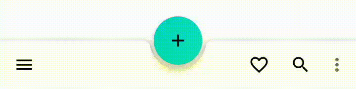
- Anchoring a FAB ⚓
- Scrolling behavior ☝
- Theming 🎨
- Color
- Typography
- Shape
- More resources 📚
Реализация BottomAppBar. Часть 3: Поведения для Android

BottomAppBar — это один из новых Android Material компонентов, которые были представлены на Google I/O 2018. Благодаря перемещению Navigation Drawer и меню приложения в нижнюю часть экрана, BottomAppBar радикально меняет внешний вид Android приложений.
В первой и второй частях нашей серии статей про BottomAppBar мы познакомились с BottomAppBar и обсудили его атрибуты. Также мы объяснили, как реализовать Navigation Drawer и меню приложения в рамках BottomAppBar.
Поведение
Согласно Material Design, компоненты приложения не являются статичными. Они могут перемещаться или трансформироваться, т.е. иметь какое-то поведение. Material Design также формирует некие рамки для такого поведения. В этой статье мы обсудим детали реализации рекомендуемого поведения для BottomAppBar, которое представлено на странице гайдлайнов для BottomAppBar.
Макет
Первый гайдлайн описывает макет BottomAppBar. Вот что предлагается:
Для разных по смыслу экранов приложения, можно изменять макет и набор пунктов меню в BottomAppBar. Например, можно отображать больше или меньше пунктов меню в зависимости от того, что лучше всего подходит для конкретного экрана.

Основываясь на этом гайдлайне, на главных экранах рекомендуется использовать макет BottomAppBar, показывающий несколько пунктов в меню и центрированную FAB (Floating Action Button). На второстепенных экранах, переход на которые осуществляется с главных, макет BottomAppBar должен состоять из выровненной по правому краю FAB и нескольких дополнительных пунктов в меню. Переходы между этими двумя экранами должны выполняться надлежащим образом. Gif сверху демонстрирует этот гайдлайн.
Теперь давайте посмотрим, как можно реализовать это поведение. У нас есть два xml-файла в папке res/menu для меню каждого экрана:
Когда происходит переход между экранами, например, по нажатию кнопки TOGGLE SCREEN в нашем случае, макет BottomAppBar, включая меню и FAB, должен измениться. Вот базовый код для такого поведения макета BottomAppBar:
Если вы хотите сделать анимированные переходы, нужен дополнительный код. Вы можете изучить исходный код, прикреплённый в конце этой статьи, в котором найдёте анимацию.
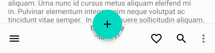
Скроллирование
Скроллирование — важный триггер поведения для таких компонентов, как BottomAppBar. На странице гайдлайнов Material Design рекомендуется следующее поведение для этого случая:
При скроллировании BottomAppBar может появиться или исчезнуть:
— Скроллирование вниз скрывает BottomAppBar. Если на нём была FAB, она отсоединяется от панели и остается на экране.
— Скроллирование вверх показывает BottomAppBar и снова присоединяет его к FAB, если она там была.
Ниже приведена демонстрация поведения BottomAppBar при скроллировании.
Чтобы использовать это поведение, BottomAppBar и FAB должны быть прямыми дочерними элементами CoordinatorLayout. Затем мы включаем hideOnScroll и устанавливаем флаги скроллирования для BottomAppBar:
Этого вполне достаточно для реализации такого поведения BottomAppBar.
Возвышение
У каждого компонента в мире Material Design есть возвышение, аналогичное нашему физическому миру. У BottomAppBar возвышение — 8dp, а само содержимое экрана возвышается на 0dp. FAB в статичном состоянии возвышается на 12dp. Два компонента, которые мы ещё вспомним в этой статье, Navigation Drawer и Snackbar, возвышаются на 16dp и 6dp соответственно.
Как правило, Snackbar — это компонент для уведомления пользователя, выскакивающий из нижней части экрана. Но если на экране есть BottomAppBar или Navigation Drawer, поведение Snackbar должно измениться. В этих случаях Snackbar следует показывать над нижними компонентами. Вот демонстрация и соответствующий код для реализации:
Как мы уже упоминали, Navigation Drawer возвышается на 16dp, что означает — согласно гайдлайну —
Меню, выпадающие из BottomAppBar (например, Navigation Drawer), открываются как модальные окна на уровень выше, чем сам BottomAppBar.
Ниже приведена реализация нашего Navigation Drawer:
Navigation Drawer является модальным окном и поэтому следует приведённому выше правилу реализации.
Детали реализации этого поведения выглядят следующим образом. В папке res/menu должен быть создан xml-файл меню для Navigation View, который будет использован в Navigation Drawer:
Затем должен быть создан файл макета для фрагмента, использующего Navigation Drawer:
Этот файл макета содержит Navigation View и другие компоненты, формирующие макет для Navigation Drawer. Чтобы создать этот макет, нам нужен класс фрагмента, расширяющий BottomSheetDialogFragment:
При клике по значку Navigation Drawer создаётся экземпляр этого фрагмента, который показывается в виде модального окна:
Это статья завершает нашу серию статей про BottomAppBar. Найти исходный код этой статьи вы можете на Github. Комментируйте и задавайте вопросы.
Источник
Hands-on with Material Components for Android: Bottom App Bar
Part 1 of a series covering practical usage of Material Components for Android

This post will be covering the features and API of the Bottom App Bar component. To find out how to handle initial setup of Material Components for Android (including the Gradle dependency and creating an app theme), please see my original post:
Setting up a Material Components theme for Android
Attribute by attribute
The Bottom App Bar is an evolution of the traditional Top App Bar (a.k.a Toolbar or ActionBar in the Android world) which, one might argue, was the defining component of v1 of the Material Guidelines. The Bottom App Bar maintains the core features of an App Bar while offering a fresh look and functional improvements in key areas.

Like its Top counterpart, the Bottom App Bar serves to:
- Highlight important screen actions with icon menu items
- Provide a means of interacting with app navigation (such as opening a Navigation Drawer or navigating back/up) with a navigation icon menu item
- Act as an anchor for a FAB (Floating Action Button)
However, the characteristics that set the Bottom App Bar apart are:
- Ergonomics: The bottom placement makes it easier to reach with a single hand on mobile devices
- Flexibility: As we will explore further on, the layout of the Bottom App Bar and the position of a FAB and icon menu items can change based on the needs of the screen
Basic usage 🏁
A BottomAppBar can be included in your screen layout like so:
As shown above, the parent ViewGroup of a BottomAppBar should ideally be a CoordinatorLayout . This allows for full customization of scrolling and FAB anchoring behaviors.
Handling menu and navigation items 🍽
A BottomAppBar can have its menu implemented in the same way as a Toolbar (its parent class) or with new convenience functions specific to BottomAppBar .

Using setSupportActionBar
This should be familiar territory for most Android developers. As with a Toolbar , a variety of hooks/callbacks exist for attaching a BottomAppBar to an Activity or Fragment , inflating a menu and handling item clicks. To do so, you’ll need to be using the AndroidX AppCompatActivity and/or Fragment classes. You should also be using a *.NoActionBar app theme variant.
If you’re using a Fragment , you will firstly need to enable the aforementioned menu callbacks in the Fragment#onCreate callback:
Note: This is not necessary if you are using an Activity .
After you’ve inflated a layout, you’ll then need to let the Activity / Fragment know that your BottomAppBar is the primary Action Bar for the screen, in order to link it to the callbacks. This can be done in the Activity#onCreate callback ( after the call to setContentView , unless you’re using the ContentView annotation) or the Fragment#onViewCreated callback:
Now you can make use of the overridable callbacks for inflating a menu resource and handling item clicks. This is detailed in the Android Menus documentation.
Using convenience functions
Compared to the previous approach, a simpler convenience function exists for inflating a BottomAppBar menu:
An equally simple function exists for attaching a menu item click listener:
What about the navigation item?
Seeing as the navigation item does not form part of the inflated menu, it needs to be set separately on the BottomAppBar . This can be done in XML:
Alternatively, it can be done programmatically:
Detecting when the navigation item has been clicked is very similar to how it is done for regular menu items.
If you’re using the setSupportActionBar method mentioned above, check for the android.R.id.home ID in the onOptionsItemSelected callback.
Alternatively, a convenience function exists:
Anchoring a FAB ⚓
A FloatingActionButton can be anchored to a BottomAppBar . This draws attention to the important screen action that the FAB fulfils while also reducing the vertical space taken up by both components. The menu items will change position depending on the chosen anchoring properties.
From a design perspective, there are two ways of anchoring a FAB:
- Inset: The shape of the BottomAppBar is transformed to allow the FAB to be “cradled” (at the same elevation) within a cutout. This is the default behavior.

Note: The Material Guidelines caution against using an Extended FAB with a Bottom App Bar. Limited anchoring support was added in Material Components for Android 1.1.0-alpha04 , but cutouts and animations are not supported.
In order to implement this the FAB also needs to be within the parent CoordinatorLayout :
By default, the FAB is cradled and horizontally center-aligned. A number of attributes exist to customize these properties:
- fabAlignmentMode : The horizontal alignment of the FAB. This can either be set to center ( FAB_ALIGNMENT_MODE_CENTER , default) or end ( FAB_ALIGNMENT_MODE_END ). When programmatically changed, a hide/show animation (defined by fabAnimationMode below) will run.

- fabCradleMargin : The distance between the edge of the FAB and the BottomAppBar cradle cutout. Defaults to 5dp .

- fabCradleRoundedCornerRadius : The radius of the corners of the BottomAppBar cradle cutout. Defaults to 8dp .

- fabCradleVerticalOffset : The vertical offset distance of the FAB in relation to the BottomAppBar cradle cutout. Defaults to 0dp , meaning the FAB center will be aligned with the top of the BottomAppBar .

- fabAnimationMode : The animation style that is used when changing fabAlignmentMode (as mentioned above). This can either be set to scale ( FAB_ANIMATION_MODE_SCALE , default) or slide ( FAB_ANIMATION_MODE_SLIDE ).
Note: All of these attributes can also be set programmatically.
The naming of these attributes would suggest that an overlap FAB anchor is not supported by the BottomAppBar component. However, we can somewhat fake this behavior by using a fabCradleMargin and fabCradleRoundedCornerRadius of 0dp .
Scrolling behavior ☝
If your screen contains scrollable content (eg. A RecyclerView or NestedScrollView ), you can control how a BottomAppBar responds to scrolling with the hideOnScroll attribute. Again, the scrolling container also needs to be within the parent CoordinatorLayout :
If set to true , the BottomAppBar will automatically hide/show in an animated fashion when content is scrolled up/down.
You can programmatically hide/show the BottomAppBar with BottomAppBar#performHide / BottomAppBar#performShow respectively.
Theming 🎨
The BottomAppBar can be themed in terms of the three Material Theming subsystems: color, typography and shape. There are two style variants that inherit from Widget.MaterialComponents.BottomAppBar , each with an optional style suffix: surface (default, no suffix) and colored ( *.Colored ). When implementing a global custom BottomAppBar style, reference it in your app theme with the bottomAppBarStyle attribute.
Color
The color of the BottomAppBar background can be customized with the backgroundTint attribute. This defaults to colorSurface for surface Bottom App Bars and colorPrimary for colored Bottom App Bars.
Note: You should not use android:background with BottomAppBar , as this will break the internal handling of the FAB cradle.
The color of the BottomAppBar menu/navigations items can be customized with the materialThemeOverlay attribute. There are two theme overlay variants that inherit from ThemeOverlay.MaterialComponents.BottomAppBar , each with a style suffix: surface ( *.Surface ) and colored ( *.Colored ). These contain two attributes: colorControlNormal (for customizing menu/navigation icon color) and actionMenuTextColor (for customizing overflow menu text color). Typically you would want to keep these the same. They default to colorOnSurfaceEmphasisMedium for surface Bottom App Bars and colorOnPrimary for colored Bottom App Bars.
Note: The above approach requires that you set the tint/color of your menu/navigation icon resources to colorControlNormal . If you are using VectorDrawable s, this can be achieved with the android:tint attribute. If you are using raster (PNG/JPG) assets, you can wrap these in a in a new XML resource in order to apply an android:tint . This is not as intuitive as, for example, an itemIconTint attribute. You can star the issue for this on the issue tracker.

Typography
There is no primary text as part of the BottomAppBar component. However, for large menus, there will be an overflow action menu. These text items will adopt the fontFamily attribute defined in your app theme.

Shape
At the time of writing, the latest release of Material Components for Android is 1.2.0-alpha06 and global shape theming attributes (eg. shapeAppearanceMediumComponent ) do not affect BottomAppBar . Specifically, only rounded corners (as opposed to cut corners) are supported for the FAB cradle. A manual workaround has been added to the Material Components for Android GitHub repository and will hopefully make its way into shape theming in a future release. You can star the issue for this on the issue tracker.

More resources 📚
- The source code for the Playground app used in this article can be found on GitHub.
- Bottom App Bar Design Documentation
- Bottom App Bar API Documentation
I hope this post has provided some insight into Bottom App Bar and how it can be used in your Android app(s). If you have any questions, thoughts or suggestions then I’d love to hear from you!
Источник


