- Делаем красивые кнопки в Android
- Добавляем кнопку на разметку
- Атрибуты кнопки
- Включение и выключение кнопки
- Кнопка с Drawable
- ImageButton
- Обработка нажатий на кнопку
- Дизайн и стили кнопок
- Настройка стилей кнопок
- Кнопка с закруглёнными углами
- Высота и тень кнопки
- Настройка анимации тени
- Простая кнопка логина
- Hands-on with Material Components for Android: Buttons
- Part 4 of a series covering practical usage of Material Components for Android
- Setting up a Material Components theme for Android
- Attribute by attribute
- Basic usage 🏁
- Choosing a style 🤔
- Adding an icon 🔷
- Grouping Buttons to create a Toggle Button 👨👩👧👦
- Grouping
- Adjusting selected behavior
- Listening for selection state
- Orientation
- Theming 🎨
- Color
- Typography
- Shape
- More resources 📚
Делаем красивые кнопки в Android
Одним из важных компонентов пользовательского интерфейса в приложения является кнопка. Она используется для выполнения различных действий пользователя.
В этой статье мы приведём примеры использования и стилизации кнопки.
Добавляем кнопку на разметку
Пользовательский интерфейс приложения определён в XML-файле с разметкой. Вы можете добавить элемент Button и установить атрибуты вручную. Или вы можете, воспользовавшись инструментом дизайна, добавить Button из палитры элементов и задать атрибуты.
Атрибуты кнопки
Button является подклассом TextView и наследует атрибуты от TextView и View. Ниже приведены некоторые важные атрибуты кнопки, которые можно использовать для настройки стиля и поведения.
- background: установка в качестве фона как цвета, так и drawable
- onClick: установить метод, который будет запускаться при нажатии на кнопку
- minHeight: для определения минимальной высоты кнопки
- minWidth: для определения минимальной ширины кнопки
- stateListAnimator: определение анимации при изменении состояния кнопки
- focusable: для определения того, будет ли обработано нажатие клавиши
- clickable: указать, является ли кнопка кликабельной
- gravity: установка выравнивания текста кнопки
- textAppearance: установить стиль текста
Включение и выключение кнопки
Вы можете использовать атрибут enabled для включения или выключения кнопки, установив его в true или false. Также это можно сделать программно, вызвав метод setEnabled(), как показано ниже:
Кнопка с Drawable
Вы можете отображать на кнопке вместе с текстом изображение, используя drawableTop, drawableRight, drawableBottom или drawableLeft, в зависимости от того, где располагать картинку, как показано на скриншоте ниже.
ImageButton
Android также предоставляет ImageButton, задачей которого является использование изображения в качестве кнопки. Чтобы установить изображение, вы можете использовать атрибут src. Вы также можете использовать разные изображения, которые будут меняться в зависимости от состояния кнопки, меняя в XML drawable selector как показано ниже.
Пример XML drawable selector
Обработка нажатий на кнопку
Клики можно обрабатывать двумя способами. Первый — это установить атрибут onClick в разметке XML. Второй — назначить кнопке слушатель в коде активности или фрагмента.
Чтобы установить атрибут onClick, сначала определите метод типа void, принимающий в качестве параметра View, в активности или фрагменте и затем используйте имя этого метода как значение для атрибута onClick, как показано ниже.
Ниже приведён код обработки нажатия с помощью слушателя.
Дизайн и стили кнопок
Вы можете применять стили и темы для изменения внешнего вида кнопок. Платформа Android предоставляет заранее определённые стили. На рисунке ниже вы можете увидеть, как отображаются кнопки с различными стилями.
Пример применения темы для кнопки.
Настройка стилей кнопок
Вы можете изменить цвета по умолчанию для стилей, применяемых к кнопке, установив атрибут colorAccent на уровне приложения и атрибут colorButtonNormal на уровне виджета для нужных цветов. Атрибут colorControlHighlight используется для установки цвета кнопки, когда она находится в нажатом состоянии.
Как только вы определите собственный стиль, вы можете применить его к кнопкам с помощью атрибута theme. Ниже приведен пример пользовательской темы.
Кнопка с закруглёнными углами
Вы можете определить элемент inset, как показано ниже, чтобы создать кнопку с закруглёнными углами и сохранить файл с drawable в папке res/drawable. Вы можете увеличить или уменьшить атрибут радиуса элемента, чтобы отрегулировать радиус углов кнопки.
Затем определите стиль, задающий атрибут background для xml drawable и примените его к кнопке с помощью атрибута style.
Высота и тень кнопки
Вы можете установить атрибуты elevation и translationZ, чтобы нарисовать тень кнопки.
Настройка анимации тени
Вы можете определить различные свойства теней для разных состояний кнопки и анимировать переход путём определения селектора. Вы можете применить аниматор к кнопке, используя свойство stateListAnimator.
Обратите внимание, что stateListAnimator установлен в null в приведённом выше примере. Это было сделано для удаления аниматора по умолчанию, чтобы elevation и translationZ работали.
Чтобы настроить анимацию тени при изменении состояния кнопок, вам нужно определить селектор, как показано ниже, в папке res/animator и установить свойство stateListAnimator своей темы для определённого аниматора.
Примените следующую тему, которая использует аниматор, к кнопке с использованием атрибута style или theme.
Простая кнопка логина
Совмещая всё вышесказанное, можно создать красивую кнопку, позволяющую, например, заходить пользователям на свои аккаунты. Код разметки будет выглядеть следующим образом:
Кроме того, с помощью атрибута drawableLeft можно добавить изображение к нашей кнопке, в том числе и векторное. На старых устройствах, векторные изображения вызывают падение всего приложения, поэтому сделаем это программно в коде активности при помощи AppCompatResources:
Метод setCompoundDrawablesWithIntrinsicBounds() делает то же, что и атрибуты drawableLeft, drawableTop и так далее. В качестве параметров нужно указать, где именно будет размещаться изображение (указываем null в случае, если здесь изображение не нужно).
Источник
Hands-on with Material Components for Android: Buttons
Part 4 of a series covering practical usage of Material Components for Android

This post will be covering the features and API of Button components. To find out how to handle initial setup of Material Components for Android (including the Gradle dependency and creating an app theme), please see my original post:
Setting up a Material Components theme for Android
Attribute by attribute
Buttons are arguably the most widely-used components in any app. This is largely due to their versatility, allowing users to perform actions and make choices that ultimately guide the flow of an experience. A single line of contained text and/or an icon indicate the action a button can perform.

Material Buttons are slightly different to traditional Android buttons in that they do not include additional insets (4dp on the left/right) and have more letter-spacing, different default colors and other attributes that improve legibility and affordance amongst other components.

From a design perspective, there are three main types of buttons which are intended to offer hierarchical levels of emphasis:
- Text button (low emphasis): No container. Best used for less important actions, especially when other main content needs to be emphasised.


In addition to this, buttons can be grouped together into a fourth type: Toggle button. This allows related button actions to be horizontally arranged in a common container. The buttons themselves can be selected/deselected to indicate an active/inactive choice.

Basic usage 🏁
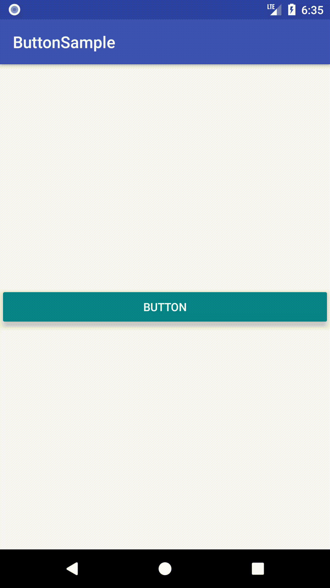
A MaterialButton can be included in your layout like so:
Choosing a style 🤔
As discussed in the intro section above, a variety of button types exist. These types map to styles that you can apply to a MaterialButton . There also exists a variety of sub-styles for specific use cases, such as to adjust padding for an icon. The full list of styles and their attributes can be found on GitHub. These style variants inherit from Widget.MaterialComponents.Button , each with an optional style suffix:
- Text button: *.TextButton (main), *.TextButton.Icon , *.TextButton.Snackbar , *.TextButton.Dialog , *.TextButton.Dialog.Icon , *.TextButton.Dialog.Flush
- Outlined button: *.OutlinedButton (main), *.OutlinedButton.Icon
- Contained button (unelevated): *.UnelevatedButton (main), *.UnelevatedButton.Icon
- Contained button (raised): No suffix (default, main), *.Icon
Adding an icon 🔷
An icon can be added to a button. It is displayed at the start, before the text label. In order to get the correct icon padding, it is recommended that you use a *.Icon style variant (shown above in the “Choosing a style” section).

The icon can be added in XML:
Alternatively, it can be done programmatically:
A few additional attributes exist for adjusting the icon size and position:
- iconSize : The width/height of the icon. The default value is the supplied Drawable ’s intrinsic width.

- iconGravity : The gravity of the icon. This can be set to start ( ICON_GRAVITY_START , default, at start of button), end ( ICON_GRAVITY_END , at end of button), textStart ( ICON_GRAVITY_TEXT_START , at start of centered text label) or textEnd ( ICON_GRAVITY_TEXT_END , at end of centered text label).


- iconPadding : The spacing between the icon and the text label. Typically you would not want to change this. The default value is 4dp for text buttons and 8dp for all other types.
Attributes related to icon tinting are discussed in the “Theming” section below.
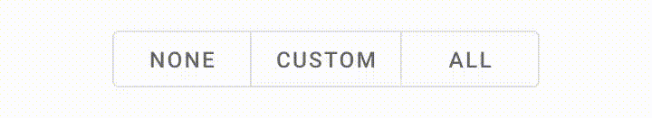
Grouping Buttons to create a Toggle Button 👨👩👧👦
In order to create a toggle button, we need to add MaterialButton s as child View s to a MaterialButtonToggleGroup (a custom ViewGroup ).
Note: MaterialButtonToggleGroup was added in the 1.1.0-alpha05 release of Material Components for Android.
Grouping
This can be done in XML:
Alternatively, it can be done programmatically:
The MaterialButtonToggleGroup handles layout and adjusting of only the relevant shape corners in the row of MaterialButton s. The appearance of the MaterialButton s is determined by whichever style they each use. It is advised to use a consistent style for all children and also recommended to use the outlined button type.
Adjusting selected behavior
When added to a MaterialButtonToggleGroup , child MaterialButton s automatically become “selectable” (i.e. The android:checkable attribute is set to true).
Thus, there exists a couple of attributes for adjusting how MaterialButtonToggleGroup manages this:
- singleSelection : Determines whether or not only a single button in the group can be checked at a time. The default value is false, meaning multiple buttons can be checked/unchecked independently.
Listening for selection state
We are able to query for and adjust the current checked button(s) in a variety of ways:
We are also able to listen for checked changes by adding an OnButtonCheckedListener to a MaterialButtonToggleGroup :
Listeners can also be removed with the MaterialButtonToggleGroup#removeListener and MaterialButtonToggleGroup#clearListeners functions.
Orientation
The default arrangement of buttons within a toggle group is horizontal. However, seeing as MaterialButtonToggleGroup extends LinearLayout , it also supports vertical arrangement. This can be set programmatically or in XML:

The interesting thing to note here is the extra attributes on the child MaterialButton (s). It is recommended to set the width to match_parent and to remove the top/bottom insets from the child buttons so as to have them sit flush against each other vertically. This also, however, requires adjusting the minHeight to make up for the lack of insets.
Theming 🎨
Buttons can be themed in terms of the three Material Theming subsystems: color, typography and shape. We have already shown which styles to use in the “Choosing a style” section above. When implementing a global custom MaterialButton and MaterialButtonToggleGroup styles, reference them in your app theme with the materialButtonStyle / materialButtonOutlinedStyle and materialButtonToggleGroupStyle attributes respectively.
Color
The color of the MaterialButton background can be customized with the backgroundTint attribute. This requires a ColorStateList , meaning a for checked/enabled/disabled states is required. It defaults to colorPrimary (enabled)/ colorOnSurface (disabled) for contained buttons and transparent(unchecked)/ colorPrimary (checked) for all other types, with different opacities per state. There is also a backgroundTintMode attribute to change the tint PorterDuff.Mode , although typically you would want to keep this the same.
The color of the text label can be customized with the android:textColor attribute. This too requires a ColorStateList . It defaults to colorOnPrimary (enabled)/ colorOnSurface (disabled) for contained buttons and colorPrimary (enabled or checked)/ colorOnSurface (disabled or unchecked) for all other types, with different opacities per state.
The color of the optional icon can be customized with the iconTint attribute. This too requires a ColorStateList and the defaults are the same as those of android:textColor . As before, there is also an iconTintMode attribute.
Lastly, the color of the button touch ripple can be customized with the rippleColor attribute. It too accepts a ColorStateList and defaults to colorOnPrimary for contained buttons and colorPrimary for all other types, with different opacities per state.

Typography
The button text label will adopt the fontFamily attribute defined in your app theme.
While you would typically want to keep most aspects of the button text appearance as is, the Material Guidelines suggest we can use sentence case over the standard all caps for the text label, if desired. To achieve this, we would create a new style:
We could apply this directly to a button or in an individual button style by referencing it with the android:textAppearance attribute. Alternatively, it can be applied globally by referencing it in your app theme with the textAppearanceButton attribute.

Shape
The shape of a button background can be customized with the shapeAppearance attribute. This defaults to shapeAppearanceSmallComponent .
While not strictly shape theming, it is worth mentioning that the width of an outlined button stroke can be adjusted with the strokeWidth attribute. This defaults to 1dp.

More resources 📚
- The source code for the Playground app used in this article can be found on GitHub.
- Buttons Design Documentation
- Buttons API Documentation
- Toggle Buttons API Documentation
I hope this post has provided some insight into Material Buttons and how they can be used in your Android app(s). If you have any questions, thoughts or suggestions then I’d love to hear from you!
Источник


