- Drawable. Фигуры и градиенты
- Shape и ShapeDrawable
- Элементы фигуры
- rectangle (Прямоугольник)
- oval (Эллипс)
- ring (Кольцо)
- line (Горизонтальная линия)
- Градиенты: gradient и GradientDrawable
- linear
- radial
- sweep
- Примеры с shape
- Закругляем уголки у компонентов
- Овальный кабинет
- Tek Eye
- Prepare the App and the Images for the ImageButton
- Add the ImageButtons to the App
- Define the Background Shape Drawable
- Set the ImageButton Background Attribute
- Variations on Button Background
- Acknowledgements
- See Also
- Do you have a question or comment about this article?
- Drawables
Drawable. Фигуры и градиенты
Shape и ShapeDrawable
Фигуры являются подмножеством Drawable-ресурсов.
Данный вид ресурсов на основе класса ShapeDrawable позволяет описывать простые геометрические фигуры, указывая их размеры, фон и контур с помощью тега .
Можно создавать ресурсы фигур на основе стандартных фигур вроде прямоугольника, эллипса, линии. Для использования ресурсов фигур нужно создать в подкаталоге res/drawable XML-файл, в котором будет присутствовать тег , который в свою очередь может содержать дочерние элементы , ,
Имя файла без расширения будет служить идентификатором (ID): R.drawable.filename в Java-коде и @[package:]drawable/filename в XML-файлах.
Элементы фигуры
— отступы. Возможные атрибуты: android:left, android:top, android:right, android:bottom
rectangle (Прямоугольник)

shape_rect.xml — Атрибут android:shape здесь необязателен: rectangle — это значение по умолчанию.
Пример с градиентным прямоугольником в качестве разделителя
Создадим файл separator.xml:
В разметке приложения добавим код:
У первого разделителя ширина 1dp, у второго — 3dp. Получили красивую полоску.

У прямоугольников можно скруглить углы при помощи тега corners

Можно закруглить углы по отдельности:

oval (Эллипс)

Другой вариант с пунктиром:

ring (Кольцо)

shape_ring.xml — Для кольца имеются дополнительные атрибуты:
innerRadius Внутренний радиус innerRadiusRatio Отношение между внешним и внутренним радиусами. По умолчанию равно 3 thickness Толщина кольца (т.е. разница между внешним и внутренним радиусами) thicknessRatio Отношение ширины кольца к его толщине. По умолчанию равно 9
line (Горизонтальная линия)

shape_line.xml — Линия может быть только горизонтальной
Градиенты: gradient и GradientDrawable
Тег gradient (класс GradientDrawable) позволяет создавать сложные градиентные заливки. Каждый градиент описывает плавный переход между двумя или тремя цветами с помощью линейного/радиального алгоритма или же используя метод развертки.
Тег gradient внутри тега shape. Основные атрибуты: type, startColor (обязателен), endColor (обязателен) и middleColor (необязателен). Также иногда оказывается полезным атрибут centerColor.
Используя атрибут type, вы можете описать свой градиент:
linear

- android:type=»linear» можно опустить, он так и есть по умолчанию. Отображает прямой переход от цвета startColor к цвету endColor под углом, заданным в атрибуте angle.
- Атрибут android:angle используется только линейным градиентом и должен быть кратным значению 45.
Дополнительный материал: Android Dev Tip #3 — помните о прозрачности, который может привести к другому результату.
Также можно задействовать атрибуты centerX и centerY.
radial
Интересный эффект получается при использовании множества радиальных градиентов.

sweep
Рисует развёрточный градиент с помощью перехода между цветами startColor и endColor вдоль внешнего края фигуры (как правило, кольца).

Можно использовать атрибуты android:centerX и android:centerY.

Попробуйте также такой вариант.
А почему бы не повращать?
Примеры с shape
Закругляем уголки у компонентов
Создадим отдельный файл res/drawable/roundrect.xml и с его помощью скруглим уголки у LinearLayout, ImageView, TextView, EditText:
В разметке активности пишем следующее:

Овальный кабинет
В Белом доме есть Овальный кабинет. Если вам придётся писать приложение для администрации президента США, то все элементы нужно сделать овальными. Создадим файл res/drawable/oval.xml:
Заменим в предыдущем примере android:background=»@drawable/roundrect» на android:background=»@drawable/oval».
Источник
Tek Eye
In this tutorial a background is set on an ImageButton to change its appearance. The article also shows how the ImageButton’s appearance can be easily changed without the need to edit the image assigned to the button. This is done by changing the background for the ImageButton with a shape drawable.
(This Android ImageButton background tutorial assumes that Android Studio is installed, a basic App can be created and run, and the code in this article can be correctly copied into Android Studio. The example code can be changed to meet your own requirements.)
Prepare the App and the Images for the ImageButton
For this ImageButton tutorial a new project is created in Android Studio, here called ImageButton. An Empty Activity was used and all other settings left as default. On the app’s screen, activity_main.xml, the TextView showing Hello World! is deleted.
A graphic is required for use with the ImageButton. Here a couple of buttons will be used one to show a red cross and another a green tick. Using images from the Open Clip Art Library, a good source of free graphics, or use your own.


(To see how images from the Open Clip Art Libray can be converted into PNGs see the article Android Launcher Icons Using Inkscape or Free Android Icons Using OpenClipArt.org and Paint.NET.)
The images are also on the free Android Graphic Resources page. Use the greentick.zip and redcross.zip files, unzip them into the project, adding the contents to the project’s res folder.
Add the ImageButtons to the App
With the activity_main.xml layout file open drag and drop an ImageButton from the Images on the Palette. A Resource Chooser dialog will open. Select the greentick drawable. (If the ConstraintLayout is used add the required constraints.)
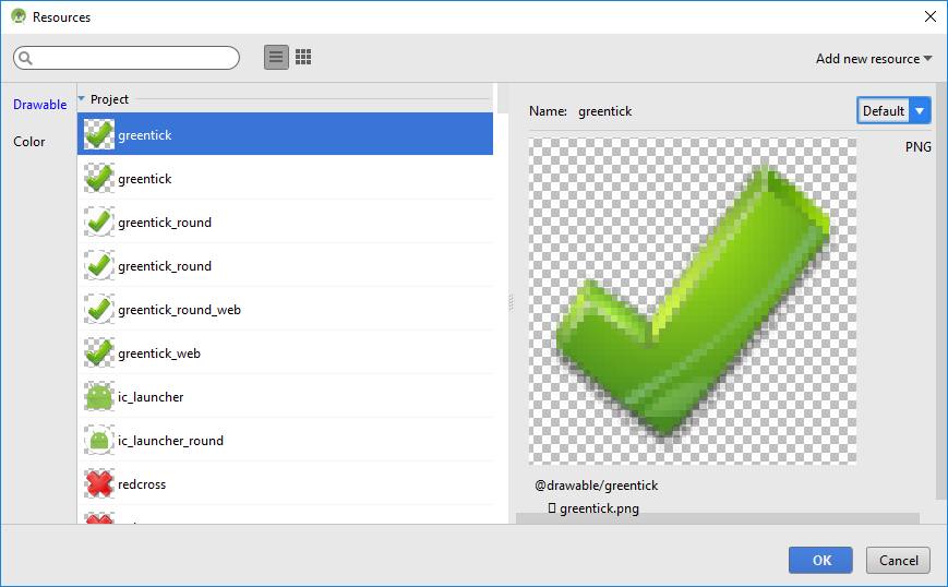
Do the same for the red tick, dragging and dropping an ImageButton on to the screen and selecting the redtick drawable graphic. With the graphics set for the two ImageButtons they are ready to be used by adding code to handle the onClick event, see Different Ways to Code Android Event Listeners.
Define the Background Shape Drawable
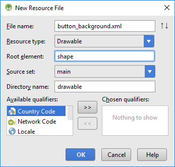
To improve the buttons appearance the background attribute for the ImageButton can be set. This is more flexible than modifying the image used by the button itself. The background attribute supports images but it also supports shapes defined in XML. The XML files are also drawables, so sit in the res/drawable folder. Unlike images it is not necessary to produce a version for all screen densities. To add a shape drawable background for the ImageButtons begin by creating a new shape XML file.
With app highlighted in the Project select New from the context menu (normally right-click) or from the main File menu. Select Android resource file, use button_background.xml for the File name, Drawable for the Resource type and shape as the Root element then press OK.
By setting appropriate gradient, padding and corners elements on a shape, and assigning it to the background attribute for the buttons, they are given a rounded button appearance. Edit the background_button.xml to have the following code:
Set the ImageButton Background Attribute
Use the Properties list for the ImageButton to set the Background property to @drawable/button_background (it can be selected using the ellipsis). The code for the activity_main.xml layout file should look something like this:
Here is the ImageButtons with a shape drawable:
Try different shape elements to see the effect on the ImageButton appearance. See the Android documentation on the Shape Drawable. The following shows some of the possible variations achieved, by setting the android:shape attribute on the shape root element, changing the color and its transparency, removing the padding element etc.
Variations on Button Background
android:shape=»oval» on shape element
No padding element
Transparency of colors reduced (from B0 to 50)
Color changed (startColor=»#B0FFE97F», endColor=»#B0FFD800″)
instead of gradient and no transparency set
Larger corners radius of 18dp
 Example of a dashed outline for the stroke:
Acknowledgements
See Also
- For a full list of all the articles in Tek Eye see the full site Index.
Author: Daniel S. Fowler Published: 2012-04-17 Updated: 2017-05-06


Do you have a question or comment about this article?
(Alternatively, use the email address at the bottom of the web page.)
↓markdown↓ CMS is fast and simple. Build websites quickly and publish easily. For beginner to expert.
Free Android Projects and Samples:
Источник
Drawables
A drawable resource is a general concept for a graphic that can be drawn to the screen. Drawables are used to define shapes, colors, borders, gradients, etc. which can then be applied to views within an Activity.
This is typically used for customizing the view graphics that are displayed within a particular view or context. Drawables tend to be defined in XML and can then be applied to a view via XML or Java.
For a list of the default drawables for every version of Android, see the androiddrawables site as an excellent reference.
Drawables can be an initially overwhelming topic because there are many drawable types used in different situations such as drawing shapes, setting state behaviors for buttons, creating stretchable button backgrounds and creating compound drawable layers.
There are at least 17 types of drawables but there are five that are most important to understand:
- Shape Drawables — Defines a shape with properties such as stroke, fill, and padding
- StateList Drawables — Defines a list of drawables to use for different states
- LayerList Drawables — Defines a list of drawables grouped together into a composite result
- NinePatch Drawables — A PNG file with stretchable regions to allow proper resizing
- Vector Drawables — Defines complex XML-based vector images
Let’s explore these drawable file types one by one and take a look at examples of usage.
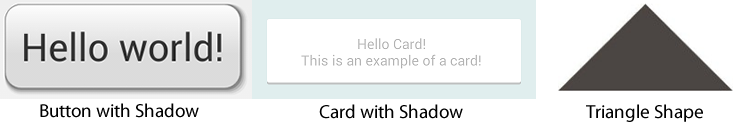
The Shape Drawable is an XML file that defines a geometric shape, including colors and gradients. This is used to create a complex shape that can then be attached as the background of a layout or a view on screen. For example, you can use a shape drawable to change the shape, border, and gradient of a button background.
A shape is simply a collection of properties that are combined to describe a background. The shape can be described with properties such as corners for rounding, gradient for backgrounds, padding for spacing, solid for background colors, and stroke for border.
Here’s an example of drawing a rounded rectangle with a border in res/layout/drawable/solid_color_shape.xml :
and then applied to a TextView using the background property:
and the resulting view looks like:

Note that drawables can be applied to any view and are usually set with the background property referencing the drawable resource.
Shapes also support gradients backgrounds as well as supporting properties such as startColor , centerColor , endColor , angle . Different gradients such as radial, linear or sweep can be selected using the type property.
Here’s an example of a simple linear gradient shape specified in res/layout/drawable/gradient_shape.xml :
applied to a button and the resulting view looks like:

You can also setup radial-type gradients with:
and applied to a TextView, this looks like:

Using solid color shapes and gradients we can customize the appearance of buttons, layouts and other views without requiring the use of any images. Note that custom shapes can be created at runtime using other shape drawable types using PathShape and ArcShape .
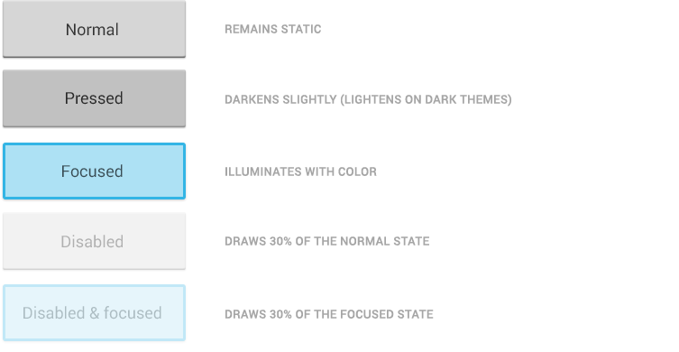
A StateListDrawable is a drawable object defined in XML that uses several different images to represent the same graphic, depending on the state of the object. For example, a Button widget can exist in one of several different states (pressed, focused, or neither) and, using a state list drawable, you can provide a different background image for each state. The state list supports different view states such as android:state_pressed , android:state_focused , android:state_enabled , android:state_selected , among many others. The illustration below shows all the major states that can be represented:
For example, a state list XML for a button background might look like the following in a file such as res/drawable/selector_button_bg :
Now, when the view (i.e button) is pressed or focused, the drawable used for the view will change accordingly. Note that any view can have a state selector, but the most common uses are with buttons and listview items. There are also color state selectors which allow a color to be chosen based on view state such as in a file named res/color/button_text.xml :
and applied to any field that accepts a color value such as the textColor property of a button in a layout file:
Using state lists allows us to easily define dynamic views that respond to pressed, checked, enabled or other related states.
A LayerDrawable is a drawable object that manages an array of other drawables. Each drawable in the list is drawn in the order of the list—the last drawable in the list is drawn on top. Each drawable is represented by an element inside a single element.
The LayerList can be used to draw multiple other drawables (shapes, images, etc) and position them in relationship to one another. The layers are placed on top of one another by default with the last item being drawn on the top. Layers can then have their coordinates shifted using the left , right , top , and bottom properties.
Common use cases for layer lists include:
For a simple example, the following layer list draws several shapes in relation to each other:
and this results in the following:

Keep in mind that the items in a LayerList can also be images or any other type of drawable. You can use this to create more complex drawings and overlay multiple drawables on top of each other. See more examples within the official docs.
A NinePatch is a PNG image in which you can define stretchable regions that are stretched when the content within the View exceeds the normal image bounds. You typically assign this type of image as the background of a View which has its width set to wrap_content . The most common use is a button that has to stretch based on the text displayed inside.
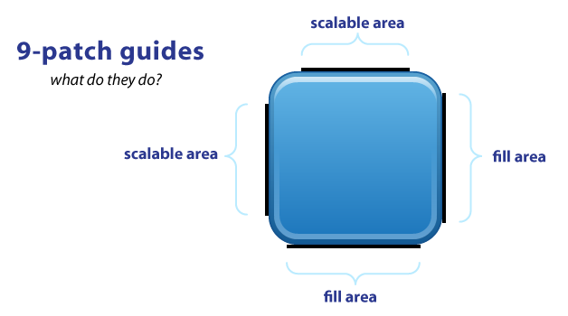
NinePatch are images that have a .9.png file extension, which signifies that this is a stretchable PNG image. The file is no different from a normal PNG file except that you will add thin black lines to indicate the vertical and horizontal «stretchable» and «fill» areas for the image. Android will not show these guide lines, which are used to determine how the image should be rendered.
An example of a 9-patch image is embedded below (left is the 9patch graphic, right is an example of use in an app):


A NinePatch is defined and saved in the drawable folder and setting the background works the same as with any image:
Android Studio comes with the ability to edit 9-patch files directly. Your PNG file simply needs to be saved with the .9.png extension in the drawable folder, and the 9-patch editor will display instead of the normal image editor. You can use the mouse to select the regions to be stretched (use Shift and click while dragging the mouse to erase the region), and the preview pane on the right displays how images will be rendered depending on the text inside.

The left and top lines need to be defined for the stretchable regions. To avoid stretching the arrow of this speech bubble in the above example, we define regions outside this area. The right and bottom lines define where text can be filled. Without the bottom line for instance, your text will not fill up the entire width of the stretched region and may not be centered properly.
You can also use the draw9patch tool to create special nine-patch images or you can use the online 9-patch utility. You can check out great ready-made examples of pretty 9-patch buttons for examples.
See this simple guide for more information. You can also refer to the official nine-patch docs.
These are XML drawables that can define complex vector-based images which can scale to support all densities automatically. This means using vector-based images, you will need only one asset file as opposed to an asset file for each screen density in the case of bitmap images.
First, see the setup guide to enable support for vector drawables for pre-Lollipop devices.
To create a vector image, you need to define pathData syntax which is located here. This example defines the details of the shape inside a XML element such as res/drawable/ic_heart.xml with:
We can then load vectors using the app:srcCompat property:
Note: Be sure to use app:srcCompat to support older Android devices. If you use android:src for a vector drawable, your app may render correctly in newer devices but may crash in pre-Lollipop devices.
This results in the following image being rendered:

You can also set a vector at runtime using:
Be sure to check out this great age of vectors blog post for a more detailed look at vectors. Also see the official release blog post for additional compatibility notes and this video talk.
Vector drawables can now be found directly within Android Studio and also on many Android resource websites. Assuming you have updated to Android Studio v2.2, you can check for vector drawables inside the File => New => Vector Asset wizard:


You can find additional icons on the material design icons website which includes community-contributed icons as well.

Learn more about finding icons here for use within your app.
In addition, there are several ways to create vector drawables directly from SVG graphics:
- Vector Asset Studio is a utility included in Android Studio (shown above) for converting SVG assets into vector drawables.
- SVG2Android Online Utility converts SVG into vectors right in your browser.
- Command-line SVG Converter can batch convert SVGs to vectors.
- Vectorizer — Transform a PNG image into an SVG to be converted to a vector drawable.
Let’s take a look at an end-to-end example of customizing a button using drawables to govern the styling and the pressed states.
Creating a custom button require combining at least a state list drawable with a shape drawable. First, let’s create our shape drawable which represents the «default» button background in res/drawable/nice_button_enabled.xml :
Let’s also create a style (set of view properties) that includes setting the background in res/values/styles.xml :
This now represents the shape and background of the button in the default state along with all the other properties. We could apply this by setting the style of the button:
If we run that, we will see the following button:

Now the button shows up nicely but doesn’t have any «pressed» or «focused» states. To do this, we need to create a State List drawable that describes the drawables for each state in res/drawable/states_nice_button.xml :
This describes the look of the button in all three major states (default, pressed and focused). Now we need to create two more Shape drawable states. One for res/drawable/nice_button_pressed.xml and another for res/drawable/nice_button_focused.xml :
For this guide the pressed and focused states will appear the same but of course these could be distinct visual states as well. Now, we need to change the style to use the res/drawable/states_nice_button.xml :
Now we have a button that has a nice shape drawable background and changes visual state when pressed all without requiring a single image asset! Be sure to check out the Button Generator for a tool that allows you to make your own buttons via a web interface.
Another common task is customizing the appearance of items in a ListView. First let’s create the basic ListView and populate String items inside. First, the layout XML for the item in res/layout/item_simple.xml :
Next, let’s setup the basic ListView xml in an activity:
and then populate the ListView with items:
This results in the following default styles ListView:

Now, let’s add our own styling to the ListView. Let’s add a default gradient and a pressed gradient, change the divider color between items and add a border around the ListView. First, let’s add the shape gradient background for the default state in res/drawable/gradient_bg.xml :
and then for the pressed gradient background in res/drawable/gradient_pressed_bg.xml :
and then let’s create a state list which describes the drawables to use in various list states in res/drawable/states_selector_list.xml :
Next, let’s setup the border for our ListView using a Shape drawable in res/drawable/list_border.xml by setting the «stroke» property:
Let’s now apply each of these XML drawables to the various elements. First, let’s add the background to the list item itself and tweak res/layout/item_simple.xml :
Notice that the background property has been set to the states list in order to apply the default background for the item. Next, let’s add the border and the selector states to the existing ListView in the activity layout file:
Here we have customized the divider color and dividerHeight as well as the background to apply the border and listSelector to manage the states when an item is pressed. With all this in place, our customized ListView now looks like:
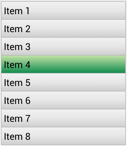
We’ve now successfully customized the appearance of our ListView and it’s items using a series of drawables. You can use these techniques to make a list look however you want based on the needs for your app.
We can access drawables at runtime within our Java code by accessing the background of a view that has the drawable applied. For example, given this layer list at res/drawables/message_bubble.xml :
We can then access the outerRectangle by the specified id from within our activity:
Note that the shape is accessed as a GradientDrawable here even though the shape is a solid color.
If you are using vector drawables or animated vector drawables at runtime for pre-Lollipop devices, make sure to use the new AppCompatResource class instead of the normal getDrawable() call, especially if you reference custom theme attributes (i.e. `?attr/colorAccent) in your drawables:
Starting in Android 5.0 and above, a tint color can now be applied to drawables. The advantage is that images to be styled according to the current theme used. For instance, in Twitter’s recent Android UI update, most of the images are stored as vector drawables in black color:
Here is the corresponding vector drawable:
First, we add the color to our colors.xml file:
The simplest way to change this vector drawable to be blue is to apply an android:tint attribute to the tag.
Источник


