Gradient Drawable in Android — Create Gradient Backgrounds
LAST UPDATED: AUGUST 10, 2021
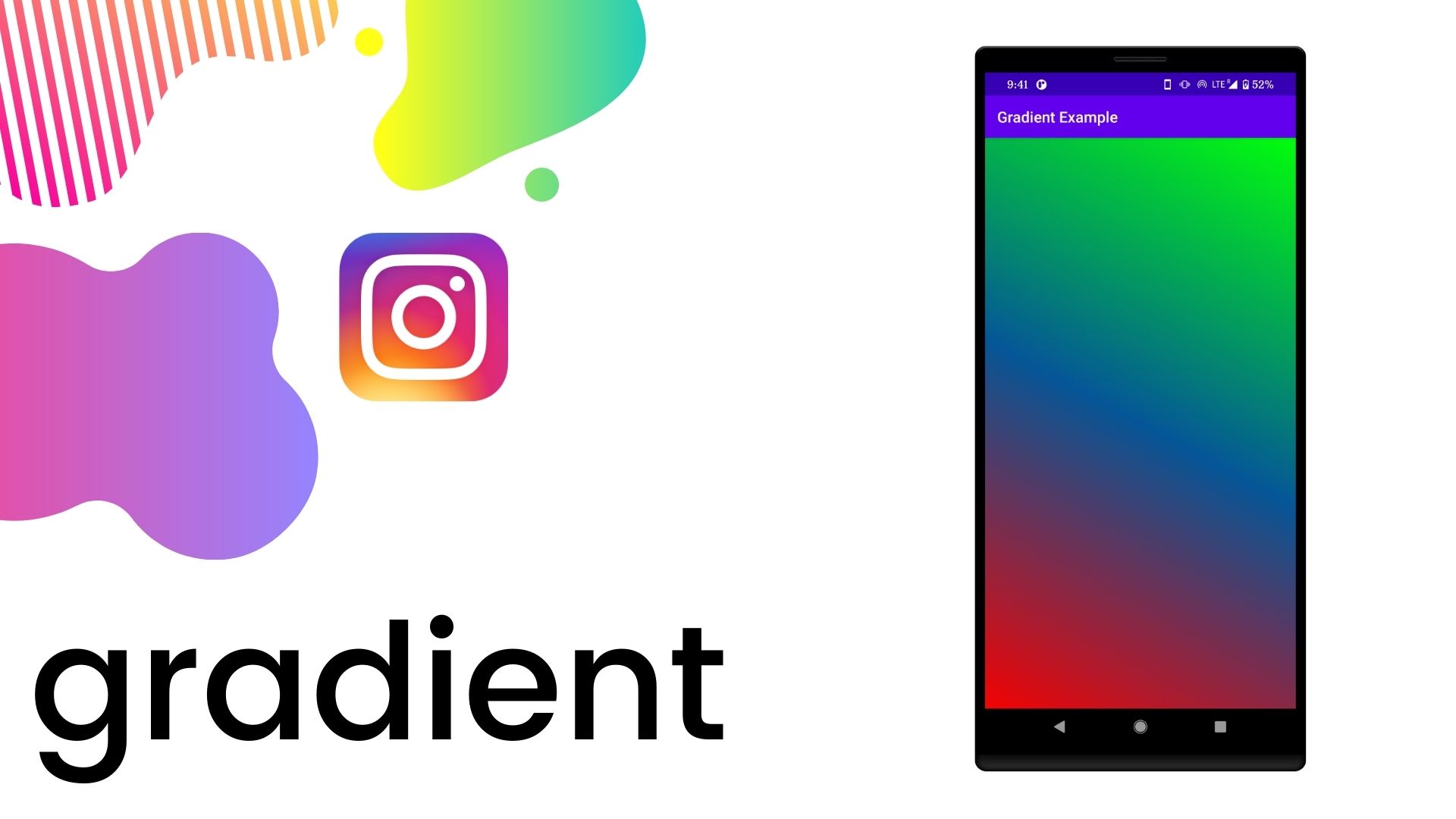
We have seen the Gradient colors on many websites as backgrounds, used in App logos, like in the Instagram logo shown below, App background, buttons, progress bars, etc. A gradient makes the UI of any app, be it Mobile App or a website, more beautiful and vibrant. Many developers are using gradient in their apps and websites to make it look more attractive. So in this tutorial, we will learn how to set a gradient background for our Android App activity.
What is Gradient?
According to Wikipedia:
In computer graphics, a color gradient specifies a range of position-dependent colors, usually used to fill a region. For example, many window managers allow the screen background to be specified as a gradient. The colors produced by a gradient vary continuously with the position, producing smooth color transitions.
A color gradient is also known as a color ramp or a color progression. In assigning colors to a set of values, a gradient is a continuous colormap, a type of color scheme.
So let’s add a simple gradient to our Android App.
Step 1: Create a new Project
Open Your Android Studio Click on «Start a new Android Studio project» (Learn how to setup Android Studio and create your first Android project)
Choose «Empty Activity» from the project template window and click Next
Enter the App Name, Package name, save location, language(Java/Kotlin, we use Java for this tutorial), and minimum SDK(we are using API 19: Android 4.4 (KitKat))
Next click on the Finish button after filling the above details
Now, wait for the project to finish the build.
Step 2: Creating Gradient Color
To create a gradient color we need to create a .xml file in the drawable folder. So go to app -> res -> drawable and right-click on drawable -> New -> Drawable Resource File and create gradient_drawable.xml file.
The code of gradient_drawable.xml file is shown below:
As you can see in the code above, we are using the gradient tag along with providing android:startColor , android:centerColor and android:endColor attributes to define the color that will be used in the gradient. So let’s learn about the attributes available in the gradient drawable.
The value of color may be in any one of «#rgb», «#argb», «#rrggbb», «#aarrggbb» forms
End color of the gradient
The value of color may be in any one of «#rgb», «#argb», «#rrggbb», «#aarrggbb» forms
The Center color of the gradient. It may be optional but you can use it if you want
The value of color may be in any one of «#rgb», «#argb», «#rrggbb», «#aarrggbb» forms
X position of the center point of the gradient within the shape as a fraction of the width
0.5 is the default value
Y-position of the center point of the gradient within the shape as a fraction of the height
0.5 is the default value
The angle of the gradient and it is only used with the linear gradient
It must be multiple of 45 in the range [0, 315]
It is used to set the type of gradient and the default value is linear . and it is of 3 types
It is used to set the radius of the gradient. It is only used with the radial gradient.
Step 3: Modify activity_main.xml
Now open the activity_main.xml file and remove the default code and change the layout to RelativeLayout and set it’s background to gradient background as shown below:
with this our activity_main.xml is done and the complete code will look like:
And the output of the above is shown below:
We can also add the gradient to different Views and layouts in our Android App. Let’s cover a few other Android App components in which we can use gradient backgrounds.
Gradient background with Button:
Here we will use the gradient background for button:
Output of the above code is:
Gradient background with TextView:
Here we will use the gradient background for TextView:
The output of the above code is:
Gradient background with ImageView:
Here we will use the gradient background for ImageView:
The output of the above code is:
Gradient background with SeekBar:
Here we will use the gradient background for SeekBar:
The output of the above code is:
Conclusion:
In just 3 simple steps we have integrated and shown you the basic example for creating a Gradient Drawable in your android app. If you face any issue while doing this, please share it in the comment section below and we will be happy to help.
Источник
Adding a background image to an Android Toolbar in the right way
At first glance it seems pretty easy to add a background drawable to your Android material design Toolbar. However, if your app bar consists of several views (e.g. an additional tab layout) or if you want a transparent status bar, it gets complicated.
The final result
In this tutorial I will show you how to overcome several difficulties in order to implement a layout similar to the following:
Getting started
We start with a new Tabbed Activity with Action Bar Tabs (with ViewPager). Android Studio generates a layout file and the activity which are the perfect start for this project. We just need to make a few optimizations here and there so that it looks like the end result above. The first step is to get rid of the floating action button in your activity_main.xml and in the MainActivity.java code and after that your app should look like this:
With this being your layout file:
Making the status bar transparent
First of all, you need to change your activity theme to have a transparent status bar. Therefore add a theme to your styles.xml:
And set this theme as your activity theme in the AndroidManifest.xml:
This makes almost no difference to the appearance of your app, only the status bar looks a bit darker. However, this is necessary for your background image to be visible below the status bar.
Adding a background image to the AppBarLayout
After that, you need to add your background drawable resource to your layout by adding the following attribute to your AppBarLayout in your activity_main.xml layout file:
You can download the background drawable I am using here as vector graphic which was created in Adobe Illustrator. Unfortunately, the result looks not as good as expected (your layout can differ based on the size of the background image you chose):
There are several issues with your layout: 1. The Toolbar is not transparent so there is a lot of blue (primary color) 2. The image is not visible under our status bar, even though we made it transparent before 3. You can scroll the Toolbar away 4. The app bar layout changed its size based on the background image
To fix the first issue we simply need to remove the android:background=»?attr/colorPrimary» attribute from our Toolbar to make it transparent instead of filled with the primary color.
Furthermore, to fix the second issue we need to add some android:fitsSystemWindows=»true» attributes to our layout since this attribute is not inherited. So add it to your AppBarLayout and to your Toolbar in order to make the AppBarLayout use the space below the status bar and to position your Toolbar just below the status bar. Additionally, remove the android:paddingTop=»@dimen/appbar_padding_top» attribute from your AppBarLayout.
Moreover, to change the third issue remove the app:layout_scrollFlags=»scroll|enterAlways» attribute from your Toolbar.
Last but not least, the Toolbar is way to big because the background drawable is part of the content of the view and the attribute android:layout_height=»wrap_content» is set for your AppBarLayout. Nevertheless, you can’t just change the height of the app bar layout to a fixed value, since the status bar height differs from phone to phone. Luckily, I can tell you the height of a TabLayout which is 48dp high and the height of a Toolbar which is 56dp high. Consequently, our AppBarLayout needs to have the height 48dp+56dp+StatusBarHeight. You need to set this height programmatically in the onCreate method of your MainActivity.java by using the following code:
Just call the method setAppBarHeight in your onCreate method and that’s it! Finally, your app should now look like this:
Источник
Drawable. Фигуры и градиенты
Shape и ShapeDrawable
Фигуры являются подмножеством Drawable-ресурсов.
Данный вид ресурсов на основе класса ShapeDrawable позволяет описывать простые геометрические фигуры, указывая их размеры, фон и контур с помощью тега .
Можно создавать ресурсы фигур на основе стандартных фигур вроде прямоугольника, эллипса, линии. Для использования ресурсов фигур нужно создать в подкаталоге res/drawable XML-файл, в котором будет присутствовать тег , который в свою очередь может содержать дочерние элементы , ,
Имя файла без расширения будет служить идентификатором (ID): R.drawable.filename в Java-коде и @[package:]drawable/filename в XML-файлах.
shape_rect.xml — Атрибут android:shape здесь необязателен: rectangle — это значение по умолчанию.
Пример с градиентным прямоугольником в качестве разделителя
Создадим файл separator.xml:
В разметке приложения добавим код:
У первого разделителя ширина 1dp, у второго — 3dp. Получили красивую полоску.
У прямоугольников можно скруглить углы при помощи тега corners
Можно закруглить углы по отдельности:
oval (Эллипс)
Другой вариант с пунктиром:
ring (Кольцо)
shape_ring.xml — Для кольца имеются дополнительные атрибуты:
innerRadius Внутренний радиус innerRadiusRatio Отношение между внешним и внутренним радиусами. По умолчанию равно 3 thickness Толщина кольца (т.е. разница между внешним и внутренним радиусами) thicknessRatio Отношение ширины кольца к его толщине. По умолчанию равно 9
line (Горизонтальная линия)
shape_line.xml — Линия может быть только горизонтальной
Градиенты: gradient и GradientDrawable
Тег gradient (класс GradientDrawable) позволяет создавать сложные градиентные заливки. Каждый градиент описывает плавный переход между двумя или тремя цветами с помощью линейного/радиального алгоритма или же используя метод развертки.
Тег gradient внутри тега shape. Основные атрибуты: type, startColor (обязателен), endColor (обязателен) и middleColor (необязателен). Также иногда оказывается полезным атрибут centerColor.
Используя атрибут type, вы можете описать свой градиент:
linear
android:type=»linear» можно опустить, он так и есть по умолчанию. Отображает прямой переход от цвета startColor к цвету endColor под углом, заданным в атрибуте angle.
Атрибут android:angle используется только линейным градиентом и должен быть кратным значению 45.
Дополнительный материал: Android Dev Tip #3 — помните о прозрачности, который может привести к другому результату.
Также можно задействовать атрибуты centerX и centerY.
radial
Интересный эффект получается при использовании множества радиальных градиентов.
sweep
Рисует развёрточный градиент с помощью перехода между цветами startColor и endColor вдоль внешнего края фигуры (как правило, кольца).
Можно использовать атрибуты android:centerX и android:centerY.
Попробуйте также такой вариант.
А почему бы не повращать?
Примеры с shape
Закругляем уголки у компонентов
Создадим отдельный файл res/drawable/roundrect.xml и с его помощью скруглим уголки у LinearLayout, ImageView, TextView, EditText:
В разметке активности пишем следующее:
Овальный кабинет
В Белом доме есть Овальный кабинет. Если вам придётся писать приложение для администрации президента США, то все элементы нужно сделать овальными. Создадим файл res/drawable/oval.xml:
Заменим в предыдущем примере android:background=»@drawable/roundrect» на android:background=»@drawable/oval».