- Tek Eye
- Drawable Folder
- Creating the Border Drawable
- Add the Border to a Layout
- Archived Comments
- Do you have a question or comment about this article?
- Android Border – Draw Android Textview Border
- Основы верстки для нативных андроид приложений
- FrameLayout
- LinearLayout
- RelativeLayout
- TableLayout
- Alternate Layouts
- Стили
Tek Eye
The User Interface (UI) for an Android Application (App) must be easy to use, intuitive and pleasing to the eye. With Android Studio and the Software Development Kit (SDK) it is easy to generate screens, but the developer should add a little extra to make the interface attractive. Fortunately the SDK allows for enhancements to the UI using attributes on layouts and views. These attributes affect the UI appearence when a screen is displayed. The background attribute is one of the most versatile, it can be used to set colors, images, nine patch files and shapes. In this example project a simple Android shape is used to add a rectangular border with rounded corners to a layout file.
(This Android border tutorial assumes that Android Studio is installed; a basic App can be created and run; and code can be correctly copied into Studio. For this test App the Application name is called Layout Border and an Empty Activity is used. You are free to change this example for your own requirements. When entering code in Studio add import statements when prompted by pressing Alt-Enter.)
Drawable Folder
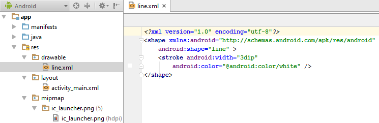
In an Android App project the drawable folder holds graphical resources (part of a wide range of Android resources that a project can have). Different types of drawables include image bitmaps (e.g. PNG or JPG) and XML definitions of shapes, colours and animations. Any drawable can be referenced from any screen. (In earlier versions of Android the res/drawable folder also stored an App’s launcher icon. Now launcher icons are located in the mipmap folders.) This screenshot example shows a drawable defining a horizontal line:
Creating the Border Drawable
Add a file called customborder.xml to the drawable folder. (In the Project explorer highlight the res/drawable folder. Use the context menu, normally right-click, or the File menu and select New then Drawable resource file. In the New Drawable Resource File dialog enter a File name of customborder. Set the Root element to shape. Click OK.. Click OK.) Code is added to define a rectangle that has rounded corners, some padding and a solid color:
- On the root shape element the attribute android:shape is set to rectangle (shape files also support oval, line and ring). Rectangle is the default value so this attribute could be left out if a rectangle is being defined. See the Android documentation on shapes for detailed information on a shape file.
- The element corners sets the rectangle corners to be rounded, it is possible to set a different radius on each corner (see the Android reference).
- The padding attributes are used to move the contents of the View to which the shape is applied, to prevent the contents overlapping the border.
- The border color here is set to a light gray (CCCCCC hexadecimal RGB value).
Shapes also support gradients but that is not being used here, again see the Android documentation to see how a gradient is defined. To use the shape reference the drawable from a layout or view using the android:background attribute, in this case it would be used with android:background=»@drawable/customborder».
Add the Border to a Layout
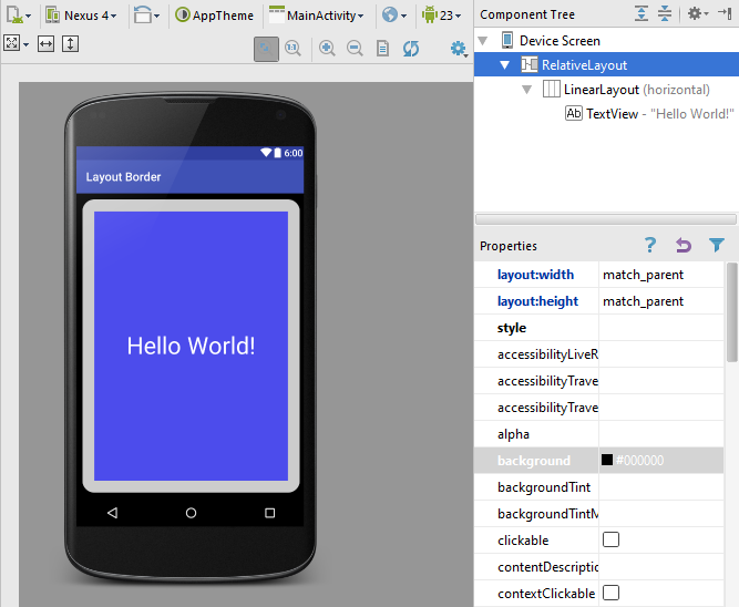
This shape border is added, for a panel effect, to a layout, to which other views can be added as normal. Here the root RelativeLayout background is set to black (#000000, a hexadecimal alpha RGB value) and padding set to 10dp to help the border stand out. Drag and drop a LinearLayout onto the screen and set the border background (android:background=»@drawable/customborder»). In this example the existing single TextView is moved onto the LinearLayout. Tip: If required use the Component Tree to move Views and Widgets around. The TextView’s background is set to blue, plus some transparency to reduce the brightness (#A00000FF). The TextVew text is set white (#FFFFFF), enlarged (android:textSize=»40sp») and centered (android:gravity=»center_vertical|center_horizontal»). The layout code in activity_main.xml in the res/layout folder should be similar to this:
Play around with values and attributes to see what effect they have on the layout. Use the Android documentation to understand what the attributes do. Try adding other layouts and controls to experiment with different looks. Getting an App to look good adds to it’s appeal.
Download the code for this article ready for importing into Studio. The code can also be accessed via the Android Example Projects page. A version of this article appears in the Android Cookbook.
Archived Comments
2012/02/15 at 12:13 pm — Daniel — I found it very useful. Thanks.
But I have a little question. Can I have a white background and give a color only to the border of the button?
2012/02/15 at 8:15 pm — Tek Eye — In reply to Daniel.
Buttons need three drawables to be fully supported; for the normal, focus and pressed states. By default 9-patch files are used for button backgrounds. XML shape files can be used as well, to get what you require stack two shapes with different colors using a layer-list:
Save it in the drawables folder, use it like other drawables. To support button states you’ll need three different versions referenced from a selector drawable.
2012/08/13 at 2:22 pm — Erez — Thanks, very helpful and clear!
Author: Daniel S. Fowler Published: 2012-02-08 Updated: 2016-07-03


Do you have a question or comment about this article?
(Alternatively, use the email address at the bottom of the web page.)
↓markdown↓ CMS is fast and simple. Build websites quickly and publish easily. For beginner to expert.
Free Android Projects and Samples:
Источник
Android Border – Draw Android Textview Border
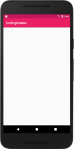
Hi and welcome to another tutorial from Codingdemos, in this tutorial you will learn how to draw Android border around a TextView.
By the end of this tutorial, you will have an app that looks like this. (Large preview)
In this tutorial we will be using the following:
- – Android studio version 3.0.1
– Android emulator Nexus 5X with API 26
– Minimum SDK API 16
1- Open up Android Studio and open any project that you have in your computer.
Create new Android Studio project or open existing project. (Large preview)
2- Next open up colors.xml file to change the main colors of the app.
3- Now you can build and run the app to see the new colors.
4- Create a new Drawable resource file under drawable folder and name it textview_border.
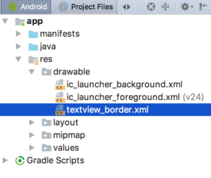
textview_border.xml file created under drawable folder. (Large preview)
5- Open up textview_border.xml file and add the following code.
This is the file that you will use it later to draw Android Textview border. Here you specify the shape you want to draw as Rectangle, then you specify the thickness of Android border and color by using Stroke.
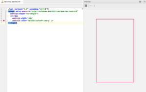
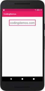
Preview of Android Textview border. (Large preview)
6- Now open up activity_main.xml file and add Android TextView.
This Android TextView is positioned in the top-center of the screen with margin from the top (30dp), increased text size to (30sp) and set the label of the text to (codingdemos.com).
7- Next you can apply the rectangle shape on this TextView by referencing textview_border.xml and using it as a background.
8- Now build and run the app to see the result.

9- You can see from the output above that the text is very close to the sides of the rectangle shape, you can fix that by adding some padding around Android TextView.
10- Now build and run the app to see the progress.
Android border around TextView. (Large preview)
11- I hope you find this tutorial helpful and if you have any question please post them in the comment below.
Источник
Основы верстки для нативных андроид приложений
( пользоваться не рекомендуется, deprecated )
AbsoluteLayout — означает что каждый элемент верстки будет иметь абсолютную позицию относительно верхнего левого угла экрана задаваемую с помощью координат x и y. Т.е. верхнийлевый угол экрана при AbsoluteLayout имеет координаты x = 0, y = 0.
Позиция указывается в атрибутах элемента android:layout_x и android:layout_y.
Пример кода:

FrameLayout
FrameLayout — тип верстки внутри которого может отображаться только один элемент в строке. Т.е. если внутри FrameLayout вы поместите несколько элементов, то следующий будет отображаться поверх предыдущего.
Пример кода:
LinearLayout
LinearLayout — тип верстки при котором область верстки делится на строки и в каждую строку помещается один элемент. Разбиение может быть вертикальное или горизонтальное, тип разбиения указывается в атрибуте LinearLayout android:orientation. Внутри верстки возможно комбинировать вертикальную и горизонтальную разбивки, а кроме того, возможна комбинация нескольких разных типов верстки например использование LinearLayout внутри FrameLayout.
Пример вертикальной разбивки LinearLayout:
Пример горизонтальной разбивки LinearLayout:
Комбинация нескольких LinearLayout:
RelativeLayout
RelativeLayout — тип верстки при котором позиционирование элементов происходит относительно друг друга и относительно главного контейнера.
За то, каким образом будут позиционироваться элементы отвечают следующие атрибуты:
Атрибуты позиционирования относительно контейнера
- android:layout_alignParentBottom – Низ элемента находится внизу контейнера
- android:layout_alignParentLeft – Левая часть элемента прилегает к левой части контейнера
- android:layout_alignParentRight – Правая часть элемента прилегает к правой части контейнера
- android:layout_alignParentTop – Элемент находится в верхней части контейнера
- android:layout_centerHorizontal – Элемент позиционируется по центру относительно горизонтального размера контейнера
- android:layout_centerInParent – Элемент позиционируется по центру относительно горизонтального и вертикального размеров размера контейнера
- android:layout_centerVertical – Элемент позиционируется по центру относительно вертикального размера контейнера
Атрибуты позиционирования относительно других элементов.
В качестве значений этих атрибутов ставятся id элемента относительно которого будет производится позиционирование.
android:layout_above – Распологает элемент над указанным
android:layout_below – Распологает элемент под указанным
android:layout_toLeftOf – Распологает элемент слева от указанного
android:layout_toRightOf – Распологает элемент справа от указанного
Выравнивание относительно других элементов.
android:layout_alignBaseline – Выравнивает baseline элемента с baseline указаннго элемента
android:layout_alignBottom – Выравнивает низ элемента по низу указанного элемента
android:layout_alignLeft – Выравнивает левый край элемента с левым краем указанного элемента
android:layout_alignRight – Выравнивает правый край элемента с правым краем указанного элемента
android:layout_alignTop – Выравнивает верхнюю часть элемента в соответствие с верхней частью указанного элемента
TableLayout
TableLayout — табличная верстка.
Организует элементы в строки и столбцы таблицы.
Для организации строк служит таг
Alternate Layouts
Alternate Layouts — альтернативная верстка. Позволяет использовать различную верстку для различных ориентаций экрана.
XML для альтернативной верстки помещается в папки проекта:
res/layout-land – альтернативная верстка для landscape UI
res/layout-port –альтернативная верстка для portrait UI
res/lauout-square – альтернативная верстка для square UI
и перед тем как получить макет из res/lauout система проверяет наличие файлов в этих папках.
И в завершении немного о стилях.
Стили
Во первых стили элемента могут быть описаны в атрибутах самого элемента.
Например:
Кроме того стили можно вынести в отдельный xml файл и сохранить его в папке res/values/
Напимер:
Если мы вынесем стили в отдельный файл, то для описания стилей элемента будем использовать атрибут style.
Источник


