Полный список
— изучаем drawable-тег shape
Подробно ознакомившись с Bitmap, переходим к другому ключевому объекту графики – Drawable.
Drawable – это абстрактный контейнер для графического объекта. Его главное абстрактное умение – он может нарисовать свое содержимое на предоставленной ему канве. А вот что конкретно он нарисует, зависит уже от реализации. Это может быть, например, тот же Bitmap, если мы используем BitmapDrawable объект. Или это может быть простая геометрическая фигура, если мы используем ShapeDrawable.
Drawable-объекты мы можем создавать сами напрямую в коде. Но для некоторых из них мы можем создать описание в xml-файлах, в папке res/drawable. И когда он нам понадобится, мы укажем id файла, система сама распарсит его и создаст нам нужный объект.
Самое распространенное использование Drawable – это свойство background, которое есть у каждого View. В качестве значения вы можете указать там RGB-цвет или id ресурса из папки res/drawable. Далее система сама по этому значению определит тип и далее:
— если это цвет, то создаст ColorDrawable,
— если это id картинки в res/drawable, то создаст BitmapDrawable
— если это id xml-файла в res/drawable, то распарсит его и вернет соответствующего ему наследника Drawable: StateListDrawable, AnimationDrawable или какой-то другой.
В итоге View получит свой Drawable-объект и сможет его нарисовать.
В общем, как вы поняли, у абстрактного Drawable есть несколько наследников-реализаций и в ближайших уроках мы их рассмотрим. Начнем с тех, которые можно описать в xml. По ним есть отдельная статья в хелпе. Там, правда, есть пара ошибок копипаста, но в остальном все верно.
В этом уроке рассмотрим тег
Project name: P1621_DrawableShape
Build Target: Android 4.4
Application name: DrawableShape
Package name: ru.startandroid.develop.p1621drawableshape
Create Activity: MainActivity
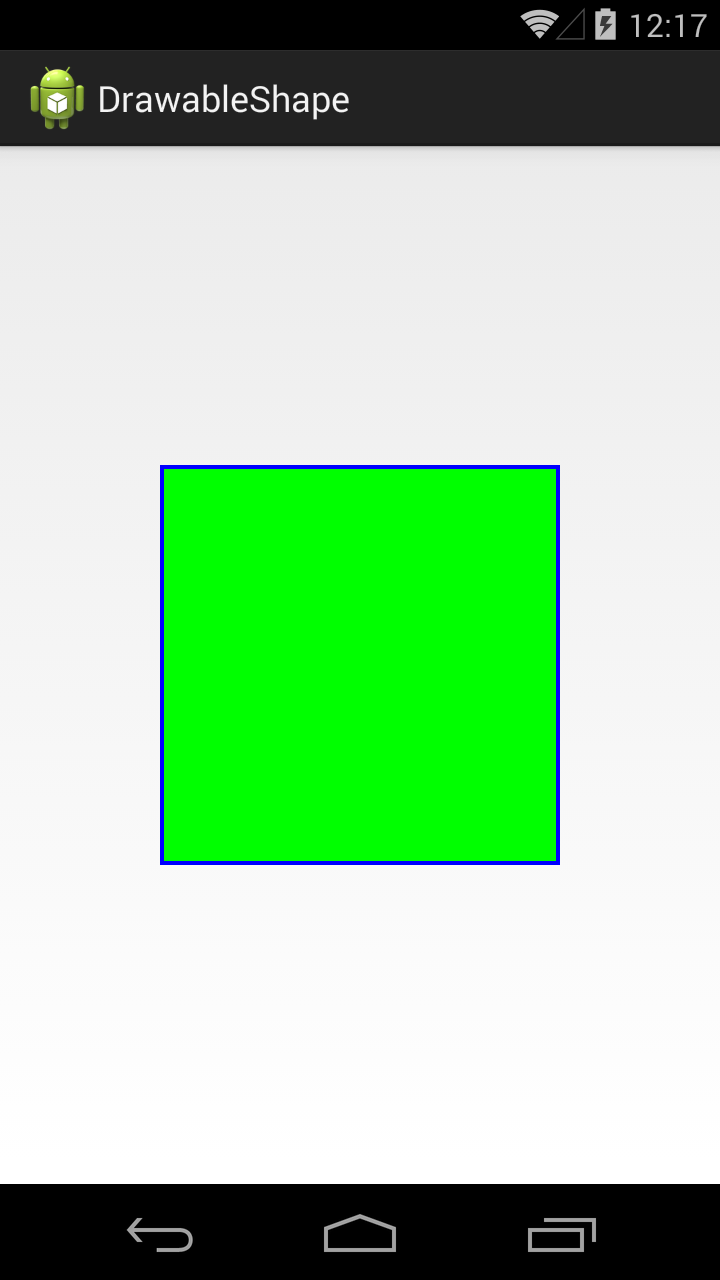
Корневой тег shape и у него же есть одноименный атрибут shape, в котором мы указываем тип фигуры. Мы указали rectangle – это прямоугольник.
Далее, внутри тега shape, идет тег stroke, который позволяет задать нам характеристики линии контура (периметра) фигуры. Мы задаем толщину (width) в 1dp и черный цвет (color).
В ImageView пока ничего не отображаем.
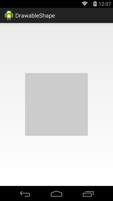
Видим ImageView с серым фоном
Перепишем метод setDrawable:
В качестве drawable будем передавать наш файл shape
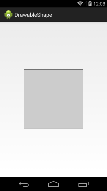
ImageView теперь отображает прямоугольник с черным контуром.
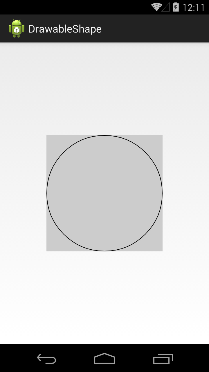
Посмотрим, какие еще фигуры нам доступны.
Значение атрибута shape = oval, это эллипс
В нашем случае получился круг, т.к. ImageView квадратный.
Значение line даст нам горизонтальную линию

Есть еще фигура кольцо (ring), но о нем чуть позже.
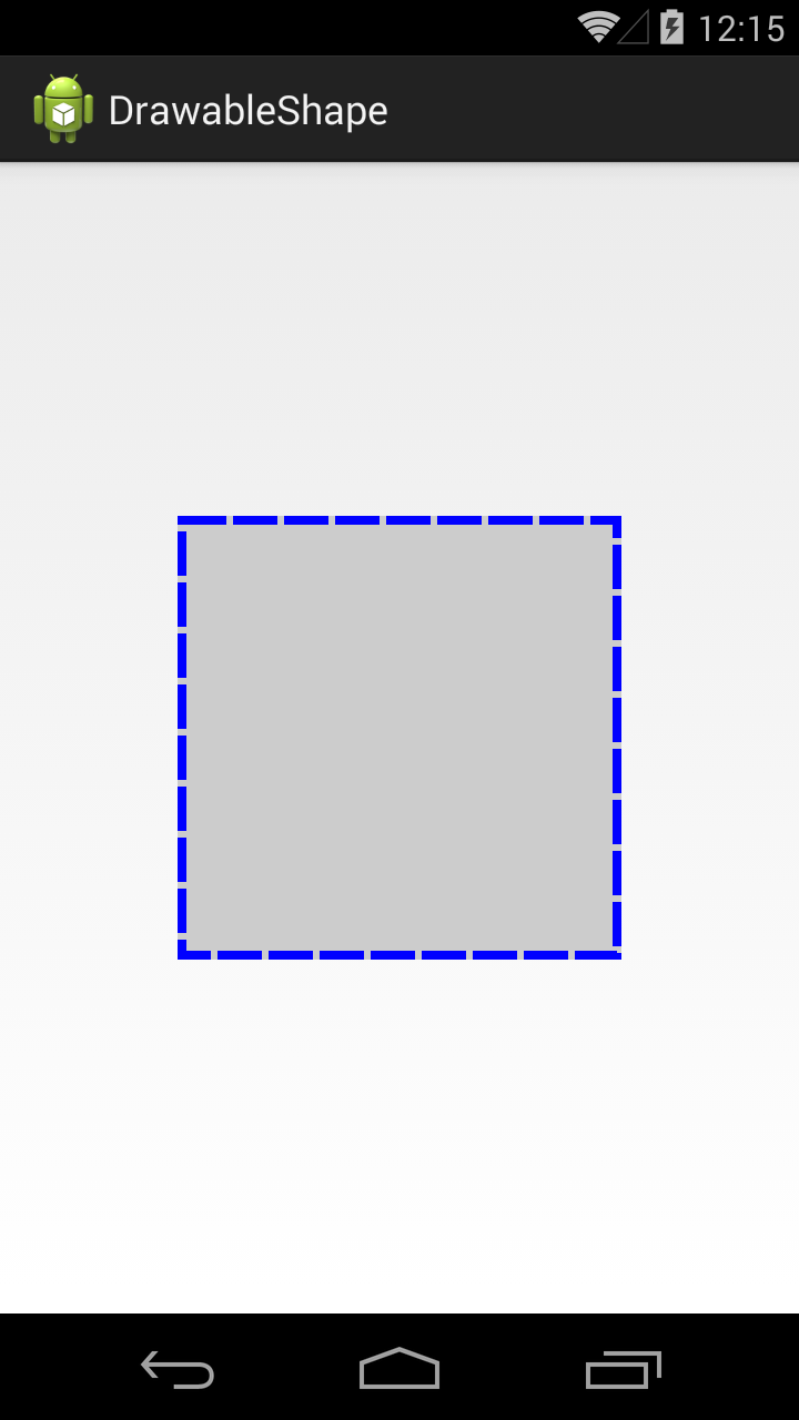
Вернемся к тегу stroke. Добавим в него параметров.
Ширина – 4dp, цвет – синий. Параметры dashWidth и dashGap сделают линию контура пунктирной. dashWidth задает длину пунктирной черточки, а dashGap – расстояние между черточками
Добавим заливку, для этого используется тег solid
Тег solid имеет атрибут color, который позволяет указать цвет заливки фигуры. Мы указали в нем зеленый цвет.
По умолчанию фигура занимает все доступное ей пространство, но мы можем явно указать ее размер с помощью тега size.
Используем тег size с атрибутами width и height
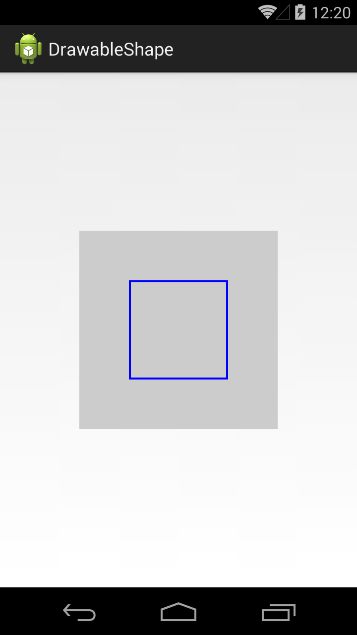
Фигура теперь размером 100х100 и уже не занимает всю доступную ей площадь.
Учтите, что режим отображения зависит от scaleType y ImageView.
Тег padding позволяет нам задать величину отступа внутри фигуры. Это актуально, например, для TextView. Отступ будет учтен при размещении текста.
Мы указали различные отступы со всех 4 сторон.
Если мы теперь повесим эту фигуру в качестве background для TextView, результат будет таким

В качестве заливки мы можем использовать не один цвет, а градиент из двух или трех. Для этого используется тег gradient.
В теге gradient указываем два атрибута-цвета: startColor и endColor.
В результате получится градиент, переходящий из первого цвета во второй.

Градиент вовсе необязательно должен идти слева-направо. Мы можем указать угол направления. Для этого у тега gradient есть атрибут angle
В angle указываем угол 225. Угол 0 означает направление слева-направо, 90 – снизу вверх и т.д. Угол должен быть кратным 45.
В результате видим угол справа-сверху налево-вниз.

Тег gradient позволяет указать третий цвет, который вклинится между start- и end- цветами.
В атрибуте centerColor укажем синий цвет, и он в градиенте будет между красным и зеленым.

Градиент может быть разных типов. Мы рассмотрели тип linear, который используется по умолчанию. Есть еще два типа: radial и sweep.
Тип radial даст нам круговой градиент, а в параметре gradientRadius мы должны указать радиус круга.

Мы можем указать точку центра кругового градиента атрибутами centerX и centerY. Значения этих атрибутов должны быть от 0 до 1.
Центра градиента будет в точке (0.2, 0.2), если принять размеры фигуры за единицу.

Теперь посмотрим, как выглядит градиент sweep.

Для этого типа градиента также можно использовать атрибуты centerColor, centerX и centerY.
Для фигуры прямоугольника мы можем сгладить углы. За это отвечает тег corners.
Атрибут radius позволяет задать радиус закругления сразу для всех углов.

Есть возможность задать свой радиус для каждого угла отдельно.

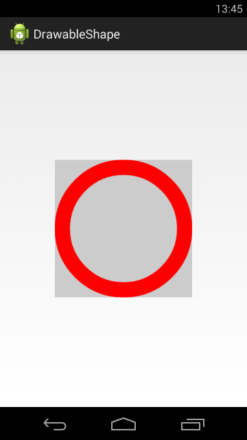
Кольцо
Нам осталось рассмотреть четвертую фигуру — кольцо. Чтобы его получить, надо в атрибуте shape указать значение ring. Для кольца мы можем настроить два параметра: размер внутреннего радиуса и толщина кольца. Причем, эти два параметра мы можем указывать в абсолютном и относительном выражении.
innerRadius – позволяет указать внутренний радиус, а thickness – толщину кольца. Атрибут useLevel, который нам пока неизвестен, должен быть false, иначе эта фигура у меня не отображалась.

Отобразился круг с внутренним радиусом = 50dp и толщиной = 40dp.
Попробуем указать толщину кольца в относительном значении. Для этого вместо thickness используем thicknessRatio. В этом атрибуте мы указываем во сколько раз толщина кольца будет меньше его ширины.
Ширина кольца = 200 dp, это указано в теге size. thicknessRatio =10, значит толщина кольца = 200 dp / 10 = 20dp.

Теперь укажем внутренний радиус в относительном выражении. Для этого вместо innerRadius используем innerRadiusRatio. В атрибуте innerRadiusRatio указываем во сколько раз внутренний радиус меньше ширины кольца.
Ширина кольца = 200 dp. innerRadiusRatio = 3, значит внутренний радиус кольца = 200 dp / 3 = 67dp.

Как видите, кольцо может занимать не весь свой размер. Это зависит от значений, которые мы задаем для внутреннего радиуса и толщины.
У атрибутов относительного размера есть значения по умолчанию. Т.е. если мы явно не укажем значение для innerRadiusRatio, то по умолчанию он будет равен 3, а thicknessRatio по умолчанию равен 9. Посмотрим, как это выглядит
Мы указали только внутренний радиус. А размер толщины будет вычислен исходя из значения thicknessRatio по умолчанию, т.е. 9.
Теперь не будем указывать инфу о внутреннем радиусе.
Мы указали только толщину кольца, а внутренний радиус будет вычислен исходя из значения innerRadiusRatio по умолчанию = 3.

Давайте теперь попробуем вообще не указывать размеры внутреннего радиуса и толщины, и посмотрим, что получится.

Видим, что кольцо заняло не все 200 dp по высоте, которые мы ему задали в теге size. Почему? Давайте считать исходя из значения по умолчанию.
Внутренний радиус = 200 / 3 = 67. Толщина = 200 / 9 = 22. Т.е. диаметр кольца получается = 22 + 67 * 2 + 22 = 178.
Попробуем подогнать размер кольца под все выделенное ему пространство.
Теперь радиус будет равен 200 / 2.5 = 80, а толщина = 200 / 10 = 20. Диаметр кольца = 20 + 80 * 2 + 20 = 200.
Это видно и на скрине. Кольцо теперь по размеру равно ImageView, т.е. = 200.

Атрибуты абсолютных значений (innerRadius и thickness) имеют приоритет перед относительными (innerRadiusRatio и thicknessRatio).
GradientDrawable
Хоть корневой тег и называется shape, но когда система его распарсит, она создает не ShapeDrawable, а GradientDrawable.
Также, этот объект мы можем сами создать программно.
Перепишем метод setDrawable:
Методы set* позволяют нам установить почти все те же параметры, что и в xml-файле.

Но есть и отличия. Например, я не нашел как для GradientDrawable установить значения размеров для кольца. С другой стороны, мы в GradientDrawable можем указать больше трех цветов для градиента.
Т.е. в основном — xml- и java-создание равноценны, но есть некоторые нюансы.
На следующем уроке:
— изучаем drawable теги: , ,
Присоединяйтесь к нам в Telegram:
— в канале StartAndroid публикуются ссылки на новые статьи с сайта startandroid.ru и интересные материалы с хабра, medium.com и т.п.
— в чатах решаем возникающие вопросы и проблемы по различным темам: Android, Kotlin, RxJava, Dagger, Тестирование
— ну и если просто хочется поговорить с коллегами по разработке, то есть чат Флудильня
— новый чат Performance для обсуждения проблем производительности и для ваших пожеланий по содержанию курса по этой теме
Источник
Drawables
A drawable resource is a general concept for a graphic that can be drawn to the screen. Drawables are used to define shapes, colors, borders, gradients, etc. which can then be applied to views within an Activity.
This is typically used for customizing the view graphics that are displayed within a particular view or context. Drawables tend to be defined in XML and can then be applied to a view via XML or Java.
For a list of the default drawables for every version of Android, see the androiddrawables site as an excellent reference.
Drawables can be an initially overwhelming topic because there are many drawable types used in different situations such as drawing shapes, setting state behaviors for buttons, creating stretchable button backgrounds and creating compound drawable layers.
There are at least 17 types of drawables but there are five that are most important to understand:
- Shape Drawables — Defines a shape with properties such as stroke, fill, and padding
- StateList Drawables — Defines a list of drawables to use for different states
- LayerList Drawables — Defines a list of drawables grouped together into a composite result
- NinePatch Drawables — A PNG file with stretchable regions to allow proper resizing
- Vector Drawables — Defines complex XML-based vector images
Let’s explore these drawable file types one by one and take a look at examples of usage.
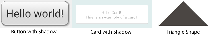
The Shape Drawable is an XML file that defines a geometric shape, including colors and gradients. This is used to create a complex shape that can then be attached as the background of a layout or a view on screen. For example, you can use a shape drawable to change the shape, border, and gradient of a button background.
A shape is simply a collection of properties that are combined to describe a background. The shape can be described with properties such as corners for rounding, gradient for backgrounds, padding for spacing, solid for background colors, and stroke for border.
Here’s an example of drawing a rounded rectangle with a border in res/layout/drawable/solid_color_shape.xml :
and then applied to a TextView using the background property:
and the resulting view looks like:

Note that drawables can be applied to any view and are usually set with the background property referencing the drawable resource.
Shapes also support gradients backgrounds as well as supporting properties such as startColor , centerColor , endColor , angle . Different gradients such as radial, linear or sweep can be selected using the type property.
Here’s an example of a simple linear gradient shape specified in res/layout/drawable/gradient_shape.xml :
applied to a button and the resulting view looks like:

You can also setup radial-type gradients with:
and applied to a TextView, this looks like:

Using solid color shapes and gradients we can customize the appearance of buttons, layouts and other views without requiring the use of any images. Note that custom shapes can be created at runtime using other shape drawable types using PathShape and ArcShape .
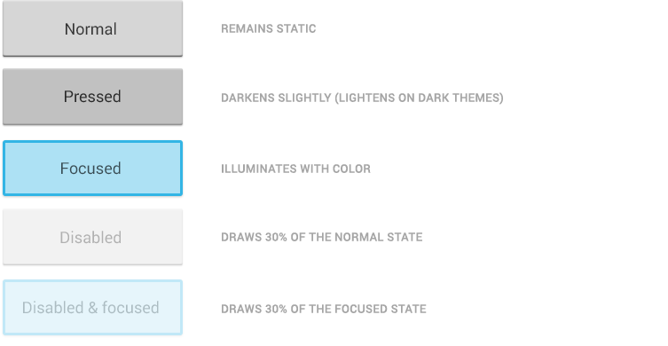
A StateListDrawable is a drawable object defined in XML that uses several different images to represent the same graphic, depending on the state of the object. For example, a Button widget can exist in one of several different states (pressed, focused, or neither) and, using a state list drawable, you can provide a different background image for each state. The state list supports different view states such as android:state_pressed , android:state_focused , android:state_enabled , android:state_selected , among many others. The illustration below shows all the major states that can be represented:
For example, a state list XML for a button background might look like the following in a file such as res/drawable/selector_button_bg :
Now, when the view (i.e button) is pressed or focused, the drawable used for the view will change accordingly. Note that any view can have a state selector, but the most common uses are with buttons and listview items. There are also color state selectors which allow a color to be chosen based on view state such as in a file named res/color/button_text.xml :
and applied to any field that accepts a color value such as the textColor property of a button in a layout file:
Using state lists allows us to easily define dynamic views that respond to pressed, checked, enabled or other related states.
A LayerDrawable is a drawable object that manages an array of other drawables. Each drawable in the list is drawn in the order of the list—the last drawable in the list is drawn on top. Each drawable is represented by an element inside a single element.
The LayerList can be used to draw multiple other drawables (shapes, images, etc) and position them in relationship to one another. The layers are placed on top of one another by default with the last item being drawn on the top. Layers can then have their coordinates shifted using the left , right , top , and bottom properties.
Common use cases for layer lists include:
For a simple example, the following layer list draws several shapes in relation to each other:
and this results in the following:

Keep in mind that the items in a LayerList can also be images or any other type of drawable. You can use this to create more complex drawings and overlay multiple drawables on top of each other. See more examples within the official docs.
A NinePatch is a PNG image in which you can define stretchable regions that are stretched when the content within the View exceeds the normal image bounds. You typically assign this type of image as the background of a View which has its width set to wrap_content . The most common use is a button that has to stretch based on the text displayed inside.
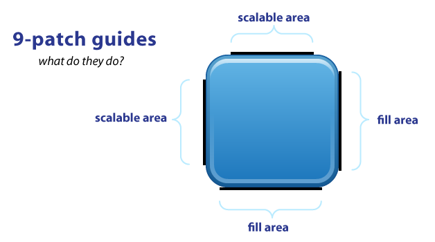
NinePatch are images that have a .9.png file extension, which signifies that this is a stretchable PNG image. The file is no different from a normal PNG file except that you will add thin black lines to indicate the vertical and horizontal «stretchable» and «fill» areas for the image. Android will not show these guide lines, which are used to determine how the image should be rendered.
An example of a 9-patch image is embedded below (left is the 9patch graphic, right is an example of use in an app):


A NinePatch is defined and saved in the drawable folder and setting the background works the same as with any image:
Android Studio comes with the ability to edit 9-patch files directly. Your PNG file simply needs to be saved with the .9.png extension in the drawable folder, and the 9-patch editor will display instead of the normal image editor. You can use the mouse to select the regions to be stretched (use Shift and click while dragging the mouse to erase the region), and the preview pane on the right displays how images will be rendered depending on the text inside.

The left and top lines need to be defined for the stretchable regions. To avoid stretching the arrow of this speech bubble in the above example, we define regions outside this area. The right and bottom lines define where text can be filled. Without the bottom line for instance, your text will not fill up the entire width of the stretched region and may not be centered properly.
You can also use the draw9patch tool to create special nine-patch images or you can use the online 9-patch utility. You can check out great ready-made examples of pretty 9-patch buttons for examples.
See this simple guide for more information. You can also refer to the official nine-patch docs.
These are XML drawables that can define complex vector-based images which can scale to support all densities automatically. This means using vector-based images, you will need only one asset file as opposed to an asset file for each screen density in the case of bitmap images.
First, see the setup guide to enable support for vector drawables for pre-Lollipop devices.
To create a vector image, you need to define pathData syntax which is located here. This example defines the details of the shape inside a XML element such as res/drawable/ic_heart.xml with:
We can then load vectors using the app:srcCompat property:
Note: Be sure to use app:srcCompat to support older Android devices. If you use android:src for a vector drawable, your app may render correctly in newer devices but may crash in pre-Lollipop devices.
This results in the following image being rendered:

You can also set a vector at runtime using:
Be sure to check out this great age of vectors blog post for a more detailed look at vectors. Also see the official release blog post for additional compatibility notes and this video talk.
Vector drawables can now be found directly within Android Studio and also on many Android resource websites. Assuming you have updated to Android Studio v2.2, you can check for vector drawables inside the File => New => Vector Asset wizard:


You can find additional icons on the material design icons website which includes community-contributed icons as well.

Learn more about finding icons here for use within your app.
In addition, there are several ways to create vector drawables directly from SVG graphics:
- Vector Asset Studio is a utility included in Android Studio (shown above) for converting SVG assets into vector drawables.
- SVG2Android Online Utility converts SVG into vectors right in your browser.
- Command-line SVG Converter can batch convert SVGs to vectors.
- Vectorizer — Transform a PNG image into an SVG to be converted to a vector drawable.
Let’s take a look at an end-to-end example of customizing a button using drawables to govern the styling and the pressed states.
Creating a custom button require combining at least a state list drawable with a shape drawable. First, let’s create our shape drawable which represents the «default» button background in res/drawable/nice_button_enabled.xml :
Let’s also create a style (set of view properties) that includes setting the background in res/values/styles.xml :
This now represents the shape and background of the button in the default state along with all the other properties. We could apply this by setting the style of the button:
If we run that, we will see the following button:

Now the button shows up nicely but doesn’t have any «pressed» or «focused» states. To do this, we need to create a State List drawable that describes the drawables for each state in res/drawable/states_nice_button.xml :
This describes the look of the button in all three major states (default, pressed and focused). Now we need to create two more Shape drawable states. One for res/drawable/nice_button_pressed.xml and another for res/drawable/nice_button_focused.xml :
For this guide the pressed and focused states will appear the same but of course these could be distinct visual states as well. Now, we need to change the style to use the res/drawable/states_nice_button.xml :
Now we have a button that has a nice shape drawable background and changes visual state when pressed all without requiring a single image asset! Be sure to check out the Button Generator for a tool that allows you to make your own buttons via a web interface.
Another common task is customizing the appearance of items in a ListView. First let’s create the basic ListView and populate String items inside. First, the layout XML for the item in res/layout/item_simple.xml :
Next, let’s setup the basic ListView xml in an activity:
and then populate the ListView with items:
This results in the following default styles ListView:

Now, let’s add our own styling to the ListView. Let’s add a default gradient and a pressed gradient, change the divider color between items and add a border around the ListView. First, let’s add the shape gradient background for the default state in res/drawable/gradient_bg.xml :
and then for the pressed gradient background in res/drawable/gradient_pressed_bg.xml :
and then let’s create a state list which describes the drawables to use in various list states in res/drawable/states_selector_list.xml :
Next, let’s setup the border for our ListView using a Shape drawable in res/drawable/list_border.xml by setting the «stroke» property:
Let’s now apply each of these XML drawables to the various elements. First, let’s add the background to the list item itself and tweak res/layout/item_simple.xml :
Notice that the background property has been set to the states list in order to apply the default background for the item. Next, let’s add the border and the selector states to the existing ListView in the activity layout file:
Here we have customized the divider color and dividerHeight as well as the background to apply the border and listSelector to manage the states when an item is pressed. With all this in place, our customized ListView now looks like:
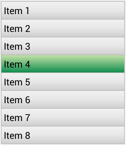
We’ve now successfully customized the appearance of our ListView and it’s items using a series of drawables. You can use these techniques to make a list look however you want based on the needs for your app.
We can access drawables at runtime within our Java code by accessing the background of a view that has the drawable applied. For example, given this layer list at res/drawables/message_bubble.xml :
We can then access the outerRectangle by the specified id from within our activity:
Note that the shape is accessed as a GradientDrawable here even though the shape is a solid color.
If you are using vector drawables or animated vector drawables at runtime for pre-Lollipop devices, make sure to use the new AppCompatResource class instead of the normal getDrawable() call, especially if you reference custom theme attributes (i.e. `?attr/colorAccent) in your drawables:
Starting in Android 5.0 and above, a tint color can now be applied to drawables. The advantage is that images to be styled according to the current theme used. For instance, in Twitter’s recent Android UI update, most of the images are stored as vector drawables in black color:
Here is the corresponding vector drawable:
First, we add the color to our colors.xml file:
The simplest way to change this vector drawable to be blue is to apply an android:tint attribute to the tag.
Источник


