Разметка TableLayout (Табличная разметка) позиционирует свои дочерние элементы в строки и столбцы, как это привыкли делать веб-мастера в теге table. TableLayout не отображает линии обрамления для их строк, столбцов или ячеек. TableLayout может иметь строки с разным количеством ячеек. При формировании разметки таблицы некоторые ячейки при необходимости можно оставлять пустыми. При создании разметки для строк используются объекты TableRow, которые являются дочерними классами TableLayout (каждый TableRow определяет единственную строку в таблице). Строка может не иметь ячеек или иметь одну и более ячеек, которые являются контейнерами для других объектов. В ячейку допускается вкладывать другой TableLayout или LinearLayout.
TableLayout удобно использовать, например, при создании логических игр типа Судоку, Крестики-Нолики и т.п.
Вот несколько правил для TableLayout. Во-первых, ширина каждой колонки определяется по наиболее широкому содержимому в колонке. Дочерние элементы используют в атрибутах значение match_parent. Атрибут TableRow для layout_height всегда wrap_content. Ячейки могут объединять колонки, но не ряды. Достигается слияние колонок через атрибут layout_span.
Если атрибуту android:stretchColumns компонента TableLayout присвоить значение «*», то содержимое каждого компонента TableRow может растягиваться на всю ширину макета.
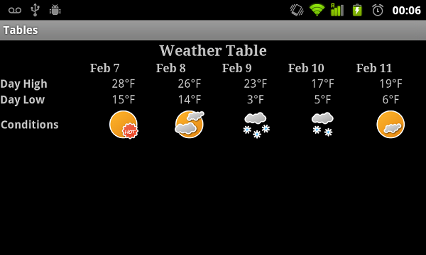
Создаем таблицу прогноза погоды
Например, для создания таблицы прогноза погоды можно использовать следующий дизайн:
В первом ряду показать заголовок таблицы
Во втором ряду показать даты по типу календаря
В третьем ряду показать наибольшую температуру
В четвёртом ряду показать наименьшую температуру
В пятом ряду показать графику (дождь, снег, облачность, солнце)
Показать код (щелкните мышкой)
В альбомной ориентации наша разметка будет выглядеть следующим образом
Программное создание TableLayout
Усадка, усушка, утруска
Если текст в ячейке таблицы слишком длинный, то он может растянуть ячейку таким образом, что часть текста просто выйдет за пределы видимости. Чтобы избежать данной проблемы, у контейнтера TableLayout есть атрибут android:shrinkColumns. Мы рассмотрим программное применение данного атрибута через метод setColumnShrinkable().
Для начала смоделируем ситуацию и поместим в одну из ячеек очень длинный текст, который не поместится на экран:
Теперь напишем код для усадки текста:
Книжная полка
Создадим подобие книжной полки. Нам понадобится изображение одной полки, которая послужит фоном и изображение книги (найдите сами).
Объявим две константы, которые отвечают за количество полок и количество книг на каждой полке.
Откуда на верхней полке появился кот и как он туда забрался я не знаю. Вы уж сами разберитесь с ним.
Источник
TableLayout приложения Android
Данная статья является продолжением описания разметки интерфейса приложения Android. В предыдущей статье был представлен обзор с примерами возможных типов разметки. В данной статье рассмотрим табличную разметку TableLayout.
Контейнер TableLayout позволяет формировать табличный интерфейс расположения компонентов, в котором View размещаются в строках и столбцах подобно тому, как это оформляется на WEB-странице в теге
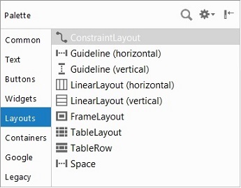
. TableLayout не отображает линии обрамления для строк и столбцов. Количество ячеек в разных строках может отличаться. При формировании строки некоторые ячейки можно оставлять пустыми. На следующем скриншоте представлены компоненты вкладки Layouts, которые можно включать в контейнер TableLayout для формирования интерфейса.
Пример табличной разметки, TableLayout
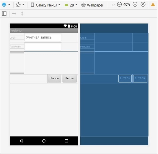
Для наглядного использования контейнера TableLayout создадим layout в рамках приложения p02layout, описанного в начальной части статьи. При создании нового layout определим наименование table (table.xml) и тип контейнера TableLayout. После этого в table.xml создадим интерфейс авторизации пользователя, т.е. включим компоненты ввода логина и пароля с метками пользователя и кнопки выполнения авторизации и закрытия.
Интерфейс формы будет включать 4 строки. В первой строке разместим метку (TextView) и компонент определения логина пользователя (EditText). Во второй строке установим метку (TextView) и компонент определения пароля пользователя (TextPassword). Третья строка останется пустой; она будет определять по вертикали относительное расположение кнопок. В четвертой строке справа разместим кнопки управления (Button).
Добавление строк, TableRow. Для формирования строк интерфейса необходимо использовать объект TableRow, который должен быть дочерним элементом контейнера TableLayout. Каждый компонент TableRow определяет единственную строку в таблице. Строка может не иметь ячеек или иметь одну и более ячеек. Ячейки строки являются контейнерами для других объектов. В ячейку можно вкладывать другой TableLayout или LinearLayout.
Для добавления строки в интерфейс нужно открыть вкладку Layouts в Palette, выделить компонент TableRow и перетащить его либо на страницу, либо в контейнер панели Component Tree. После этого можно таким же образом размещать в строке другие компоненты.
На первом шаге, чтобы не делать лишних телодвижений можно в контейнер поместить сразу 4 строки TableRow. На следующем шаге создадим пустую 3-ю строку с определенным по высоте размером.
Пустая строка. Чтобы создать пустую строку требуемого размера по высоте в 3-ю строку TableRow помещаем контейнер LinearLayout и определяем его размер по высоте; это можно сделать мышкой. Хватаем нижнюю часть компонента (LinearLayout), перемещаем на требуемое расстояние и бросаем (drag-and-drop). Таким образом, можно отделить одну часть интерфейса – компонентов определения учетной записи – от другой (кнопок управления).
Cтрока кнопок управления. Теперь можно в 4-ую строку поместить кнопки управления. Для этого сначала перетаскиваем два пустых компонента Space, и после этого две кнопки «ОК» и «Закрыть». Компонент Space также можно растягивать мышкой по горизонтали. Первый Space будет определять ширину первой колонки для меток, второй Space в совокупности с кнопкой «ОК» будет определять ширину второй колонки, где будут размещаться компоненты ввода параметров учетной записи.
Фоновой цвет строки. Чтобы визуально выделять заголовки или строки таблицы можно определить фоновый цвет TableRow. Для этого следует использовать атрибут «android:background» компонента TableRow.
Растягивание компонентов. Чтобы содержимое компонентов TableRow растянулось на всю ширину макета, необходимо указать в атрибуте «android:stretchColumns» контейнера TableLayout символ ‘*’. Но можно через запятую указать порядковые номера столбцов, которые следует растянуть. Номера столбцов отсчитываются от нуля; остальные колонки занимают минимум места. Например :
Объединение колонок. Смежные ячейки строк можно объединить, чтобы расстянуть компонент на несколько ячеек. Ряды строк объединить нельзя. Слияние ячеек выполняется определением значения целочисленного атрибута «android:layout_span» компонента; layout_span является аналогом атрибута colspan в HTML. Вот как это было выполнено для компонента edLogin в примере :
Рамка в таблице. К сожалению, контейнер TableLayout не может создать рамку для таблицы или ячейки; разработчики Android почему-то не определили эту функциональность. Но данную функциональность Вы можете создать самостоятельно, определяя фоновой цвет таблицы и ячейки.
Ограничение размера колонки. По невнимательности в ячейку таблицы можно вставить очень длинный текст, который растянет ячейку так, что часть текста просто выйдет за пределы экрана. Чтобы избежать данной проблемы необходимо использовать атрибут «android:shrinkColumns» контейнтера TableLayout. С точки зрения программирования приложения данный атрибут управляется методом setColumnShrinkable().
Рассмотрим програмное управление свойством «android:shrinkColumns» на примере. Допустим, что одна из меток в нулевой колонке таблицы имеет очень длинный текст. В интерфейсе мы разместили кнопку btnShrink, по нажатию на которую будем устанавливать флаг «android:shrinkColumns» или сбрасывать. Для этого, необходимо в главном модуле определить логическую переменную (b_shrink), значением которой будет управлять. Код примера представлен в листинге :
Программное создание таблицы. При программном создании таблицы необходимо найти/определить контейнер TableLayout, к которому соответствующим образом добавить необходимое количество строк TableRow. Каждую из строк можно также динамически «оформить». Следующий пример демонстрирует динамическое формирование таблицы, в каждой из ячеек которой размещается изображения.
Интерфейс приложения
Описание возможностей TableLayout и TableRow можно было бы продолжать еще долго. Но, как я полагаю, Вы получили достаточный толчок в понимании того, как можно через интерфейс или программно определить тот или иной атрибут таблицы. Теперь Вам не составит труда самостоятельно соответствующим образом настроить табличный интерфейс приложения.
Возвращаясь к нашему примеру, можно представить внешний вид интерфейса приложения на следующем скриншоте.
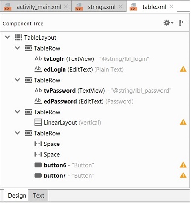
Если посмотреть на представление компонентов в дереве (Component Tree), то сразу же бросаются в глаза изображения предупреждения с восклицательными знаками напротив компонентов. В данном случае среда разработки Android Studio нас предупреждает, что текстовые заголовки меток и кнопок необходимо локализовать. Кроме этого необходимо связать метки с компонентами.
Вопрос локализации интерфейса Android Studio рассмотрен на отдельной странице локализациии приложения, а здесь только покажем, как можно бороться с подобными предупреждениями.
Обратите внимание на светло-серый текст возле компонентов tvLogin (@string/lbl_login), tvPassword (@string/lbl_password). Рядом с кнопками подобный текст отсутствует, но имеются предупреждающие сообщения. Это говорит о том, что текст для меток tvLogin и tvPassword используется из ресурсного файла string.xml. Рассмотрим этот файл :
Текст меток
В ресурсном файле определяются наименования ключей и их значения подобно key=value. Для этого в текст файла в формате XML включаются строки с атрибутами (ключами) «name» и соответствующими значеними.
Далее необходимо определенный ключ подключить к метке TextView или к кнопке в опции «android:text». Вот как это выглядит для метки tvLogin :
В описании метки tvLogin определяется идентификатор «android:id», размер метки «android:layout_width», текстовое значение «android:text» и устанавливается связь с компонентом edLogin в опции «android:labelFor». Все эти значения можно определять также через интерфейс в панели атрибутов после выделения компонета.
Текстовое описание интерфейса
В следующем листинге приведено полное описание файла table.xml . Полагаю, что Вам не составит труда самостоятельно подключить локализованные строки к кнопкам.
Старт приложения
Для старта приложения необходимо в активности MainActivity.java в методе onCreate переключиться на интерфейсное описание table.xml :
Помните, что если Вы не корректно завершите работу Android приложения, то IDE может не удалить файлы и поддиректории эмулятора, и при следующем старте приложения эмулятор не запуститься. Как бороться с проблемами запуска эмулятора описано здесь.
Источник
Урок 19. Как создать андроид-приложение с вкладками – TabLayout с ViewPager2 на Kotlin
На прошлом уроке мы познакомились с ViewPager2 и создали андроид-приложение, в котором можно листать экраны свайпом вправо или влево. На этом уроке добавим в верхней части экрана вкладки, которые будут содержать заголовки и индикатор экрана, на котором находится пользователь в данный момент, а также рассмотрим некоторые их свойства и способы оформления.
В этом уроке будем использовать проект из прошлого урока, можно скачать его на странице урока 18 по ссылке вверху.
Добавление TabLayout в макет разметки экрана
Чтобы добавить вкладки на экран, нужно открыть макет разметки и добавить компонент com.google.android.material.tabs.TabLayout в верхней части экрана:
Для корректного размещения нужно изменить компонент ViewPager2 – высоту укажем 0dp. Таким образом, высоту компонента будет регулировать корневой ConstraintLayout по заданным ограничениям. А вместо ограничения app:layout_constraintTop_toTopOf=»parent» поставим app:layout_constraintTop_toBottomOf=»@+id/tab_layout» – чтобы верх компонента ViewPager2 был ограничен не верхней границей родительского компонента, а нижней границей компонента TabLayout.
Рассмотрим подробнее компонент com.google.android.material.tabs.TabLayout. Свойство app:tabMode=»scrollable» обеспечивает размещение в видимой части экрана только нескольких вкладок, остальные будут доступны в процессе прокрутки. Если мы не укажем это свойство, то в видимой части экрана будут одновременно отображаться все вкладки, и при большом их количестве визуальное восприятие будет затруднено.
Свойство app:tabIndicatorColor=»@color/teal_200″ указывает цвет, а app:tabIndicatorHeight=»4dp» – толщину индикатора вкладки.
Далее идут свойства ширины – указываем по родителю – и высоты – указываем по содержимому.
Последние три свойства – ограничения верхней части и боковых сторон компонента по родителю.
Реализация вкладок в MainActivity
Открываем класс MainActivity и пишем реализацию вкладок:
Источник
TabLayout Tutorial With Example In Android Studio
In Android TabLayout is a new element introduced in Design Support library. It provides horizontal layout to display tabs on the screen. We can display more screens in a single screen using tabs. We can quickly swipe between the tabs. TabLayout is basically view class required to be added into our layout(xml) for creating Sliding Tabs. We use different methods of TabLayout to create, add and manage the tabs.
Special Note: TabLayout is used to display tabs on the screen. We can create sliding as well as non sliding tabs by using TabLayout. If we need simple tabs without sliding then we replace the layout with the fragment on tab selected listener event and if we need sliding tabs then we use Viewpager.
Table Of Contents
Basic TabLayout XML Code:
Important Methods Of TabLayout:
Let’s we discuss some important methods of TabLayout that may be called in order to manage the TabLayout.
1. newTab(): This method is used to create and return a new TabLayout.Tab.
Below we create a new tab and set the text and icon for the tab.
2. addTab(Tab tab): This method is used to add a tab in the TabLayout. By using this method we add the tab which we created using newTab() method in the TabLayout. The tab will be added at the end of the list and If it is the first tab to be added then it will become the selected tab.
Below we firstly create a new tab and then add it in the TabLayout.
3. addTab(Tab tab, boolean setSelected): This method is used to add a tab in the TabLayout and set the state for the tab. By using this method we add the tab which we created using newTab() method in the TabLayout. In this method we also set the state of the tab whether it is selected or not.
Below we firstly create a new tab and then add it in the TabLayout and set the true value for setSelected parameter that makes it selectable.
4. addTab(Tab tab, int position): This method is used to add a tab in the TabLayout and set the state for the tab. By using this method we add the tab which we created using newTab() method in the TabLayout. The tab will be inserted at the given position. If it is the first tab to be added then it will become the selected tab.
Below we firstly create a new tab and then add it in the TabLayout at a specific position.
5. addTab(Tab tab, int position, boolean setSelected): This method is used to add a tab at a specific position and set the state of the tab. By using this method we add the tab which we created using newTab() method in the TabLayout. The tab will be inserted at the defined position and a Boolean value used to set the state of the tab. True value is used to make the tab selectable.
Below we firstly create a tab and then add it in the TabLayout at a specific position and we also set true value to make the tab selectable.
6. getSelectedTabPosition(): This method is used to get the position of the current selected tab. This method returns an int type value for the position of the selected tab. It returns -1 if there isn’t a selected tab.
Below we get the current selected tab position.
7. getTabAt(int index): This method is used to get the tab at the specified index. This method returns TabLayout.Tab.
Below we get the tab at 1th index.
8. getTabCount(): This method is used to get the number of tabs currently registered with the action bar. This method returns an int type value for the number of total tabs.
Below we get the total number of tabs currently registered with the action bar.
9. setTabGravity(int gravity): This method is used to set the gravity to use when laying out the tabs.
Below we set the gravity for the tabs.
10. getTabGravity(): This method is used to get the current gravity used for laying out tabs. This method returns the gravity which we set using setTabGravity(int gravity) method.
Below we firstly set the gravity and then get the current gravity used for laying out tabs.
11. setTabMode(int mode): This method is used to set the behavior mode for the Tabs in this layout. The valid input options are:
MODE_FIXED: Fixed tabs display all tabs concurrently and are best used with content that benefits from quick pivots between tabs.
MODE_SCROLLABLE: Scrollable tabs display a subset of tabs at any given moment and it can contain longer tab labels and a larger number of tabs. They are best used for browsing contexts in touch interfaces when users don’t need to directly compare the tab labels. This mode is commonly used with a ViewPager.
Below we set the behaviour mode for the tabs.
12. getTabMode(): This method is used to get the current mode of TabLayout. This method returns an int type value which we set using setTabMode(int mode) method.
Below we firstly set the tab mode and then get the current mode of the TabLayout.
13. setTabTextColors(int normalColor, int selectedColor): This method is used to set the text colors for the different states (normal, selected) of the tabs.
Below we set the tab text colors for the both states of the tab.
14. getTabTextColors(): This method is used to get the text colors for the different states (normal, selected) of the tabs. This method returns the text color which we set using setTabTextColors(int normalColor, int selectedColor) method.
Below we firstly set the text colors and then get the text colors for the both states of the tab.
15. removeAllTabs(): This method is used to remove all tabs from the action bar and deselect the current tab.
Below we remove all the tabs from the action bar and deselect the current tab.
16. setOnTabSelectedListener(OnTabSelectedListener listener): This method is used to add a listener that will be invoked when tab selection changes.
Below we show how to use addOnTabSelectedListener of TabLayout.
17. removeTab(Tab tab): This method is used to remove a tab from the layout. In this method we pass the TabLayout.Tab object to remove the tab from the layout. If the removed tab was selected then it will be automatically deselected and another tab will be selected if present in the TabLayout.
Below we firstly create and add a tab and then remove it from the TabLayout.
18. removeTabAt(int position): This method is used to remove a tab from the layout. In this method we pass the position of the tab that we want to remove from the layout. If the removed tab was selected then it will be automatically deselected and another tab will be selected if present in the TabLayout.
Below we remove the tab from a specified position of TabLayout.
19. setSelectedTabIndicatorColor(int color): This method is used to set the tab indicator’s color for the currently selected tab.
Below we set the red color for the selected tab indicator.
20. setSelectedTabIndicatorHeight(int height): This method is used to set the tab indicator’s height for the currently selected tab.
Below we set the height for the selected tab’s indicator.
21. setupWithViewPager(ViewPager viewPager): This method is used for setting up the TabLayout with ViewPager. ViewPager is mainly used for creating Sliding tabs.
Below we set the TabLayout with the ViewPager.
Attributes of TabLayout:
Now let’s we discuss some common attributes of a TabLayout that helps us to configure it in our layout (xml).
1. id: id attribute is used to uniquely identify a TabLayout.
2. support.design:tabBackground: This attribute is used to set the background of the tabs. We can set a color or drawable in the background of tabs.
Below we set the Black color for the background of the tabs.
3. support.design:tabGravity: This attribute is used to set the gravity to use when laying out the tabs. We can also set gravity programmatically means in java class using setTabGravity(int gravity) method.
Below we set the gravity for the tabs.
4. support.design:tabIndicatorColor: This attribute is used to set the Color of the indicator used to show the currently selected tab. We can also set color programmatically means in java class using setSelectedTabIndicatorColor(int color) method.
Below we set the red color for the selected tab indicator
5. support.design:tabIndicatorHeight: This attribute is used to set the height of the indicator used to show the currently selected tab. We can also set height programmatically means in java class using setSelectedTabIndicatorHeight(int height) method.
Below we set the height for the selected tab’s indicator.
6. support.design:tabMaxWidth: This attribute is used to set the maximum width for the tabs.
Below we set the maximum width value for the tabs.
7. support.design:tabMinWidth: This attribute is used to set the minimum width for the tabs.
Below we set the minimum width value for the tabs.
8. support.design:tabMode: This attribute is used to set the behavior mode for the Tabs in this layout. We can also set the mode programmatically means in java class using setTabMode(int mode) method.
Below we set the behaviour mode for the tabs.
9. support.design:tabPadding: This attribute is used to set the padding along all edges of tabs.
android.support.design:tabPaddingBottom: Set padding along the bottom edge of the tabs.
android.support.design:tabPaddingEnd: Set padding along the end edge of the tabs.
android.support.design:tabPaddingStart: Set padding along the start edge of the tabs.
android.support.design:tabPaddingTop: Set padding along the top edge of the tabs.
Below we set the padding along all edges of the tabs.
10. support.design:tabSelectedTextColor: This attribute is used to set the text color to be applied to the currently selected tab. We can also set this programmatically using setTabTextColors(int normalColor, int selectedColor) method.
Below we set the text color for the selected tab.
11. support.design:tabTextColor: This method is used to set the default text color to be applied to tabs. . We can also set this programmatically using setTabTextColors(int normalColor, int selectedColor) method.
Below we set the default text color for the tabs.
TabLayout Example In Android Studio:
Example 1 of TabLayout:
Below is the first example of TabLayout in which we display three non-sliding tabs. In this example we define a TabLayout and a FrameLayout in our xml file. In this example we create and add 3 tabs in the TabLayout with the help of different methods of TabLayout. After that we implement setOnTabSelectedListener event and replace the FrameLayout with the fragment’s according to selected tab.
Step 1: Create a new project and name it TabLayoutExample
Step 2: Open build.gradle and add Design support library dependency.
Step 3: Open res -> layout ->activity_main.xml (or) main.xml and add following code:
In this step we add the code for displaying TabLayout and ViewPager in our xml file.
Step4: Open src -> package -> MainActivity.java
In this step we open MainActivity and add the code for initiate the FrameLayout and TabLayout. After that we create and add 3 tabs in the TabLayout. Finally we implement setOnTabSelectedListener event and replace the FrameLayout with the fragment’s according to selected tab.
Step 5: Now we need 3 fragments and 3 xml layouts for three tabs. So create three fragments by right click on your package folder and create classes and name them as FirstFragment, SecondFragment and ThirdFragment and add the following code respectively.
FirstFragment.class
SecondFragment.class
ThirdFragment.class
Step 6: Now create 3 xml layouts by right clicking on res/layout -> New -> Layout Resource File and name them as fragment_first, fragment_second and fragment_third and add the following code in respective files.
Here we will design the basic simple UI for all the three tabs.
fragment_first.xml
fragment_second.xml
fragment_third.xml
Example 2 of TabLayout Using ViewPager:
Below is the example of TabLayout in which we display sliding tabs with the help of ViewPager. In this example we define a TabLayout and a ViewPager in our xml file. In this example we create and add 3 tabs in the TabLayout with the help of different methods of TabLayout. After that we create a PagerAdapter to set up the TabLayout with ViewPager.
Step 1: Create a new project and name it TabLayoutExample
Step 2: Open build.gradle and add Design support library dependency.
Step 3: Open res -> layout ->activity_main.xml (or) main.xml and add following code:
Step 4: Open src -> package -> MainActivity.java
In this step we open MainActivity and add the code for initiate the ViewPager and TabLayout. After that we create and add 3 tabs in the TabLayout. Finally we set an Adapter named PagerAdapter to set up the TabLayout with ViewPager.
Step 5: Create a new Class named PagerAdapter and extend FragmentStatePagerAdapter in the class. In this step we create a PagerAdapter class and extends FragmentStatePagerAdapter In the class for setting the TabLayout with the ViewPager.
Step 6: Now we need 3 fragments and 3 xml layouts for three tabs. So create three fragments by right click on your package folder and create classes and name them as FirstFragment, SecondFragment and ThirdFragment and add the following code respectively.
FirstFragment.class
SecondFragment.class
ThirdFragment.class
Step 7: Now create 3 xml layouts by right clicking on res/layout -> New -> Layout Resource File and name them as fragment_first, fragment_second and fragment_third and add the following code in respective files.
Here we will design the basic simple UI for all the three tabs.