- Switch
- SwitchCompat
- Полный список
- Один обработчик для двух кнопок
- Activity, как обработчик
- Самая простая реализация обработчика
- Android studio switch listener
- Android Switch XML Element
- Android Switch Properties
- Android Switch Material Style
- Android Switch Button Custom Style Application Level
- Android Switch Custom Style Individual
- Android Switch Event Listener
- Custom Switch Button
- Android switch with custom track
- Android switch with custom thumb
- About
- Creating Custom Listeners
Switch
Switch — ещё один вид переключателей, который появился в Android 4.0 (API 14). Находится в разделах Commons и Buttons. Фактически, это замена немного устаревшего ToggleButton. В новых проектах лучше использовать Switch.
Компонент используется в том случае, когда нужно переключиться на противоположное состояние — да/нет, вкл./выкл., открыть/закрыть. В реальной жизни это выглядит следующим образом.
При добавлении компонента в макет студия рекомендует использовать использовать SwitchCompat или SwitchMaterial. Общий принцип работы у них одинаковый, отличия касаются дизайна.
Компонент представляет собой полоску с двумя состояниями и сопровождающим текстом. Переключиться можно сдвиганием ползунка или касанием экрана в области компонента (не только на самом ползунке, но и на сопровождающем тексте).
По умолчанию компонент находится в выключенном состоянии. Чтобы установить его в включённом состоянии на этапе разработки, используйте атрибут android:checked=»true».
Сопровождающий текст задаётся в атрибуте android:text. А текст на самом переключателе задаётся при помощи атрибутов android:textOn (методы getTextOn() и setTextOn()) и android:textOff (методы getTextOff() и setTextOff()). Обратите внимание, что сопровождающий текст может быть очень большим и положение самого переключателя относительно этого текста можно регулировать при помощи атрибута android:gravity (смотри пример ниже). Если сопровождающий текст вам не нужен, то не используйте атрибут android:text.
Момент переключения можно отслеживать при помощи слушателя CompoundButton.OnCheckedChangeListener.
SwitchCompat
Студия рекомендует использовать SwitchCompat. Явных отличий у него нет.


Для показа текста на кнопке переключателя установите в true значение атрибута app:showText.
Не забывайте, что данный компонент можно использовать только в активностях типа AppCompatActivity.
Вы можете задать свой стиль для SwitchCompat, добавив строки в styles.xml

Цвет дорожки, вдоль которой двигается ползунок, можно поменять также через стиль:
Источник
Полный список
В этом уроке мы:
— научимся использовать один обработчик для нескольких View-элементов
— научим Activity выступать в качестве обработчика
Создадим проект:
Project name: P0101_Listener
Build Target: Android 2.3.3
Application name: Listener
Package name: ru.startandroid.develop.listener
Create Activity: MainActivity
Будем работать с теми же View, что и в предыдущем уроке. Код для main.xml:
Один обработчик для двух кнопок
Итак, у нас есть TextView с текстом и две кнопки. Как и на прошлом уроке, мы сделаем так, чтобы по нажатию кнопки менялось содержимое TextView. По нажатию кнопки OK – будем выводить текст: «Нажата кнопка ОК», по нажатию Cancel – «Нажата кнопка Cancel». Но сейчас мы сделаем это с помощью одного обработчика, который будет обрабатывать нажатия для обеих кнопок.
Напомню механизм обработки событий на примере нажатия кнопки. Сама кнопка обрабатывать нажатия не умеет, ей нужен обработчик (listener), который присваивается с помощью метода setOnClickListener. Когда на кнопку нажимают, обработчик реагирует и выполняет код из метода onClick.
Соответственно для реализации необходимо выполнить следующие шаги:
— создаем обработчик
— заполняем метод onClick
— присваиваем обработчик кнопке
В нашем случае мы будем присваивать один обработчик обеим кнопкам, а внутри обработчика надо будет определять, какая именно кнопка была нажата.
Подготовим объекты и создадим обработчик:
Давайте заполнять метод onClick. На вход ему подается объект класса View, это как раз то, что нам нужно. Это View, на которой произошло нажатие, и, которая вызвала обработчик. Т.е. в нашем случае это будет либо кнопка OK либо Cancel. Нам осталось узнать ID этой View и сравнить его с нашими R.id.btnOk и R.id.btnCancel, чтобы определить какая именно это кнопка. Чтобы получить ID какой-либо View, используется метод getId. Для перебора результатов используем java-оператор switch.
Реализация метода onClick:
Если сейчас запустить приложение и проверить, то ничего не произойдет. Обработчик то мы создали, но не присвоили его кнопкам. Обеим кнопкам присваиваем один и тот же обработчик:
Вот теперь можем запускать и проверять, все должно работать.
Как вы понимаете, один обработчик может быть присвоен не двум, а любому количеству кнопок. И не только кнопкам. У остальных View-элементов тоже есть различные события, которые нуждаются в обработчиках. В дальнейшем мы еще будем с ними работать. А сейчас важно понять схему, как происходит обработка событий.
Отличие способа реализации на этом уроке от прошлого урока в том, что сейчас мы создали один объект-обработчик для обеих кнопок, а на прошлом уроке — два объекта, по одному каждой кнопке. Есть правило – чем меньше объектов вы создаете, тем лучше, т.к. под каждый объект выделяется память, а это достаточно ограниченный ресурс, особенно для телефонов. Поэтому создавать один обработчик для нескольких View это правильнее с точки зрения оптимизации. К тому же кода становится меньше и читать его удобнее.
Есть еще один способ создания обработчика, который вовсе не потребует создания объектов. Будет использоваться уже созданный объект – Activity
Activity, как обработчик
Кнопка присваивает себе обработчика с помощью метода setOnClickListener (View.OnClickListener l). Т.е. подойдет любой объект с интерфейсом View.OnClickListener. Почему бы классу Activity не быть таким объектом? Мы просто укажем, что Activity-класс реализует интерфейс View.OnClickListener и заполним метод onCreate.
Создадим для этого новый проект:
Project name: P0102_ActivityListener
Build Target: Android 2.3.3
Application name: ActivityListener
Package name: ru.startandroid.develop.activitylistener
Create Activity: MainActivity
Экран снова возьмем тот же самый:
Подготовим объекты и добавим реализацию интерфейса (implements onClickListener)
OnClickListener подчеркнут красным, т.к. его нет в импорте. Поэтому CTRL+SHIFT+O и выбираем View.OnClickListener.
Теперь Eclipse ругается на класс MainActivity. Это происходит потому, что для класса прописан интерфейс, но нет реализации методов этого интерфейса. Исправим это с помощью Eclipse. Наведите курсор на MainAcivity и выберите Add unimplemented methods
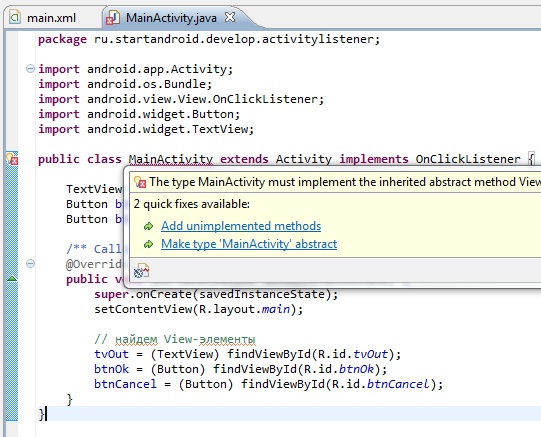
Eclipse добавит знакомый нам метод onClick. Только теперь этот метод будет реализован в Activity, а не в отдельном объекте-обработчике. Соответственно Activity и будет выступать обработчиком.
Заполним метод точно так же как и раньше. Ничего не изменилось. Ему на вход так же подается View (на которой произошло событие), по Id мы определим, какая именно эта View и выполним соответствующие действия:
Осталось в методе onCreate присвоить обработчик кнопкам. Это будет объект this, т.е. текущий объект MainActivity.
При такой реализации мы не создали ни одного лишнего объекта (Activity создается в любом случае) и затраты памяти минимальны, это рекомендуемый метод. Но, возможно, такой способ покажется сложным и непонятным, особенно если мало опыта в объектно-ориентированном программировании. В таком случае используйте ту реализацию, которая вам понятна и удобна. А со временем и опытом понимание обязательно придет.
Самая простая реализация обработчика
Есть еще один способ реализации. В layout-файле (main.xml) при описании кнопки пишем:
Т.е. используем атрибут onClick. В нем указываем имя метода из Activity. Этот метод и сработает при нажатии на кнопку.
Далее, добавляем этот метод в Activity (MainActivity.java). Требования к методу: public, void и на вход принимает View:
В методе прописываете необходимые вам действия, и они будут выполнены при нажатии кнопки.
Присоединяйтесь к нам в Telegram:
— в канале StartAndroid публикуются ссылки на новые статьи с сайта startandroid.ru и интересные материалы с хабра, medium.com и т.п.
— в чатах решаем возникающие вопросы и проблемы по различным темам: Android, Kotlin, RxJava, Dagger, Тестирование
— ну и если просто хочется поговорить с коллегами по разработке, то есть чат Флудильня
— новый чат Performance для обсуждения проблем производительности и для ваших пожеланий по содержанию курса по этой теме
Источник
Android studio switch listener
September 19, 2017
This post shows how to use android switch button, apply material styles, create custom styles, create custom switch button and how to handle switch button click events.
Android Switch XML Element
Android Switch Properties
Some of the important switch properties are textAppearance, textColor, track, thumb, switchTextAppearance, textOn, testOff, background, and showText.
Property thumb is used to set a drawable that switches back and forth, property track is used for setting a drawable as track for switch thumb, textOn and textOff are used to set text to be displayed when switch is in on or off state, textswitchTextAppearance is used to set style for switch text, and showText is used to indicate whether to show switch text or not.
Android Switch Material Style
Android system provides many material themes. When application level theme is set to one of the material themes, android switch will be displayed applying default switch material theme of the application theme used in the application. Below screen shot shows switch button in both on and off states when application theme is set to Theme.AppCompat.
Android Switch Button Custom Style Application Level
Application level themes can be customized by setting properties to custom values. If you customize properties related to UI controls, the changes will be applied to all UI controls and throughout the application. To change switch text color and switch button color, you need to set textColorPrimaryDisableOnly and colorAccent properties to custom values.
Below theme is an example of custom application theme added to res/values/styles.xml file. You can apply it to an application by setting theme attribute of application element in mainifest xml file.
Below screen shot shows switch button after application theme is set to custom material theme defined above.
Android Switch Custom Style Individual
If you want to change switch style only in a particular section of your application, then define custom switch widget style by inheriting Widget.AppCompat.CompoundButton.Switch as shown below and apply it to switch elements using theme attribute.
Switch attribute colorControlActivated can be used to set track and thumb color when switch is active and colorForeground can be used to set track color when switch is in normal state.
You can use thumbTint and trackTint properties to change color of thumb and track. Applying colors to track and thumb using selector xml allows you to apply different colors for different states, see custom switch section.
Android Switch Event Listener
Switch on and off events or switch drag event can be handled in two ways. One way of handling switch click event is by defining a method in your activity or fragment with View as input parameter and setting it as value for onClick attribute of Switch in layout xml as shown below.
Second way of handling switch on/off event is by defining OnCheckedChangeListener and adding it to switch button by using setOnCheckedChangeListener method.
Custom Switch Button
Android switch with custom track
You can customize android switch track by defining a drawable xml resource as shown below. You need to save it in res/drawable folder, our example file name switch_track_custom.xml, and apply it to switch by using track attribute.
Below xml, used as switch_color in the above drawable, is color selector for track. Color is applied based on the state of switch. This file needs to be saved in res/color folder.
Below xml shows applying the custom track drawable to Switch.
Output of custom track of switch.

Android switch with custom thumb
Android switch thumb can be customized by using material icon and defining drawable xml resource.
To do that, first download one of the android material icons which you want to use in your application or use any other image you may have and save it in res/drawable folder.
Then define drawable xml resource as shown below in res/drawable folder, our example file name is switch_thumb_custom.xml. This xml uses the above downloaded icon, defines shape and sets colors. To apply this to a switch, set its thumb attribute to the drawable xml.
In the above xml switchTrackNormal and switchThumbBgActive are colors defined in res/values/colors.xml
Below color selector xml saved as switch_color.xml is used in the custom thumb drawable xml defined above.
Below switch element in layout xml uses above custom switch thumb and switch track.
With switch button track customization explained from above section and switch button thumb customization explained in this section, the custom switch button will appear as shown below in normal and active states.

About
Android app development tutorials and web app development tutorials with programming examples and code samples.
Источник
Creating Custom Listeners
The «listener» or «observer» pattern is the most common tegy for creating asynchronous callbacks within Android development. Listeners are used for any type of asynchronous event in order to implement the code to run when an event occurs. We see this pattern with any type of I/O as well as for view events on screen. For example, here’s a common usage of the listener pattern to attach a click event to a button:
This listener is built-in but we can also create our own listeners and attach callbacks to the events they fire from other areas in our code. This is useful in a variety of cases including:
- Firing events from list items upwards to an activity from within an adapter
- Firing events from a fragment upwards to an activity.
- Firing async events from an abstraction (i.e networking library) to a parent handler.
In short, a listener is useful anytime a child object wants to emit events upwards to notify a parent object and allow that object to respond.
Listeners are a powerful mechanism for properly separating concerns in your code. One of the essential principles around writing maintainable code is to reduce coupling and complexity using proper encapsulation. Listeners are about ensuring that code is properly organized into the correct places. In particular, this table below offers guidelines about where different types of code should be called:
| Type | Called By | Description |
|---|---|---|
| Intents | Activity | Intents should be created and executed within activities. |
| Networking | Activity , Fragment | Networking code should invoked in an activity or fragment. |
| FragmentManager | Activity | Fragment changes should be invoked by an activity. |
| Persistence | Activity , Fragment | Writing to disk should be invoked by activity or fragment. |
While there are exceptions, generally speaking this table helps to provide guidelines as to when you need a listener to propagate an event to the appropriate owner. For example, if you are inside an adapter and you want to launch a new activity, this is best done by firing an event using a custom listener triggering the parent activity.
There are four steps to using a custom listener to manage callbacks in your code:
Define an interface as an event contract with methods that define events and arguments which are relevant event data.
Setup a listener member variable and setter in the child object which can be assigned an implementation of the interface.
Owner passes in a listener which implements the interface and handles the events from the child object.
Trigger events on the defined listener when the object wants to communicate events to it’s owner
The sample code below will demonstrate this process step-by-step.
First, we define an interface in the child object. This object can be a plain java object, an Adapter , a Fragment , or any object created by a «parent» object such as an activity which will handle the events that are triggered.
This involves creating an interface class and defining the events that will be fired up to the parent. We need to design the events as well as the data passed when the event is triggered.
With the interface defined, we need to setup a listener variable to store a particular implementation of the callbacks which will be defined by the owner.
In the child object, we need to define an instance variable for an implementation of the listener:
as well as a «setter» which allows the listener callbacks to be defined in the parent object:
This allows the parent object to pass in an implementation of the listener after this child object is created similar to how the button accepts the click listener.
Now that we have created the setters, the parent object can construct and set callbacks for the child object:
Here we’ve created the child object and passed in the callback implementation for the listener. These events can now be fired by the child object to pass the event to the parent as appropriate.
Now the child object should trigger events to the listener whenever appropriate and pass along the data to the parent object through the event. These events can be triggered when a user action is taken or when an asynchronous task such as networking or persistence is completed. For example, we will trigger the onDataLoaded(SomeData data) event once this network request comes back on the child:
Notice that we fire the listener event listener.onDataLoaded(data) when the asynchronous network request has completed. Whichever callback has been passed by the parent (shown in the previous step) will be fired.
The «listener pattern» is a very powerful Java pattern that can be used to emit events to a single parent in order to communicate important information asynchronously. This can be used to move complex logic out of adapters, create useful abstractions for your code or communicate from a fragment to your activities.
There are several different ways to pass a listener callback into the child object:
- Pass the callback through a method call
- Pass the callback through the constructor
- Pass the callback through a lifecycle event
The code earlier demonstrated passing the callback through a method call like this:
which is defined in the child object as follows:
If the callback is critical to the object’s function, we can pass the callback directly into the constructor of the child object as an argument:
and then when we can create the child object from the parent we can do the following:
The third case is most common with fragments or other android components that need to communicate upward to a parent. In this case, we can leverage existing Android lifecycle events to get access to the listener. In the case below, a fragment being attached to an activity:
For the full details on this approach, check out the fragments guide.
Источник


