- How To Create Tab Layout In Android With ViewPager
- Objective
- Step 1 Create New Android Project.
- Step 2 Add Android Support Design Dependency.
- 2.1 Add Dependency From Module Settings.
- 2.2 Add Dependency From Gradle File.
- Step 3 Add Images in Drawable folder
- 3.1 Update string.xml File.
- 3.2 Create color.xml File.
- Step 4 Create Fragment One — To show images.
- 4.1 Create fragment_one.xml layout File.
- 4.2 Create image_inflater.xml layout File.
- 4.3 Create FragmentOne.java File. FragmentOne.java
- 4.4 Create GridViewAdapter.java File.
- Step 5 Create Fragment Two to display contacts.
- 5.1 Create fragment_two.xml layout File.
- 5.2 Create contact_inflater.xml layout File.
- 5.3 Create FragmentTwo.java File.
- 5.4 Create ListViewAdapter.java File.
- Step 6 Adding Fragment One & Fragment Two to Main Activity.
- 6.1 activity_main.xml File.
- 6.2 MainActivity.java File.
- 6.3 Create ViewPagerAdapter.java File.
- Mehul Rughani
- Урок 19. Как создать андроид-приложение с вкладками – TabLayout с ViewPager2 на Kotlin
- Добавление TabLayout в макет разметки экрана
- Реализация вкладок в MainActivity
How To Create Tab Layout In Android With ViewPager
To download the code, login with one of the following social providers.
Login Login 
Be patient. we are fetching your source code.
Objective
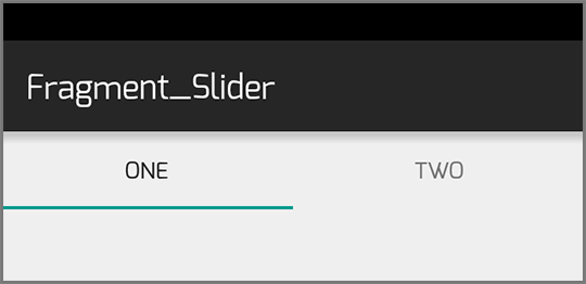
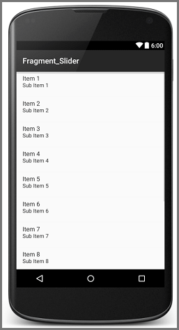
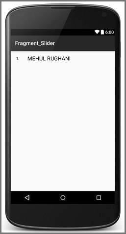
You will get Final Output:
Before moving foward, I will suggest you to refer Android Tabs.
What is Tab Layout?
Tab Layout provides a horizontal layout to display tabs in your Android application.
For more detail about Android TabLayout Click here.
How to create Tab Layout in your Android app?
Follow these simple steps to create a horizontal tab layout in your Android app.
In my example I will be displaying two tabs named One and Two.
| Tab One | I would be displaying images. |
| Tab Two | I would be displaying few contacts. |
I will need to create two fragments for that.
Step 1 Create New Android Project.
If you are new to Android Studio and don’t know how to create a new project then you should checkout our other blog:
Step 2 Add Android Support Design Dependency.
To use TabLayout feature, you have to add dependency of android.support:design library. There are two ways to add dependency in your android studio project:
2.1 Add Dependency From Module Settings.
To add dependency:
- Right click on the app and click on Open Module Settings.
- Now go to the dependencies tab and click on add (+) button and search for a support:design .
- Select android.support:design library and click ok.
2.2 Add Dependency From Gradle File.
Go to build.gradle file.
Copy the above line and paste it into the depencies
Here, I am using:
- android.support:design:23.1.1 (currently latest version of android.support:design)
Your dependencies should look like following:
You can learn more about adding dependency to your Android Studio project from our other blog post:
Step 3 Add Images in Drawable folder
In my example I would be displaying:
- Different images in tab One &
- Displaying some text in tab Two.
To Display Images I have to add few images in Drawable folder and take reference of those images in strings.xml file.
Path for string.xml: app >> res >> values >> strings.xml
3.1 Update string.xml File.
strings.xml
In strings.xml file I have declared two string arrays, each representing items I would be using in my example.
| all_images | Containing references of all static images. |
| all_contacts | Containing references of all the contacts. |
Now I am going to create color.xml file for storing required color references.
3.2 Create color.xml File.
- To create color.xml file, right click on app >> res >> values folder and select New >> Value resource file and name it color
color.xml:
Now, lets create fragments to show images and contacts.
First I am going to create fragment which will display few images.
Step 4 Create Fragment One — To show images.
I would be displaying images in this fragment, for that I need to create layout which contains the images. So let’s get started with creating layout.
4.1 Create fragment_one.xml layout File.
- To create layout file, right click on app >> res >> layout and select New >> Layout resource file.
- Give appropriate name to that layout file. Here I am using fragment_one.xml .
- In my example, fragment_one.xml is used to display some static images in GridView.
fragment_one.xml:
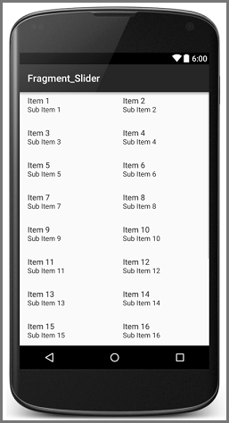
In this layout file, I have taken a GridView to display images (You can change the properties of a GridView as per your application requirements).
I am done with putting GridView in my first fragment. Now i will add images in my GridView, which needs to inflate from another layout file.
So I am going to create image_inflater.xml file.
4.2 Create image_inflater.xml layout File.
image_inflater.xml:
I would be inflating this imageView (multiple copies) to the GridView that I have declared in fragment_one.xml (You can change the properties of imageview as per your requirements).
I am done with my layout file for first fragment, so now let’s move towards the coding part of the first fragment.
4.3 Create FragmentOne.java File. FragmentOne.java
As the name suggests, this is a fragment file, so it extends Fragment class.
In this file I have taken a reference of gridview (that I have declared in fragment_one.xml ) and reference of all images from string.xml file.
Now let’s understand setAdapter() method in detail:
In this method, I am adding all the images (fetcehd from strings.xml in getAllWidgets() method) to allDrawableImages Arraylist.
After that I have created an object of GridViewAdapter and called the constructor of GridViewAdapter with two arguments.
| Argument — 1 | Context |
| Argument — 2 | Drawable ArrayList (For images). |
Then I have set GridViewAdapter object to the GridView (for displaying all the images in GridView).
We cannot add items in gridview directly, we need to do it through adapter. So I have created gridViewAdapter for that.
4.4 Create GridViewAdapter.java File.
Create GridViewAdapter.java file for adding items.
GridViewAdapter.java:
This adapter file will take images one by one and
- Store it in imageview of image_inflater.xml and
- Add it into the grid view.
So I am ready with my first fragment, now let’s move towards the second fragment.
Second fragment will be used to display contacts which I have already declared in strings.xml file.
If you would like to learn more about adapters, you can go here:
Step 5 Create Fragment Two to display contacts.
To display contacts, I need to first create layout which can contain the contacts I want to show.
So let’s get started with creating layout.
5.1 Create fragment_two.xml layout File.
Create fragment_two.xml file in res >> layout folder. In my example I am using this fragment to display contacts.
fragment_two.xml:
In this layout file I have taken a listview to display static contacts (you can change properties of listview as per your application requirements)
I am done with putting listview in my second fragment. But to put data in my listview, I’ll need to inflate the contacts from another layout file.
For that I am going to create a contact_inflater.xml file.
5.2 Create contact_inflater.xml layout File.
To inflate text I am creating contact_inflator.xml file with two TextViews. One textview will contain the name and the other is for number.
contact_inflater.xml:
I am done with my layout file for second fragment, so now let’s get started with the coding of second fragment.
5.3 Create FragmentTwo.java File.
FragmentTwo.java:
Like FragmentOne.java , this class also extends Fragment class. In this file, I have taken a reference of ListView from fragment_two.xml & all contacts from strings.xml file
Let’s understand setAdapter() method:
In this method, first I am adding all the contacts (fetched from strings.xml file) to allContactNames ArrayList.
Then I have created an object of ListViewAdapter and called constructor of ListViewAdapter with two arguments.
| Argument — 1 | Context |
| Argument — 2 | String ArrayList (For Contacts). |
Then I have set the ListViewAdapter object to the ListView.
Since we cannot add items in ListView directly (same as GridView) I am going to create an adapter for it.
5.4 Create ListViewAdapter.java File.
ListViewAdapter.java:
This adapter file will take contacts one by one and performs following operation:
- It will store name in TextView of contact_inflater.xml file
- It will add the contact into listview.
Finally, I am done with both of my fragments. So, now I will add both the fragments in TabLayout. So come back to the Main Activity of the project.
In this tutorial, you can change tabs by swiping left or right if you don’t want this feature then you can click here.
Step 6 Adding Fragment One & Fragment Two to Main Activity.
6.1 activity_main.xml File.
MainActivity.xml:
In this file I have taken TabLayout.
Sometimes you might not get an option to add TabLayout, in that case you have add dependecy for android.support:design Library. (check step-2)
ViewPager:
- It is used to change tab on swipe left and right
I am done with my main layout file now let’s check the code for the same.
6.2 MainActivity.java File.
MainActivity.java:
Here I have taken a references of:
- FragmentOne
- FragmentTwo
- Tablayout
- ViewPager
Now let’s understand setupViewPager() and setViewPagerAdapter() methods in detail.
1. setupViewPager():
I have created an object of each fragment (which would be shown in TabLayout) to ViewPagerAdapter.
Let’s understand the arguments of addFragment()
| Argument — 1 | Fragment object that we have created. |
| Argument — 2 | Name that we want to show as title of the tab. |
2. setViewPagerAdapter():
After adding both the fragments to the adapter I am going to set that adapter to the ViewPager.
I am ready with my viewpager so now I am going to set that viewpager to the TabLayout.
Now to add fragment in viewpager I am going to create ViewPagerAdapter for it.
6.3 Create ViewPagerAdapter.java File.
Here I have created this file to add both the fragments in ViewPager widget.
ViewPagerAdapter.java:
I hope you find this blog post very helpful while creating Tab Layout In Android With ViewPager. Let me know in comment if you have any questions regarding Tab Layout. I will reply you ASAP.
Got an Idea of Android App Development? What are you still waiting for? Contact us now and see the Idea live soon. Our company has been named as one of the best Android Application Development Company in India.
Mehul Rughani

I am professional Android App & Game developer. I love to develop unique and creative Games & Apps. I am very passionate about my work.
Источник
Урок 19. Как создать андроид-приложение с вкладками – TabLayout с ViewPager2 на Kotlin
На прошлом уроке мы познакомились с ViewPager2 и создали андроид-приложение, в котором можно листать экраны свайпом вправо или влево. На этом уроке добавим в верхней части экрана вкладки, которые будут содержать заголовки и индикатор экрана, на котором находится пользователь в данный момент, а также рассмотрим некоторые их свойства и способы оформления.
В этом уроке будем использовать проект из прошлого урока, можно скачать его на странице урока 18 по ссылке вверху.
Добавление TabLayout в макет разметки экрана
Чтобы добавить вкладки на экран, нужно открыть макет разметки и добавить компонент com.google.android.material.tabs.TabLayout в верхней части экрана:
Для корректного размещения нужно изменить компонент ViewPager2 – высоту укажем 0dp. Таким образом, высоту компонента будет регулировать корневой ConstraintLayout по заданным ограничениям. А вместо ограничения app:layout_constraintTop_toTopOf=»parent» поставим app:layout_constraintTop_toBottomOf=»@+id/tab_layout» – чтобы верх компонента ViewPager2 был ограничен не верхней границей родительского компонента, а нижней границей компонента TabLayout.
Рассмотрим подробнее компонент com.google.android.material.tabs.TabLayout. Свойство app:tabMode=»scrollable» обеспечивает размещение в видимой части экрана только нескольких вкладок, остальные будут доступны в процессе прокрутки. Если мы не укажем это свойство, то в видимой части экрана будут одновременно отображаться все вкладки, и при большом их количестве визуальное восприятие будет затруднено.
Свойство app:tabIndicatorColor=»@color/teal_200″ указывает цвет, а app:tabIndicatorHeight=»4dp» – толщину индикатора вкладки.
Далее идут свойства ширины – указываем по родителю – и высоты – указываем по содержимому.
Последние три свойства – ограничения верхней части и боковых сторон компонента по родителю.
Реализация вкладок в MainActivity
Открываем класс MainActivity и пишем реализацию вкладок:
Источник


