ViewPager with FragmentPagerAdapter
Layout that allows the user to swipe left and right through «pages» of content which are usually different fragments. This is a common navigation mode to use instead of ActionBar Tabs with Fragments.

A ViewPager is a layout which can be added to any layout XML file inside a root layout:
If you want an «indicator» that displays the pages available at the top as shown in the screenshot above, you need to include a nested indicator view called a PagerTabStrip:
which will automatically display the page indicator for your pager. You might want to check out the popular ViewPagerIndicator for an improved page indicator.
Next, let’s suppose we have defined two fragments FirstFragment and SecondFragment both of which contain a label in the layout and have implementations such as:
Now we need to define the adapter that will properly determine how many pages exist and which fragment to display for each page of the adapter by creating a FragmentPagerAdapter:
For more complex cases with many pages, check out the more dynamic approach with SmartFragmentStatePagerAdapter explained later.
Finally, let’s associate the ViewPager with a new instance of our adapter:
And now we have a basic functioning ViewPager with any number of fragments as pages which can be swiped between.
We can access the selected page within the ViewPager at any time with the getCurrentItem method which returns the current page:
The current page can also be changed programmatically with the
With this getter and setter, we can easily access or modify the selected page at runtime.
If the Activity needs to be able listen for changes to the page selected or other events surrounding the ViewPager , then we just need to hook into the ViewPager.OnPageChangeListener on the ViewPager to handle the events:
We can use the ViewPager to display a tabbed indicator in order to create tabs to display our fragments. At Google I/O 2015, Google announced a new TabLayout class that makes creating this tabbed interface fairly easy to do. See Google Play Style Tabs using TabLayout for a walkthrough.
An alternative approach to achieve this is to use the third-party PagerSlidingTabStrip library.
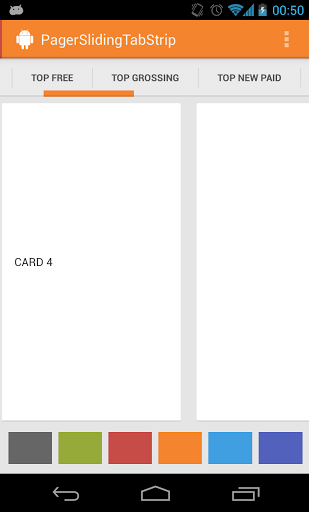
In this way, we can use the same pager system described above and augment the pager with a tabbed navigation indicator.
In certain cases, we may require a dynamic ViewPager where we want to get access to fragment instances or with pages being added or removed at runtime. If your ViewPager is more dynamic with many pages and fragments, we will want to use an implementation of the alternate FragmentStatePagerAdapter instead. Below shows us how to use this and also intelligently cache the fragments for easy lookup.
First, copy in the SmartFragmentStatePagerAdapter.java which provides the intelligent caching of registered fragments within our ViewPager . It does so by overriding the instantiateItem() method and caching any created fragments internally. This solves the common problem of needing to access the current item within the ViewPager.
Now, we want to extend from SmartFragmentStatePagerAdapter copied above when declaring our adapter so we can take advantage of the better memory management of the state pager:
Now with this adapter in place, we can also easily access any fragments within the ViewPager with:
and we can easily access the «current» pager item with:
This pattern should save your app quite a deal of memory and allow for much easier management of fragments within your pager for the right situation.
In certain cases, we want to dynamically replace the Fragment shown for a given page within a ViewPager . For example, perhaps the page in the ViewPager currently displays a list of items and we want to have a detail view show up when an item is selected. There are two approaches for this: create a fragment container as a page or switch fragments from within the adapter.
The first approach is to have the page display a fragment container that switches between multiple child content fragments as outlined in this tutorial on the subject. You can view the working sample code here as well.
The second approach is to switch the fragment that displays inside the FragmentPagerAdapter by overriding the getItem(. ) method as well as getItemPosition(Object object) which is invoked every time you call viewPager.getAdapter().notifyDataSetChanged() . For example:
You would then invoke notifyDataSetChanged on the pager adapter to trigger a reload of the pager at any time. For more details, check out this StackOverflow thread as well as this post.
Alternatively, you can use the method setOffscreenPageLimit(int limit) provided by ViewPager to set how many page instances you want the system to keep in memory on either side of your current page. As a result, more memory will be consumed. So be careful when tweaking this setting if your pages have complex layouts.
For example, to let the system keep 3 page instances on both sides of the current page:
This can be useful in order to preload more fragments for a smoother viewing experience trading off with memory usage.
If you are interested in a ViewPager with visible adjacent pages that are partially visible:
We can do that with by tuning a few properties of our pager. First, here’s how the ViewPager might be defined in the XML Layout:
Next, we need to tune these properties of the pager in the containing fragment or activity:
Finally we need to adjust the width inside the adapter:
For more details, you can follow these guides:
We can customize how the pages animate as they are being swiped between using the PageTransformer.
The easiest way to leverage transformers is to use this ViewPagerTransforms library:

Loading the library into app/build.gradle with:
and then using the desired effect:
Other transform types include AccordionTransformer , CubeInTransformer , FlipHorizontalTransformer , ScaleInOutTransformer , ZoomInTransformer , and many others.
However, custom usage is pretty straightforward, just attach a PageTransformer to the ViewPager:
The first argument is set to true if the supplied PageTransformer requires page views to be drawn from last to first instead of first to last. The second argument is the transformer which requires defining the transformPage method to define the sliding page behavior.
The transformPage method accepts two parameters: page which is the particular page to be modified and position which indicates where a given page is located relative to the center of the screen. The page which fills the screen is at position 0. The page immediately to the right is at position 1. If the user scrolls halfway between pages one and two, page one has a position of -0.5 and page two has a position of 0.5.
For more details, check out the official guide or this guide. You can also review this cool rotating page transformer effect for another example.
If we want to disable swipe in a particular direction, check out this custom ViewPager that swipes in only one direction using a custom class extending ViewPager that intercepts the swipe touch events.
In certain situations your app might even want to have a ViewPager that allows switching pages using an indicator but that doesn’t intercept swipe events at all. This is usually because we want to have the swipe events perform another action rather than change the page.
The first step is to define a custom ViewPager subclass called LockableViewPager. The class inherits from ViewPager and includes a new method called setSwipeable to control if swipe events are enabled or not. Copy this class into your project. Make sure to change your layout file accordingly:
Now, just call setSwipeable(false) to disable swiping to change the page.
Often when launching a tabbed activity, there needs to be a way to select a particular tab to be displayed once the activity loads. For example, an activity has three tabs with one tab being a list of created posts. After a user creates a post on a separate activity, the user needs to be returned to the main activity with the «new posts» tab displayed. This can be done through the use of intent extras and the ViewPager#setCurrentItem method. First, when launching the tabbed activity, we need to pass in the selected tab as an extra:
If the activity needs to return a result, we can also return this as an activity result. Next, we can read this information from the intent within the tabbed activity:
With that, any activity can launch the tabbed activity with the ability to configure the selected tab.
While a ViewPager is often coupled with a Fragment for each page using the FragmentPagerAdapter , there are cases where the pages are better off as plain views.

A good example is an image gallery, where the user can swipe between different pictures. To achieve this, we can extend from PagerAdapter :
This is most commonly used for image slideshows or galleries. See this image gallery tutorial or this viewpager without fragments guide for more detailed steps.
An «indicator» is the UI element that displays the possible pages and the current page such as «tabs». There are a number of other custom indicators for the pager that can be helpful in various contexts.


A few of the most interesting ones are listed below:
- Spring indicator with animated elastic selection. Indicator that visually springs between pages as dragged.
- Simple circle «dots» indicator for pages. Indicator that displays the typical «dots» associated to pages.
- Custom «Ink» dots indicator for pages. Indicator that displays dots for items and uses «ink» to visualize the current page.
Источник
ViewPager 2 — новая функциональность в старой обертке
ViewPager — один из самых известных и широко используемых компонентов Android Support Library. Все простейшие карусели, онбординги и слайдеры в мобильных приложениях для Android выполнены именно на нем. В феврале 2019 года команда разработки AndroidX выпустила ViewPager2. Давайте разберемся, какие у этого были предпосылки и какими преимуществами обладает обновленная версия компонента.

ViewPager 2
На момент написания поста (июль 2019) доступна бета-версия ViewPager2, а это значит, что нижеупомянутые проблемы могут быть исправлены, а функциональность доработана и расширена. Разработчики обещают в будущем добавить поддержку TabLayout (пока он умеет работать только с первой версией), оптимизировать производительность адаптера, внести множество мелких исправлений и доработать документацию.
Интеграция
Компонент не поставляется со стандартными пакетами, а подключается отдельно. Для этого необходимо добавить в блок dependencies в gradle-скрипте вашего модуля следующую строку:
Реализация
Начнём с хороших новостей: переход с первой на вторую версию максимально прост и сводится к смене импортов. Старый добрый синтаксис не тронули: текущую страницу возвращает метод getCurrentItem(), подписаться на изменение состояния пейджера позволяет ViewPager2.onPageChangeCallback, адаптер по-прежнему устанавливается через setAdapter().
Стоит копнуть глубже, как становится понятно, что у первого и второго пейджеров нет ничего общего кроме интерфейсов. Знакомство с реализацией метода setAdapter() не оставляет почвы для сомнений:
Да, ViewPager2 является всего лишь обёрткой над RecyclerView. С одной стороны, это большой плюс, с другой же — добавляет головной боли. Замаскировать RecyclerView под «листалку» стало возможно с появлением PagerSnapHelper. Этот класс меняет физику скролла. Когда пользователь отпускает палец, PagerSnapHelper рассчитывает, какой элемент списка находится ближе всего к осевой линии списка, и с плавной анимацией выравнивает его точно по центру. Таким образом, если свайп был достаточно резким, список пролистывается к следующему элементу, в противном случае — с анимацией возвращается в исходное состояние.
При использовании PagerSnapHelper убедитесь, что ширина и высота самого RecyclerView, а также всех его ViewHolder’ов задана равной MATCH_PARENT. В противном случае поведение SnapHelper будет непредсказуемым, могут возникнуть баги в совершенно неожиданных местах. Всё это делает создание карусели из элементов небольшой высоты довольно трудоёмким, хотя и возможным.
Учитывая все вышесказанное, в верстке виджет будет выглядеть следующим образом:
В одном пакете с ViewPager2 мы также можем найти класс ScrollEventAdapter, помогающий сохранить преемственность синтаксиса. ScrollEventAdapter реализует RecyclerView.OnScrollListener и трансформирует события скролла в события OnPageChangeCallback.
Теперь OnPageChangeCallback представлен не интерфейсом, а абстрактным классом, что позволяет переопределять только необходимые методы (в большинстве случаев вам понадобится только onPageSelected(Int), срабатывающий при выборе определенной страницы):
Особенности
Достоин упоминания и метод setPageTransformer(), в качестве параметра принимающий ViewPager2.PageTransformer. Он устанавливает callback на каждое событие выбора страницы и служит для задания собственной анимации этой страницы. Callback получает на вход View текущей страницы и её номер. Ближайшим аналогом этого метода является ItemAnimator из RecyclerView.
В новых версиях библиотеки были добавлены две реализации трансформера:
CompositePageTransformer и MarginPageTransformer. Первый отвечает за то, чтобы комбинировать трансформеры, чтобы применять сразу несколько трансформаций к одному пейджеру, а второй — для проставления отступов между страницами:
Кроме того, новый виджет поддерживает смену ориентации: простым вызовом метода setOrientation() вы можете превратить свой пейджер в вертикальный список со свайпам сверху вниз:
Происходит это вновь благодаря переходу на RecyclerView: под капотом вызывается смена ориентации LayoutManager, который отвечает за отображение элементов списка. Хочется отметить, что делегирование большого количества задач другим классам пошло новому компоненту на пользу: его листинг стал гораздо более компактным и читаемым.
На этом интересное не заканчивается. В одном из обновлений ViewPager2 получил поддержку ItemDecoration: класса-помощника для декорирования дочерних View. Этот механизм может быть использован для рисования разделителей между элементами, границ, подсветки ячеек.
Готовых реализаций декораторов уже очень много, ведь они уже много лет успешно применяются при работе с обычным RecyclerView. Все наработки теперь применимы и к пейджерам. «Из коробки» доступна стандартная реализация разделителей элементов пейджера:
Вместе с очередным апдейтом в мае 2019 года ViewPager2 был добавлен еще один важный метод: setOffscreenPageLimit(Int). Он отвечает за то, сколько элементов справа и слева от центрального будет инициализироваться в пейджере. Хотя по-умолчанию за кэширование и показ View отвечает RecyclerView, с помощью этого метода вы можете явно задать желаемое количество подгружаемых элементов.
Адаптер
Идейным наследником адаптера первого пейджера является FragmentStateAdapter: интерфейсы взаимодействия и нейминг классов почти не различаются. Изменения коснулись разве что именования некоторых методов. Если раньше нужно было реализовать абстрактную функцию getItem(position), чтобы вернуть нужный экземпляр Fragment для заданной позиции, и это именование могло трактоваться двояко, то сейчас эта функция переименована в createFragment(position). Общее количество фрагментов как и раньше поставляется функцией getCount().
Из важных структурных изменений интерфейса следует также отметить, что адаптер теперь имеет возможность управлять жизненным циклом своих элементов, поэтому вместе с FragmentManager’ом в конструкторе он принимает Lifecycle-объект, либо Activity или Fragment. Из-за этого, для безопасности методы saveState() и restoreState() были объявлены финальными, и закрыты для наследования.
За хранение фрагментов внутри RecyclerView отвечает класс FragmentViewHolder. Метод onCreateViewHolder() из FragmentStateAdapter вызывает FragmentViewHolder.create().
При вызове метода onBindViewHolder(), происходит связывание идентификатора элемента на текущей позиции и идентификатора ViewHolder, для дальнейшего присоединения к нему фрагмента:
И, наконец, при присоединении контейнера из ViewHolder к иерархии View, выполняется FragmentTransaction, добавляющий Fragment в контейнер:
Таким образом, вырисовывается два варианта использования ViewPager2: через наследование класса-адаптера либо напрямую от RecyclerView.Adapter, либо от FragmentStateAdapter.
Наверняка у вас возникнет вопрос: зачем же использовать второй пейджер с Fragment’ами и адаптером для них, когда есть нормально функционирующая первая версия? ViewPager — далеко не «серебряная пуля» при работе с большими динамическими списками данных. Он отлично подходит для создания каруселей со статичным набором картинок или баннеров, но вот пагинируемые новостные ленты с подгрузкой рекламных постов, фильтрацией рождают трудно-поддерживаемых и уродливых монстров. Рано или поздно вы обязательно столкнётесь со жгучим желанием переписать всё на RecyclerView. Теперь вам не придётся этого делать, потому что пейджер сам превратился в него, позаимствовав его мощные возможности по работе с динамическими списками, обернув их при этом в привычный синтаксис.
Единственное, что нам может предложить PagerAdapter — метод notifyDataSetChanged(), принуждающий ViewPager перерисовывать все отрисованные элементы списка. Вы можете резонно заметить, что никто не мешает нам хранить список позиций для существующих элементов и возвращать для них POSITION_UNCHANGED из метода getItemPosition(), всё так. Однако это решение нельзя назвать красивым, оно довольно громоздкое, к тому же, трудно расширяемое на те случаи, когда элементы в списке постоянно изменяются, а не только последовательно добавляются в конец. FragmentStateAdapter же обладает полным арсеналом методов RecyclerView.Adapter, поэтому логику перерисовки элементов можно настроить гораздо более гибко. Более того, вкупе с FragmentStateAdapter можно использовать DiffUtil, который позволяет почти полностью автоматизировать работу по уведомлению об изменениях.
Внимание! Для корректной работы методов notify… (кроме notifyDataSetChanged) следует переопределить методы getItemId(Int) и containsItem(Long). Делается это потому, что реализация по-умолчанию смотрит только на номер страницы, и если вы, например, добавите новый элемент после текущего, он не будет добавлен, так как getItemId останется неизменным. Пример переопределения этих двух методов на основе списка элементов типа Int:
Основной причиной появления ViewPager2 является нежелание изобретать велосипед. С одной стороны, команда разработки AndroidX явно готова отказаться от морально устаревшего ViewPager уже сейчас и уж точно не собирается вкладываться в расширение его функциональности. Да и зачем? Ведь RecyclerView уже и так умеет всё, что нужно. С другой стороны, удаление и прекращение поддержки настолько широко используемого компонента явно не добавит лояльности со стороны сообщества.
Подведём итоги: ViewPager2 определённо достоин внимания, хотя на данный момент и не лишён серьёзных недостатков.
Минусы
Плюсы
- Поддержка всех преимуществ RecyclerView.Adapter: комбинирование элементов разного типа в одном списке, добавление и удаление элементов прямо во время свайпа, анимированная перерисовка содержимого списка при изменении;
- Поддержка всего спектра notify… методов и автоматического вычисления изменений с помощью DiffUtil;
- Простота перехода за счёт преемственности синтаксиса;
- Поддержка вертикальной и горизонтальной ориентации «из коробки»;
- Поддержка RTL;
- Поддержка ItemDecorator;
- Поддержка программного скролла посредством fakeScrollBy();
- Возможность вручную выставить количество подгружаемых элементов;
- Возможность использования любого из готовых open-source решений для сокращения boilerplate-кода, неизбежного, при написании кастомного RecyclerView.Adapter. Например, EasyAdapter.
В качестве резюме, хочется сказать, что к ViewPager2 действительно стоит присмотреться. Это многообещающее, расширяемое и функциональное решение. И хотя пускать новый виджет в продакшн ещё рано, можно с уверенностью сказать, что после полноценного релиза он может и должен полностью вытеснить своего прародителя.
Для тех смелых и решительных, кого статья вдохновила на эксперименты, в 28-ой версии Support Library появился PagerSnapHelper, а это значит, что вы можете использовать его вместе с вашим RecyclerView, воссоздав ViewPager2 своими руками.
Семпл работы ViewPager2 и FragmentStateAdapter.
Источник


