CSS и iOS Safari
 Доброго времени суток, дорогие хабрахабровцы!
Всегда хочется, что бы твой сайт выглядел одинаково хорошо на разных устройствах, включая и мобильные. Но, если поведение в браузерах Android во многом предсказуемо, то с iOS возникает ряд «сюрпризов». О них сегодня и поговорим!
Часть примеров уже публиковалась на Хабре, но я все-равно решил включить их в статью. Разделю статью на две части. В первой – приведу список полезных css-свойств для webkit, а во второй поговорим о фиксах проблем, возникающих при версте для iOS Safari.
Свойства
1. -webkit-overflow-scrolling: touch
Это css-свойство добавит плавный скролл в блоках с overflow: scroll. Рекомендую добавлять это свойство везде, где внутри блока может возникать прокрутка, к примеру, в мобильном меню.
2. -webkit-text-size-adjust: none
Отключает масштабирование текста в горизонтальной ориентации.

3. -webkit-tap-highlight-color: #ccc
Устанавливает цвет выделения активного элемента при тапе на нем (a, label). По умолчанию это серый цвет, и часто может быть ни к чему, или выбиваться из общего дизайна.
Пример такого выделения:
4. -webkit-appearance: none
Отключает наложение на элементы стилей системы: тени, border-radius и т.д. Применяется для input (но не всех), textarea, и т.д. Удобно, когда надо задать единый вид элементов на всех устройствах.
Применяется не только в верстке для Safari.
Данный медиа-запрос позволит отдельно прописывать стили только для устройств, с поддержкой тач. Таким образом, на тач-устройствах можно отключить лишние анимации, ненужные данным типам устройств.
Можно использовать не только в верстке для Safari.
Фиксы
1. background-attachment: fixed
Проблема: background-attachment: fixed не работает в iOS Safari.
Решение: Фиксировать не фон, а блок или псевдоэлемент.
2. Нежелательный скролл модального окна
Проблема: Это довольно редкий случай, но для общей информации, думаю, так же полезно будет знать о нем. Если модальное окно имеет собственную прокрутку и в закрытом состоянии просто установлен отрицательный z-index (и, к примеру, opacity: 0) — то при попытке скролла страницы, модальное окно может перехватить скролл. В результате чего не будет осуществляться прокрутка страницы.
Решение: Добавляем pointer-events: none к модальному окну в закрытом состоянии.
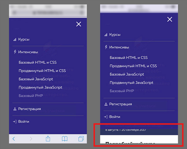
3. Пропадание меню при скролле
Для того, что бы меню «прилипало» к верхней границе экрана при скролле страницы, часто используют следующий прием. Изначально у меню установлено свойство position: absolute, и при достижении верхней границы окна, через js оно меняется на fixed. А при скролле страницы к началу, значение опять меняется на absolute.
Проблема: В Safari на iOS, при смене position с fixed на absolute, меню пропадает с экрана пока скролл не завершится.
Решение: Использовать для меню position: -webkit-sticky. Поведение меню будет сравнимо с вышеописанным, но пропадать ничего не будет! Плюс, не надо использовать js
К слову, значение sticky для свойства position сейчас поддерживается большим количеством браузеров, поэтому его можно использовать и в десктопных браузерах.
4. Блок с position: fixed при скролле
Если реализации решений предыдущих проблем я видел на некоторых сайтах, то данная проблема на сайтах встречается постоянно.
Проблема: При скролле в браузере изменяется высота экрана. Отсюда, если при раскрытом меню или модальном окне не блокировать скролл, возникает подобный эффект:
Решение: Нужно сделать следующий «трюк», используя transform.
Величина в 70px покрывает разницу в изменении высоты окна. И только transform позволяет прорисовывать фон элемента за пределами экрана в данной ситуации.
Выводы
А выводов особо нет, просто пользуйтесь ) Если знаете еще полезные css-свойства или «фиксы», применимые на практике, пишите в комментариях!
Спасибо за внимание!
Update
В свойствах изменен пункт 5. Т.к. media (hover) имеет узкую поддержку. Спасибо dom1n1k за ценное замечание.
Источник
The iOS Font Size Guidelines (Updated for iOS 15)
Erik D. Kennedy В· Updated Aug 7, 2021
You’re reading Font Sizes in UI Design: The Complete Guide. Quickly navigate to other chapters: Intro · iOS · Android · Web · Principles
Designing an iPhone or iPad app and not sure what font sizes to use? Here’s the quick and dirty summary of font sizes assuming (a) you’re using Apple’s default font, SF Pro (or similar) and (b) you want to match iOS conventions.
iPhone Typography Guidelines
Here’s a quick summary of styles. See below for visual reference and more in-depth guidelines.
| Element | Sizing | Notes |
|---|---|---|
| Titles (of pages or modals) | 17pt | Medium font weight iOS 10+ page titles are 34pt before scrolling, 17pt once scrolled |
| Paragraph text, Links | 17pt | |
| Secondary text | 15pt | Lighter color as well |
| Tertiary text, Captions, Segmented buttons | 13pt | Skip a font size between secondary and tertiary text |
| Form controls (Buttons, Text inputs) | 17pt | Highlight important buttons with medium font weight |
| Tab bar, Action bar | 10pt | Don’t go smaller than this |
Let’s break this down element-by-element and look at illustrated examples. We’ll cover not just the actual font sizes, but also how Apple thinks about text styles.
Titles
iOS has some big chunky titles, like “Inbox” below – at 34pt, it’s about the biggest text you’ll see on an iPhone.

But once you scroll, titles morph to 17pt, the default size for text-based actions as well.

Note that the title shrinks to the same size as default text – but they use a heavier weight and top-and-center placement to distinguish it as a title. This was a bit of a revelation to beginning-designer-Erik, as I always expected that titles would be bigger than normal text (not simply bolder).
List Views
Lists are the bread and butter of phone apps. You never knew how many things were actually lists until you started displaying them on a tall, thin screen. Let’s look at those next.

In a list view – in this particular example, emails – iOS treats the sender’s name as normal-sized text (17pt), and the subject and preview as secondary, smaller text (15pt). I think this is worth noting, because again, starting out as a designer, my instinct was to do the opposite: make the body the default size and make the sender’s name even bigger. Notice a trend here? iOS doesn’t style font sizes the way you might naively expect.

On the settings page, the options themselves are written out in the default text style, even though the section titles (e.g. “AirDrop”) are smaller (whoa!). But notice that even though the title is smaller, it’s a thicker font weight, meaning you can still recognize it as a title. This balance of emphasizing and deemphasizing styles is crucial.
The notes below the settings (“AirDrop lets you share instantly…”) are written in 13pt font, which is the smallest we’ve seen in any of these UI examples.
Form Controls
Let’s look at a few controls real quick.


This should be starting to feel pretty straightforward now. The only surprise is the segmented button at 15pt size (doesn’t match the other 17pt controls). My hunch is that, since Apple knew some of these buttons would have many options, they just defaulted to a smaller text size for the control, even if there are only two options.

Search uses the default size and weight, though the color is a bit lighter before you start typing in.
Modals

This little popup is a super illustrative example of how Apple styles text.
- The title is the default size. Which you would think would not be enough, but what have we seen before? A thicker font weight to make up for it not being any bigger.
- The explanatory text is 13pt. I would’ve guessed it would be 15pt, like the email body text, but perhaps they just wanted it to fit on one line?
- The password input is 13pt, which would be too small for a normal text input, though my hunch is because you’re only going to see a bunch of black circles, it doesn’t need to be the default size.
- “OK” and “Cancel” are the default size, but since “OK” is hopefully what you will press, Apple draws a little more attention to it by making it a thicker weight.
These font sizes follow a clear pattern, and they illustrate some nice text-styling tricks, but there are some odd inconsistencies for sure.
Action Bar
Finally we’ve got the action bar at the bottom of the screen. This is the smallest text I could find in the whole UI – 10pt. I would stay away from such a small size as much as possible.

iPad Typography Guidelines
As of last update (Aug 2021), iPads generally have lower pixel densities than iPhones (though this has been true for years). Since iPads have fewer pixels per inch, anything that’s sized in “pixels” or “points” will be slightly larger on an iPad. Because we hold iPads slightly farther away from our eyes than iPhones, this balances out nicely – you can keep most of the same font sizes on iPad and iPhone. So start any iPad typography work by reading the iPhone section above.
That being said, the biggest difference is with titles. As you have a larger canvas to work with, an ideal body font size remains ideal – but you have much more space for larger titles.
So while some applications still use the iPhone-style 17pt titles…

Others are bigger.


So overall, for iPad, you’re going to be following a lot of iPhone styles, but with a little more room to get creative in your headers.
SF Typography Guidelines
The default iOS font is SF, or San Francisco. You can download SF Pro for free. It’s not necessary to use SF when creating an iOS app, but if you want it to have that default iOS look, then SF is your new best friend.
Apple would like you to be a doll and follow a few extra rules when using San Francisco.
First, use SF Pro Display at font sizes 20 or higher. Only use SF Pro Text for body text and smaller.
| Font Size | Font Family |
|---|---|
| 19 or smaller | SF Pro Text |
| 20 or larger | SF Pro Display |
Second, San Francisco is designed to have different character spacing at different sizes. So if you want to perfectly mimic the “default iOS” look, have a few options:
- Hand-adjust the character spacing depending on your font size according to the table below
- Use text styles directly from the Figma iOS library or Apple’s iOS UI Design library (for Sketch, Photoshop, or XD)
- Use this handy Figma plugin or Sketch plugin to automatically have SF’s character spacing set correctly, depending on its font size
Or just ignore the fact that Apple tells you to change character spacing down to the hundredth of a pixel. Live free or die, man.
| Font Style | Font Size | Character Spacing |
|---|---|---|
| Bold title | 34pt | 0.41 |
| Body text | 17pt | -0.41 |
| Secondary text | 15pt | -0.24 |
| Tertiary text | 13pt | -0.08 |
| Smallest text | 10pt | 0.12 |
San Francisco is the default font for iPhone and iPad. So if you’re using it, best to know about these restrictions. However, you can, of course, design iOS apps in any font you want. Be careful that others might appear bigger or smaller, or less legible, even at the same size.
One Final Note рџЋ
If this is your first time here, you might also be interested in:
- Learn UI Design, my full-length online video course on user interface design
- The Design Newsletter, a 50,000+ person newsletter with original design articles aimed at giving you tactical advice to improve your UX/UI skills.
Some people have some really nice stuff to say about the newsletter.
Thank you for your newsletter. It’s possibly the best newsletter I’ve received since 1999, when I started freelancing.
Tricia Littlefield
Founder, TheSimpleWeb
Each time I receive an email from you, I’m like вЂDamn, this is a long email! No way will I read all of this’, then I began to read and I’m like вЂDamn, this is so freaking brillant’ and read it all.
Jean-Philippe
UX Strategist, Freelance
Источник


