Calendar with events android github
Material-Calendar-View is a simple and customizable calendar widget for Android based on Material Design. The widget has two funcionalities: a date picker to select dates (available as an XML widget and a dialog) and a classic calendar. The date picker can work either as a single day picker, many days picker or range picker.
We described a simple usage of the component in this article.
- Material Design
- Single date picker
- Many dates picker
- Range picker
- Events icons
- Fully colors customization
- Customized font
Make sure you are using the newest com.android.support:appcompat-v7.
Make sure you are using Java 8 in your project. If not, add below code to build.gradle file:
Make sure you have defined the jcenter() repository in project’s build.gradle file:
Add the dependency to module’s build.gradle file:
or if you want to use very early version with CalendarDay support:
To your XML layout file add:
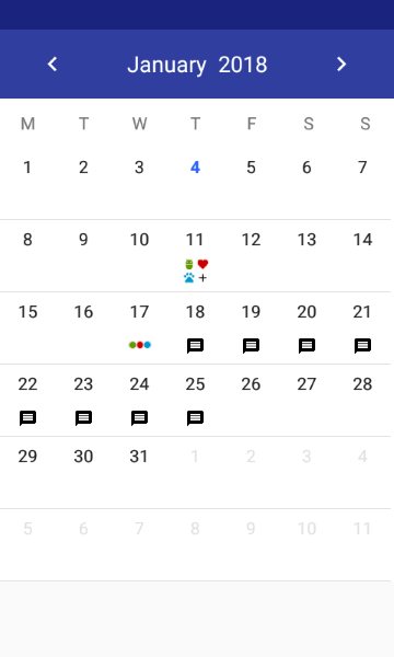
Adding events with icons:
How to create icons?
Drawable with text:
You can use our utils method to create Drawable with text
Take a look at sample_three_icons.xml and adjust it to your project
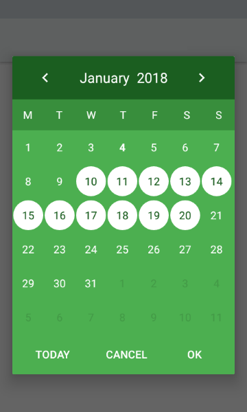
Getting a selected days in the picker mode:
If you want to get all selected days, especially if you use multi date or range picker you should use the following code:
. or if you want to get the first selected day, for example in case of using single date picker, you can use:
Setting a current date:
Setting minumum and maximum dates:
Setting disabled dates:
Setting highlighted days:
Setting selected dates:
. or if you want to remove selected dates:
- Don’t pass more than one calendar object to method above if your calendar type is CalendarView.ONE_DAY_PICKER .
- If your calendar type is CalendarView.RANGE_PICKER you have to pass full dates range. To get it you can use our utils method CalendarUtils.getDatesRange(Calendar firstDay, Calendar lastDay) .
Previous and forward page change listeners:
If you want to use calendar in the picker mode, you have to use the following tags:
- app:type=»one_day_picker»
- app:type=»many_days_picker»
- app:type=»range_picker»
If you want to display event icons in the picker mode, add:
- Header color: app:headerColor=»[color]»
- Header label color: app:headerLabelColor=»[color]»
- Previous button image resource: app:previousButtonSrc=»[drawable]»
- Forward button image resource: app:forwardButtonSrc=»[drawable]»
- Abbreviations bar color: app:abbreviationsBarColor=»[color]»
- Abbreviations labels color: app:abbreviationsLabelsColor=»[color]»
- Calendar pages color: app:pagesColor=»[color]»
- Selection color in picker mode: app:selectionColor=»[color]»
- Selection label color in picker mode: app:selectionLabelColor=»[color]»
- Days labels color: app:daysLabelsColor=»[color]»
- Color of visible days labels from previous and next month page: app:anotherMonthsDaysLabelsColor=»[color]»
- Disabled days labels color: app:disabledDaysLabelsColor=»[color]»
- Highlighted days labels color: app:highlightedDaysLabelsColor=»[color]»
- Today label color: app:todayLabelColor=»[color]»
Custom view for days cells:
To use custom view for calendar cells create XML file (like in example below) and set it using setCalendarDayLayout(@LayoutRes layout: Int) method. XML file must contain TextView with id dayLabel and can contain ImageView with id dayIcon . Do not set colors or textStyle here, it will be overwritten.
Customization of specific cells:
If you want to customize specyfic cells create list of CalendarDay objects and pass it by setCalendarDays() method like in example below:
In the future CalendarDay will replace EventDay .
- To create font directory Right-click the res folder and go to New > Android resource directory. — The New Resource Directory window appears.
- In the Resource type list, select font, and then click OK.
- Note: The name of the resource directory must be font.
- Add your ttf or otf fonts in font folder. As an example we ad sample_font.ttf and sample_font_bold.ttf
- On a DatePickerBuilder apply .typefaceSrc(R.font.sample_font) for setting sample_font to callendar and its abbreviations.
- Optionally apply .todayTypefaceSrc(R.font.sample_font_bold) to differentiate today date font form the rest of dates in calendar view
Disable month swipe:
If you want to disable the swipe gesture to change the month, you have to use the following tag:
First day of a week:
If you want to change default first day of week:
By default the first day is monday or sunday depending on user location.
Источник
Calendar with events android github


 |  |  |
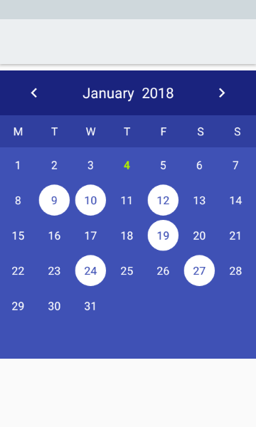
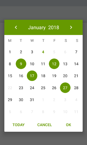
| Single Selection Mode | Range Selection Mode | Multiple Selection Mode |
What is Events Calendar?
Events Calendar is a user-friendly library that helps you achieve a cool Calendar UI with events mapping. You can customise every pixel of the calendar as per your wish and still achieve in implementing all the functionalities of the native android calendar in addition with adding dots to the calendar which represents the presence of an event on the respective dates. Events Calendar also has multi-lingual support. You are just a few steps away from implementing your own badass looking Calendar for your very own project!
[1] In your app module gradle file
[2] In your project level gradle file
[3] Use EventsCalendar in your layout.xml
[4] Implement EventCalendar.Callback on your Activity/ Fragment
[5] Create instances and set default values for the EventsCalendar in your Activity/ Fragment
[6] You can change selection mode of the calendar as you wish
Available Selection modes are,
- SINGLE_SELECTION -> can select single day at a time
- RANGE_SELECTION -> can select range of days at a time
- MULTIPLE_SELECTION -> can select multiple days at a time (not necessary that the selected days be consequtive)
| XML | Kotlin/Java | Description |
|---|---|---|
| app:primaryTextColor | setPrimaryTextColor(color: Int) | Primary Text color of the calendar (selectable dates) |
| app:secondaryTextColor | setSecondaryTextColor(color: Int) | Secondary Text color of the calendar (disabled dates) |
| app:selectedTextColor | setSelectedTextColor(color: Int) | Text color of the Selected date |
| app:selectionColor | setSelectionColor(color: Int) | Color for the Selection Circle |
| app:rangeSelectionColor | setRangeSelectionColor(color: Int) | Color for the Selection Background |
| app:rangeSelectionStartColor | setRangeSelectionStartColor(color: Int) | Color for the Range Start Selection Background |
| app:rangeSelectionEndColor | setRangeSelectionEndColor(color: Int) | Color for the Range End Selection Background |
| app:weekHeaderColor | setWeekHeaderColor(color: Int) | Text color for the Week Header labels |
| app:weekHeaderTextSize | setWeekHeaderFontSize(size: Float) | Text size for the Week Header labels |
| app:datesTextSize | setDateTextFontSize(size: Float) | Text size for the Date labels |
| app:monthTitleColor | setMonthTitleColor(color: Int) | Text color for the Month Title in the calendar view |
| app:monthTitleTextSize | setMonthTitleFontSize(size: Float) | Text size for the Month Title in the calendar view |
| app:eventDotColor | setEventDotColor(color: Int) | Color for the Event Dots marked in the calendar view |
| app:isBoldTextOnSelectionEnabled | setIsBoldTextOnSelectionEnabled(isEnabled: Boolean) | Sets whether the dates should be highlighted or not |
Voila! You have implemented an awesome Events Calendar for your Android Project now!
About
Events Calendar is a user-friendly library that helps you achieve a cool Calendar UI with events mapping. You can customise every pixel of the calendar as per your wish and still achieve in implementing all the functionalities of the native android calendar in addition with adding dots to the calendar which represents the presence of an event on…
Источник
Calendar with events android github
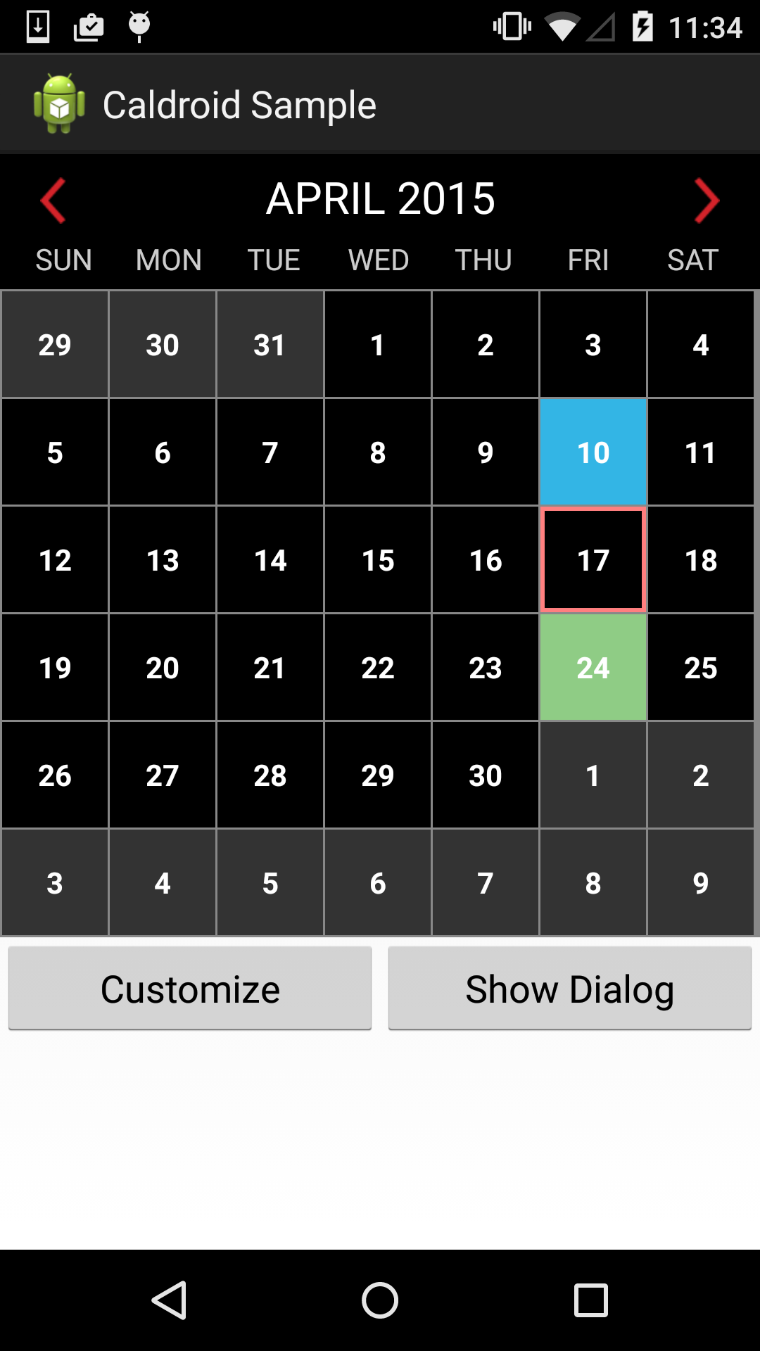
Caldroid is a fragment that display calendar with dates in a month. Caldroid can be used as embedded fragment, or as dialog fragment. User can also swipe left/right to navigate to different months.
It’s very easy to customize look and feel of Caldroid using your own theme, thanks to @crocodile2u contribution. There are two default themes in Caldroid (Light and Dark). You can provide your own theme based on these default themes as well.
Caldroid is fully localized. You can customize start day of the week for different countries. By default calendar start on Sunday.
Caldroid can be used with Android 2.2 and above. It is extracted from official Roomorama application

If you found bugs specific to Caldroid, please open a new issue on Github. However for general Android questions (about layout, drawable, etc), you probably can find more information on StackOverflow.
For Android Studio user: add compile ‘com.roomorama:caldroid:3.0.1’ to your gradle build file.
For Maven user:
For Eclipse/ADT user: please see tag eclipse_project, download the source codes, check out the CaldroidSample to see how the library works. However you are strongly recommended to use Maven or gradle, because this tag is no longer supported.
To use in your project, reference the child library project as a library. If you see JAR mismatched error, replace your android-support-v4.jar to the jar inside Caldroid. Make sure you compile the project against Android 4.2 and above to allow nested fragment. See more at http://developer.android.com/about/versions/android-4.2.html#NestedFragments
##Flexible setup: can be embedded or shown as dialog If you support Android 2.2 and above, you can embed caldroid fragment in your activity with below code:
If your app only target minSdkVersion 16 and above, you can use Caldroid too. First, you need to change your Activity class to FragmentActivity , and add support library to your project. You don’t have to change how you use android.app.Fragment .
You can also embed caldroid fragment as a child in your fragment.
Caldroid accepts numerous arguments during start up:
To customize the startDayOfWeek, just use
If you want to know when user clicks on disabled dates:
By default, Caldroid use square TextView to display date. However when the screen has limited space, user can switch to normal TextView instead:
Caldroid uses SQUARE_TEXT_VIEW_CELL parameter internally as well. When the phone is in portrait mode, it will default SQUARE_TEXT_VIEW_CELL to true , and on landscape, SQUARE_TEXT_VIEW_CELL is set to false . If your app provides different value, Caldroid will use your value instead of the default one.
To show the caldroid fragment as a dialog, you might want to set the dialog title. There is a convenient method for that:
You can define your own theme to change the look and feel of Caldroid without having to subclass it. You should inherit from base theme CaldroidDefault . Here’s how to create a dark theme:
After creating your own theme, supply it to your Caldroid fragment:
Custom backgrounds and text colors for different dates
It is very easy to supply different backgrounds and text colors for different dates:
To use these methods, you can define your colors in color.xml and background in drawable folder:
You need to call refreshView() after above methods to update calendar appearance.
You can also clear the background and text color:
Display user events on Caldroid
Caldroid is simply an UI library and it does not connect to user calendar database or fetch any user’s events. If your app wants to display these events on Caldroid:
Your app needs to fetch events (from server or from user calendar database, depend on your app)
Design a drawable for the date with event. See more here for all types of drawable you can create: http://developer.android.com/guide/topics/resources/drawable-resource.html
Use above setBackgroundDrawableForDate method to set the event drawable to correct date
Call refreshView() to update calendar appearance
If you need to customize more for the cell, you can supply your own cell design.
Set min / max date
Client can use below methods:
To refresh the calendar, just call refreshView()
Set disabled dates
Client can either provide ArrayList or ArrayList to Caldroid.
To clear the disabled dates:
##Select dates within a range To select dates within a range:
To clear the selected dates:
##Show / Hide the navigation arrows to move to previous or next month To show/hide the navigation arrows:
To enable / disable swipe:
Client can programmatically move the calendar (with animation) to a specified date:
##Allow user to select a date and inform listener
Caldroid inform clients via CaldroidListener.
User can also customize the navigation arrows and month title textView: font, size, onClickListener, onLongClickListener, etc. Client can supply different adapter to the weekdayGridView. Make sure you only access these methods after Caldroid has been successfully attached to view, otherwise you will see NullPointerException.
##Handle screen rotation
To handle rotation properly, Caldroid provides method to get current states of the fragment:
Using above method, you can save current state of Caldroid on onSaveInstanceState(Bundle outState) method.
On your activity code:
Then you can restore the state in onCreate(Bundle savedInstanceState) of your activity. The algorithm is like below:
If you use Caldroid as dialog, you can use restoreDialogStatesFromKey
Refer to the CaldroidSampleActivity for more detail.
##Allow customized cell for the dates gridView
Caldroid provides flexible API to supply your own cell view. What you have to do is:
Create your own cell view layout in your project
Subclass CaldroidGridAdapter and override getView(int position, View convertView, ViewGroup parent) . See CaldroidSampleCustomAdapter.java for more detail. Here you can customize everything: layout, text color, background for different states (normal, disable, selected)
Subclass CaldroidFragment to use your custom adapter instead of the default CaldroidGridAdapter. This is simplest step:
- Use your new customized fragment in your project instead of the default CaldroidFragment.
To see how it works, you can uncomment this line in CaldroidSampleActivity
The extraData is a HashMap , is designed to let client injects custom data to CaldroidGridAdapter, so that data can be used to customize the date grid view. Usage is simple:
In your client code:
In the CaldroidSampleCustomAdapter:
Caldroid fragment includes 4 main parts:
Month title view: show the month and year (e.g MARCH, 2013)
Navigation arrows: to navigate to next month or previous month
Weekday gridview: contains only 1 row and 7 columns. To display «SUN, MON, TUE, WED, THU, FRI, SAT»
An infinite view pager that allow user to swipe left/right to change month. This library is taken from https://github.com/antonyt/InfiniteViewPager
This infinite view pager recycles 4 fragment, each fragment contains a gridview with 7 columns to display the dates in month. Whenever user swipes different screen, the date grid views are updated.
Caldroid code is simple and clean partly because of powerful date4j library!
Источник


