- Использование компонентов Chip, ChipGroup, MaterialButton и MaterialCardView из Android Support Library 28
- Chip и ChipGroup
- MaterialButton и MaterialCardView
- BottomAppBar
- Android P: Chips and ChipGroup
- Android Tutorial
- Android Chips
- Android Chip Usage
- Types of Chips
- XML Attributes
- Android ChipGroup
- Android Chip, ChipGroup Example Project Structure
- Android Chips Code
- Android Chips – Material Component For Android
- Setup Material Chips in your Android Studio
- Usage
- Types Of Material Chip
- 1. Entry (Input) Chips
- 2.Filter Chip
- 3.Choice Chip
- 4.Action Chip (Default)
- Android Chips Attributes
- Chip Icon
- Close Icon
- Checked Icon
- Color
- Android ChipGroup Attributes
- Finally
Использование компонентов Chip, ChipGroup, MaterialButton и MaterialCardView из Android Support Library 28
В марте этого года Google анонсировала выпуск preview-версии Android P. Вместе с этим они также выпустили альфа-версию библиотеки поддержки: Android Support Library получила новое обновление под номером 28.0.0 Alpha 1, которое добавило новые возможности и компоненты.
Примечание: на данный момент версия библиотеки является предварительной и служит для ознакомления с preview-версией Android P.
Для того, чтобы посмотреть нововведения самим, нужно выполнить следующие действия:
- Установить версию Android Studio 3.1 или выше. На данный момент последней версией является 3.2 Canary 8, доступная в dev-канале.
- В build.gradle модуля приложения нужно указать последнюю версию SDK.
- Использовать эмулятор с Android P.
Chip и ChipGroup
Chip представляет собой совокупность объектов в небольших формах. Примером таких блоков являются контакты.
Chip может использоваться для различных типов объектов, включая текст, фотографии, контакты и иконки.
Нажатие на него открывает подробную информацию (в карточке или в полноэкранном виде) или отображает меню с действиями, доступными для этого объекта.
Chip может быть удаляемым и неудаляемым. В случае с удаляемым у него будет отображаться значок удаления.
Несколько компонентов Chip можно объединять в одном контейнере, называемом ChipGroup.
С помощью чипов можно предоставлять контактную информацию в удобном виде. Например, при отправке текстовых сообщений их можно отображать в поле «Кому», когда пользователь начинает вводить имя контакта и выбирает нужный.

Такой подход очень удобен, поскольку он исключает ошибку при вводе контакта: пользователь будет имя контакта и фото, если оно есть. Также при нажатии на чип можно отобразить дополнительную информацию об этом контакте.

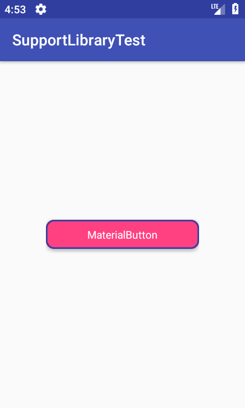
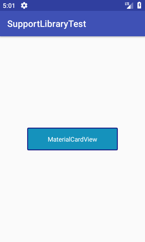
MaterialButton и MaterialCardView
MaterialButton является наследником класса AppCompatButton и предоставляет дополнительные возможности по изменению (кастомизации) кнопки.
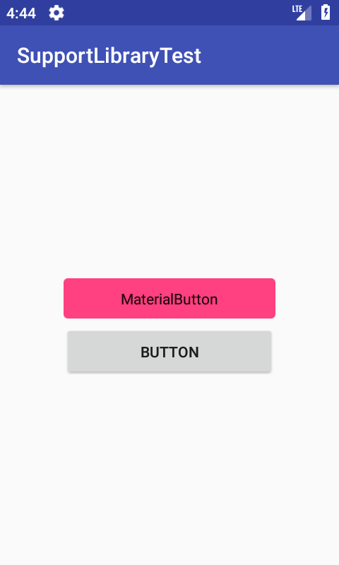
В частности, кнопкам можно задавать цвет границы и её ширину, радиус углов (как у CardView) и различные атрибуты, взятые у CardView. В результате можно легко создавать красивые кнопки для своих приложений.
MaterialCardView, как несложно догадаться, является наследником CardView и имеет не так много нового по сравнению с MaterialButton. Аналогично MaterialButton, можно задавать для карточек цвет границы и её ширину.
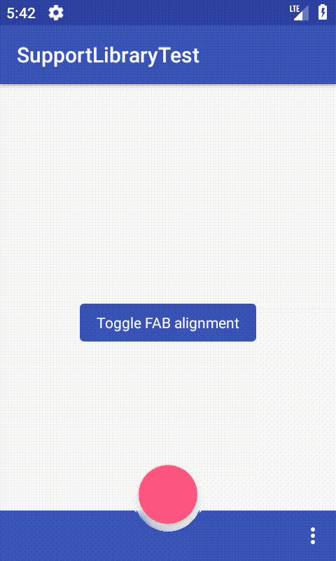
BottomAppBar
BottomAppBar является расширением Toolbar, представляя собой компромисс для пользователей, которым неудобно пользоваться тулбаром.
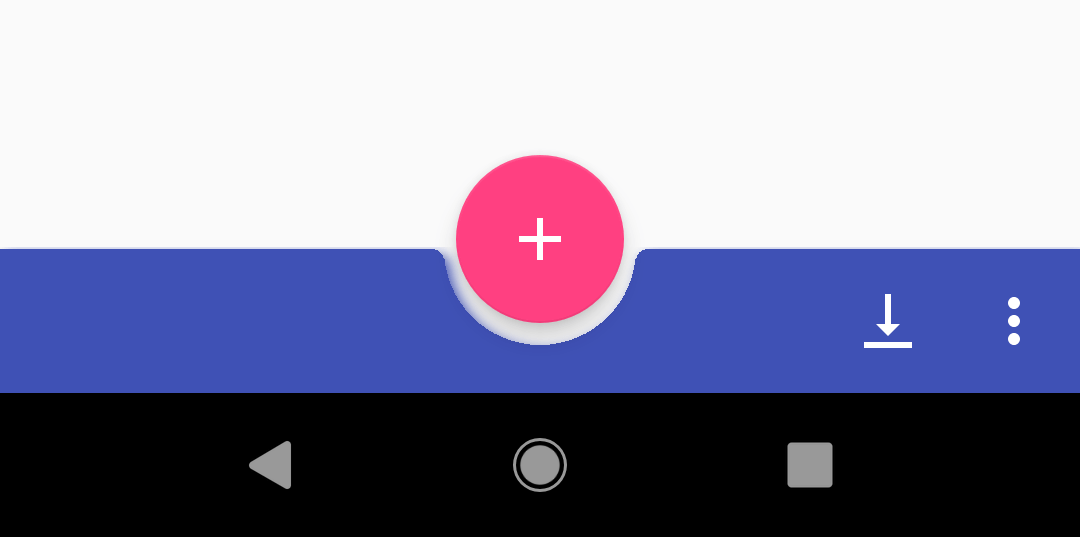
Он создаётся внизу экрана со своеобразной выемкой для FloatingActionButton. Ей можно настраивать радиус углов, диаметр, а также отступ для FloatingActionButton. Располагать кнопку можно либо в центре (FAB_ALIGNMENT_MODE_CENTER), либо в правом углу (FAB_ALIGNMENT_MODE_END).
Таким образом, можно размещать меню внизу экрана, что позволяет лучше работать с приложением.
Однако, следует отметить несколько моментов:
- Не вызывайте setSupportActionBar(), если у вас есть BottomAppBar, поскольку метод сломает его.
- Чтобы изменить цвет фона, нужно использовать app:backgroundTint вместо setBackground() из-за внутреннего управления фоном.
- Вызов setTitle() и setSubtitle() не будут иметь эффекта.
Источник
Android P: Chips and ChipGroup
Android Tutorial
In this tutorial, we’ll be discussing the latest components that are a part of the new Material Design Library: Chips and Chip Groups. We’ll be implementing them in our android application.
Android Chips
Chips are basically a text displayed in a rounded background. These are checkable and can contain icons as well.
Chips are a newer and stylised form of RadioButtons.
To use Chips in your Android application you need to use the latest Android SDK 28.
Following are the dependencies that need to be added in the build.gradle:
Note: At the time of writing above were the versions available.
What is AndroidX?
Since the introduction of Android Support v28, Google has refactored the package names. AndroidX is a replacement of the support library. For more details on the new package names check out this link.
Android Chip Usage
A Chip is defined in the xml layout as:
app:chipText displays the textual part in the Chip.
This is how the chip looks on the screen:

Types of Chips
Chips can be styled as:
- Default – Pressing this does nothing unless some other xml attribute is present.
- Entry: We need to add the style=»@style/Widget.MaterialComponents.Chip.Entry» . This makes the Chip checkable and contains a checkmark and close icon by default
- Choice: This type of chip is generally used to mark/unmark chips for selections. style=»@style/Widget.MaterialComponents.Chip.Choice»
Choice style is generally used in Chip groups. - Actions: This chip is checkable and is used to trigger actions when they are clicked.
style=»@style/Widget.MaterialComponents.Chip.Action» - Filter: This chip is checkable and shows a checkmark when checked.
style=»@style/Widget.MaterialComponents.Chip.Filter»
XML Attributes
- app:chipText
- app:chipBackgroundColor
- app:rippleColor – To show a custom ripple effect when the chip is pressed.
- app:checkable – Used to set whether the toggle is enabled or not.
- app:chipIcon – Used to set a custom drawable icon in the chip.
- app:closeIcon – Generally present in the Entry type chip. We can set our icon using this. The close icon by default is at the right of the text.
- app:closeIconTint
- app:checkedIcon – Used to change the check mark icon that is present in Entry and Filter types of Chips.
- app:chipStartPadding/app:chipEndPadding
- app:iconStartPadding/app:iconEndPadding
Let’s use these attributes in our xml layout:

Time to add background colors, ripple effects, custom icons:

The chips above are jammed against each other. We can add the padding attributes on the Chips to correct it.
Android ChipGroup
Similar to RadioGroups, ChipGroups are used to hold Chips.

ChipGroups by default spaces the Chips present inside it.
Few of the XML attributes that can be used with ChipGroups are:
app:chipSpacing : To set a custom spacing value between the chips, both horizontally and vertically.
app:chipSpacingHorizontal
app:chipSpacingVertical
app:singleSelection – Setting this as true allows only one of the chips to be checked.
app:singleLine – Sets all the chips present, in a single line only.

Let’s merge the above concepts and also implement the click listeners on the Chips in our Android Studio Project.
Android Chip, ChipGroup Example Project Structure

Android Chips Code
The code for the activity_main.xml layout is given below:
We’ve enclosed the ChipGroup which is single line only, into a horizontal scroll view.
The code for the MainActivity.java class is given below:
The output of the above application in action is given below:

This brings an end to this tutorial. You can download the project from the link below:
Источник
Android Chips – Material Component For Android
Android Chips are one of the components of the Material Design library. A Material Chip is a component that can represent the input, filter, choice, or action of a user.
A Material Chip represents a complex entity in a small block, such as a contact. It is a rounded button that consists of a label, an optional chip icon, and an optional close icon. A chip can either be clicked or toggled if it is checkable.
Chips may be placed in a, which can be configured to layout its chips in a single horizontal line or reflowed across multiple lines. If a chip group contains checkable chips, it can also control the multiple-exclusion scope for its set of chips so that checking one chip unchecks all other chips in the group. — Material.io
This is my sample app using Android chips,
Table of Contents
Setup Material Chips in your Android Studio
To use Chips, your project needs to have material components dependency.
Also, set your app theme such that it inherits one of Material Components themes.
Usage
The Chip widget provides a complete implementation of Material Design’s chip component. Example code of how to include the widget in your layout:
Types Of Material Chip
There are four types of chips: Entry (Input) Chips, Filter Chips, Choice Chips, and Action Chips. Chips are generally used with ChipGroup which is to hold a number of chips.
1. Entry (Input) Chips
Entry chip used to display captured user input in a non-editable format. It’s a very nice way to showcase the user input.
One of the most obvious usages of the Android Entry chip is shown in the Gmail app. Particularly the email input experience- when an email is entered by the user, it is showcased as an entry chip, sort of a pill-shaped layout.
Now according to the material design, this element should be an Android Chip with style as ‘Entry’. This chip can also have a close icon along with a chip icon. Generally, this type of chip is contained in a ChipGroup.
ChipGoup class is similar to the RadioGroup class, as it is used to hold multiple chips. It has the properties to display all the chips in a single line.
Adding text to Entry Chip programmatically.
2.Filter Chip
Filter chips would start acting as a radio button. This means in a way only one selection can be made at a time. This functionality is achieved by adding all the filter chips in a ChipGroup and setting the property app:singleSelection=”true” of Chip Group.
Click Listener for the Filter Chip group,
3.Choice Chip
The choice chip allows the user to select only one of the available options just like the filter chips. But with one difference, it does not have a check icon on it.
Instead according to material design guidelines, it displays the selection with a change of color, when it is selected. If you wish you can use a chipIcon with this chip.
defining the choice chip in XML.
handling ChoiceChip selection on chipgroup.
4.Action Chip (Default)
It’s a single actionable chip, in short, it’s an alternative to the button widget. If you have to perform an action, based on the user’s tap, this is the chip that you should use. Generally, this type of chip is placed after the content of the page and is used as a clickable, just like a button.
Implemention click listener for the ActionChips.
Android Chips Attributes
Chip Icon
app:chipIconVisible — visibility of the chip icon.
app:chipIcon — drawable icon to show at the start of the chip.
app:chipIconSize — size of the chip icon.
Click listener for the clip icon,
Close Icon
app:closeIconVisible — visibility of the close icon.
app:closeIcon — drawable icon show at end of the chip.
app:closeIconSize — size of the close icon.
Click listener for close icon,
Checked Icon
android:checkable — Whether or not checkable tapping is enabled.
app:checkedIconVisible — visibility of the checked icon.
app:checkedIcon — drawable to show after user toggled chip button.
Click listener for checked icon,
Color
chipBackgroundColor — used to customize the chip background.
textColor — customize the text color.
chipIconTint — the color of the Chip icons can be customized
closeIconTint — Color of the close icon in the chip.
hipStrokeColor — stroke color of the chip.
Android ChipGroup Attributes
singleLine — Put all the Chips under the chip group in single line.
chipSpacingVertical — Vertical space between two chips in chip group.
chipSpacingHorizontal — Horizontal space between two chips.
singleSelection –The singleSelection attribute can be set to true on a ChipGroup in order to toggle single-select and multi-select behavior of child Chips.
selectionRequired — The selectionRequired attribute can be set to true on a ChipGroup to prevent all child Chips from being deselected.
That’s all. Done with the Android chip explanation.
You can download my Android Chips Material Design example in Github.
Check my other example using Material design.
Finally
Thanks for reading. Please try Material chips in your application. And let me know your feedback in the comments.
Give a clap if you like it.
Источник


