- Custom View, скроллинг и жесты в Android на примере простого вьювера картинок
- Android Custom View Tutorial
- Version
- Getting Started
- Working with the Basic Widgets
- Working with Views in Kotlin
- Working with Views in XML
- Android Views
- Custom View and Custom ViewGroup
- How Android Draws Views
- Creating a custom view
- Android View Class Constructors
- Drawing on Canvas
- Responsive View
- Creating Custom XML Attributes
- User Interaction
- Saving View State
- Where To Go From Here?
Custom View, скроллинг и жесты в Android на примере простого вьювера картинок
В статье описываются детали реализации простого вьювера картинок и показываются некоторые тонкости имплементации скроллинга и обработки жестов.
И так, начнем. Ми будем разрабатывать приложения для просмотра картинок. Готовое приложение выглядит так (хотя скриншоты, конечно, слабо передают функционал): 
Установить приложение можно либо из Маркета, либо установив вручную отсюда. Исходный код доступен здесь.
Главным элементом нашего приложения является класс ImageViewer который мы и будем разрабатывать. Но нужно также отметить, что для выбора файла для просмотра я не стал изобретать велосипед и взял готовый «компонент» здесь.
Компонент представляет собой activity, который вызывается при старте из главного activity. После выбора файла, мы его загружаем и показываем на экране с помощью класса ImageViewer. Рассмотрим класс более подробно.
Класс является наследником класса View и переопределяет только один его метод onDraw. Также класс содержит конструктор и метод загрузки изображения:
Если мы загрузим картинку по размерам больше чем экран смартфона, то отобразится только часть ее и у нас не будет способа ее подвинуть или уменьшить.
Добавим теперь возможность скроллинга. Скроллинг по своей сути представляет собой жест, при котором пользователь дотрагивается пальцем к экрану, передвигает его не отрывая, и отпускает. Для того чтоб иметь возможность обрабатывать события связанные с тач-скрином, нужно переопределить метод onTouchEvent. Метод принимает один параметр типа MotionEvent и должен возвратить true в случае обработки события. Через этот метод можно реализовать поддержку любого жеста, включая скроллинг.
Для распознавания скроллинга нам нужно зафиксировать момент дотрагивания, перемещения и отпускания. К счастью нету необходимости делать это вручную так как в Android SDK есть класс делающий всю работу за нас. Таким образом для того чтоб распознать жест скроллинга, нужно добавить в наш класс поле типа GestureDetector которое инициализируется объектом реализующим интерфейс OnGestureListener (именно этот объект будет получать события скроллинга). Также нужно переопределить метод onTouchEvent в классе ImageViewer и передавать обработку событий из него в наш объект типа OnGestureListener. Измененный класс ImageViewer (без неизмененных методов) представлен ниже:
Как видно на самом деле ми наследуем MyGestureListener не от OnGestureListener, а от SimpleOnGestureListener. Последний класс просто реализует интерфейс OnGestureListener с помощью пустых методов. Этим мы избавляем себя от реализации всех методов, выбирая только те, что нужно.
Теперь если загрузить большую картинку, мы, по крайней мере, сможем скролить ее. Но: во первых мы можем проскроллить за рамки картинки, во вторых нету скроллбаров, которые бы подсказали нам где мы находимся и сколько еще осталось до краев.
Решим для начала вторую проблему. Поиск в Интернет приводит нас к тому, что нужно переопределить методы computeHorizontalScrollRange и computeVerticalScrollRange. Эти методы должны возвратить реальные размеры картинки (на самом деле есть еще методы которые имеют отношение к скроллбарам – это методы computeHorizontalScrollExtent, computeHorizontalScrollOffset и такая же пара для вертикального скроллбара. Если переопределить и их, то тогда возвращать можно более произвольные значения). Но этого оказывается недостаточно – скроллбары в первых нужно включить, во вторых проинициализировать. Включаются они методами setHorizontalScrollBarEnabled и setVerticalScrollBarEnabled, инициализируются методом initializeScrollbars. Но вот незадача – последний метод принимает немного непонятный параметр типа TypedArray. Этот параметр должен содержать в себе набор стандартных для View атрибутов. Список можно увидеть здесь в таблице «XML Attributes». Если бы мы создавали наш view из XML, Android runtime бы автоматически составил такой список. Но так как мы создаем класс программно, нужно также создать этот список программно. Для этого нужно создать файл attrs.xml в каталоге res\values с таким содержимым:
В файле просто перечислены все атрибуты, которые были указаны в таблице, упомянутой выше (кроме некоторых на которые указывает компилятор как на ошибку – видимо в документации список приведен самый последний). Измененный класс ImageViewer (кроме неизменных методов):
Не хотелось бы на этом останавливаться, поэтому давайте добавим поддержку жеста «бросок» (fling). Этот жест есть просто дополнение к жесту скроллинга, но учитывается скорость перемещения пальца в последние моменты (перед отпусканием), и если она не нулевая, скроллинг продолжается с постепенным затуханием. Поддержка этого жеста уже заложена в GestureDetector – поэтому нам нужно всего лишь переопределить метод onFling в классе MyGestureListener. Отловив это событие нам нужно еще некоторое время изменять положение скроллинга. Конечно, это можно сделать «вручную» с помощью таймеров или еще как, но опять же в Android SDK уже есть класс, реализующий нужный функционал. Поэтому нужно добавить в класс ImageViewer еще одно поле типа Scroller, которое и будет заниматься «остаточным» скроллингом – для старта скроллинга нужно вызвать его метод fling. Также нужно показать скроллбары (они ведь прячутся когда не нужны) вызовом метода awakenScrollBars. И последнее что нужно сделать – это переопределить метод computeScroll, который должен непосредственно делать скроллинг с помощью метода scrollTo (класс Scroller сам не занимается скроллингом – он просто работает с координатами). Код измененного класса ImageViewer представлен ниже:
В завершения разговора о жесте fling надо сделать одну мелочь – при прикосновении пальцем во время скроллинга от броска, нужно остановить скроллинг. На этот раз мы это сделаем «вручную» в методе onTouchEvent. Измененный метод представлен ниже:
Уже можно любоваться достаточно интересной физикой, но можно увидеть некоторые «глюки» при скроллинге за пределы картинки. Это происходит из-за того, что fling работает только в пределах картинки, а скроллинг без броска работает везде. Т.е. мы сможем выйти за рамки картинки только если очень плавно скролить (чтоб не срабатывал fling). Исправить этот «косяк» можно путем введения ограничение на обработку в метод onFling и обрабатывать бросок только если он не выходит за границы картинки. Измененный метод представлен ниже:
Теперь мы опять можем беспрепятственно скролить за рамки картинки. Кажется, эту проблему мы уже вспоминали… У нее есть элегантное решение, лежащее в том, что при отпускании пальца (при завершении скроллинга за рамками картинки) нужно картинку плавно вернуть в «положенное» место. И опять мы это сделаем «вручную» в методе onTouchEvent:
Вот теперь с уверенностью можно сказать что со скроллингом мы разобрались. Можем переходить к последнему жесту который хотелось бы реализовать – это жест pinch zoom.
Со стороны жест выглядит как растягивание или сжатие чего-то воображаемого на экране смартфона двумя пальцами. Пошагово жест происходит так: нажатие одним пальцем, нажатие вторым пальцем, изменение положения одного или двух пальцев не отпуская, отпускание второго пальца. Для определения величины масштабирования нужно вычислить соотношение между расстояниями между пальцами в момент начала жеста и в момент окончания жеста. Расстояние между пальцами находится по формуле sqrt(pow(x2 – x1, 2) + pow(y2 – y1, 2)). Также нужно отметить некоторое положение скроллинга которое нужно сохранять – ведь если жестом увеличить картинку, то положение скроллинга изменится (из-за измененного размера картинки). Это положение – а точнее точка, положение которой нужно сохранить, в терминологии Android SDK называется фокальной точкой, и находиться она посередине между двумя пальцами.
Реализовать жест как всегда можно самому, но и это к счастью уже реализовано в Android SDK (правда, только начиная с версии 2.2). Поможет в этом класс ScaleGestureDetector, инстанс которого добавим в наш класс. ScaleGestureDetector инициализируется обьектом, поддерживающим интерфейс OnScaleGestureListener, поэтому создадим также внутренний класс MyScaleGestureListener, который реализует методы onScaleBegin, onScale и onScaleEnd. Не забываем передать управление ScaleGestureDetector из метода onTouchEvent. Ну и самое главное – нужно как-то использовать данные масштабирования: их нужно учитывать во всех местах, где раньше фигурировали ширина и высота картинки (т.е. фактически нужно умножить эти параметры на коэффициент масштабирования). Финальный код класса ImageViewer можно посмотреть в исходниках.
На этом все. Надеюсь статься окажется полезной.
Источник
Android Custom View Tutorial
Create an Android Custom View in Kotlin and learn how to draw shapes on the canvas, make views responsive, create new XML attributes, and save view state.

Version
- Kotlin 1.2, Android 4.1, Android Studio 3

The Android platform has several View classes that cover many needs for a typical app. But sometimes these views don’t fit your needs and you need to build a custom view for reasons like:
- Innovative UI design or animation
- Different user interaction
- Displaying different types of data
- Some performance optimization
- Reusability
In this tutorial, you will get a head start with Android custom views by learning how to make an emotional face view that can be set to happy or sad according to your user state, and through that you will see how to add new XML attributes to a custom view and how to draw some shapes and paths on the Android Canvas .
To follow along with this tutorial, you’ll need to use Android Studio 3.0.1 or later and Kotlin 1.2.21 or later.
Getting Started
To kick things off, start by downloading the materials for this tutorial (you can find a link at the top or bottom of the page) and then fire up Android Studio and import the starter project. It is (mostly) an empty project with some resources (colors, dimens and icon launcher).
Build and run the app, and you will see an empty screen like this:

Working with the Basic Widgets
Android has a set of basic widgets and the base class of any Android widget is the View class.
The following image shows a part of the basic widget hierarchy:

You have two ways to create a new instance of an Android view and to set values for its attributes:
- From your XML files (layout files)
- From your Kotlin code
Working with Views in Kotlin
You can add a TextView to your layout from the Kotlin code. Open MainActivity and replace the setContentView(R.layout.activity_main) line in onCreate() with the following code:
- Create a TextView by using the constructor which needs the activity context.
- Set “Hello Custom Views” as the text of the TextView .
- Set the TextView as the content view of the activity.
Build and run. You will see the text “Hello Custom Views” on your screen like this:

Working with Views in XML
Now open up res/layout/activity_main.xml. To use one of the basic Android widgets like TextView , just drag it from the palette window on the left into the design editor and drop it to the top center of the layout, or switch to the XML text editor and add the following lines to the XML code inside the RelativeLayout :
You can change a lot of basic attributes from the View class in XML, such as id, layout_width, layout_height, alpha, visibility, elevation, padding, tag , etc.
To change an attribute, like the text of a TextView, just add the attribute name ( android:text ) and assign a value to it ( «Hello Custom Views» ), as in the last line of the previous snippet.
Reset onCreate() in MainActivity to use setContentView(R.layout.activity_main) , and remove the code you added earlier. Build and run the project. You will see the text «Hello Custom Views» on your screen, like this:

Android Views
The Android View class is the basic building block of an Android user interface. A View occupies a rectangular area on the screen to draw itself and its children (for the case of a ViewGroup). Also, a View is responsible for user event handling.
ViewGroup is a subclass of the View class. ViewGroup is the base class for Android layouts, which are containers for a set of Views (or other ViewGroups), and define their own layout properties and also where each subview should draw itself.
Custom View and Custom ViewGroup
What is a custom View?
Sometimes you want to show a certain type of data and there is already a suitable view in the basic widget set. But if you want UI customization or a different user interaction, you may need to extend a widget.
Suppose that there were no Button widget in the basic widget set in the Android SDK and you want to make one. You would extend the TextView class to get all the capabilities related to the text like setting text, text color, text size, text style and so on. Then you will start your customization work, to give your new widget the look and feel of a button. this is what happens in the Android SDK the Button class extends the TextView class.
Or you could in theory extend the View class to start from scratch.
What is a custom ViewGroup?
Sometimes you want to group some views into one component to allow them to deal with each other easily through writing some specific code or business logic. You can call that a “compound view”. Compound views give you reusability and modularity.
For example, you may want to build an emotional face view with a sliding bar that the user can slide to the right to make the emotional face happier or slide to left to make it sadder. You may also want to show that state of happiness in a TextView .
You can group those views ( ImageView, SeekBar, TextView ) into one layout file, then create a new class that extends a layout (e.g. a LinearLayout or a RelativeLayout ) and write your business logic in it.
Another reason for implementing a custom ViewGroup is if you want to make your custom ViewGroup align its children in a different and unique way. For example, laying out the children in a circle instead of linearly as in the LinearLayout .
How Android Draws Views
When an Android activity comes up into the foreground, Android asks it for its root view. The root view is the top parent of the layout hierarchy. Android then starts drawing the whole view hierarchy.
Android draws the hierarchy starting from the top parent, then its children, and if one of the children is also a ViewGroup, Android will draw its children before drawing the second child. So it’s a depth-first traversal.
Android draws the children of a ViewGroup according to the index of the child (its position in the XML file), so the view which you added first will be drawn first.
Android draws the layout hierarchy in three stages:
- Measuring stage: each view must measure itself.
- Layout stage: each ViewGroup finds the right position for its children on the screen by using the child size and also by following the layout rules.
- Drawing stage: after measuring and positioning all of the views, each view happily draws itself. :]
Creating a custom view
It’s finally time to start making a custom view yourself!
Start by creating a new Kotlin class and in the main app package and name it EmotionalFaceView . Make it inherit from the View class:
Now if you hover on the word View you will get a message:
“This type has a constructor, and thus must be initialized here”
Android View Class Constructors
View has four constructors and you will need to override one of them at least to start your customization. Check out all of them to pick the suitable one for the tutorial:
- constructor(context: Context)
To create a new View instance from Kotlin code, it needs the Activity context. - constructor(context: Context, attrs: AttributeSet)
To create a new View instance from XML. - constructor(context: Context, attrs: AttributeSet, defStyleAttr: Int)
To create a new view instance from XML with a style from theme attribute. - constructor(context: Context, attrs: AttributeSet, defStyleAttr: Int, defStyleRes: Int)
To create a new view instance from XML with a style from theme attribute and/or style resource.
Pick the second constructor to create your new instance from XML, you can override the constructor in the class body as:
Or, make it the primary constructor using:
Now you can add your custom view at the center of the layout and below the TextView, by adding the following lines to activity_main.xml
Congrats! You have created a custom view and you have added it to the layout! But it still has no your special customization.
Build and run the project, and as you expect there is no change in the UI, but don’t worry: you will start the fun part right now :]
Drawing on Canvas
Prepare your painting tools in EmotionalFaceView by declaring a Paint property for coloring and styling, and some colors:
Now start drawing by overriding the onDraw() method from the parent class. Android invokes onDraw() for you and pass a canvas for drawing:
Create three new methods for drawing the happy face. All of them have a Canvas object as a parameter. Call them from onDraw() :
Draw the face background
Add the following code to drawFaceBackground() :
- Set the paint color to the faceColor and make it fill the drawing area.
- Calculate a radius for a circle which you want to draw as the face background.
- Draw the background circle with a center of (x,y) , where x and y are equal to the half of size, and with the calculated radius .
- Change the paint color to the borderColor and make it just draw a border around the drawing area by setting the style to STROKE
- Draw a border with the same center but with a radius shorter than the previous radius by the borderWidth .
Build and run the app, and you should see a screen like this:

Draw the Eyes
Add the following code to drawEyes() :
- Set the paint color to the eyesColor and make it fill the drawing area.
- Create a RectF object with left, top, right and bottom using the following percentages of the size: (32%, 23%, 43%, 50%). Then you draw the left eye by drawing an oval with the created RectF. For more info about RectF, check the docs.
- Do the same as the last step but with the following percentages of the size: (57%, 23%, 68%, 50%)
Build and run the app, and you should see a screen like this:

To draw curved paths on a canvas you need to create a path object. Add the following property to the EmotionalFaceView class:
After creating the Path object, set the curving instructions for it by adding the following code to the drawMouth() :

- Set the starting point of the path to (x0,y0) by using the moveTo() method where:
- x0 is equal to 22% of the size.
- y0 is equal to 70% of the size.
- x1 is equal to 50% of the size.
- y1 is equal to 80% of the size.
- x2 is equal to 78% of the size.
- y2 is equal to 70% of the size.
- x3 is equal to 50% of the size.
- y3 is equal to 90% of the size.
- x0 is equal to 22% of the size.
- y0 is equal to 70% of the size.
Build and run the app, and you should see a screen like this:

Responsive View
Currently, your custom view has a fixed size, but you want it to be responsive and fit its parent. Also, you want the happy face to always be a circle, not an oval shape.
Android measures the view width and heigh. You can get these values by using measuredWidth, measuredHeight.
Override the onMeasure() method to provide an accurate and efficient measurement of the view contents:
Add the following lines of code to onMeasure() :
- Calculate the smaller dimension of your view
- Use setMeasuredDimension(int, int) to store the measured width and measured height of the view, in this case making your view width and height equivalent.
Build and run the app, and you should see a screen like this:

Creating Custom XML Attributes
To create a new XML attribute go to res/values and create new values resource file named attrs.xml. Add the following lines to the file:
- Open the declare-styleable tag and set the name attribute to your custom view class name.
- Add new attributes with different names and set their format to a suitable format.
Go to res/layout/activity_main.xml and add the following new views to the RelativeLayout:
You have added two EmotionalFaceView objects to the layout, and are using the new custom XML attributes. This proves the reusability concept for the custom view.
The first view has a happy state and the second view has a sad state . You will use both of them later to act as buttons with different themes and different happiness states, and
Build and run the app, and you should see a screen like this:
As you can see, the new XML attributes have no effect yet on the EmotionalFaceView . In order to receive the values of the XML attributes and to use them in the EmotionalFaceView class, update all the lines of code setting up the properties above onDraw() to be:
- Add two constants, one for the HAPPY state and one for the SAD state.
- Setup default values of the XML attribute properties, in case a user of the custom view does not set one of them
- Add a new property called happinessState for the face happiness state.
- Call the invalidate() method in the set happinessState method. The invalidate() method makes Android redraw the view by calling onDraw() .
- Call a new private setupAttributes() method from the init block.
- Obtain a typed array of the XML attributes
- Extract custom attributes into member variables
- Recycle the typedArray to make the data associated with it ready for garbage collection.
Build and run the app, and you should see a screen like this:

As you see in the previous screenshot, the happinessState still has no effect, and both of the EmotionalFaceView buttons are happy.
At the beginning of the drawMouth() method, add the following line
This will reset the path and remove any old path before drawing a new path, to avoid drawing the mouth more than one time while Android calls the onDraw() method again and again.
You want to make the face happy or sad, according to the state, in drawMouth() . Replace the mouthPath() drawing with the following lines of code:
- Draw a happy mouth path by using quadTo() method as you learned before.
- Draw a sad mouth path.
The whole drawMouth() method will be like this
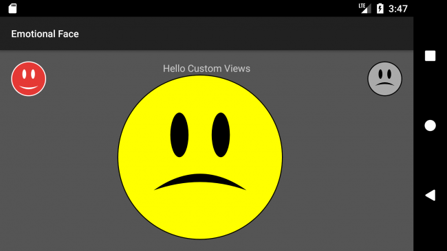
Build and run the app, and you should see the top right button become a sad face, like the following screenshot:

User Interaction
You can let your user change the happiness state of the center emotional face view by clicking on the top left button to make it happy or by clicking on the top right button to make it sad. First, add the following line of code to the MainActivity import statements:
Kotlin Android Extensions provide a handy way for view binding by importing all widgets in the layout in one go. This allows avoiding the use of findViewById() , which is a source of potential bugs and is hard to read and support.
Now add the following click listeners to onCreate() in MainActivity:
- Set the emotionalFaceView ‘s happinessState to HAPPY when the user clicks on the happy button.
- Set the emotionalFaceView ‘s happinessState to SAD when the user clicks on the sad button.
Build and run the app, and click on the both of buttons to change the happiness state:

Saving View State
You can save your view state in case there is any change in the device configuration, e.g., orientation, by overriding the onSaveInstanceState() and onRestoreInstanceState() methods.
Add the following method overrides to EmotionalFaceView :
- Create anew Bundle object to put your data into.
- Put the happiness state value into the bundle.
- Put the state coming from the superclass, in order to not lose any data saved by the superclass, then return the bundle .
- Check the type of the Parcelable to cast it to a Bundle object.
- Get the happinessState value.
- Get the superstate then pass it to the super method.
Build and run the app, change the happiness state to sad, and change the orientation of your device. The center face should remain sad after device rotation:

Where To Go From Here?
Yes! You have created your own custom view :]
You can download the completed project using the download button at the top or bottom of this tutorial.
During this tutorial you:
- Drew a circle, oval and a path on a canvas. You can learn more about custom drawing here.
- Made the custom view responsive.
- Created new XML attributes for the custom view.
- Saved the view state.
- Reused the custom view for different use cases.
You can make your custom view even more interactive by detecting special gestures; check for more info here.
Adding animation to your custom view can enhance the UX strongly. Check out Android Animation Tutorial with Kotlin.
Feel free to share your feedback or ask any questions in the comments below or in the forums. Thanks!
Источник


