- RatingBar
- Методы
- Пример с RatingBar
- Собственный вид
- res/values/stylebar.xml
- Custom ratingbar android studio
- Android RatingBar and Custom RatingBar Example
- Android RatingBar Example
- Android RatingBar Propterties
- RatingBar Style and Material Design
- Small RatingBar
- Non Changeable RatingBar
- RatingBar Change Listener
- Custom RatingBar with Custom Rating Image
- About
- Android Custom Ratingbar Tutorial Example | Change Custom Star Image
- Output
- Step 1. Add Custom Images
- Step 2. Making selector file
- Step 3. Changing styles.xml
- Step 4. Main Activity Updation
- Common Problems and It’s Solutions
- Solution
- Download Source Code For Android Custom RatingBar
- Android RatingBar with Examples
- Create Android RatingBar in XML Layout File
- Get Android RatingBar Value
- Android RatingBar Control Attributes
- Android RatingBar Control Example
- activity_main.xml
- MainActivity.java
- Output of Android RatingBar Example
RatingBar
Компонент RatingBar показывает значение рейтинга в виде звёздочек. Можно установить рейтинг касанием пальца или с помощью клавиш курсора, используя заранее заданное количество звёздочек.
RatingBar находится в разделе Widgets.
Класс RatingBar наследуется от классов AbsSeekBar и ProgressBar.
Для установки количества звёзд в режиме дизайна используется атрибут android:numStars.
Методы
Для компонента RatingBar используются следующие методы:
- setNumStart(int) — устанавливает число звёздочек
- getRating() — возвращает значение рейтинга
- setRating(float) — устанавливает значение рейтинга
- isIndicator() — устанавливает в режим для чтения без возможности установить рейтинг пользователем
- setStepSize(float) — устанавливает шаг приращения рейтинга
Для отслеживания изменения рейтинга существует интерфейс OnRatingBarChangeListener.
У компонента есть два встроенных стиля ratingBarStyleSmall (маленькие звёздочки) и ratingBarStyleIndicator (большие звёзды), которые работают только в режиме индикатора, т.е. пользователь не может их изменять. Рассмотрим пример.
Пример с RatingBar
Расположим на экране три компонента RatingBar с разными стилями.
Переходим к программной части.
Запускаем приложение, тыкаем лапкой в звёздочки в третьем ряду. Обратите внимание, что если коснуться левой части звезды, то можно установить половинку рейтинга. Благодаря методу onRatingBarChanged(), мы можем отслеживать изменения рейтинга и устанавливать такое же значение у рейтингов-индикаторов.
Подобный элемент управления можно использовать в приложениях, где требуется оценка чего-либо: музыкального альбома, кулинарного рецепта, степень пушистости кота и т.д.

Внешний вид на разных устройствах может различаться. Можно применить стили для Material Design. Мы установим свои цвета для примера (styles.xml).
Присоединяем к компоненту через атрибут темы.
Первое свойство отвечает за цвет в нормальном режиме (зелёный), второй — во время нажатия (оранжевый).

Собственный вид
Если вы не хотите использовать звёздочки для оценки рейтинга, то можете нарисовать собственные картинки и внедрить их с помощью стилей. Например, коты предпочитают видеть в качестве рейтинга лапу. Давайте им поможем.
Подготовим две картинки (тёмную и светлую) для двух состояний и поместим их в папку res/drawable. На самом деле их должно быть больше, но мы упростим пример.


Поместим в папку res/values/ файл с описанием стиля.
res/values/stylebar.xml
Далее в папке res/drawable разместим три xml-файла, которые будут отвечать за внешний вид нашего RatingBar.
Источник
Custom ratingbar android studio
Android RatingBar and Custom RatingBar Example
September 27, 2017
Android RatingBar widget allows you to provide rating feature in your application. RatingBar is a subclass of progress bar.
In this post, you will learn RatingBar styles, custom material styles, changing rating bar colors, rating bar event handling, and custom rating bar with custom image.
Android RatingBar Example
To add RatingBar to layout, use RatingBar element as shown below and define properties as explained in the following section. Below constraint layout contains RatingBar element.
Below screen shows output of above layout with default rating bar style when application theme is set to app compact material Theme.AppCompat.

Android RatingBar Propterties
Some of the important properties of rating bar are described below.
- numStars : is used to set number of stars to be displayed in rating bar.
- rating : is used to set default rating, specifies the number of stars in select state.
- stepSize : is used to set number of steps or touches it takes to fill all stars.
- isIndicator : is used to indicate whether rating bar can be changed or is display only.
- progressDrawable : is used to set drawable for rating bar background for unselected and selected states.
RatingBar Style and Material Design
In your application, to have all android UI components which follow material design, you need to use one of app compact material themes. Above screen shows RatingBar with default material style of application material theme Theme.AppCompat.
RatingBar can be customized at application or individual level by inheriting material styles.
Below example style is a custom material style which changes colors for all UI components including rating bar throughout the application when it is used as application them. To change rating bar star color, set colorAccent and colorControlNormal properties to desired colors.

To change style of an individual rating bar, you need to define custom style which inherits rating bar materil style Widget.AppCompat.RatingBar as shown below and apply it to rating bar using theme attribute. Other app compact RatingBar material styles include Widget.AppCompat.RatingBar.Indicator and Widget.AppCompat.RatingBar.Small.
To use custom style of RatingBar throughout the application, default rating bar style of your application theme needs to be overwritten by setting ratingBarStyle property as shown below.
Small RatingBar
Android provides small RatingBar style Widget.AppCompat.RatingBar.Small. The only difference between normal rating bar style and small rating bar style is star size of ranting bar.
Below xml shows applying small rating bar style to RatingBar using style attribute.
Below screen shows the difference between small and normal rating bar styles.

Non Changeable RatingBar
To just show current rating and not give an option to let user change rating in your application, you can use isIndicator. Setting isIndicator to true makes rating bar non changeable or readonly. You can even use Android provided style Widget.AppCompat.RatingBar.Indicator to display read only rating bar.
RatingBar Change Listener
You can handle rating bar events by setting RatingBar change listener. To do that, you need to first define RatingBar change listener by implementing onRatingChanged method of RatingBar.OnRatingBarChangeListener and then add it to RatingBar by calling setOnRatingBarChangeListener method on RatingBar.
To get the user selected rating or current rating value, you can either use rating value passed to onRatingChanged method or get it from RatingBar by calling getRating method.
Below code shows defining RatingBar change listener and adding it to rating bar.
Custom RatingBar with Custom Rating Image
If you want to use a different image than star for RatingBar, you can do so. First, you need to save the image you want to use it for RatingBar, in res/drawable folder. Then define drawable xml setting the RatingBar background and RatingBar progress drawables as shown below and save it in res/drawable folder.
For our example, I used thumb-up image for rating bar background and also notice that tint color of our custom RatingBar background and progress can be configure by setting colorControlNormal and colorControlActivated properties.
Below style shows how to use custom rating bar drawable defined above.
Below screen shot shows custom rating bar after applying above custom style to it using style and theme attributes.

You can change the size of rating bar star or any rating image you are using. For that, you need to get the image of desired size, save it in drawable folder and use it in your custom rating bar drawable xml.
You can download material icons of different sizes which you can use for RatingBar from https://github.com/google/material-design-icons.
About
Android app development tutorials and web app development tutorials with programming examples and code samples.
Источник
Android Custom Ratingbar Tutorial Example | Change Custom Star Image

We will boxing with android custom Ratingbar tutorial in this article.
In this post, we will learn how to give custom size, color, image, style to the in built rating bar.
By default, rating bar will show star image to give ratings to the user. We will change this star image with our own custom image.
Changes in the styles are also required for this example. You need to give your specific style to the rating bar.
I have used android studio to develop this android custom ratingbar tutorial.
Output
Below video demonstrate the final output of this example.
Step 1. Add Custom Images
Create one fresh new android studio project to reduce the complexity.
Now we need to add our custom images which we will use to show the rating stars.
As you have already shown in the output video, that we are going to use black and red heart icon instead of star.
Number of red hearts represents the actual value of rating.
So download heart images by clicking the below link.
[sociallocker] Download hearts Images [/sociallocker]
Now add images in res-> drawable directory.
 Images in drawable
Step 2. Making selector file
Now again in the drawable directory, create one xml file and give it a name “ratingbar_selector.xml”
Add following source code in it
We have added our custom images in this file. We will use this file in the styles.xml file where we have done coding for adding custom styles.
Step 3. Changing styles.xml
Open up styles.xml file which is located at values->styles.xml
Copy below code in this file
Here, I have added a custom style named “ImageRatingBar”.
I have defined the minimum and maximum height of the image here which is the same as the original size of the image.
I have also set the progress drawable. Progress drawable will control the look and feel of the rating bar when the user is sliding horizontally on the rating bar.
An xml drawablw file named “ratingbar_selector.xml” is used as the progress drawable file.
Step 4. Main Activity Updation
Last thing is to update both files of Main Activity: activity_main.xml and MainActivity.java
Make your activity_main.xml file’s code look like the below
Here, give your custom style to the rating bar.
Textview will show the current value of the rating bar.
Your source code for MainActivity.java is as following
Common Problems and It’s Solutions
Changing the size of rating images is very complex thing. There are many problems are there with it.
Sometimes rating bar shows more than five stars or sometimes it shows less than five stars. It all depends on the size of the image and also on the size of the rating bar. See the below image
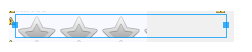
Many times, the stars of the rating bar are stretched vertically due to sizing problems as per following image.

Visit this for describing this problem but unique solution is described below.
Solution
Sizes of images and rating bar needs to be appropriate with respect to each other.
For example, in our example, the size of heart image is 50 * 50 and the size(height and width) of the rating bar is “wrap_content”.
Actually, the perfect scenario is that you keep the height and width of the rating bar as “wrap_content” always and change the size of the image as per your requirements.
You can also have multiple images with various size according to mdpi, hdpi, xhdpi, xxhdpi, xxxhdpi as you have launcher images in mipmap folder.
Download Source Code For Android Custom RatingBar
Thank you very much for reading this tutorial.
Hope you have increased your knowledge after this example.
Share our resources with other learners and developers.
Источник
Android RatingBar with Examples
In android, RatingBar is a UI control that is used to get the rating from the user. The RatingBar is an extension of SeekBar and ProgressBar that shows a rating in stars and it allows users to set the rating value by touch or click on the stars.
The android RatingBar will always return a rating value as a floating-point number such as 1.0, 2.0, 2.5, 3.0, 3.5, etc.
Following is the pictorial representation of using a RatingBar in android applications.

In android, by using android:numStars attribute we can define the number of stars to display in RatingBar. An example of using RatingBar is in movie sites or product sites to collect the user rating about the movies or products, etc.
In android, by using android.widget.RatingBar component we can display the rating bar with star icons.
Create Android RatingBar in XML Layout File
In android, we can create RatingBar in XML layout file using element with different attributes like as shown below.
RatingBar
android :id= «@+id/ratingBar1»
android :layout_width= «wrap_content»
android :layout_height= «wrap_content»
android :numStars= «5»
android :rating= «3.5»/>
If you observe above code snippet, we defined a rating bar ( ) with different attributes, those are
| Attribute | Description |
|---|---|
| android:id | It is used to uniquely identify the control |
| android:numStars | It is used to define the number of stars to display. |
| android:rating | It is used to set the default rating value for the rating bar. |
Now we will see how to get the rating value from RatingBar control in android applications.
Get Android RatingBar Value
In android, by using RatingBar methods (getNumStars(), getRating()) we can get the number of stars and the rating value which was selected.
Following is the code snippet to get the rating details from RatingBar in android applications.
int noofstars = rBar .getNumStars();
float getrating = rBar .getRating();
tView .setText( «Rating: » +getrating+ «/» +noofstars);
This is how we can get the number of stars in RatingBar control and the selected rating value from RatingBar control in android applications.
Android RatingBar Control Attributes
Following are some of the commonly used attributes related to RatingBar control in android applications.
| Attribute | Description |
|---|---|
| android:id | It is used to uniquely identify the control |
| android:numStars | It is used to define a number of stars to display. |
| android:rating | It is used to set the default rating value for the rating bar. |
| android:background | It is used to set the background color for a progress bar. |
| android:padding | It is used to set the padding for left, right, top or bottom of a progress bar. |
Android RatingBar Control Example
Following is the example of defining a RatingBar control, Button control and TextView control in RelativeLayout to get the selected rating value from RatingBar on Button click.
Create a new android application using android studio and give names as RatingBarExample. In case if you are not aware of creating an app in android studio check this article Android Hello World App.
Now open an activity_main.xml file from \res\layout path and write the code like as shown below
activity_main.xml
xml version= «1.0» encoding= «utf-8» ?>
RelativeLayout xmlns: android = «http://schemas.android.com/apk/res/android»
android :layout_width= «match_parent» android :layout_height= «match_parent» >
RatingBar
android :id= «@+id/ratingBar1»
android :layout_width= «wrap_content»
android :layout_height= «wrap_content»
android :layout_marginLeft= «80dp»
android :layout_marginTop= «200dp»
android :numStars= «5»
android :rating= «3.5»/>
Button
android :id= «@+id/btnGet»
android :layout_width= «wrap_content»
android :layout_height= «wrap_content»
android :layout_alignLeft= «@+id/ratingBar1»
android :layout_below= «@+id/ratingBar1»
android :layout_marginTop= «30dp»
android :layout_marginLeft= «60dp»
android :text= «Get Rating»/>
TextView
android :id= «@+id/textview1»
android :layout_width= «wrap_content»
android :layout_height= «wrap_content»
android :layout_alignLeft= «@+id/btnGet»
android :layout_below= «@+id/btnGet»
android :layout_marginTop= «20dp»
android :textSize= «20dp»
android :textStyle= «bold»/>
RelativeLayout >
If you observe above code we created a one RatingBar control, one Button and one TextView control in XML Layout file.
Once we are done with creation of layout with required controls, we need to load the XML layout resource from our activity onCreate() callback method, for that open main activity file MainActivity.java from \java\com.tutlane.ratingbarexample path and write the code like as shown below.
MainActivity.java
package com.tutlane.ratingbarexample;
import android.os.Bundle;
import android.support.v7.app.AppCompatActivity;
import android.view.View;
import android.widget.Button;
import android.widget.RatingBar;
import android.widget.TextView;
public class MainActivity extends AppCompatActivity <
private RatingBar rBar ;
private TextView tView ;
private Button btn ;
@Override
protected void onCreate(Bundle savedInstanceState) <
super .onCreate(savedInstanceState);
setContentView(R.layout. activity_main );
rBar = (RatingBar) findViewById(R.id. ratingBar1 );
tView = (TextView) findViewById(R.id. textview1 );
btn = (Button)findViewById(R.id. btnGet );
btn .setOnClickListener( new View.OnClickListener() <
@Override
public void onClick(View v) <
int noofstars = rBar .getNumStars();
float getrating = rBar .getRating();
tView .setText( «Rating: » +getrating+ «/» +noofstars);
>
>);
>
>
If you observe above code we are calling our layout using setContentView method in the form of R.layout.layout_file_name in our activity file. Here our xml file name is activity_main.xml so we used file name activity_main and we are trying to get the number of stars in RatingBar and the selected rating value from RatingBar control.
Generally, during the launch of our activity, onCreate() callback method will be called by android framework to get the required layout for an activity.
Output of Android RatingBar Example
When we run above example using android virtual device (AVD) we will get a result like as shown below.
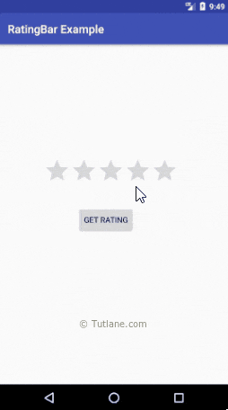
If you observe above result, we are able to get the rating value from the RatingBar control when we click on Button in android application.
This is how we can use RatingBar control in android applications to show the ratings based on our requirements.
Источник


