Custom shape view android
Shape Image View

Provides a set of custom shaped android imageview components, and a framework to define more shapes. Implements both shader and bitmap mask based image views.
- Shader based one uses canvas draw methods and Path class,
- Mask based one uses xfermode to draw image on bitmaps defined by android shape XML’s or resource bitmaps.


There are many projects online implementing such components, however one goal of this project is to provide a performant/smooth scrolling image view component framework to define different shapes for imageviews.
For use with recycling view such as ListView or GridView please use shader based implementations.
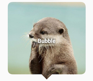
###Shader Based ImageView’s ####BubbleImageView 
- siTriangleHeight the height of the bubble pointer in dp
- siArrowPosition where to point the arrow, currently left|right
- siSquare set width and height to the minimum of the given values true|false
####RoundedImageView 
- siBorderColor border color
- siBorderWidth border width in dp
- siBorderAlpha alpha value of the border between 0.0-1.0
- siRadius corner radius in dp
- siSquare set width and height to the minimum of the given values true|false
####CircularImageView 
- siBorderColor border color
- siBorderWidth border width in dp
- siBorderAlpha alpha value of the border between 0.0-1.0
####ShapeImageView This view has the capability to process a provided SVG file (for a limited set of SVG elements), build a Path object and draw it on the shader. The library includes SVG files defining a set of basic shapes and ShapeImageView subclasses using those files. You can use whatever SVG you want to have a wonderful and creatively shaped images in your application. The included SVG files are under library/src/main/res/raw
| DiamondImageView | PentagonImageView | HexagonImageView |
|---|---|---|
 |  |  |
| OctogonImageView | StarImageView | HeartImageView |
|---|---|---|
 |  |  |
- siBorderColor border color
- siBorderWidth border width in dp
- siBorderAlpha alpha value of the border between 0.0-1.0
- siStrokeCap border stroke cap type butt|round|square
- siStrokeJoin border stroke join type bevel|miter|round
- siSquare set width and height to the minimum of the given values true|false
- siShape a reference to an SVG. This is used by ShapeImageView, not the subclasses of it.
SVG elements that are supported are: rectangle, circle, ellipse, polygon, path, group. Transformations on those elements are also supported.
The system converts an SVG file into a Path. For each element including the parent element a new Path is created, and all the children Path’s are added to their parent path.
###Bitmap Mask Based ImageViews
This view uses extra bitmaps for bitmap masks. Therefore it would be good to use them for very custom shapes, possibly not in a recycling view.


rounded rectangle shape definition in XML:
- siShape the bitmap mask shape, either a shape drawable or a bitmap
- siSquare set width and height to the minimum of the given values true|false
This method reads a shape file (either bitmap or an android shape xml), creates a bitmap object using this shape, and finally combines the bitmap of the real image to be shown and the mast bitmap using xfermode.
See/execute the sample for a demonstration of the components.
If you are lazy check this youtube video demonstrating scrolling in the sample app
Источник
Defining Custom Views
Android UI elements are all based on View (single element on screen) and ViewGroup (collection of elements on screen). There are many «widgets» and «layouts» built-in that can be used to build the UI such as views like Button and TextView, and layouts like RelativeLayout
In some apps though we need to be able to customize views to suit our own needs. This might mean extending an existing view, creating your own View subclass or doing more complicated drawing with a SurfaceView.
Customizing your own views involves extending View or an existing subclass, overriding the view behavior by writing methods such as onDraw or onTouchEvent and then using your new view in an activity.
Creating custom views is centered around five primary aspects that we may need to control or modify:
- Drawing — Control the rendering of the view on screen visually by overriding the onDraw method.
- Interaction — Control the ways the user can interact with the view with the onTouchEvent and gestures.
- Measurement — Control the content dimensions of the view on screen by overriding the onMeasure method.
- Attributes — Defining custom XML attributes for your view and using them to control behavior with TypedArray
- Persistence — Storing and restoring state on configuration changes to avoid losing the state with onSaveInstanceState and onRestoreInstanceState
To take a closer look, suppose we want to create our own view control that allows the user to select between different shapes. The view will display a single shape (square, circle or triangle) and clicking on the view will toggle the shape selected between the different options.
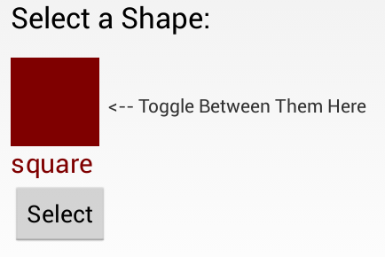
To create our own custom toggle-able shape selector from scratch, we start by defining a ShapeSelectorView which extends from View and implements the required constructor:
Next, let’s add this view to our activity layout along with a caption and a button for selecting the shape after choosing:
Note how we define a custom namespace app . This namespace allows you to allow Android to auto-resolve the namespace, avoiding the necessity for specifying the package name in this file. See this blog post for more information.
Well-written custom views can be configured and styled via XML attributes. You need to ask yourself which aspects of your view should be customizable. For example, we might want to let the user select the color of the shape as well as give the user the option to display the name of the shape in the view as well. We might want the view to be configurable in XML as follows:
In order to be able to define shapeColor and displayShapeName , we need to define these as attributes within res/values/attrs.xml :
Notice we define the attr node along with the name and format for each custom attribute we’d like to be able to define. The format is the expected type of value for that property and valid options include string, color, dimension, boolean, integer, float, enum, and several others.
Once you define the custom attributes, you can use them in layout XML files just like built-in attributes. The only difference is that your custom attributes belong to a different namespace. You can define the namespace within the root view of the layout and configure the properties for the view. Normally you would need to specify a namespace such as http://schemas.android.com/apk/res/
(i.e. com.codepath.example.customviewdemo) but the namespace http://schemas.android.com/apk/res-auto will auto-resolve for you.
Now that we have set custom properties such as shapeColor and displayShapeName , we need to extract those properties to be used within our custom View within the constructor. To extract the custom attributes, we can use a TypedArray and the obtainStyledAttributes on the AttributeSet :
Let’s expose property methods to allow us to get and set the important properties after a view has been created:
Notice that when the view properties are changed and might require a redraw, be sure to call invalidate() and requestLayout() to update the appearance.
Next, let’s actually draw a square taking into account the properties defined above for shape color and shape name. All view drawing happens within the onDraw method using the Canvas object to paint onto the view. Let’s draw a square shape:
This will paint the square based on the shapeColor specified in the XML and will paint the shape name if specified within the displayShapeName property. Result looks like:

You can read more about drawing onto a canvas on the official Custom 2D Drawing Tutorial.
In order to understand the width and height of a view that is being custom drawn, we need to define the onMeasure method which determines the width and height of the view based on it’s contents. In this case, the height and width are determined by the shape and text drawn within the view. Let’s define the onMeasure as follows:
Note that the calculations take into account the view’s padding and calculate the content size. Also note that the onMeasure method must call the setMeasuredDimension. Widths and heights are discussed using the MeasureSpec which encapsulates all the different types of constraints imposed by the parent layout for a view. The helper method resolveSizeAndState() returns an appropriate value by comparing the view’s desired size to the spec passed into the method.
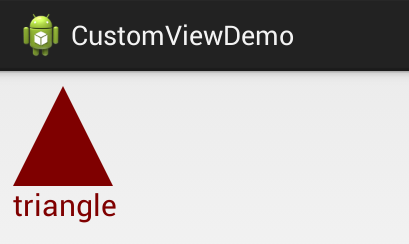
We have the square drawing, but we want the shape to toggle each time the view is clicked. Let’s setup a touch handler to ensure the shape changes as specified using the onTouchEvent method:
Now whenever the shape is clicked, the selected shape index will change and a different shape should be drawn after postInvalidate is called. Let’s update the onDraw method to paint the correct shape according to the selected index:
Now every time that we click the view, a different shape appears rotating between the three available options. Result looks like:
For more advanced view user interaction, check out the Making the View Interactive official docs.
The final touch might be to add a property to allow the activity to access the selected shape from within the view. First, let’s add the method to expose the selected shape:
and then now within the activity, we might be able to display the selected shape with a toast when a button is pressed:
The result of this is the following:

There are many events which can be customized for a view, check out the Custom Components guide for a more details.
Views are responsible for maintaining their own state when configuration changes (i.e phone is rotated) occur. You can do this by implementing View#onSaveInstanceState and View#onRestoreInstanceState in order to save and then restore the view state. For example, to maintain the selected shape index for our shape selector:
Once you’ve defined these saving and restoring methods, your view will be capable of automatically persisting state when configuration changes occur.
There is an even easier option for creating a custom View which is useful in certain circumstances. If there is a component that is already very similar to what you want, you can simply extend that component and just override the behavior that you want to change and get the rest of the behavior for free.
Incomplete: Fill this in with a relevant example
Read more about this in the Extending View Types guide for more details.
If you don’t want to create a completely customized component, but instead are looking to put together a reusable component that consists of a group of existing controls, then you may want to simply create a compound control. You might also want to create your own ViewGroup to act as a container for views or create a custom layout.
Incomplete: Fill this in with a relevant example
Check out this tutorial on Medium for a detailed overview of developing a compound view. Read more about this in the Custom Compound Components guide for more details.
There are many libraries for Android that contain custom views such as:
- Caldroid — A better calendar widget
- PullToRefresh-ListView — Pull to refresh enabled ListView
- RoundedImageView — ImageView extension that rounds the image with a border
Источник
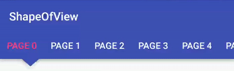
Custom shape view android

Give a custom shape to any android view Useful for Material Design 2


the old package com.github.florent37 has been replaced by io.github.florent37


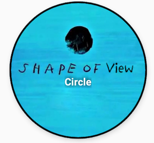
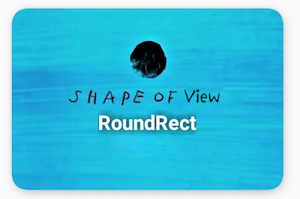
What you can do with Shape Of View :
Use implemented shapes
ShapeOfView disable the background property of your view, please specify a child with a background to enable it
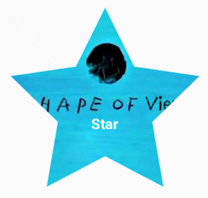
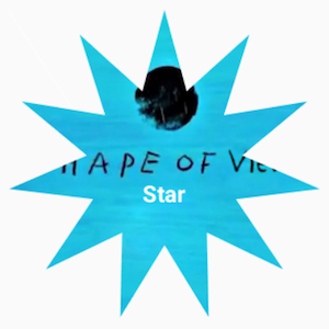
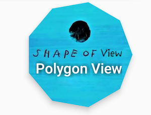
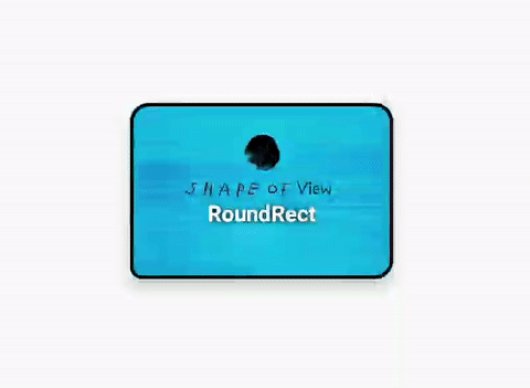
ShapeOfView came with pre-created shapes :
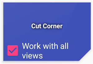
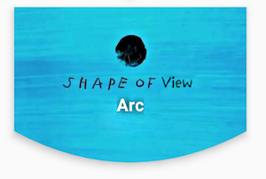
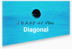
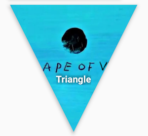
Dotted Edges with Cut Corners

All shapes methods can be animated
For example, you can animate a RoundRect corner :
Create you own shape
You can use custom shape to cut your view
Using Drawable (no elevation)
Using Path (with elevation)
This method generates also a shadow path (with Lollipop elevation API 21+)
Wrap your view with a ShapeOfView
Then generate a path in your code :
In some case you have to specify requiresBitmap = true to enable ShapeOfView to draw the shape inside a bitmap before clipping your view. It will be less efficient but can make your custom shape work.
Feel free to fork this project, and add customs shapes
Then make a merge-request after updated the README with a sample of your shape, including a preview
1.4.5 Removed DiagonalView’s Direction : if diagonalAngle > 0 ? DIRECTION_LEFT : DIRECTION_RIGHT
1.4.5 Removed ArcView’s ArcDirection : CROP_OUTSIDE if arcHeight > 0, CROP_INSIDE if arcHeight shape_
1.0.6 Updated roundrect implementation
1.0.5 Enable hardware acceleration after clip view
1.0.4 Added PolygonView
1.0.2 Added StarView
1.0.1 Added BubbleView
Ed Sheeran, for the name of this project and his awesome songs
Источник


