Создаем красивый Date/Time/Data Picker в Android
Рано или поздно любой разработчик сталкивается с мыслью, что что-то в жизни нужно написать так, чтобы нравилось не заказчику, а самому себе. Решив, что наконец-то я созрел для написания приложения для Android, которым я сам бы пользовался с удовольствием — столкнулся с тем, что внешний вид вьюх в Android не очень-то и готов к воплощению моих красивых идей. И если обычные кнопки и TextView легко поддаются переделке, то вот с TimePicker-ом дела обстоят намного хуже. Творческая часть мозга взбунтовалась и решила, что если в приложении и будет Date/TimePicker, то такой, чтобы им было не только удобно, но и приятно пользоваться, иначе она (та самая творческая часть мозга) объявит бойкот и перестанет помогать.
Ну что же, вызов принят, напишем свой Picker с преферансом и куртизанками.
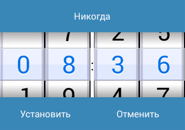
Именно такой Picker мы будем сооружать.
(Для тех кто просто хочет использовать виджет — ссылка на Git в конце статьи)
Первым делом пришлось ответить себе вопросы — а каким должен быть этот самый Picker и что он должен уметь делать?
Конечно, на вкус и цвет фломастеры разные, но если сравнить стилистику конкурирующих Picker-ов, то на мой взгляд выигрывает правый:

Time picker в Android(слева) и iOS (справа)
Пришлось отвечать для себя — а чем же привлекательнее правый Picker?
Ответ был не один:
- Приятнее выглядит
- Интуитивное переключение
- Никаких лишних элементов
Но настроение хотело большего и поэтому сразу же были добавлены пункты, которые должны присутствовать в новом Picker’e.
- Возможность легко менять размер без ущерба дизайну
- Возможность указывать не только время но и… да вообще любую информацию
- Все-таки должно быть более андроидным нежели яблочным
Итак, цели обозначены, приступим.
Палитра
Вообще все цвета палитры подбирались вручную перед каждым добавлением элемента. Цвета сравнивались и корректировались. В итоге получилась следующая палитра:
Названия цветов думаю сами за себя говорят, но в любом случае в коде будут пояснения, так что разобраться не составит труда.
Вставляем данный код в наш color.xml.
Создание Picker’а
Picker относится к View Элементам, значит создаем класс DataPicker:
Нам понадобятся следующие переменные:
В конструкторы возможны передачи параметров, стилей и т.д. Нам все эти излишки в рамках данной статьи не понадобятся.
Затем нам необходимо переопределить метод onSizeChanged:
Это нужно для того, чтобы при каждом изменении размера нашего холста все наши элементы прорисовывались правильно. Всегда зная размеры холста мы точно сможем заполнить все его области.
Следующим этапом необходимо определиться с возможностями нашего Picker’a. Первым делом он должен получать значения, которые необходимо отображать. Создадим для этого метод:
Для данного метода мне понадобился Handler. Дело в том, что размеры холста в момент создания равны 0 как по ширине, так и по высоте. В данном методе мы обращаемся к классу данных, в котором лежат наши значения и их параметры. Но на всякий случай проверяем, задан ли нашему холсту какой-нибудь размер. И если размер еще не определен, то просто немного отложим выполнение данной функции.
Класс со значениями и их параметрами выглядит так:
Следующая возможность, которая должна быть — это возможность изменения значения Picker’a путем скролла.
Переопределим для этого метод OnTouch:
Собственно метод выравнивания наших значений после остановки скроллинга:
Как мы видим, в прошлом методе мы использовали функцию onSelected, чтобы наш Picker сообщил о том, что пользователь выбрал какое-то значение.
Создадим для этого слушатель и определим события:
Когда все основные методы у нас определены, приступим к самому главному. Нам нужно отрисовать наш Picker на холсте. За отрисовку у нас отвечает метод onDraw:
Выглядеть это должно вот так:


С тенями уже получше:
Уже что-то интересное:

Так намного лучше:
Завершаем метод onDraw отловом ошибок и устанавливаем fps отрисовки:
Готово!
Удобство нашего Picker’a заключается в том, что мы можем их комбинировать для более удобного выбора значений.
Например, можно скомбинировать 4 компонента для выбора времени напоминания:
Дальше нашему Picker’у можно добавить обработку атрибутов, кастомные параметры, работу с адаптерами… Тут уже поле деятельности неисчерпаемо и в одной статье не разгуляться. Но если сообществу будет интересно продолжение — буду рад продолжить.
Источник
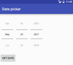
Date picker with time android
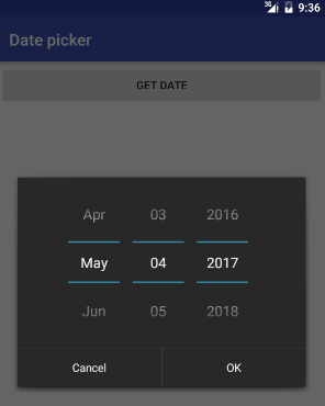
Android DatePicker provides a widget for selecting the date consisting of day, month and year in your custom user interface.
When the datePickerMode attribute is set to spinner, the date can be selected using year, month, and day spinners or a CalendarView . The set of spinners and the calendar view are automatically synchronized. The client can customize whether only the spinners, or only the calendar view, or both to be displayed.
When the datePickerMode attribute is set to calendar, the month and day can be selected using a calendar-style view while the year can be selected separately using a list.
Following is layout file.
Following is MainActivity.java file.
Following is a DatePicker example in Kotlin.
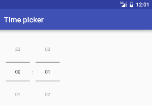
Android TimePicker provides a widget for selecting the time of day, in either 24-hour or AM/PM mode. You cannot select time by seconds.
timePickerMode attribute defines the look of the widget. It could be either clock or spinner .
In order to get the time selected by the user on the screen, you will use getCurrentHour() and getCurrentMinute() method of the TimePicker class.
Following is layout file.
Following is MainActivity.java file.
Following is a TimePicker example in Kotlin.
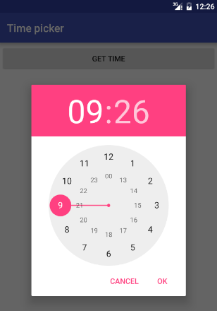
Android TimePickerDialog allows you to select the time of day, in either 24-hour or AM/PM mode in your custom user interface. A dialog that prompts the user for the time of day using a TimePicker .
To show a TimePickerDialog we need to define a fragment class (named TimePickerDialog ) which extends the DialogFragment class (available from API 11) and returns a TimePickerDialog from its onCreateDialog() method.
TimePickerDialog class have onTimeSetListener() callback method. This callback methods are invoked when the user is done with filling the time.
The TimePickerDialog class consists of a 5 argument constructor with the parameters listed below.
- Context . It requires the application context.
onTimeSet() is callback function which invoked when the user sets the time with the following parameters:
- int hourOfDay . It will be store the current selected hour of the day from the dialog.
- int minute . It will be store the current selected minute from the dialog.
int mHours . It shows the the current hour that’s visible when the dialog pops up.
Get TimePickerDialog by click on Button.
We will display TimePickerDialog dialog on click Button and display date on TextView .
Following is layout file.
Following is MainActivity.java file.
Following is TimePickerDialog.java file.
Get TimePicker dialog by click on EditText.
We will display TimePickerDialog dialog on click EditText and display date on TextView .
Following is layout file.
Following is MainActivity.java file.
Following is a TimePickerDialog example in Kotlin.
Following is MainActivity.kt.
Following is TimePickerFragment.kt.
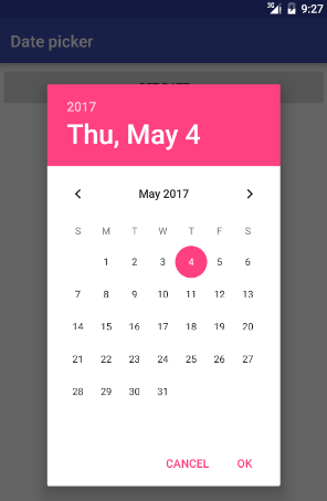
Android DatePickerDialog allows you to select the date consisting of day, month and year in your custom user interface. It’s a simple dialog containing an DatePicker .
To show a DatePickerDialog we need to define a fragment class (named DatePickerFragment ) which extends the DialogFragment class (available from API 11) and returns a DatePickerDialog from its onCreateDialog() method.
DatePickerDialog class have onDateSetListener() callback method. This callback methods are invoked when the user is done with filling the date.
The DatePickerDialog class consists of a 5 argument constructor with the parameters listed below.
- Context . It requires the application context.
onDateSet() is a callback function which invoked when the user sets the date with the following parameters
- int year . It will be store the current selected year from the dialog.
- int monthOfYear . It will be store the current selected month from the dialog.
- int dayOfMonth . It will be store the current selected day from the dialog.
int mYear . It shows the the current year that’s visible when the dialog pops up.
We will display DatePickerDialog dialog on click Button and display date on TextView .
Following is layout file.
To display DatePickerDialog , we will create a DatePickerFragment class that extends DialogFragment . Define the onCreateDialog() method to return an instance of DatePickerDialog .
We need to implement DatePickerDialog.OnDateSetListener interface to receive a callback when the user sets the date. Add onDateSet() method to sets the date by user.
If you want to change color in DatePickerDialog use following approach. First, define new style for DatePickerDialog in styles.xml.
Second, add style ID to the constructor of DatePickerDialog .
We can also change theme of DatePickerDialog by passing themeResId .
Following is a DatePickerDialog example in Kotlin.
Following is MainActivity.kt.
Following is DatePickerFragment.kt.
Other libs for Date/Time pick
- SingleDateAndTimePicker. You can now select a date and a time with only one widget!
- MaterialDateRangePicker. A material Date Range Picker.
- MaterialDateTimePicker. Material DateTime Picker tries to offer you the date and time pickers as shown in the Material Design spec, with an easy themable API. The library uses the code from the Android frameworks as a base and tweaked it to be as close as possible to Material Design example.
- datepicker-timeline. An infinite scrolling timeline to pick a date.
Источник
Date picker with time android
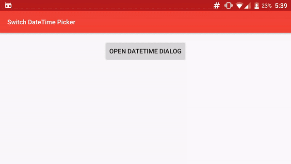
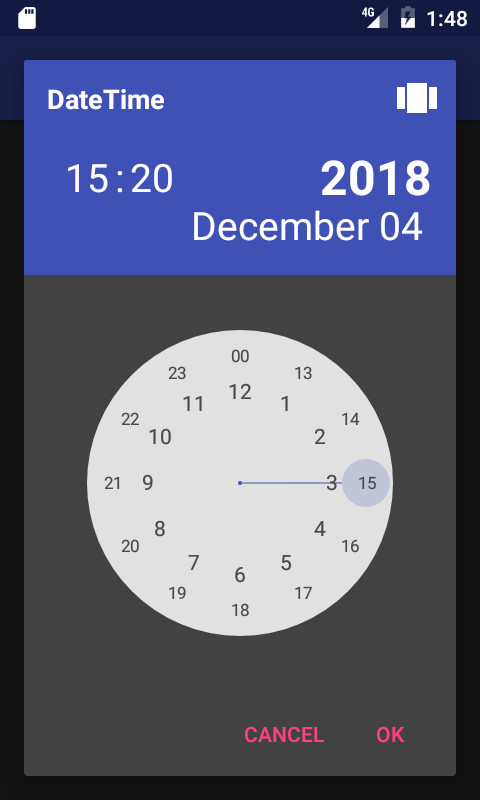
Android SwitchDateTime Picker
SwitchDateTime Picker is a library for select a Date object in dialog with a DatePicker (Calendar) and a TimePicker (Clock) in the same UI.
You can contribute in different ways to help us on our work.
- Add features by a pull request.
- Help to translate into your language
- Donate 人◕ ‿‿ ◕人Y for a better service and a quick development of your features.
Add the JitPack repository in your build.gradle at the end of repositories:
And add the dependency  replacing $
SimpleDateFormat for Day and Month
You can specify a particular SimpleDateFormat for value of Day and Month with setSimpleDateMonthAndDayFormat(SimpleDateFormat format) Warning, the format must satisfy the regular expression : (M|w|W|D|d|F|E|u|\s)* , for example dd MMMM
By default, time is in 12 hours mode, If you want a 24-hour display, use: dateTimeFragment.set24HoursMode(true); before the «show»
Hightligh selected AM / PM
In 24 hours mode, If you want to highlight the selected AM or PM, use : dateTimeFragment.setHighlightAMPMSelection(true);
Start with a specific view
For launch Dialog with a specific view, call : dateTimeFragment.startAtTimeView(); , dateTimeFragment.startAtCalendarView(); or dateTimeFragment.startAtYearView(); before the «show»
Define minimum and maximum
For just allow selection after or/and before dates, use : dateTimeFragment.setMinimumDateTime(Date minimum); and dateTimeFragment.setMaximumDateTime(Date maximum);
Optionally define a timezone : dateTimeFragment.setTimeZone(TimeZone.getDefault());
You can customize the style to change color, bold, etc. of each element. You need to use a Theme.AppCompat theme (or descendant) with SwitchDateTime’s activity. ( compile ‘com.android.support:appcompat-v7:25.1.0’ in gradle)
In your styles.xml, you can redefine each style separately, but you must keep each item, for example : change size of «year label»
To customize the AlertDialog that is shown, use : void setAlertStyle(@StyleRes int styleId)

To use with a neutral button, initialize with another parameter and implement the OnButtonWithNeutralClickListener :
Copyright (c) 2016 JAMET Jeremy
Licensed under the Apache License, Version 2.0 (the «License»); you may not use this file except in compliance with the License. You may obtain a copy of the License at
Unless required by applicable law or agreed to in writing, software distributed under the License is distributed on an «AS IS» BASIS, WITHOUT WARRANTIES OR CONDITIONS OF ANY KIND, either express or implied. See the License for the specific language governing permissions and limitations under the License.
About
Android library for Date and Time Picker in same dialog
Источник


