- Разработка под планшеты
- Квалификаторы large/xlarge (устар.)
- Квалификатор Smallest-width (sw)
- Квалификаторы width (w) и height (h)
- Псевдонимы
- res/values-large/layout.xml
- res/values-sw600dp/layout.xml
- Квалификаторы ориентации
- Поддержка планшетов, которые умеют принимать/отправлять SMS, но не умеют звонить
- Только под планшеты, только под телефоны
- How to Get Your App Off the Ground With the Help of a Tablet Version
- Read the guidelines for Android and iOS design
- Consider the screen configurations and different size
- Think the layout, fonts and intervals through
Разработка под планшеты
Устройства под Android можно условно разделить на две группы — телефоны и планшеты. До недавнего времени существовали две ветки развития платформы — версии 2.* и версии 3.*. С выходом Android 4.0 обе ветки были объединены и теперь везде используется единый код. Но пусть данное обстоятельство не вводит вас в заблуждение.
Разработка под планшеты очень сильно отличается от разработки под обычный смартфон. Для меня первый звоночек прозвучал, когда я выложил на Google Play простенькую программу для снятия показаний счётчика электроэнергии. Писалась программа для практики в учебных целях и была выложена в магазине приложений для изучения механизма работы этого самого магазина. Но неожиданно для меня несколько тысяч человек скачало программу и стали просить продолжить работу над ней. В статистике загрузок было видно, что очень много пользователей устанавливает приложение именно на планшет. И вот однажды один из пользователей программы прислал мне скриншот, где описывал свою проблему и просил меня подправить логику приложения. Когда я увидел этот скриншот, то чуть со стула не упал. Не ожидал, что впечатление от программы так может резко меняться от размеров. Но размер имеет значение!
Когда я запускал программу на маленьком телефоне, то всё выглядело достаточно аккуратно и изящно. А теперь возьмите в руки стандартную книгу, разверните её в альбомной ориентации и представьте себе кнопку, которая тянется по всей ширине книги. Жуткое зрелище.
Далее одна компания попросила сделать им программу специально под планшеты. Так как у меня не было на тот момент планшета, то я тестировал все изменения на телефоне. И тут тоже возникли проблемы. Если на телефоне расположение элементов казалось компактным, то на планшете либо оставалось много лишнего пространства, либо элементы казались слишком большими. Можно, конечно, было разрабатывать приложение только под планшет, руководствуюясь присылаемыми скриншотами. Но это не наш путь. Мне хотелось создать универсальную программу, которая была бы удобной и под телефон и под планшет. Так я начал изучать вопрос в этом направлении.
Средства разработки позволяют достаточно удобно создавать программу под разные форм-факторы. Но есть ряд особенностей, о которых нужно знать. Во-первых, дизайнер форм и эмулятор не совсем точно показывают размеры и взаимное расположение элементов. Необходимо всегда проверять конечный результат на реальном устройстве. Во-вторых, нужно грамотно настроить среду разработки под наши цели.
Квалификаторы large/xlarge (устар.)
Существует специальный квалификатор large (res/layout-large и его производные layout-large-land и т.п.), который действует на устройства с экранами от 7 дюймов и выше. Сейчас считается устаревшим, так как некоторые устройства не совсем правильно определяли данный квалификатор. Часто в целях совместимости создают папку с данным квалификатором и копируют в него файлы из новых квалификаторов (или псевдонимы), о которых ниже.
Тоже самое относится к xlarge, который действует на устройства с диагональю экрана 10 дюймов.
Квалификатор Smallest-width (sw)
В Android 3.2 и выше доступен квалификатор Smallest-width, сокращёно sw. Он позволяет определять экраны с заданной минимальной шириной в dp. Например, планшет с экраном 7 дюймов имеет минимальную ширину 600 dp, и если вы хотите, чтобы приложение работало на нём в двухпанельном режиме (а на меньших экранах в однопанельном), используйте два макета, но вместо квалификатора размера large укажите sw600dp. В таком случае на экранах, минимальная ширина которых составляет 600 dp, будет использоваться двухпанельный макет.
Далее речь пойдёт применительно к планшету на 7 дюймов с разрешением экрана 1024×600. Мы уже привыкли, что вся основная разметка содержится в файле activity_main, которая находится в папке res/layout. Отлично, начните с этого файла и набросайте макет для телефона. Теперь создайте новую папку res/layout-sw600dp/ и скопируйте в неё файл activity_main.xml. В этой папке будет находиться макет программы, специально разработанный с учетом семидюймового экрана. Теперь, в зависимости, где запускается программа, система сама автоматически выберет нужный макет и покажет его пользователю.
Квалификаторы width (w) и height (h)
Также можно использовать квалификатор типа wXXXdp, где доступная ширина больше или равна XXX dp, и квалификатор типа hXXXdp, где доступная высота больше или равна XXX dp.
Псевдонимы
Следует учесть, что на Android-устройствах до версии 3.2 квалификатор sw600dp не будет работать, поэтому для них по-прежнему нужно использовать large и вам потребуется еще один файл с названием res/layout-large/main.xml, идентичный файлу res/layout-sw600dp/main.xml. Поэтому приходится дублировать оба файла с одинаковым содержанием.
Чтобы избежать дублирования файлов, используйте псевдонимы. Например, можно определить следующие макеты:
- res/layout/main.xml (однопанельный макет);
- res/layout/main_twopanes.xml (двухпанельный макет).
Добавляем новые папки с файлами:
res/values-large/layout.xml
res/values-sw600dp/layout.xml
Содержание последних двух файлов одинаково, но сами по себе они не определяют макет. Они служат для того, чтобы назначить файл main в качестве псевдонима main_twopanes. Так как в них используются селекторы large и sw600dp, они применяются к планшетам и телевизорам на платформе Android независимо от версии (для версий до 3.2 используется large, а для более новых – sw600dp).
Квалификаторы ориентации
Так как число устройств с разными экранами растёт, то приходится дополнительно адаптировать дизайн для маленьких экранов, планшетов на 7 и 10 дюймов, телевизоров. Вот примеры различных вариантов дизайна.
- Маленький экран, вертикальная ориентация: однопанельный вид с логотипом.
- Маленький экран, горизонтальная ориентация: однопанельный вид с логотипом.
- Планшетный ПК с 7-дюймовым экраном, вертикальная ориентация: однопанельный вид с панелью действий.
- Планшетный ПК с 7-дюймовым экраном, горизонтальная ориентация: двухпанельный вид с панелью действий.
- Планшетный ПК с 10-дюймовым экраном, вертикальная ориентация: двухпанельный вид (узкий вариант) с панелью действий.
- Планшетный ПК с 10-дюймовым экраном, горизонтальная ориентация: двухпанельный вид (широкий вариант) с панелью действий.
- Телевизор, горизонтальная ориентация: двухпанельный вид с панелью действий.
Каждый из этих макетов определен в XML-файле в каталоге res/layout/. Чтобы сопоставить их с определенными конфигурациями экрана, в приложении используются псевдонимы. Примеры можно посмотреть в документации (русский перевод).
Как с этим работать в Eclipse. Когда вы создадите файл в новой папке, то в верхней части IDE вы можете увидеть выпадающий список, позволяющий быстро переключаться между двумя файлами activity_main.xml. Изменения, которые вы делаете в одном файле, не переносятся в другой файл. Поэтому будьте внимательны. Если какие-то элементы должны совпадать, то нужно внести изменения в оба файла. Также рядом с этим выпадающим списком можно выбрать форм-фактор устройства, чтобы увидеть созданный макет визуально. Эта операция возможно только при работе с XML в графическом режиме.

Также необходимо создать несколько новых эмуляторов под ваши требования. Сразу хочу предупредить об одной проблеме, с которой сам столкнулся. Когда я попытался загружать программу в уже готовый эмулятор на 7 дюймов, он по-прежнему загружал разметку под обычный телефон. В конце концов я снёс все эмуляторы, перезагрузился и создал эмуляторы под нужные мне размеры заново. И тогда всё заработало.
Второй важный момент — указание размеров. Обычно мы храним значения размеров в файле res/values/dimens.xml. Текст, заданный для телефона, окажется слишком мелким для планшета. Поэтому аналогично, создаём альтернативный файл res/values-sw600dp/dimens.xml. Я также пробовал сохранить файл dimens.xml в папке res/values-v15 и у меня также всё работало. Честно говоря, не знаю, какой вариант правильный.
Также можно управлять размерами через стили. В файле res/values/styles.xml:
В файле res/values-sw600dp/styles.xml:
Третий важный момент, о котором нужно помнить — различия в железе. Например, в новом планшете Google Nexus 7 нет телефонного модуля и только одна фронтальная камера. Поэтому, в манифесте рекомендуется указывать, что программа требует наличия телефона или камеры, чтобы ваше приложение не было доступно в магазине приложений для пользователей, у которых нет телефона и камеры. Например:
Т.е. ваша программа не требует наличия камеры, но обязывает иметь микрофон.
Кстати, выяснил интересную особенность фильтрации по разрешениям для Nexus 7. Оказывается, для него отдельно следует добавлять строку с точным указанием dpi:
Делайте отступы 16dp как минимум от краёв экрана для текстов.
Длина строки не должна быть слишком большой. Максимум 100 символов, оптимальный вариант: 50-75.
ListView и меню не должны растягиваться на весь экран (используйте фрагменты).
Рекомендуемый размер для элементов экрана, работающих от пальца — 48dp (32dp как минимум).
Поддержка планшетов, которые умеют принимать/отправлять SMS, но не умеют звонить
Существуют планшеты с модулем, позволяющим принимать и отправлять SMS. Для них стоит установить разрешения:
Только под планшеты, только под телефоны
Можно прописать в манифесте различные настройки, чтобы программа выводилась в Google Play только под планшеты или только под телефоны. Приблизительно так.
Источник
How to Get Your App Off the Ground With the Help of a Tablet Version
Updated 29 Aug 2021
Published 18 Dec 2017

Imagine, you have launched a nice app for Android or iOS platform, your users are delighted with it and the number of downloads is growing. But, as a good businessman, you want to achieve even greater success. And the solution to it is a tablet version. The Mint company estimated that it’s customers interact with their tablet application 7 times more often than those who installed the application on a smartphone. And TinyCo company claims that on average, 35% more users make a paid subscription on tablets compared with phones. These figures show how important a tablet optimisation for business is.
Tablet app development differs from the development of an Android mobile appor an app for iOS platform. We need to consider these significant distinguishes. The differences are related to user interfaces and deal with the content, flexibility, interaction, and organization of an application for different screen sizes. Let’s take a look at the most important steps we need to make. But first, let’s figure out why tablet optimization is so important.
The importance of a tablet app
Most researches show that smartphones are the most used devices for today, therefore the most common actions that customers use them for are the daily tasks (communication, listening to music, playing games, etc.). While tablets are often used for other tasks, like video content viewing, studying, financial management, reading, doing some business tasks like working with charts and texts.
Still don’t understand why you need an app prototype before the development? Here are some powerful arguments for you!
Obviously, users have different needs regarding the work on different devices, which should tell us what exactly customers want to see in a tablet UI design. The main task is to foresee, or, it would be even better to conduct research and understand how users would use your application, and concentrate efforts around these basic needs.
Think whether your customers prefer a book or an album orientation, or even the place where they are going to use your product. If an app involves working with maps, maybe people would hold a device with both hands? Or will they use it to watch the show lying on a couch? The UI has to fit the content of an app. For example, the exact position of elements, their number and purpose of each should be well-considered and calculated. There is a huge variety of sizes of smartphone and tablet screens and what is more, we can use a device vertically or horizontally which makes our task even harder. Therefore we move to the next block in our article where we’ll discuss adaptability and design.
Creating design for a tablet app from the scratch
If you don’t have much experience with iOS or Android tablet app development or simple apps for smartphones, you need to follow the simple steps below, to make sure that you have all needed information. Let’s see what these steps are:
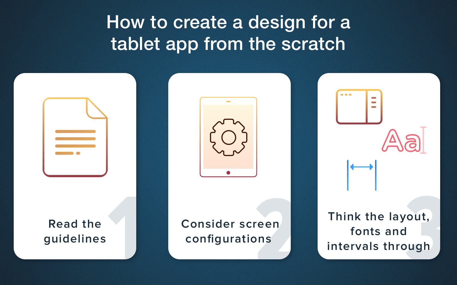
Tablet app UI development from the scratch
- Read the guidelines for Android and iOS design
Our advice, first of all, to become familiar with the manual on Android Design or the Human Interface Guidelines for iOS. While most partitions apply to all Android devices, some sections are highlighted as being particularly important for tablet design.
- Consider the screen configurations and different size
The Android system allows you to develop applications in such a way that they work equally well on a wide range of devices with different sizes and form-factors of screens. This exceptional compatibility gives you the advantage to develop one application which can be distributed to all supported devices.
At the same time, to ensure convenient access for each configuration, especially for tablets, it is necessary to optimize layouts and other components for each of the supported configuration. On tablets, the optimization of an interface will bring you lots of benefits if you use the additional space of a screen, for example, adding new features, providing new content, improving usability in other ways, which makes the application more attractive.
When it comes to iOS, in order to provide full-screen resolution on all gadgets, make sure that the iPad-specific launch screen is provided (you have to use the storyboard for that). It guarantees that an app will be correctly displayed on iPad mini, iPad and iPad Pro.
Want to make your site look great on mobile devices? Read our article and make the right decision choosing between adaptive and responsive design!
Before iOS 9, all applications occupied the whole space on a screen of a gadget, but in new versions, some iPads can now perform the function of multitasking with screen sharing. It means that your application can be displayed only in a certain screen size, 50% of the width or full screen, but we will talk about this a little bit later.
- Think the layout, fonts and intervals through
There are lots of programs which you can use to plan your UI. This training will help you see, not just imagine, how the elements will look like in an app. Some very creative product owners sometimes want to add into their tablet application design everything they like in the best tablet apps. But they don’t think about the convenience of such tablet UI and the general look. That is why you need a professional designer who can explain what fonts, intervals and elements should there be on a screen to provide the best ratio of beauty and convenience.
Creating a tablet layout design from an existing app
One of the reasons why you should go for making a separate version for tablets if you already have a mobile app, is, of course, the design differences. In a case of iOS devices, there is a non-significant difference between screen sizes.
However, Android gadgets have a much greater variety, and therefore a larger number of screen sizes. Remember, the interaction of a customer with a tablet contrasts from the interaction with a smartphone. For example, if we hold a tablet with both hands, a smartphone is mostly held with only one. That is why a layout for tablet apps and an order of all elements have to be convenient and logical. What is more, an app itself should not be stretched and lose it’s original look, because it represents your business or the company itself and has to look seamlessly.
Did you know that landing page is the most effective promotional tools for your app? Watch our video and find out what you can get launching one for your application!
How to Promote Apps Using a Landing Page?
Tablets have much more screen area which you can use in your application, especially in an album orientation. When you’re planning a UI for tablets, make sure that it takes all the benefits of the space available. We’ve collected some nice tips, you can use to achieve that:
Tablet app UI from an existing app
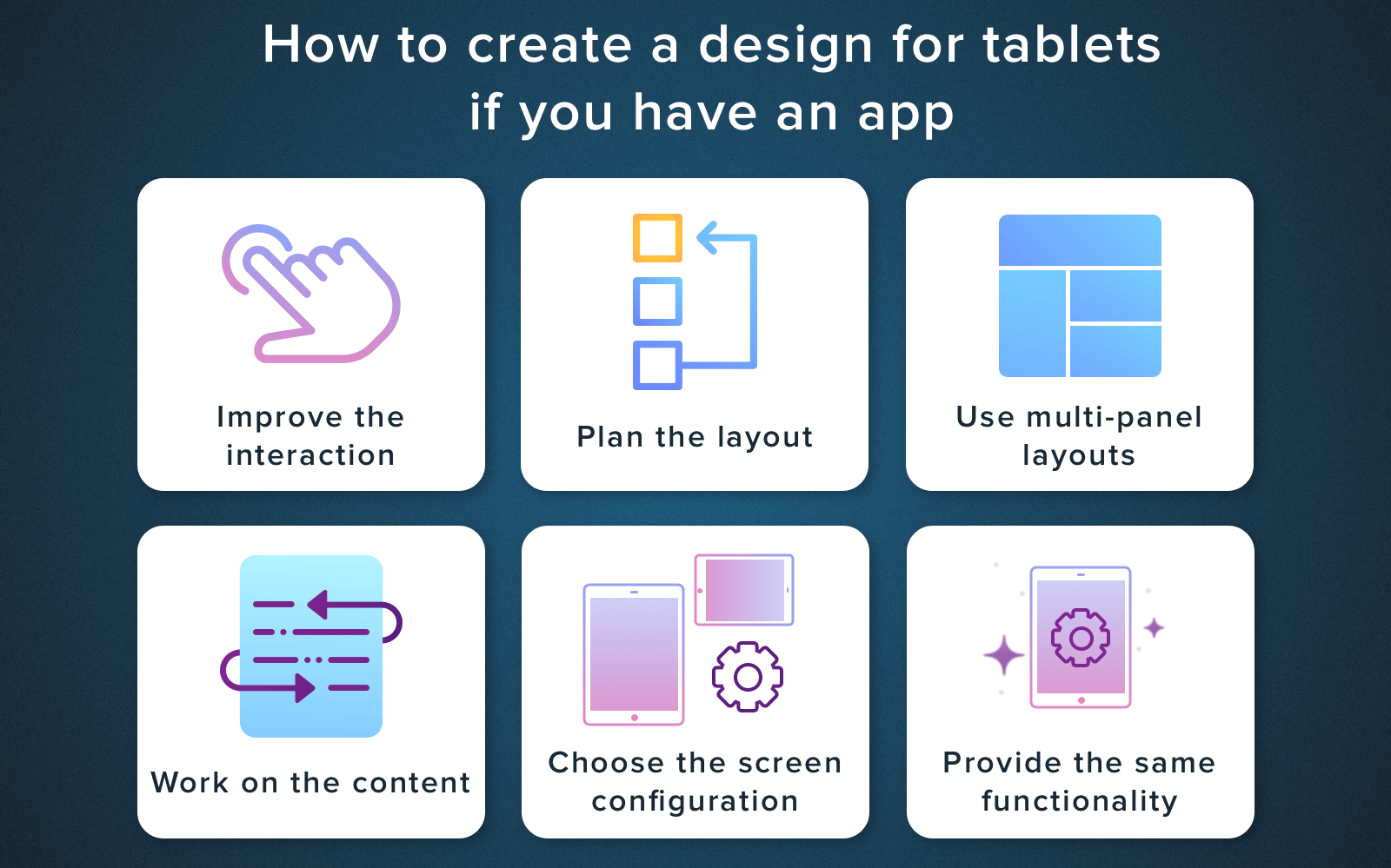
Improve the interaction
To do that, think about the optimal elements arrangements and design it to work with both hands. Since there is more space on a tablet, the number of interactive elements that users can work with can also be larger.
Plan the layout
If the application was originally developed for smartphones, but now you want to make it compatible with tablets and PCs, you need to start with making minor corrections of the layout, fonts and intervals between the interface objects. In some cases, like with 7-inches tablets or games which use all the space available, these corrections can be enough to make your app look awesome. In other instances, you can modify the design or some parts of the interface, replacing the «stretched screen» with an effective interface with several panels, simplifying the navigation and adding some new elements.
Find out the latest UI trends for 2018 to create the most appealing design for your product!
Use multi-panel layouts
Use multi-panel layouts on tablet screens to provide better visual balancing while also providing them with greater efficiency and visibility.
Work on your content
Learn all possible ways of working with the content. Of course, you can add some new materials to your app or find another way to process the existing content.
Choose the screen sizes
Choose which screen sizes the multi-panel interface will use, and then offer different layouts for similar screen sizes or for screens with a minimum width.
Provide the same functionality
Design your application in such a way, so the tablet optimization could provide at least the same functionality as a mobile app.
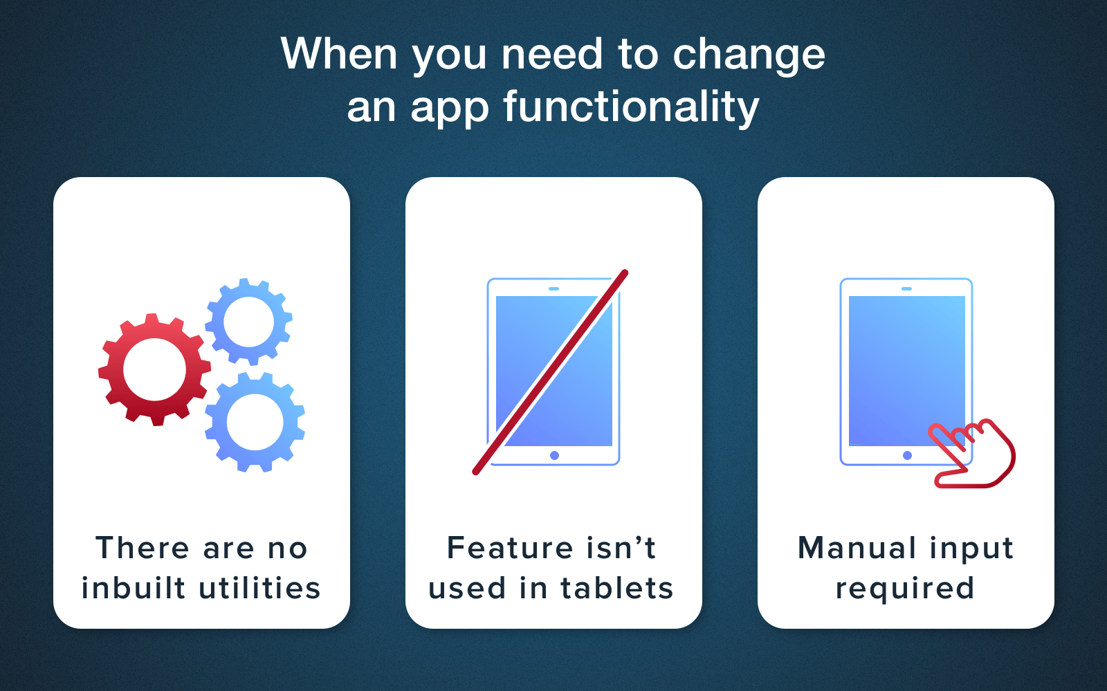
Of course, some changes are acceptable. In some cases, different functions can be excluded or replaced, here are some of these instances:
Making changes in a Tablet app version
- An app uses phone’s inbuilt utilities which a tablet simply doesn’t have. In that event, you can exclude or replace the corresponding feature.
- A lot of tablets already have an inbuilt GPS sensor, however, we still don’t take our tablets for jogging. If your application for a phone offers users the ability to record route using the GPS while running, it makes no sense to add this feature to the tablet application, since this scenario of use will not be called for.
- If an app uses a GPS module, and a tablet doesn’t have one, the tablet app can ask a user to indicate his or her location manually. The application can check the hardware capabilities of the device at the beginning of it’s work and use this data to improve the workflow.
If you like this article, then subscribe to our blog! Our next article is going to be about the apps with VR and it’s cost. Don’t miss it!
Multi-window mode peculiarities
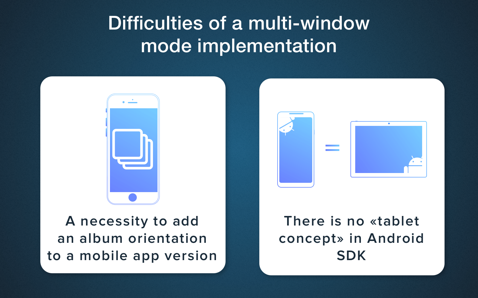
After the release of Android 7.0, one of it’s main features was multi-window support. This feature is also available on iOS 9. Unfortunately, on many forums, you can meet negative feedback from developers about the implementation of multi-window mode feature for tablet apps. So, if you think about a tablet application development with the support of a multi-window mode, there are some difficulties you can face. Like these ones:
Peculiarities of a Tablet UI design development
A necessity to add an album orientation to a mobile app version
Since the tablet has different screen size variations and, in addition, an album orientation, you need to provide an album orientation in the mobile version too. Otherwise, at the end, you’ll get a stretched image in a multi-window mode. It all happens because when you open this mode, the application takes resources from the shared mobile resources of the app. And, after you try to turn the screen back, the tablet will show the mobile version, which will spoil the look. As an option, you can break an app into several windows and design a layout in such a way, that all resources would be taken from a mobile application and returned as for a tablet app.
An absence of a «tablet concept» in Android SDK
iOS has a really separate tablet concept and there is an opportunity to do everything differently for it, in iOS app for tablets everything will be ok with this mode. At the same time, the Android SDK does not have a ‘tablet’ concept at all. That’s why here you will have to work hard to use the existing tools during the Android tablet application development.
I hope that our article explained all the importance of a tablet version of your application for your business. In some cases, this can affect the download and frequency of using your app, in some, it affects the ease of use. But in both cases, it is more a necessity than a whim. If you are ready to start the development, contact our managers, we know how to help you!
Most researches show that smartphones are the most used devices for today, therefore the most common actions that customers use them for are the daily tasks (communication, listening to music, playing games, etc.). While tablets are often used for other tasks, like video content viewing, studying, financial management, reading, doing some business tasks like working with charts and texts.
Users have different needs regarding the work on different devices, which should tell us what exactly customers want to see in a tablet UI design. The main task is to foresee, or, it would be even better to conduct research and understand how users would use your application, and concentrate efforts around these basic needs.
Источник


