- How to Add a Dropdown Menu in Android Studio
- Setting Up the Environment
- Adding the Dropdown Menu Layout
- Adding Elements to the Dropdown Menu
- Calling the Spinner in the Java File
- Summary
- Jetpack compose #1 DropdownMenu — Weather UI
- Introduction
- Anatomy
- Appbar — Spinner
- Implementation
- Anchor view
- Dropdown menu design
- Menu item design
- Conclusion
How to Add a Dropdown Menu in Android Studio
A dropdown or pull-down menu, also known as spinner, is one of the most essential UI elements for an app. In this tutorial I’ll tell you how to add one to your Android app using Java.
Dropdown menus organize an app and improve the user experience. Almost every app has a dropdown menu integrated into its user interface.
Even though adding a dropdown menu in your Android app is as simple as dragging and dropping it, it sure can get tricky, especially if you are new to using Android Studio. If you’re a fresh developer making your initial apps on Android Studio, this tutorial is for you.
Setting Up the Environment
Once you have created a project on Android Studio, open these files:
- res/layout/activity_main.xml
- res/values/strings.xml
- app/java/your.project.name/MainActivity.java
(The MainActivity.java file is opened by default when you create the project.)
With all the files open, your IDE should look like this:


Adding the Dropdown Menu Layout
Now, it’s time to add the dropdown menu layout. In Android Studio, the layouts are added to the layout XML files. For that, head over to activity_main.xml. While you’re in the activity_main.xml file, open the Design tab. You’ll find it in the upper right corner of your IDE.


Android pull-down menus in Android Studio are added using Spinners.
If there is default text present on your application screen, head back to the code section and remove all the TextViews . Now, from the design palette, select Containers. You’ll find Spinner there.
Once you’ve located the Spinner, drag and drop it on top of your mobile application. Android Studio will do the relevant coding for you, and you can later check it out by getting back to the code screen.
Depending on where you’ve dropped your Spinner, the layout code should look something like this:
However, Android Studio allows you to customize your dropdown menu by changing its height, width, and margins through the attributes panel without having to code all of it from scratch.
While you’re at it, make sure that spinnerMode is set to dropdown to create a dropdown menu. You’ll find this setting in the attributes panel.
Positioning the dropdown menu on your application screen is quite easy. The Android Studio GUI will provide you with all the constraints to let you specify where your dropdown menu sits.
Once you’re satisfied with the styling of your dropdown menu, switch to the code view and edit the Spinner id. This will be required later on, when we integrate the Spinner into the Java file.
The Spinner id is found in the first line of the tag. Give this an id that you’ll remember for use elsewhere in your app code.


Lastly, head back to the design section and press the Infer Constraints button—which I personally call the «magic button»—on the top to take care of all the missing constraints in our code:


Adding Elements to the Dropdown Menu
Now that you’ve added a dropdown menu to your screen, it’s time to populate it with a bunch of choices for the user to choose from.
For this, you need to open up the strings.xml file. This file will be empty initially, and it should look something like this:


To add elements to your Android dropdown menu, you need to declare a string array and give it a name. Declare a string-array under the already declared string using the following syntax:
The string array has to be declared within the resources tag. Otherwise, you will get a Syntax error. The string array can be declared within the main Java file as well, but putting it in a separate XML file increases the reusability of the code and enhances the efficiency of your application. There’s no limit to the number of items that you can have in your dropdown menu.
Calling the Spinner in the Java File
Before we begin the coding, have the following classes imported into your code:
It’s best that these classes are imported beforehand to avoid any syntax errors later on. However, if you still get a Syntax error, you can always hover your mouse over it and then press Alt-Enter to import the relevant class for your code.
To pass the Android dropdown menu to Java, you have to define a Spinner object. Use the Spinner class name and give the object an appropriate name. Next, instantiate the spinner by looking it up with the same id you declared in the activity_main.xml file:
In the next step, you’ll have to create an ArrayAdapter . The ArrayAdapter will be responsible for rendering every item in the languages string array to the screen when the Java dropdown menu is accessed.
createFromResources() is a built-in method for the ArrayAdapter class which takes three input parameters:
- the environment of the application—within an Activity, you can just use this
- the name of the StringArray that you declared in the strings.xml file
- the layout type
For this particular example, we’re using a basic spinner layout.
The adapter that we declared above is useless unless it is attached to our dropdown menu (spinner). Therefore, set the spinner to use that adapter.
With the ArrayAdapter declared and successfully bound to the spinner , you’ve successfully integrated your very first Android pull-down menu into your application.
You can now run your application on the emulator. It will look something like this:

With the Java dropdown menu all set, you can now play around with it a little in the activity_main.xml file. Try altering the height attribute and see how the dropdown menu moves across the screen.
Summary
You can add a dropdown menu to your Android application in a few simple steps.
For starters, you need to edit the XML files. Integrate the dropdown menu into them using Android Studio’s drag-and-drop feature. Next, you have to create a string array to add all the relevant items to your dropdown menu. Then, you need to get the Spinner instance in the main Java file, along with an ArrayAdapter . Lastly, you set your spinner up to use that adapter.
With all three code files working simultaneously, you’ll have an Android dropdown menu fully functional in your first Android app.
Источник
Jetpack compose #1 DropdownMenu — Weather UI
Introduction
Sharing my experience with jetpack while practicing with the weather — forecast screen(from uptechteam). While surfing dribble this particular shot caught my eye. Minimal — subtle colors also simple layout to implement. Best fit if you want to start with any UI framework.
Anatomy
This page comprise of multiple sections, each will cover different ui element from compose. To make use of stacked layouts (box, row, column), I didn’t touch ConstraintLayout in this project.
- Top app bar → Popup window
- Carousel of weather cards with indicator
- List of forecast for the week
Appbar — Spinner
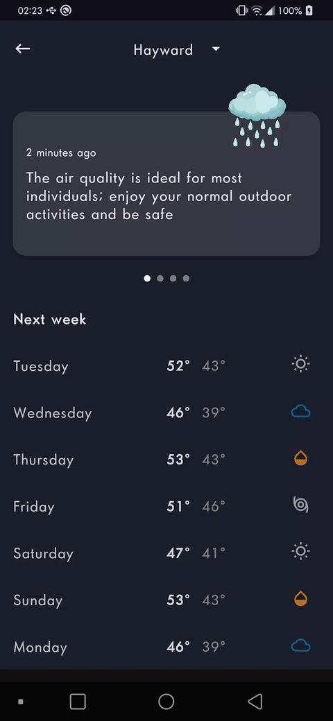
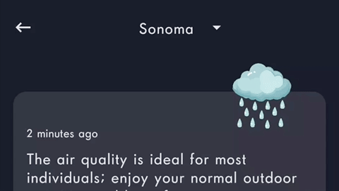
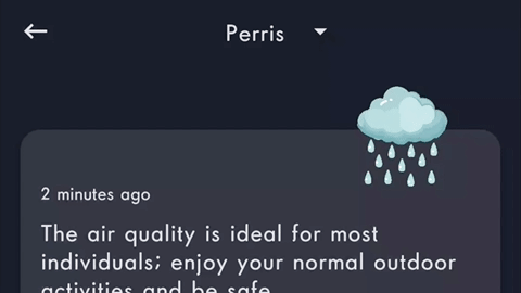
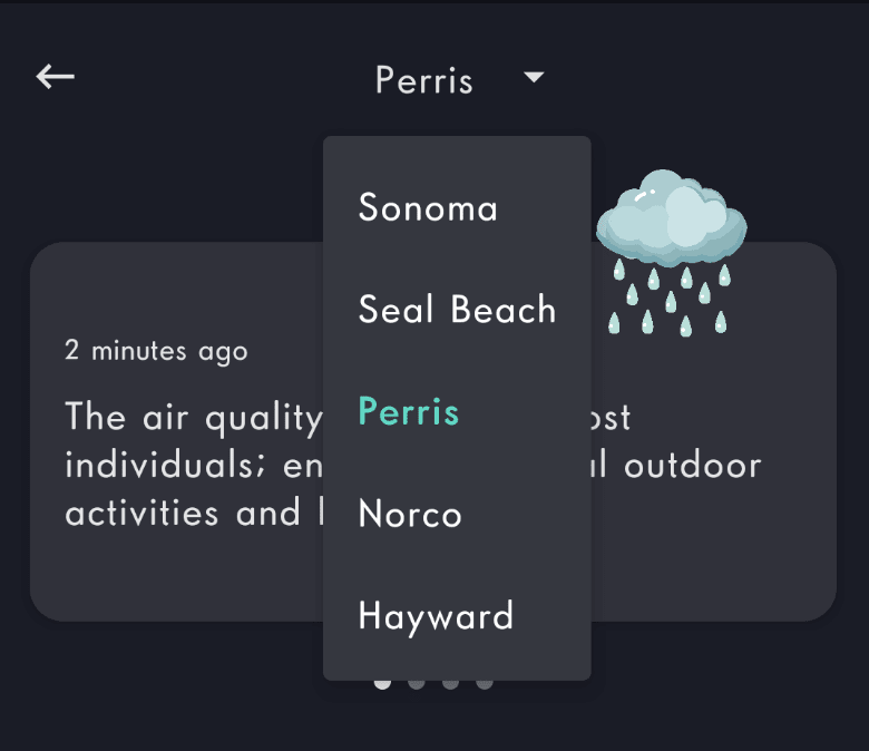
App bar holds a back arrow and a Spinner. that helps user to switch between cities. Let’s focus on the popup window part.
In the old android system, this is a Spinner component with custom adapter (since we do color updates). This requires layouts defined for both anchor and list item, inflated at some point. Not to say about binding the content and updating the selected element. Enogh with old Views. Let’s see how to implement this in Jetpack.
Implementation
Anchor view
Create a Row container that holds the Text & Icon. This will act as anchor for dropdown and ensure clicking both items will show the menu.
Exit fullscreen mode

Now we don’t see any city name displayed in it. We can take a param for the @Compose function and update it. But we expect the name to change while picking a city from menu. Thankfully, we have a nice way of doing this in Compose.
Exit fullscreen mode
Here, cityName is a local state that update the UI once the value change. We set the initial value to first item in the list.

Dropdown menu design
Now we have the AppBar UI ready, let’s design dropdown menu.
Exit fullscreen mode
Here, we introduced a new state called expanded , which controls the visibility of menu. To show the window, we set it to true otherwise false. We know anchor controls the visibility, so add a click listener there.
Exit fullscreen mode

Running this, we get ripple — nothing more. This is because, we haven’t setup the menu. Let’s jump to it. Before adding, the actual content, let’s experiment with popup content.
Exit fullscreen mode
Now the menu is shown, but we cannot dismiss it. As we saw earlier, the expanded variable is the only thing that can control the visibility.
But.. we toggle it on clicking on anchor. This is because, the click event is not delivered to the anchor (note.. no ripple). A different callback stole it. Let’s figure out what to do.
Exit fullscreen mode

The mandatory callback onDismissRequest , should be implemented to dismiss the menu. Otherwise, we’ll endup with a sticky popup like in previous step.
Menu item design
We can place any Composable view in side the DropdownMenu. Current case, we need list of Label/Text in a column — each clickable. To keep the article short, I’m not demonstrating with a Column and Text list items. Keep these two points in mind and fast forward to the snippet.
- DropdownMenu places the given content inside column. So we don’t have to add a Column manually. From DropdownMenu source:
Exit fullscreen mode
- Likewise, we have DropdownMenuItem container, which is a Row internally — can take care of placing line item’s content horizontally [ex. Country flag — Country name]. Also it ensures minimum height / width requirements met as per material design and has a click listener. From DropdownMenuItemContent source:
Exit fullscreen mode
Let’s make use of above containers and cook the list items.
Exit fullscreen mode

We get a list with clickable items, but menu not dismissed and value not updated. It’s just matter of implementing the onClick in menu-item.
Exit fullscreen mode
With bit of style customization to menu item, we can highlight the current city in menu.
Exit fullscreen mode
Conclusion
We can see the benefit of using composable here. In the old view system, Views has it’s own saved instance state backed by their ids this had few advantages, yet leaves the system unpredictable in many cases. Devs have to take care of keeping the UI and model in sync.
In compose, data drives the UI. Take a look at cityName, initial value set to the component — and then menu item click updates the variable name — not the Text/Label view. This is called unidirectional data flow. Data paints the UI, and UI updates the model. No UI vs UI communication happens here. That means, we don’t take value from the UI — rather state can give it to us.
Источник


