GridLayout
В Android 4.0 появился новый вид макета под именем GridLayout (раздел Layouts на панели инструментов). На первый взгляд он может показаться похожим на TableLayout. Но на самом деле он гораздо удобнее и функциональнее. И очень рекомендуется изучить и использовать его в своих новых проектах, которые разрабатываются под новую платформу.
Позже в библиотеку совместимости добавили класс android.support.v7.widget.GridLayout, который позволяет использовать компонент и для старых устройств. Найти его можно в разделе AppCompat.
Разметка относится к классу android.widget.GridLayout и имеет колонки, ряды, клетки как в TableLayout, но при этом элементы могут гибко настраиваться.
В GridLayout для любого компонента можно указать строку и колонку, и в этом месте таблицы он будет размещён. Указывать элемент для каждой ячейки не понадобится, это нужно делать только для тех ячеек, где действительно должны быть компоненты. Компоненты могут растягиваться на несколько ячеек таблицы. Более того, в одну ячейку можно поместить несколько компонентов.
В данной разметке нельзя использовать атрибут веса, поскольку он не сработает в дочерних представлениях GridLayout. Используйте атрибут layout_gravity.
Обратите внимание на атрибуты layout_column и layout_columnSpan, используемые для указания самой левой колонки и количества занимаемых компонентом колонок. Также доступны атрибуты layout_row и layout_rowSpan.
Для дочерних элементов не нужно указывать атрибуты layout_height и layout_width, по умолчанию они устанавливаются в значение wrap_content.
Количество колонок и рядов используются атрибуты android:columnCount=»number» и android:rowCount=»number».
Цифровая клавиатура
Для демонстрации создадим пример цифровой клавиатуры или калькулятора, чтобы понять преимущества нового шаблона.
Итак, мы хотим создать разметку, напоминающую цифровую панель на многих моделях клавиатур для настольного компьютера или обычный калькулятор. Если вы посмотрите на цифровую панель, то увидите, что часть клавиш имеет больший размер и вытянуты в длину или ширину. Подобный дизайн практически невозможно реализовать старыми способами — придётся постоянно использовать вложенные конструкции LinearLayout, TableLayout и др.
Но, теперь у нас есть GridLayout. Во многом его поведение схоже с LinearLayout — у него есть горизонтальная и вертикальная ориентации, которые определяют вывод следующего элемента.
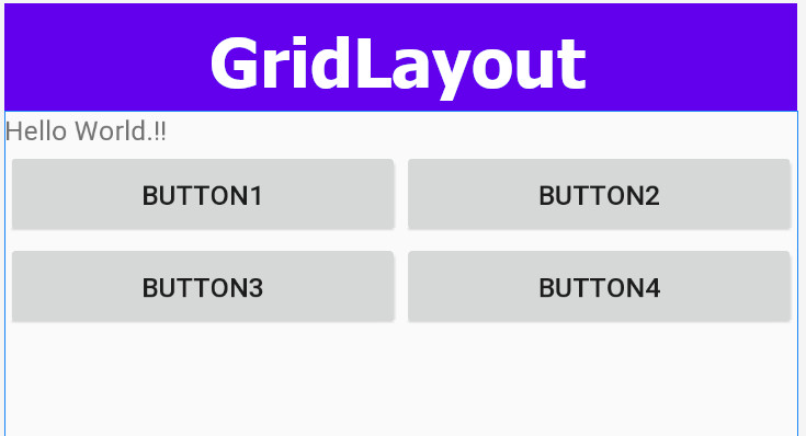
Для цифровой клавиатуры, если начнем с клавиши слэша (/) с позиции 4 колонки, то используя горизонтальную ориентацию, нам не нужно пропускать клетки. Выбирая горизонтальную ориентацию, мы ограничиваем число колонок для автоматического переноса новой клетки на следующий ряд. В нашем примере используется четыре колонки. В каждой клетке макета будет находиться кнопка, отцентрированая относительно клетки. Сама разметка должна занимать весь контент экрана.
Дочерние элементы настраиваются не совсем привычном образом. Нам не нужно явно задавать размеры (ширину и высоту) каждого элемента. Согласно нашему плану мы должны использовать четыре колонки для 16 кнопок. Попробуем.
Вот как будет выглядеть первоначальная XML-разметка для нашей цели:
А так будет выглядеть форма в графическом дизайнере:

Поиграйтесь с параметром android:columnCount, чтобы увидеть, как ведёт себя шаблон при разных значениях.
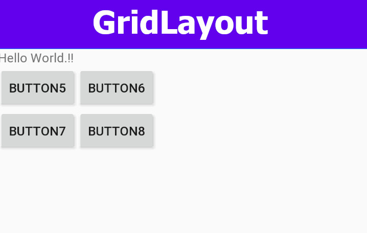
Теперь займёмся более точной настройкой. Например, первая клавиша клавиатуры — символ слеша (/) будет иметь такой же размер, как большинство кнопок, но начинаться с четвёртой колонки. Клавиша (+) идёт после клавиши (9) и занимает три воображаемых ряда. Клавиша (0) должна занять две колонки. Клавиша (=) должна занять три колонки. Внесём требуемые изменения:
Теперь мы видим такую картину:

Это не совсем то, что нам нужно. Вроде клавиши зарезервировали себе место, но не растянулись до нужных размеров. Исправляем ситуацию. Здесь на помощь нам придёт атрибут layout_gravity. Применим его у клавиш, которые необходимо растянуть:
Финальный результат радует глаз:

Как видите, если разобраться, то ничего сложного. Разметка получилась лаконичной и удобной для чтения.
Источник
GridLayout – Part 1
In a recent series of articles, we covered he basic layout types supported by Android. Since those articles were written Google have released the Android 4.0 SDK and there is a new addition: GridLayout. In this series of articles we’ll have a look at GridLayout and explore the way it works to get a feel for how to use it effectively.
The first thing that strikes you if you look at the GridLayout API is that it offers similar functionality to TableLayout although it goes about it in a rather different way. In fact, it is somewhat more like a hybrid of TableLayout and LinearLayout. Let’s start with a simple example which is similar to what we did when we covered TableLayout:
The first thing to point out is that we are not specifying android:layout_width or android:layout_height attributes for any of the TextView widgets within the GridLayout. This is because GridLayout uses a different layout model to other layouts as we shall see.
if we run this, we’ll see:
Whil this is pretty close to what we got with TableLayout, there is a difference which is highlighted by the longer text in row 3, cell 3: The cells are not automatically stretched to fill the column as they are in TableLayout. Normally we would look at android:layout_width in conjunction with android:layout_weight to control to cell sizes, however GridLayout bases it’s layout model upon the android:layout_gravity of the cells. Normally gravity is used to align the content within a control, but GridLayout uses this to determine the size of cells.
This is easy enough to fix, but it demonstrates a key aspect of how GridLayout works, which we see more of later: How GridLayout sizes each cell is dependent on the layout_gravity of both the cell itself and its siblings in the same row or column. Let’s demonstrate this by adding android:layout_gravity=”fill_horizontal” to each cell in the third column:
This gives us the same as the TableLayout example:
It is important to remember that GridLayout does still support android:layout_width and android:layout_height, but default to WRAP_CONTENT for both. However, you can get in to all kinds of problems if you start mixing your layout metaphors, so I would strongly advise leaving android:layout_width and android:layout_height set to their defaults, and control cell widths using android:layout_gravity instead.
This shows some of the parallels with TableLayout, but what about LinearLayout? Similarly to LinearLayout GridLayout supports an android:orientation attribute which controls the order in which GridLayout populates the cells. The default orientation is horizontal, which means that it fills the cells in the first row with the first n children, the cells in the second row with the next n children, and so on (where n is the number of columns). If we change this to “vertical” it will fill the first column with the first m children, the second column with the next m children, and so on (where m is the number of rows). So, by simply changing our GridLayout declaration:
Источник
Android Grid Layout

Question which android developers ask them-self every day — which layout to use?
Current situation in android development world regarding GridLayout is following:
- Most of android developers don’t even know such layout exist.
- Some android developers know about GridLayout but for some reason do not use this layout.
- Only few android developers spent time to play with GridLayout and are actively using it.
The reason I wrote this article, is because I think this layout has been unfairly forgotten.
Why do we need Grid Layout?
GridLayout gives you possibility to create grid based layouts with a single root view.
I can use nested LinearLayout to create grid!
Yes, but you can have performance problems in hierarchies that are too deep.
I can use RelativeLayout to create grid!
Yes, but RelativeLayout has some limitations, like:
- inability to control alignment along both axes simultaneously.
- widgets can get off the screen / overlap when they take more space than you expected because you can’t use weigh, etc.
In other words RelativeLayout — is not flexible and responsive enough.
Sample
Let’s implement a simple layout which consist of one big image, two small icons and text next to those icons.

It’s pretty easy to implement this layout via RelativeLayout. Key attributes here are layout_below, layout_toRightOf and layout_alignTop.

At first glance everything seems to be perfect, until you start testing your layout with different text sizes.
Issue 1 inability to control alignment along both axes simultaneously.
Single line text should be vertically centered with icons, unfortunately RelativeLayout doesn’t offer such possibility.
Issue 2 widgets overlapping
Multi-line text cause overlapping, since text is aligned to icon via layout_alignTop attribute.

As you can see on image below GridLayout produces much better results:
- text is vertically aligned to icon.
- multi-line text push widgets down.

So how to achieve such results? First define GridLayout as a root layout. Next count how many columns do you have and define android:columnCount attribute, in this example we have 2 columns.
When you define views inside GridLayout they are placed one after another, so it’s not necessary to explicitly define view row and column.
If you want to stretch view for 2 or more rows / columns you can use layout_columnSpan / layout_rowSpan attribute.
And the most important thing to remember — if you want your view to use all available space, don’t set width of your view to match_parent, set it to 0dp along with layout_gravity=”fill” attribute.

Conclusions
GridLayout can be a powerful tool in the right hands. It provides great flexibility and performance. On the other hand it requires some time learn how it works, you usually need more time to develop and maintain such layout.
- flexibility
- single root layout
Источник
Android GridLayout with Equal Width Columns using Android Studio — Tutorial

A GridLayout in Android places individual components in columns and rows just like a table. Let us know more about Android GridLayout that aligns columns with equal widths using Android Studio. Finally, the layout becomes Auto-Fit Grid-Layout.
Learn Java basics before diving into Android for fast coding and development.
Android GridLayout with Equal Width Columns
A GridLayout (Grid Layout) is good if you are developing Calculator-Buttons type screen. The problem with the default Android GridLayout is that the elements do not take full width available. So the auto-expanding or shrinking of components according to the width of the screen does not happen. This spoils the user experience or impression.
Two main properties the GridLayout to be set here are the Column Count and Orientation .
First, we shall see how the normal GridLayout looks like the using default XML code. We try to place components directly under a GridLayout parent element. We placed buttons here inside the layout. These buttons do not expand up to the screen width.
content_main.xml File
The output of the above Layout looks like this.
Now, we shall make some changes to the GridLayout elements or components so that those take equal-width columns.
Follow the below steps to make the elements take full available width of the screen.
- Add a LinearLayout enclosing each element of the GridLayout
- Making the width of the LinearLayout to «0dp».
- Setting the width of the inner element to «match_parent»
content_main.xml File
The output of the XML looks like the below infographic.
This is how we can easily make the elements of the Android GridLayout to expand or shrink to match the screen width automatically.
It is time to share this android studio code sample with your friends and colleagues.
Источник
Android Gridlayout Example With Recyclerview
Hi and welcome to another tutorial from Codingdemos, in this tutorial you will learn how to use Android Gridlayout with Recyclerview. You will build an Android app that shows you pictures of natural places, when you tap on any of the picture you will be directed to a detail page which shows you the picture in full size.
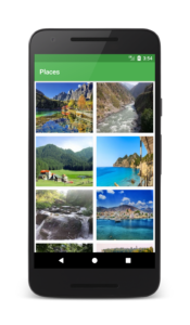
By the end of this tutorial, you will have an app that looks like this. (Large preview)
In this tutorial we will be using the following:
- – Android studio version 3.0
– Android emulator Nexus 5 with API 26
– Minimum SDK API 16
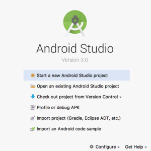
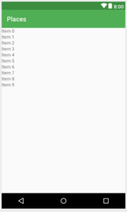
1- Open up Android Studio and create a new project and give it a name, in our case we’ve named it (Places), choose API 16 as the minimum SDK, then choose a blank activity, click “Finish” and wait for Android Studio to build your project.
Create new Android Studio project. (Large preview)
2- Open up colors.xml file to change the main colors of the app.
3- Open up activity_main.xml file to add Android Recyclerview.
4- Make sure to add the images that you want them to appear in Gridlayout inside project drawable folder.
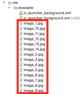
Images inside Android Studio drawable folder. (Large preview)
5- Create a new resource file and name it (recyclerview_custom_layout), inside this file you add Android ImageView and name it (ivPlace), you will use this ImageView to show images inside Android Gridlayout.
Android ImageView for Gridlayout. (Large preview)
6- Create a new java class and name it (MyAdapter) and make it extends RecyclerView.Adapter
. Make sure to implement Recyclerview required methods (onCreateViewHolder(), onBindViewHolder(), and getItemCount()), based on the error that you see below PlaceViewHolder you need to create a new class called (PlaceViewHolder).
7- Inside PlaceViewHolder class and based on the error you will need to add a default constructor.
8- Inside MyAdapter.java class you need to declare 2 variables and a constructor, this constructor will be used to pass data from MainActivity.java to this adapter.
9- Here is the code for MyAdapter.java class.
10- Inside Recyclerview (onCreateViewHolder) method you need to inflate the custom layout file recyclerview_custom_layout.xml .
11- Inside the constructor of PlaceViewHolder class you need to declare and initialize Android ImageView (ivPlace).
12- Inside (onBindViewHolder) is where you will initialize (ivPlace).
13- Finally you need to change the return value inside (getItemCount()) to actually return the size of the images array instead of null value.
14- The final code for MyAdapter.java .
15- Open up MainActivity.java file, here you will need to declare and initialize Android Recyclerview.
16- Now you need to declare and initialize Android GridLayoutManager, this will be used to determine how you want to arrange the images inside Recyclerview.
Note: Android GridLayoutManager takes 2 argument: First one is the context, the second one is used to indicate the number of columns that you want to show inside Recyclerview.
17- Next you will need to declare and initialize the images array that you will have to use it later inside (MyAdapter).
18- The only thing remaining before the app is ready is you will need to declare and initialize (MyAdapter) and make sure to use this adapter with Android Recyclerview.
19- Here is the full code for MainActivity.java file.
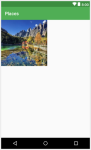
20- Now you can build and run the app to see the progress in the emulator.
Android Gridlayout with images. (Large preview)
21- Hmm that’s odd you can see there is a space between the images inside Gridlayout even though you didn’t add any margin. Well you can remove that unwanted space between the images by adding this line android:scaleType=»centerCrop» inside ImageView (ivPlace).
22- Build and run the app to see the images without unwanted space.

Android Gridlayout with images and without spaces. (Large preview)
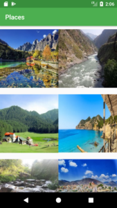
23- Great, and to make it even better you can add a small margin inside ImageView (ivPlace) so that those images don’t stick to each other when they appear in Android Gridlayout.

Android Gridlayout with margin between images. (Large preview)
24- Displaying images inside Gridlayout looks great but how about if you make those images clickable, that will be awesome 🙂
25- Open up MyAdapter.java file, inside (onBindViewHolder) you can make the image clickable by using setOnClickListener .
26- Inside onClick method you need to pass the clicked image to another page, before you do that you have to first create a new activity and name it (DetailActivity).
27- Next you need to add an ImageView inside activity_detail.xml file, this ImageView will be use to display the image that was clicked on previously.
28- Now go back to (onBindViewHolder) and inside OnClick , you will need to use Android Intent to pass the clicked image to DetailActivity.java
29- Open up DetailActivity.java , here you need to declare and initialize Android ImageView.
30- Next you need to use Android Bundle to get the clicked image from Android Intent, then you can set that clicked image to (mPlace) ImageView.
31- The app is complete, now build and run the app to see the progress. The source code for this tutorial is available on GitHub, I hope you find this tutorial helpful and if you have any question please post them in the comment below.
Источник


