- Мета-теги HTML для Apple Safari
- Apple Touch Icon
- Apple Touch Icon Precomposed
- Mask Icon
- Apple-Mobile-Web-App-Title
- Apple-Mobile-Web-App-Capable
- Apple-Mobile-Web-App-Status-Bar-Style
- Apple-Itunes-App
- Format-Detection
- Safari HTML Reference
- Supported Meta Tags
- Apple-Specific Meta Tag Keys
- apple-mobile-web-app-capable
- apple-mobile-web-app-status-bar-style
- format-detection
- viewport
- Safari Web Content Guide
- Configuring Web Applications
- Specifying a Webpage Icon for Web Clip
- Specifying a Launch Screen Image
- Adding a Launch Icon Title
- Hiding Safari User Interface Components
- Changing the Status Bar Appearance
- Linking to Other Native Apps
- Блог Vaden Pro
- Правильный для мобильных сайтов
- Appcache
- Title
- HandheldFriendly
- MobileOptimized
- Viewport
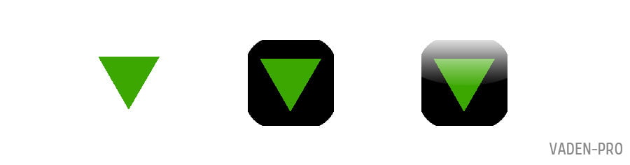
- Иконки
- В завершение еще парочка нужных тегов:
Мета-теги HTML для Apple Safari
Обзор html мата-тегов для браузеров Safari на платформах Mac OS X и iOS.
Apple Touch Icon
Иконка сайта в iOS на экране закладок и домашнем экране.
Иконки разных размеров указываются атрибутом sizes :
Apple Touch Icon Precomposed
Тоже самое что и apple touch icon , но с наложенными эффектами в стиле iOS с закругленными углами и т.д.
Mask Icon
Используется в MacOS при сохранении сайта на рабочий стол. Элементы SVG должны быть черного цвета, цвет задается атрибутом color .
Apple-Mobile-Web-App-Title
При добавлении сайта на домашний экран в iOS задает имя иконки.
Apple-Mobile-Web-App-Capable
В Safari iOS для закрепленных сайтов на экране «Домой» включает полноэкранный режим.
Apple-Mobile-Web-App-Status-Bar-Style
Задает стиль панели состояния при полноэкранном режиме.
Может иметь следующее значение:
| default | Белый фон |
| black | Черный фон |
| black-translucent | Прозрачный фон и белый цвет иконок и шрифтов |
 default default | 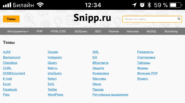 black black | 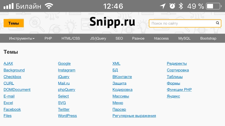 black-translucent black-translucent |
Apple-Itunes-App
В iOS Safari выводит баннер с приложением в App Store.

Баннер не отобразится, если устройство не поддерживает приложение или оно недоступно для данной локали, подробнее на developer.apple.com.
Format-Detection
В iOS запрещает распознавать номера телефонов и адреса.
Источник
Safari HTML Reference
Supported Meta Tags
Apple-specific meta tags are described here.
Apple-Specific Meta Tag Keys
apple-mobile-web-app-capable
Sets whether a web application runs in full-screen mode.
Syntax
If content is set to yes , the web application runs in full-screen mode; otherwise, it does not. The default behavior is to use Safari to display web content.
You can determine whether a webpage is displayed in full-screen mode using the window.navigator.standalone read-only Boolean JavaScript property.
Availability
Available for iOS.
Support Level
apple-mobile-web-app-status-bar-style
Sets the style of the status bar for a web application.
Syntax
This meta tag has no effect unless you first specify full-screen mode as described in apple- apple-mobile-web-app-capable .
If content is set to default , the status bar appears normal. If set to black , the status bar has a black background. If set to black-translucent , the status bar is black and translucent. If set to default or black , the web content is displayed below the status bar. If set to black-translucent , the web content is displayed on the entire screen, partially obscured by the status bar. The default value is default .
Availability
Available for iOS.
Support Level
format-detection
Enables or disables automatic detection of possible phone numbers in a webpage in Safari on iOS.
Syntax
By default, Safari on iOS detects any string formatted like a phone number and makes it a link that calls the number. Specifying telephone=no disables this feature.
Support Level
viewport
Changes the logical window size used when displaying a page on iOS.
Syntax
Use the viewport meta key to improve the presentation of your web content on iOS. Typically, you use the viewport meta tag to set the width and initial scale of the viewport.
For example, if your webpage is narrower than 980 pixels, then you should set the width of the viewport to fit your web content. If you are designing a Safari on iOS-specific web application, you should set the width to the width of the device.
Table 1 describes the properties supported by the viewport meta key and their default values. When providing multiple properties for the viewport meta key, you should use a comma-delimited list of assignment statements. Follow these rules when setting multiple properties:
Do not use a semicolon as a delimiter.
A space may work as a delimiter, but a comma is preferred.
For numeric properties, if the value contains a nonnumeric character but starts with a number, then the number prefix is used as the value. For example, 1.0x is equivalent to 1.0 and 123×456 is equivalent to 123 . If the parameter doesn’t begin with a number, the value is 0 .
When referring to the dimensions of a device, you should use the constants described in Table 2 instead of hard-coding specific numeric values. For example, use device-width instead of 320 for the width, and device-height instead of 480 for the height in portrait orientation.
You do not need to set every viewport property. If only a subset of the properties are set, then Safari on iOS infers the other values. For example, if you set the scale to 1.0 , Safari assumes the width is device-width in portrait and device-height in landscape orientation. Therefore, if you want the width to be 980 pixels and the initial scale to be 1.0 , then set both of these properties.
For example, to set the viewport width to the width of the device, add this to your HTML file:
To set the initial scale to 1.0 , add this to your HTML file:
To set the initial scale and to turn off user scaling, add this to your HTML file:
Use the Safari on iOS console to help debug your webpages as described in the Safari Web Inspector Guide. The console contains tips to help you choose viewport values—for example, it reminds you to use the constants when referring to the device width and height.
Support Level
The width of the viewport in pixels. The default is 980 . The range is from 200 to 10,000 .
You can also set this property to the constants described in Table 2 .
The height of the viewport in pixels. The default is calculated based on the value of the width property and the aspect ratio of the device. The range is from 223 to 10,000 pixels.
You can also set this property to the constants described in Table 2 .
The initial scale of the viewport as a multiplier. The default is calculated to fit the webpage in the visible area. The range is determined by the minimum-scale and maximum-scale properties.
You can set only the initial scale of the viewport—the scale of the viewport the first time the webpage is displayed. Thereafter, the user can zoom in and out unless you set user-scalable to no . Zooming by the user is also limited by the minimum-scale and maximum-scale properties.
Specifies the minimum scale value of the viewport. The default is 0.25 . The range is from > 0 to 10.0 .
Specifies the maximum scale value of the viewport. The default is 5.0 . The range is from > 0 to 10.0 .
Determines whether or not the user can zoom in and out—whether or not the user can change the scale of the viewport. Set to yes to allow scaling and no to disallow scaling. The default is yes .
Setting user-scalable to no also prevents a webpage from scrolling when entering text in an input field.