- Полный список
- Bitmap
- Layer List
- State List
- Android Layer-List Example
- 1. How To Define Android Layer List.
- 2. Layer-list Three Layer Example.
- 3. Layer-list Image Border Example.
- 4. Layer-list Red Crosshair Example.
- 5. Layer-list Heart Example.
- 6. Layer-list Bitmap Example.
- Drawable Resources
- See also
- Bitmap
- Bitmap File
- XML Bitmap
- Nine-Patch
- Nine-Patch File
- XML Nine-Patch
- Layer List
Полный список
— изучаем drawable теги: , ,
Продолжаем разбирать типы Drawable, которые можно описывать с помощью XML-разметки. Проектов в этом уроке создавать не будем. Я просто буду в своем проекте создавать XML-файлы в папке drawable и ставить их фоном для View. А в тексте урока приведу код и скрины. Иногда буду вешать дополнительно серый фон, чтобы был виден реальный размер View.
Чтобы программно добраться до Drawable, который вы для View повесили как фон, надо просто вызвать метод getBackground.
Bitmap
Тег позволяет получить Drawable обертку для Bitmap. У тега есть несколько атрибутов.
В атрибуте src указываем нужный нам файл-изображение.
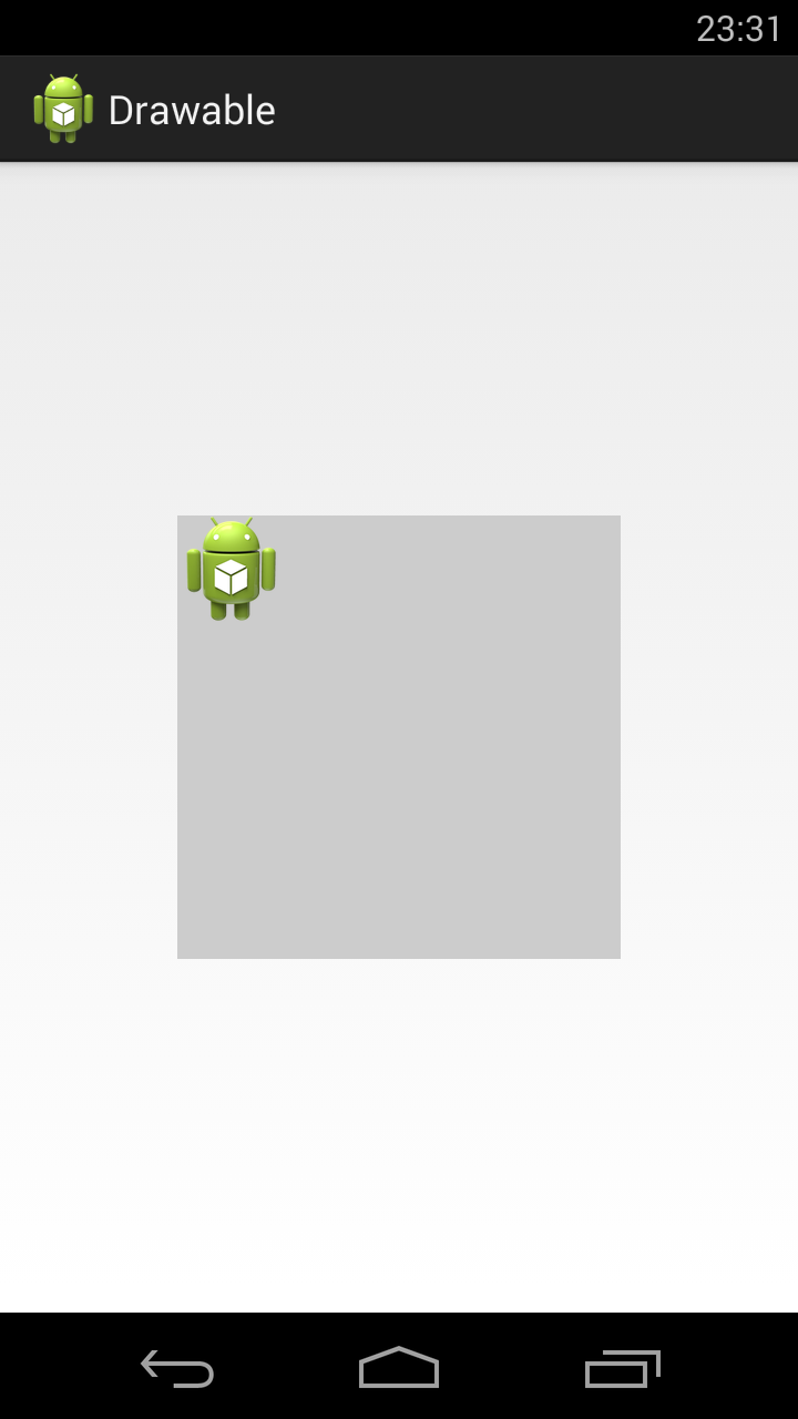
Атрибут gravity указывает, как bitmap будет располагаться внутри Drawable. Можно использовать несколько значений, разделенных знаком | . Значения тут стандартные, и некоторые из них мы часто используем при работе с layout. Рассмотрим пример.
Значение атрибута gravity сдвигает изображение влево-вверх
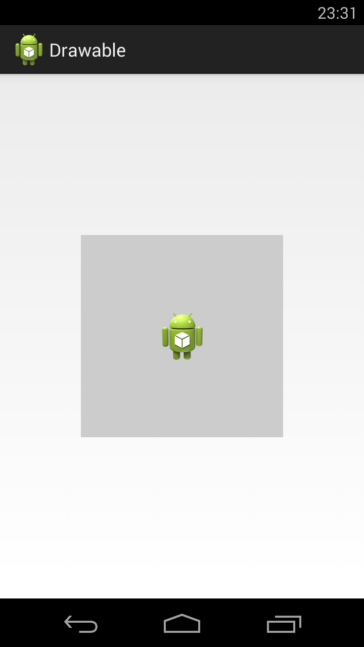
Далее ставим следующие значение атрибута gravity:
fill_horizontal — растянуть по горизонтали
fill — растянуть (используется по умолчанию)
Насколько я понял, значения clip_vertical и clip_horizontal идентичны значениям fill_vertical и fill_horizontal в случае когда Bitmap по размеру больше, чем предоставляемое ему пространство. Т.е. clip_vertical сожмет его по вертикали, так чтобы он влез. А clip_horizontal — по горизонтали.
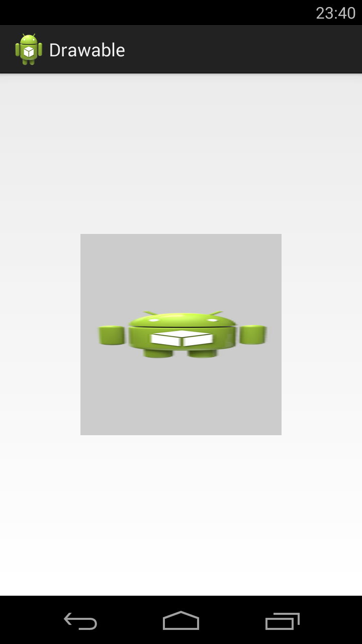
Атрибут tileMode — это режим «плитки». Позволяет замостить вашим изображением все доступное пространство. По умолчанию он имеет значение disabled.
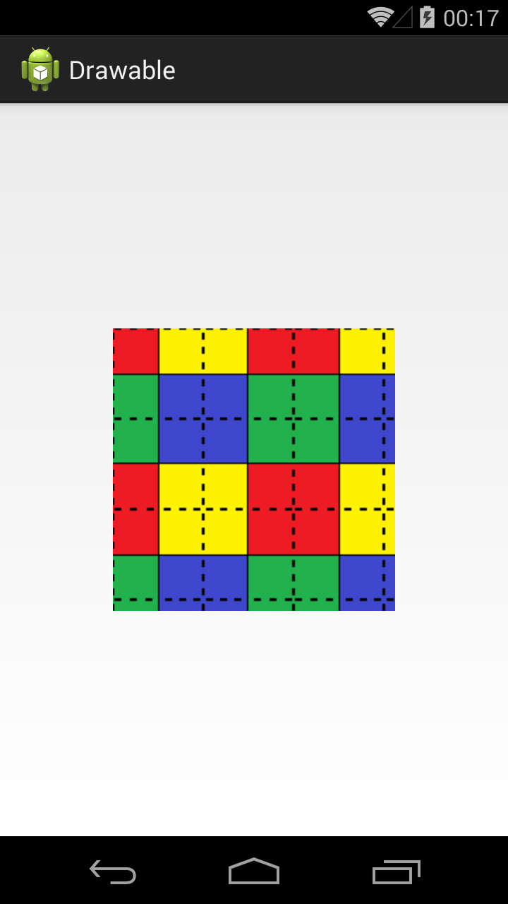
Для примера я создам такой bitmap.

Четыре разных цвета, внутренние границы — сплошные, внешние — пунктиром.
Если tileMode = repeat, то Bitmap будет размножен и займет все доступное пространство

Далее меняем значение атрибута tileMode.
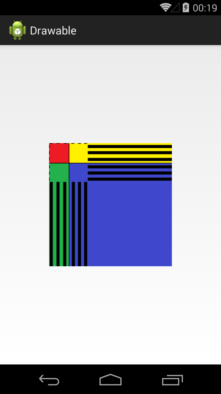
mirror – Bitmap также будет размножен, но при этом он будет чередоваться со своим отражением
clamp – растягивает края картинки на все свободное пространство
Прочие атрибуты тега :
antialias – сглаживание линий
dither – преобразование цветов, если текущей палитры недостаточно для отображения
filter – фильтр при сжатии или растягивании (пример результата использования есть в Уроке 158)
mipMap – использование mip-текстурирования. Про него можно почитать в википедии. Используйте этот режим, если планируете в процессе отображения уменьшать bitmap более чем в два раза.
Мы рассмотрели XML-описание, но вы всегда можете создать этот объект и программно. Java-реализация – класс BitmapDrawable.
Layer List
Мы можем описать Drawable, который будет состоять из нескольких Drawable-слоев. Для этого используется тег , а внутри него теги .
У нас 4 слоя. Три bitmap со стандартной иконкой и одна фигура. Атрибуты left, top, right, bottom позволяют указывать отступы. А в атрибуте id можно указать id этого Drawable-слоя.

Обратите внимание, что важен порядок тегов item. Каждый последующий слой рисуется поверх предыдущего. Например, на получившемся изображении видно, что прямоугольник проходит «над» верхней иконкой, но «под» нижней.
Мы можем в коде получать доступ к отдельным Drawable внутри LayerDrawable. Для этого сначала получаем LayerDrawable.
А затем вызываем метод findDrawableByLayerId(int id) и указываем id, который вы указывали в атрибуте id тега item. На выходе получим Drawable.
Также у LayerDrawable есть еще несколько интересных методов
getDrawable(int index) — возвращает Drawable по индексу, а не по id
getId(int index) — возвращает id по индексу
getNumberOfLayers() — возвращает кол-во Drawable-слоев
State List
Тег позволяет отображать Drawable в зависимости от состояния View. Возможные состояние View можно посмотреть в хелпе. Рассмотрим пример с двумя из них: checked и pressed. На экране будет ToogleButton. Эта кнопка переходит в состояние checked и обратно, если на нее нажимать. А во время нажатия, пока палец касается экрана, кнопка находится в состоянии pressed.
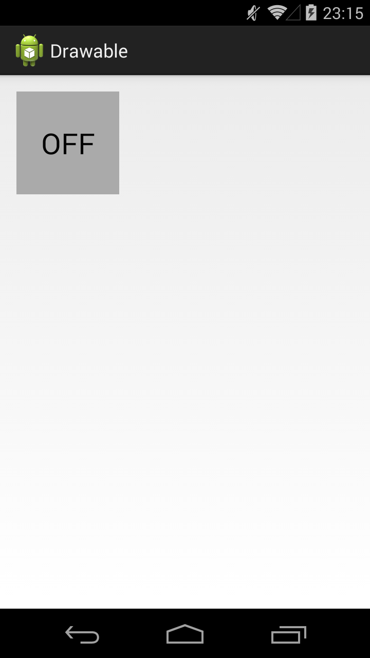
State List позволит нам использовать три разных Drawable для отображения кнопки в трех состояниях: обычное, checked, pressed. Для этого создадим три файла в папке drawable.
Прямоугольник темно-серого цвета. Этот Drawable будем отображать в обычном состоянии кнопки.
Прямоугольник темно-синего цвета. Этот Drawable будем отображать в нажатом состоянии кнопки.
Прямоугольник светло-синего цвета. Этот Drawable будем отображать когда кнопка находится в состоянии checked.
И еще один файл, button_selector.xml:
Этот последний Drawable является селектором. В нем мы используем теги item, в которых указываем для какого состояния какой Drawable использовать
В первом item мы указали state_pressed=true, а значит этот item будет выбран системой когда кнопка будет в состоянии pressed. И экране мы увидим Drawable из этого item, т.е. toogle_button_pressed.
В втором item мы указали state_checked=true, а значит этот item будет выбран системой когда кнопка будет в состоянии checked. И экране мы увидим toogle_button_checked.
В третьем item мы не указали никакого состояния, этот item будет выбран при обычном состоянии кнопки. И экране мы увидим toogle_button.
Учтите, что здесь важен порядок расположения item внутри selector. Т.е. система идет по ним по порядку и выбирает первый подходящий. Если вы третий item, который без явного указания состояния, поставите первым, то система всегда будет останавливаться на нем.
Состояния можно комбинировать, т.е. в одном item вы можете указать несколько разных состояний.
Ставим этот Drawable, как фон для ToogleButton:
В результате, сначала видим обычное состояние
Нажимаем и держим, т.е. состояние pressed
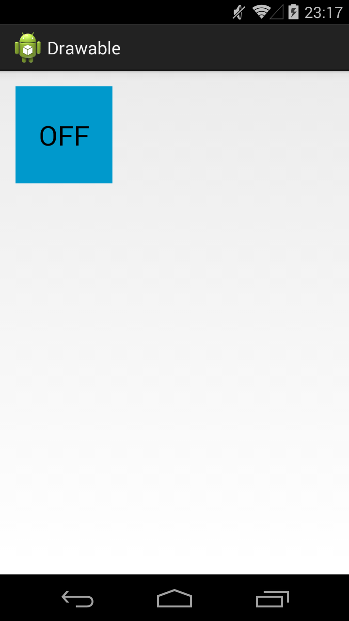
Отпускаем – включился checked
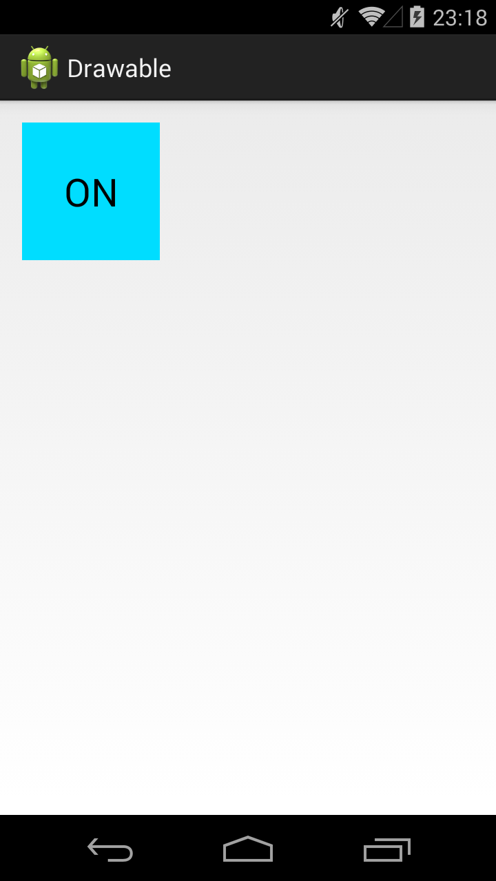
Еще раз нажмем-отпустим — выключится checked и будет снова обычное состояние. Для каждого состояния отображается свой Drawable.
У View, кстати, есть методы, которые позволяют программно управлять состоянием. Это, например: setPressed и setSelected.
Присоединяйтесь к нам в Telegram:
— в канале StartAndroid публикуются ссылки на новые статьи с сайта startandroid.ru и интересные материалы с хабра, medium.com и т.п.
— в чатах решаем возникающие вопросы и проблемы по различным темам: Android, Kotlin, RxJava, Dagger, Тестирование
— ну и если просто хочется поговорить с коллегами по разработке, то есть чат Флудильня
— новый чат Performance для обсуждения проблем производительности и для ваших пожеланий по содержанию курса по этой теме
Источник
Android Layer-List Example
The android.graphics.drawable.LayerDrawable is a drawable object that manages arrays of other drawable objects in the desired order. Each drawable object in the layer list is drawn in the order of the list, and the last drawable object in the list is drawn at the top.
1. How To Define Android Layer List.
- To define a LayerDrawable object, you need to add an XML file under the app/res/drawable folder. And the file name is just the drawable resource id. In this example, the app/res/drawable/my_layer_list.xml file contains a layer list definition.
- In the layer list definition XML file, each drawable object is represented by a element within a single element. You can add any or sub-elements under the element . You can read Android Shape, Selector Examples to learn how to create shapes drawable in android.
- To use the above layer-list drawable resource, you can use the below methods.
- Call the layer-list drawable resource in java source code by id: R.id.my_layer_list.
- Call the layer list drawable resource in Xml Code: @drawable/my_layer_list.
2. Layer-list Three Layer Example.
There is a button in this example, as shown above, it uses a three-layer layer-list drawable object as the background.
my_layer_list.xml
layout XML code use above layer-list.
3. Layer-list Image Border Example.
Above example add two borders for an image. If you want to left only one border. You can remove element to remove green border, remove element or change
value to 5dp to remove red border.
my_layer_list.xml
4. Layer-list Red Crosshair Example.
There are two-layer in this example. The bottom layer draws the vertical line and the top layer draws the horizontal line. You can adjust the layer item’s top, bottom, left, and right offset to change the crosshair center point.
my_layer_list.xml
5. Layer-list Heart Example.
There are three layers in this example.
- The bottom layer is a blue square that rotates 45-degree rotation.
- The middle layer is a red oval.
- The top layer is a green oval.
You can adjust each layer’s item offset to change the heart border and shape. If you set the same color for both three-layer. You can see a heart picture.
my_layer_list.xml
6. Layer-list Bitmap Example.
By default, all rendering items are scaled to fit the size of the included view. Therefore, placing the image at different locations in the layer list may increase the size of the view, and some of the images will scale accordingly.
To avoid scaling items in a list, use elements within elements to specify drawable objects, and define gravity for some items that are not scaled (such as “center”). The below layer-list do not add gravity attribute for bitmap, so the picture has been scaled.
my_layer_list.xml
If you add android:gravity=”center” attribute for each bitmap in the above layer-list XML file, you can see the below screen effect.
Источник
Drawable Resources
See also
A drawable resource is a general concept for a graphic that can be drawn to the screen and which you can retrieve with APIs such as getDrawable(int) or apply to another XML resource with attributes such as android:drawable and android:icon . There are several different types of drawables:
Bitmap File A bitmap graphic file ( .png , .jpg , or .gif ). Creates a BitmapDrawable . Nine-Patch File A PNG file with stretchable regions to allow image resizing based on content ( .9.png ). Creates a NinePatchDrawable . Layer List A Drawable that manages an array of other Drawables. These are drawn in array order, so the element with the largest index is be drawn on top. Creates a LayerDrawable . State List An XML file that references different bitmap graphics for different states (for example, to use a different image when a button is pressed). Creates a StateListDrawable . Level List An XML file that defines a drawable that manages a number of alternate Drawables, each assigned a maximum numerical value. Creates a LevelListDrawable . Transition Drawable An XML file that defines a drawable that can cross-fade between two drawable resources. Creates a TransitionDrawable . Inset Drawable An XML file that defines a drawable that insets another drawable by a specified distance. This is useful when a View needs a background drawble that is smaller than the View’s actual bounds. Clip Drawable An XML file that defines a drawable that clips another Drawable based on this Drawable’s current level value. Creates a ClipDrawable . Scale Drawable An XML file that defines a drawable that changes the size of another Drawable based on its current level value. Creates a ScaleDrawable Shape Drawable An XML file that defines a geometric shape, including colors and gradients. Creates a ShapeDrawable .
Also see the Animation Resource document for how to create an AnimationDrawable .
Note: A color resource can also be used as a drawable in XML. For example, when creating a state list drawable, you can reference a color resource for the android:drawable attribute ( android:drawable=»@color/green» ).
Bitmap
A bitmap image. Android supports bitmap files in three formats: .png (preferred), .jpg (acceptable), .gif (discouraged).
You can reference a bitmap file directly, using the filename as the resource ID, or create an alias resource ID in XML.
Note: Bitmap files may be automatically optimized with lossless image compression by the aapt tool during the build process. For example, a true-color PNG that does not require more than 256 colors may be converted to an 8-bit PNG with a color palette. This will result in an image of equal quality but which requires less memory. So be aware that the image binaries placed in this directory can change during the build. If you plan on reading an image as a bit stream in order to convert it to a bitmap, put your images in the res/raw/ folder instead, where they will not be optimized.
Bitmap File
A bitmap file is a .png , .jpg , or .gif file. Android creates a Drawable resource for any of these files when you save them in the res/drawable/ directory.
file location: res/drawable/filename.png ( .png , .jpg , or .gif )
The filename is used as the resource ID. compiled resource datatype: Resource pointer to a BitmapDrawable . resource reference: In Java: R.drawable.filename
In XML: @[package:]drawable/filename example: With an image saved at res/drawable/myimage.png , this layout XML applies the image to a View:
The following application code retrieves the image as a Drawable :
XML Bitmap
An XML bitmap is a resource defined in XML that points to a bitmap file. The effect is an alias for a raw bitmap file. The XML can specify additional properties for the bitmap such as dithering and tiling.
Note: You can use a element as a child of an element. For example, when creating a state list or layer list, you can exclude the android:drawable attribute from an element and nest a inside it that defines the drawable item.
file location: res/drawable/filename.xml
The filename is used as the resource ID. compiled resource datatype: Resource pointer to a BitmapDrawable . resource reference: In Java: R.drawable.filename
In XML: @[package:]drawable/filename syntax: elements: Defines the bitmap source and its properties.
xmlns:android String. Defines the XML namespace, which must be «http://schemas.android.com/apk/res/android» . This is required only if the is the root element—it is not needed when the is nested inside an . android:src Drawable resource. Required. Reference to a drawable resource. android:antialias Boolean. Enables or disables antialiasing. android:dither Boolean. Enables or disables dithering of the bitmap if the bitmap does not have the same pixel configuration as the screen (for instance: a ARGB 8888 bitmap with an RGB 565 screen). android:filter Boolean. Enables or disables bitmap filtering. Filtering is used when the bitmap is shrunk or stretched to smooth its apperance. android:gravity Keyword. Defines the gravity for the bitmap. The gravity indicates where to position the drawable in its container if the bitmap is smaller than the container.
Must be one or more (separated by ‘|’) of the following constant values:
| Value | Description |
|---|---|
| top | Put the object at the top of its container, not changing its size. |
| bottom | Put the object at the bottom of its container, not changing its size. |
| left | Put the object at the left edge of its container, not changing its size. |
| right | Put the object at the right edge of its container, not changing its size. |
| center_vertical | Place object in the vertical center of its container, not changing its size. |
| fill_vertical | Grow the vertical size of the object if needed so it completely fills its container. |
| center_horizontal | Place object in the horizontal center of its container, not changing its size. |
| fill_horizontal | Grow the horizontal size of the object if needed so it completely fills its container. |
| center | Place the object in the center of its container in both the vertical and horizontal axis, not changing its size. |
| fill | Grow the horizontal and vertical size of the object if needed so it completely fills its container. This is the default. |
| clip_vertical | Additional option that can be set to have the top and/or bottom edges of the child clipped to its container’s bounds. The clip is based on the vertical gravity: a top gravity clips the bottom edge, a bottom gravity clips the top edge, and neither clips both edges. |
| clip_horizontal | Additional option that can be set to have the left and/or right edges of the child clipped to its container’s bounds. The clip is based on the horizontal gravity: a left gravity clips the right edge, a right gravity clips the left edge, and neither clips both edges. |
android:mipMap Boolean. Enables or disables the mipmap hint. See setHasMipMap() for more information. Default value is false. android:tileMode Keyword. Defines the tile mode. When the tile mode is enabled, the bitmap is repeated. Gravity is ignored when the tile mode is enabled.
Must be one of the following constant values:
| Value | Description |
|---|---|
| disabled | Do not tile the bitmap. This is the default value. |
| clamp | Replicates the edge color if the shader draws outside of its original bounds |
| repeat | Repeats the shader’s image horizontally and vertically. |
| mirror | Repeats the shader’s image horizontally and vertically, alternating mirror images so that adjacent images always seam. |
example: see also:
- BitmapDrawable
- Creating alias resources
Nine-Patch
A NinePatch is a PNG image in which you can define stretchable regions that Android scales when content within the View exceeds the normal image bounds. You typically assign this type of image as the background of a View that has at least one dimension set to «wrap_content» , and when the View grows to accomodate the content, the Nine-Patch image is also scaled to match the size of the View. An example use of a Nine-Patch image is the background used by Android’s standard Button widget, which must stretch to accommodate the text (or image) inside the button.
Same as with a normal bitmap, you can reference a Nine-Patch file directly or from a resource defined by XML.
For a complete discussion about how to create a Nine-Patch file with stretchable regions, see the 2D Graphics document.
Nine-Patch File
XML Nine-Patch
An XML Nine-Patch is a resource defined in XML that points to a Nine-Patch file. The XML can specify dithering for the image.
file location: res/drawable/filename.xml
The filename is used as the resource ID. compiled resource datatype: Resource pointer to a NinePatchDrawable . resource reference: In Java: R.drawable.filename
In XML: @[package:]drawable/filename syntax: elements: Defines the Nine-Patch source and its properties.
xmlns:android String. Required. Defines the XML namespace, which must be «http://schemas.android.com/apk/res/android» . android:src Drawable resource. Required. Reference to a Nine-Patch file. android:dither Boolean. Enables or disables dithering of the bitmap if the bitmap does not have the same pixel configuration as the screen (for instance: a ARGB 8888 bitmap with an RGB 565 screen). example:
Layer List
A LayerDrawable is a drawable object that manages an array of other drawables. Each drawable in the list is drawn in the order of the list—the last drawable in the list is drawn on top.
Each drawable is represented by an element inside a single element.
Источник


