- Material 2.0 для разработчиков. Краткий обзор новых компонентов
- Android X вместо Support library
- Material library
- BottomAppbar
- Chips
- BackDrop
- MaterialButtons
- Text Fields
- MaterialCardView
- Итого
- Upgrading to Material Components
- AndroidX vs Support Library
- How to upgrade to AndroidX?
- 1. Automatic refactoring to AndroidX
- 2. “ Non automatic” refactoring
- Implementing the UI
- TextInputLayout
- OutlinedBox
- FilledBox
- Material Button
- Filled, elevated Button
- Text Button
- Chips
- Bottom App Bar
- Backdrop Menu
Material 2.0 для разработчиков. Краткий обзор новых компонентов

В мае на Google I/O мы впервые увидели Material Design 2.0. Команда Google провела крупный рефакторинг и выпустила обновленную библиотеку дизайна. В ней появились новые компоненты и анимации. Мы следим за развитием Material Components с самого начала. Сейчас все находится на стадии RC1, и уже скоро выйдет в релиз. Под катом обзор новых и обновленных UI-компонентов для тех, кто еще не пробовал их в работе, но интересуется.
Android X вместо Support library
«Как это уже задеприкейтили? Я даже попробовать ее толком не успел», – сказал один мой знакомый, когда узнал о переезде Material Components в новый пакет. Действительно, поддержки support.design больше не будет, а на ее место придет com.google.android.material.
В рамках проекта Android X Google устроили рефакторинг всей библиотеки поддержки и архитектурных компонентов. Подробнее можно почитать в их блоге. Вот пример некоторых пакетов:
старый пакет
новый пакет
androidx.@
androidx.databinding.@
com.google.android.material.@
К счастью, для «мягкого» переезда на новую библиотеку, в студии появится инструмент, позволяющий автоматически обновить все зависимости. Сейчас это доступно уже в Android Studio Canary 3.3. Он призван автоматически находить все зависимости в импортах, в gradle файлах, в XML и в Proguard.
Material library
Все старые UI-компоненты из Support Library переехали в Material library, а ещё появились новые компоненты. Добавим в проект новую зависимость:
Обратной совместимости с Support не предполагается. Придется избавиться от всех остальных зависимостей, где встречается слово support, и заменить их на соответствующие из Android X. Иначе проект просто не соберется из-за множества конфликтов. Для тестовой сборки мне пришлось даже заменить Glide на Picasso, потому что первый тянет за собой android-support. На большом проекте вручную это делать будет неудобно.
Однако для тестирования Material Components можем воспользоваться support:design версии 28-beta, куда Google любезно продублировала все актуальные компоненты. Несмотря на это, 28 версия Support library будет последней, и в дальнейшем ее поддержка прекратится. А теперь давайте посмотрим на новые компоненты, и измененные старые.
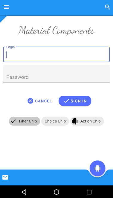
BottomAppbar
BottomAppbar – это что-то похожее на Appbar, только с возможностью прикрепления Floating Action Button и вырезом под него. Предназначен для работы внутри CoordinatorLayout.
Вот некоторые параметры, которые мы можем кастомизировать:
- app:backgroundTint — цвет заполненного пространства
- app:fabAlignmentMode — положение FAB
- app:fabCradleMargin — отступ между FAB и BottomAppbar
- app:fabCradleRoundedCornerRadius — закругление на углах выреза для FAB
- app:fabCradleVerticalOffset
- app:hideOnScroll
На момент написания статьи, BottomAppBar доделан не до конца. Например, нельзя разместить NavigationIcon в центре по вертикали, но, наверное, это скоро допилят.
Chips
Chip – еще одна новая View в библиотеке. С её помощью можно удобно показывать перечисление небольших объектов. Например, фильтры или какие-нибудь подсказки для пользователя. По гайдлайнам Chip обладает следующими свойствами:
- Может иметь иконку контента (слева).
- Может иметь иконку для удаления (справа).
- Содержит текст.
- Может находится в двух состояниях, как CheckBox.
Реализация в Material library представляет из себя расширенную версию AppCompatCheckBox, и может порадовать нас такими кастомизируемыми параметрами:
- app:chipCornerRadius
- app:chipMinHeight
- app:chipBackgroundColor
- app:chipStrokeColor
- app:chipStrokeWidth
- app:rippleColor
- android:text
- android:textAppearance
- app:chipIconVisible
- app:chipIcon
- app:chipIconTint
- app:chipIconSize
- app:closeIconVisible
- app:closeIcon
- app:closeIconSize
- app:closeIconTint
- app:checkable
- app:checkedIconVisible
- app:checkedIcon
- app:showMotionSpec
- app:hideMotionSpec
Приятно удивило наличие ChipGroup, являющегося наследником FlexboxLayout, которого наконец-то включили в библиотеку дизайна.
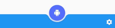
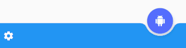
BackDrop
BackDrop – новый для Android паттерн навигации. Есть основной контент, который расположен на переднем плане, и дополнительная область, лежащая позади (обычно это меню навигации). Если нужно добраться до контента сзади, то передний план съезжает вниз до нужного уровня.
Состоит Backdrop из трех элементов:
На момент написания статьи он еще не реализован в библиотеке, и в соответствующем репозитории пока пусто. Поэтому пришлось делать свою реализацию, обернув ее в библиотеку:
Просто прикрепляем BackdropBehavior на нужный Front Container и передаем ему Toolbar и Back Container.
XML
Kotlin
Это просто один из вариантов реализации. Но для моего кейса получилось удобно. Думаю, решение Google будет несколько отличаться. Если вдруг есть предложения, то с радостью готов обсудить их в комментариях под статьей.
MaterialButtons
MaterialButtons – обновленные более кастомизируемые кнопки. У них есть следующие параметры для кастомизации:
- android:inset (Left, Top, Right, Bottom) — отступ кнопки от края View
- app:backgroundTint — цвет заполнения кнопки
- app:backgroundTintMode
- app:icon — можно добавить иконку, по умолчанию слева от текста
- app:iconPadding
- app:iconTint
- app:iconTintMode
- app:strokeColor — для создания кнопок с обводкой
- app:strokeWidth
- app:cornerRadius
- app:rippleColor
Конечно, эти стили для кнопок всегда можно сделать самостоятельно. Но теперь кастомизация кнопок хорошо работает «из коробки», и это очень удобно.
Например, чтобы сделать кнопку с крестиком, раньше пришлось бы писать два XML файла:
Layout:
bg_button.xml
Теперь описать кнопку можно сразу на месте:
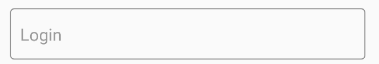
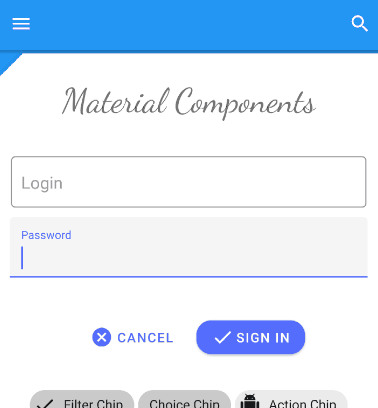
Text Fields
Text Fields – тоже претерпел изменения. Теперь текстовому полю «из коробки» можно добавить обводку по контуру, сделать его залитым каким-то цветом, или закруглить отдельные углы.
Как и раньше, можно использовать конструкцию из InputLayout с дочерним EditText, для более удобного для отображения подсказок, ошибок и прочего выделения текста.
- app:boxCornerRadiusTopLeft
- app:boxCornerRadiusTopRight
- app:boxCornerRadiusBottomLeft
- app:boxCornerRadiusBottomRight
- android:hint
- app:hintEnabled
- app:errorEnabled
- app:setError
- app:helperTextEnabled
- app:helperText
- app:passwordToggleEnabled
- app:passwordToggleDrawable
- app:counterEnabled
- app:counterMaxLength
Изменения тоже не очень существенные, но кастомные решения можно разрабатывать теперь намного быстрее. С точки зрения бизнеса, скорость разработки имеет значение, и тут Google постарались неплохо.
MaterialCardView
MaterialCardView – это все старая CardView, но теперь с обводкой по контуру, как у кнопок.
Итого
Существенных изменений не так много. Новые механизмы кастомизации просто позволяют сделать чуточку проще то, что мы все делали и раньше. Зато появилась проблема совместимости с Support library. Разработчикам библиотек придется переезжать на Android X, что отнимет много времени и нервов. Особенно, если учесть, какая кодовая база сейчас support-ориентированна. Несмотря на то, что Google предоставляет инструмент для автоматизации переезда с заменой всех импортов, работает он не идеально. Подобные переезды на своих проектах все-таки придется пережить с некоторыми трудностями.
На данный момент не все заявленные Material-компоненты реализованы корректно, а некоторые не реализованы совсем. Будем смотреть, будем пробовать.
Источник
Upgrading to Material Components

M aterial Components (part of Android Jetpack) bring redesign for well known UI elements and even add new ones to the entire collection. In this article we’ll take a look at them — their appearance, behaviour and what is the most important — how to upgrade an app in order to check them out in practice. And of course, when upgraded, how to implement them in an easy and clear way.
AndroidX vs Support Library
Material Components are part of AndroidX, which is a succeedor of Support Library, bringing newer OS features to older Android versions. AndroidX simply maps the original Support Library API packages into the androidx.* namespace. Only the package and Maven artifact names changed. Classes, methods, and field names did not change. This is finally a huge step to clean and order the confusing mess of old artifacts and package names.
Short overview of included features:
- Material Design components compatible with older Android versions
- Android KTX (set of Kotlin extensions)
- Smaller, specified packages
- Architecture Components & Support Library together under androidx.* packages
It’s also worth emphasizing that new UI elements are included in API 28. However, keep in mind that Support Libraries will no longer be updated by Google. We can avoid refactoring the whole project at the moment, but it is strongly recommended to upgrade to AndroidX as soon as possible.
How to upgrade to AndroidX?
There are few ways of it, all of them require Android Studio 3.2 or higher:
1. Automatic refactoring to AndroidX
- Upgrade Gradle to version 4.8 or higher ( see Upgrade Gradle section below)
- Menu > Refactor > Migrate to AndroidX

If you have any dependencies that have not been migrated to the AndroidX namespace, set android.enableJetifier to true and Gradle system will automatically migrate them. Otherwise, set to false .
2. “ Non automatic” refactoring
- Upgrade Gradle version in gradle-wrapper.properties:
- Add following lines to gradle.properties file:
- Update build.gradle (Project level):
- Update build.gradle (Module: App) — in order to use AndroidX, app has to target API level 28:
- Add following lines to build.gradle (Module: App) file, replacing standard Support Libraries — these libraries will let you try out all the examples from the article:
- Change your styles in styles.xml to inherit from MaterialComponents instead of AppCompat :
- Change prefixes of packages used in project to use AndroidX ones:
For Support Library: android.support.* to androidx.*
For Design Library: android.design.** to com.google.android.material.*
Note: for exact import mappings, check out the official documentation .
- Done! Your project is configured to use the new namespace and its components.
Implementing the UI
NOTE: all examples from this article will be explained using com.google.android.material namespace.
TextInputLayout

Material TextInputLayout comes with new types of text boxes: Outlined and Filled. Both come with smooth corner roundings and updated hint animation behaviour. To create a Material text field, add a TextInputLayout to your XML file and TextInputEditText as a direct child.
OutlinedBox
Outlined text fields have less visual emphasis than filled text fields. When they appear in places like forms, where many text fields are placed together, their reduced emphasis helps simplify the layout.
Remember to add style TextInputLayout.OutlinedBox to your View:
FilledBox
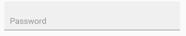
Filled text fields have more visual emphasis than outlined text fields, making them stand out when surrounded by other content and components.
Remember to add style TextInputLayout.FilledBox to your View:
Material Button
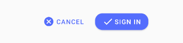
Material Buttons generally come in two main types: Button and Text Button. Both have elevation and ripple effect by default, optional icons, icon padding and optional button corner radius.
Filled, elevated Button
The default style represents an button with an elevation and a colored background.
Text Button
This type has a transparent background with colored text. Text buttons are used for low-priority actions, especially when presenting multiple options.
Chips
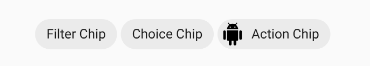
Chips are compact elements that represent an input, attribute or action. Chips allow users to enter information, make selections, filter content, trigger actions and look like perfect component for tagging. Unlike Buttons, Chips were fully designed for dynamic and interactive content.
Chips should be aggregated in groups. In order to provide them, add ChipGroup container to your XML layout file:
There are several types of Chips. Any of them can be regular or outlined.

Filter chips use tags or descriptive words to filter content. They contain optional chip icon, optional close icon and are always checkable.

Choice chips allow selection of a single chip from a set of options. They contain optional chip icon and are always checkable.

They offer actions related to primary content in a particular dynamic context (unlike Buttons, that are static).
Bottom App Bar
BottomAppBar is an evolution from standard Material guidance. Visually anchors the UI, puts more focus on features and increases engagement. It comes with several alignment modes: we can have anchored FloatingActionButton (center or end) or no fab anchored. There are also several useful attributes available to modify fab’s cradle apperarance, such as app:fabCradleMargin , app:fabCradleRoundedCornerRadius , app:fabCradleVerticalOffset . We can also of course, assign a custom menu — via XML or programatically.
Activity layout XML:
Code above will make your Top App Bar empty and make Bottom Bar default for action icons. If you want to have two Bars on one screen, just set your Top Toolbar as SupportActionBar instead of Bottom and assign different menus to both of them.
Backdrop Menu
As a newest way of interacting with user, a backdrop is the furthest back surface of an app, appearing behind all other content and components. It’s composed of two surfaces: a back layer (which displays actions and filters) and a front layer (which displays content). Back layer can be available for user via standard “Hamburger” icon in top left corner. You can use a backdrop to display interactive information and actions, such as navigation or content filters.
For the best tutorial of implementing the menu, I recommend trying out this one from Google’s Material Advanced Codelabs. It provides clear, step-by-step explanation of how to make back layer, place it in a right place and finally implement the menu with proper design and animation.
That’s all for today, it’s been ages since my last post and that was so much fun to come back with a brand new content 🙂 Don’t forget to 👏👏👏 and leave your opinions and comments 🙂
My last two posts ( first and second ) on AndroidPub got over !2.5 K! claps and immensely great amount of new readers. Thank you very much!
Источник


