- Material Design for Android
- Developer Docs
- Video
- Video
- Video
- Material Theme
- Lists and Cards
- View Shadows
- Animations
- Drawables
- Android Material Design and the Design Support Library
- Prerequisites
- Project setup
- AppCompat theme & colors
- Toolbar
- Include the Toolbar
- Setup the action menu
- Customise Toolbar
- TextInputLayout
- Floating Action Button
- Snackbar
- CoordinatorLayout
- PercentRelativeLayout
- Summary
- Adam Jodłowski
- X-Team Weekly
Material Design for Android
Developer Docs
Creating Apps with Material Design
Video
Introduction to Material Design
Video
Paper and Ink: The Materials that Matter
Video
Material Design in the Google I/O App
Material design is a comprehensive guide for visual, motion, and interaction design across platforms and devices. Android now includes support for material design apps. To use material design in your Android apps, follow the guidelines defined in the material design specification and use the new components and functionality available in Android 5.0 (API level 21) and above.
Android provides the following elements for you to build material design apps:
- A new theme
- New widgets for complex views
- New APIs for custom shadows and animations
For more information about implementing material design on Android, see Creating Apps with Material Design.
Material Theme
The material theme provides a new style for your app, system widgets that let you set their color palette, and default animations for touch feedback and activity transitions.

Dark material theme

Light material theme
Lists and Cards
Android provides two new widgets for displaying cards and lists with material design styles and animations:

The new RecyclerView widget is a more pluggable version of ListView that supports different layout types and provides performance improvements.

The new CardView widget lets you display important pieces of information inside cards that have a consistent look and feel.
View Shadows
In addition to the X and Y properties, views in Android now have a Z property. This new property represents the elevation of a view, which determines:
- The size of the shadow: views with higher Z values cast bigger shadows.
- The drawing order: views with higher Z values appear on top of other views.
Animations
The new animation APIs let you create custom animations for touch feedback in UI controls, changes in view state, and activity transitions.
These APIs let you:
- Respond to touch events in your views with touch feedback animations.
- Hide and show views with circular reveal animations.
- Switch between activities with custom activity transition animations.
- Create more natural animations with curved motion.
- Animate changes in one or more view properties with view state change animations.
- Show animations in state list drawables between view state changes.
Touch feedback animations are built into several standard views, such as buttons. The new APIs let you customize these animations and add them to your custom views.
Drawables
These new capabilities for drawables help you implement material design apps:
- Vector drawables are scalable without losing definition and are perfect for single-color in-app icons.
- Drawable tinting lets you define bitmaps as an alpha mask and tint them with a color at runtime.
- Color extraction lets you automatically extract prominent colors from a bitmap image.
Источник
Android Material Design and the Design Support Library
Android as an operating system has undergone many visual overhauls over the years, and the current incarnation of those is Material Design. The comprehensive guide from Google thoroughly explains its concepts, but probably concerns designers and UI experts the most. From a programmers perspective though, some of the effects were difficult to achieve and were inconsistent across applications because of using custom solutions or third-party libraries. Thankfully, Google created the Design Support Library that now contains all commonly used visual components for us to use. No more custom code needed.
The following tutorial contains an overview of the Material Design UI components with example code for including and customising them in your application. All of them can be used independently from others, so you can treat every section as a reference guide.
Prerequisites
Please refer to the base tutorial How To Get Started With Android Programming for an explanation of basic Android concepts. This tutorial directly expands on that base project — you can download the initial source code here.
Project setup
Open your app’s build.gradle file and add Design Support Library in dependencies section. Sync project.
AppCompat theme & colors
In the newest versions of Android Studio, the theme for the entire application is set by default in the AndroidManifest.xml to AppTheme :
Command-click on the @style/AppTheme to see the resource file located in /res/values/styles.xml folder of your application.
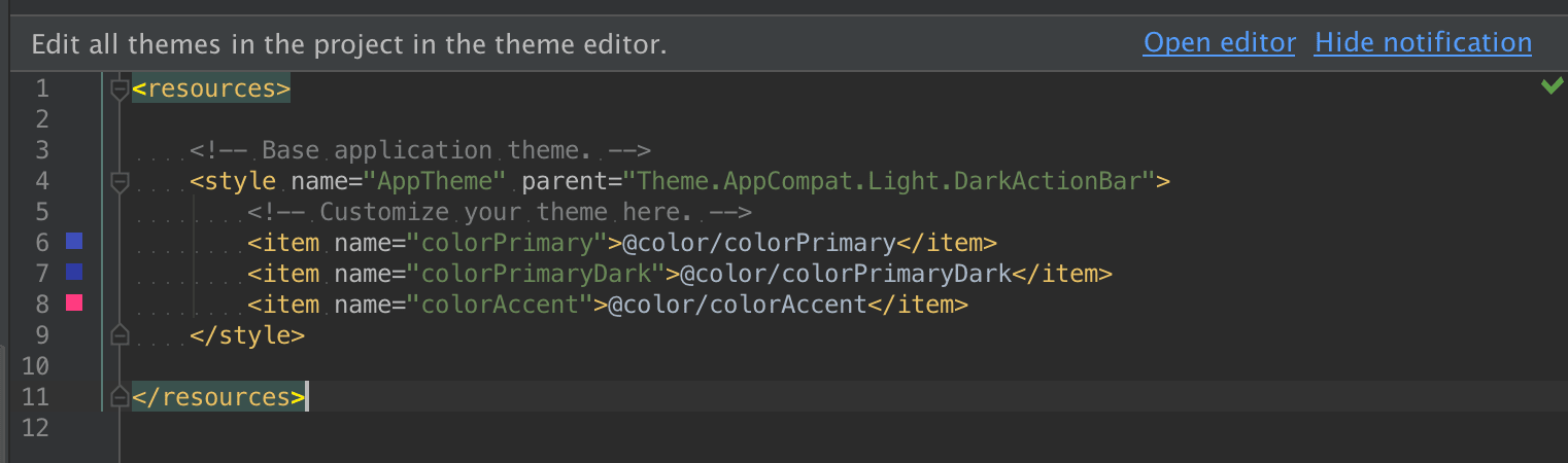
As you can see, our theme has a parent named Theme.AppCompat.Light.DarkActionBar (feel free to modify this using code autocompletion to see what other themes are available) and defines three custom colors: colorPrimary , colorPrimaryDark , and colorAccent . This is a convention introduced by using Material Design and AppCompat, that allows us to quickly change the color scheme of the entire application. This AppCompat Theme is a back-port of Material theme (available only on Android 5.0+) to use on older platforms, which is the preferred way to go for the sake of backward compatibility.
Notice the prompt Edit all themes in the project in the theme editor. — click on Open editor, it will display the visual editor which helps to find the right color scheme by displaying previews of visual components. This is a very helpful tool.

To customise a color scheme manually, you can always go to /res/values/colors.xml and modify the values, or add new ones with the corresponding theme properties in styles.xml .
Toolbar
The Toolbar is essentially a concrete implementation of App Bar, which has been previously known as the Action Bar. Although visually very similar, the Toolbar brings improvements over the well-known actionbar pattern — being a ViewGroup , it can contain arbitrary widgets within itself and can be placed anywhere in your application layout. It is not part of a window decoration (as a theme attribute) anymore.
Include the Toolbar
Our currently applied theme Theme.AppCompat.Light.DarkActionBar does just that — provides the ActionBar. Let us change that to Theme.AppCompat.Light.NoActionBar in styles.xml . Now there is no default ActionBar added to our Activity layouts, so we need to add it as another widget in the View hierarchy.
We have added the Toolbar and moved the TextView relatively below it by adding the android:layout_below=»@id/toolbar property. As you can see, so far it is empty.
The Toolbar can be set up as the ActionBar for the Activity, but that needs to be done in code. Modify the MainActivity.java . Notice the support package containing the Toolbar:
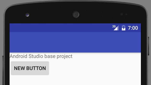
Now, run the app. It displays the Playground title in the Toolbar, but it is black on dark blue background — remedy this by setting additional properties on it:
The popupTheme will come in handy in the next section.
Setup the action menu
In order to provide custom actions in the Toolbar, we need to perform the same steps that the ActionBar would require:
- define menu XML
- implement callback methods in the Activity
Create a new resource file /res/menu/main.xml :
Add two methods to the MainActivity.java :
You should see action items in the Toolbar now.
Customise Toolbar
Because it is an ordinary ViewGroup component, we can place arbitrary View hierarchies inside it. Modify the Toolbar node in activity_main.xml :
In MainActivity.java , get a reference to ActionBar in the onCreate() method and hide its title:
Please notice that we are using SupportActionBar. It gives us a reference to the activity’s ActionBar, in this particular case — it is a Toolbar instance, fully compatible with the ActionBar’s API. The final effect should look like this:

TextInputLayout
This handy layout wraps around the TextView and provides a few useful functions that most Android programmers have had to code manually at some point. Add this XML to the activity layout:
And this code at the end of the onCreate() method:
- adds a counter to the TextView, sets its max number of characters and enables it
- adds an error message that normally should be done dynamically in response to some kind of validation method
The final effect looks like this:

Floating Action Button
FAB is a new concept of a single, clearly visible ImageButton that invites the user to take a significant, contextual action specific to the screen he is on. This may be composing a new email, taking a photo, or editing the currently viewed calendar event. It is also a showcase of shiny new Material properties, which are elevation (casting a shadow on elements underneath) and the ripple click effect.
Add the FAB at the end of the layout file:
Let’s add OnClickListener in MainActivity ‘s onCreate() method:
As you can see, the FAB has the additional functionality of animating its view when hiding or showing.

Snackbar
The Snackbar is a next-level Toast. It can briefly appear on the screen and can have one optional action that happens on click. It is usually used to confirm actions, such as archiving an email or sending a message and additionally provides a contextual undo action for what we have just done. It is straightforward to use because the API is similar to its predecessor. Modify the part of the code responsible for the FAB from the previous section:
Play with the Snackbar.LENGTH parameters, different text colors and custom duration you can set via helper setters. As you can see:
- instead of Context , we provide a View for Snackbar construction (see the next section)
- the action text has been capitalized
- the Snackbar appeared on the bottom of the screen, without any changes to the XML layout
- by default, it covers everything underneath — this is not good when we use FAB, but we will fix it in the next section

CoordinatorLayout
What we were missing in the previous section is the CoordinatorLayout — an intelligent FrameLayout that is aware of the interactions between views — scrolling, moving views around, etc. By implementing Behaviors, child views can define their interactions and layout modifications they would like to perform in reaction to others. Support Library components provide default behaviors, and we are going to make use of those now.
Modify the activity_main.xml to accommodate CoordinatorLayout and extract the FAB from the RelativeLayout containing other components:
We have wrapped the FAB into a CoordinatorLayout in XML, now we need to set it as Snackbar’s anchor view in onCreate() :
Thanks to the default Behaviors and CoordinatorLayout, Snackbar pushes up the FAB when it appears on screen.

PercentRelativeLayout
One neat addition to the SupportLibrary is PercentRelativeLayout that (finally) allows us to define relative dimensions as a percentage of available space.
Add the dependency in the build.gradle file:
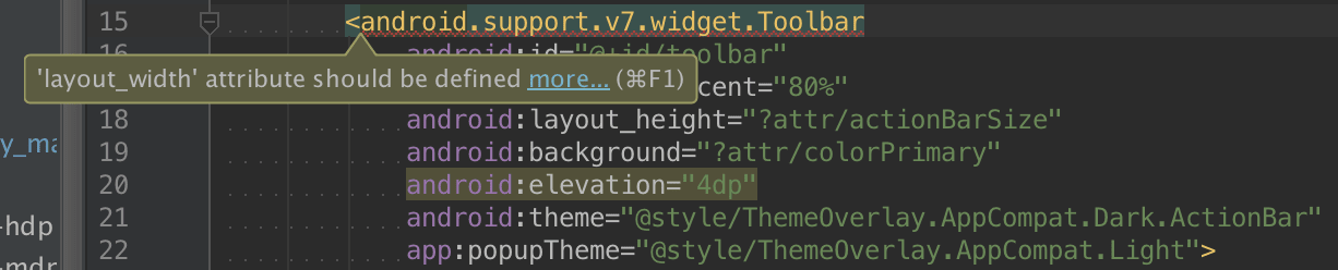
Change the RelativeLayout to PercentRelativeLayout and alter the width of Toolbar (just for fun) replacing android:layout_width=»wrap_content» attribute with app:layout_widthPercent=»80%» :
Feel free to rotate the screen to see if the width is still relative to the overall width. The final effect should look like this (it also proves that the Toolbar is just another View):

You can encounter errors using those percentage attributes:
This will go away once the tools get updated to recognize the Percentage Library, but the actual compilation should go just fine.
Summary
In this tutorial, you have learned the basics of Material Design, which dramatically changed how modern Android apps look like, as well as interact with the users. You are now able to take advantage of the most popular building blocks provided by Android and to use the Design Support Library on newest and older Android devices.
The source code for this tutorial can be found on GitHub.

Adam Jodłowski
X-Team Weekly
Our curated newsletter across programming, productivity, and inspiration.
Keep up to date with the X-Team culture.
Источник


