- Navigation Drawer в стиле Material Design за 5 минут
- Создание проекта
- Android Support Library
- Подключение библиотеки MaterialDrawer
- Подготовка разметки для Navigation Drawer
- Инициализация Navigation Drawer
- Улучшения Navigation Drawer
- Bottom Navigation Bar in Android
- Steps for Creating Bottom Navigation Bar
- Style Navigation Bar on Android
- Add Material Components Dependence
- Create Navigation bar from XML
- Style with XML file
- Create with Jetpack Compose
- Style with Jetpack Compose
- Conclusion
Navigation Drawer в стиле Material Design за 5 минут
 В данной статье я расскажу, как быстро добавить в ваше приложение для Android боковое меню (aka Navigation Drawer) в стиле Material Design. Для этого мы воспользуемся библиотекой, любезно предоставленной Mike Penz.
У вас получится Navigation Drawer, который:
- Соответствует последним рекомендациям по дизайну (Google Material Design Guidelines);
- Поддерживает использование нескольких Drawer (можно выдвигать второй справа);
- Поддерживает использование бейджей;
- Имеет простой и понятный интерфейс (API);
- Может выползать как под, так и поверх Status Bar;
- Позволяет менять иконки, цвета, бейджи во время выполнения;
- Использует AppCompat support library;
- Работает, начиная с API 14.
Помимо этого, новички обучатся интеграции сторонних библиотек в свой проект, что крайне полезно, учитывая их грандиозное разнообразие на Github.
Создание проекта
В примере будет использоваться интегрированная среда разработки Android Studio от компании Google, основанная на IntelliJ IDEA, которую сама корпорация активно продвигает. Все действия можно воспроизвести используя и другие среды, например, Eclipse. Однако статья ориентирована на новичков, а они будут в большинстве своем использовать именно Android Studio, так как именно его Google теперь и предлагает при скачивании Android SDK с developer.android.com (ранее можно было скачать Eclipse).
Итак, выбираем в меню «File» -> «New Project. »:
Заполняем имя приложения, пакета, выбираем SDK.
Создавать проект мы будем с поддержкой минимального API Level равного 14, что соответствует Android 4.0 Ice Cream Sandwich, поскольку всё, что ниже, составляет менее 8% аудитории и привносит несоизмеримо большее количество головной боли:
В последних двух окнах оставляем все по умолчанию, жмем «Finish».
Android Support Library
Для того, чтобы красивый Navigation Drawer работал на версиях Android ниже 5.0 и выглядел в стиле Material Design, необходимо включить в проект библиотеку поддержки от Google, которая носит название v7 appcompat library. В текущей версии Android Studio (1.0.2) библиотека подключается по умолчанию при создании проекта. Проверьте это в файле проекта \app\build.gradle, в разделе dependencies должна быть строка (цифры могут быть не обязательно «21.0.3»):
а класс MainActivity должен наследоваться от ActionBarActivity
Также проверьте в \res\values\styles.xml, чтобы тема приложения наследовалась от Theme.AppCompat или ее вариаций без ActionBar (мы заменим ActionBar на ToolBar), например:
Подключение библиотеки MaterialDrawer
Добавьте в раздел dependencies файла \app\build.gradle строки
и нажмите появившуюся в верхней части окна кнопку «Sync Now» для синхронизации вашего проекта.
Подготовка разметки для Navigation Drawer
В главный layout приложения нужно добавить ToolBar. Приведите activity_main.xml к такому виду:
Создайте в папке layout файл drawer_header.xml со следующим содержанием
этот файл — разметка для верхней части Drawer’a, в которой находится картинка. Теперь положите в папку \res\drawable\ любую картинку с именем header.jpg, которая будет отображаться в верхней части Drawer’a, например эту: 
Файл \res\strings.xml, содержащий строковые ресурсы, приведите к следующему виду
Инициализация Navigation Drawer
В методе onCreate вашей MainActivity мы инициализируем ToolBar, добавьте после setContentView следующий код:
Затем инициализируем и сам Navigation Drawer, добавьте ниже:
В случае появления ошибок, убедитесь, что ваша секция импортов в MainActivity выглядит так:
Теперь можно запустить приложение и оценить результат:
Улучшения Navigation Drawer
Чтобы Navigation Drawer еще точнее соответствовал рекомендациям от Google, можно сделать следующие улучшения (см. полный листинг MainActivity в конце статьи):
- Скрывать клавиатуру при открытии NavigationDrawer:
Закрывать NavigationDrawer по нажатию системной кнопки «Назад»:
Реализацию всех этих улучшений вы можете посмотреть в полном листинге MainActivity:
Источник
Bottom Navigation Bar in Android
We all have come across apps that have a Bottom Navigation Bar. Some popular examples include Instagram, WhatsApp, etc. In this article, let’s learn how to implement such a functional Bottom Navigation Bar in the Android app. Below is the preview of a sample Bottom Navigation Bar:

Why do we need aBottom Navigation Bar?
- It allows the user to switch to different activities/fragments easily.
- It makes the user aware of the different screens available in the app.
- The user is able to check which screen are they on at the moment.
The following is an anatomy diagram for the Bottom Navigation Bar:

Steps for Creating Bottom Navigation Bar
Step 1: Create a new Android Studio project
Step 2: Adding the dependency to the build.gradle(:app) file
We will be using Android’s Material Design Library so we need to import it in the build.gradle(:app) file. Here’s the dependency we need to add:
Step 3: Working with activity_main.xml file
For this example, create a basic app with a FrameLayout and a Bottom Navigation Bar. The FrameLayout will contain Fragments which will change as the user click on the items in the Bottom Navigation Bar. This is how the activity_main.xml looks like:
Step 4: Creating a menu for the Bottom Navigation Bar
The Navigation Bar needs to have some items which will create using Menu. To create a Menu, first, create a Menu Directory by clicking on the app -> res(right-click) -> New -> Android Resource Directory and select Menu in the Resource Type.

To create a Menu Resource File , click on the app -> res -> menu(right-click) -> New -> Menu Resource File and name it bottom_nav_menu.

Now the user can create as many items as he wants in the bottom_nav_menu.xml file. The user also needs to create an icon for each of these items. To create an icon, click on the app -> res -> drawable(right-click) -> New -> Image Asset.

In the window that opens, the user can name the icon whatever he wants but it should not comprise any uppercase letter. The user can select the icon he wants by searching it and when the user is done, click Next-> Finish.
Источник
Style Navigation Bar on Android

This is the third post of my style bars on Android series. If you want to know more about other Android UI bars, you can find how to style the action model here and the system toolbar here.
Navigation bar here I refer to the bottom navigation bar, which allows the user to switch between different screens(activities/fragments) easily. It is part of the Material Components for Android library.
There are two ways to style the navigation bar depends on how you create it. One is using the XML style file if you create the navigation bar from XML. The other one is to change it using code. As the Jetpack Compose is ready for production now, I will use Jetpack Compose to create/style it but you can also use the standard way to reference the view and update the style.
In this post, I’ll go through both ways to create/style the bottom navigation bar with the most common use cases. To explore the idea, I created a very simple demo, which you can check here.
Add Material Components Dependence
As I mentioned in the introduction, the navigation bar is included in the martial component, so you need to add the material dependences first.
There are two parts you need to be aware of : the app’s compileSdkVersion need to be 30+ and use AppCompatActivity or AppCompatDelegate to ensure all the components work correctly. You also need to inherent your system-level style from one of the material styles, but I will talk about it more in the style with XML section.
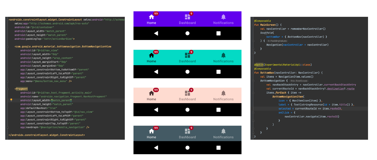
Create Navigation bar from XML
Using a bottom navigation bar on Android is very straightforward, a typical layout would look something like this:
The BottomNavigationView will be set the contains with layout_constraintBottom_toBottom to parent view and the menu items will be configured from the menu XML file. Before we move to how to style the UI, let’s go one level deeper to check how this UI is built. If you use the layout inspector or read the source code of BottomNavigationView , it extends the NavigationBarView , which is customers view, can hold no more than 5 ( MAX_ITEM_COUNT ) menu items. Here is the hierarchy view of the BottomNavigation and its subviews.

- BottomNavigationView: the root container view of the bottom navigation bar, which extends the FrameLayout .
- NavigationBarItemView: the menu item view, which also extends the Framelayout . It contains the icon, labels and badge views for each menu item.
- Icon: is an ImageView and the AppCampImageView will be automatically used to support compatible features on older versions of the platform.
- Label group: extends the BaseLineLayout . It contains the large and small text label views and aligns the views inside on a baseline. You can only see one text label at one time. The visibility of the text labels will be switched based on the menu item is active or not.
- Text Label: is a MateriaTextView , large and small labels will share the same text appearance by default. You can use setTextAppearanceActive and setTextAppearanceInactive to change the text appearance with specified style resources .
- Badge: This is a very interesting one, as it doesn’t show in the layout inspector. Once you check the code, it is a BadgeDrawable class. For API 18+, the BadgeDrawable will be added as a view overlay to the NavigationBarItemView . More detail regarding the badge view you can find here.
Style with XML file
Now we know how the BottomNavigationView is created with these subviews. To style the bottom navigation bar is just to style each of the subview components. BottomNavigationView can be customized in terms of colour and typography. As the BottomNavigationView is a material component, you need to inherit from a Material Components theme or a Material Components Bridge theme. Several attributes that will inherit from the default material theme Widget.MaterialComponents.BottomNavigationView.colored . More navigation bar attributes you can find here.
- Container background colour: you can override it with colorPrimary or backgroundColor from materialThemeOverlay . Otherwise, it will use the colorPrimary from the app-level theme.
- Text label style: you can style the text label as a normal material text view. There are two states you can override: itemTextAppearanceInactive and itemTextAppearanceActive for small and large (unselected and selected state) label text views. You can override it with itemTextColor from BottomNavigaitonView or the colorOnPrimary from the default app-level theme and this will apply to both text labels.
- Icon: if you don’t set anything, the default behaviour will work here. For inactive state, the overlay will be added 60% of the colorOnSurface . You can also use the selector state to change the icon state colour.
- Badge: you can override the background colour ( backgroundColor ), text colour ( badgeTextColor ) or even gravity of the text ( badgeGravity ) from the style Widget.MaterialComponents.Badge . More attributes about the badge component you can find here.
Create with Jetpack Compose
In the Jetpack Compose material library, each material component is an interactive building block. You can use or combine them to create a UI. Here is the code snippet of the same layout as the XML version.
The following components are used to create the bottom navigation bar:
- BottomNavigation: the container composable for the bottom navigation bar, which needs to be configured as the bottomBar in Scafford .
- BottomNavigaiton Item: has the same structures as the XML one. There is no restriction for the menu items in the code now, but I wouldn’t suggest adding more than 5 items even we have a bigger screen.
- Icon and Lable: two container composable. In principle, you can put any composable you want but the item composable may not be able to display it.
- BadgeBox: this component is still an experimental composable, which accept the badgeContent (RowScope) and content (BoxScope). In the current Compose Material version ( 1.0.2 ), even you don’t set anything in the badgeContent , it will still display a round circle with the default colour red.
Decoupling is one of the main benefits Jetpack Compose provides as everything will be written in Kotlin. The layout hierarchy is also cleaner than the XML version. There is only one text label in the hierarchy now.

Style with Jetpack Compose
The core element for implementing theming in Jetpack Compose is the MaterialTheme composable. Placing this composable in your compose hierarchy allows you to specify the colour, type and shapes for all components within it. If you are using Jetpack Compose in an existing code, same as the demo project, you can use the adaptor library to bridge the gap between the XML theme and theme in Jetpack Compose. You don’t need to reference these XML files in your Kotlin code and making modifications to them. But there are some known limitations you can find here. The composable default value and export attributes make it easier to style the components. The default values are inherited the same as the ones from the XML style file and you can find some examples below.

Conclusion
In this post, I have given a basic description of how to create/style the bottom navigation bar in two different ways. I hope this post gives you some ideas to style your bottom navigation bar UI. You can find more details from the code in the demo project and play with the code to explore other possibilities. If you have any questions, thoughts or suggestions, feel free to leave comments or let me know if you’d like to hear more.
Источник


