React Native date & time picker component for iOS and Android
React Native DateTimePicker
React Native date & time picker component for iOS and Android.
iOS
Getting started
RN >= 0.60
If you are using RN >= 0.60, only run pod install from the ios directory. Then rebuild your project.
RN react-native link :
Then run pod install from the ios directory and rebuild your project.
If this does not work, see Manual installation.
General Usage
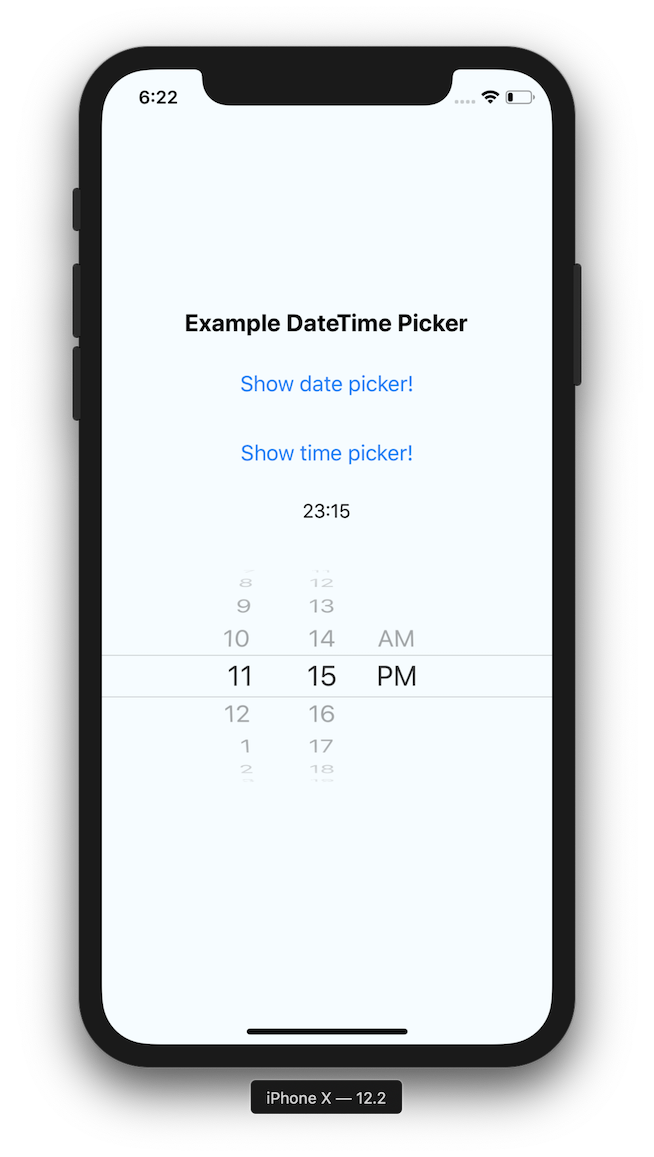
Basic usage with state
Props
Please note that this library currently exposes functionality from UIDatePicker on iOS and DatePickerDialog + TimePickerDialog on Android.
These native classes offer only limited configuration, while there are dozens of possible options you as a developer may need. It follows that if your requirement is not supported by the backing native views, this libray will not be able to implement your requirement. When you open an issue with a feature request, please document if (or how) the feature can be implemented using the aforementioned native views. If those views do not support what you need, such feature requests will be closed as not actionable.
mode ( optional )
Defines the type of the picker.
List of possible values:
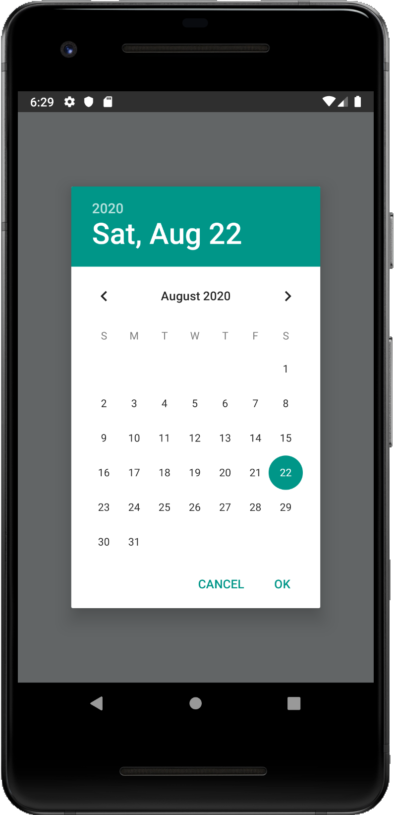
«date» (default for iOS and Android )
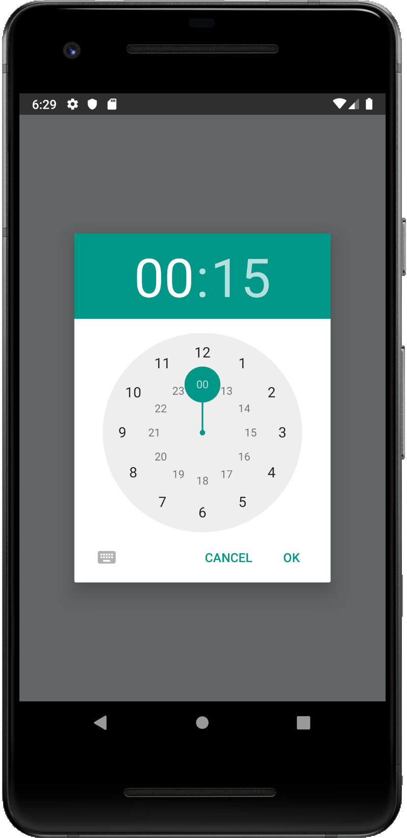
«time»
«datetime» ( iOS only)
«countdown» ( iOS only)
display ( optional , Android only )
Defines the visual display of the picker for Android and will be ignored for iOS.
List of possible values:
«default»
«spinner»
«calendar» (only for date mode)
«clock» (only for time mode)
onChange ( optional )
Date change handler.
This is called when the user changes the date or time in the UI. It receives the event and the date as parameters.
value ( required )
Defines the date or time value used in the component.
maximumDate ( optional )
Defines the maximum date that can be selected.
minimumDate ( optional )
Defines the minimum date that can be selected.
timeZoneOffsetInMinutes ( optional , iOS only )
Allows changing of the timeZone of the date picker. By default it uses the device’s time zone.
textColor ( optional , iOS only )
Allows changing of the textColor of the date picker.
locale ( optional , iOS only )
Allows changing of the locale of the component. By default it uses the device’s locale.
is24Hour ( optional , Android only )
Allows changing of the time picker to a 24 hour format.
neutralButtonLabel ( optional , Android only )
Allows displaying neutral button on picker dialog. Pressing button can be observed in onChange handler as event.type === ‘neutralButtonPressed’
minuteInterval ( optional , iOS only )
The interval at which minutes can be selected. Possible values are: 1, 2, 3, 4, 5, 6, 10, 12, 15, 20, 30
style ( optional , iOS only )
Sets style directly on picker component. By default height of picker is fixed to 216px.
Migration from the older components
RNDateTimePicker is the new common name used to represent the old versions of iOS and Android.
On Android, open picker modals will update the selected date and/or time if the prop value changes. For example, if a HOC holding state, updates the value prop. Previously the component used to close the modal and render a new one on consecutive calls.
DatePickerIOS
initialDate is deprecated, use value instead.
date is deprecated, use value instead.
onChange now returns also the date.
onDateChange is deprecated, use onChange instead.
DatePickerAndroid
date is deprecated, use value instead.
minDate and maxDate are deprecated, use minimumDate and maximumDate instead.
dateSetAction is deprecated, use onChange instead.
dismissedAction is deprecated, use onChange instead.
TimePickerAndroid
hour and minute are deprecated, use value instead.
timeSetAction is deprecated, use onChange instead.
dismissedAction is deprecated, use onChange instead.
Contributing to the component
Manual installation
Install CocoaPods, here the installation guide.
Inside the iOS folder run pod init , this will create the initial pod file.
Update your pod file to look like the following ( Remember to replace MyApp with your target name ):
Run pod install inside the same folder where the pod file was created
Источник
React native datetimepicker android
A declarative cross-platform react-native date and time picker.
This library exposes a cross-platform interface for showing the native date-picker and time-picker inside a modal, providing a unified user and developer experience.
Setup (for non-Expo projects)
If your project is not using Expo, install the library and the community date/time picker using npm or yarn:
Please notice that the @react-native-community/datetimepicker package is a native module so it might require manual linking.
Setup (for Expo projects)
If your project is using Expo, install the library and the community date/time picker using the Expo CLI:
To ensure the picker theme respects the device theme, you should also configure the appearance styles in your app.json this way:
Refer to the Appearance documentation on Expo for more info.
👉 Please notice that all the @react-native-community/react-native-datetimepicker props are supported as well!
Name
Type
Default
Description
backdropStyleIOS
style
The style of the picker backdrop view style (iOS)
cancelButtonTestID
string
Used to locate cancel button in end-to-end tests
cancelTextIOS
string
«Cancel»
The label of the cancel button (iOS)
confirmButtonTestID
string
Used to locate confirm button in end-to-end tests
confirmTextIOS
string
«Confirm»
The label of the confirm button (iOS)
customCancelButtonIOS
component
Overrides the default cancel button component (iOS)
customConfirmButtonIOS
component
Overrides the default confirm button component (iOS)
customHeaderIOS
component
Overrides the default header component (iOS)
customPickerIOS
component
Overrides the default native picker component (iOS)
date
obj
new Date()
Initial selected date/time
isVisible
bool
false
Show the datetime picker?
isDarkModeEnabled
bool?
undefined
Forces the picker dark/light mode if set (otherwise fallbacks to the Appearance color scheme) (iOS)
modalPropsIOS
object
<>
Additional modal props for iOS
modalStyleIOS
style
Style of the modal content (iOS)
mode
string
«date»
Choose between «date», «time», and «datetime»
onCancel
func
REQUIRED
Function called on dismiss
onChange
func
() => null
Function called when the date changes (with the new date as parameter).
onConfirm
func
REQUIRED
Function called on date or time picked. It returns the date or time as a JavaScript Date object
onHide
func
() => null
Called after the hide animation
pickerContainerStyleIOS
style
The style of the picker container (iOS)
pickerStyleIOS
style
The style of the picker component wrapper (iOS)
Frequently Asked Questions
The component is not working as expected
Under the hood react-native-modal-datetime-picker uses @react-native-community/datetimepicker . Before reporting a bug, try swapping react-native-datetime-picker with @react-native-community/datetimepicker and, if the issue persists, check if it has already been reported as a an issue there.
How can I show the timepicker instead of the datepicker?
Set the mode prop to time . You can also display both the datepicker and the timepicker in one step by setting the mode prop to datetime .
I can’t set the initial date on the picker
Please make sure you’re using the date props (and not the value one).
Can I use the new iOS 14 style for the date/time picker?
Yes! You can set the display prop (that we’ll pass down to react-native-datetimepicker ) to inline to use the new iOS 14 picker.
Please notice that you should probably avoid using this new style with a time-only picker (so with mode set to time ) because it doesn’t suit well this use case.
The picker shows up twice on Android
This seems to be a known issue of the @react-native-community/datetimepicker . Please see this thread for a couple of workarounds. The solution, as described in this reply is hiding the modal, before doing anything else.
Example of solution using Input + DatePicker
The most common approach for solving this issue when using an Input is:
Wrap your Input with a » Pressable «/ Button ( TouchableWithoutFeedback / TouchableOpacity + activeOpacity= <1>for example)
Prevent Input from being focused. You could set editable= too for preventing Keyboard opening
Triggering your hideModal() callback as a first thing inside onConfirm / onCancel callback props
How can I set a minimum and/or maximum date?
How do I change the color of the Android date and time pickers?
This is more a React-Native specific question than a react-native-modal-datetime-picker one. See issue #29 and #106 for some solutions.
How to set 24 hours in iOS ?
The is24Hour prop is only available on Android but you can use a small hack for enabling it on iOS by setting the picker timezone to en_GB :
How can I change the picker language/locale?
Under the hood this library is using @react-native-community/datetimepicker . You can’t change the language/locale from react-native-modal-datetime-picker . Locale/language is set at the native level, on the device itself.
How can I set an automatic locale in iOS
On iOS, you can set an automatic detection of the locale ( fr_FR , en_GB , . ) depending on the user’s device locale. To do so, edit your AppDelegate.m file and add the following to didFinishLaunchingWithOptions .
The picker is not showing the right layout on iOS >= 14
I can’t show an alert after the picker has been hidden (on iOS)
Unfortunately this is a know issue with React-Native on iOS. Even by using the onHide callback exposed by react-native-modal-datetime-picker you might not be able to show the (native) alert successfully. The only workaround that seems to work consistently for now is to wrap showing the alter in a setTimeout 😔 :
See issue #512 for more info.
Why does the date of onConfirm not match the picked date (on iOS)
On iOS, clicking the «Confirm» button while the spinner is still in motion — even just slightly in motion — will cause the onConfirm callback to return the initial date instead of the picked one. This is is a long standing iOS issue (that can happen even on native app like the iOS calendar) and there’s no failproof way to fix it on the JavaScript side. See this GitHub gist for an example of how it might be solved at the native level — but keep in mind it won’t work on this component until it has been merged into the official React-Native repo.
Related issue in the React-Native repo here.
How do I make it work with snapshot testing?
See issue #216 for a possible workaround.
The library is released under the MIT license. For more details see LICENSE .
About
A React-Native datetime-picker for Android and iOS
Источник
React native datetimepicker android
React Native DateTimePicker
React Native date & time picker component for iOS and Android
iOS
Table of Contents
If you are using RN >= 0.60, only run pod install from the ios directory. Then rebuild your project.
RN react-native link :
Then run pod install from the ios directory and rebuild your project.
If this does not work, see Manual installation.
Basic usage with state
Please note that this library currently exposes functionality from UIDatePicker on iOS and DatePickerDialog + TimePickerDialog on Android.
These native classes offer only limited configuration, while there are dozens of possible options you as a developer may need. It follows that if your requirement is not supported by the backing native views, this libray will not be able to implement your requirement. When you open an issue with a feature request, please document if (or how) the feature can be implemented using the aforementioned native views. If those views do not support what you need, such feature requests will be closed as not actionable.
Defines the type of the picker.
List of possible values:
«date» (default for iOS and Android )
«time»
«datetime» ( iOS only)
«countdown» ( iOS only)
display ( optional , Android only )
Defines the visual display of the picker for Android and will be ignored for iOS.
List of possible values:
«default»
«spinner»
«calendar» (only for date mode)
«clock» (only for time mode)
Date change handler.
This is called when the user changes the date or time in the UI. It receives the event and the date as parameters.
Defines the date or time value used in the component.
Defines the maximum date that can be selected.
Defines the minimum date that can be selected.
timeZoneOffsetInMinutes ( optional , iOS only )
Allows changing of the timeZone of the date picker. By default it uses the device’s time zone.
locale ( optional , iOS only )
Allows changing of the locale of the component. By default it uses the device’s locale.
is24Hour ( optional , Android only )
Allows changing of the time picker to a 24 hour format.
neutralButtonLabel ( optional , Android only )
Allows displaying neutral button on picker dialog. Pressing button can be observed in onChange handler as event.type === ‘neutralButtonPressed’
minuteInterval ( optional , iOS only )
The interval at which minutes can be selected. Possible values are: 1, 2, 3, 4, 5, 6, 10, 12, 15, 20, 30
Migration from the older components
RNDateTimePicker is the new common name used to represent the old versions of iOS and Android.
On Android, open picker modals will update the selected date and/or time if the prop value changes. For example, if a HOC holding state, updates the value prop. Previously the component used to close the modal and render a new one on consecutive calls.
initialDate is deprecated, use value instead.
date is deprecated, use value instead.
onChange now returns also the date.
onDateChange is deprecated, use onChange instead.
date is deprecated, use value instead.
minDate and maxDate are deprecated, use minimumDate and maximumDate instead.
dateSetAction is deprecated, use onChange instead.
dismissedAction is deprecated, use onChange instead.
hour and minute are deprecated, use value instead.
timeSetAction is deprecated, use onChange instead.
dismissedAction is deprecated, use onChange instead.
Contributing to the component
Install CocoaPods, here the installation guide.
Inside the iOS folder run pod init , this will create the initial pod file.
Update your pod file to look like the following ( Remember to replace MyApp with your target name ):
Run pod install inside the same folder where the pod file was created
npm run start:ios
Add the following lines to android/settings.gradle :
Add the compile line to the dependencies in android/app/build.gradle :
Add the import and link the package in MainApplication.java :
Running the example app
Install required pods in example/ios by running pods install
Run npm start to start Metro Bundler
Run npm run start:ios or npm run start:android
About
React Native date & time picker component for iOS and Android


