Ripple effect in Android
What is Ripple?
Ripple is a small wave like pattern, generally formed on the surface of some liquid when you drop something on it.

What is Ripple effect in Android?
Ripple effect provides an instantaneous visual confirmation at the point of contact when users interact with UI elements.
These UI elements could be any of the View elements.
Like – Layouts, Buttons, TextViews, ListViews, etc.
Whenever the user clicks or touches any UI element like, a button, it is desirable to provide some kind of visual confirmation, so that the user knows that their touch or click was successful. Responsive interaction encourages deeper exploration of an app by creating timely, logical, and delightful screen reactions to the user input. However, this interaction should not be distracting to the user. Traditionally in Android, this has been handled using state list drawables to provide different colored or shaded drawables which indicate that a control is in touched or pressed state. With the Android Lollipop, a new touch feedback mechanism was introduced to provide this touch feedback and is loosely based on the concept of ripples on the card metaphor which features strongly in Material design. These ripples are actually really easy to implement.
When was it introduced?
In the android development ecosystem, it was added in Android 5.0: API 21(LOLLIPOP). So, it does not work on pre-lollipop devices. However, we have external libraries which can be used to give the same effect. Links for the same are provided at the end of the blog.
Class hierarchy followed is :
[sourcecode language=”java”]
java.lang.Object
↳android.graphics.drawable.Drawable
↳android.graphics.drawable.LayerDrawable
↳android.graphics.drawable.RippleDrawable
[/sourcecode]
How to achieve Ripple effect?
It can be achieved in 2 ways :
(a) Programmatically – by using RippleDrawable class.
(b) By XML – by using Drawable XML that shows a ripple effect in response to state changes of the View.
In order to understand how the ripple is drawn it would be nice to slow the animation down. The ripple animation runs slower when we perform a long press, so we can use that to see exactly what’s happening.
Programmatically
Our respective class will implement View.OnTouchListener interface.
It will provide us : public abstract boolean onTouch (View v, MotionEvent event) callback.
This is called, when a touch event is dispatched to a view.
Here, v : The view, the touch event has been dispatched to.
event : The MotionEvent object containing full information about the event.
This method returns True if the listener has consumed the event, False otherwise.
The anchoring position of the ripple for a given state is specified by calling setHotspot(float, float) with the corresponding state attribute identifier.
[sourcecode language=”java”]
private RippleDrawable rippleDrawable;
private Button buttonWithRipple;
buttonWithRipple = (Button) findViewById(R.id.buttonWithRipple);
rippleDrawable = (RippleDrawable) buttonWithRipple.getBackground();
buttonWithRipple.setOnTouchListener(this);
@Override
public boolean onTouch(View v, MotionEvent event) <
switch (v.getId()) <
case R.id.buttonWithRipple :
rippleDrawable.setHotspot(event.getX(), event.getY());
rippleDrawable.setColor(ColorStateList.valueOf(getResources().getColor(R.color.red)));
break; >
return false;
>
[/sourcecode]
Here, event.getX() & event.getY() gives us current pointer coordinates. And then, we set our required color to the rippledrawable object.

By XML
Setting DEFAULT Ripple effect on Android 5.0: API 21(LOLLIPOP) devices :
- If you want to apply the Standard ripple effect on Android 5.0: API 21 or more, which should be limited to your view (bounded ripple), just apply to your View background :
[sourcecode language=”java”]
android:background=»?android:attr/selectableItemBackground»
[/sourcecode]
This background attribute value :
will provide default ripple effect, which will constrain the animation, within the View that’s handling the touch event.
- If you want to apply the standard ripple effect on Android 5.0: API 21 or more, which should not be limited to your view (unbounded ripple), just apply to your View background :
[sourcecode language=”java”]
android:background=»?android:attr/selectableItemBackgroundBorderless»[/sourcecode]
This background attribute value :
[sourcecode language=”java”] selectableItemBackgroundBorderless[/sourcecode]
will provide default ripple effect, which will extend the animation beyond the bounds of its View that’s handling the touch event. It will be bounded by the nearest parent of the view with a non-null background.


Standard bounded Ripple Effect Standard Unbounded Ripple Effect
Setting CUSTOMISED Ripple effect on Android 5.0: API 21(LOLLIPOP) devices :
We create a touch feedback drawable that shows a ripple effect in response to state changes, using the ripple as root element.
This drawable may contain 0 or more child layers, including a special mask layer that is not drawn to the screen.
Attributes are as under :
- android:color – the color to use for ripple effects.
1. Must be a color value, in the form of “#rgb”, “#argb”, “#rrggbb”, or “#aarrggbb”.
2. This may also be a reference to a resource (in the form “@[package:]type:name”) or theme attribute (in the form “?[package:][type:]name”) containing a value of this type. This corresponds to the global attribute resource symbol color.
- android:radius – radius of the ripple when fully expanded.
1. Default value is computed based on the size of the ripple’s container.
2. Must be a dimension value, which is a floating point number appended with a unit (like : px, dp, sp, in, mm).
3. This may also be a reference to a resource (in the form “@[package:]type:name”) or theme attribute (in the form “?[package:] [type:]name”) containing a value of this type. This corresponds to the global attribute resource symbol radius.

USAGE :
Set this drawable as the background to your view :
- Drawable with only a mask layer and no child layer
If a mask layer is set and the ripple is set as a View background, the ripple effect will be masked against that layer.
- Drawable with a child layer and a mask layer
If a mask layer is set and the ripple is set as a View background, the ripple effect will be masked against that layer before it is drawn over the composite of the remaining child layers (if they exist).
Here, background color of button is changed by setting the child layer in the Ripple drawable XML.
- Drawable with no mask layer or child layer
If no child or mask layer is specified and the ripple is set as a View background, the ripple will be drawn atop the first available parent background within the View’s hierarchy.


Drawable with only a mask Drawable with a mask Drawable with no mask or
layer and no child layer layer and a child layer child layer
Below are the references to various libraries which can be used to apply Ripple Effect on Pre-Lollipop devices :
- https://github.com/siriscac/RippleView.git
- https://github.com/balysv/material-ripple.git
- https://github.com/traex/RippleEffect.git
- https://android-arsenal.com/tag/167
Thanks to Google for its Material Design 🙂
Источник
Ripple Animation
Touch feedback in material design provides an instantaneous visual confirmation at the point of contact when users interact fwith UI elements. For example, buttons now display a ripple effect when they are touched — this is the default touch feedback animation in Android 5.0. Ripple animation is implemented by the new RippleDrawable class. The ripple effect can be configured to end at the bounds of the view or extend beyond the bounds of the view. For example, the following sequence of screenshots illustrates the ripple effect in a button during touch animation:
Initial touch contact with the button occurs in the first image on the left, while the remaining sequence (from left to right) illustrates how the ripple effect spreads out to the edge of the button. When the ripple animation ends, the view returns to its original appearance. The default ripple animation takes place in a fraction of a second, but the length of the animation can be customized for longer or shorter lengths of time.
Note that the ripples will only show up on devices running Lollipop, and will fall back to a static highlight on previous versions.
In general, ripple effect for regular buttons will work by default in API 21, and for other touchable views it can be achieved by specifying

Most buttons are made with several drawables. Usually you’ll have a pressed and normal version of assets like this:
If you have a custom button with selected state, your text color changes depending on the state, etc. So the default button background is not going to work for you here. You can add this feedback for your own drawables and for custom buttons by simply wrapping them in a ripple element:
Using ?android:colorControlHighlight will give the ripple the same color as the built-in ripples in your app.

If you don’t like the default grey, you can specify what color you want android:colorControlHighlight to be in your theme.
If you want the ripple to extend past the boundary of the view, then you can instead use ?attr/selectableItemBackgroundBorderless . This works well with ImageButtons and smaller Buttons that are part of a larger View:
Источник
Android Material Design RippleDrawable
Example
Ripple touch effect was introduced with material design in Android 5.0 (API level 21) and the animation is implemented by the new RippleDrawable class.
Drawable that shows a ripple effect in response to state changes. The anchoring position of the ripple for a given state may be specified by calling setHotspot(float x, float y) with the corresponding state attribute identifier.
In general, ripple effect for regular buttons works by default in API 21 and above, and for other touchable views, it can be achieved by specifying:
for ripples contained within the view or:
for ripples that extend beyond the view’s bounds.
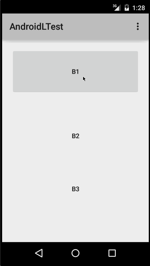
For example, in the image below,
- B1 is a button that does not have any background,
- B2 is set up with android:background=»android:attr/selectableItemBackground»
- B3 is set up with android:background=»android:attr/selectableItemBackgroundBorderless»
You can achieve the same in code using:
Ripples can also be added to a view using the android:foreground attribute the same way as above. As the name suggests, in case the ripple is added to the foreground, the ripple will show up above any view it is added to (e.g. ImageView , a LinearLayout containing multiple views, etc).
If you want to customize the ripple effect into a view, you need to create a new XML file, inside the drawable directory.
Here are few examples:
Example 1: An unbounded ripple
Example 2: Ripple with mask and background color
If there is view with a background already specified with a shape , corners and any other tags, to add a ripple to that view use a mask layer and set the ripple as the background of the view.
Example:
Example 3: Ripple on top a drawable resource
Usage: To attach your ripple xml file to any view, set it as background as following (assuming your ripple file is named my_ripple.xml ):
Selector:
The ripple drawable can also be used in place of color state list selectors if your target version is v21 or above (you can also place the ripple selector in the drawable-v21 folder):
In this case, the color of the default state of your view would be white and the pressed state would show the ripple drawable.
Point to note: Using ?android:colorControlHighlight will give the ripple the same color as the built-in ripples in your app.
To change just the ripple color, you can customize the color android:colorControlHighlight in your theme like so:
and then use this theme in your activities, etc. The effect would be like the image below:
Источник
RippleDrawable для Pre-L устройств

Доброго времени суток!
Те, кто следил за Google IO/2014, знают о новом Material Design и новых фишках. Одной из них является пульсирующий эффект при нажатии. Вчера я решил его портировать для старых устройств.
В Android L перешли на новый эффект — пульсирование, он используется по умолчанию в ответной реакции на касание. То есть при касании на экран появляется большой исчезающий (fades) овал с размером родительского слоя и вместе с ним растет круг в точке прикосновения. Эта анимация меня вдохвновила использовать в своем проекте и я решил попробовать его сделать.
Примеры анимации на Google Design.
Создадим класс RippleDrawable со вспомогательным классом Circle, который будет помогать нам рисовать круги:
Вспомогательный элемент Circle нам понадобится для сохранения точки касания. Теперь нам понадобится два круга: фоновой круг, который покроет всего родителя и круг поменьше, для отображения точки касания. Ах, да, и еще объявим константы, значение анимации по умолчанию будет 250мс, радиус круга по умолчанию в 150px. Во сколько раз увеличивать фоновой круг, примечания, все цифры взяты на глаз.
Флаг Paint.ANTI_ALIAS_FLAG предназначен для сглаживания, чтобы круги были кругами, а не фиг пойми мазней какой-то, теперь инициализируем наши переменные в отдельном методе, укажем что стиль окраски «заливка» и создадим круги, далее вызовем его в конструкторе:
Готово, перейдем к наверное самому интересному обработке касаний, добавим в наш класс интерфейс OnTouchListener:
При касании по экрану сначала мы сохраняем координаты касания по кругам и размер View (для фонового круга), затем стартуем анимашку, если она ранее не стартовала. Кстати говоря, у обоих кругов имеется opacity (прозрачность), я их определил как 100 для фонового круга и от 160 до 40 для маленьго кружочка. Все цифры опять же были взяты из потолка (зоркий глаз) (если кто не понял, цифры от 0 до 255 argb).
Теперь, если пользователь коснулся, у нас появляются 2 круга, пользовательский и фоновой, но не уходят, и даже не двигаются при движении пальца, пора это исправлять:
Проверьте, двигается теперь кружочек-то, а?
Логика при снятии пальца с курка, то есть с экрана. Если анимация была запущена, мы должны ее закончить и привести к конечному состоянию, далее запустить анимацию, исчезновения кругов, где пользовательский круг будет увеличиваться и исчезать одновременно, приступим:
Источник


