Working with the TextView
Every Android device comes with a collection of standard fonts: Droid Sans, Droid Sans Mono and Droid Serif. They were designed to be optimal for mobile displays, so these are the three fonts you will be working with most of the time and they can be styled using a handful of XML attributes. You might, however, see the need to use custom fonts for special purposes.
This guide will take a look at the TextView and discuss common properties associated with this view as well as how to setup custom typefaces.
As stated in the overview, there are three different default typefaces which are known as the Droid family of fonts: sans , monospace and serif . You can specify any one of them as the value for the android:typeface attribute in the XML:
Here’s how they look:
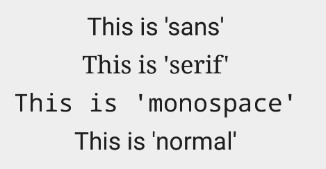
In addition to the above, there is another attribute value named «normal» which defaults to the sans typeface.
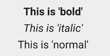
The android:textStyle attribute can be used to put emphasis on the text. The possible values are: normal , bold , italic . You can also specify bold|italic .
A sampling of styles can be seen below:
android:textSize specifies the font size. Its value must consist of two parts: a floating-point number followed by a unit. It is generally a good practice to use the sp unit so the size can scale depending on user settings.
A sampling of styles can be seen below:

Too many type sizes and styles at once can wreck any layout. The basic set of styles are based on a typographic scale of 12, 14, 16, 20, and 34. Refer to this typography styles guide for more details.
There are a few ways to truncate text within a TextView . First, to restrict the total number of lines of text we can use android:maxLines and android:minLines :
In addition, we can use android:ellipsize to begin truncating text
Following values are available for ellipsize : start for . bccc , end for aaab. , middle for aa. cc , and marquee for aaabbbccc sliding from left to right. Example:

There is a known issue with ellipsize and multi-line text, see this MultiplelineEllipsizeTextView library for an alternative.
The android:textColor and android:textColorLink attribute values are hexadecimal RGB values with an optional alpha channel, similar to what’s found in CSS:
The android:textColorLink attribute controls the highlighting for hyperlinks embedded within the TextView. This results in:

We can edit the color at runtime with:
You can use three different attributes to customize the appearance of your text shadow:
- android:shadowColor — Shadow color in the same format as textColor.
- android:shadowRadius — Radius of the shadow specified as a floating point number.
- android:shadowDx — The shadow’s horizontal offset specified as a floating point number.
- android:shadowDy — The shadow’s vertical offset specified as a floating point number.
The floating point numbers don’t have a specific unit — they are merely arbitrary factors.
This results in:

There are many other text properties including android:lineSpacingMultiplier , android:letterSpacing , android:textAllCaps , android:includeFontPadding and many others:
android:includeFontPadding removes the extra padding around large fonts. android:lineSpacingMultiplier governs the spacing between lines with a default of «1».
TextView natively supports HTML by translating HTML tags to spannable sections within the view. To apply basic HTML formatting to text, add text to the TextView with:
This results in:

Note that all tags are not supported. See this article for a more detailed look at supported tags and usages.
For setting font colors, we can use the tag as shown:
And you should be all set.
If you want to store your HTML text within res/values/strings.xml , you have to use CDATA to escape such as:
and access the content with getString(R.string.htmlFormattedText) to load this within the TextView.
For more advanced cases, you can also check out the html-textview library which adds support for almost any HTML tag within this third-party TextView.
TextView has native support for automatically locating URLs within the their text content and making them clickable links which can be opened in the browser. To do this, enable the android:autolink property:
This results in:

One known issue when using android:autoLink or the Linkify class is that it may break the ability to respond to events on the ListView through setOnItemClickListener . Check out this solution which extends TextView in order to modify the onTouchEvent to correctly propagate the click. You basically need to create a LinkifiedTextView and use this special View in place of any of your TextView’s that need auto-link detection.
In addition, review these alternate solutions which may be effective as well:
A TextView is actually surprisingly powerful and actually supports having images displayed as a part of it’s content area. Any images stored in the «drawable» folders can actually be embedded within a TextView at several key locations in relation to the text using the android:drawableRight and the android:drawablePadding property. For example:
Which results in:

In Android, many views inherit from TextView such as Button s, EditText s, RadioButton s which means that all of these views support the same functionality. For example, we can also do:
Which results in:

The relevant attributes here are drawableLeft , drawableRight , drawableTop and drawableBottom along with drawablePadding . Check out this TextView article for a more detailed look at how to use this functionality.
Note that if you want to be able to better control the size or scale of the drawables, check out this handy TextView extension or this bitmap drawable approach. You can also make calls to setCompoundDrawablesWithIntrinsicBounds on the TextView .
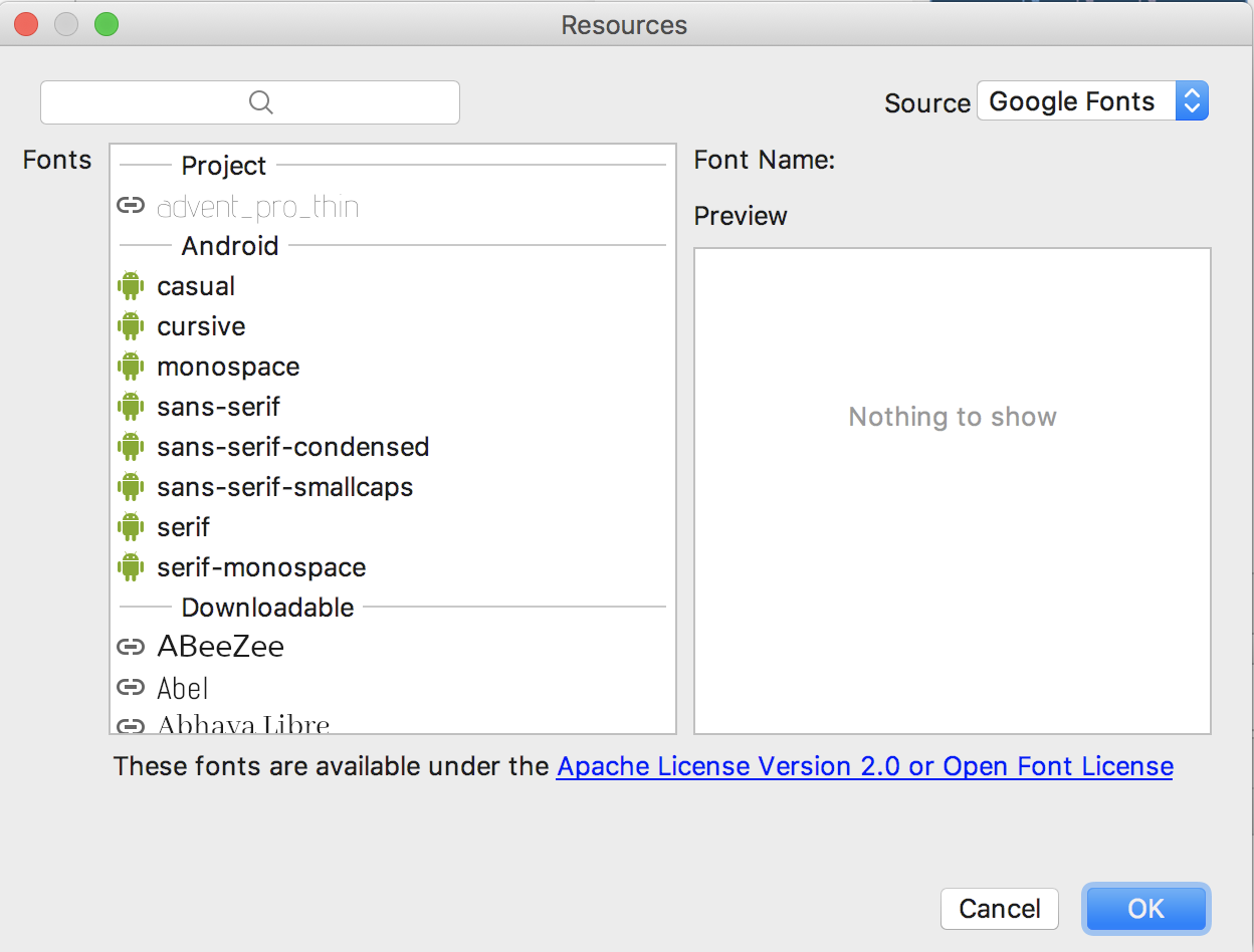
The easiest way to add font support is to upgrade to Android Studio 3.0, which provides the ability to use other fonts provided by Google. You can visit https://fonts.google.com/ to see the ones that are free to use. See the FAQ section for more information.
Android Studio v3.0 provides built-in support for these fonts and will automatically handles generating the XML and necessary metadata. Next to the Attributes section of a TextView , look for the fontFamily and click on More Fonts :

You will then see these choices:
Once you choose a font, you will notice that a font directory will be created and a similar XML file will be generated. Notice that Android Studio automatically takes care of adding the necessary font provider certificates required to request from Google:
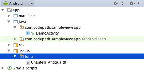
We can actually use any custom font that we’d like within our applications. Check out fontsquirrel for an easy source of free fonts. For example, we can download Chantelli Antiqua as an example.
Fonts are stored in the «assets» folder. In Android Studio, File > New > folder > Assets Folder . Now download any font and place the TTF file in the assets/fonts directory:
We’re going to use a basic layout file with a TextView , marked with an id of «custom_font» so we can access it in our code.
To set the custom font manually, open your activity file and insert this into the onCreate() method:
Alternatively, you can use the third-party calligraphy library:
Either method will will result in:

You’ll also want to keep an eye on the total size of your custom fonts, as this can grow quite large if you’re using a lot of different typefaces.
Spans come in really handy when we want to apply styles to portions of text within the same TextView. We can change the text color, change the typeface, add an underline, etc, and apply these to only certain portions of the text. The full list of spans shows all the available options.
As an example, let’s say we have a single TextView where we want the first word to show up in red and the second word to have a strikethrough:

We can accomplish this with spans using the code below:
Note: There are 3 different classes that can be used to represent text that has markup attached. SpannableStringBuilder (used above) is the one to use when dealing with mutable spans and mutable text. SpannableString is for mutable spans, but immutable text. And SpannedString is for immutable spans and immutable text.
In certain cases, we might want different substrings in a TextView to different styles and then clickable to trigger an action. For example, rendering tweet items where @foo can be clicked in a message to view a user’s profile. For this, you should copy over the PatternEditableBuilder.java utility into your app. You can then use this utility to make clickable spans. For example:
and this results in the following:

For more details, view the README for more usage examples.
Источник
Android TextView Decoration Tutorial
TextViews are the first things that we learn when we start learning Android and due to this whenever we create an Empty Activity, then by default we will see one TextView on the screen with “Hello World!”. So, Hello World! Hope you are learning well. In this blog, we will learn TextView decoration in Android. This blog is going to be an interesting blog as we all use TextViews in our Android application to display some textual information. In this blog, we will learn how to decorate these TextViews in Android. In the beginning, we will learn some of the basic attributes of TextView and after that, we will be having some cool TextViews in our app. So, let’s get started.
TextView
A TextView is a user interface element that is used to display some text or some textual information in our application. Following is an XML code for using TextView in our application:
By using the TextView tag in your application, you can insert a TextView to display the desired text by using android:text property. To decorate a TextView, there are various attributes that can be used. Let’s discuss one by one.
Typeface
By default, Android gives you four fonts that you can use in your application. They are:
You can use these fonts in your TextView by using the android:typeface attribute.

Textstyle
You can emphasize a text by using the android:textStyle attribute. Following are the three options that are available with android:textStyle :

Text size and Text Color
You can change the text size by using the android:textSize attribute and the color of the text can be change by using android:textColor attribute.

Font family
You can change the font family of a TextView by using the android:fontFamily attribute. By default, we have 14 font families that can be used in TextView. Some of these are serif, monospace, casual, cursive, sans-serif, sans-monospace, etc.
ImageIf you want to use your custom font then you can read our blog at MindOrks Blogs.

Text alignment
You can align your text with the help of android:textAlignment attribute. This attribute provides us a lot of options like center align, textStart, textEnd, viewStart, viewEnd, etc.

Text shadow
You can put shadow to your text and change the color of the shadow by using the android:shadowColor attribute. Also, you can use shadowDx and shadowDy to specify the offset of the shadow. For example, a -Dx draws a shadow on the left of the text and +Dx draws a shadow on the right of the text. shadowRadius can be used to specify how much the shadow should be blurred at the edges.

Non Breaking Sentence
You can put a sentence in more than one line. This is possible when the width of the TextView is not enough to hold the contents of the TextView i.e. you are having more texts but the space is not provided.

Gradient
To set the color of the TextView, you can also use Gradient color by using the LinearGradient.
Also, add the below code in you MainActivity.kt file to use LinearGradient:
The parameters of the LinearGradient are:
- x0: x-coordinate for start of gradient line. It is of type float.
- y0: y-coordinate for start of gradient line. It is of type float.
- x1: x-coordinate for end of gradient line. It is of type float.
- y1: y-coordinate for end of gradient line. It is of type float.
- colors: The RGB color to be distributed along the gradient line. It is of type float.
- positions: It is the relative position of each corresponding color in the colors array. It is of type float.
- tile: It is the shader tiling mode. It is of type float.

Clickable span
While reading a text, you can go to somewhere else by clicking on the text. This is the same way as used in websites, where we use hyperlinks to open new page from the existing one. Add the below code in your XML file:
Here, textColorLink is the color of the clickable link and the textColorHighlight is the color used when you click the link.Add the below code in your MainActivity.kt file:

Background Image
You can use some background image in TextView i.e. it seems like the text is written on the image. Add the below code in your XML file:
After that, add the below code in your MainActivity.kt file:

Conclusion
In this blog, we learned how we can decorate TextViews in our application. We learned many ways of decorating the text used in our application. Hope you enjoyed this blog and will implement the learnings of this blog in your application.
Источник


