Toolbar menu item android
There are two kind of bar with control items in activity
- ActionBar is action control bar or navigation bar you usually see at the top of an app, it usually has an app logo icon on the left, name of the current screen next to the logo, and other menu list on the right. To use actionbar, you don’t have to define an actionbar in the layout file which is handy but it deosn’t give you much flexibilities when you want to do some customizations in the actionbar, such as adding background image, animations, place the actionbar on the bottom instead on the top.
- Toolbar does evertying you can do with ActionBar, and gives you the freedom to do customiztions that you can’t do easily with ActionBar .
You can use either old ActionBar (without any declarations in XML) or define android.support.v7.widget.Toolbar in activity layout and customize it look and events (more coding in this way).
Let’s look at ActionBar and it’s parameters. Insert following lines in onCreate method and you’ll get ActionBar with icon
ToolBar was introduced in Android Lollipop, API 21 release and is the successor of the ActionBar . It’s a ViewGroup that can be placed anywhere in your XML layouts. ToolBar ‘s appearance and behavior can be more easily customized than the ActionBar .
There are two ways to use Toolbar
- Use a Toolbar as an ActionBar when you want to use the existing ActionBar facilities (such as menu inflation and selection, ActionBarDrawerToggle, and so on) but want to have more control over its appearance.
- Use a standalone Toolbar when you want to use the pattern in your app for situations that an ActionBar would not support; for example, showing multiple toolbars on the screen, spanning only part of the width, and so on.
So, you should replace ActionBar with ToolBar if you want the flexibilities that comes with the Toolbar (adding background image, animations, place the actionbar on the bottom instead on the top and so on). Note that the ActionBar continues to work and if all you need is a static bar at the top that can host icons and a back button, then you can safely continue to use ActionBar .
To use Toolbar as an ActionBar , first ensure the AppCompat-v7 support library is added to your application build.gradle (Module:app) file
Second, let’s disable the theme-provided ActionBar . The easiest way is to have your theme extend from Theme.AppCompat.NoActionBar (or the light variant) within the res/styles.xml file
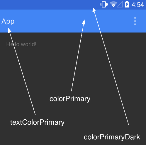
Now lets talk about the color scheme for our project, as you can see from the image below, there are attributes which you can set to get a basic color scheme of your App done, right now we are just dealing we App bar so we would talk about colorPrimary and colorPrimaryDark . colorPrimary as the name says is the primary color of your App and the App bar while with the colorPrimaryDark you can set the color of the status bar to a certain color.
Next, you need to add a Toolbar to your Activity layout file. Below I place the Toolbar at the top of a LinearLayout like the standard ActionBar
Next, in your Activity or Fragment , set the Toolbar to act as the ActionBar by calling the setSupportActionBar(Toolbar) method
Adding items to ActionBar or Toolbar
Menus are typically created in resource files using XML but they are stored in the res/menu directory though they can also be created in code. To create a menu resource, use the element.
The element defines each individual menu item and is enclosed in the element. A basic menu item looks as follows
The most common attributes are the following
- id , this is the standard resource identifier;
- title , this indicates the text to display;
- icon , this is a draw-able resource;
- showAsAction , this controls how the menu item is shown;
- enabled , this is enabled by default.
The showAsAction attribute controls how the menu item is shown. The options include the following:
- ifRoom , this menu item should be included in the Action Bar if there’s enough space;
- withText , this indicates that both the title and the icon should be shown;
- never , this indicates that the menu item should never be included in the Action Bar;
- always , this indicates that the menu item should be always included in the Action Bar.
First, we will add a string resource to the strings.xml file for the menu title. Start by opening the /res/values/strings.xml file and add the following element to the element EMail
Create a new file in the res/menu directory (right click on res — New — Android resource directory ) and call it menu_main.xml .
Open the menu_main.xml file and add the following XML to define the menu
With the menu now created, we just have to override the onCreateOptionsMenu() method in our activity to inflate the menu
Add the following method to the application to see a Toast when the EMail menu is selected
If you want to show icon in overflow menu use following snippet
Creating sub menus
Sub menus are created and accessed in almost exactly the same manner as other menu elements and can be placed in any of the provided menus, although they cannot be placed within other sub menus. To define a sub menu, include a element within an element.
Here is the XML form this recipe with two sub menu items added
Grouping menu items
Another menu feature that Android supports is grouping menu items. Android provides several methods for groups, including the following
- setGroupVisible() show or hide all items;
- setGroupEnabled() enable or disable all items;
- setGroupCheckable() set the checkable behavior.
Android will keep all grouped items with showAsAction=»ifRoom» together. This means all items in the group with showAsAction=»ifRoom» will be in the Action Bar or all items will be in the overflow.
To create a group, add the menu elements to a element. Here is an example using the menu XML from this recipe with two additional items in a group
A Toolbar is just a decorated ViewGroup and as a result, the title contained within can be completely customized by embedding a view within the Toolbar such as:
This means that you can style the TextView like any other. You can access the TextView inside your activity with:
Note that you must hide the default title using setDisplayShowTitleEnabled . This results in:
How to change color of menu in Toolbar
How to add back button to Toolbar
Android context menu example
First, define main activity layout
Second, describe context menu items
Third, define events and action in MainActivity class
onCreateContextMenu called when a context menu for the view is about to be shown. Unlike onCreateOptionsMenu , this will be called every time the context menu is about to be shown and should be populated for the view (or item inside the view for AdapterView subclasses, this can be found in the menuInfo ).
onContextItemSelected hook is called whenever an item in a context menu is selected. The default implementation simply returns false to have the normal processing happen. You can use this method for any items for which you would like to do processing without those other facilities.
Toolbar example in Kotlin
Following is MainActivity.kt file.
Following is activity_main.xml file.
Following is toolbar_menu.xml file.
Popup menu with icons example in Kotlin
Источник
Adding Icons and Menu Items to an Android Toolbar
You now need to add some icons to the toolbar you added in the previous lesson. There’s also a thing called the Overflow Menu. This is for items that won’t fit on the toolbar. You’ll then typically see three dots. Press the dots and you see a sub menu appear. This sub menu is the Overflow Menu. Let’s see how to do that.
Items that go on your toolbars come from a separate XML file that is placed in a menu folder. You then attach the XML file to your toolbar using Java code.
First, we’ll need the menu folder.
In the Explorer area on the left of Android Studio, right-click the res folder. From the menu that appears, select New > Android resource directory:
When you get the dialogue box up, select menu from the Resources type dropdown:
The Directory name box at the top will then change to menu:
Click OK to create a menu folder inside of your res directory:
Now right click your new menu folder. From the menu that appears, select New > Menu resource file:
When you get the New Resource File dialogue box up, type menu_items as the file name:
Click OK to create a new XML file in your menu folder:
The XML file will open up in Design view in your main coding area. It should look something like this: (Later versions of Android Studio will have a Cast Button item at the top.)
Have a look on the left, though, and notice the Palette and the Component Tree. You can drag items from the Palette onto either your Component Tree or directly onto your toolbar.
Drag a Menu Item from the Palette to your Component Tree or toolbar:
Your Component Tree will then look like this:
And your layout will look like this:
Notice that the layout is showing the three dots for the Overflow Menu, and a menu item with the default name of item.
With your new menu item selected, have a look at the properties area on the right:
We’ll need IDs for the menu items. Type favourites_page as the ID. For the title, click the Pick a Resource button to the right of the title area. Then select the favourites string resource you set up in the previous lesson:
Click OK and your layout will update with your new title:
The title will appear only if a menu item is pushed to the Overflow Menu. It is pushed to the Overflow Menu if there is not enough room on the toolbar. But only if you have specified this in the showAsAction property. Click inside of this property to see the following box appear in earlier versions of Android Studio:
In later versions, you need to click the little flag. You’ll then see the same dialog box but in a different design:
Select the one for ifRoom. This means that the item will appear on the toolbar if there is room for it, otherwise it will get pushed to the Overflow Menu. The never means that it will never appear on the toolbar but always on the Overflow Menu; always means it will always appear on the toolbar; withText means that the title you add will always be displayed. (The collpaseActionView item is used with something called an Action Layout. We won’t be using these.)
Your properties area should look like this, so far:
You’ll probably want an icon to appear for your toolbar items. Instead of designing one yourself, there are lots of inbuilt ones you can use. You add these to the drawable folder as a Vector asset. You’ll learn how to do that in the next lesson below.
Источник
Using the App Toolbar
Toolbar was introduced in Android Lollipop, API 21 release and is the spiritual successor of the ActionBar. It’s a ViewGroup that can be placed anywhere in your XML layouts. Toolbar’s appearance and behavior can be more easily customized than the ActionBar.

Toolbar works well with apps targeted to API 21 and above. However, Android has updated the AppCompat support libraries so the Toolbar can be used on lower Android OS devices as well. In AppCompat, Toolbar is implemented in the androidx.appcompat.widget.Toolbar class.ura
There are two ways to use Toolbar:
- Use a Toolbar as an Action Bar when you want to use the existing ActionBar facilities (such as menu inflation and selection, ActionBarDrawerToggle , and so on) but want to have more control over its appearance.
- Use a standalone Toolbar when you want to use the pattern in your app for situations that an Action Bar would not support; for example, showing multiple toolbars on the screen, spanning only part of the width, and so on.
The Toolbar is a generalization of the ActionBar system. The key differences that distinguish the Toolbar from the ActionBar include:
- Toolbar is a View included in a layout like any other View
- As a regular View , the toolbar is easier to position, animate and control
- Multiple distinct Toolbar elements can be defined within a single activity
Keep in mind that you can also configure any Toolbar as an Activity’s ActionBar, meaning that your standard options menu actions will be display within.
Note that the ActionBar continues to work and if all you need is a static bar at the top that can host icons and a back button, then you can safely continue to use ActionBar .
To use Toolbar as an ActionBar, first ensure the AndroidX support library is added to your application build.gradle (Module:app) file:
Second, let’s disable the theme-provided ActionBar. The easiest way is to have your theme extend from Theme.AppCompat.NoActionBar (or the light variant) within the res/values/styles.xml file:
Now you need to add a Toolbar to your Activity layout file. One of the biggest advantages of using the Toolbar widget is that you can place the view anywhere within your layout. Below we place the toolbar at the top of a LinearLayout like the standard ActionBar:
Note: You’ll want to add android:fitsSystemWindows=»true» (learn more) to the parent layout of the Toolbar to ensure that the height of the activity is calculated correctly.
As Toolbar is just a ViewGroup and can be styled and positioned like any other view. Note that this means if you are in a RelativeLayout , you need to ensure that all other views are positioned below the toolbar explicitly. The toolbar is not given any special treatment as a view.
Next, in your Activity or Fragment, set the Toolbar to act as the ActionBar by calling the setSupportActionBar(Toolbar) method:
Note: When using the support library, make sure that you are importing android.support.v7.widget.Toolbar and not android.widget.Toolbar .
Next, we need to make sure we have the action items listed within a menu resource file such as res/menu/menu_main.xml which is inflated above in onCreateOptionsMenu :
For more details about action items in the Toolbar including how to setup click handling, refer to our ActionBar guide. The above code results in the toolbar fully replacing the ActionBar at the top:

From this point on, all menu items are displayed in your Toolbar, populated via the standard options menu callbacks.
In many apps, the same toolbar can be used across multiple activities or in alternative layout resources for the same activity. In order to easily reuse the toolbar, we can leverage the layout include tag as follows. First, define your toolbar in a layout file in res/layout/toolbar_main.xml :
Next, we can use the tag to load the toolbar into our activity layout XML:
and then access the Toolbar by the include id instead:
This allows us to create a consistent navigation experience across activities or configuration changes.
The Toolbar can be customized in many ways leveraging various style properties including android:theme , app:titleTextAppearance , app:popupTheme . Each of these can be mapped to a style. Start with:
Now, we need to create the custom styles in res/values/styles.xml with:
This results in:

In certain situations, we might want to display an app icon within the Toolbar . This can be done by adding this code into the Activity
Next, we need to remove the left inset margin that pushes the icon over too far to the left by adding app:contentInsetStart to the Toolbar :
With that the icon should properly display within the Toolbar as expected.
A Toolbar is just a decorated ViewGroup and as a result, the title contained within can be completely customized by embedding a view within the Toolbar such as:
This means that you can style the TextView like any other. You can access the TextView inside your activity with:
Note that you must hide the default title using setDisplayShowTitleEnabled . This results in:

In certain cases, the status bar should be translucent such as:

To achieve this, first set these properties in your res/values/styles.xml within the main theme:
The activity or root layout that will have a transparent status bar needs have the fitsSystemWindows property set in the layout XML:
You should be all set. Refer to this stackoverflow post for more details.
If you want the status bar to be entirely transparent for KitKat and above, the easiest approach is to:
and then add this style to your res/values/styles.xml within the main theme:
You should be all set. Refer to this stackoverflow post for more details.
We can configure the Toolbar to react and change as the page scrolls:
For example, we can have the toolbar hide when the user scrolls down on a list or expand as the user scrolls to the header. There are many effects that can be configured by using the CoordinatorLayout. First, we need to make sure we add the jetpack libraries to our app/build.gradle file:
Next, inside the activity layout XML such as res/layout/activity_main.xml , we need to setup our coordinated layout with a Toolbar and a scrolling container such as a RecyclerView :
Of course, the RecyclerView could also be replaced with a FrameLayout which could then allow for fragments to be loaded instead:
This type of layout results in the following:

Refer to the guide on CoordinatorLayout and AppBarLayout for additional explanation and specifics. For troubleshooting, refer to this troubleshooting guide.
The proper way of reacting to simple scroll behavior is leveraging the CoordinatorLayout built into the Design Support Library as shown in the previous section. However, there are a few other relevant resources around reacting to scrolling events with a more manual approach:
- Hiding or Showing Toolbar on Scroll — Great guide on an alternate strategy not requiring the CoordinatorLayout to replicate the behavior of the «Google Play Music» app. Sample code can be found here.
- Hiding or Showing Toolbar using CoordinatorLayout — Great guide that outlines how to use CoordinatorLayout to hide the Toolbar and the FAB when the user scrolls.
With these methods, your app can replicate any scrolling behaviors seen in common apps with varying levels of difficulty not captured with the method shown above.
Источник


