- Hands-on with Material Components for Android: Bottom App Bar
- Part 1 of a series covering practical usage of Material Components for Android
- Setting up a Material Components theme for Android
- Attribute by attribute
- Basic usage 🏁
- Handling menu and navigation items 🍽
- Using setSupportActionBar
- Using convenience functions
- What about the navigation item?
- Anchoring a FAB ⚓
- Scrolling behavior ☝
- Theming 🎨
- Color
- Typography
- Shape
- More resources 📚
- Top app bar android
Hands-on with Material Components for Android: Bottom App Bar
Part 1 of a series covering practical usage of Material Components for Android

This post will be covering the features and API of the Bottom App Bar component. To find out how to handle initial setup of Material Components for Android (including the Gradle dependency and creating an app theme), please see my original post:
Setting up a Material Components theme for Android
Attribute by attribute
The Bottom App Bar is an evolution of the traditional Top App Bar (a.k.a Toolbar or ActionBar in the Android world) which, one might argue, was the defining component of v1 of the Material Guidelines. The Bottom App Bar maintains the core features of an App Bar while offering a fresh look and functional improvements in key areas.

Like its Top counterpart, the Bottom App Bar serves to:
- Highlight important screen actions with icon menu items
- Provide a means of interacting with app navigation (such as opening a Navigation Drawer or navigating back/up) with a navigation icon menu item
- Act as an anchor for a FAB (Floating Action Button)
However, the characteristics that set the Bottom App Bar apart are:
- Ergonomics: The bottom placement makes it easier to reach with a single hand on mobile devices
- Flexibility: As we will explore further on, the layout of the Bottom App Bar and the position of a FAB and icon menu items can change based on the needs of the screen
Basic usage 🏁
A BottomAppBar can be included in your screen layout like so:
As shown above, the parent ViewGroup of a BottomAppBar should ideally be a CoordinatorLayout . This allows for full customization of scrolling and FAB anchoring behaviors.
Handling menu and navigation items 🍽
A BottomAppBar can have its menu implemented in the same way as a Toolbar (its parent class) or with new convenience functions specific to BottomAppBar .

Using setSupportActionBar
This should be familiar territory for most Android developers. As with a Toolbar , a variety of hooks/callbacks exist for attaching a BottomAppBar to an Activity or Fragment , inflating a menu and handling item clicks. To do so, you’ll need to be using the AndroidX AppCompatActivity and/or Fragment classes. You should also be using a *.NoActionBar app theme variant.
If you’re using a Fragment , you will firstly need to enable the aforementioned menu callbacks in the Fragment#onCreate callback:
Note: This is not necessary if you are using an Activity .
After you’ve inflated a layout, you’ll then need to let the Activity / Fragment know that your BottomAppBar is the primary Action Bar for the screen, in order to link it to the callbacks. This can be done in the Activity#onCreate callback ( after the call to setContentView , unless you’re using the ContentView annotation) or the Fragment#onViewCreated callback:
Now you can make use of the overridable callbacks for inflating a menu resource and handling item clicks. This is detailed in the Android Menus documentation.
Using convenience functions
Compared to the previous approach, a simpler convenience function exists for inflating a BottomAppBar menu:
An equally simple function exists for attaching a menu item click listener:
What about the navigation item?
Seeing as the navigation item does not form part of the inflated menu, it needs to be set separately on the BottomAppBar . This can be done in XML:
Alternatively, it can be done programmatically:
Detecting when the navigation item has been clicked is very similar to how it is done for regular menu items.
If you’re using the setSupportActionBar method mentioned above, check for the android.R.id.home ID in the onOptionsItemSelected callback.
Alternatively, a convenience function exists:
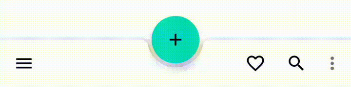
Anchoring a FAB ⚓
A FloatingActionButton can be anchored to a BottomAppBar . This draws attention to the important screen action that the FAB fulfils while also reducing the vertical space taken up by both components. The menu items will change position depending on the chosen anchoring properties.
From a design perspective, there are two ways of anchoring a FAB:
- Inset: The shape of the BottomAppBar is transformed to allow the FAB to be “cradled” (at the same elevation) within a cutout. This is the default behavior.

Note: The Material Guidelines caution against using an Extended FAB with a Bottom App Bar. Limited anchoring support was added in Material Components for Android 1.1.0-alpha04 , but cutouts and animations are not supported.
In order to implement this the FAB also needs to be within the parent CoordinatorLayout :
By default, the FAB is cradled and horizontally center-aligned. A number of attributes exist to customize these properties:
- fabAlignmentMode : The horizontal alignment of the FAB. This can either be set to center ( FAB_ALIGNMENT_MODE_CENTER , default) or end ( FAB_ALIGNMENT_MODE_END ). When programmatically changed, a hide/show animation (defined by fabAnimationMode below) will run.

- fabCradleMargin : The distance between the edge of the FAB and the BottomAppBar cradle cutout. Defaults to 5dp .

- fabCradleRoundedCornerRadius : The radius of the corners of the BottomAppBar cradle cutout. Defaults to 8dp .

- fabCradleVerticalOffset : The vertical offset distance of the FAB in relation to the BottomAppBar cradle cutout. Defaults to 0dp , meaning the FAB center will be aligned with the top of the BottomAppBar .

- fabAnimationMode : The animation style that is used when changing fabAlignmentMode (as mentioned above). This can either be set to scale ( FAB_ANIMATION_MODE_SCALE , default) or slide ( FAB_ANIMATION_MODE_SLIDE ).
Note: All of these attributes can also be set programmatically.
The naming of these attributes would suggest that an overlap FAB anchor is not supported by the BottomAppBar component. However, we can somewhat fake this behavior by using a fabCradleMargin and fabCradleRoundedCornerRadius of 0dp .
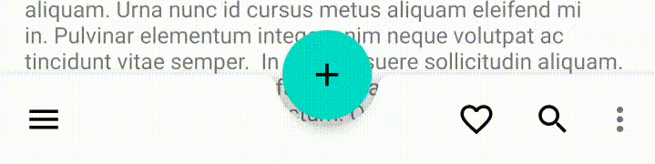
Scrolling behavior ☝
If your screen contains scrollable content (eg. A RecyclerView or NestedScrollView ), you can control how a BottomAppBar responds to scrolling with the hideOnScroll attribute. Again, the scrolling container also needs to be within the parent CoordinatorLayout :
If set to true , the BottomAppBar will automatically hide/show in an animated fashion when content is scrolled up/down.
You can programmatically hide/show the BottomAppBar with BottomAppBar#performHide / BottomAppBar#performShow respectively.
Theming 🎨
The BottomAppBar can be themed in terms of the three Material Theming subsystems: color, typography and shape. There are two style variants that inherit from Widget.MaterialComponents.BottomAppBar , each with an optional style suffix: surface (default, no suffix) and colored ( *.Colored ). When implementing a global custom BottomAppBar style, reference it in your app theme with the bottomAppBarStyle attribute.
Color
The color of the BottomAppBar background can be customized with the backgroundTint attribute. This defaults to colorSurface for surface Bottom App Bars and colorPrimary for colored Bottom App Bars.
Note: You should not use android:background with BottomAppBar , as this will break the internal handling of the FAB cradle.
The color of the BottomAppBar menu/navigations items can be customized with the materialThemeOverlay attribute. There are two theme overlay variants that inherit from ThemeOverlay.MaterialComponents.BottomAppBar , each with a style suffix: surface ( *.Surface ) and colored ( *.Colored ). These contain two attributes: colorControlNormal (for customizing menu/navigation icon color) and actionMenuTextColor (for customizing overflow menu text color). Typically you would want to keep these the same. They default to colorOnSurfaceEmphasisMedium for surface Bottom App Bars and colorOnPrimary for colored Bottom App Bars.
Note: The above approach requires that you set the tint/color of your menu/navigation icon resources to colorControlNormal . If you are using VectorDrawable s, this can be achieved with the android:tint attribute. If you are using raster (PNG/JPG) assets, you can wrap these in a in a new XML resource in order to apply an android:tint . This is not as intuitive as, for example, an itemIconTint attribute. You can star the issue for this on the issue tracker.

Typography
There is no primary text as part of the BottomAppBar component. However, for large menus, there will be an overflow action menu. These text items will adopt the fontFamily attribute defined in your app theme.

Shape
At the time of writing, the latest release of Material Components for Android is 1.2.0-alpha06 and global shape theming attributes (eg. shapeAppearanceMediumComponent ) do not affect BottomAppBar . Specifically, only rounded corners (as opposed to cut corners) are supported for the FAB cradle. A manual workaround has been added to the Material Components for Android GitHub repository and will hopefully make its way into shape theming in a future release. You can star the issue for this on the issue tracker.

More resources 📚
- The source code for the Playground app used in this article can be found on GitHub.
- Bottom App Bar Design Documentation
- Bottom App Bar API Documentation
I hope this post has provided some insight into Bottom App Bar and how it can be used in your Android app(s). If you have any questions, thoughts or suggestions then I’d love to hear from you!
Источник
Top app bar android
Top app bars display information and actions related to the current screen.

Contents
Using top app bars
Before you can use Material top app bars, you need to add a dependency to the Material Components for Android library. For more information, go to the Getting started page.
Making top app bars accessible
Android’s top app bar component APIs provide support for the navigation icon, action items, overflow menu and more, to inform the user what each action performs. While optional, their use is strongly encouraged.
When using icons for navigation, action items and other elements of top app bars, you should set a content description for them so that screen readers like TalkBack are able to announce their purpose or action.
For an overall content description of the top app bar, set an android:contentDescription or use the setContentDescription method on the MaterialToolbar .
For the navigation icon, this can be achieved via the app:navigationContentDescription attribute or setNavigationContentDescription method.
For action items and items within the overflow menu, the content description needs to be set in the menu:
For images within collapsing top app bars, set an android:contentDescription or use the setContentDescription method for the ImageView .
There are four types of top app bars: 1. Center aligned, 2. Small, 3. Medium, 4. Large.
For implementation purposes, the Center aligned & Small types can be grouped into Regular top app bars, while the Medium & Large types can be grouped into Collapsing top app bars.

Top app bars use the following APIs and source code:
Regular top app bars
The top app bar provides content and actions related to the current screen. It’s used for branding, screen titles, navigation, and actions.
Small top app bar example
The following example shows a Small top app bar with a page title, a navigation icon, two actions, and an overflow menu.

In menu/navigation icon drawables:
Note: The above example is the recommended approach and, in order for it to work, you need to use a Theme.Material3.* theme containing the NoActionBar segment, such as the Theme.Material3.Light.NoActionBar . If not, an action bar will be added to the current Activity window. The MaterialToolbar can be set as the support action bar and thus receive various Activity callbacks, as shown in this guide.
Applying scrolling behavior to the top app bar
The following example shows the top app bar positioned at the same elevation as content. Upon scroll, it increases elevation and lets content scroll behind it.
The following example shows the top app bar disappearing upon scrolling up, and appearing upon scrolling down.
Center aligned top app bar example
All of the same guidance and code from the sections above is relevant for Center aligned top app bars. The only additional configuration needed for centering is setting the app:titleCentered and/or app:subtitleCentered attributes to true on your MaterialToolbar .

Anatomy and Key properties

- Container
- Navigation icon (optional)
- Title (optional)
- Action menu items (optional)
| Element | Attribute | Related method(s) | Default value |
|---|---|---|---|
| Color | android:background | setBackground getBackground | ?attr/colorSurface |
| MaterialToolbar elevation | android:elevation | setElevation getElevation | 4dp |
| AppBarLayout elevation | android:stateListAnimator | setStateListAnimator getStateListAnimator | 0dp to 4dp (see all states) |
Navigation icon attributes
| Element | Attribute | Related method(s) | Default value |
|---|---|---|---|
| MaterialToolbar icon | app:navigationIcon | setNavigationIcon getNavigationIcon | null |
| MaterialToolbar icon color | app:navigationIconTint | setNavigationIconTint | ?attr/colorOnSurface |
| Element | Attribute | Related method(s) | Default value |
|---|---|---|---|
| MaterialToolbar title text | app:title | setTitle getTitle | null |
| MaterialToolbar subtitle text | app:subtitle | setSubtitle getSubtitle | null |
| MaterialToolbar title color | app:titleTextColor | setTitleTextColor | ?attr/colorOnSurface |
| MaterialToolbar subtitle color | app:subtitleTextColor | setSubtitleTextColor | ?attr/colorOnSurfaceVariant |
| MaterialToolbar title typography | app:titleTextAppearance | setTitleTextAppearance | ?attr/textAppearanceTitleLarge |
| MaterialToolbar subtitle typography | app:subtitleTextAppearance | setSubtitleTextAppearance | ?attr/textAppearanceTitleMedium |
| MaterialToolbar title centering | app:titleCentered | setTitleCentered | false |
| MaterialToolbar subtitle centering | app:subtitleCentered | setSubtitleCentered | false |
| CollapsingToolbarLayout collapsed title typography | app:collapsedTitleTextAppearance | setCollapsedTitleTextAppearance | ?attr/textAppearanceTitleLarge |
| CollapsingToolbarLayout expanded title typography | app:expandedTitleTextAppearance | setExpandedTitleTextAppearance | ?attr/textAppearanceHeadlineSmall for Medium ?attr/textAppearanceHeadlineMedium for Large |
| CollapsingToolbarLayout collapsed title color | android:textColor (in app:collapsedTitleTextAppearance ) or app:collapsedTitleTextColor | setCollapsedTitleTextColor | ?attr/colorOnSurface |
| CollapsingToolbarLayout expanded title color | android:textColor (in app:expandedTitleTextAppearance ) or app:expandedTitleTextColor | setExpandedTitleTextColor | ?attr/colorOnSurface |
| CollapsingToolbarLayout expanded title margins | app:expandedTitleMargin* | setExpandedTitleMargin* | 16dp |
| CollapsingToolbarLayout title max lines | app:maxLines | setMaxLines getMaxLines | 1 |
Action items attributes
| Element | Attribute | Related method(s) | Default value |
|---|---|---|---|
| MaterialToolbar menu | app:menu | inflateMenu getMenu | null |
| MaterialToolbar icon color | N/A | N/A | ?attr/colorOnSurfaceVariant |
Overflow menu attributes
| Element | Attribute | Related method(s) | Default value |
|---|---|---|---|
| MaterialToolbar icon | android:src and app:srcCompat in actionOverflowButtonStyle (in app theme) | setOverflowIcon getOverflowIcon | @drawable/abc_ic_menu_overflow_material (before API 23) or @drawable/ic_menu_moreoverflow_material (after API 23) |
| MaterialToolbar overflow theme | app:popupTheme | setPopupTheme getPopupTheme | @style/ThemeOverlay.Material3.* |
| MaterialToolbar overflow item typography | textAppearanceSmallPopupMenu and textAppearanceLargePopupMenu in app:popupTheme or app theme | N/A | ?attr/textAppearanceBodyLarge |
Scrolling behavior attributes
| Element | Attribute | Related method(s) | Default value |
|---|---|---|---|
| MaterialToolbar or CollapsingToolbarLayout scroll flags | app:layout_scrollFlags | setScrollFlags getScrollFlags (on AppBarLayout.LayoutParams ) | noScroll |
| MaterialToolbar collapse mode | app:collapseMode | setCollapseMode getCollapseMode (on CollapsingToolbar ) | none |
| CollapsingToolbarLayout content scrim color | app:contentScrim | setContentScrim setContentScrimColor setContentScrimResource getContentScrim | null |
| CollapsingToolbarLayout status bar scrim color | app:statusBarScrim | setStatusBarScrim setStatusBarScrimColor setStatusBarScrimResource getStatusBarScrim | @empty |
| CollapsingToolbarLayout scrim animation duration | app:scrimAnimationDuration | setScrimAnimationDuration getScrimAnimationDuration | 600 |
| CollapsingToolbarLayout collapsing animation interpolator | app:titlePositionInterpolator | setTitlePositionInterpolator | @null |
| AppBarLayout lift on scroll | app:liftOnScroll | setLiftOnScroll isLiftOnScroll | true |
| Element | Style |
|---|---|
| Surface background color style | Widget.Material3.AppBarLayout |
Default style theme attribute: ?attr/appBarLayoutStyle
| Element | Style |
|---|---|
| Default style | Widget.Material3.Toolbar |
| Surface background color style | Widget.Material3.Toolbar.Surface |
| On Surface color style | Widget.Material3.Toolbar.OnSurface |
Default style theme attribute: ?attr/toolbarStyle
Additional style theme attributes: ?attr/toolbarSurfaceStyle
| Element | Style |
|---|---|
| Default style | Widget.Material3.CollapsingToolbar |
| Medium style | Widget.Material3.CollapsingToolbar.Medium |
| Large style | Widget.Material3.CollapsingToolbar.Large |
Default style theme attribute: ?attr/collapsingToolbarLayoutStyle
Additional style theme attributes: ?attr/collapsingToolbarLayoutMediumStyle , ?attr/collapsingToolbarLayoutLargeStyle
See the full list of styles and attrs.
Collapsing top app bars
The larger collapsing top app bars can be used for longer titles, to house imagery, or to provide a stronger presence to the top app bar.
Medium top app bar example
The following example shows a Medium collapsing top app bar with a page title, a navigation icon, an action icon, and an overflow menu.

Large top app bar example
The following example shows a Large collapsing top app bar with a page title, a navigation icon, an action icon, and an overflow menu.

Adding an image to a collapsing top app bar
A collapsing top app bar with an image background, a page title, a navigation icon, two action icons, and an overflow menu:

Applying scrolling behavior to a collapsing top app bar
When scrolling up, the collapsing top app bar transforms into a regular top app bar.
Contextual action bar
Contextual action bars provide actions for selected items. A top app bar can transform into a contextual action bar, remaining active until an action is taken or it is dismissed.
Contextual action bar example
API and source code:
The following example shows a contextual action bar with a contextual title, a close icon, two contextual action icons, and an overflow menu:

In menu/navigation icons:
Anatomy and Key properties

- Close button (instead of a navigation icon)
- Contextual title
- Contextual actions
- Overflow menu (optional)
- Container (not shown)
Close button attributes
| Element | Attribute | Related method(s) | Default value |
|---|---|---|---|
| Icon | app:actionModeCloseDrawable (in app theme) | N/A | @drawable/abc_ic_ab_back_material |
| Color | N/A | N/A | ?attr/colorControlNormal (as Drawable tint) |
Contextual title attributes
| Element | Attribute | Related method(s) | Default value |
|---|---|---|---|
| Title text | N/A | setTitle getTitle | null |
| Subtitle text | N/A | setSubtitle getSubtitle | null |
| Title typography | app:titleTextStyle | N/A | @style/TextAppearance.Material3.ActionBar.Title |
| Subtitle typography | app:subtitleTextStyle | N/A | @style/TextAppearance.Material3.ActionBar.Subtitle |
Contextual actions attributes
| Element | Attribute | Related method(s) | Default value |
|---|---|---|---|
| Menu | N/A | menuInflater.inflate in ActionMode.Callback | null |
| Icon color | N/A | N/A | ?attr/colorControlNormal (as Drawable tint) |
Overflow menu attributes
| Element | Attribute | Related method(s) | Default value |
|---|---|---|---|
| Icon | android:src and app:srcCompat in actionOverflowButtonStyle (in app theme) | setOverflowIcon getOverflowIcon | @drawable/abc_ic_menu_overflow_material (before API 23) or @drawable/ic_menu_moreoverflow_material (after API 23) |
| Overflow item typography | textAppearanceSmallPopupMenu and textAppearanceLargePopupMenu in app theme | N/A | ?attr/textAppearanceTitleMedium |
| Element | Attribute | Related method(s) | Default value |
|---|---|---|---|
| Color | app:background | N/A | ?attr/actionModeBackground |
| Height | app:height | N/A | ?attr/actionBarSize |
| Overlay window | app:windowActionModeOverlay (in app theme) | N/A | false |
| Element | Style |
|---|---|
| Default style | Widget.Material3.ActionMode |
Default style theme attribute: actionModeStyle
Theming the top app bar
The top app bar supports Material Theming and can customize color, typography and shape.
Top app bar theming example
API and source code:
A regular top app bar with Material Theming:

Implementing top app bar theming
Use theme attributes in res/values/styles.xml , which applies to all top app bars and affects other components:
Use default style theme attributes, styles and theme overlays, which applies to all top app bars but does not affect other components:
Use the style in the layout, which affects only this top app bar:
Источник


