Создание анимаций переходов между Activity в Android
Начиная с Android 4.4 в арсенале разработчиков появился дополнительный инструмент для создания анимаций — Transitions Framework. Изначально он предназначался для создания анимаций изменения состояния приложения путём манипулирования несколькими View. С выходом Android 5.0 набор доступных для использования анимаций был расширен, чтобы соответствовать представленной тогда же концепции Material Design.
Transitions Framework позволяет быстро и безболезненно создавать различные анимации. Поэтому в процессе работы над iFunny было невозможно пройти мимо этого инструментария. Вниманию читателей предлагается частный случай использования Transitions API — создание анимации перехода между Activity с эффектом «бесшовности».

С визуальной точки зрения представленные в Transitions Framework анимации переходов между Activity можно условно разделить на два типа: обычные анимации и анимации с общим элементом. Концепт анимации с общим элементом продемонстрирован на честно украденном с сайта developer.android.com рис. 1. На нём в роли общих элементов выступают аватар и имя контакта.

Рис. 1. Анимация перехода между Activity с общими элементами
Но никто не любит длинные вступления, поэтому сразу перейдём к рассказу о том, как создавались анимации данного типа в приложении iFunny. В качестве первого примера рассмотрим анимацию, показанную на рис. 2. Для её использования нам потребуется Android версии 5.0 и выше.
Рис. 2. Анимация перехода между Activity на экране аутентификации пользователя
С точки зрения пользователя, здесь нет ничего необычного: один экран, простенькая анимация. Но, как вы уже могли догадаться, «под капотом» — переход между двумя экранами с одним общим элементом.
Первым шагом к созданию подобного перехода является, как ни странно, выбор этого самого элемента и определение его местоположения в вёрстке обеих Activity. После этого в описание каждого View, отображающего выбранный элемент, нужно добавить атрибут android:transitionName, а также назначить им android:id, если таковой отсутствует.
В нашем случае это обычные ImageView следующего вида:
Здесь стоит отметить два важных момента. Во-первых, в обоих ImageView необходимо установить одинаковые transitionName, что логично. Во-вторых, коль скоро мы используем ImageView, то и содержимое у них должно быть одним и тем же, поскольку использование двух отличающихся ресурсов может привести к неожиданным последствиям (как минимум к морганию анимируемого View в начале и конце анимации).
На втором шаге необходимо добавить опции для запускаемой (второй) Activity, сообщающие о том, что при её запуске должна быть запущена анимация.
Примечание. Под «второй» подразумевается запускаемая Activity, переход к которой должен быть осуществлён, а под «первой» — запускающая Activity.
Делается это следующим образом:
В приведённом листинге:
- R.id.auth_logo — ImageView из первой Activity, используемый в анимации;
- activity — первая Activity;
- R.string.email_auth_transition — метка, ранее оставленная в вёрстке обоих ImageView;
- SecondActivity.class — вторая Activity.
И сейчас внимательный читатель может испытать недоумение: во вступлении речь шла об использовании API level 19, в примере фигурировал API level 21, а в листинге выше стоит ограничение на API level 22. К сожалению, при написании кода выяснилось, что анимации перехода с общим элементом могут вести себя некорректно на телефонах c API level 21. Проявляется это в виде подтормаживаний анимации в целом и артефактов на анимируемом View в частности. Если вы уже знакомы с темой, знаете причины подобного поведения и/или способы решения описанной проблемы — расскажите нам об этом в комментариях.
На третьем шаге необходимо описать анимацию перехода, т.е. указать путь, проходимый анимируемым View, и трансформацию самого View. Для этого создадим отдельный файл projectName/src/main/res/transitions/email_auth_transition.xml со следующим содержимым:
Немного теории. Тег transitionSet предназначен для описания сразу нескольких трансформаций, применяемых к анимируемому View. Параметр transitionOrdering отвечает за порядок применения этих трансформаций. В нашем случае они применяются одновременно. Существует несколько типов готовых трансформаций, представленных в Transitions Framework. С полным списком можно ознакомиться на этой странице. Мы же остановимся на двух конкретных: changeBounds и changeImageTransform.
Первая предназначена для трансформации размера View. Вторая работает только с ImageView и в связке с первой позволяет изменять не только размер, но и форму ImageView. Использовав данные трансформации, получаем на выходе анимацию изменения размера изображения, представленную на рис. 2. Если не указывать тип движения анимируемого View, то он будет двигаться по кратчайшему пути. Более интересный способ передвижения рассмотрим во втором примере.
Последним шагом создания анимации является её объявление в темах обеих Activity. Для этого отредактируем описание тем следующим образом (или создадим новые в папке projectName/src/main/res/values-v22/theme.xml):
- android:windowActivityTransitions разрешает выполнение анимации перехода;
- android:windowSharedElementEnterTransition указывает на файл с описанием анимации перехода от первой Activity ко второй;
- android:windowSharedElementExitTransition указывает на файл с описанием анимации перехода при возвращении из второй Activity в первую.
Следует отметить, что для версий ОС ниже 5.1 необходимо создать темы с идентичными стилями, чтобы избежать вполне ожидаемых последствий в виде падения приложения. Например, поместим их в файл projectName/src/main/res/values/theme.xml:
Итак, для создания анимации перехода от Activity к Activity необходимо:
- Описать анимации (в нашем случае в xml-файле);
- Добавить эти анимации в xml-описание темы Activity;
- Пометить анимируемый общий элемент (View) в разметке;
- При запуске второй Activity указать в параметрах запуска, что для неё необходимо задействовать анимацию перехода.
Как видите, создавать такие анимации совсем не трудно, если не считать некоторых ограничений, упомянутых в первом примере. Теперь рассмотрим второй, более сложный пример. Тут нас интересует переход из раздела комментариев к профилю пользователя (рис. 3).
Рис. 3. Анимация перехода из комментариев к профилю пользователя
Все шаги по созданию перехода, рассмотренные выше, также подходят для этой анимации. А вот трансформация общего элемента реализована немного иначе. В приведённом ниже листинге описано перемещение общего элемента «по дуге» вместе с изменением его размера.
В чём же сложность второго примера? В первом случае использовалось изображение из ресурсов самого приложения, а тут — картинка загружается из сети. К тому же для комментариев изображение аватара пользователя берётся в более низком разрешении, чем для профиля. Поэтому требуется не только дать второй Activity доступ к изображению, используемому в первой, но и по завершении анимации подгрузить требуемое изображение в более высоком качестве. Так и получается две проблемы.
Для решения первой можно было бы собственноручно закэшировать изображение на диск или же передать его адрес в параметре второй Activity. Однако решение данной проблемы переложили на используемую в приложении библиотеку для загрузки изображений — Glide. При загрузке изображения достаточно просто добавить параметр diskCacheStrategy(DiskCacheStrategy.SOURCE), и оно будет закэшировано самой библиотекой (актуально для Glide версии 3.x). Следовательно, при повторном обращении к данному ресурсу из второй Activity будет использоваться кэшированный файл, что поможет нам избежать моргания анимируемого ImageView.
Вторая проблема также решается достаточно просто. В то время как осуществляется анимация перехода, профиль пользователя вместе с аватаром в более высоком разрешении скачиваются из сети и ожидают её завершения. Как только выполняются оба условия (завершение анимации и завершение загрузки), аватар пользователя обновляется. Добиться такого поведения можно, если использовать специальный Listener, в котором реализованы колбэки, вызываемые при смене статуса анимации. Для этого во Fragment, который принадлежит второй Activity, зададим этот самый Listener:
Здесь происходит следующее:
- С помощью getSharedElementEnterTransition().addListener() задаётся Listener для анимации появления Activity;
- В методе setAvatar() производится попытка загрузки и установки аватара (который уже лежит в кэше).
Рассмотрим, как именно реализован Listener:
В методе onProfileUpdated() мы обновляем содержимое профиля, в т.ч. и аватар.
Стоит отдельно упомянуть случай, когда общий элемент уходит за пределы экрана. Особенность его состоит в том, что, вопреки (а может, и согласно) логике, анимация перехода всё равно будет выполнена и будет смотреться достаточно забавно (рис. 4).
Рис. 4. Анимация возвращения из профиля в комментарии
Чтобы избежать подобного поведения, достаточно в момент ухода общего элемента за пределы экрана выставить ему видимость, отличную от View.VISIBLE.
В целом можно сказать, что Transitions Framework является простым и мощным инструментом для создания анимаций. Он не ограничивается только анимациями перехода между Activity — в статье был рассмотрен лишь частный случай его использования. Также стоит отметить, что помимо предоставляемых трансформаций имеется возможность создавать свои собственные, но это уже совсем другая история, достойная отдельного поста.
Источник
Animations
Android supports powerful animations for both views and transitions between activities. There are three animation systems that work differently for different cases but the most important are Property animations. Property animations allow us to animate any property of any object from one value to another over a specified duration.
These can be applied to anything within the Android application. This is typically used for any dynamic movement for views including position changes, rotations, expansion or coloration changes.
Animations like many resources for Android can be defined both through XML resources as well as dynamically within the Java code.
There are actually three distinct animation frameworks for Android:
- Property Animations — The most powerful and flexible animation system introduced in Android 3.0.
- View Animations — Slower and less flexible; deprecated since property animations were introduced
- Transition Animations — For Android 4.4 devices and above, the Transitions API framework enables layout changes within an activity. Using the design support library, view hierarchy animations can be supported down to Android 4.0 devices.
Powered by these animation frameworks, there are five relevant types of animations:
- Property Animations — This is the animation of any property between two values. Frequently used to animate views on screen such as rotating an image or fading out a button.
- Activity Transitions — Animates the transition as an Activity enters the screen when an Intent is executed.
- Fragment Transitions — Animates the transition as a fragment enters or exits the screen when a transaction occurs.
- Layout Animations — This allows us to enable animations on any layout container or other ViewGroup such as LinearLayout, RelativeLayout, or ListView. Using the Transitions API (for Android 4.4 devices and above), the animations to the view changes can be specified. For lower versions, layout animations can still be enabled, but there is no way to dictate how the transitions occur.
- Drawable Animations — Used to animate by displaying drawables in quick succession
With the release of Android 5.0, Google has released detailed animation design guidelines which documents important principles to consider when integrating animations and motion into your application. There are four core principles outlined:
- Authentic motion — Motion in the world of material design is not only beautiful, it builds meaning about the spatial relationships, functionality, and intention of the system.
- Responsive interaction — When a user interacts with an app; beautiful yet perfectly logical things happen, the user feels satisfied—even delighted.
- Meaningful transitions — Carefully choreographed motion design can effectively guide the user’s attention and focus through multiple steps of a process or procedure and avoid confusion.
- Delightful details — Animation can exist within all components of an app and at all scales, from finely detailed icons to key transitions and actions. All elements work together to construct a seamless experience and a beautiful, functional app.
Review these principles for a detailed look at how to think about animations in a way that aligns with a material app.
Property animations were a more recent Android feature introduced in 3.0. The primary motivations for the introduction of the property animations system are outlined in this post from 2011 introducing property animations.
Common properties commonly animated on views include:
| Property | Description |
|---|---|
| alpha | Fade in or out |
| rotation , rotationX , rotationY | Spin or flip |
| scaleX , scaleY | Grow or shrink |
| x , y , z | Position |
| translationX , translationY , translationZ (API 21+) | Offset from Position |
In the past, the way to use animations compatible with pre-3.0 Android versions is to use NineOldAndroids for all our property animations. Nine Old Androids has now been deprecated and no longer being supported but can still be used by adding this line to your app/build.gradle file:
A library that simplifies common animations is called AndroidViewAnimations and makes certain common animations on views much easier to achieve. This library is definitely worth a look.
We can use the ObjectAnimator method to execute simple animations for a particular property on a specified object:
This code will execute the animation to fade out the button. Notice that the «alpha» is designated as a string type. The ObjectAnimator relies on reflection and uses the button’s getAlpha() and setAlpha() methods to perform the animation.

We can also use the properties system in 4.0 to execute property animations on common properties using:
This is considerably faster because this property check doesn’t require as much slow runtime reflection. Properties supported include ALPHA , ROTATION , ROTATION_X , ROTATION_Y , SCALE_X , SCALE_Y , TRANSLATION_X , TRANSLATION_Y , TRANSLATION_Z , X , Y , Z in order to improve performance on these animations.
This code above will fade the specified view to 20% opacity. We can add additional behavior such as duration or repeating the animation with:
Whenever we define a property animation, we should also consider the rate of change of that animation. In other words, we don’t just want to consider the value to change a property to but also the trajectory of the movement. This is done by specifying a TimeInterpolator on your ObjectAnimator :
The result of this is a different rate of motion:
Common pre-defined interpolators are listed below:
| Name | Description |
|---|---|
| AccelerateInterpolator | Rate of change starts out slowly and and then accelerates |
| BounceInterpolator | Change bounces right at the end |
| DecelerateInterpolator | Rate of change starts out quickly and and then decelerates |
| LinearInterpolator | Rate of change is constant throughout |
There are several other time interpolators which can be reviewed.
We can add an AnimatorListenerAdapter to manage events during the animation lifecycle such as onAnimationStart or onAnimationEnd :
We can play multiple ObjectAnimator objects together concurrently with the AnimatorSet with:
This results in the following:

We can also animate sets of other animator sets:
Here’s one more example of a choreographed set of animations:
See the Property Animation official docs for more detailed information.
We can also do property animations in an even simpler way using the ViewPropertyAnimator system which is built on top of the ObjectAnimator . It also enables faster performance as described in this blog post and provides a convenient way of doing animations.
If we do not need the rely on the ViewCompat#animate support v4 library and only need to support Android v3.0 devices and above, we can invoke animate() directly on any view with:
The animate method has many properties that mirror the methods from the ViewPropertyAnimator class including changing many possible properties such as opacity, rotation, scale, x&y positions, and more. Here’s a more complex animation being executed:
This applies multiple property animations in parallel including opacity change, rotation, scale and modifying the position of the button. Here we also can modify the duration, introduce a start delay and even setup a listener at the beginning or end of the animation.
If we want to be able to compile the code to run on pre-ICS devices, we can leverage the support library’s ViewCompat.animate static method instead. If you are an Android Studio user, first add the following dependency to your app/build.gradle file:
We can now run concurrent animations with the following:
The support v4 library is used to enable devices back to API 11 to execute the code. However, the animations are simply ignored on pre Android v4.0.3 devices according to this finding. To have the animations run, we need to use NineOldAndroids.
If we wish to use the ViewPropertyAnimator and have animations run on Android pre-v3.0 devices using the now deprecated NineOldAndroids project, this import statement should be used:
If we want to fade out a button on screen, we can pass the button view into the animate() static function and then invoke the alpha method:
This will automatically create and execute the animation to fade out the button:
We can also use property animations from XML. All we have to do is create an XML file that describes the object property animation we want to run. For example, if we wanted to animate a fade out for a button, we could add this file to res/animator/fade_out.xml :
Now we can load that XML file into our Activity and execute an animation with:
And that’s all! We’ve now executed our predefined XML animation. Here’s a more complicated animation in res/animator/multi.xml that applies multiple animations to the button in parallel:
and now let’s execute this on the button by inflating the XML animation description:
This results in the following:
See more details in the Property Animation topic guide and the Animation Resource guide.
In certain cases, instead of animating the property of an object directly (i.e alpha) as shown above, we might need finer-grained control over the animation at each step of execution. In these situations, we can use a ValueAnimator and setup a custom listener to adjust the view as the animation executes:
See the ValueAnimator for more information. Note that in most cases we can use an ObjectAnimator as shown above but the value animator is a lower-level construct that can be used when we do not want to animate the property of an object directly.
View animations is a slower and less flexible system for animation that predates the property animation system that was introduced later. Property animations are generally preferred but let’s take a look at the older system and how to apply animations using the original XML syntax.
The primary motivations for the introduction of the property animations system are outlined clearly in this post from 2011 introducing property animations. Some of the major differences include:
The old view animation system only supported move, fade, scale, and rotate, whereas the new one provides a more extensible framework (i.e. animating background color, gradients, or even marker map locations).
The old system only supported View objects (i.e. Button, TextView, ListView, etc.) but the new Property animations can support any objects such as drawables.
The old system would not actually update the location after a move animation, requiring manual code to update to the new position. This issue has been fixed in the new system.
See this Google I/O talk discussing some of the limitations in the older view animation system.
There have been misconceptions that Android did not use dedicated hardware (GPU’s) to perform animations in the old view system. This point has been debunked by one of Google’s engineers. When the new Property animations systems was announced along with Android v3.0, support for hardware acceleration for common views and widgets was also added, making the overall experience seem smoother.
We can define our view animations using XML instead of using the Property XML Animations. First, we define our animations in the res/anim folder. You can see several popular animations by checking out this Android Animation XML Pack.
For example, a value animation XML file might look like this for fading in an object in res/anim/fade_out.xml :
Now, we can load that animation within an activity and apply this to a view:
This results in the following:
In addition to property animations for views, we can also manage the animations and transitions for Activities as they become visible on screen. We do this by managing the transitions around the time we trigger an intent. The basic approach is that right after executing an intent with startActivity , you call the overridePendingTransition method such as:
The first parameter is the «enter» animation for the launched activity and the second is the «exit» animation for the current activity. These animations can be any XML view animation files such as the animations in our XML Pack. For example, right_in might be defined in res/anim/right_in.xml as:
This would move the X position of the new window from off the screen sliding in from the right ( 100%p means the Activity should start at a position equal to the full width of the window). We might then define left_out in res/anim/left_out.xml with:
This causes the parent activity to slide off screen to left. When these animations run together, it creates the effect that the new activity is pushing the old one off the screen while sliding in. In order to control the «back» animation transition as well, we need to create a left_in.xml and right_out.xml that reverse the values of left_out.xml and right_in.xml :
We then use overridePendingTransition with these two XML-based animations:
This results in the following:

The Transitions API (only for Android 5.0 and above) introduces a new way of performing activity transitions, which obviously is not backwards compatible with older Android devices but provides the foundation for performing layout animations within activity view hierarchies. You can create different types of XML tags res/transition include slide , fade , explode , autoTransition , and recolor . For instance, a slide right could be defined as slide_right.xml :
We could then inflate this transition using the TransitionInflater class:
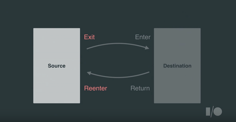
Note that we set the exit transition of the activity. There are actually 4 different transitions that work in pairs: exit/enter and return/reenter. The exit transition should be declared on the departing activity, and the enter transition should be declared on the incoming activity. If no return and reenter transitions are specified, then the transitions used will be played back in reverse.
We also need to change the entering activity as well with a slide_left.xml :
One particular change is that startActivity needs to be called with a special bundle:
Also, if you need to navigate back to the previous screen, use finishAfterTransition() instead of finish() . Normally clicking the back button already calls this method for you.
You can also control what parts of the activity transitions are excluded from this animation sequence, especially for shared elements between screens. See this section for more details.
You can see several complete examples of activity transitions in the following resources:
Check out these above to get a deeper understanding of how to create custom and unique transitions. In Android 5.0 and above the ability for activities to «share elements» was introduced allowing an element in on activity to morph into an element within the child activity. Check out our Shared Element Activity Transition guide for more details.
The default entrance and exit animations for activities can be customized as part of a theme by modifying res/styles.xml with a custom Animation.Activity style as shown below:
Refer to this stackoverflow post for more details.
Similar to activities, we can also animate the transition between fragments by invoking the setCustomAnimations method on a FragmentTransaction . The animations are simply view animation XML files as used for activity transitions above. For example, suppose we want the fragment to slide in from the left and push the old fragment out. First, let’s define the custom view animations starting with res/anim/slide_in_left.xml :
and then res/anim/slide_out_right.xml as well:
Now we just have to configure the animations of the fragment transaction before we replace the fragment or call commit:
This results in the following:

Compatibility Note: The animation files explained above are used in conjunction with support fragments. Keep in mind that if you are not using support fragments, you need to use object animations instead as explained on StackOverflow.
Note that Android has built-in animations with R.anim that can be used as well by reference android.R.anim such as:
Read more about Fragment Transitions in this detailed article. You can even check out the source code of those animations.
Extended Note: Check out this stackoverflow post if you are looking to animate the appearance of a DialogFragment.
A particular animation can be specified when the layout first appears on screen. This can be done by using the android:layoutAnimation property to specify an animation to execute.
First, let’s define an animation we’d like to use when the views in the layout appear on the screen in res/anim/slide_right.xml which defines sliding in right from outside the screen:
and now we need to create a special layoutAnimation which references that animation:
and now we need to apply this layoutAnimation to our Layout or ViewGroup:
and now when you launch the application, the views within this layout will slide in from the right. See more information about layout animation in this guide by linkyan or in this layout animation tutorial or in the ui action layout tutorial.
Layout Change Animations allow us to enable animations on any Layout container or other ViewGroup such as a ListView. With layout animations enabled, all changes to views inside the container will be animated automatically. This is especially useful for ListViews which causes items to be animated as they are added or removed.
In the past, the only way to animate changes within a layout was to set the animateLayoutChanges property on any ViewGroup within the XML:
The android:animateLayoutChanges property enables a default animation if no further customization is made.
With the introduction of the Transitions API framework, the animation sequences can now be controlled as well. See this guide for more details.
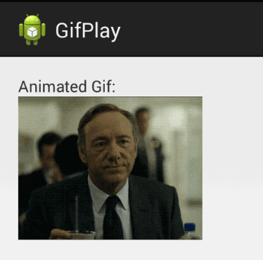
In certain cases, we want to be able to display animated images such as an simple animated GIF. The underlying class for making this happen is called AnimationDrawable which is an XML format for describing a sequence of images to display.
One of the simplest ways to display an animated gif is to use a third-party library. Glide is an easy way to display a local or remote gif into an ImageView . First, let’s add Glide to our app/build.gradle file:
Next, setup an ImageView in the the activity i.e activity_main.xml :
For local GIFs, be sure to put an animated gif into the res/raw folder for displaying. Next, we can convert and load the GIF into the ImageView within the activity i.e MainActivity.java using Glide:
and now we have this:
You can also check out the popular android-gif-drawable library for another solution. An alternative method is simply to use a WebView.
In Android 5.0, several new animation features were introduced including:
- Shared Element Activity Transition — Transitions that have shared layout elements that transform as one activity is transitioned to the other.
- Ripple Animation — Used provide an instantaneous visual confirmation at the point of contact when users interact with UI elements.
- Circular Reveal Animation — Reveal is a new animation introduced in Android L that animates the view’s clipping boundaries. Often used in conjunction with material floating action buttons.
- View Hierarchy Animations — Provides an easy way to perform animation transitions within an activity.
Note that these animations require lollipop or newer and do not work on devices with an Android version less than API 21. Around 70% of devices have at least lollipop running (April 2017), so the time spent using one of these animations requires thought to determine if it is worth the effort. Refer to this Material Animations sample app for detailed explanations with examples.
Use the third-party Leonids library for simple particle effects. Particle systems are often used in games for a wide range of purposes: explosions, fire, smoke, etc. This effects can also be used on normal apps to add elements of playful design. Here’s an example of particle motion:

Precisely because its main use is games, all engines have support for particle systems, but there is no such thing built-in for standard Android UI. Instead we can use Leonids by reviewing this tutorial for further details.
The following animations library provide easy ways to plug-in animations into your app:
- AndroidViewAnimations — Common property animations made easy.
- ViewAnimator — A wrapper to simplify common property animations.
- RecyclerView Animators — Animate the items in your RecyclerView.
- ListViewAnimations — List view item animations made simple including insertion and deletion.
- NineOldAndroids — Compatibility library supporting property animations all the way back to Android 1.0 (deprecated but still works).
- Leonids — Simple particle effects for Android.
- Like Button — Easily animate action buttons.
Источник


