- Android styling: common theme attributes
- Android Styling: Themes vs Styles
- The Android styling system offers a powerful way to specify your app’s visual design, but it can be easy to misuse…
- Colors
- Dimens
- Drawables
- TextAppearances
- Shape
- Button Styles
- Floats
- App vs Android namespace
- More Resources
- Do It Yourself
- Question (mark) everything
- Theming with AppCompat
- Theming in a material (design) world
- colorPrimary
- colorPrimaryDark
- colorAccent
- More colors
- Theming Views with the help of Theme Overlays
- Themes: useful for every app
Android styling: common theme attributes

In the previous article in this series on Android styling, we looked at the difference between themes and styles and how themes allow you to write more flexible styles and layouts which isolate changes:
Android Styling: Themes vs Styles
The Android styling system offers a powerful way to specify your app’s visual design, but it can be easy to misuse…
Specifically we recommended using theme attributes to provide a point of indirection to resources, so that you can vary them (e.g. in dark theme). That is, if you find yourself writing a direct resource reference (or worse yet, a hardcoded value 😱) in a layout or style, consider if you should use a theme attribute instead.
But what theme attributes are available to use? This post highlights the common ones that you should know about; those that come from Material, AppCompat or the platform. This is not a complete list (for that I’d recommend browsing the attrs files linked below where they are defined) but these are the attributes that I use all the time.
Colors
Many of these colors come from the Material color system, which defines semantic names for colors that you can use throughout your app (implemented as theme attrs).
- ?attr/colorPrimary The primary branding color for the app.
- ?attr/colorSecondary The secondary branding color for the app, usually a bright complement to the primary branding color.
- ?attr/colorOn[Primary, Secondary, Surface etc] A color which contrasts against the named color.
- ?attr/color[Primary, Secondary]Variant An alternate shade of the given color.
- ?attr/colorSurface A color for surfaces of components, such as cards, sheets, and menus.
- ?android:attr/colorBackground The background for the screen.
- ?attr/colorPrimarySurface switches between colorPrimary in the Light themes, colorSurface in the Dark theme.
- ?attr/colorError A color for displaying errors.
Other handy colors:
- ?attr/colorControlNormal The color applied to icons/controls in their normal state.
- ?attr/colorControlActivated The color applied to icons/controls in their activated state (e.g. checked).
- ?attr/colorControlHighlight The color applied to control highlights (e.g. ripples, list selectors).
- ?android:attr/textColorPrimary The most prominent text color.
- ?android:attr/textColorSecondary Secondary text color.
Dimens
- ?attr/listPreferredItemHeight Standard (min) height for list items.
- ?attr/actionBarSize The height of a toolbar.
Drawables
- ?attr/selectableItemBackground A ripple/highlight for interactive items (also handy for foregrounds!!)
- ?attr/selectableItemBackgroundBorderless An unbounded ripple.
- ?attr/dividerVertical A drawable that may be used as a vertical divider between visual elements.
- ?attr/dividerHorizontal A drawable that may be used as a horizontal divider between visual elements.
TextAppearances
Material defines a type scale — a discrete set of text styles that you should use throughout your app, each of which is provided as a theme attribute which can be set as a textAppearance . Check out the Material type scale generator to help generate a scale for different fonts.
- ?attr/textAppearanceHeadline1 defaults to light 96sp text.
- ?attr/textAppearanceHeadline2 defaults to light 60sp text.
- ?attr/textAppearanceHeadline3 defaults to regular 48sp text.
- ?attr/textAppearanceHeadline4 defaults to regular 34sp text.
- ?attr/textAppearanceHeadline5 defaults to regular 24sp text.
- ?attr/textAppearanceHeadline6 defaults to medium 20sp text.
- ?attr/textAppearanceSubtitle1 defaults to regular 16sp text.
- ?attr/textAppearanceSubtitle2 defaults to medium 14sp text.
- ?attr/textAppearanceBody1 defaults to regular 16sp text.
- ?attr/textAppearanceBody2 defaults to regular 14sp text.
- ?attr/textAppearanceCaption defaults to regular 12sp text.
- ?attr/textAppearanceButton defaults to medium all caps 14sp text.
- ?attr/textAppearanceOverline defaults to regular all caps 10sp text.
Shape
Material employs a shape system which is implemented as theme attrs for small, medium and large components. Note that if you’re setting a shape appearance on a custom component, you likely want to use a MaterialShapeDrawable as it’s background which understands and implements the shaping.
- ?attr/shapeAppearanceSmallComponent used for Buttons, Chips, Text Fields etc. Defaults to rounded 4dp corners.
- ?attr/shapeAppearanceMediumComponent used for Cards, Dialogs, Date Pickers etc. Defaults to rounded 4dp corners.
- ?attr/shapeAppearanceLargeComponent used for Bottom Sheets etc. Defaults to rounded 0dp corners (i.e. square!)
Button Styles
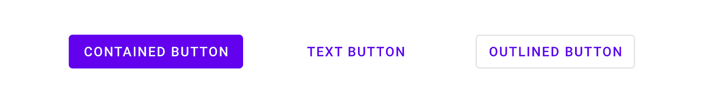
This might seem super specific, but Material defines three types of buttons: Contained, Text and Outlined. MDC offers theme attrs that you can use to set the style of a MaterialButton :
- ?attr/materialButtonStyle defaults to contained (or just omit the style).
- ?attr/borderlessButtonStyle for a text style button.
- ?attr/materialButtonOutlinedStyle for outlined style.
Floats
- ?android:attr/disabledAlpha Default disabled alpha for widgets.
- ?android:attr/primaryContentAlpha The alpha applied to the foreground elements.
- ?android:attr/secondaryContentAlpha The alpha applied to secondary elements.
App vs Android namespace
You might have noticed that some attributes are referenced by
? android:attr/foo and others just by ?attr/bar . This is because some are defined by the Android platform, and as such you need the android part to reference them by their namespace (just like with view attributes in layouts: android:id ). Those without come from static libraries (i.e. AppCompat or MDC) which are compiled into your application, so don’t need the namespace (similar to how you might use app:baz in a layout). Some elements are defined both in the platform and in a library e.g. colorPrimary . In these cases, prefer the non-platform version, as this can be used on all API levels i.e. they’re duplicated in a library precisely to backport them. In these cases, I’ve listed the non-platform versions above.
prefer non-platform attributes which can be used on all API levels
More Resources
For a complete list of the theme attributes available to use, go to the source of truth:
Material Design Components:
Do It Yourself
Sometimes there isn’t a theme attribute which abstracts something you’d like to vary by theme. No worries… create your own! Here’s an example from the Google I/O app which shows a list of conference sessions in two screens.
They’re largely similar but the left screen must leave space for the sticky time headers while the right screen does not. We implemented this by abstracting where to align items behind a theme attribute so that we can vary them by theme and use the same layout across two different screens:
1. Define the theme attribute in attrs.xml
2. Provide different values in different themes:
3. Use the theme attr in the single layout used on both screens (each using one of the above themes):
Question (mark) everything
Knowing what theme attributes are available, equips you to use them when writing your layouts, styles or drawables. Using theme attributes makes it much easier to support theming (like dark theme) and to write more flexible, maintainable code. For a deep dive on this, join us in our next post in this series:
Источник
Theming with AppCompat

I like standard components — basic building blocks that take care of common functionality and accessibility. I like standard components with a consistent design even better — something that AppCompat provides out of the box. But what I like most of all? Standard components that consistently look awesome and bring personality to my apps. This is what you get when you use the theming provided by AppCompat.
Now you’ll be able to add just a few colors such as colorPrimary, colorPrimaryDark, and colorAccent to your theme and you’ll be able to affect large parts of your app without individually customizing components.
Theming in a material (design) world
When it comes to theming there was a great shift in Lollipop with the introduction of material design. No longer was every button expected to either be exactly the same or completely custom. Tools for generating colorized components or custom colorized action bars went from essential to more than you actually need. Instead, you could customize your theme’s color palette to automatically colorize most of your app. Powerful stuff.
But it shouldn’t be only Lollipop and higher that gets the cool stuff right? So a big focus of AppCompat v21 was in backporting this new theming to all API 7+ devices and support has only grown since then (what with tint-aware widgets being made public in AppCompat 22.1 and even more features added in AppCompat 23.1). This means that a simple theme might look like:
Very different from what you might have seen prior to Lollipop (thankfully!).
colorPrimary
The first color you’ll want to add is colorPrimary. This color should represent your primary branding color which users should associate with your app (hence its ‘primary’ name). And obviously the first thing to be colored with colorPrimary should be your app bar.

When using a base theme of Theme.AppCompat and the AppCompat-provided app bar, you’ll find the app bar’s background automatically uses your colorPrimary. However, if you’re using a Toolbar (along with a Theme.AppCompat.NoActionBar theme, most likely), you’ll need to manually set the background color.
As mentioned in our previous pro-tip on colorizing the App Bar, the ?attr/ format is how you tell Android that this value should be resolved from your theme rather than directly from a resource. Generally when choosing a colorPrimary, consider colors from the material color palette around the 500 value.
colorPrimaryDark
As you might expect from the name, colorPrimaryDark is a darker variant of your primary color, which is used as the background color of the status bar that adorns the top of the screen. This difference in color gives users a clear separation between the system-controlled status bar and your app. Compared to colorPrimary, this should be the 700 color from the color palette of the same shade.
While AppCompat can backport a lot of things, coloring the status bar correctly relies on new APIs introduced in Lollipop (namely windowDrawsSystemBarBackgrounds), so don’t expect to see a colorPrimaryDark status bar on older platform versions.
colorAccent
Where colorPrimary and colorPrimaryDark are more suitable as a background color for sections of your UI, the vast majority of times you’ll see colorAccent is in small quantities that provide a contrasting color to draw attention to certain components.
In fact, many of the built in components already use colorAccent:
- Checked Checkboxes
- RadioButtons
- SwitchCompat
- EditText’s focused underline and cursor
- TextInputLayout’s floating label
- TabLayout’s current tab indicator
- The selected NavigationView item
- The background for the FloatingActionButton
While you may notice quite a few more apps focusing on colorPrimary and colorPrimaryDark (they are primary after all), colorAccent can be an easy way to guide user’s attention, provide context, and inspire confidence (all important things if you look at user research!).
More colors
If those three main colors aren’t quite enough, you don’t have to resort to coloring specific components quite yet: there are a few more colors in the color palette which can help fine tune certain things for you:
- colorControlNormal controls the ‘normal’ state of components such as an unselected EditText, and unselected Checkboxes and RadioButtons
- colorControlActivated overrides colorAccent as the activated or checked state for Checkboxes and RadioButtons
- colorControlHighlight controls the ripple coloring
Theming Views with the help of Theme Overlays
The example theme above had a parent theme of Theme.AppCompat. If you’ve ever looked at the base theme’s source code, you’ll see that the theme sets just about everything possible, as you’d expect for an Activity’s theme. However, Lollipop and AppCompat as of version 22.1 make it possible to apply themes to individual Views.
As mentioned in our previous pro-tip, a ThemeOverlay is a separate type of parent theme that only changes what is needed — for example, ThemeOverlay.AppCompat.Light changes background colors, text colors, and highlight colors as if it was a light theme and ThemeOverlay.AppCompat.Dark does the same for switching to a dark theme.
This is particularly prevalent when it comes to the Toolbar, so much so that there are separate ThemeOverlay.AppCompat.ActionBar and ThemeOverlay.AppCompat.Dark.ActionBar, which also change colorControlNormal to android:textColorPrimary and set the correct SearchView styling as is expected for those components:
Of course, the real power here is in building your own custom ThemeOverlay, which is done like any other theme — just make sure you are using a variant of ThemeOverlay.AppCompat as the parent theme:
As it is those ThemeOverlay.AppCompat parent themes that automatically translate the AppCompat colorPrimary into the Lollipop+ framework android:colorPrimary attributes — you’ll find things aren’t quite what you expect if you leave out the parent theme!
Themes: useful for every app
So whether you have a design team, a single designer, or are working through the design of your app yourself, using the theming colors available to you is an important first step and ensures you get the most out of the standard components without resorting to an app of mostly different shades of gray.
Join the discussion on the Google+ post and follow the Android Development Patterns Collection for more!
Источник


