What is the iphone screen size
The 2021 iPhone 13 release feels like an incremental update over the iPhone 12. Not much has changed but here’s a recap of what you need to know to update your apps for the new devices.
The New Models In A Nutshell
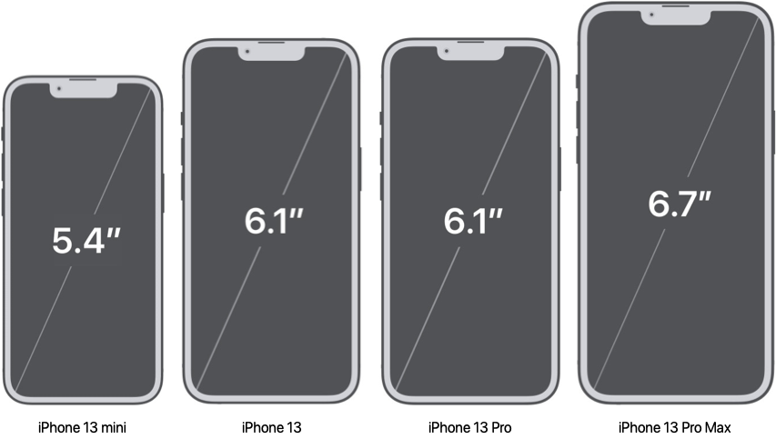
The four new iPhone 13 devices follow the screen sizes of their iPhone 12 equivalents:
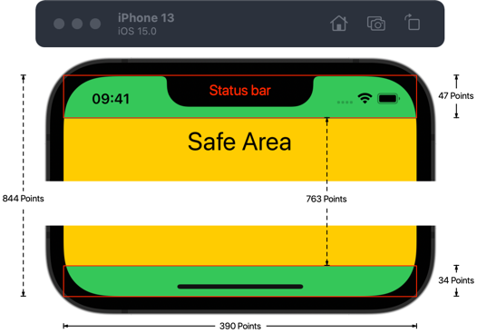
iPhone 13
- Display: 6.1″ Super Retina XDR (OLED)
- Screen resolution (points): 390 x 844
- Native resolution (pixels): 1170 x 2532 (460 ppi)
- Native Scale factor: 3x
- Portrait size classes: w: Compact, h: Regular
- Landscape size classes: w: Compact, h: Compact
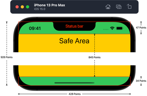
The status bar is 47 points high which gives the following safe area insets:
- Safe Area Insets (portrait): top: 47, bottom: 34, left: 0, right: 0
- Safe Area Insets (landscape): top: 0, bottom: 21, left: 47, right: 47
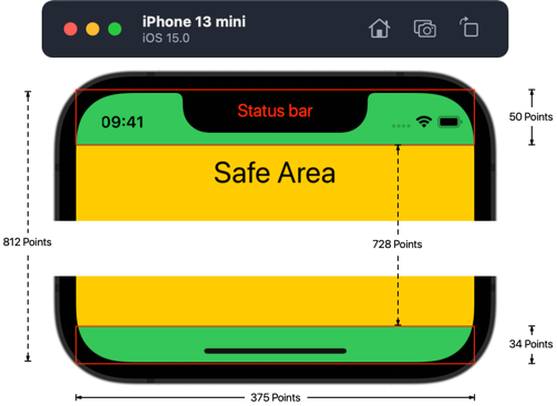
iPhone 13 mini
- Display: 5.4″ Super Retina XDR (OLED)
- Screen resolution (points): 375 x 812
- Native resolution (pixels): 1080 x 2340 (476 ppi)
- Native Scale factor: 2.88x
- Portrait size classes: w: Compact, h: Regular
- Landscape size classes: w: Compact, h: Compact
The status bar is 50 points high which gives the following safe area insets:
- Safe Area Insets (portrait): top: 50, left: 0, bottom: 34, right: 0
- Safe Area Insets (landscape): top: 0, left: 50, bottom: 21, right: 50
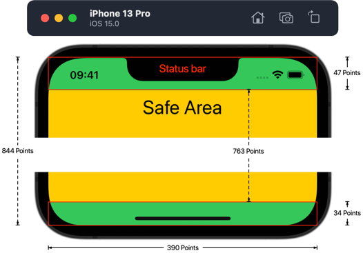
iPhone 13 Pro
- Display: 6.1″ Super Retina XDR (OLED) with ProMotion
- Screen resolution (points): 390 x 844
- Native resolution (pixels): 1170 x 2532 (460 ppi)
- Scale factor: 3x
- Portrait size classes: w: Compact, h: Regular
- Landscape size classes: w: Compact, h: Compact
The status bar is 47 points high which gives the following safe area insets (same as the iPhone 13):
- Safe Area Insets (portrait): top: 47, bottom: 34, left: 0, right: 0
- Safe Area Insets (landscape): top: 0, bottom: 21, left: 47, right: 47
iPhone 13 Pro Max
- Display: 6.7″ Super Retina XDR (OLED) with ProMotion
- Screen resolution (points): 428 x 926
- Native resolution (pixels): 1284 x 2778 (458 ppi)
- Scale factor: 3x
- Portrait size classes: w: Compact, h: Regular
- Landscape size classes: w: Regular, h: Compact
The status bar is 47 points high which gives the following safe area insets (same as the iPhone 13):
- Safe Area Insets (portrait): top: 47, bottom: 34, left: 0, right: 0
- Safe Area Insets (landscape): top: 0, bottom: 21, left: 47, right: 47
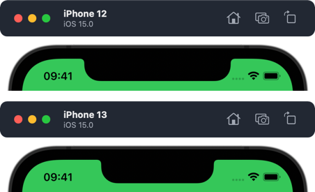
A Smaller Notch
It’s not obvious from the numbers above but the notch appears a little smaller this year:
This doesn’t affect the safe area insets or status bar height but if you’re putting something in that area you’ll want to check how it looks.
The Complete List of iPhones (and an iPod)
By my count there are 9 different iPhone screen sizes that you need to support with a minimum deployment target of iOS 13:
6.7″ (428 x 926 points @3x)
iPhone 13 Pro Max, iPhone 12 Pro Max
6.5″ (414 x 896 points @3x)
iPhone 11 Pro Max, iPhone XS Max
6.1″ (390 x 844 points @3x)
iPhone 13 Pro, iPhone 13, iPhone 12 Pro, iPhone 12
6.1″ (414 x 896 points @2x)
iPhone 11, iPhone XR
5.8″ (375 x 812 points @3x)
iPhone 11 Pro, iPhone XS, iPhone X
5.5″ (414 x 736 points @3x)
iPhone 8 Plus, iPhone 7 Plus, iPhone 6S Plus
5.4″ (375 x 812 points @3x)
iPhone 13 mini, iPhone 12 mini
4.7″ (375 x 667 points @2x)
iPhone SE (2nd Gen), iPhone 8, iPhone 7, iPhone 6S
4″ (320 x 568 @2x)
iPhone SE (1st Gen), iPod Touch (7th Gen)
App Store Screenshots
The screenshot requirements in App Store Connect have not changed for the new device sizes. This means you still need at least a 6.5″ (1242 x 2688 pixel) and a 5.5″ (1242 x 2208 pixel) screenshot which are then scaled for the remaining sizes you don’t supply.
Want To Learn More?
If you’re struggling to build layouts that work across the growing range of iOS devices you might like my book — Modern Auto Layout.
Источник
Viewport Sizes for iPhone
Apple iPhone have Retina Display, Which means iPhone screen shows 2x or 3x higher resolution display instead of normal display to our Eye.
In Retina display, ONE pixel may contains many more pixels, thats why Retina Display or Device Dimensions got bigger and we see high resolution of images and content in smaller display. However devices’ actual dimensions depends on actual Pixels Per Inch which is called «Viewport Size» of device or «device-width». Web designs for mobile or CSS responsive styles are based on viewport size of devices, Click here to see popular devices viewport table.
Here we list down all Apple iPhone models with their viewport size, resolution, pixel density, screen size and CSS media queries respectively:
| Device Name | Viewport SizePX | Device Resolution PX | Screen Size | Pixel Ratio | Density PPI | CSS PPI | Media Queries |
|---|---|---|---|---|---|---|---|
| Apple iPhone 12 mini | 360 x 780 | 1080 x 2340 | 5.4″ | 3.0 | 476 | 159 |  |
| Apple iPhone 12 Pro Max | 428 x 926 | 1284 x 2778 | 6.7″ | 3.0 | 458 | 153 |  |
| Apple iPhone 12 Pro | 390 x 844 | 1170 x 2532 | 6.1″ | 3.0 | 460 | 153 |  |
| Apple iPhone 12 | 390 x 844 | 1170 x 2532 | 6.1″ | 3.0 | 460 | 153 |  |
| Apple iPhone SE (2020) | 375 x 667 | 750 x 1334 | 4.7″ | 2.0 | 326 | 163 |  |
| Apple iPhone 11 Pro Max | 414 x 896 | 1242 x 2688 | 6.5″ | 3.0 | 458 | 153 |  |
| Apple iPhone 11 Pro | 375 x 812 | 1125 x 2436 | 5.8″ | 3.0 | 458 | 153 |  |
| Apple iPhone 11 | 414 x 896 | 828 x 1792 | 6.1″ | 2.0 | 326 | 163 |  |
| Apple iPhone XS Max | 414 x 896 | 1242 x 2688 | 6.5″ | 3.0 | 458 | 153 |  |
| Apple iPhone XR | 414 x 896 | 828 x 1792 | 6.1″ | 2.0 | 326 | 163 |  |
| Apple iPhone X | 375 x 812 | 1125 x 2436 | 5.8″ | 3.0 | 458 | 153 |  |
| Apple iPhone 8 | 375 x 667 | 750 x 1334 | 4.7″ | 2.0 | 326 | 163 |  |
| Apple iPhone 8 Plus | 414 x 736 | 1080 x 1920 | 5.5″ | 3.0 | 401 | 134 |  |
| Apple iPhone 7 | 375 x 667 | 750 x 1334 | 4.7″ | 2.0 | 326 | 163 |  |
| Apple iPhone 7 Plus | 414 x 736 | 1080 x 1920 | 5.5″ | 3.0 | 401 | 134 |  |
| Apple iPhone 6s Plus | 414 x 736 | 1080 x 1920 | 5.5″ | 3.0 | 401 | 134 |  |
| Apple iPhone SE | 320 x 568 | 640 x 1136 | 4.0″ | 2.0 | 326 | 163 |  |
| Apple iPhone 6s | 375 x 667 | 750 x 1334 | 4.7″ | 2.0 | 326 | 163 |  |
| Apple iPhone 6 | 375 x 667 | 750 x 1334 | 4.7″ | 2.0 | 326 | 163 |  |
| Apple iPhone 5s | 320 x 568 | 640 x 1136 | 4.0″ | 2.0 | 326 | 163 |  |
| Apple iPhone 5c | 320 x 568 | 640 x 1136 | 4.0″ | 2.0 | 326 | 163 |  |
| Apple iPhone 5 | 320 x 568 | 640 x 1136 | 4.0″ | 2.0 | 326 | 163 |  |
This website uses cookies, We and our partners use technology such as cookies to analyse our traffic and to show you personalised content and ads. You consent to our cookies by clicking «Agree» or by continuing to use our website.
Источник
