- Summary of Chapter 6. Button clicks
- Processing the click
- Sharing button clicks
- Anonymous event handlers
- Distinguishing views with IDs
- Saving transient data
- Xamarin.Forms Button
- Handling button clicks
- Creating a button in code
- Disabling the button
- Using the command interface
- Pressing and releasing the button
- Button appearance
- Button visual states
- Creating a toggle button
- Using bitmaps with buttons
Summary of Chapter 6. Button clicks
This book was published in the spring of 2016, and has not been updated since then. There is much in the book that remains valuable, but some of the material is outdated, and some topics are no longer entirely correct or complete.
The Button is the view that allows the user to initiate a command. A Button is identified by text (and optionally an image as demonstrated in Chapter 13, Bitmaps). Consequently, Button defines many of the same properties as Label :
Button also defines three properties that govern the appearance of its border, but the support of these properties and their mutual independence is platform specific:
Button also inherits all the properties of VisualElement and View , including BackgroundColor , HorizontalOptions , and VerticalOptions .
Processing the click
The Button class defines a Clicked event that is fired when the user taps the Button . The Click handler is of type EventHandler . The first argument is the Button object generating the event; the second argument is an EventArgs object that provides no additional information.
The ButtonLogger sample demonstrates simple Clicked handling.
Sharing button clicks
Multiple Button views can share the same Clicked handler, but the handler generally needs to determine which Button is responsible for a particular event. One approach is to store the various Button objects as fields and check which one is firing the event in the handler.
The TwoButtons sample demonstrates this technique. The program also demonstrates how to set the IsEnabled property of a Button to false when pressing the Button is no longer valid. A disabled Button does not generate a Clicked event.
Anonymous event handlers
It is possible to define Clicked handlers as anonymous lambda functions, as the ButtonLambdas sample demonstrates. However, anonymous handlers can’t be shared without some messy reflection code.
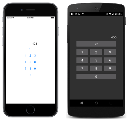
Distinguishing views with IDs
Multiple Button objects can also be distinguished by setting the StyleId property or AutomationId property to a string . This property is defined by Element but it is not used within Xamarin.Forms. It is intended to be used solely by application programs.
The SimplestKeypad sample uses the same event handler for all 10 number keys on a numeric keypad and distinguishes between them with the StyleId property:
Saving transient data
Many applications need to save data when a program is terminated and to reload that data when the program starts up again. The Application class defines several members that help your program save and restore transient data:
- The Properties property is a dictionary with string keys and object items. The contents of the dictionary are automatically saved in application local storage prior to program termination, and reloaded when the program starts up.
- The Application class defines three protected virtual methods that the program’s standard App class overrides: OnStart , OnSleep , and OnResume . These refer to application lifecycle events.
- The SavePropertiesAsync method saves the contents of the dictionary.
It is not necessary to call SavePropertiesAsync . The contents of the dictionary are automatically saved prior to program termination and retrieved before program startup. It’s useful during program testing to save data if the program crashes.
- Application.Current , a static property that returns the current Application object that you can then use to obtain the Properties dictionary.
The first step is to identify all the variables on the page that you want to persist when the program terminates. If you know all the places where those variables change, you can simply add them to the Properties dictionary at that point. In the page’s constructor, you can set the variables from the Properties dictionary if the key exists.
A larger program will probably need to deal with application lifecycle events. The most important is the OnSleep method. A call to this method indicates that the program has left the foreground. Perhaps the user has pressed the Home button on the device, or displayed all the applications, or is shutting down the phone. A call to OnSleep is the only notification that a program receives before it is terminated. The program should take this opportunity to ensure that the Properties dictionary is up to date.
A call to OnResume indicates that the program did not terminate following the last call to OnSleep but is now running in the foreground again. The program might use this opportunity to refresh internet connections (for example).
A call to OnStart occurs during program startup. It is not necessary to wait until this method call to access the Properties dictionary because the contents have already been restored when the App constructor is called.
The PersistentKeypad sample is very similar to SimplestKeypad except that the program uses the OnSleep override to save the current keypad entry, and the page constructor to restore that data.
Источник
Xamarin.Forms Button
The Button responds to a tap or click that directs an application to carry out a particular task.
The Button is the most fundamental interactive control in all of Xamarin.Forms. The Button usually displays a short text string indicating a command, but it can also display a bitmap image, or a combination of text and an image. The user presses the Button with a finger or clicks it with a mouse to initiate that command.
Most of the topics discussed below correspond to pages in the ButtonDemos sample.
Handling button clicks
Button defines a Clicked event that is fired when the user taps the Button with a finger or mouse pointer. The event is fired when the finger or mouse button is released from the surface of the Button . The Button must have its IsEnabled property set to true for it to respond to taps.
The Basic Button Click page in the ButtonDemos sample demonstrates how to instantiate a Button in XAML and handle its Clicked event. The BasicButtonClickPage.xaml file contains a StackLayout with both a Label and a Button :
The Button tends to occupy all the space that’s allowed for it. For example, if you don’t set the HorizontalOptions property of Button to something other than Fill , the Button will occupy the full width of its parent.
By default, the Button is rectangular, but you can give it rounded corners by using the CornerRadius property, as described below in the section Button appearance.
The Text property specifies the text that appears in the Button . The Clicked event is set to an event handler named OnButtonClicked . This handler is located in the code-behind file, BasicButtonClickPage.xaml.cs:
When the Button is tapped, the OnButtonClicked method executes. The sender argument is the Button object responsible for this event. You can use this to access the Button object, or to distinguish between multiple Button objects sharing the same Clicked event.
This particular Clicked handler calls an animation function that rotates the Label 360 degrees in 1000 milliseconds. Here’s the program running on iOS and Android devices, and as a Universal Windows Platform (UWP) application on the Windows 10 desktop:
Notice that the OnButtonClicked method includes the async modifier because await is used within the event handler. A Clicked event handler requires the async modifier only if the body of the handler uses await .
Each platform renders the Button in its own specific manner. In the Button appearance section, you’ll see how to set colors and make the Button border visible for more customized appearances. Button implements the IFontElement interface, so it includes FontFamily , FontSize , and FontAttributes properties.
Creating a button in code
It’s common to instantiate a Button in XAML, but you can also create a Button in code. This might be convenient when your application needs to create multiple buttons based on data that is enumerable with a foreach loop.
The Code Button Click page demonstrates how to create a page that is functionally equivalent to the Basic Button Click page but entirely in C#:
Everything is done in the class’s constructor. Because the Clicked handler is only one statement long, it can be attached to the event very simply:
Of course, you can also define the event handler as a separate method (just like the OnButtonClick method in Basic Button Click) and attach that method to the event:
Disabling the button
Sometimes an application is in a particular state where a particular Button click is not a valid operation. In those cases, the Button should be disabled by setting its IsEnabled property to false . The classic example is an Entry control for a filename accompanied by a file-open Button : The Button should be enabled only if some text has been typed into the Entry . You can use a DataTrigger for this task, as shown in the Data Triggers article.
Using the command interface
It is possible for an application to respond to Button taps without handling the Clicked event. The Button implements an alternative notification mechanism called the command or commanding interface. This consists of two properties:
This approach is particularly suitable in connection with data-binding, and particularly when implementing the Model-View-ViewModel (MVVM) architecture. These topics are discussed in the articles Data Binding, From Data Bindings to MVVM, and MVVM.
In an MVVM application, the viewmodel defines properties of type ICommand that are then connected to the XAML Button elements with data bindings. Xamarin.Forms also defines Command and Command classes that implement the ICommand interface and assist the viewmodel in defining properties of type ICommand .
Commanding is described in greater detail in the article The Command Interface but the Basic Button Command page in the ButtonDemos sample shows the basic approach.
The CommandDemoViewModel class is a very simple viewmodel that defines a property of type double named Number , and two properties of type ICommand named MultiplyBy2Command and DivideBy2Command :
The two ICommand properties are initialized in the class’s constructor with two objects of type Command . The Command constructors include a little function (called the execute constructor argument) that either doubles or halves the Number property.
The BasicButtonCommand.xaml file sets its BindingContext to an instance of CommandDemoViewModel . The Label element and two Button elements contain bindings to the three properties in CommandDemoViewModel :
As the two Button elements are tapped, the commands are executed, and the number changes value:
The advantage of this approach over Clicked handlers is that all the logic involving the functionality of this page is located in the viewmodel rather than the code-behind file, achieving a better separation of the user interface from the business logic.
It is also possible for the Command objects to control the enabling and disabling of the Button elements. For example, suppose you want to limit the range of number values between 2 10 and 2 –10 . You can add another function to the constructor (called the canExecute argument) that returns true if the Button should be enabled. Here’s the modification to the CommandDemoViewModel constructor:
The calls to the ChangeCanExecute method of Command are necessary so that the Command method can call the canExecute method and determine whether the Button should be disabled or not. With this code change, as the number reaches the limit, the Button is disabled:
It is possible for two or more Button elements to be bound to the same ICommand property. The Button elements can be distinguished using the CommandParameter property of Button . In this case, you’ll want to use the generic Command class. The CommandParameter object is then passed as an argument to the execute and canExecute methods. This technique is shown in detail in the Basic Commanding section of the Command Interface article.
The ButtonDemos sample also uses this technique in its MainPage class. The MainPage.xaml file contains a Button for each page of the sample:
Each Button has its Command property bound to a property named NavigateCommand , and the CommandParameter is set to a Type object corresponding to one of the page classes in the project.
That NavigateCommand property is of type ICommand and is defined in the code-behind file:
The constructor initializes the NavigateCommand property to a Command object because Type is the type of the CommandParameter object set in the XAML file. This means that the execute method has an argument of type Type that corresponds to this CommandParameter object. The function instantiates the page and then navigates to it.
Notice that the constructor concludes by setting its BindingContext to itself. This is necessary for properties in the XAML file to bind to the NavigateCommand property.
Pressing and releasing the button
Besides the Clicked event, Button also defines Pressed and Released events. The Pressed event occurs when a finger presses on a Button , or a mouse button is pressed with the pointer positioned over the Button . The Released event occurs when the finger or mouse button is released. Generally, a Clicked event is also fired at the same time as the Released event, but if the finger or mouse pointer slides away from the surface of the Button before being released, the Clicked event might not occur.
The Pressed and Released events are not often used, but they can be used for special purposes, as demonstrated in the Press and Release Button page. The XAML file contains a Label and a Button with handlers attached for the Pressed and Released events:
The code-behind file animates the Label when a Pressed event occurs, but suspends the rotation when a Released event occurs:
The result is that the Label only rotates while a finger is in contact with the Button , and stops when the finger is released:
This kind of behavior has applications for games: A finger held on a Button might make an on-screen object move in a particular direction.
Button appearance
The Button inherits or defines several properties that affect its appearance:
- TextColor is the color of the Button text
- BackgroundColor is the color of the background to that text
- BorderColor is the color of an area surrounding the Button
- FontFamily is the font family used for the text
- FontSize is the size of the text
- FontAttributes indicates if the text is italic or bold
- BorderWidth is the width of the border
- CornerRadius is the corner radius of the Button
- CharacterSpacing is the spacing between characters of the Button text.
- TextTransform determines the casing of the Button text.
The Button class also has Margin and Padding properties that control the layout behavior of the Button . For more information, see Margin and Padding.
The effects of six of these properties (excluding FontFamily and FontAttributes ) are demonstrated in the Button Appearance page. Another property, Image , is discussed in the section Using bitmaps with button.
All of the views and data bindings in the Button Appearance page are defined in the XAML file:
The Button at the top of the page has its three Color properties bound to Picker elements at the bottom of the page. The items in the Picker elements are colors from the NamedColor class included in the project. Three Slider elements contain two-way bindings to the FontSize , BorderWidth , and CornerRadius properties of the Button .
This program allows you to experiment with combinations of all these properties:
To see the Button border, you’ll need to set a BorderColor to something other than Default , and the BorderWidth to a positive value.
On iOS, you’ll notice that large border widths intrude into the interior of the Button and interfere with the display of text. If you choose to use a border with an iOS Button , you’ll probably want to begin and end the Text property with spaces to retain its visibility.
On UWP, selecting a CornerRadius that exceeds half the height of the Button raises an exception.
Button visual states
Button has a Pressed VisualState that can be used to initiate a visual change to the Button when pressed by the user, provided that it’s enabled.
The following XAML example shows how to define a visual state for the Pressed state:
The Pressed VisualState specifies that when the Button is pressed, its Scale property will be changed from its default value of 1 to 0.8. The Normal VisualState specifies that when the Button is in a normal state, its Scale property will be set to 1. Therefore, the overall effect is that when the Button is pressed, it’s rescaled to be slightly smaller, and when the Button is released, it’s rescaled to its default size.
For more information about visual states, see The Xamarin.Forms Visual State Manager.
Creating a toggle button
It is possible to subclass Button so that it works like an on-off switch: Tap the button once to toggle the button on and tap it again to toggle it off.
The following ToggleButton class derives from Button and defines a new event named Toggled and a Boolean property named IsToggled . These are the same two properties defined by the Xamarin.Forms Switch :
The ToggleButton constructor attaches a handler to the Clicked event so that it can change the value of the IsToggled property. The OnIsToggledChanged method fires the Toggled event.
The last line of the OnIsToggledChanged method calls the static VisualStateManager.GoToState method with the two text strings «ToggledOn» and «ToggledOff». You can read about this method and how your application can respond to visual states in the article The Xamarin.Forms Visual State Manager.
Because ToggleButton makes the call to VisualStateManager.GoToState , the class itself doesn’t need to include any additional facilities to change the button’s appearance based on its IsToggled state. That is the responsibility of the XAML that hosts the ToggleButton .
The Toggle Button Demo page contains two instances of ToggleButton , including Visual State Manager markup that sets the Text , BackgroundColor , and TextColor of the button based on the visual state:
The Toggled event handlers are in the code-behind file. They are responsible for setting the FontAttributes property of the Label based on the state of the buttons:
Here’s the program running on iOS, Android, and the UWP:
Using bitmaps with buttons
The Button class defines an ImageSource property that allows you to display a bitmap image on the Button , either alone or in combination with text. You can also specify how the text and image are arranged.
The ImageSource property is of type ImageSource , which means that the bitmaps can be loaded from a file, embedded resource, URI, or stream.
While a Button can load an animated GIF, it will only display the first frame of the GIF.
Each platform supported by Xamarin.Forms allows images to be stored in multiple sizes for different pixel resolutions of the various devices that the application might run on. These multiple bitmaps are named or stored in such a way that the operating system can pick the best match for the device’s video display resolution.
For a bitmap on a Button , the best size is usually between 32 and 64 device-independent units, depending on how large you want it to be. The images used in this example are based on a size of 48 device-independent units.
In the iOS project, the Resources folder contains three sizes of this image:
- A 48-pixel square bitmap stored as /Resources/MonkeyFace.png
- A 96-pixel square bitmap stored as /Resource/MonkeyFace@2x.png
- A 144-pixel square bitmap stored as /Resource/MonkeyFace@3x.png
All three bitmaps were given a Build Action of BundleResource.
For the Android project, the bitmaps all have the same name, but they are stored in different subfolders of the Resources folder:
- A 72-pixel square bitmap stored as /Resources/drawable-hdpi/MonkeyFace.png
- A 96-pixel square bitmap stored as /Resources/drawable-xhdpi/MonkeyFace.png
- A 144-pixel square bitmap stored as /Resources/drawable-xxhdpi/MonkeyFace.png
- A 192-pixel square bitmap stored as /Resources/drawable-xxxhdpi/MonkeyFace.png
These were given a Build Action of AndroidResource.
In the UWP project, bitmaps can be stored anywhere in the project, but they are generally stored in a custom folder or the Assets existing folder. The UWP project contains these bitmaps:
- A 48-pixel square bitmap stored as /Assets/MonkeyFace.scale-100.png
- A 96-pixel square bitmap stored as /Assets/MonkeyFace.scale-200.png
- A 192-pixel square bitmap stored as /Assets/MonkeyFace.scale-400.png
They were all given a Build Action of Content.
You can specify how the Text and ImageSource properties are arranged on the Button using the ContentLayout property of Button . This property is of type ButtonContentLayout , which is an embedded class in Button . The constructor has two arguments:
- A member of the ImagePosition enumeration: Left , Top , Right , or Bottom indicating how the bitmap appears relative to the text.
- A double value for the spacing between the bitmap and the text.
The defaults are Left and 10 units. Two read-only properties of ButtonContentLayout named Position and Spacing provide the values of those properties.
In code, you can create a Button and set the ContentLayout property like this:
In XAML, you need specify only the enumeration member, or the spacing, or both in any order separated by commas:
The Image Button Demo page uses OnPlatform to specify different filenames for the iOS, Android, and UWP bitmap files. If you want to use the same filename for each platform and avoid the use of OnPlatform , you’ll need to store the UWP bitmaps in the root directory of the project.
The first Button on the Image Button Demo page sets the Image property but not the Text property:
If the UWP bitmaps are stored in the root directory of the project, this markup can be considerably simplified:
To avoid a lot of repetitious markup in the ImageButtonDemo.xaml file, an implicit Style is also defined to set the ImageSource property. This Style is automatically applied to five other Button elements. Here’s the complete XAML file:
The final four Button elements make use of the ContentLayout property to specify a position and spacing of the text and bitmap:
You’ve now seen the various ways that you can handle Button events and change the Button appearance.
Источник


